CS 194-26 Project 1 - Alex Krentsel
Colorizing the Russian Empire
Description
The goal of the project was colorizing images of the Prokudin-Gorskii photo collection. Each image is broken into 3 parts, where each part is the red, green, or blue composition of the image:
The image needs to be cut into 3 parts, and then those parts need to be overlaid in their respective colors. However, naively overlaying these produces a poor result, due to slight movement in camera position and misalignments when scanning the images into digital format:
 To fix this, we need to algorithmically find the best alignment for the image. We hold one color constant and find the best shifts for the other two colors. We do this by calculating the Sum of Squared Differences (SSD) of a range of different alignments (+/- 10 pixels), and picking the best one. This produces a result like this:
This becomes trickier as the image gets bigger, so we need to implement some tricks to do this in a reasonable amount of time. We can implement an image pyramid to speed up the search by searching more coarse versions of the image before doing a less expansive search on the high quality image.
The only problem I ran into after doing this was that emir.tif was not aligning properly. This was because there was such a constrast difference between the different colors. Originally I was aligning red and green to blue. Keeping green constant instead of blue fixed the issue.
Results on Staff Images
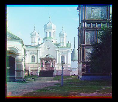
cathedral.jpg
 Blue Offset: -2, -5
Red Offset: 1, 7
Blue Offset: -2, -5
Red Offset: 1, 7
emir.tif
 Blue Offset: -24, -48
Red Offset: 17, 57
Blue Offset: -24, -48
Red Offset: 17, 57
harvesters.tif
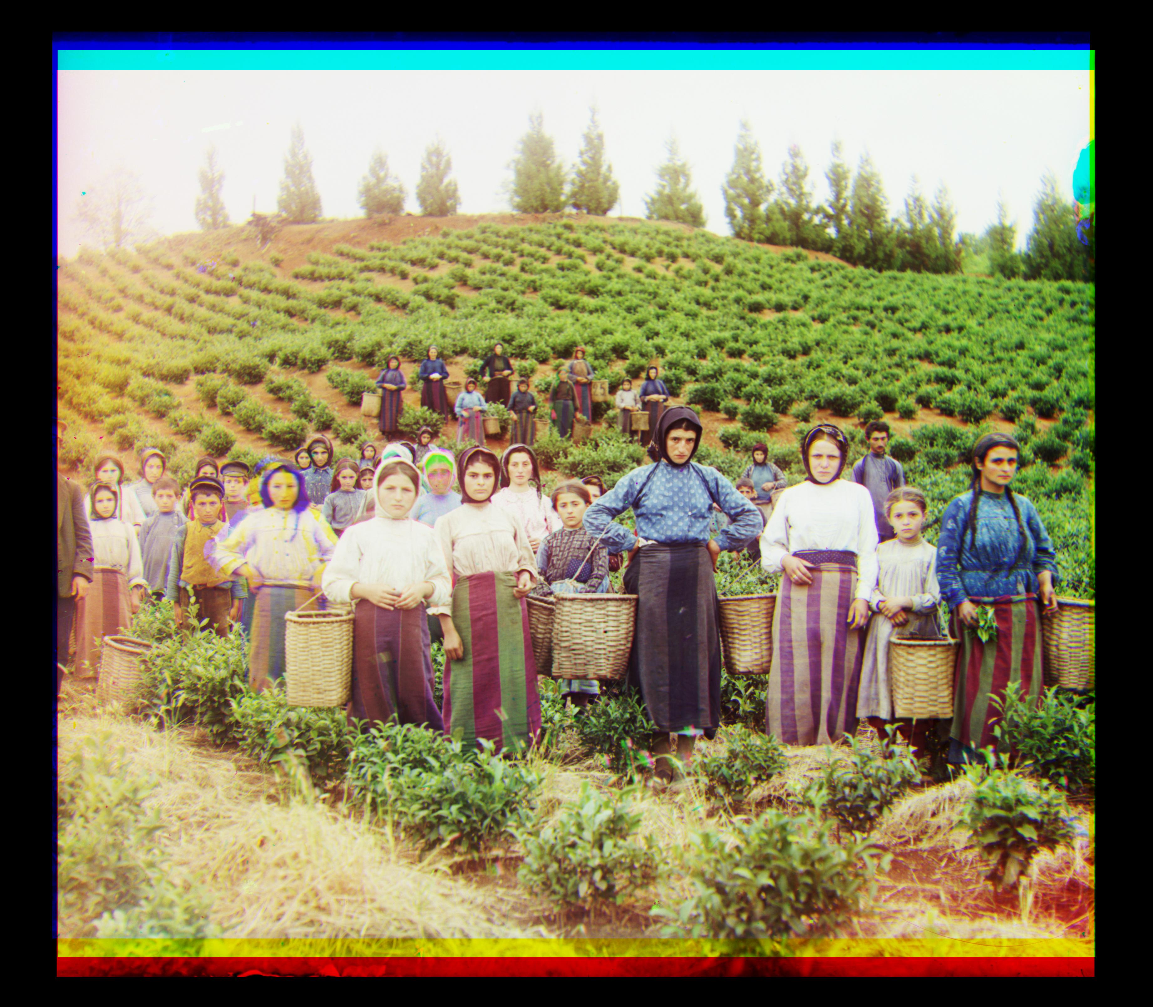 Blue Offset: -17, -59
Red Offset: -3, 64
Blue Offset: -17, -59
Red Offset: -3, 64
icon.tif
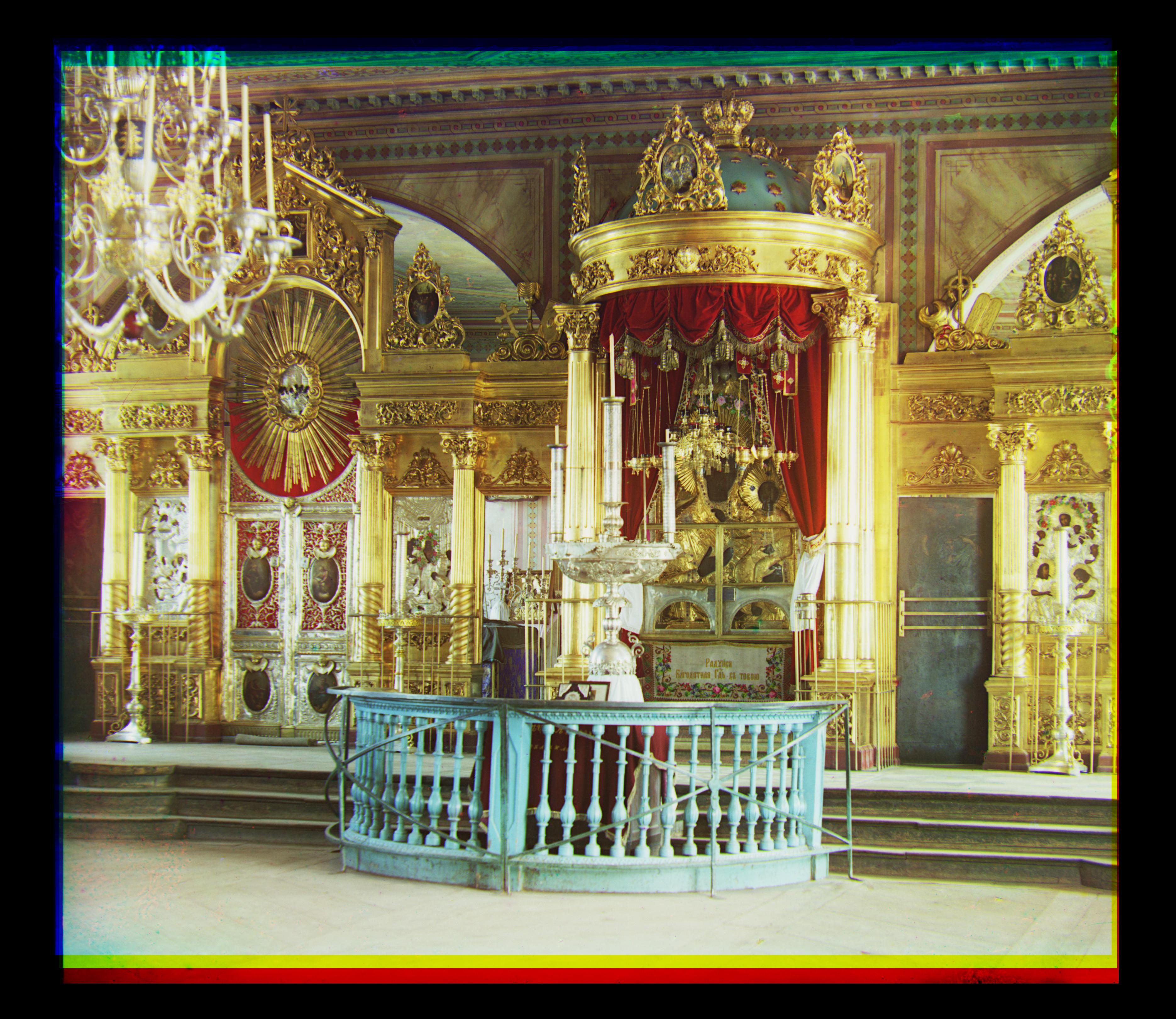 Blue Offset: -18, -42
Red Offset: 5, 49
Blue Offset: -18, -42
Red Offset: 5, 49
lady.tif
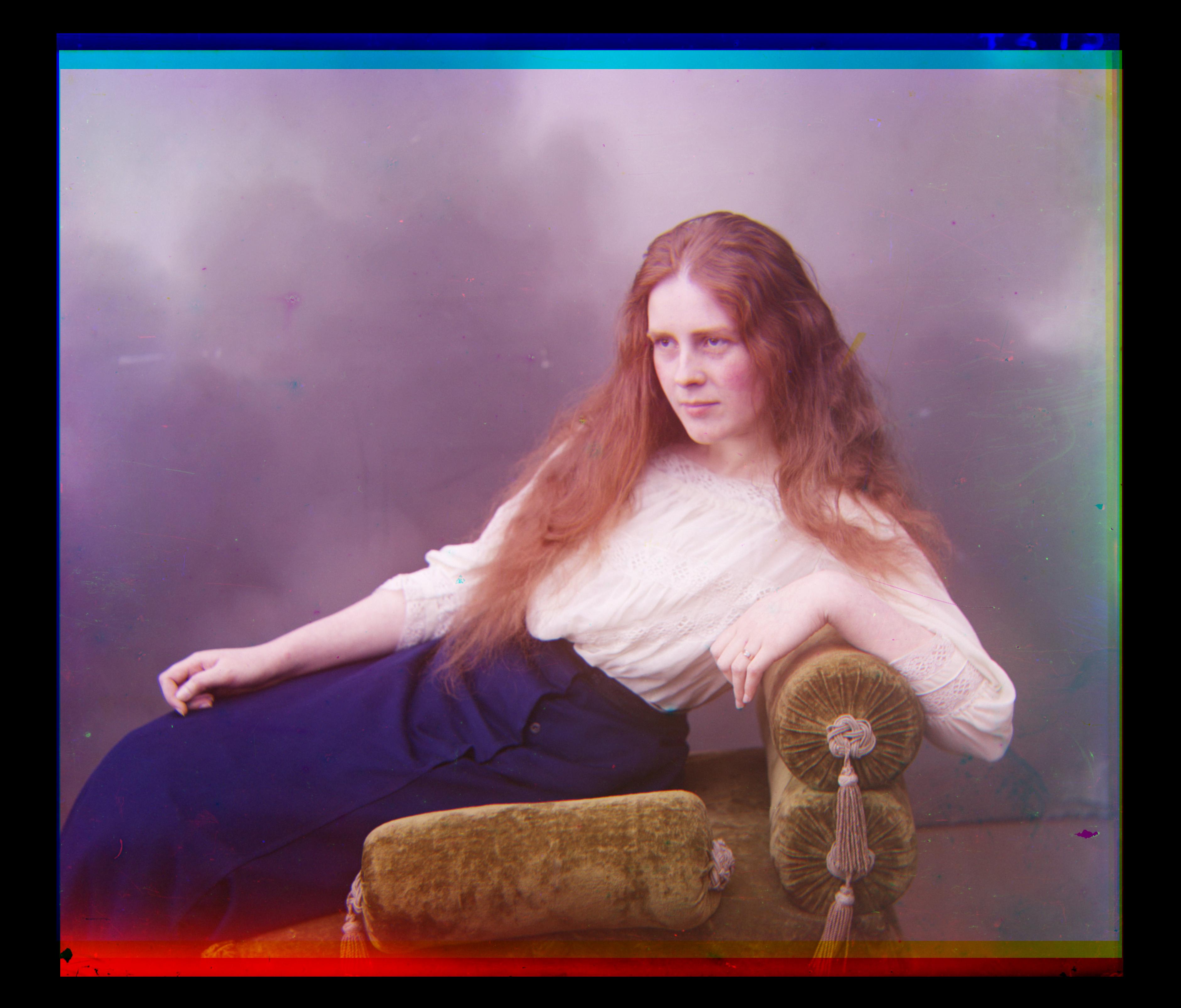 Blue Offset: -8, -54
Red Offset: 4, 60
Blue Offset: -8, -54
Red Offset: 4, 60
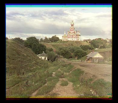
monastery.jpg
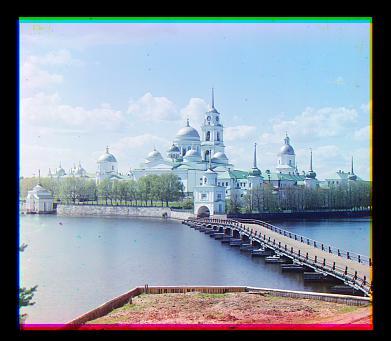 Blue Offset: -2, 3
Red Offset: 1, 6
Blue Offset: -2, 3
Red Offset: 1, 6
nativity.jpg
 Blue Offset: -1, -3
Red Offset: -1, 5
Blue Offset: -1, -3
Red Offset: -1, 5
self_portrait.tif
 Blue Offset: -29, -78
Red Offset: 8, 98
Blue Offset: -29, -78
Red Offset: 8, 98
settlers.jpg
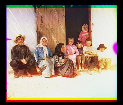 Blue Offset: 0, -7
Red Offset: -1, 8
Blue Offset: 0, -7
Red Offset: -1, 8
three_generations.tif
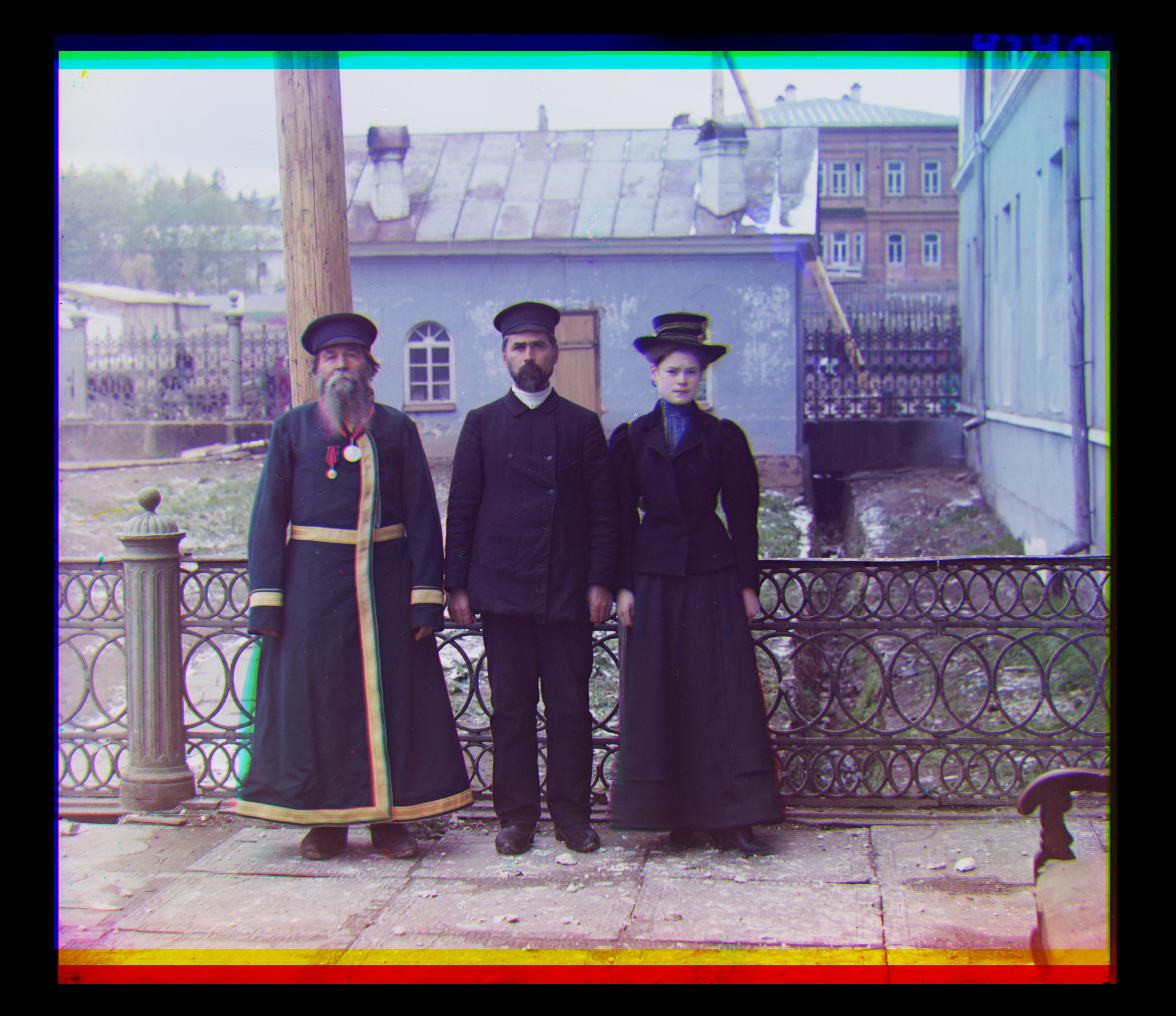 Blue Offset: -14, -52
Red Offset: -3, 59
Blue Offset: -14, -52
Red Offset: -3, 59
train.tif
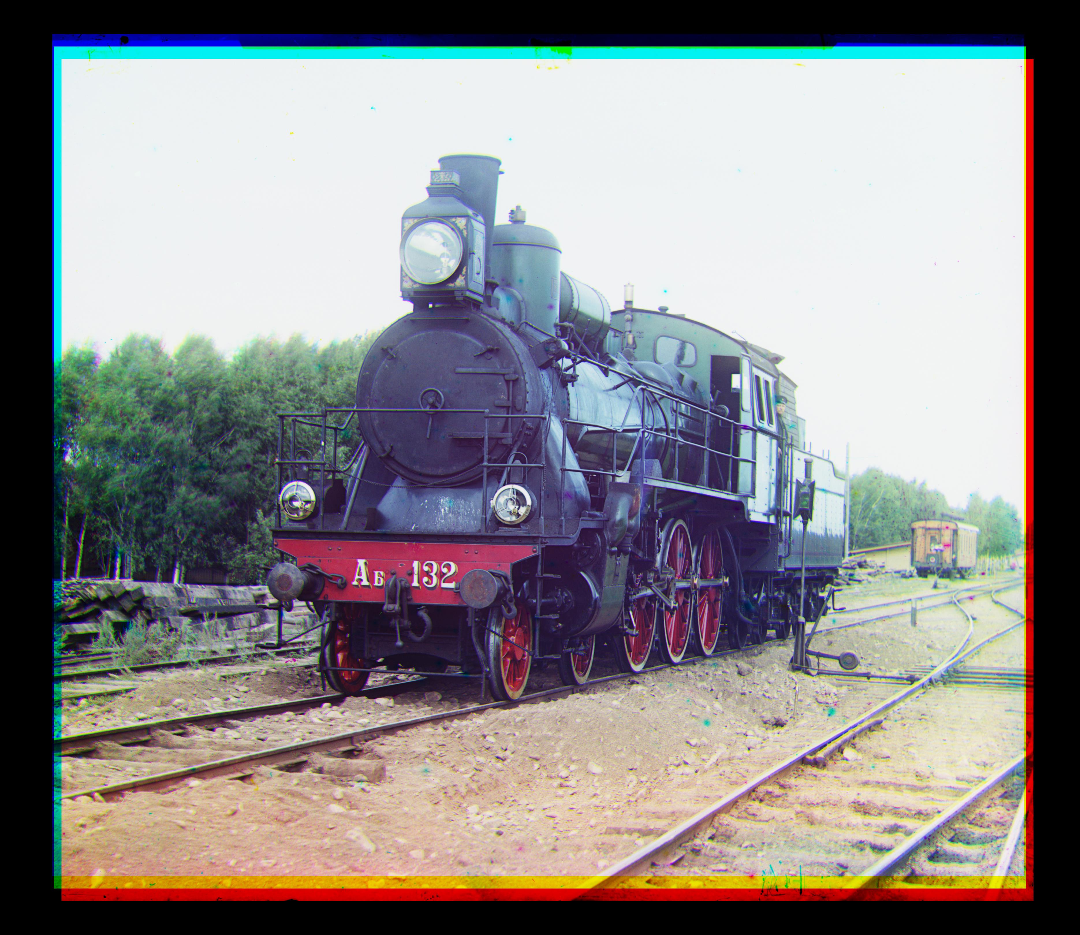 Blue Offset: -6, -43
Red Offset: 26, 43
Blue Offset: -6, -43
Red Offset: 26, 43
turkmen.tif
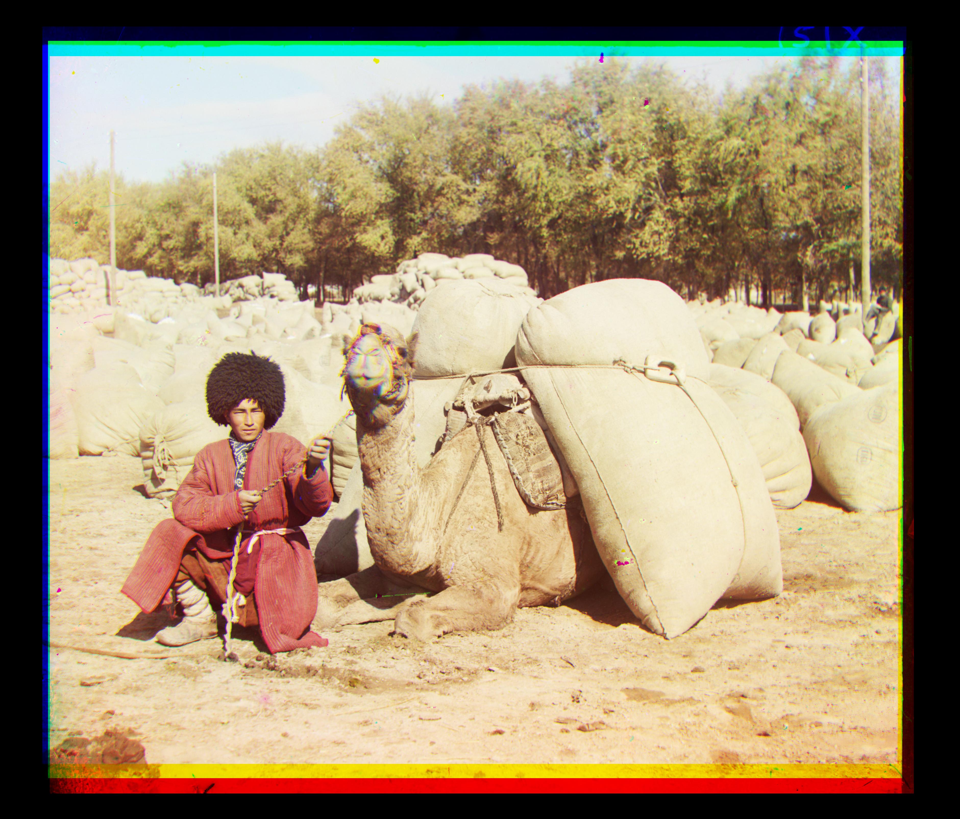 Blue Offset: -22, -56
Red Offset: 7, 60
Blue Offset: -22, -56
Red Offset: 7, 60
village.tif
 Blue Offset: -12, -64
Red Offset: 10, 73
Blue Offset: -12, -64
Red Offset: 10, 73
Results on Self-Selected Images
lugano.tif
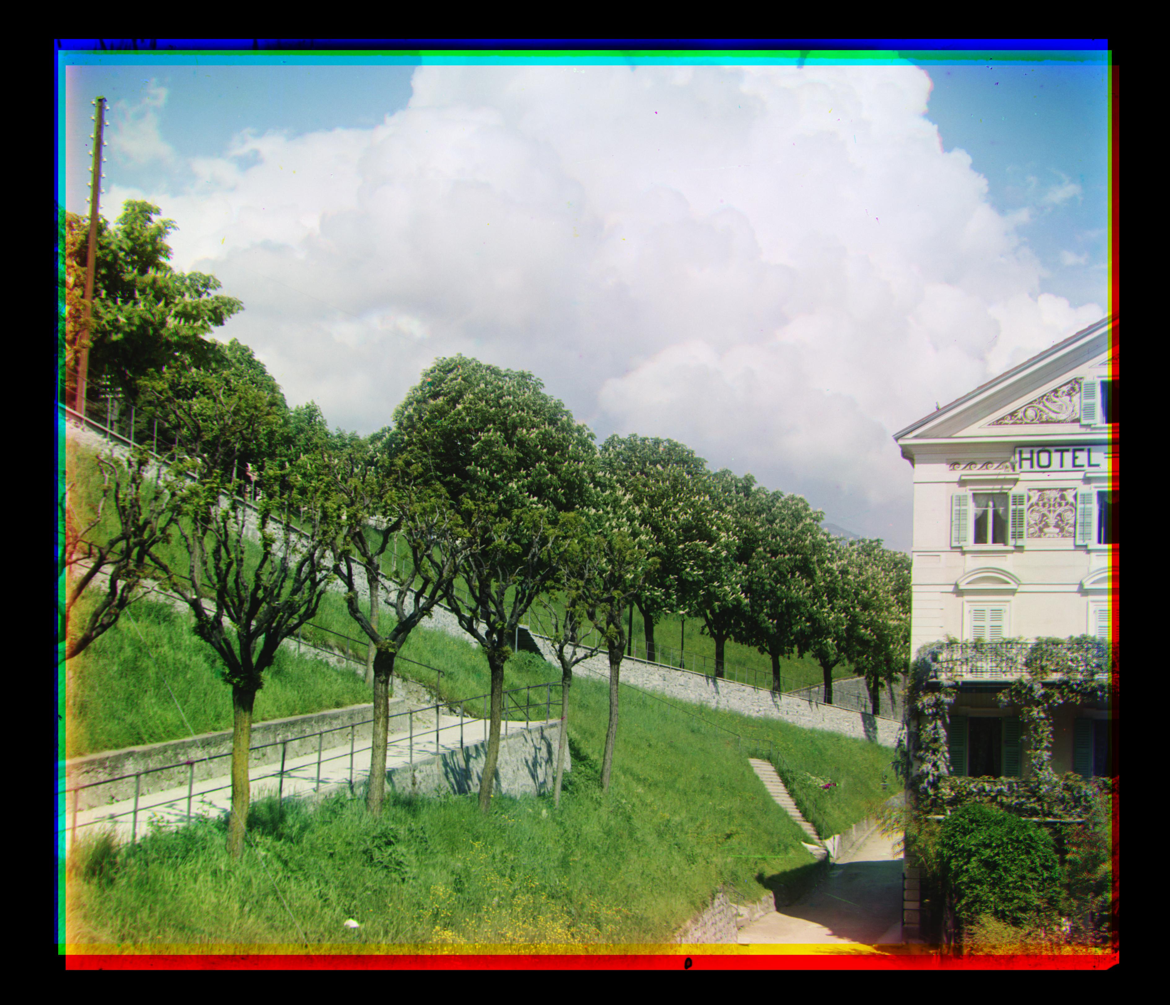 Blue Offset: -13, -36
Red Offset: 24, 49
Blue Offset: -13, -36
Red Offset: 24, 49
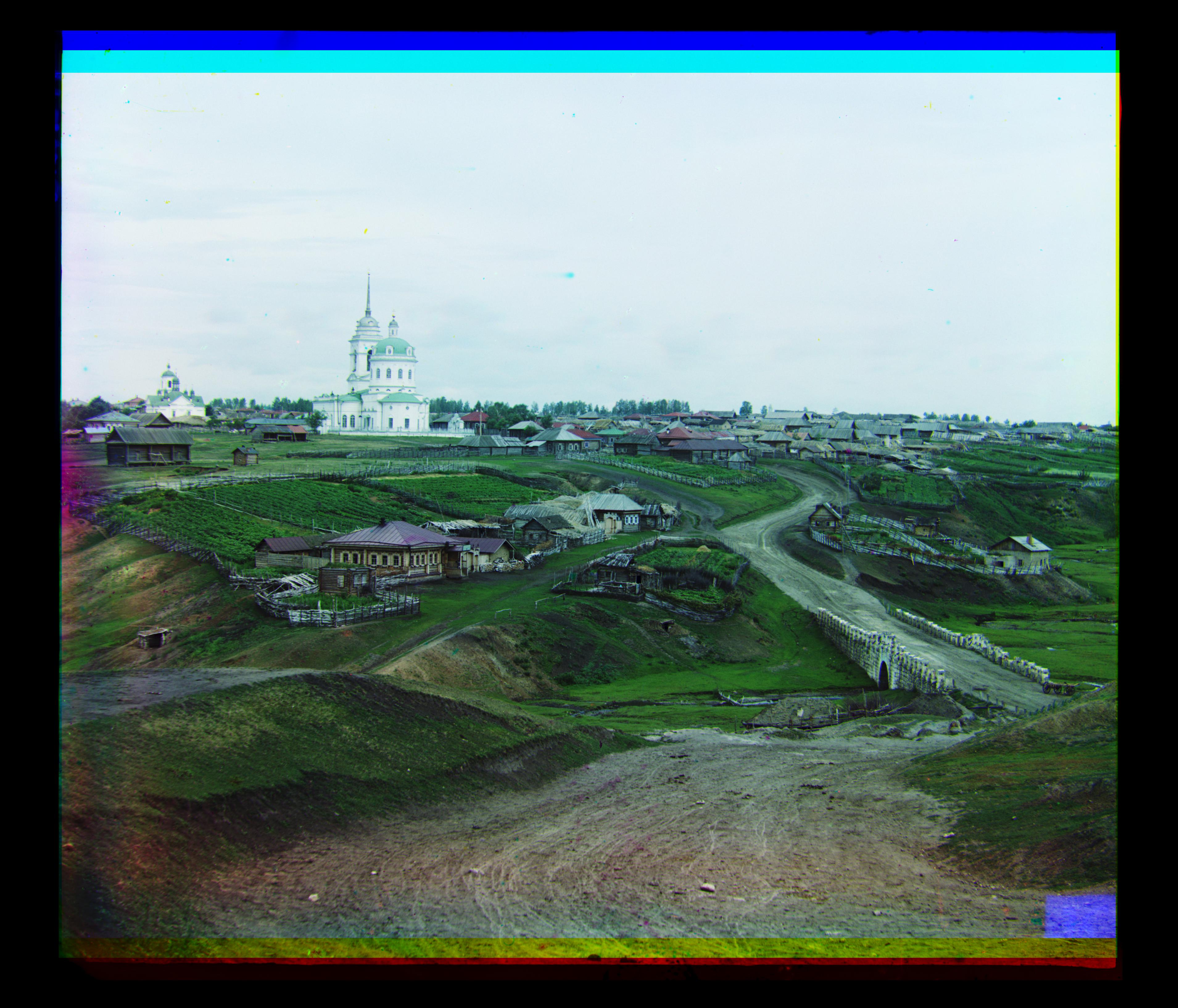
staraia_ladoga.tif
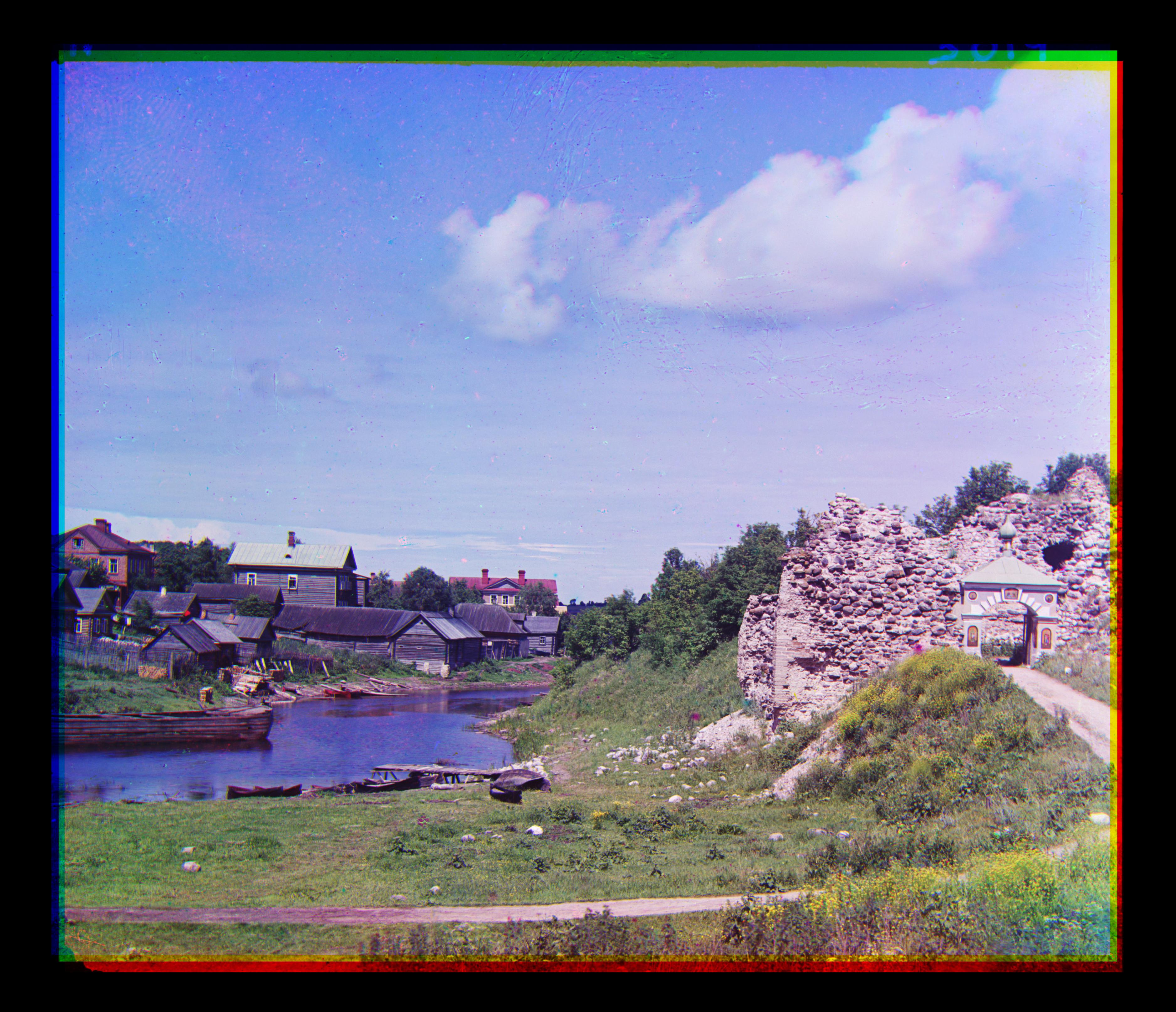 Blue Offset: -23, -21
Red Offset: 19, 34
Blue Offset: -23, -21
Red Offset: 19, 34
stone_excavator.tif
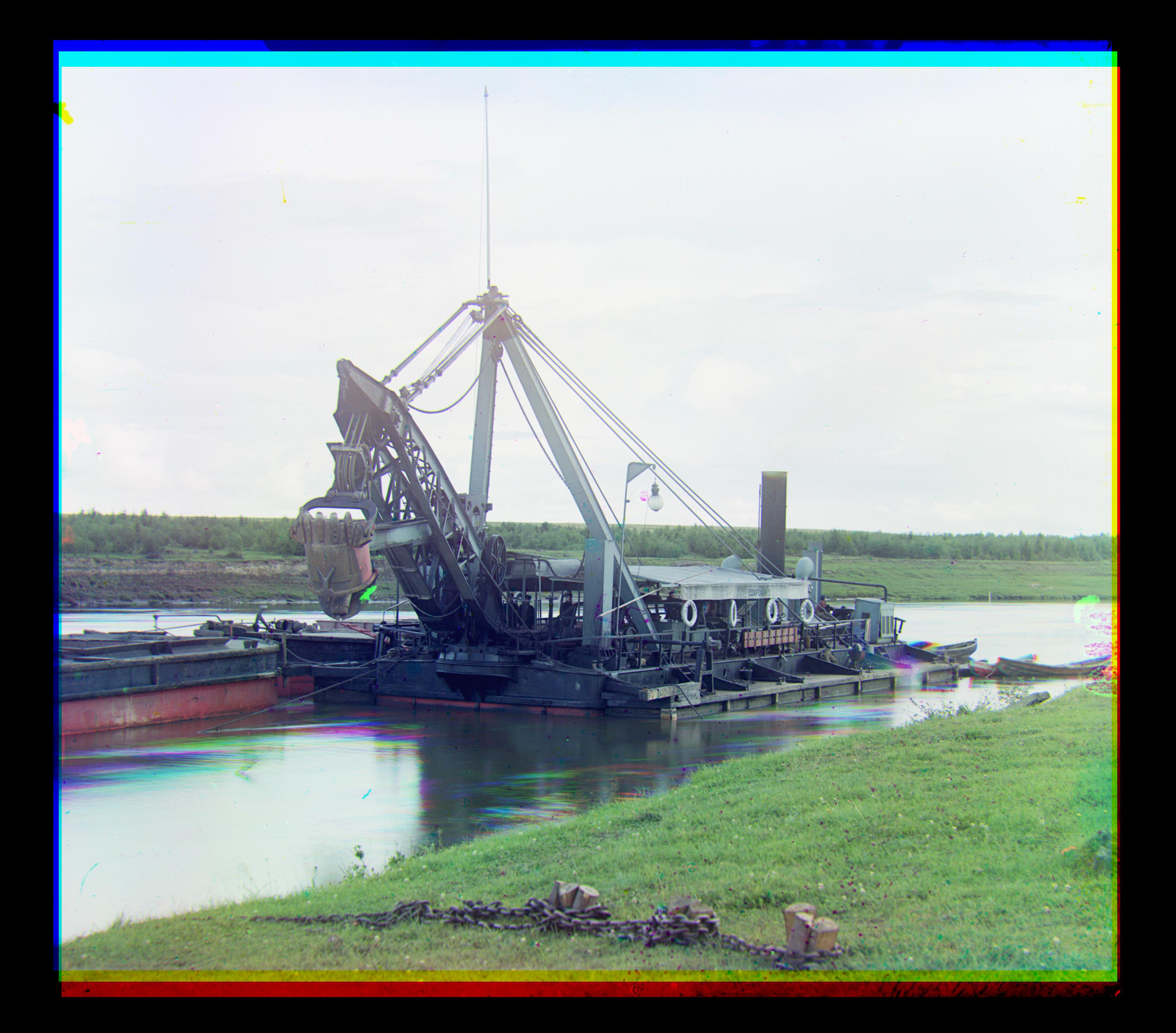 Blue Offset: -17, -35
Red Offset: 9, 48
Blue Offset: -17, -35
Red Offset: 9, 48
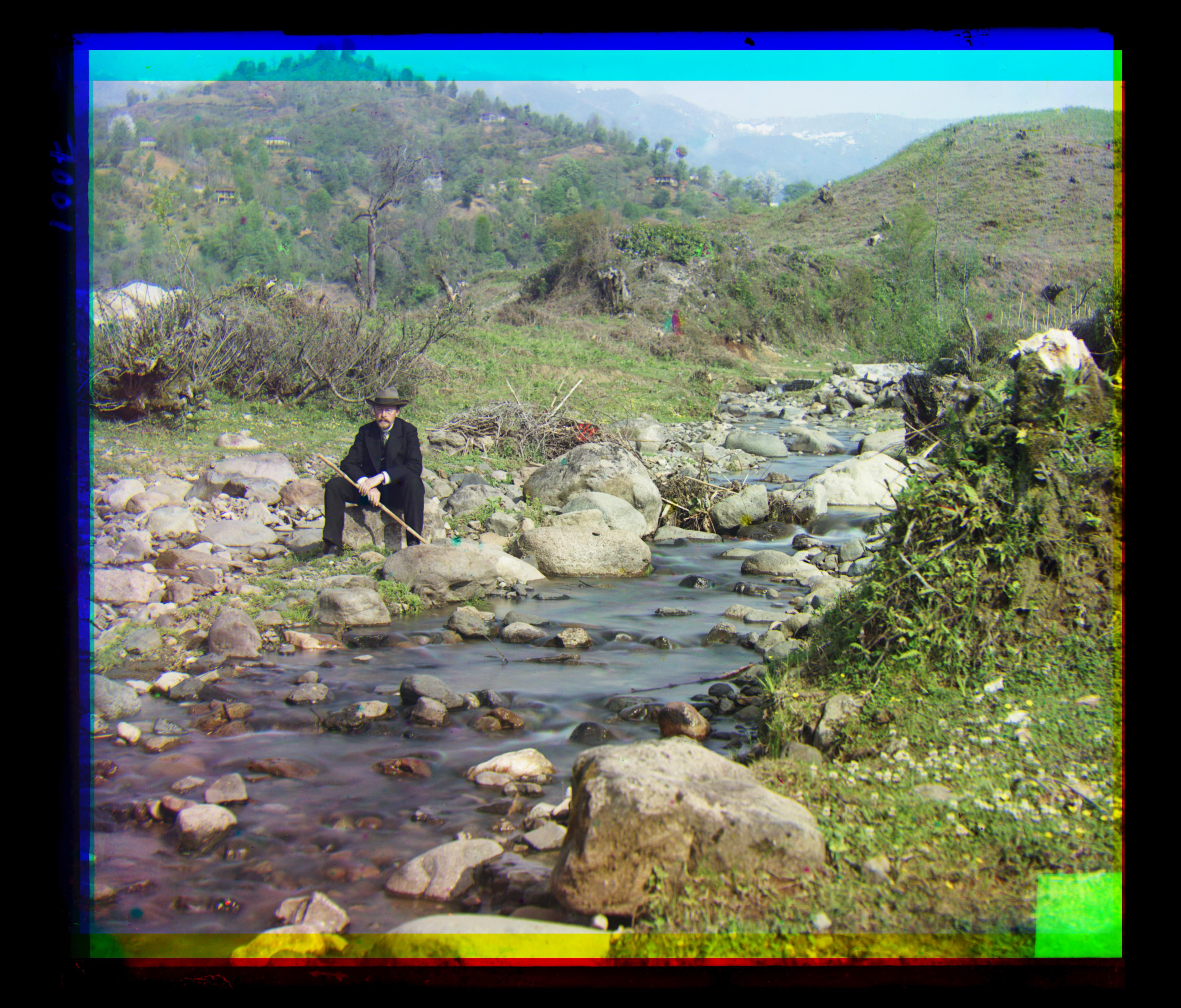
tobolom_river.tif
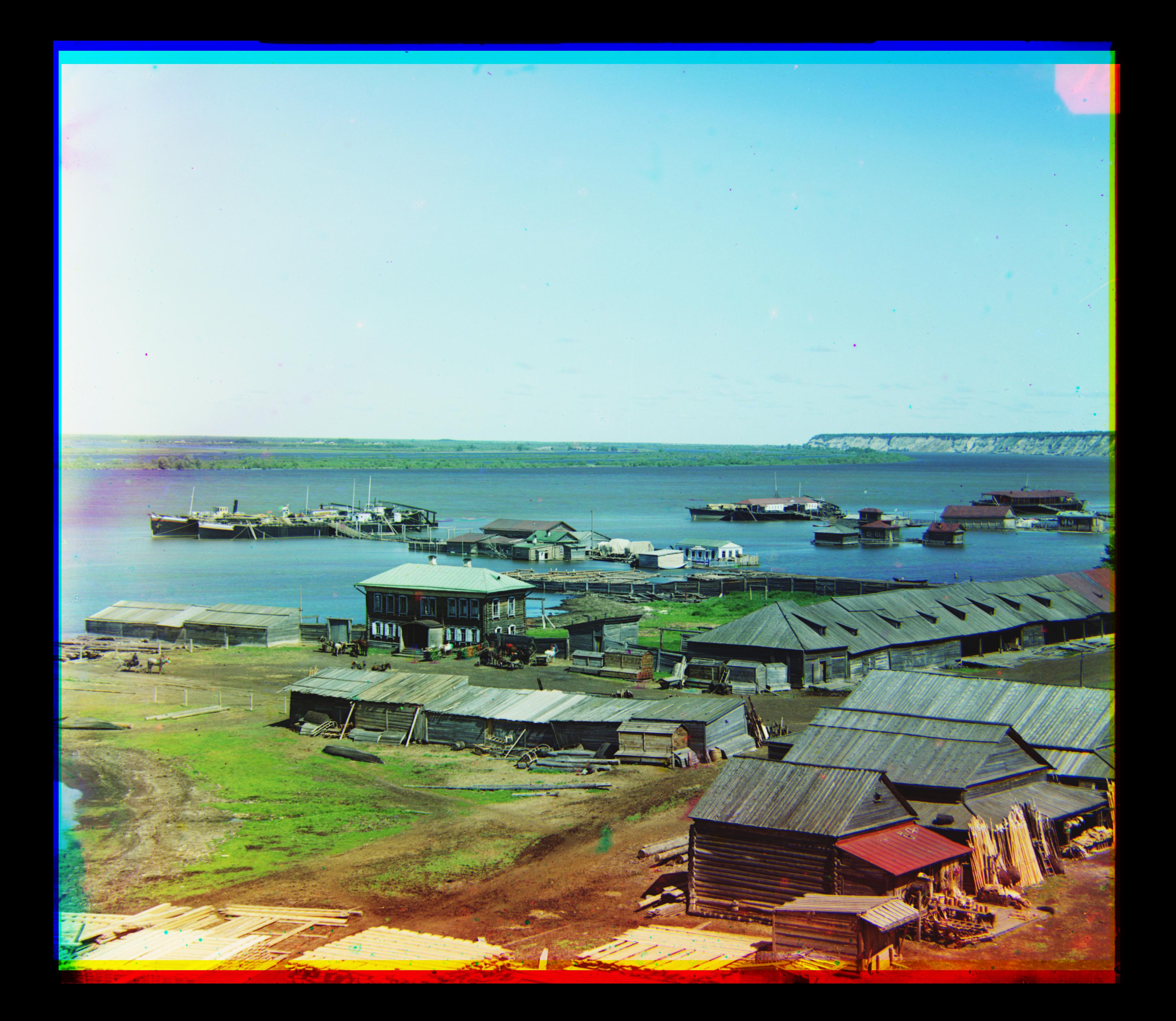 Blue Offset: -17, -32
Red Offset: 9, 42
Blue Offset: -17, -32
Red Offset: 9, 42
Bells and Whistles
Better Color Mappig
Originally, I assumed for the project that the lenses used in taking the picture were pure blue, red, or green (so that a pixel in the red image corresponds only to the red channel). However, in reality, this was almost definitely not the case. It's much more likely that the colors were actually actually slightly off "pure."
To fix this assumption, I reimplemented my aligning method to also map each value from a respective color's image (for example red) to a RGB value. So 255 will get mapped to (225, 30, 18) (for example) when going to combine layers, instead of being mapped to (255, 0, 0) as it was in previous methods.
Original Image
Potential Mappings


 The particular mapping applied here seems to make the images look more realistic. After playing around with a lot of different mappings, it became hard to decide what was "better" and what was "worse" - sometimes more realistic looking images didn't look as striking as the more vibrant images.
For example, while the above mapping makes the settlers image look better, it also makes the cathedral image look arguably worse:
The particular mapping applied here seems to make the images look more realistic. After playing around with a lot of different mappings, it became hard to decide what was "better" and what was "worse" - sometimes more realistic looking images didn't look as striking as the more vibrant images.
For example, while the above mapping makes the settlers image look better, it also makes the cathedral image look arguably worse:
 Original on the left, Adjusted on the right
There are a few possible reasons for this. One would be that slightly different color plates may have been used for different photographs. This is possible, but less likely - plates like that would have been expensive and hard to come by, and it's much more likely that the photographer only had one set and used the same set for all the photographs.
The more likely reason is that some of the colors in the settlers image may have been overexposed, so the adjusting helped fix that issue. It is also possible that the incorrect mapping of colors just made the cathedral look prettier, and fixing that makes it look less striking.
Original on the left, Adjusted on the right
There are a few possible reasons for this. One would be that slightly different color plates may have been used for different photographs. This is possible, but less likely - plates like that would have been expensive and hard to come by, and it's much more likely that the photographer only had one set and used the same set for all the photographs.
The more likely reason is that some of the colors in the settlers image may have been overexposed, so the adjusting helped fix that issue. It is also possible that the incorrect mapping of colors just made the cathedral look prettier, and fixing that makes it look less striking.