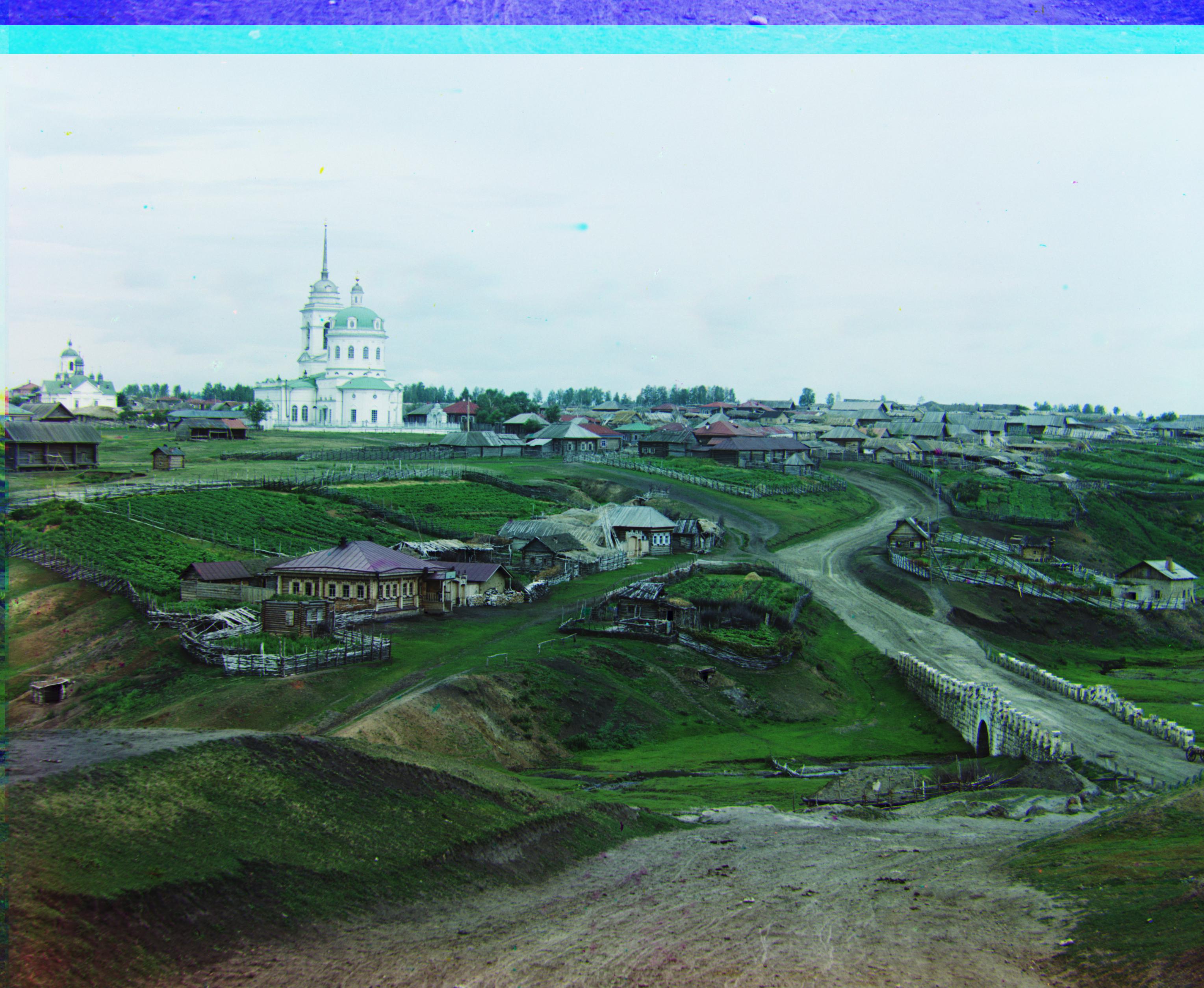
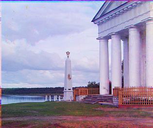
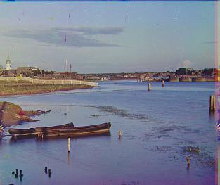
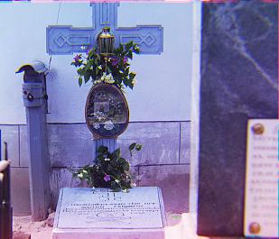
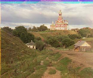
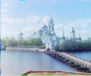
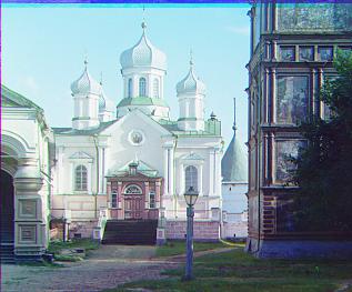
Project Description
Back in the early 1900s, photography Sergei Mikhailovich Prokudin-Gorskii travelled across Russia, taking color photos before color photography had even been invented. He did this by recording 3 exposures of every shot onto a glass plate with a red, green and blue filter. He envisioned that in the future, people would find a way to combine the 3 stills into one color photograph. This assigment is to do exactly that.
Conceptually, the task is simple: align the images on top of one another, then construct a new image using the values of each image as a separate r/g/b component. The trick was in finding how far to displace each each image from one another. What made a particular alignment better than another? And how could we search through a large number of possible alignments efficiently?
Solution
To compare different alignments, I used a similarity metric from the ITK (Insight Segmentation and Registration Toolkit), called pattern intensity. This is just the sum of 1 / (1 + x), where x is the squared difference between intensity values (think SSD with a bit more processing). From some empirical testing this metric appeared to work better than SSD or NCC.
I implemented an image pyramid to speed up the process for larger images. Essentially it would start off with a very down-sized version of the original images and find the best displacement for that size. Then it would double the image quality and displacement values and search around in that area for the best displacement, then return that. This would continue until we returned to original image quality.
There were two other tricks used to improve accuracy. The first was to compute displacements on versions of the images that had their edges cropped off. There was no edge detection used, I just removed a tenth of every side. The last thing I did was to attempt the alignment process using each color as a base, then picking out the one that worked the best. This was good because, for example, some pictures would have very faint blues, which made it difficult to align red or green onto it.
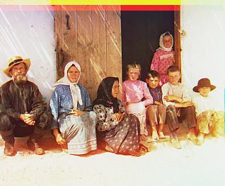
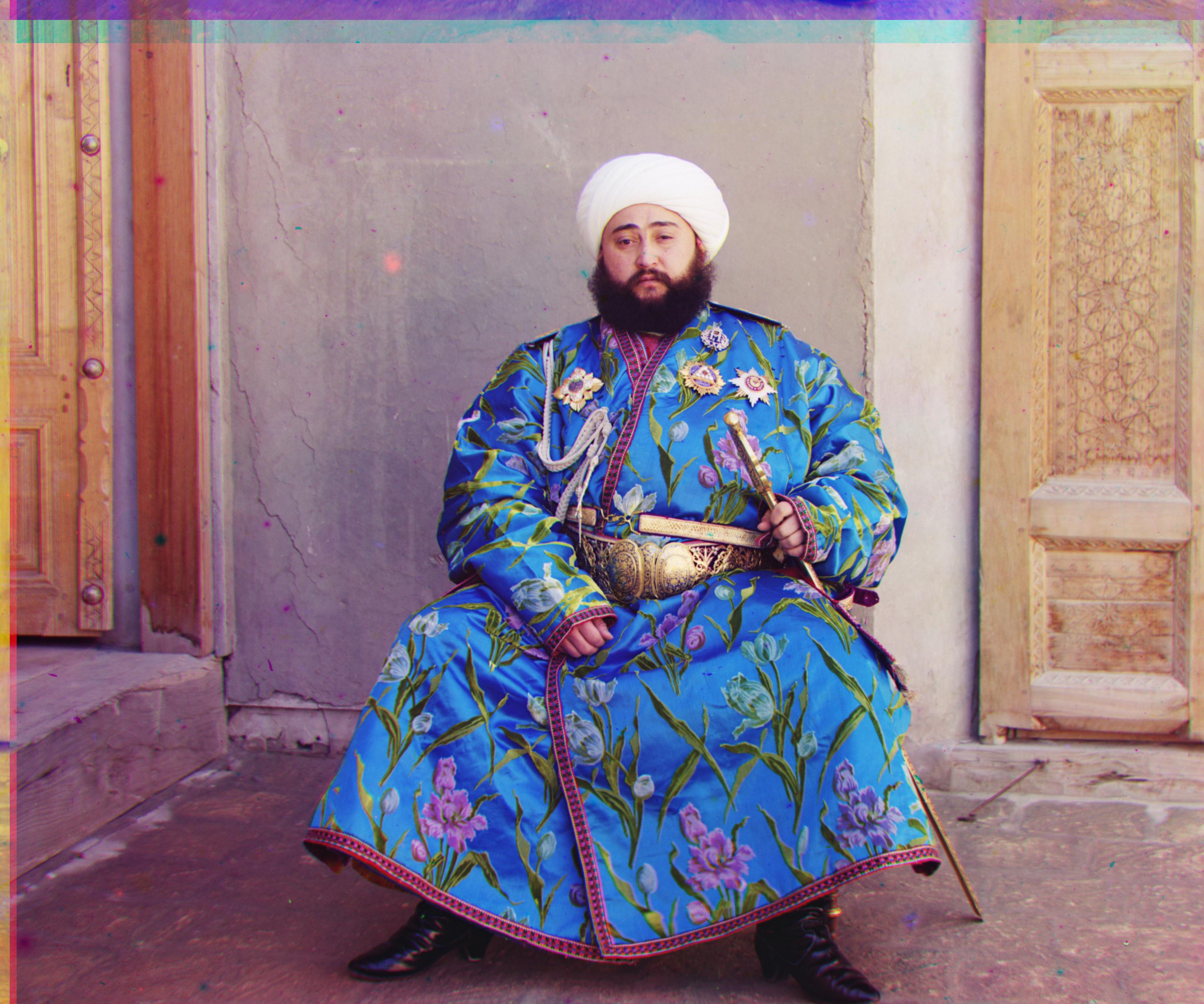
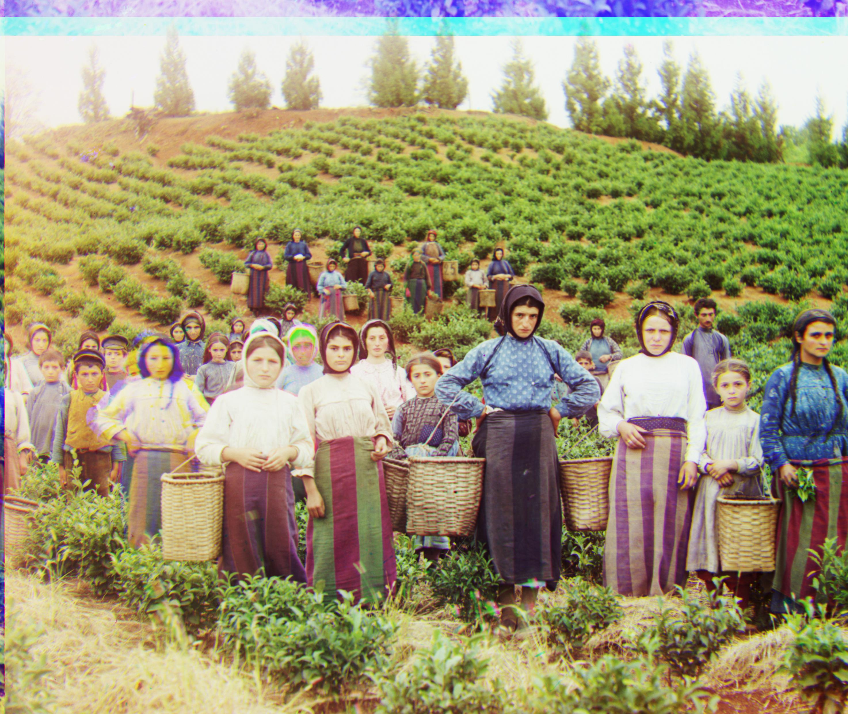
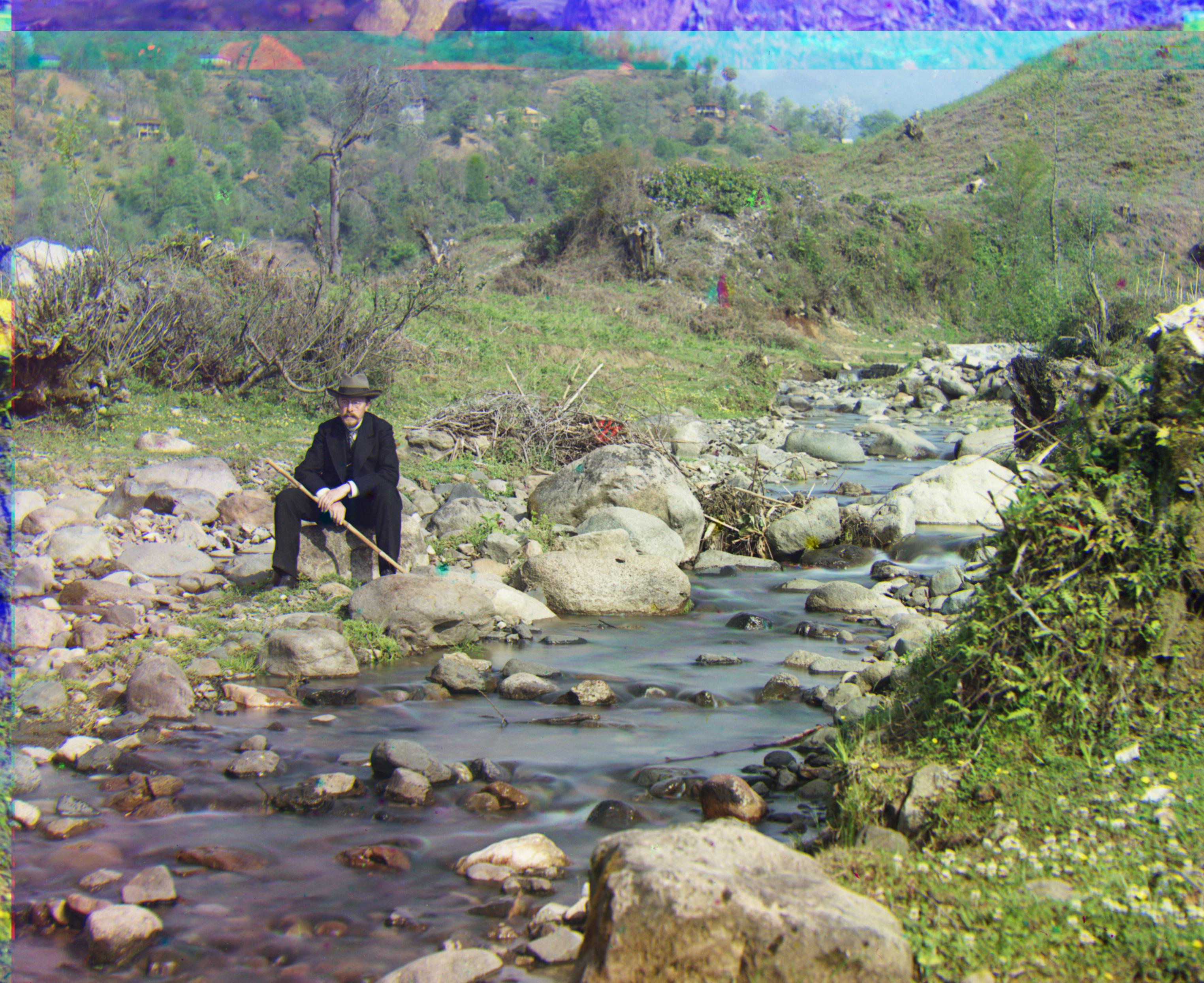
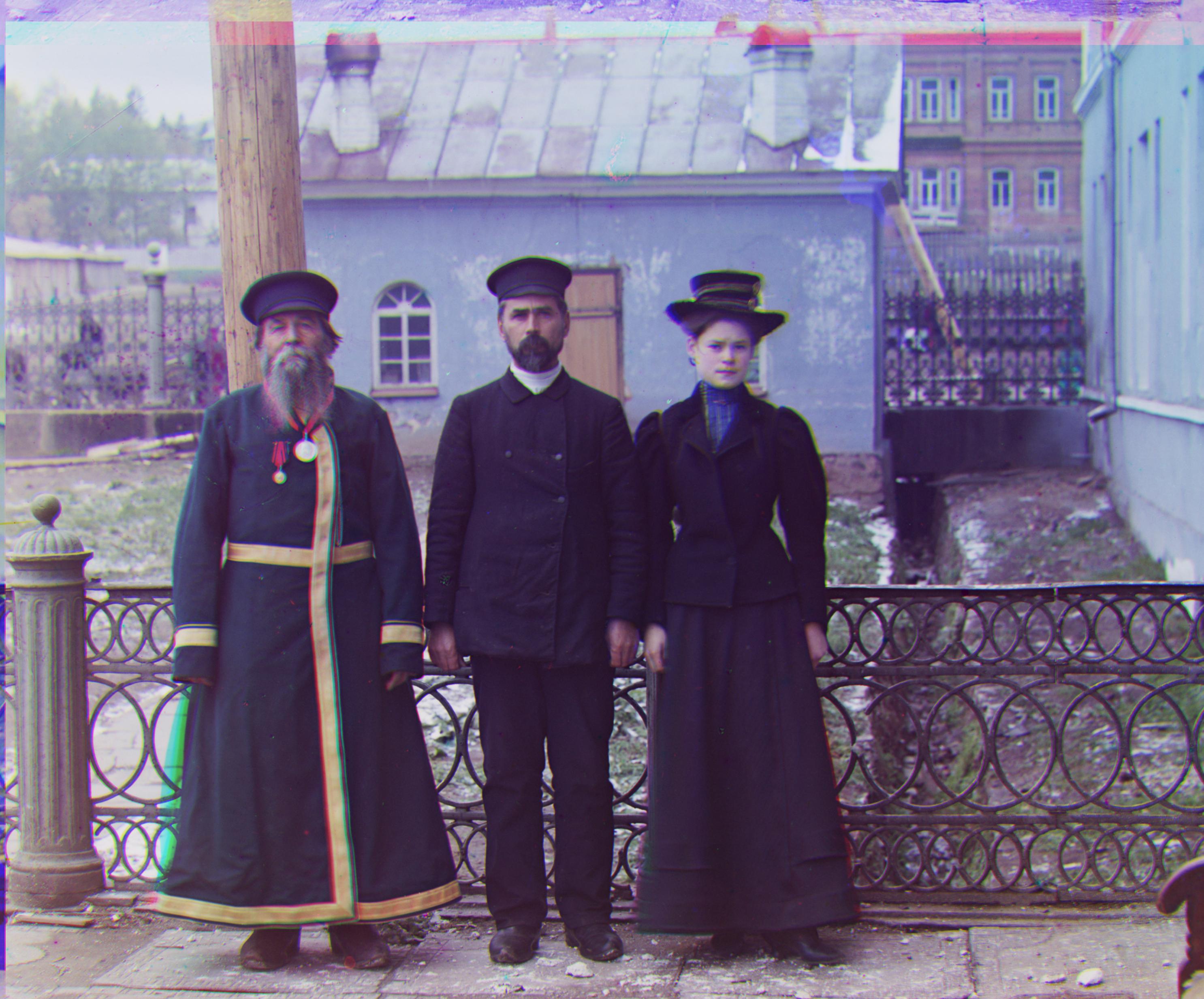
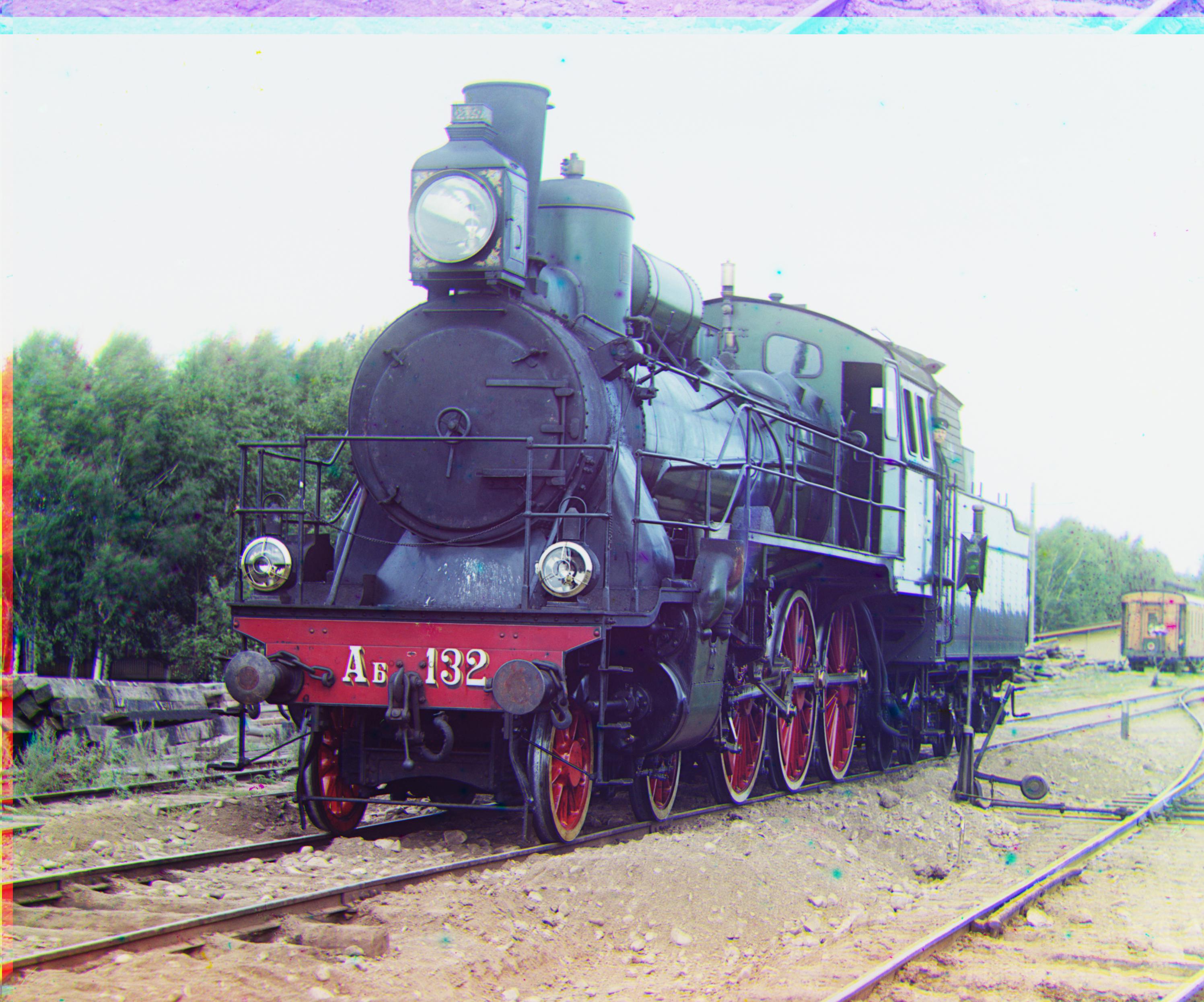
Results
Red: (3, 12), Green: (2, 5)
Red: (3, 3), Green: (2, -3)
Red: (0, 7), Green: (1, 3)