 red shift (1, 7); blue shift (-2, -5)
 red shift (1, 6); blue shift (-2, 3)
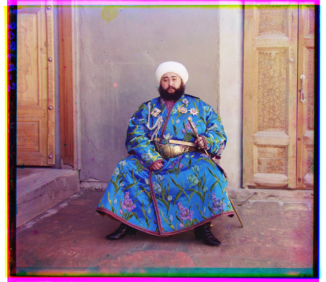
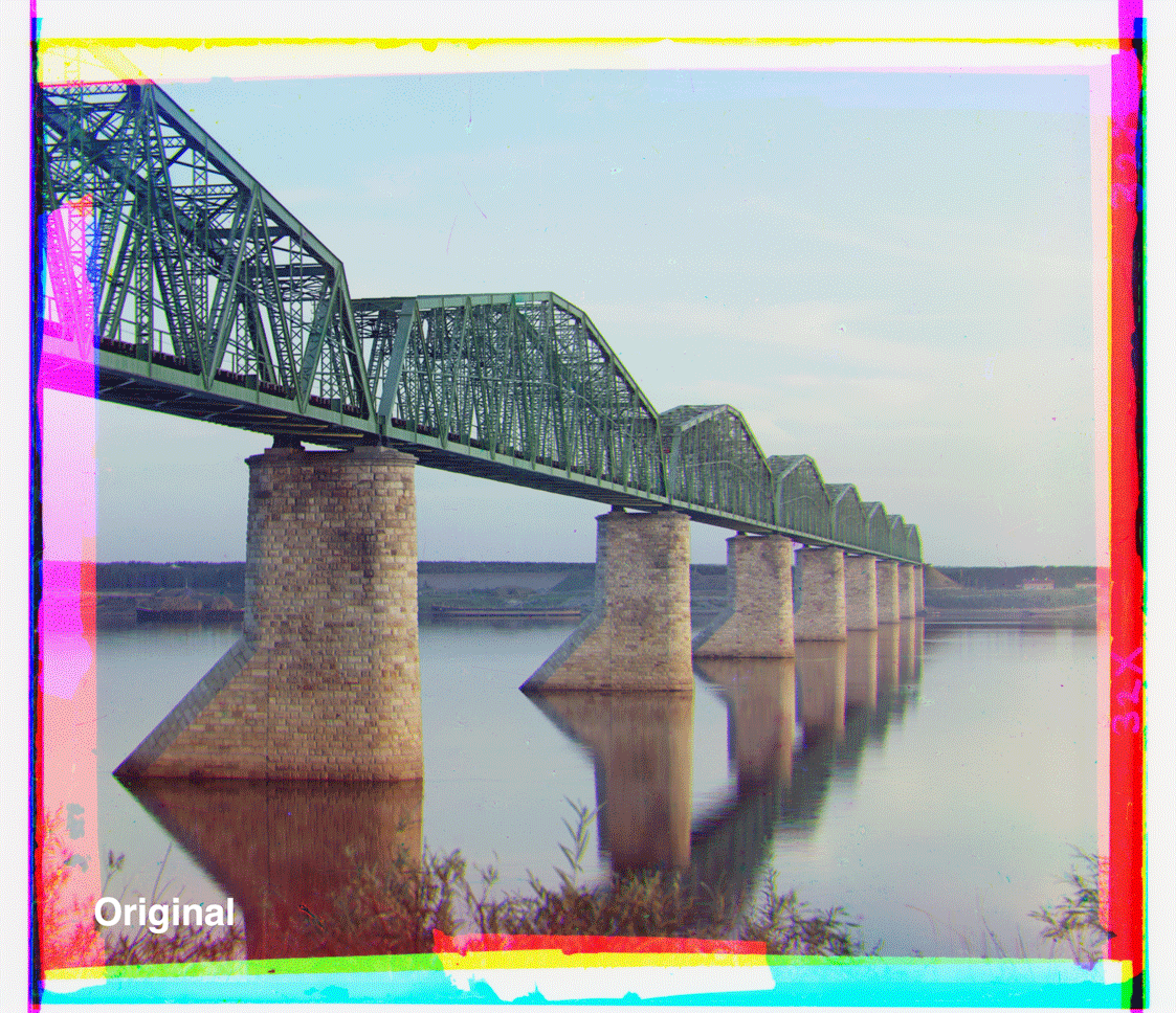
In the early 20th century, Sergey Mikhaylovich Prokudin-Gorskii traveled across the Russian empire and took color photos of everything he saw. He captured three exposures of each scene onto a glass plate using separate red, green, and blue filters. In this project, we're attempting to align each set of three negatives to reproduce the images captured by Prokudin-Gorskii.
My approach toward aligning the images utilizes the sum of squared distances (SSD) between each pair of negatives.
Theoretically, after attempting different combinations of horizontal and vertical translations between the negatives,
the optimal alignment is the one that produces the smallest SSD.
I had also implemented normalized cross-correlation (NCC) as a metric, which represents two images as normalized vectors and
looks at their dot product. Ideally, the vectors with the highest dot product would indicate the best alignment. This
approach ends up giving me basically the same results as SSD, so I stick with SSD throughout the project.
The basic algorithm involves using the green color plate as the base, then aligning the red and blue plates with it as
best as possible. For small images, this shifts the non-base plate up to 15 pixels in either direction along
the x and y axes for a total of 900 possible alignments. Over all of those alignments, I keep track of
the shift that minimizes the SSD. Once this is done for both the red and blue plates, the three layers are combined
into one image for the final result.
For larger images, I uses an image pyramid. This scales the input images down 50% repeatedly until the largest dimension
is not greater then 300 pixels. Here, I run the basic algorithm on the small image, which gives me a general neighborhood
to refine the alignment within. From here, I double the current image size and realign the image within a
radius of 3 pixels around the previous coarse alignment; this process is repeated until I reach the original image size.
These approaches give me satisfactory results. There are still some chromatic aberrations, but they seem to arise from
the data in the plates rather than from the alignment.
Note: all listed shift amounts are relative to the green color plate.
red shift (1, 7); blue shift (-2, -5)red shift (1, 6); blue shift (-2, 3)
 red shift (-1, 4); blue shift (-1, -3)
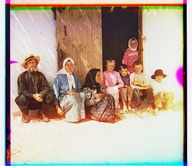 red shift (-1, 8); blue shift (0, -7)
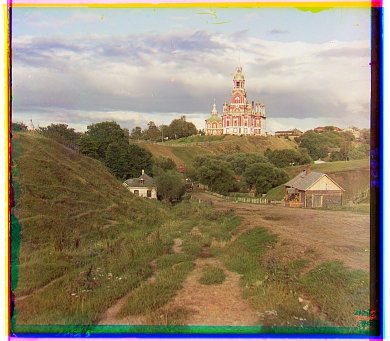
 red shift (17, 57); blue shift (-24, -49)
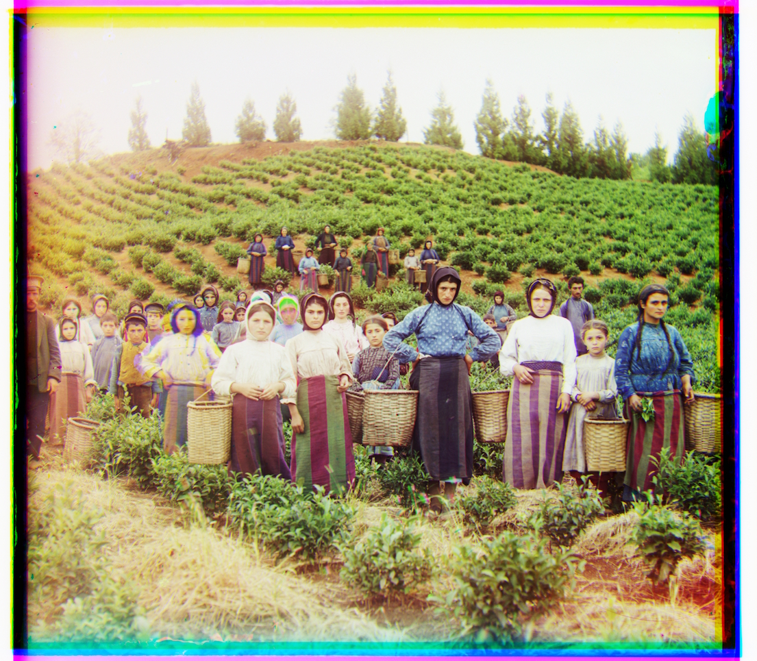 red shift (-3, 65); blue shift (-17, -59)
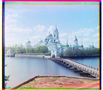
![]() red shift (5, 48); blue shift (-17, -41)
red shift (5, 48); blue shift (-17, -41)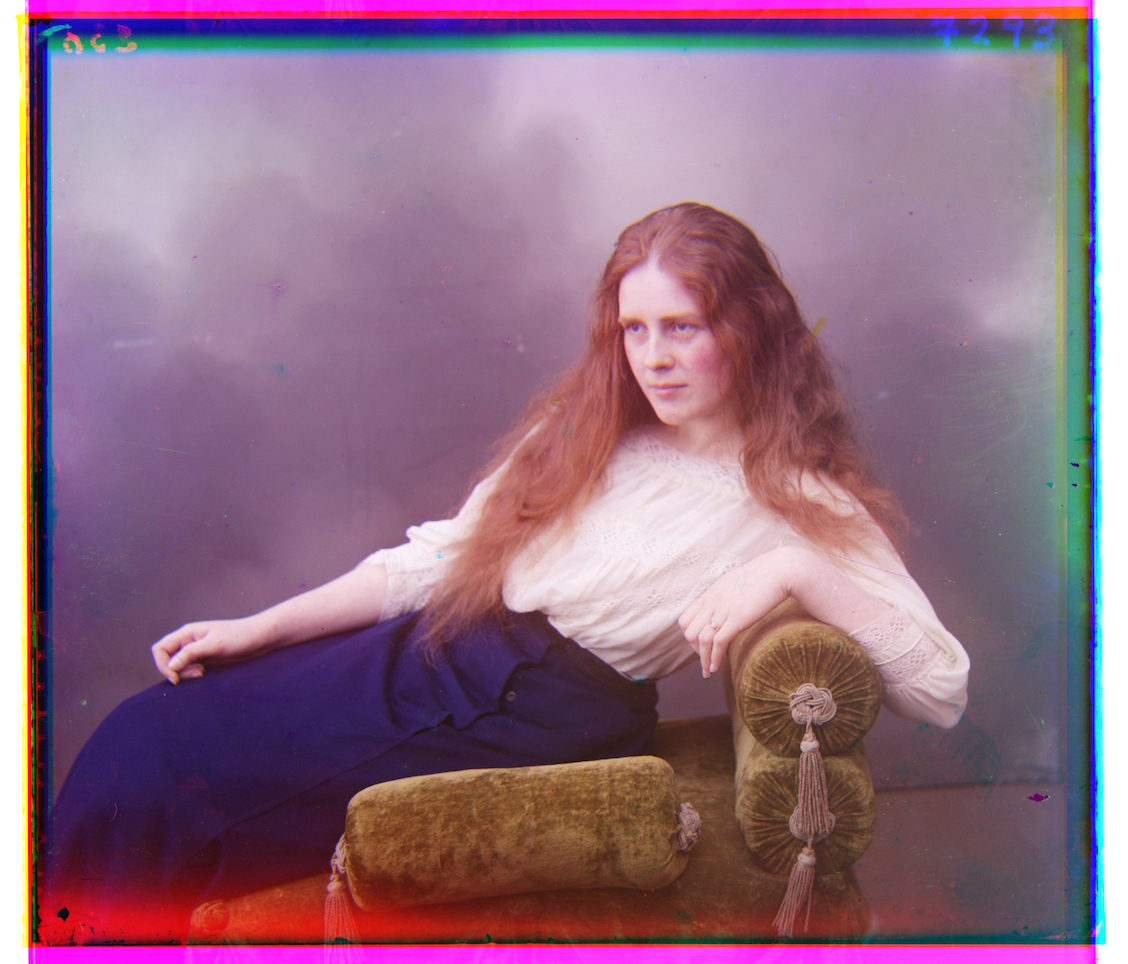 red shift (4, 62); blue shift (-9, -55)
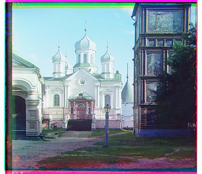
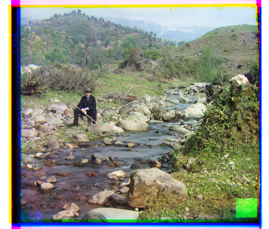 red shift (8, 98); blue shift (-29, -79)
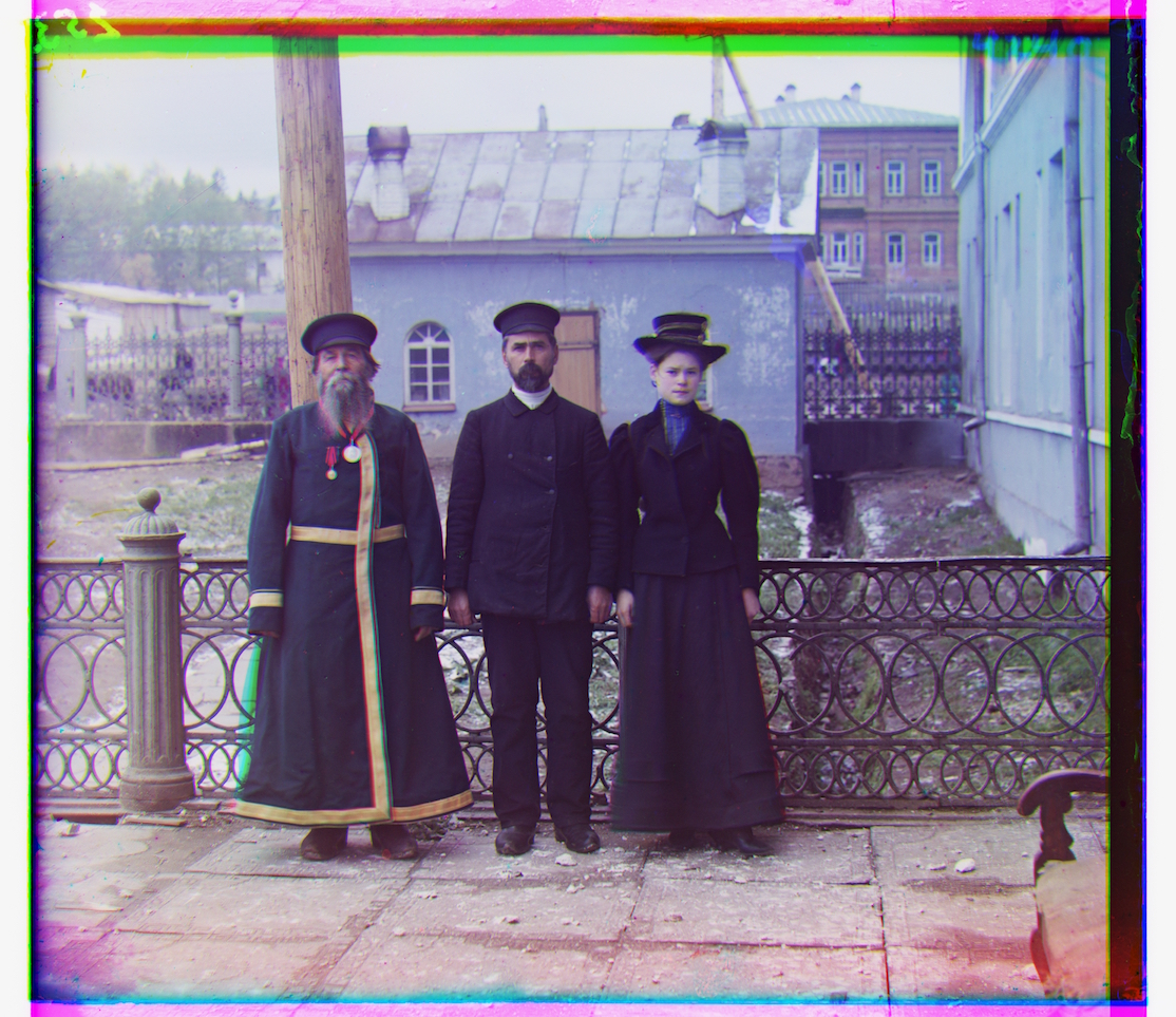 red shift (-3, 59); blue shift (-14, -53)
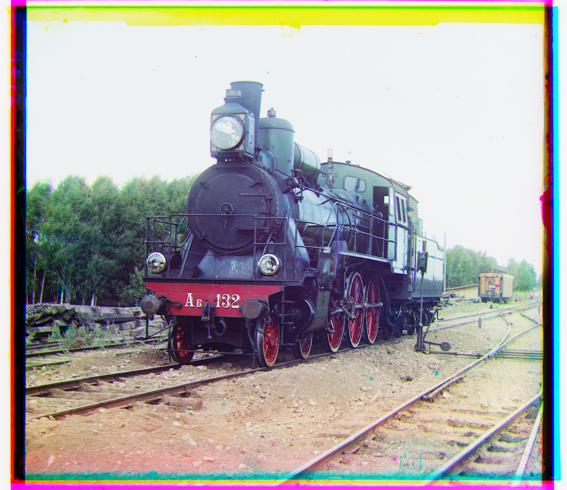 red shift (27, 43); blue shift (-6, -43)
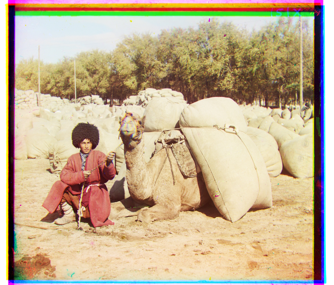 red shift (7, 60); blue shift (-21, -56)
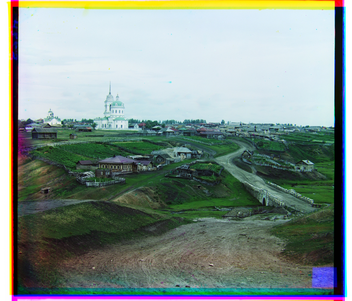 red shift (10, 73); blue shift (-12, -65)
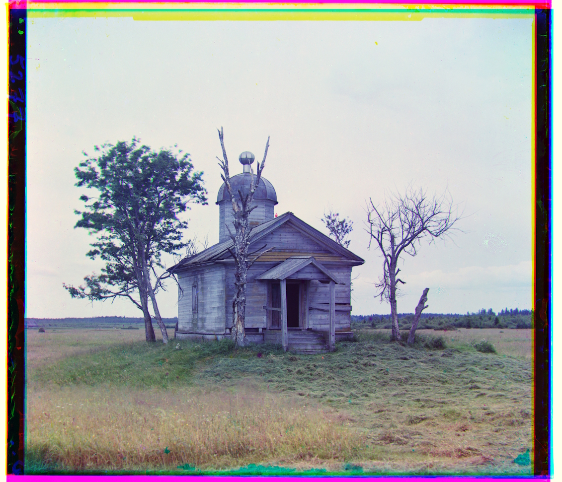
 red shift (13, 56); blue shift (9, -12)
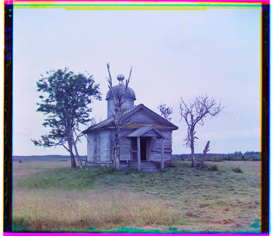 red shift (-21, 60); blue shift (-22, -45)
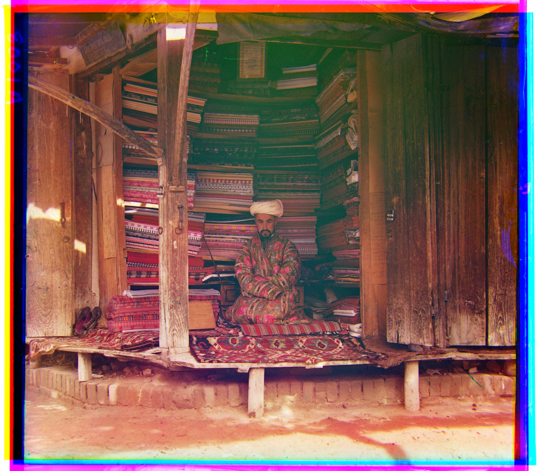 red shift (32, 85); blue shift (-45, -77)
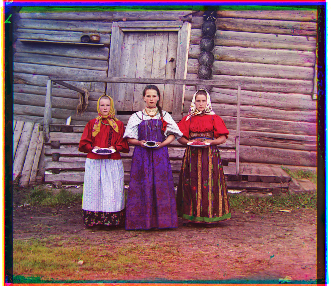 red shift (9, 26); blue shift (-10, -16)
I scale the intensities of the images such that the darkest pixel reached 0 and the brightest pixel reached 1, if they aren't already. Though the results are not drastic, this process increases the dynamic range of the images and makes them appear less flat.
The first step in automatic white balancing is estimating the illuminant, which I assume is the average color of the image. After calculating this color, I manipulate each channel to shift the illuminant to gray.
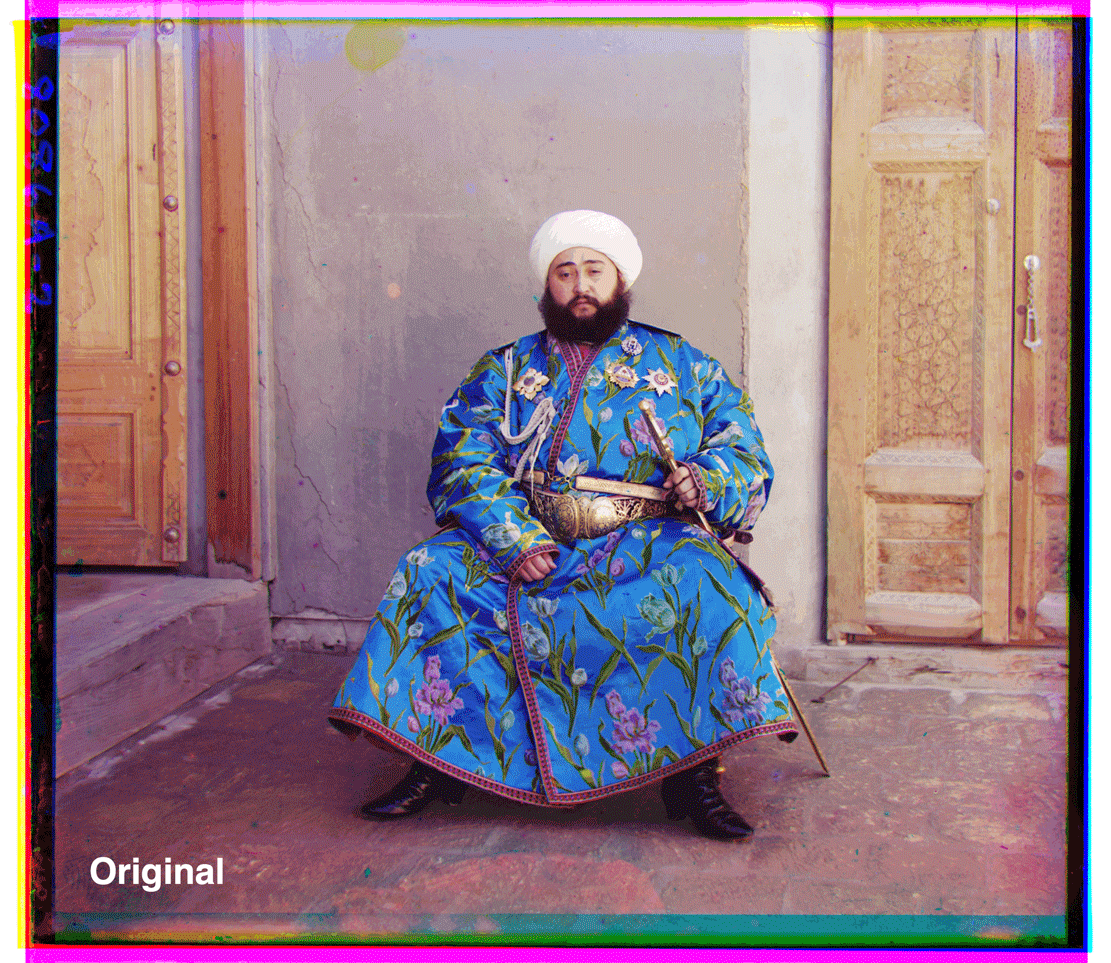
In this first example, automatic white balancing removes the bluish cast from the image and makes it seem more natural.
However, in this second example, automatic white balancing adds a blue tone to the image that I find less appealing.
Original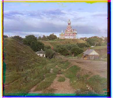 White-balanced
In many of my outputs, I don't see noticeable improvements or changes after implementing my bells and whistles. This might be in part due to the algorithms I use for both automatic contrasting and white balancing, which take into consideration the data from the image borders. This border data is irrelevant to the image itself, which I assume throws off the results. However, I feel like I would see better results by cropping out the borders and then running the automatic contrasting and white balancing procedures.
 White-balanced