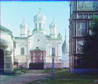
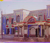
Cathedral: B(-2, -4) R(1, 7)
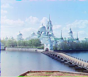
Monastery: B(-2, 3) R(1, 6)
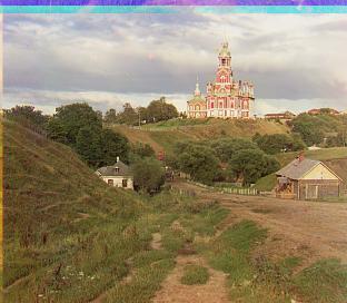
Nativity: B(-1, -3) R(-1, 4)
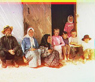
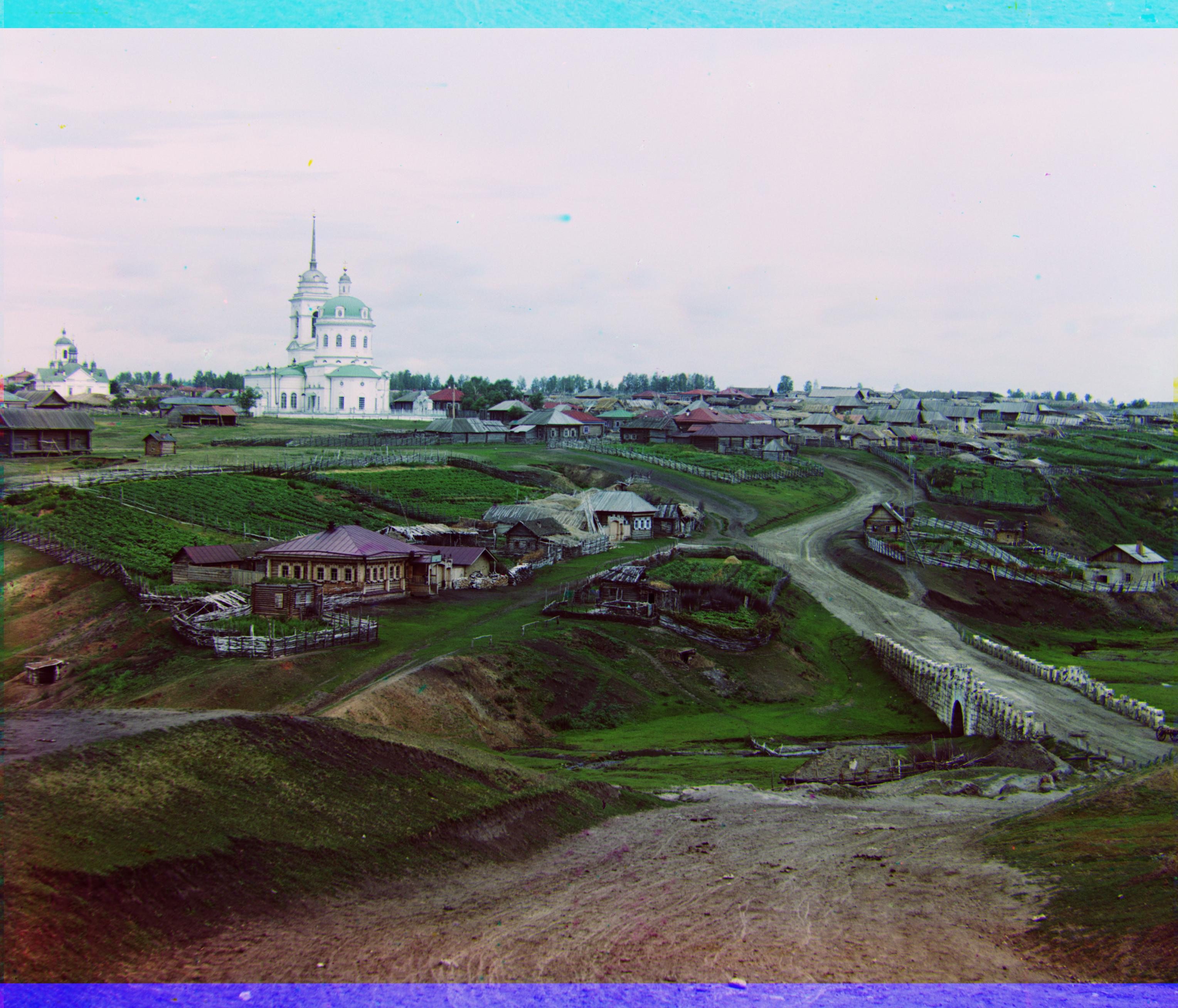
Settlers: B(0, -7) R(-1, 8)
Prokudin-Gorskii left the legacy of his glass plate negatives, a remnant of his failed experiments to bring about color photography. The man was a visionary, understanding that recording the exposure of a scene in red, green and blue filters would result in color photographs - something he was unable to accomplish but was in fact correct. In this project we take thse images and align the three color channels to produce a color image. When precisely aligned, we should have a clear colored image and if possible, we can try to apply more processing to bring any ages images up to a higher quality.
I started with a simplistic approach which aligned to the lowest sum of squared differences across all possible displacements of the two channels being compared. We could limit that displacement to just some fraction of the image since we know that the plates aren't entirely different and that displacement should be relatively small. Thus I modified the code to account for that, looping over just a small measure of displacement as opposed to the entire image.
An issue that I faced when dealing with this category of images was that the photo was aligning heavily to the border pixels, where the high intensities would match up but the content of the image be highly misaligned. I introduced a simple cropping mechanism that takes off a tenth of the photo on each edge leaving the rest to be aligned.
To produce a more efficient solution, I implemented the Coarse to Fine image pyramid approach. I would scale the image to a smaller image size which averages the pixels based on chosen scale. Displacement is then taken and when scaling the image back up (by a factor of 4 in my scenario), we can look for a more accurate displacement in the ballpark of the of the scaled displacement, which I chose to give some room for error by seeking each x, y displacement +/- 1 (scaled). Although this is a larger area than we need to search over, it gives confidence in the answer and takes up negligible computation time.
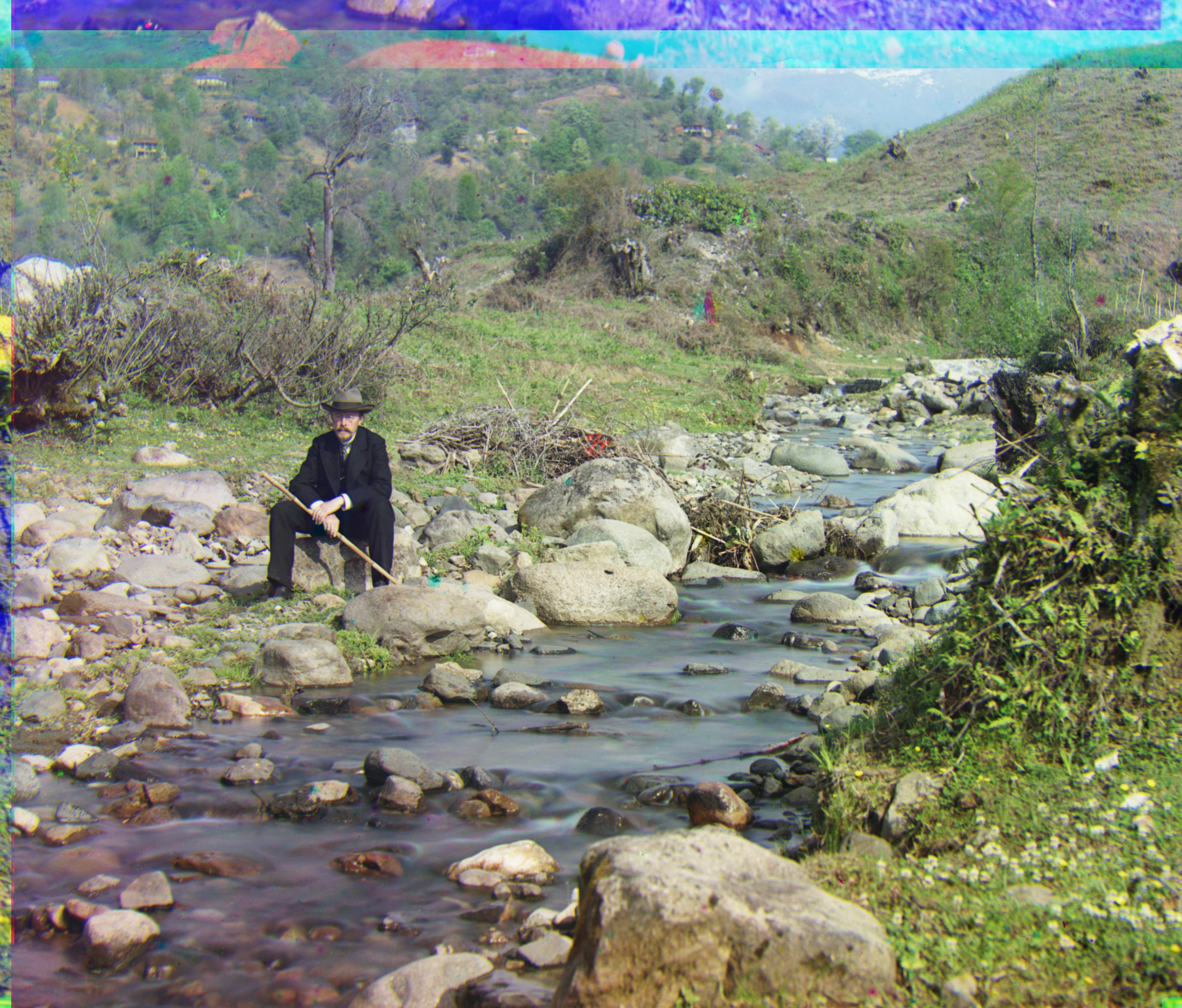
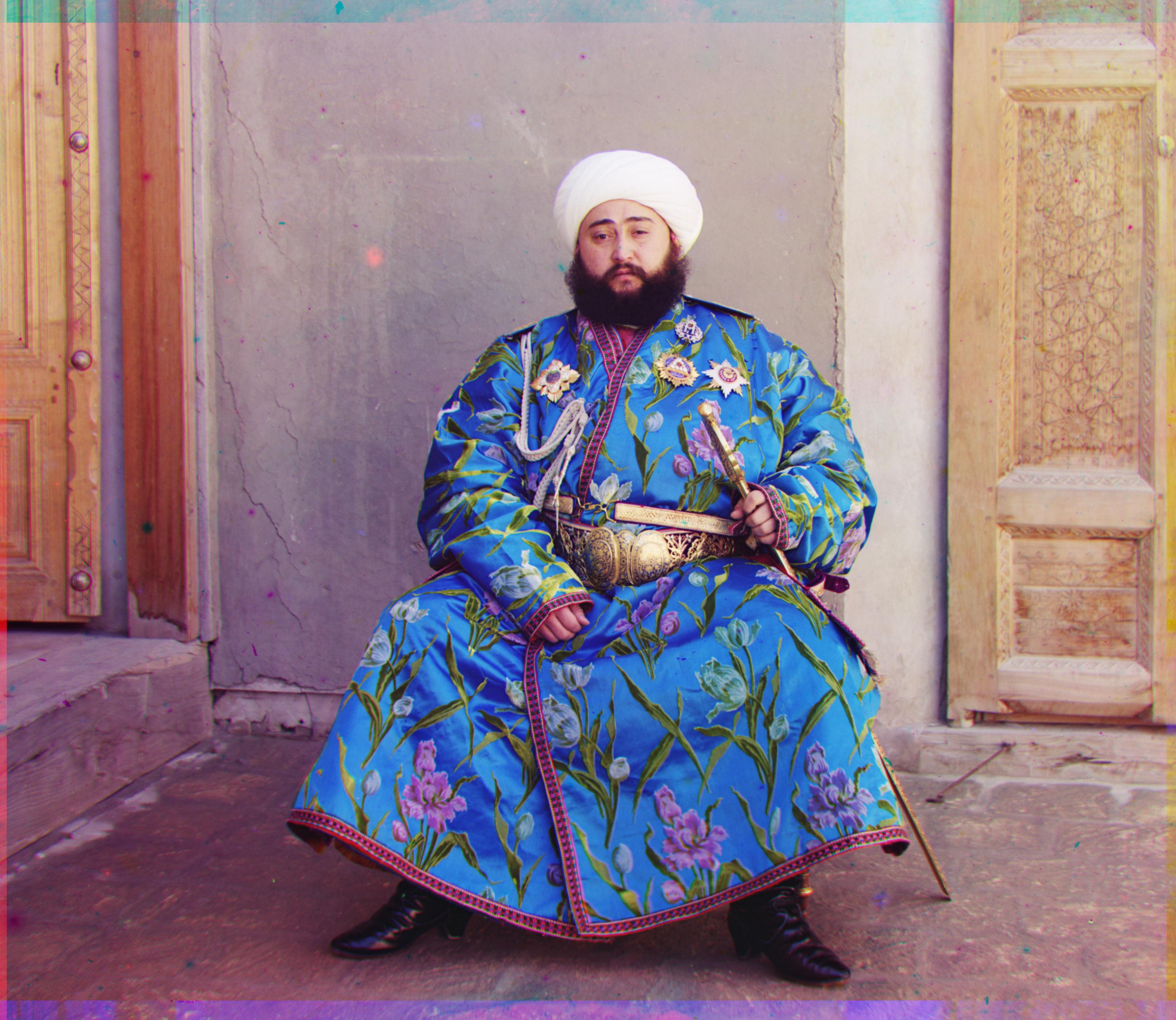
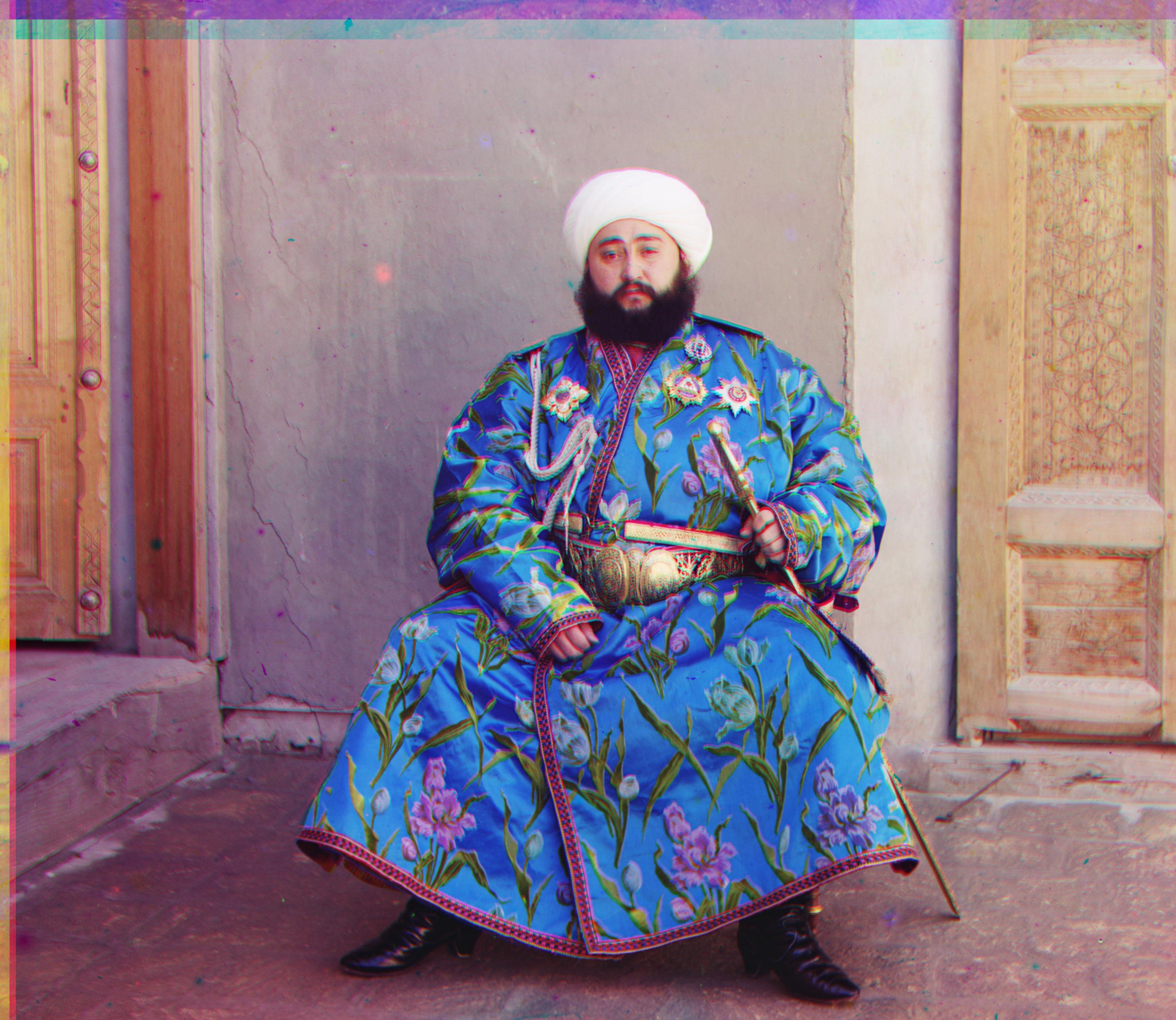
Emir was difficult to resolve perfectly, and when taking a look at the color channels, I observed that the blue channel is drastically different from the other two. Given that blue is being compared to, this could highly impact the ability to align to blue and have it be accurate. I chose to work with green, the more neutral of the three colors and align to that since it seemed it had enough intensity that it could find a balance to be met by red and blue which actually worked beautifully
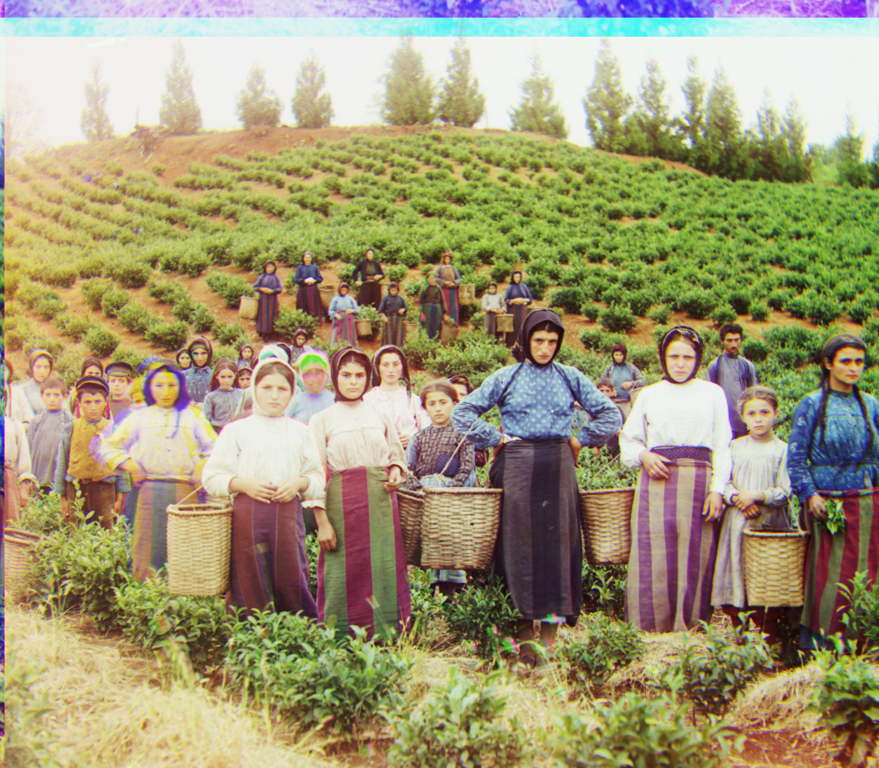
These images actually turned out really nicely and seemed to line up with little issue. Something of interest is seeing how where some areas of the image might be damaged, certain colors like green come through with strong clarity.
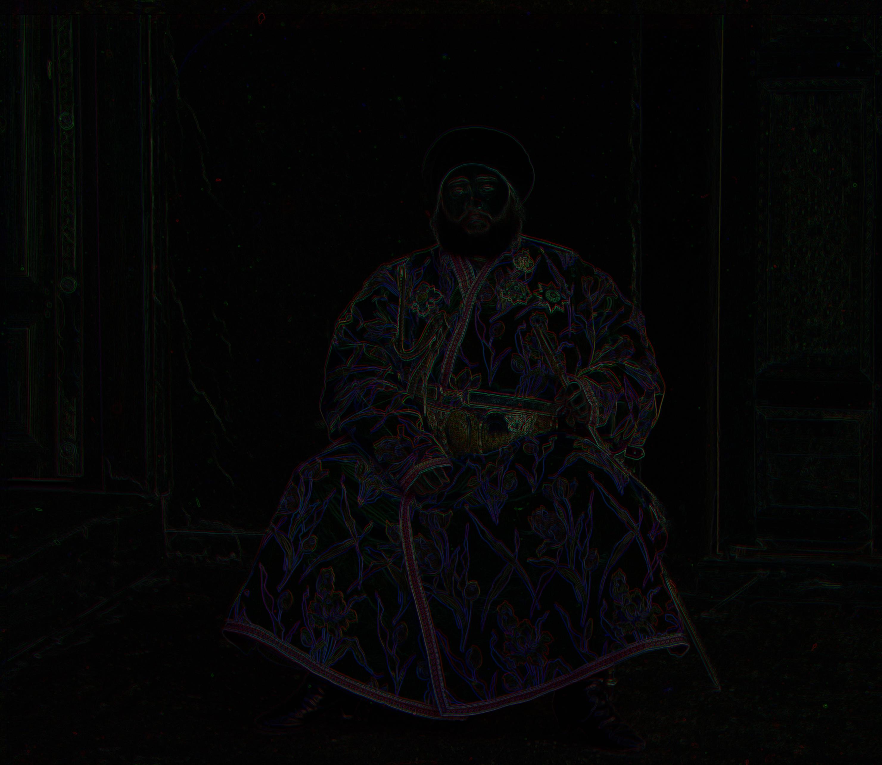
Using skimage.filters library, I experimented with the roberts filter - an operator used in image processing which essentially performs differentiation and computes and approximate gradient of the image intesity. We use the originally unaligned emir to try to align using edge detecting. In theory this should work since emir although the channels are colored differently, his posture is the same in all three and should be detected in edge detection. We find this in fact to be the case. Some modifications I needed to make included increasing the buffer to be +/- 2 when scaling to account for the pyramid scaling since majority of the photo is black, its hard to be accurate at low resolutions. this made the runtime slower.

Auto-contrasting was implemented by grabbing the highest intensity seen in the three color channels and the lowest and setting them to 1 and 0 respectively. Then we scale each channel off that ratio and hope that the colors come out appreciably better balenced. It seems that with our colors, the ratio was some 0.92 but this wasnt an appreciable difference - meaning that visually the naked eye can't differentiate the images. Most images had at least one or 2 pixels of black or white which also made it kind of meaningless to try to auto-contrast those.
Introducing the exposure library helps combat this by helping equalize out the distribution of intensities - this actually nicely fixes the issue where we actually get greater contrast as opposed to minimally shifted and scaled contrast.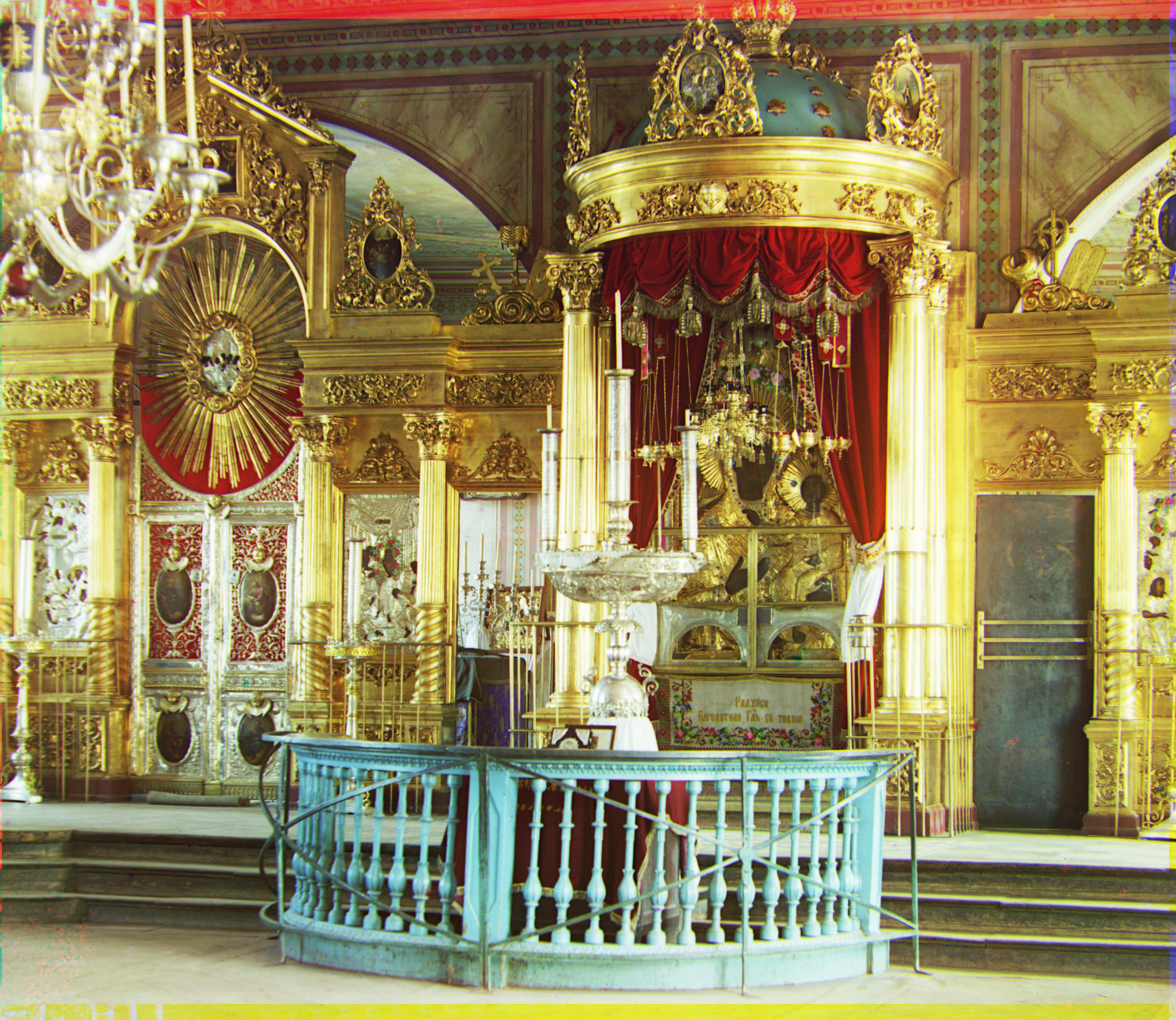
By taking each channel and assuming the mean is the illumination, we can set it to .50 to suggest this is the expected illumination and subtract that difference from each value in the image. Set any values outside the range to be 0 or 1 depending on the extremity and it produces an interesting image that shows what a better balance may look like - giving clarity to white washed details previously hard to see.