Fun with Frequencies and Gradients
CS 194-26 Project 3 · Madeline Wu
Part 1: Frequency Domain
1.1: Image Sharpening
Approach
Steps:
- Blur the image (gaussian)
- Get high-frequency parts by subtracting blurry image from original
- Reapply the high-frequency parts to original image
Results
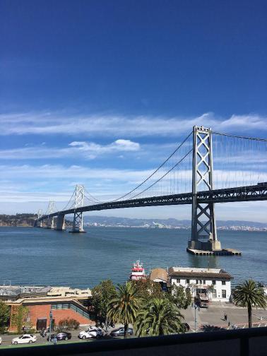
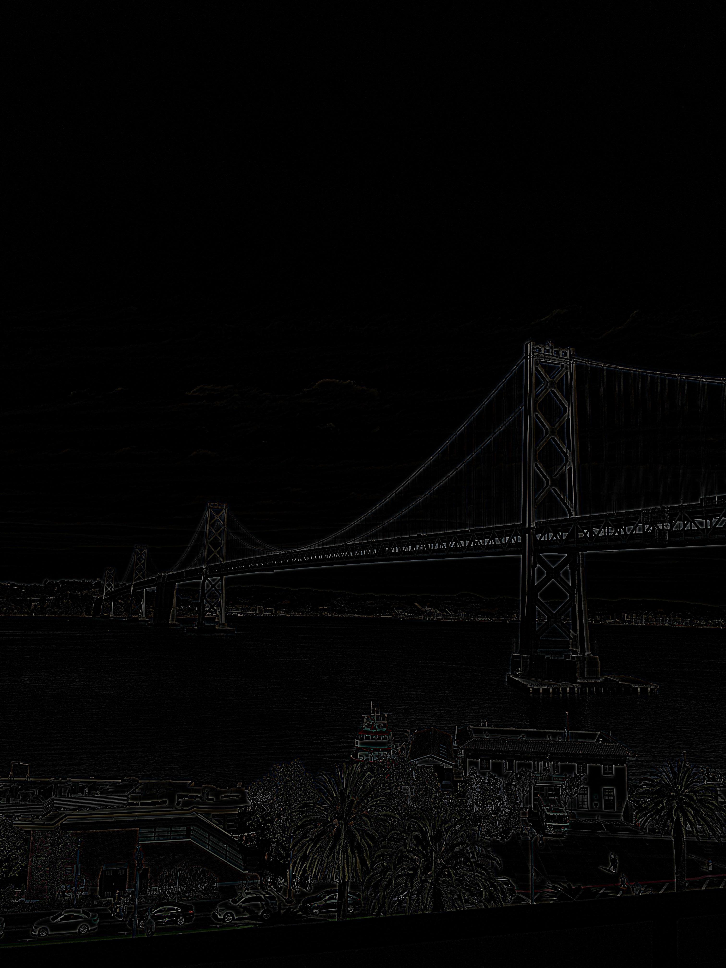
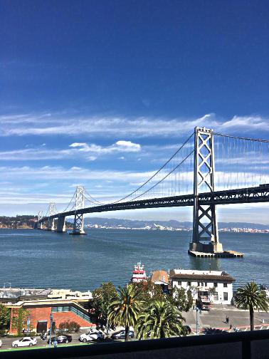
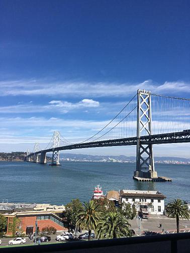
I chose an image of the Bay Bridge that I took a few days ago. Here is the photo before and after sharpening, as well as the high frequency edges that were added to sharpen the image.
|
|
|
Here are the sharpening results at different sigma values.
|
|
|

|
|
|

|
1.2: Hybrid Images
Approach
We can create hybrid images by mixing images at different frequencies. These hybrid images appear differently based on how far away the viewer is from the image. This trick works because of how the human eye and perception work together. At farther lengths, our perception picks up on the low frequency parts of the signal and constructs an image from that. When closer to the image, we are able to use the higher frequency signals to construct an image.
Given two images, A and B, we can create a hybrid image by combining the high frequency signals from A with the low frequency signals of B. I found that you can simulate a farther away viewing distance by viewing the image on your computer screen through a phone camera.
Results
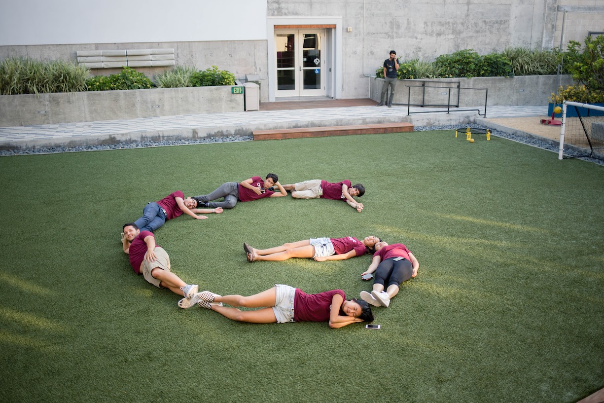
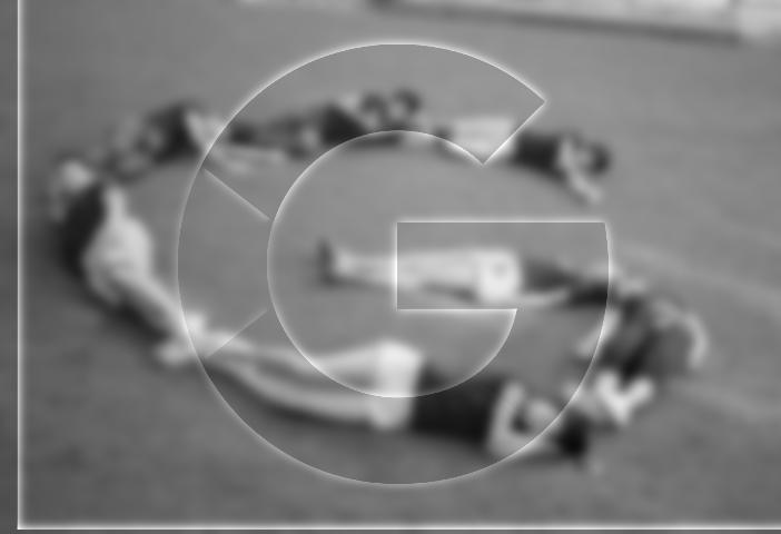
a googley hybrid
I took a photo of my friends making the "G" of the Google logo and attempted to make a hybrid image with the actual "G" Google logo. The hybrid image did not come out as well as expected because of alignment and angle issues.

|
|
|
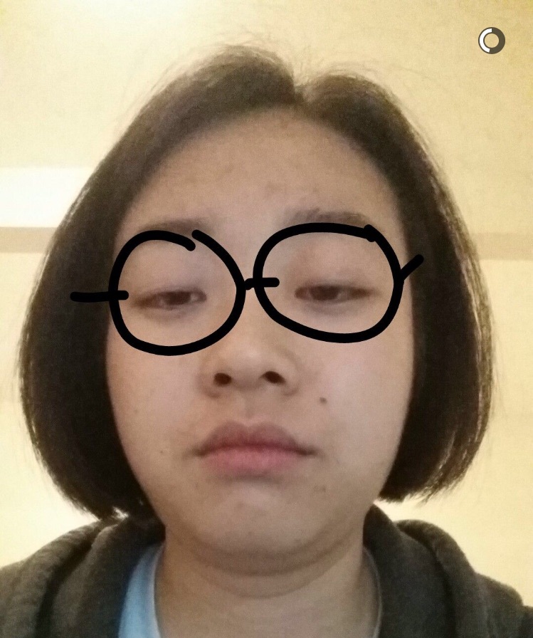
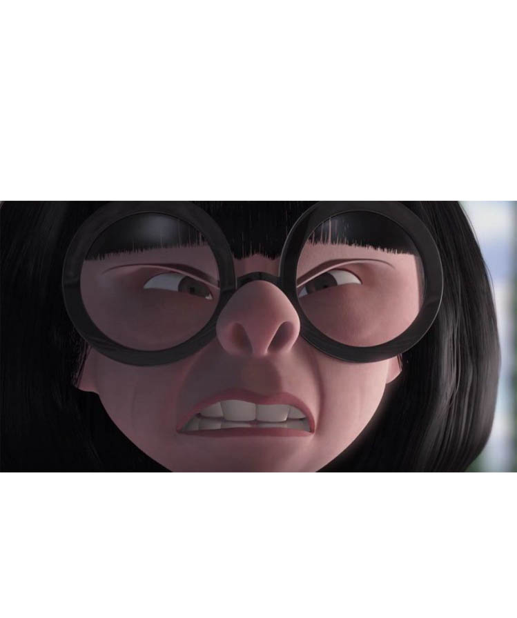
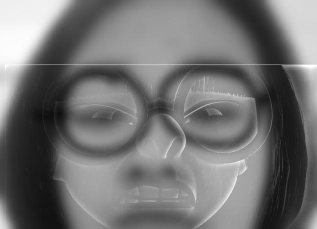
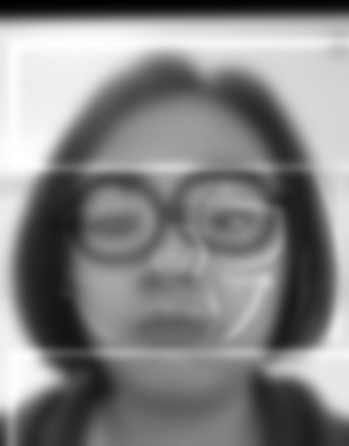
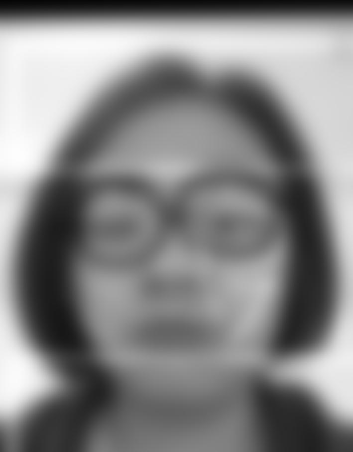
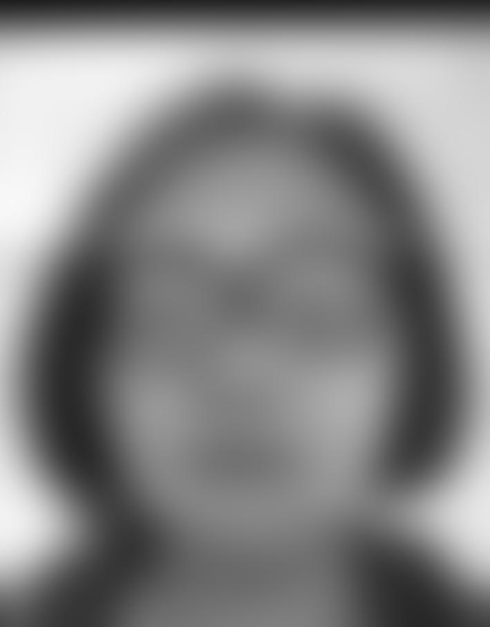
ednanxi mode
My friend Nanxi sent me a Snapchat of herself looking like Edna Mode. I decided to take advantage of the uncanny resemblance and create a hybrid photo with an actual photo of Edna Mode. The high frequency signals are a bit hard to discern, as compared to the previous hybrid image, but the result is better in regards to alignment.
|
|
|
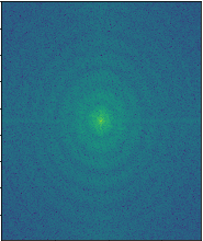
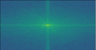
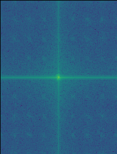
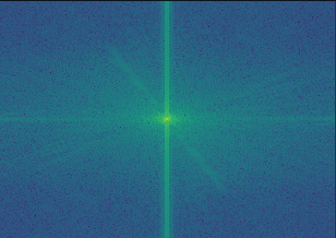
Frequency Analysis
Here are the frequency analysis results on the Nanxi-Edna Mode hybrid image. Each figure below is the log magnitude result of the Fourier transform, for the specified image.
|
|
|

|
|
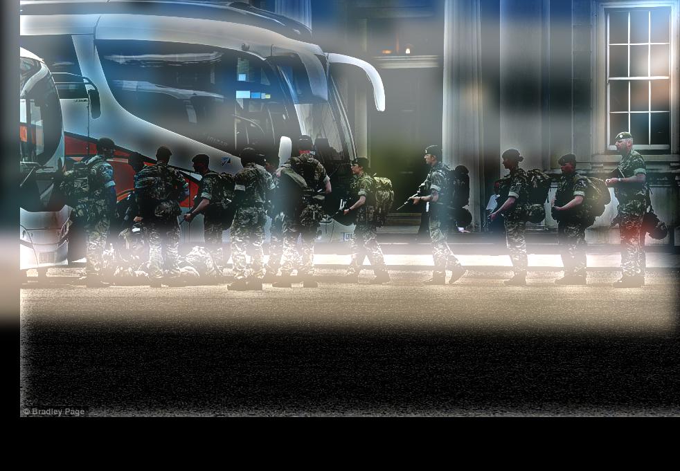
Bells and Whistles: Color Hybrid Images
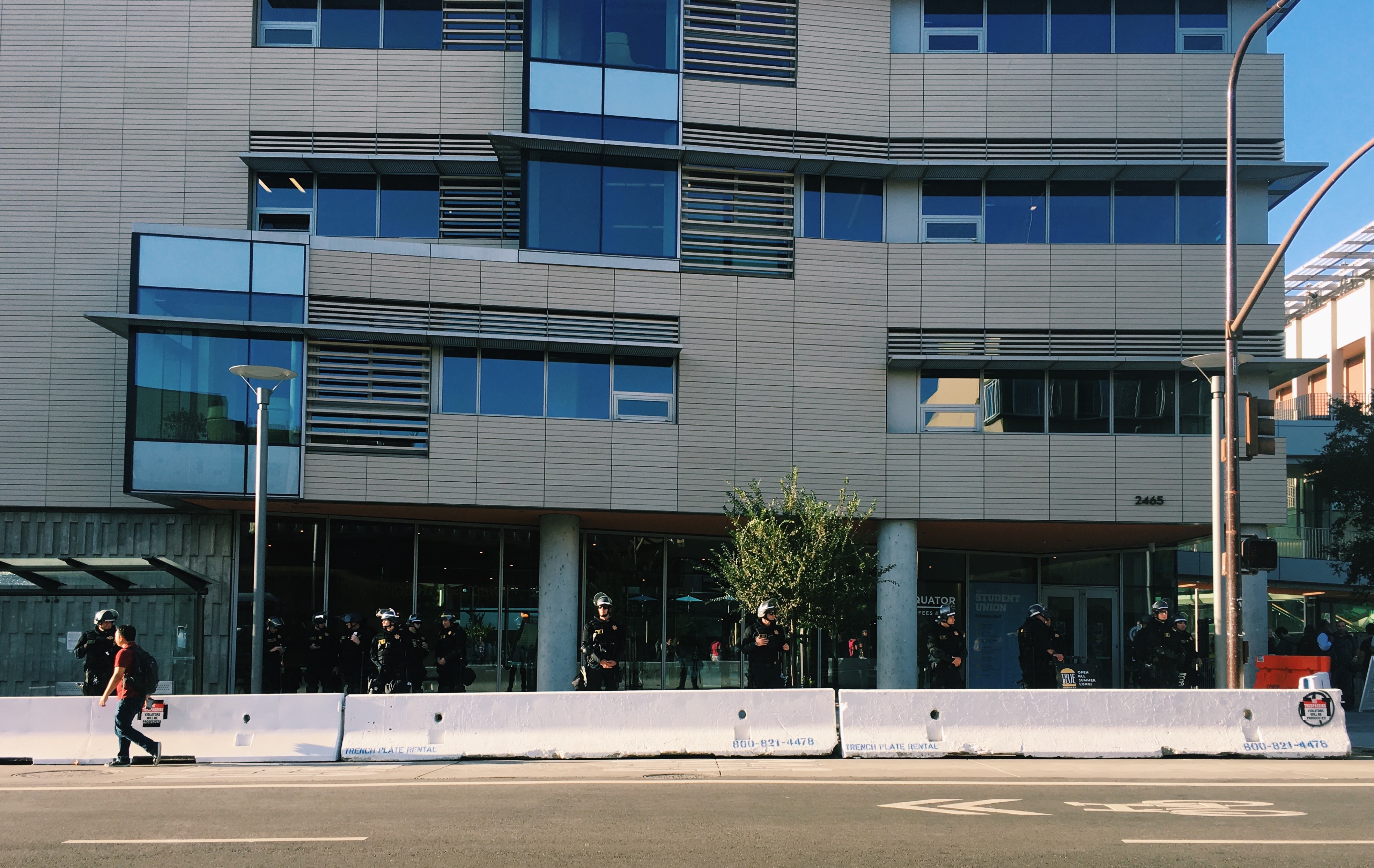
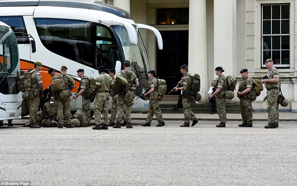
soldiers or UCPD?
I was walking home from CS 194 lecture and passed by the student union, which had a ton of armed UCPD members in riot gear. I took this photo of our campus because I couldn't believe that our campus looked like this. I decided to hybridize that image with a photo of the British military. The second image was chosen to try and match the composition of the Berkeley image.
|
|
|
The color works better for the low frequency component. The low frequency component still looks kind of white, similar to the black and white results. I found that if I made my sigma very high for the high frequency component, the color came out much better. However, this was not optimal for the overall hybrid image because it dominated the image too much and made the low frequency harder to recognize.
Gaussian and Laplacian Stacks
Approach
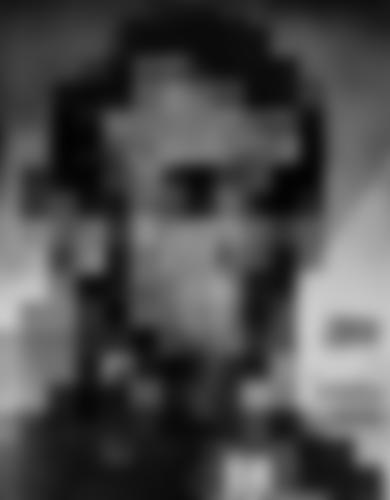
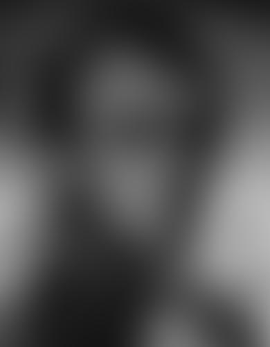
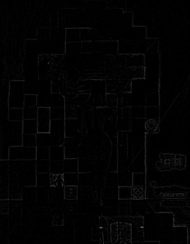
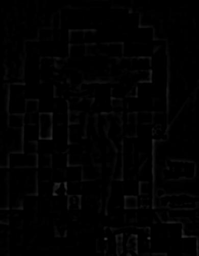
We create a Gaussian stack, with depth d, by applying a Gaussian filter with σ = 2^depth at each layer. Stacks are similar to pyramids, except that there is no subsampling happening at each layer. A layer of the Laplacian stack, i, is created with by subtracting the image in the i+1th layer of the Gaussian stack from the image in the ith layer of the Guassian stack. Here are the Gaussian and Laplacian stacks on Salvador Dali's painting, Lincoln
Results
Gaussian Stack

|

|
|

|
|
Laplacian Stack
|
|
|
|
|
Hybrid Results
Gaussian Stack

|

|
|
|
|
Laplacian Stack
|
|
|
|
|
Multiresolution Blending
Approach
In order to accomplish multiresolution blending, we have 3 important images: image A, image B, and the mask. We also utilize gaussian and laplacian stacks in order to blend the images at multiple levels. At each level, we calculate the aggregate image to be the gaussian of the mask * laplacian of A + (1- gaussian of the mask) * laplacian of B. Our blended image is the result of adding together all of the layers. We can accomplish color multiresolution blending by repeating this process for each of the 3 channels and stacking the results.
Results

|
|
|
|
|
|
|

|
|
Part 2: Gradient Domain Fushion
2.1: Toy Problem
Approach
We want to reconstruct an image, given a single pixel from the original image and the x, y gradients of the original image. We can accomplish this setting up a system of linear equations, Ax = b. Our x vector, with dimensions (height * width, 1), is the vector of the unknowns or reconstructed image. Our b vector, with dimensions (height * width + 1, 1), is the reshaped original image vector. A is a sparse matrix, with dimensions (2 * height * width + 1, height * width). The first height * width rows in A correspond to the x-gradients for each pixel. The next height * width rows in A correspond to the y-gradients of each pixel. The last row exists to ensure that we are setting the correct information for our "base" pixel, which we've chosen to be the top, leftmost pixel.
Results
|

|
2.2: Poisson Blending
Approach
Poisson blending makes for smoother blending between images. This section builds off of the concept we looked at with the Toy Problem. We have a source image and a target image. We want to paste some section(s) of the source image and blend it with the surrounding region in the target image, so that the two images combine more naturally.
This can be accomplished by solving this blending constaint:
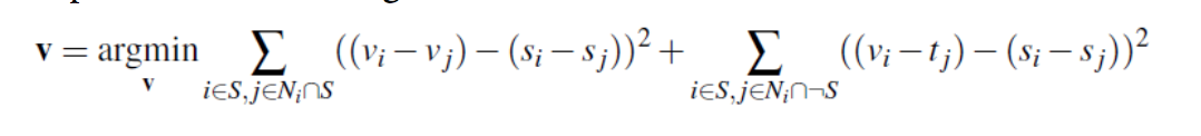
The regions we are interested in blending from source can be called S. We want to eventually create an image V, similar to our reconstructed image from the Toy Problem. To populate the values of V as such: If the pixel is outside of the S region, then we simply copy the pixel value of the target image. If the pixel is within the S region, then we ensure that the gradients match as much as possible.
Results
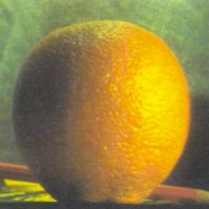
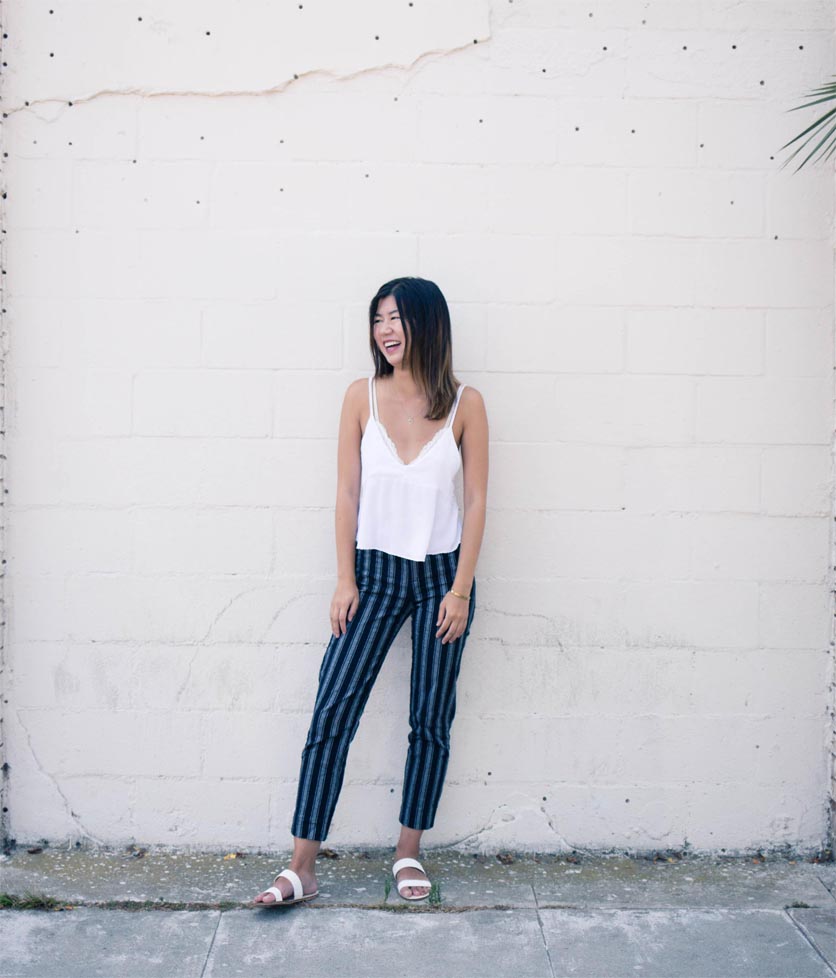
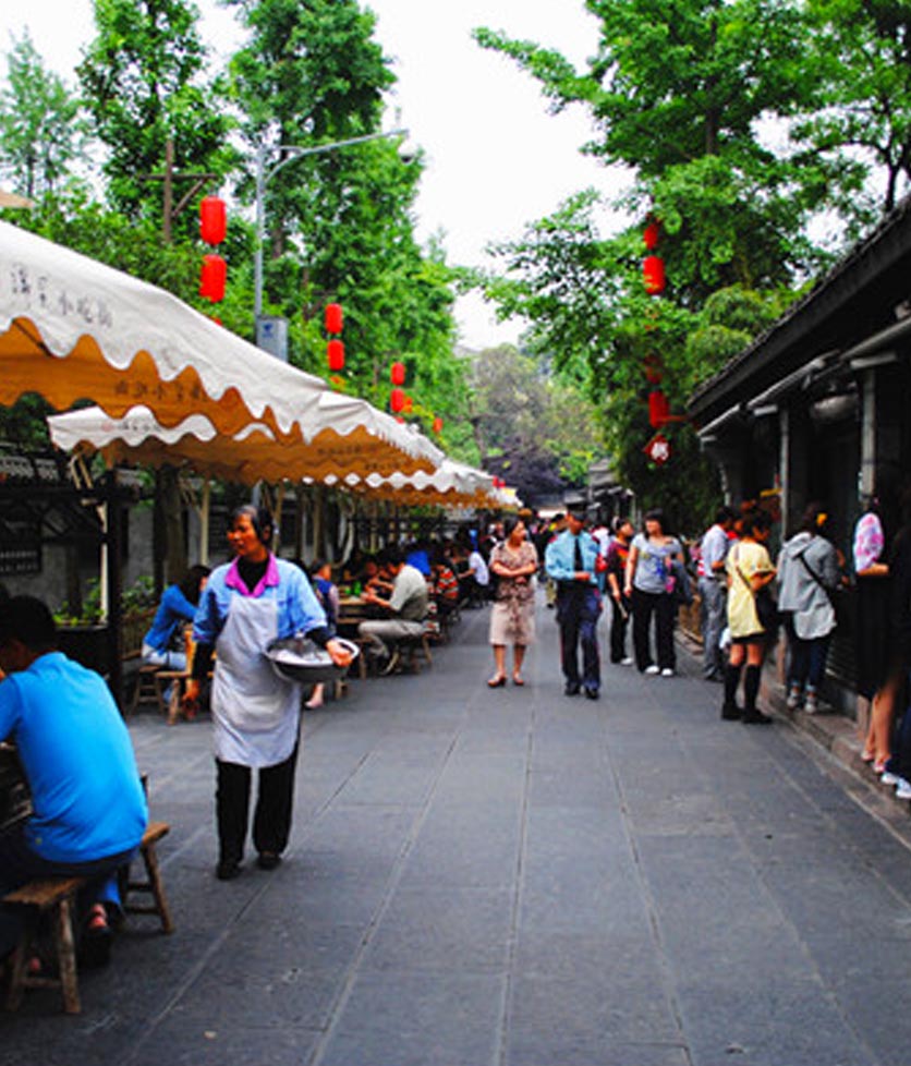
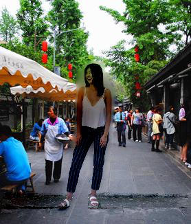
myra in chengdu
Here is a photo I took of my friend Myra. We recently talked about wanting to travel to Asia, but since we are both college students, that's rather difficult. But with Poisson Blending, maybe this photo of her in Chengdu, China, is good enough.
|
|
|
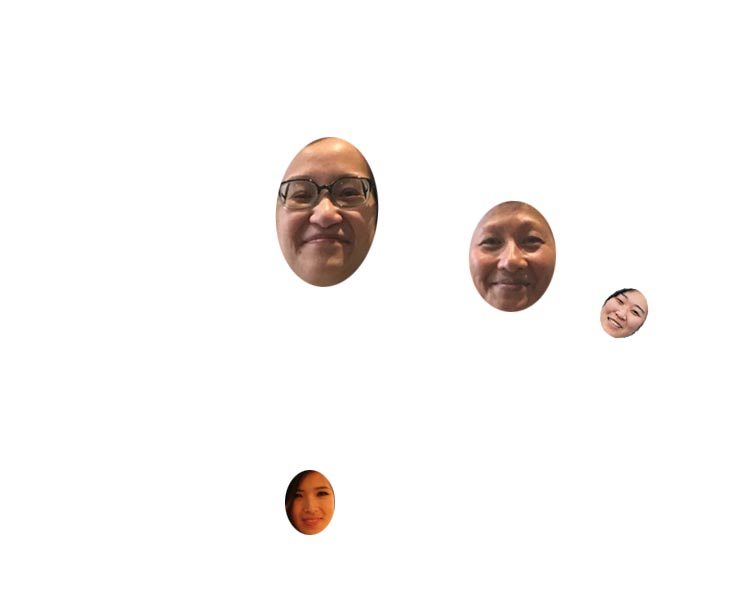
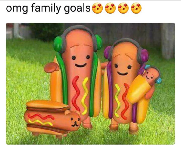
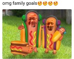
meme-fied
I saw this meme on my Facebook newsfeed recently. I took some photos of me and my coworkers' faces. I blended them because I thought the skin tones would match the hotdog's color. However, this was more of a failure because only the boundary is blended and the interior of the source image does not match the target image (hotdog) as well.
|
|
|
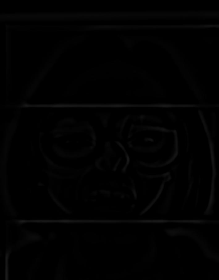
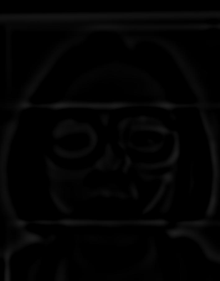
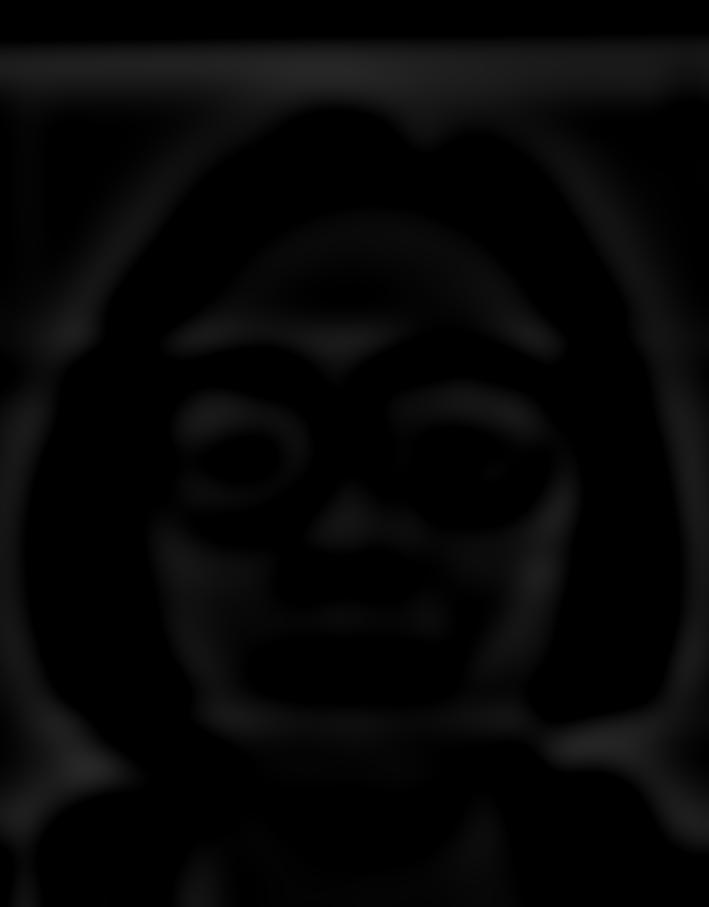
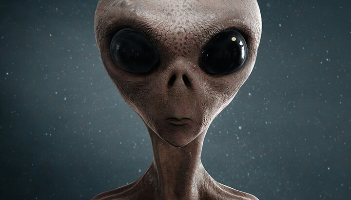
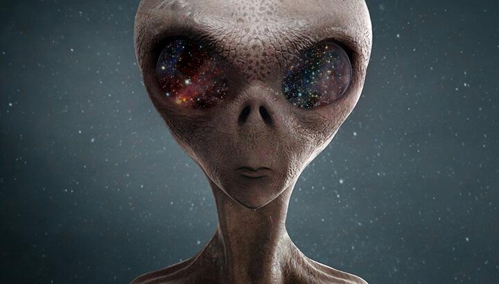
alien spaceman (again)
I used Poisson blending to blend the alien and space again. This result was not as good as the previous result. I think this was due to the fact that I scaled the image done, for computation purposes. Also, it's kind of hard to do better than the previous blending because both the source and target images are already pretty close in color. So there difference being mitigated is not as extreme.
|

|

|
Conclusion
I had a lot of fun working on this project. I think the biggest takeaway from this project was an appreciation for blending and its complexity. I learned that there is no fixed way to accomplish optimal blending, and it really depends on how the original images are in relation to each other. Some blending methods are better than others, for a given situation. It was fun to experiment around to try and get the best results. I was constrained by time, otherwise I would have played around more with different images/blending styles and gotten more creative results.