Project 3: Fun with Frequencies
Jiana Huang
Part 1
Warm Up
Sharpening up the image involved adding the higher frequencies of the image (edges) to the original image. This makes edges and lines more apparent, appearing "sharper".
Original Picture of Cloud

Sharpened Picture of Cloud
Hybrid Images
Following examples like Mona Lisa and Lincoln and Gala, we combined two images using different frequencies. This allows the viewer to see two different images dependent on how far they are from the image.
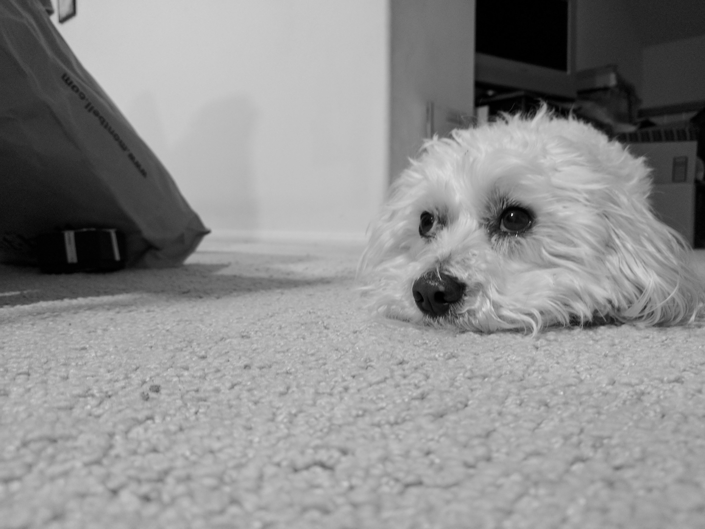
Dog or Bagel?
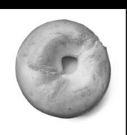
Dog: High Frequency
Bagel: Low Frequency
Blended: Bagel Dog
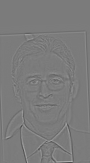
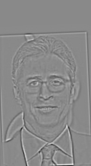
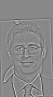
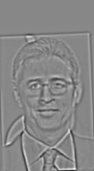
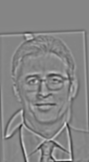
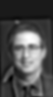
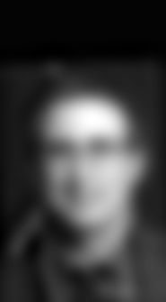
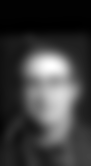
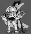
Favorite: Battle of the Jo[h]ns
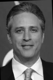
High Frequency: Jon Stewart
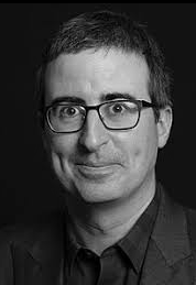
Low Frequency: John Oliver
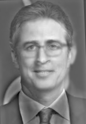
Blended: Jo[h]ns
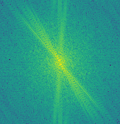
Fourier Domain of Jo[h]ns
High Frequency
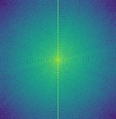
Low Frequency
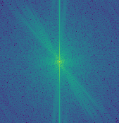
Blended Frequencies
Failure: Jiana + Cloud
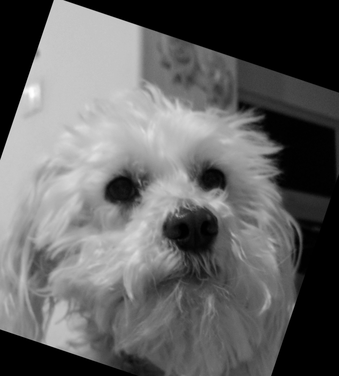
Cloud: High Frequency
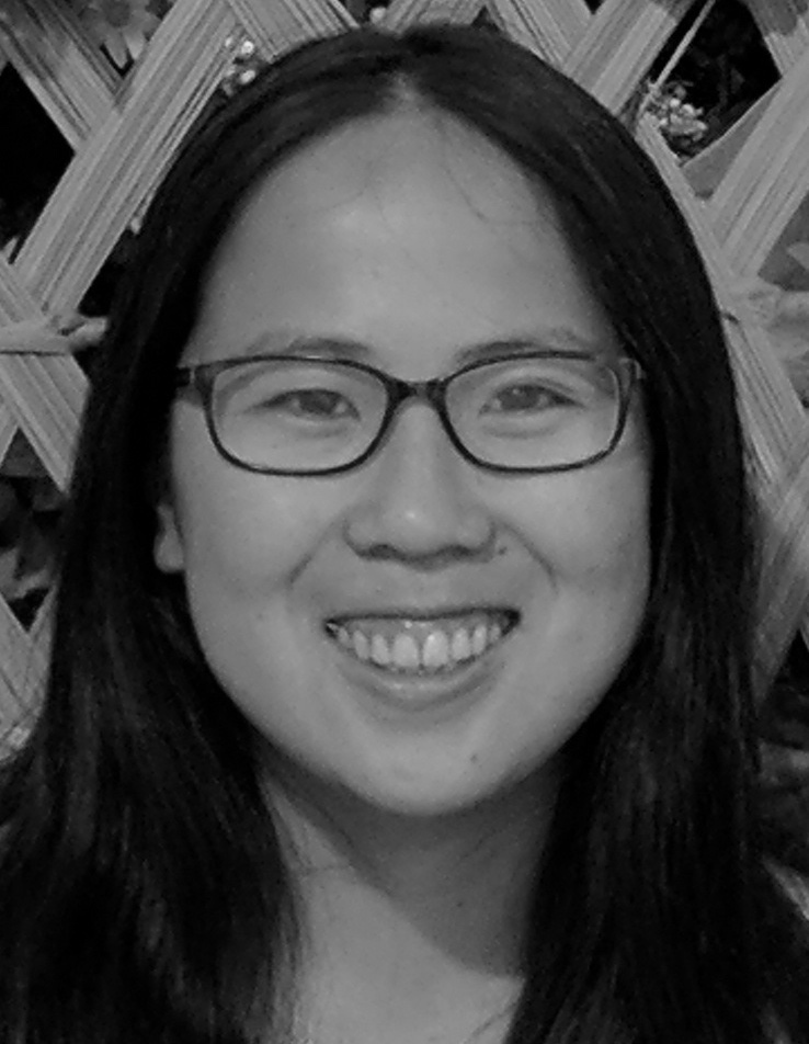
Jiana: Low Frequency
???
This hybrid image didn't work out well because our facial features aren't well aligned. Also, Cloud has a lot of texture and edges on his face which is highlighted in the high frequency domain. This makes it harder to see my face in the lower frequency.
Gaussian and Laplacian Stacks
Lincoln and Gala
Laplacian Stack (High Frequency)
Gaussian Stack (Low Frequency)


Jo[h]n Stacks


Multiresolution Blending
Orapple
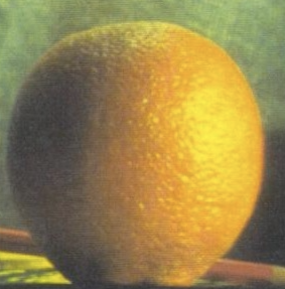
Orange
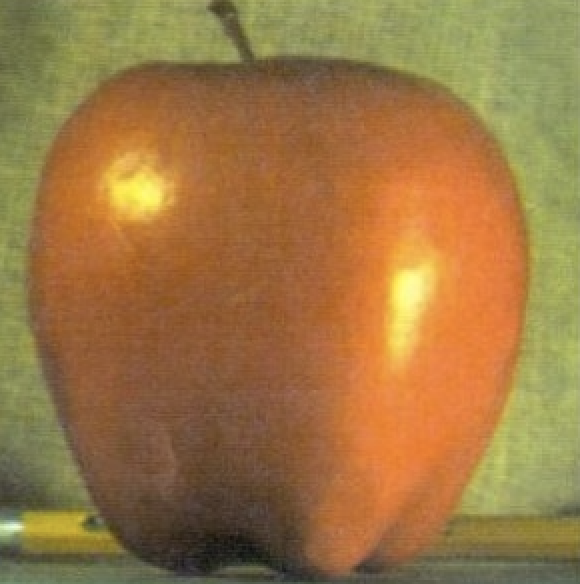
Apple
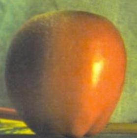
Orapple
Sea-Francisco: The Ultimate Tech Hub
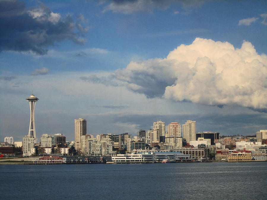
Seattle
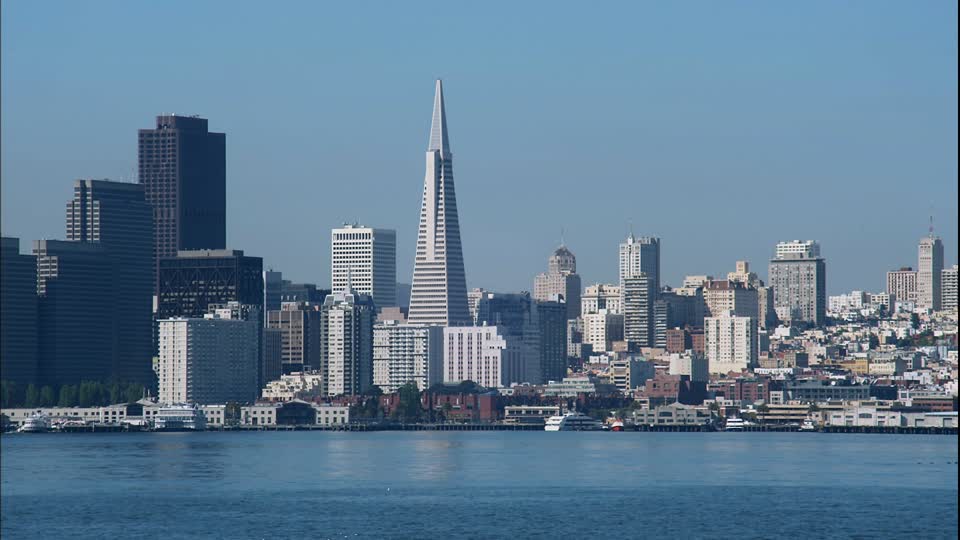
San Francisco
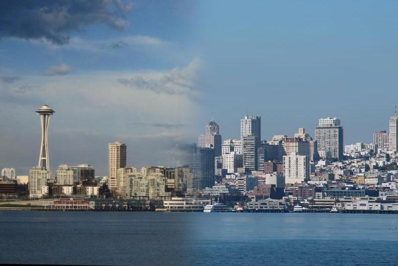
Sea-Francisco
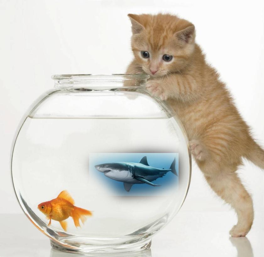
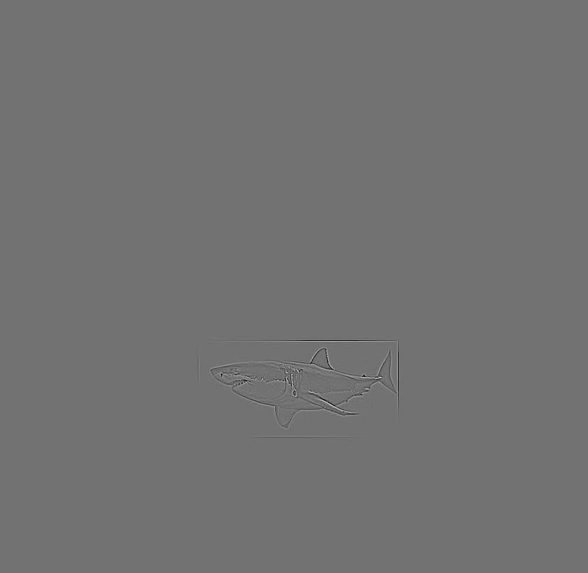
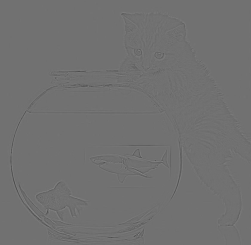
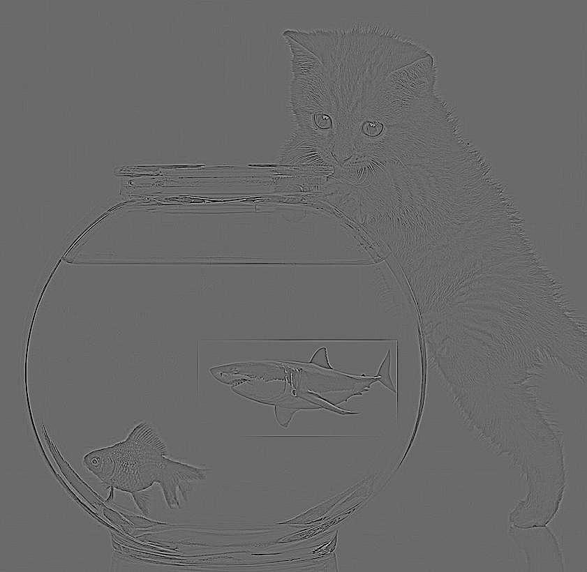
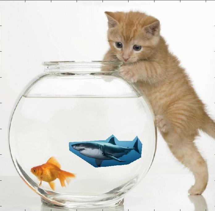
Pet Shark
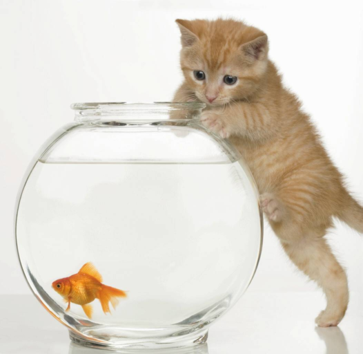
Fishbowl
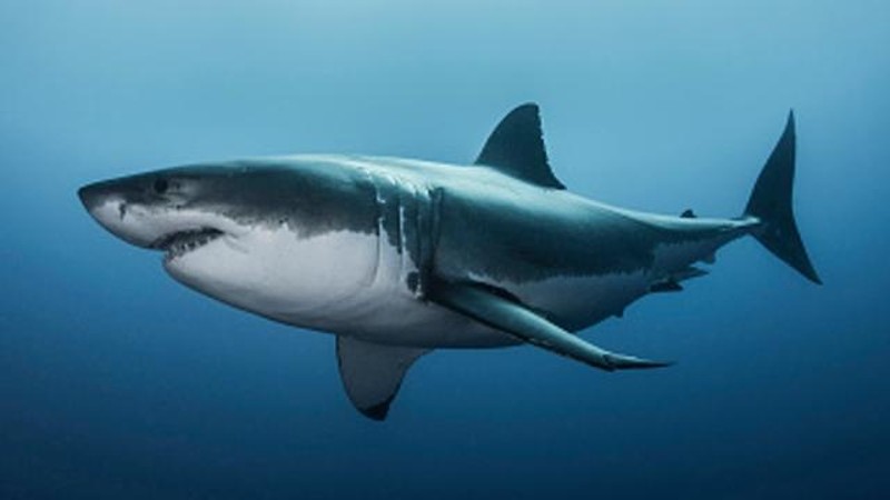
Shark
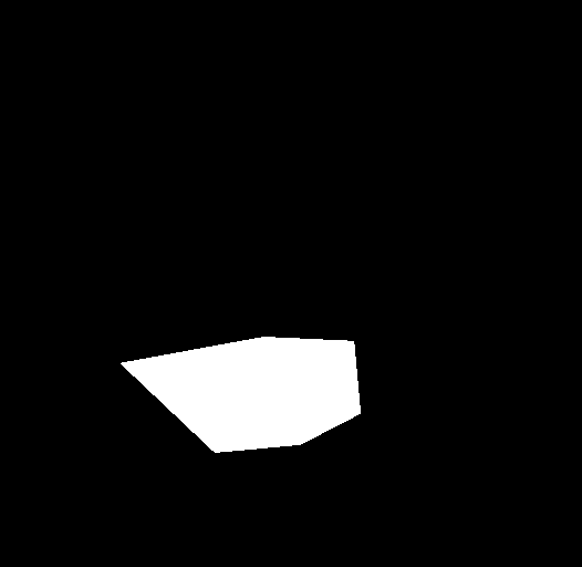
Mask Used to Blend Images
Your Own Pet Shark
This blending didn't work well because the colors are so different between the fishbowl and ocean. This creates edges from the transplanted source and background. We'll find a solution to this problem in part 2.
Laplacian Pyramid of Pet Shark
Contrast has been increased in these images to increase visibility
Layer 0
Layer 2

Layer 4

Part 2
Overview
We've tried blending with Laplacian pyramids in the previous part of this project. However one of the problems was that while the edges of the mask may have been blurred, there is still a stark transition in color between the source and the target images. We will explore poisson blending as a solution to this contrast problem. Instead of blending the photos at different frequency levels, we instead look to gradients, trying to match the source gradients as much as possible in the final image. We constrain the background pixels to be the same intensity but try to minimize the difference in the gradient domain of the source and final image. We can formulate this problem as a least squares problem in order to find the new pixel values in the target image that most closely resembles the gradients in the source image.

Toy Problem

Original
Reconstructed with Error = .0209
Possion Blending
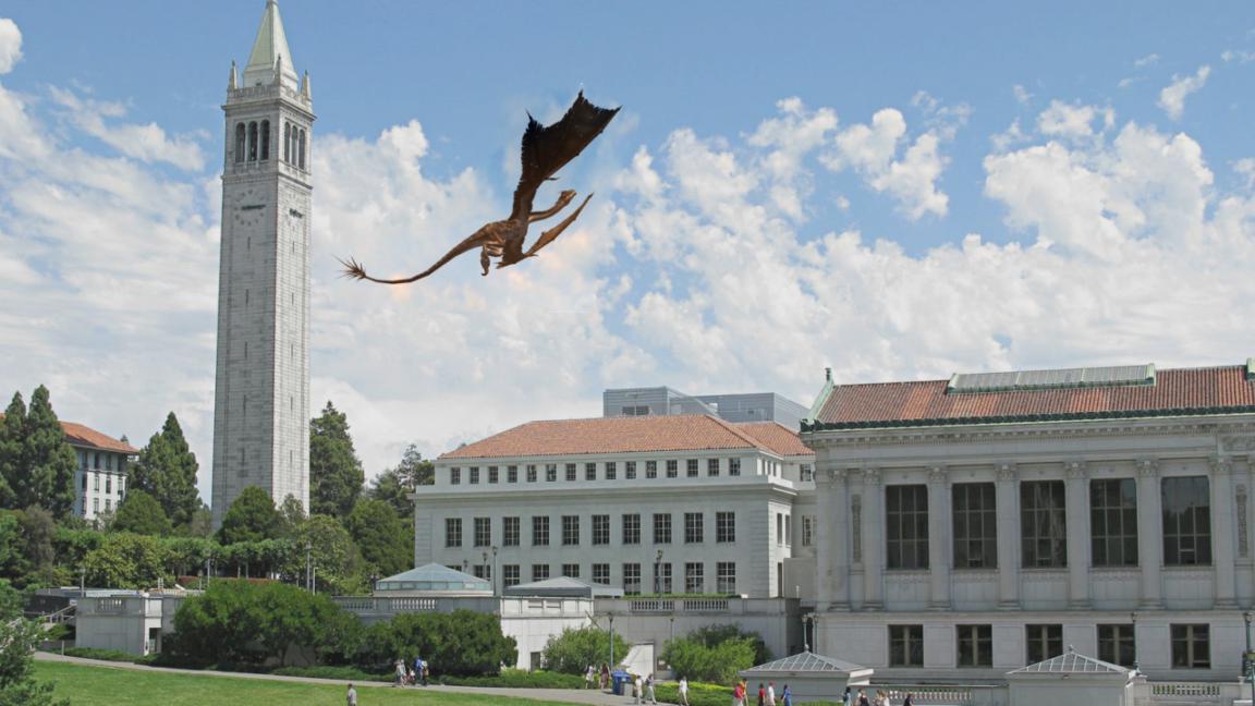
Dragons Beware
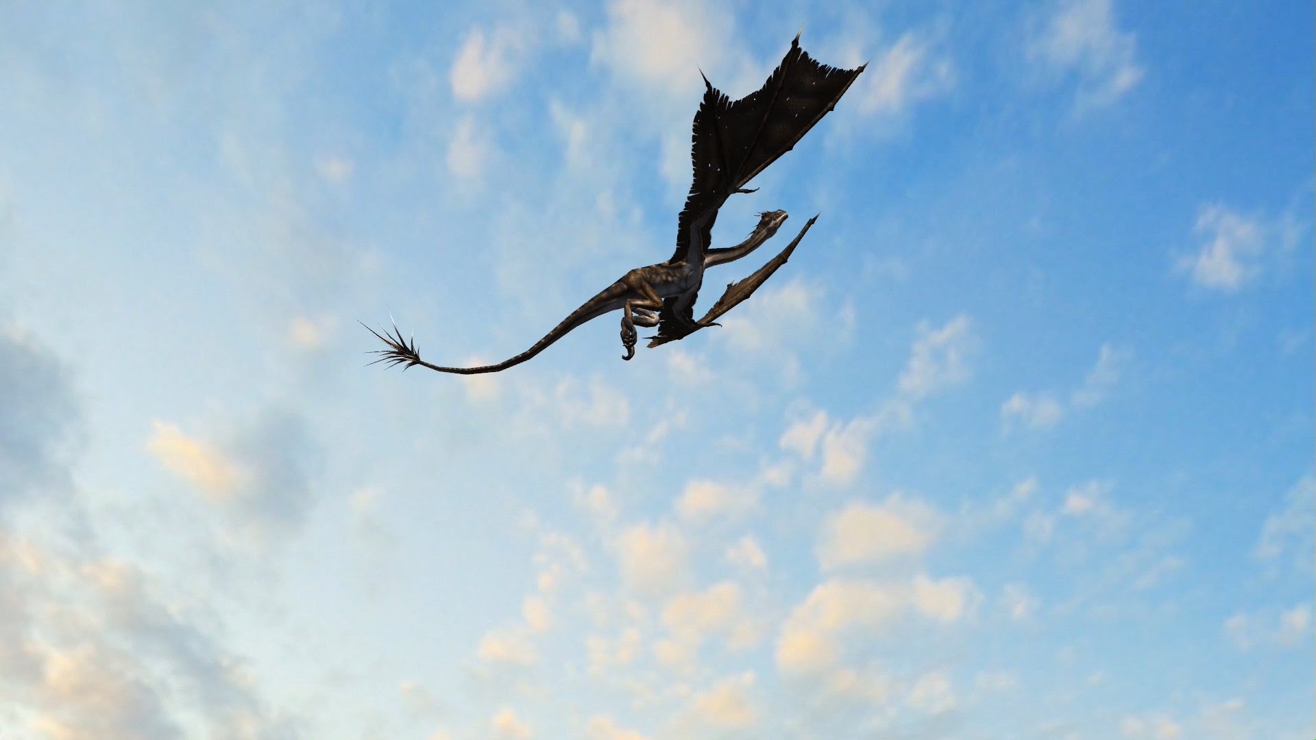
Source
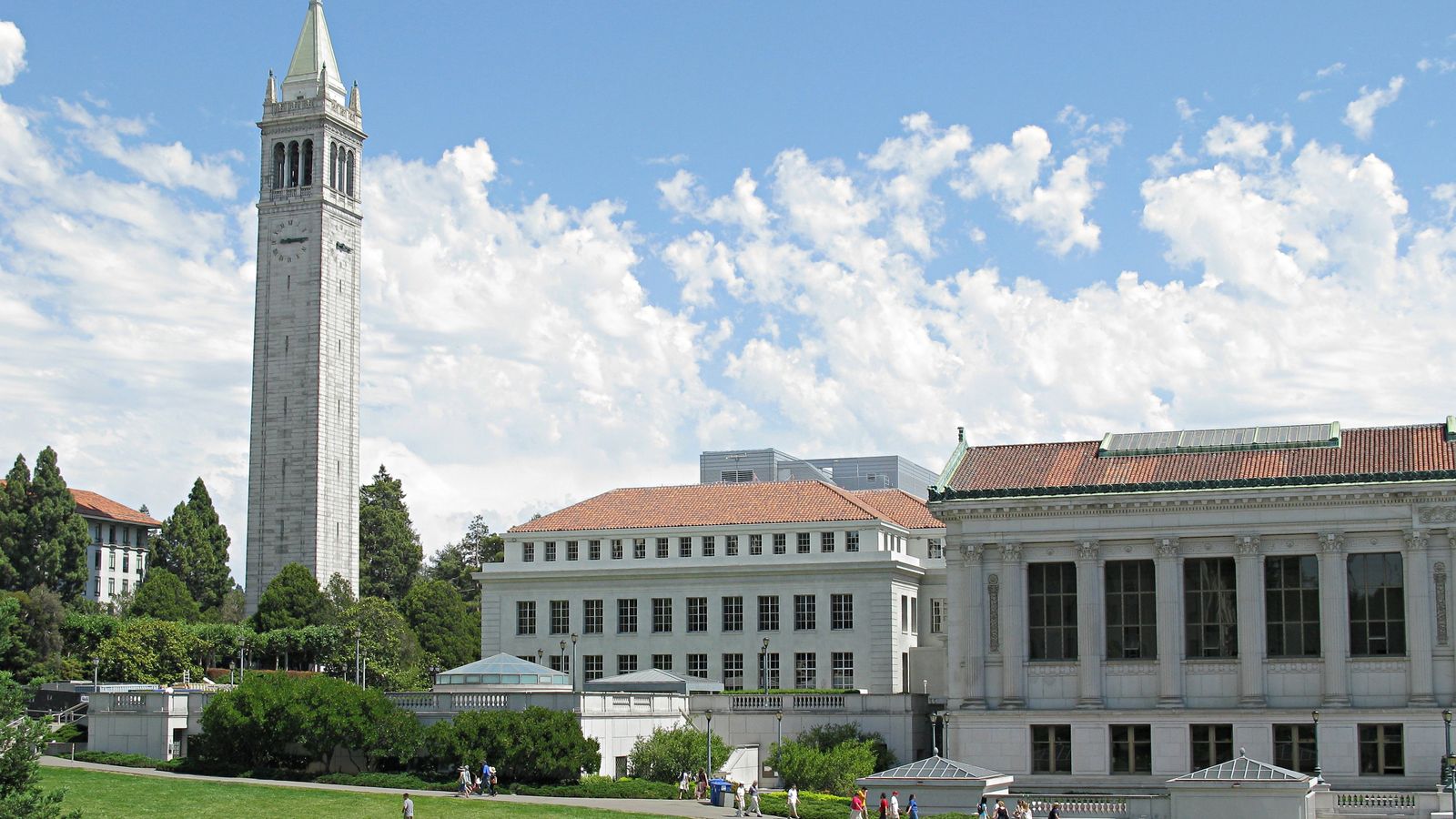
Target
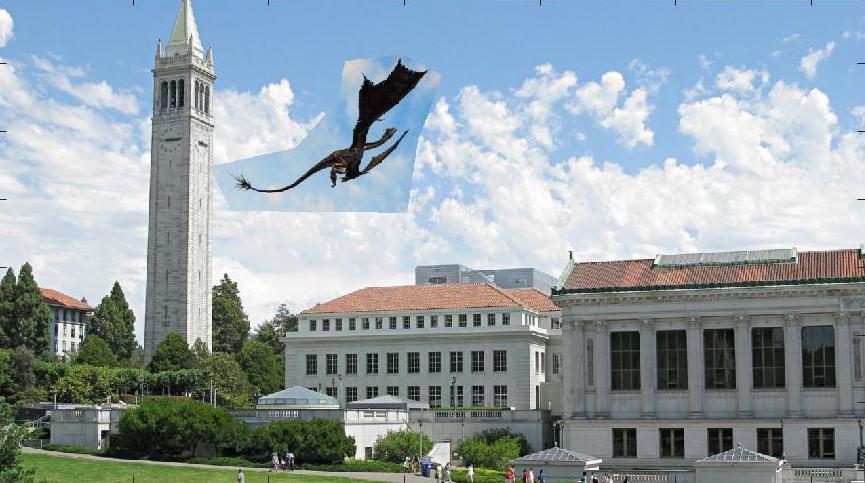
Naive Cut and Paste
Poisson Blended
Imposing a dragon on the Berkeley campus through poisson blending was pretty successful. This can be attributed to the similar backgrounds in both images (slightly cloudy blue skies). Because of the similar colors and textures, the dragon's pixel intensities remained pretty similar compared to the source, and poisson blending was able to deal with the cloud texture to make it look believable. However, if you look closely, you can see the clouds look slightly unnatural as the texture of the clouds is not taken to account in this type of blending. However, the blended colors match pretty well with the Berkeley sky.
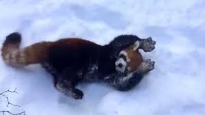
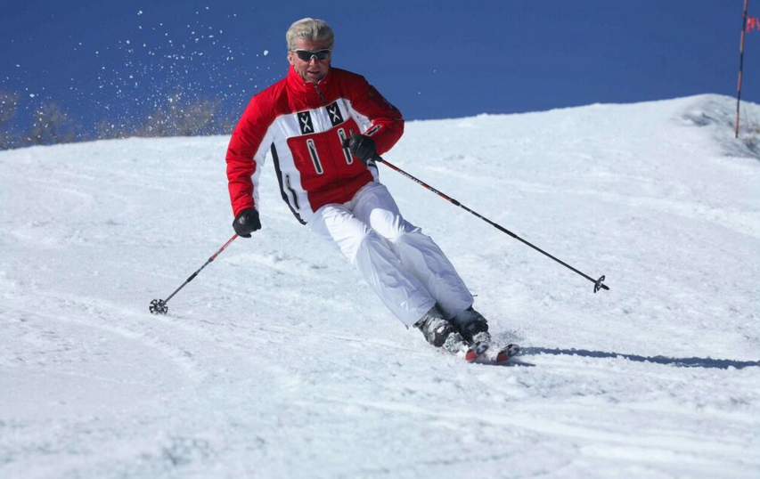
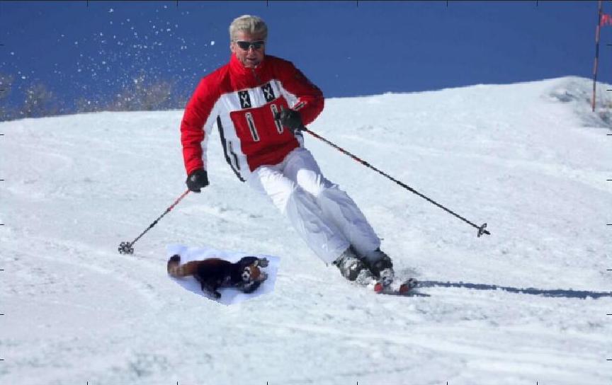
Red Panda + Skier
Source
Target
Naive Cut and Paste
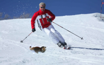
Blended
Meh Example: Flying Squirrel in Space
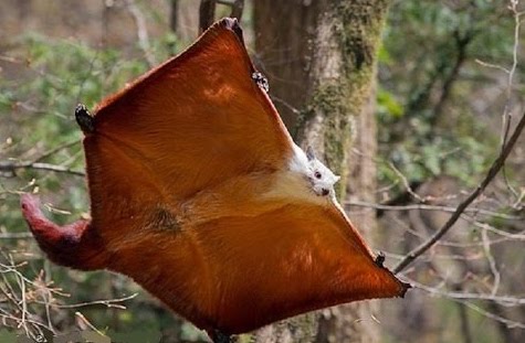
Source
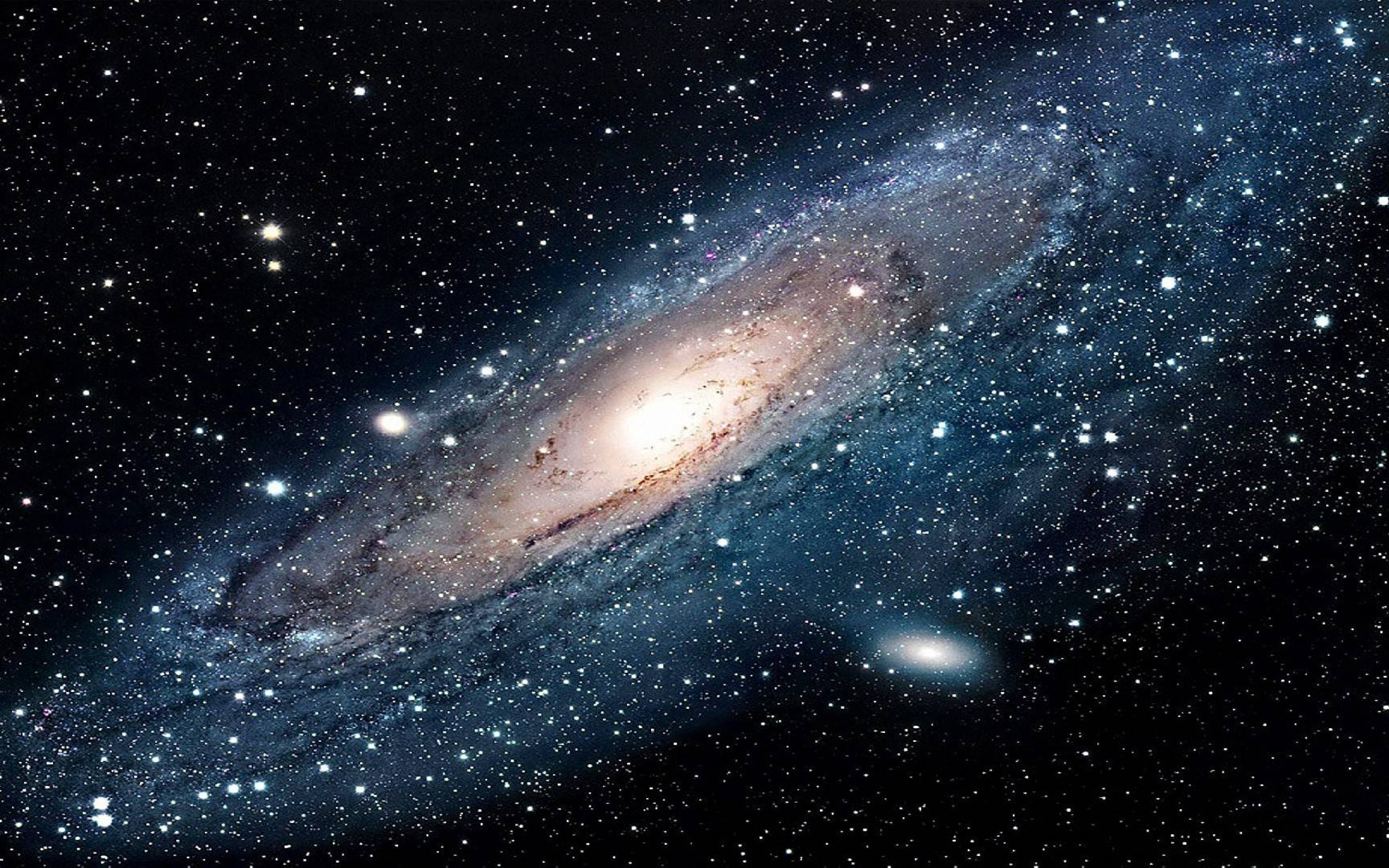
Target
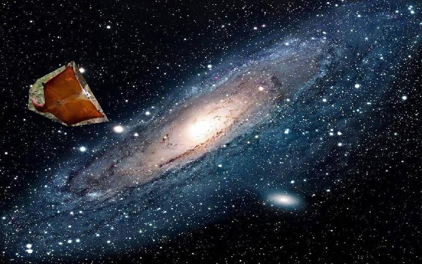
Naive Cut and Paste
Poisson Blended
The squirrel didn't work as well as the previous example because the background of the squirrel and space are totally different textures and colors. The squirrel was also darkened significantly because in the original image, it didn't contrast greatly with the forest background. When the algorithm tried to blend the forest background to the space in the target image, it also darkened the squirrel to better match the gradients in the original source image.
Comparing Poisson and Laplacian Stack Blending
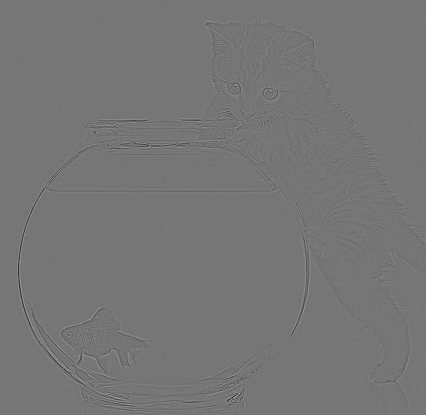
Pet Shark: Improved
Poisson Blending Components
Source
Target
Naive Cut and Paste
Final Comparison
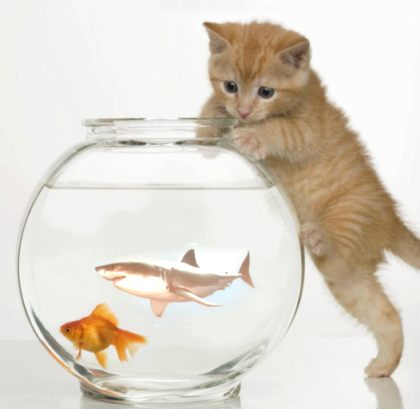
Poisson Blended
Laplacian Stack Blending
Poisson Blending did a much better job than using the laplacian pyramid by changing the color of the source image. You can see here that we care more about the gradients of an image rather than the actual intensity values of each pixel since the poisson-blended example looks more believable than the laplacian blended result. Even the image on the right has a more realistically-colored shark, the change in water color and sharp edges from the original source image makes the shark stick out. Poisson blending is a better technique to use when the background has similar textures and colors, making the blending more natural. However, it fails when the colors of the source and background images don't match up, as it distorts the colors in the target image.
Reflections
This project was really fun to implement and also frustrating in terms of small details. I struggled with thresholding the pixel values so they would show up in images correctly as well as indexing in the image correctly. Despite these challenges, it was really cool to see how a relatively simple algorithm like poisson blending works extremely well in certain cases.