Nicole Rasquinha
Computational Photography
Project 6: [Auto]Stitching Photo Mosaics

Part A Overview:
In this project, we learn how to rectify images, in other words, take a plane which is in some non-frontal perspective and rectify it to be front-facing. Furthermore, we learn how to mosaic two images together by shifting the perspective of one to fit the other. Both rectifying and mosaicing rely on the concept of homographies. For the rectifying task, I simply find four points in the image on the plane I wish to rectify that form a square or rectangle. I then transform the image to a set of points which represents an actual square or rectangle on a grid. The over-arching approach of mosaicing is to first determine corresponding points between two images you wish to stitch together. In part A, we hand-define the correspondence points, but in part B, we find them automatically. Then, compute a homograhy to transform from one image to another. Recall that the homography matrix, H, is a 3 by 3 matrix but that the bottom right entry is simply a scaling factor and can be set to one. Thus we have eight unknowns. With the four correspondence points, you have eight equations (2 dimensions per point) in order to solve for a system of equations to recovery H. In my code, I use numpy's least squares solver to solve this system. Determine the resulting canvas size by taking the max and min row and column coordinates of the second image's corners and the result of warping the first image's corners. "Paste" the warped image 1 and the shifted image 2 accordingly. Finally, apply some linear blending along the axis of the panorama to smoothen the edge between images.
I'll be there for you... Check out this picture of the apartment building from the classic sitcom Friends.
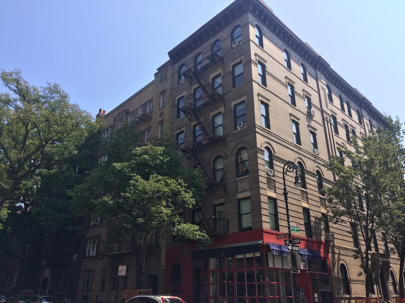
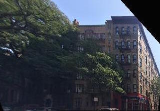
Would be nice to see what the building looks like from one of the sides. Unfortunately, I didn't walk down that way while strolling through NYC. Luckily we can just rectify the image and nobody will know!
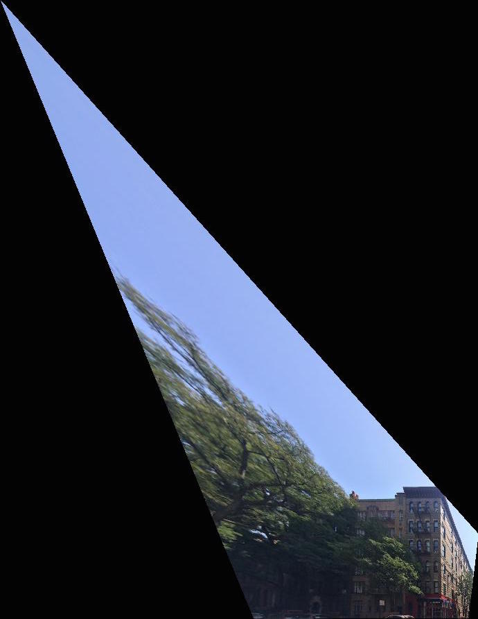
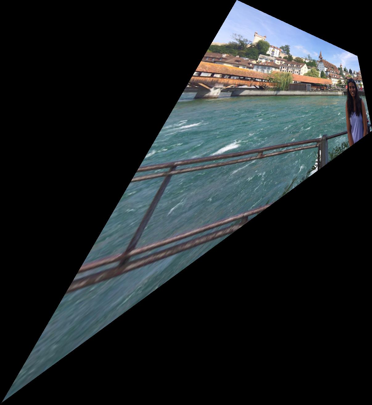
So... looks a little funky. Since we are changing the perspective of the image so drastically, the corners REALLY get warped into this dagger shape. With a little bit of cropping we can get the following image instead.
Great! Now let's fly to Lucerne, Switzerland and check out a few more examples.
From left to right: original image, rectified image, rectified and cropped
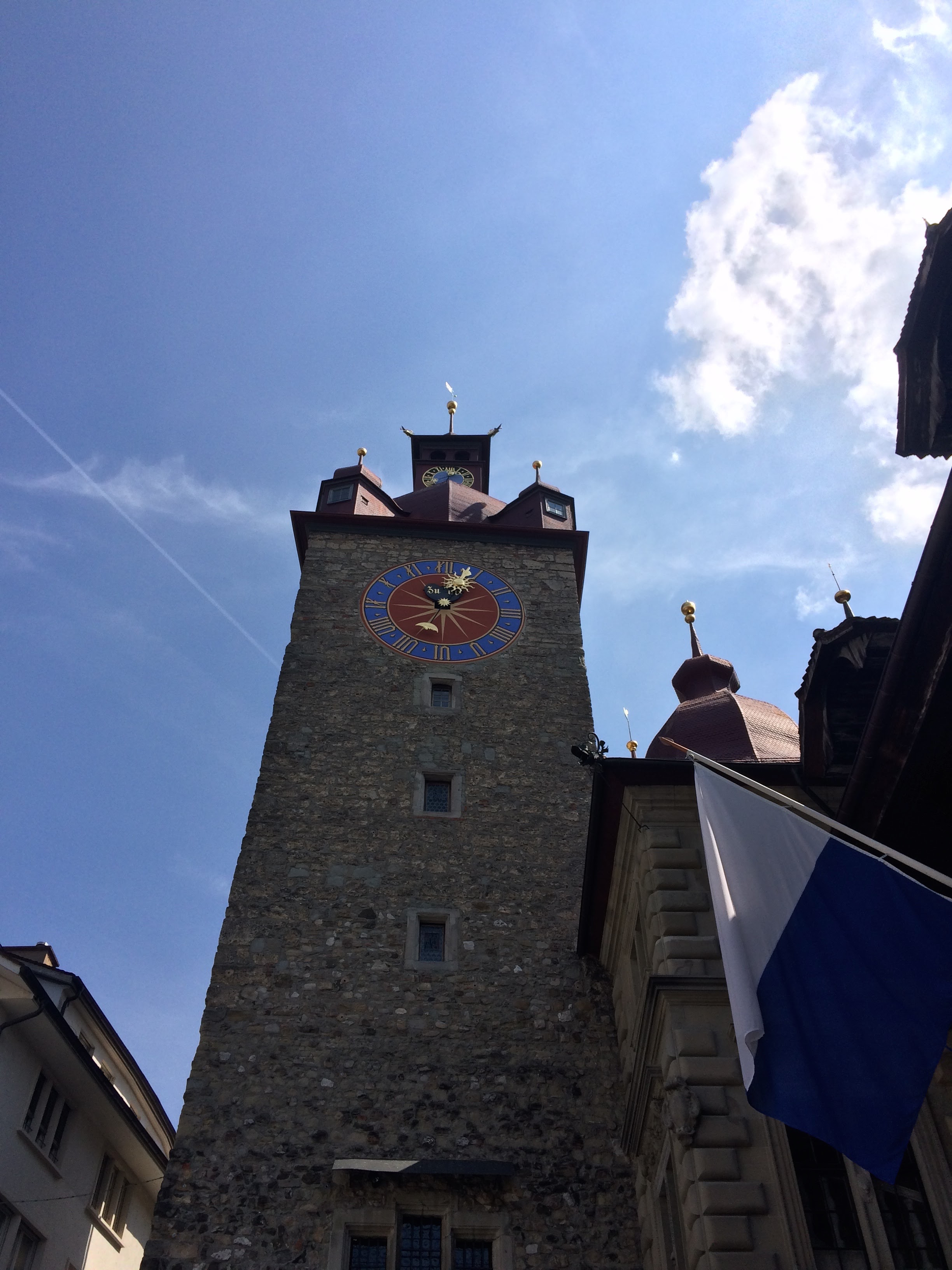
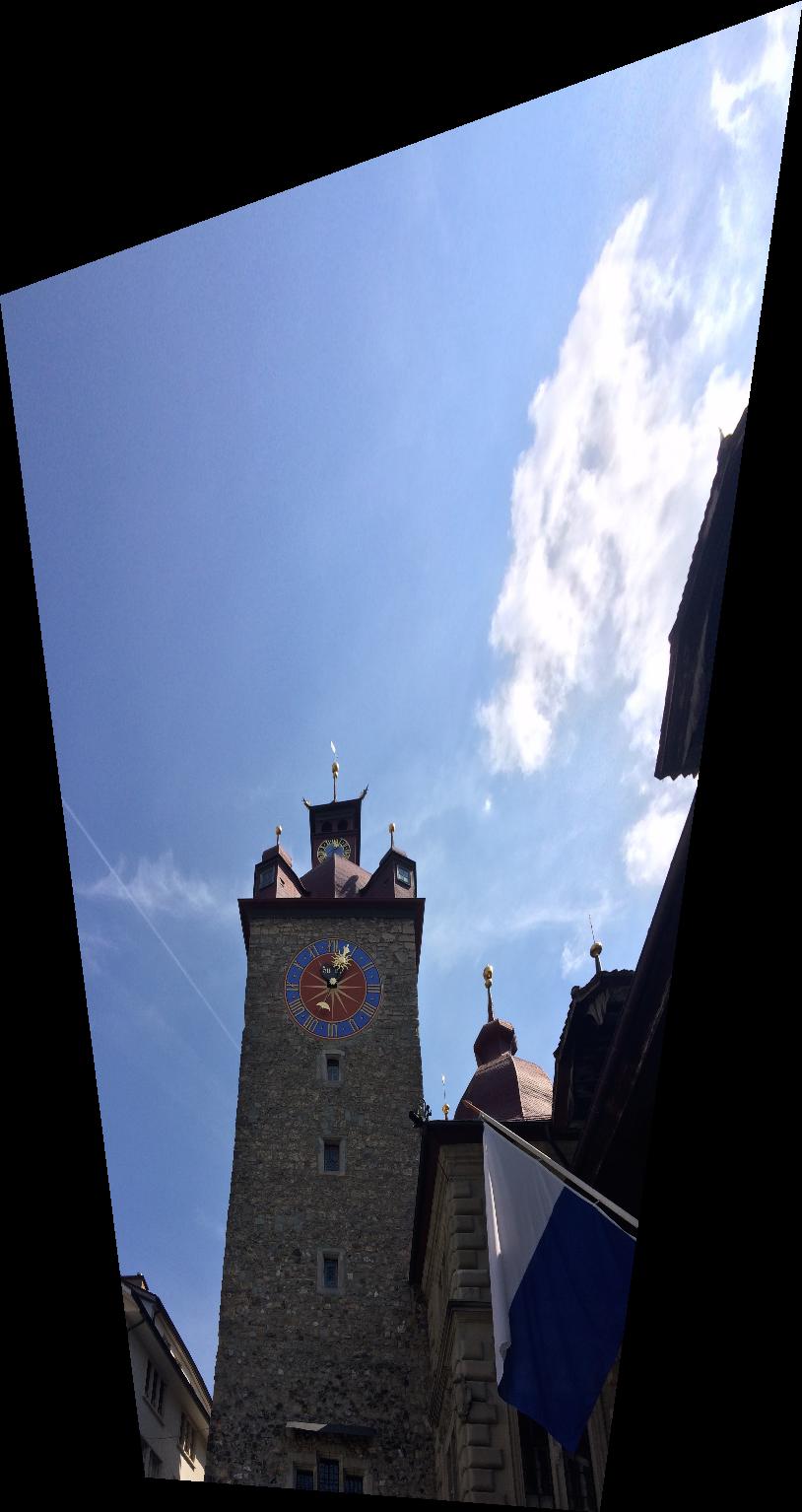
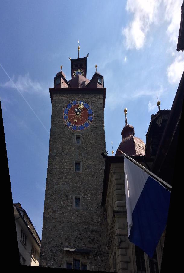
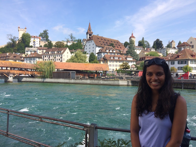
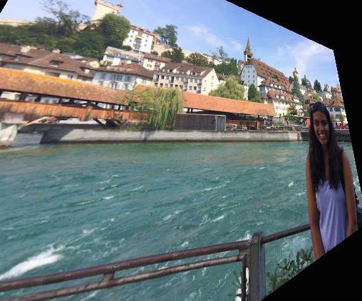
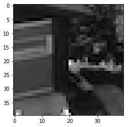
I tried to rectify this image of myself obscuring the view of the gorgeous town of Lucerne. I tried to rectify the face of a building very far off in the distance. The further you get from the object, the more you'd have to move the position of the camera to achieve the change in perspective in real life. Also, warping the image a lot causes a lot of interpolation, worsening the appearance. Finally, since there is a subject (me) very close-up in the shot, I have to be warped quite a bit and this warping is especially noticeable. From left to right: original image, rectified image, rectified and cropped
Now it's time to go check out the Swiss Alps!
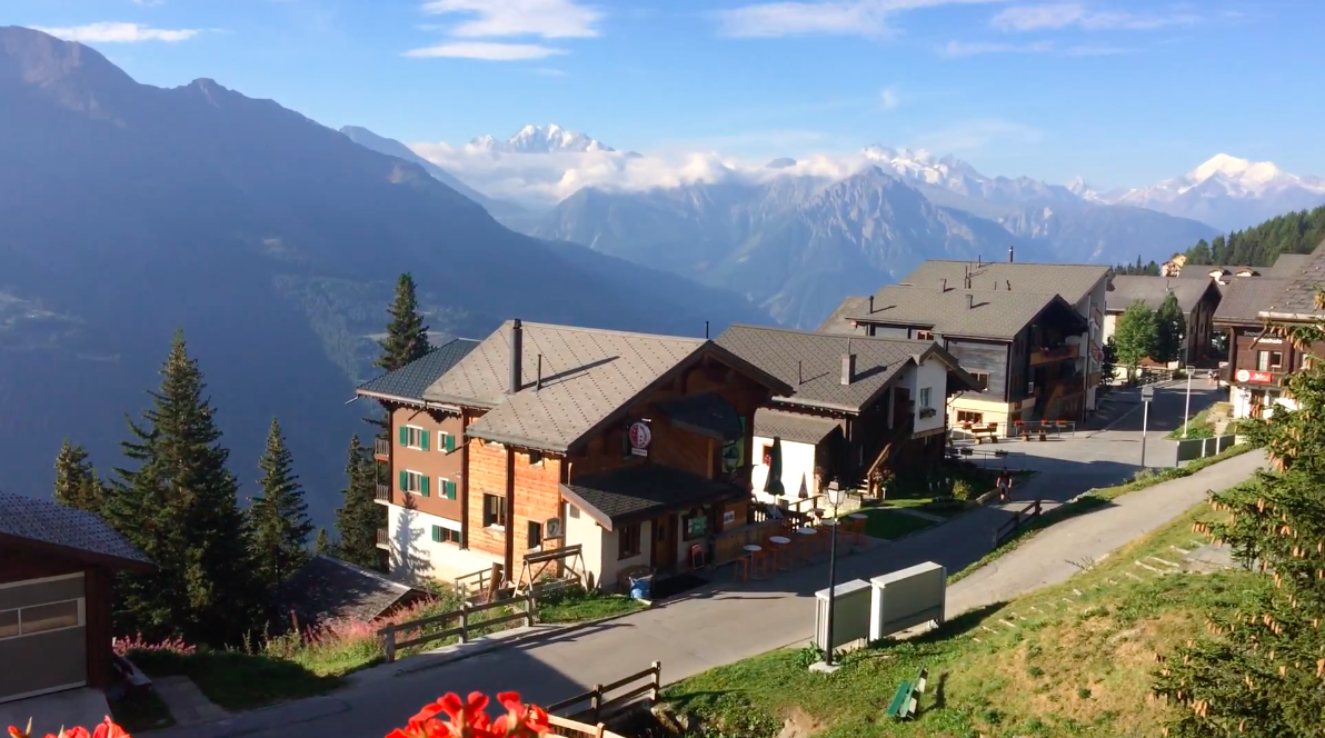
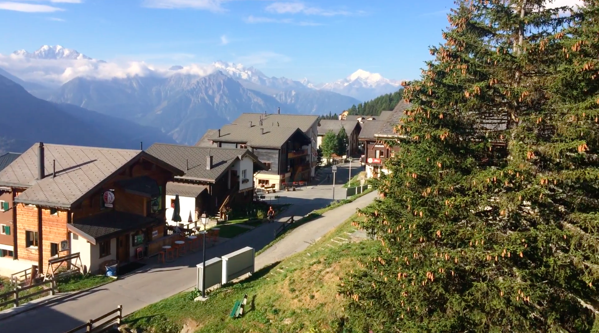
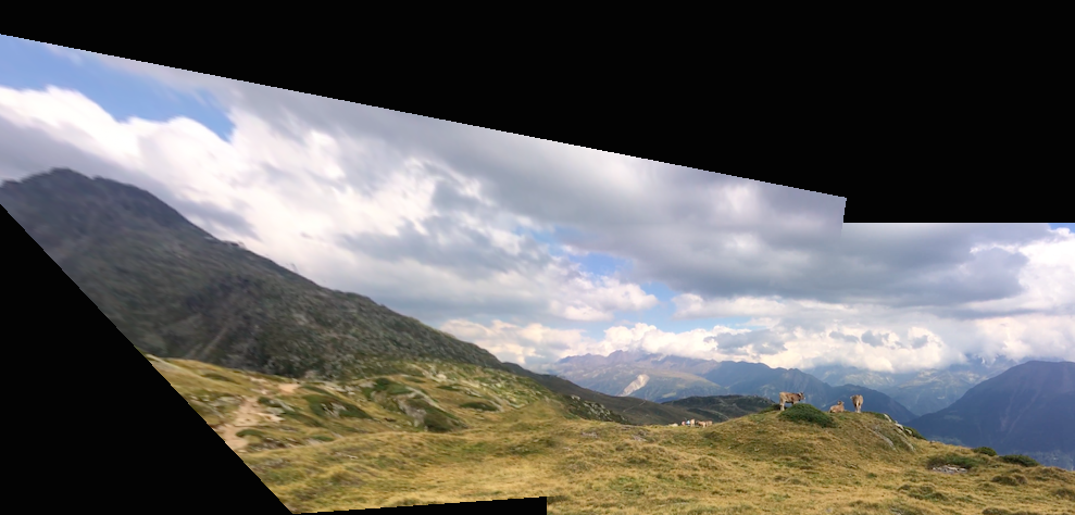
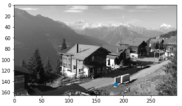
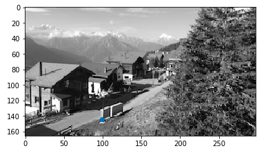
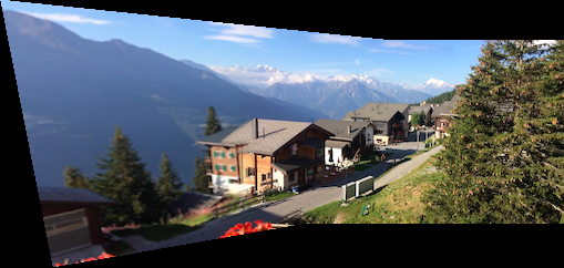
For the second task in this project, mosaicing, let me take you on a tour of the Swiss town of Bettmeralp and the beautiful Alestch Glacier it boasts access to. Cool note: I actually took all the following images from panoramic-esque videos from my trip. I found this to be a terrific approach to gathering panoramic frames. Let's start at the hotel I stayed at. Here are the original images.
On the left is the transformed image one, and on the right is the mosaic with image two naively pasted on top.
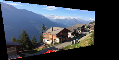
Although the image looks pretty good from a distance, if you look closely you can see a harsh edge between images one and two. To address this problem, I implemented feather blending along the x-axis (weights transitioning from 0 to 1 and vice versa in increments of 1/20) for a more smooth transition between the images. Here is my result:

That's much better, but since I am only feathering along the x-axis, you can still see horizontal edges if you look closely. To remediate this, I add additional feathering such that if you are at an overlapping pixel, you feather according to the closest edge (vertical or horizontal). Here is my final result:

Voila! Now the mosaic is more-or-less seamless! :)
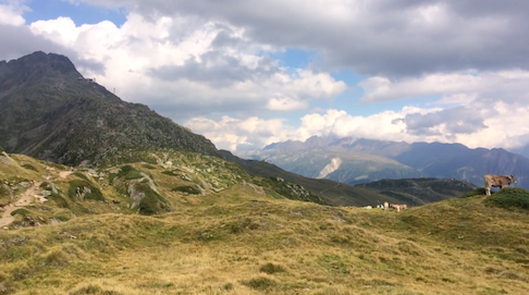
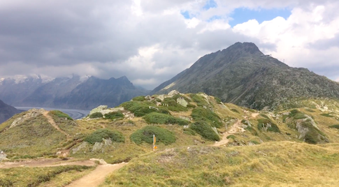
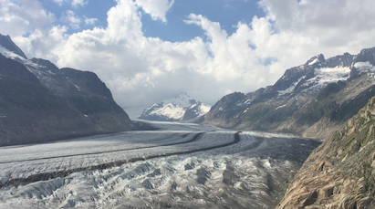
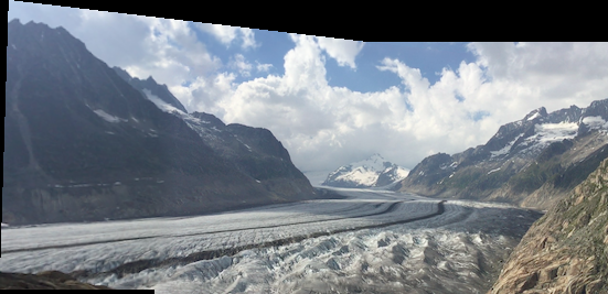
Let's hike onwards to this famous glacier. Is it worth the trek?
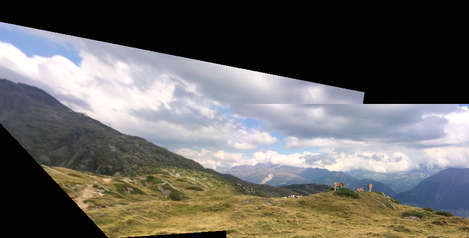
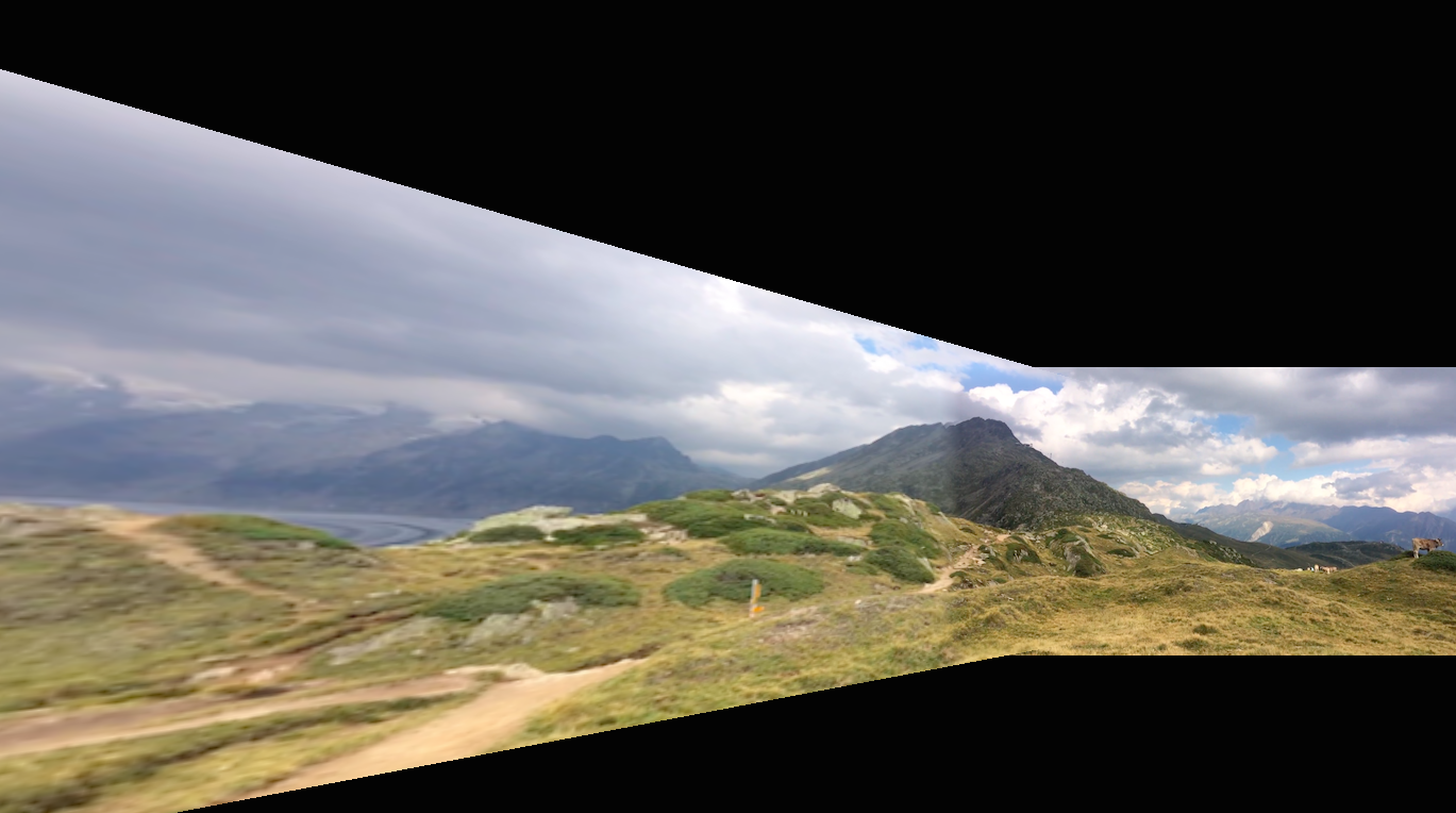
As you can see, the horizontal edge is extremely apparent here. Let's apply our additional vertical feathering here as well!
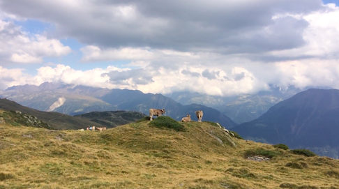
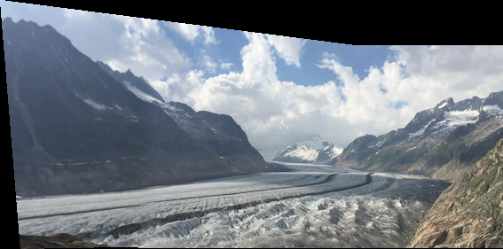
I really like this result. The additional feathering makes a huge difference. And no hike is complete without seeing some happy Swiss cows!For the remaining examples, I will only show the result with both horizontal and vertical feathering.
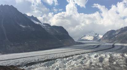
Can you catch a glimpse of the glacier over yonder?
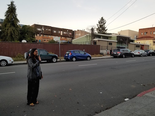
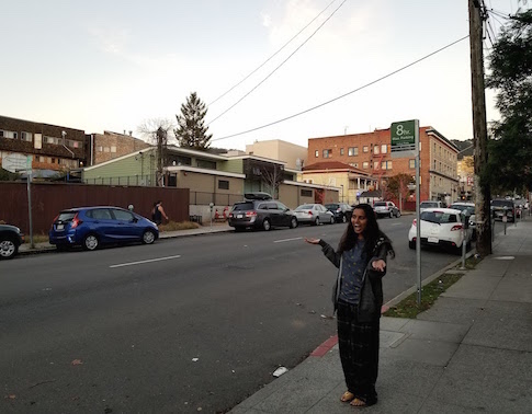
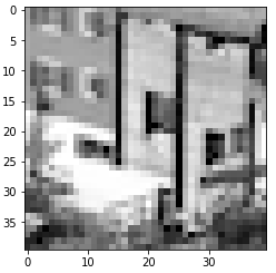
Our journey has come to close and we find ourselves back in Berkeley. As a cute little bells and whistles extension, I decided to have some fun with this powerful mosaicing tool.Here I am (in my PJs) reuniting with... myself?
Due to my phone's automatic brightness settings, the picture on the left is noticeably brighter than the one on the right. As a quick fix to this issue, I brightened the second image, and re-ran the algorithm. Here is the brightened version of image two and the mosaic result:
I enjoyed this project quite a lot. It was fun to see these images come to life with the added perspectives. I also learned (from personal hiccups) that certain images do not work quite as well. For example, I learned about the relationship between distance and perspective from the Lucerne photo, which I explained in detail in the rectification section. Another small issue I had when stitching together my Berkeley images was difference in brightness. Clearly differences in brightness result in a less realistic output, and it would be nice to implement a mosaicing algorithm that is not sensitive to differences in brightness. During Part B, I believe I will get a chance to explore this further!
Part B Overview:
So part A was super cool. But wouldn't it be even better if we didn't have to mark corresponding points by hand? That is the purpose of part B of this project. We use a Harris corner detector to find the most "corner-y" pixels in the image. Furthermore, we use a technique called ANMS to select points that are spread out and have maximal strength. Then, we extract small feature patches around our chosen corner pixels, and use nearest-neighbor techniques to match features between the two images being stitched together. Finally, we use an algorithm called Ransac to deal with outliers and find a stable homography. Let's revisit our favorite hotel in Bettmeralp.
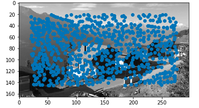
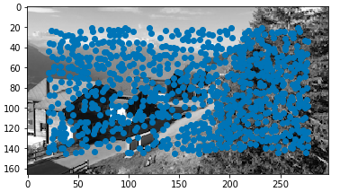
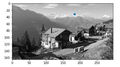
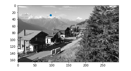
Note that auto-aligning does not depend on color, so these images will be in black and white. The idea with the Harris corner detector is that at a corner, moving a little window in any direction changes the image quite a lot as opposed to an edge (no change along edge direction) or nothing at all (no change in any direction). Here are the images with all Harris corners overlayed.
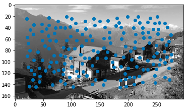
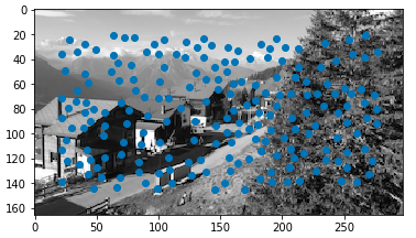
That's a lot of points... We want a more uniform spread of points while still maximizing "edginess." We use an algorithm called ANMS which accomplishes this by finding each point's minimal suppression radii. Then, we take points with the largest radii up to the desired number of points. This means we take the points who are biggest in their "neighborhood." Here are the images with only ANMS corners overlayed.
Now we have a handful of corner-y points in each image, but we need to pair them up. To do this, we should extract small patches around each point to compare against patches in the other image. The idea here is to take a simple 40 by 40 patch around the pixel and subsample it to an 8 by 8 patch. Note that we assumed the images would not need any sort of rotation invariance. Finally, we bias normalized our patches. Here are some strong examples of the patches and the resulting features.
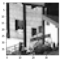
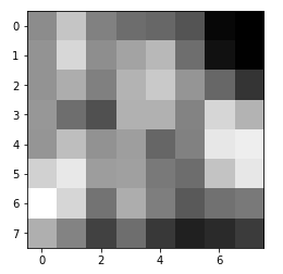
Note that because I used fairly low resolution images, in my actual mosaicing code I started off with a 16 by 16 patch instead of 40 by 40 because otherwise the patches were far too large with respect to the whole image.
For this step, you find the first and second nearest neighbors for each feature descriptor. Using an algorithm we learned anecdotally as the "Russian Granny Algorithm," you only want to include matches whose first nearest neighbor is much better than the second. Therefore, I sort the feature matches by the ratio of the 1-NN to the 2-NN, and take the best ones. Here are some examples of matches.
The last step to compute the homography is RANSAC - Random Sample Consensus. This helps us deal with outliers and use our auto-generated matches to agree upon a single homography. Remember that the homography is described by only four points. Thus, we repeatedly take a random sample of four matches, compute a homography based on those four points and determine which of the remaining points are inliers with the homography. We take the largest set of inliers after many iterations, and use least squares to compute the homography after that. Finally, we are ready to mosaic some images!
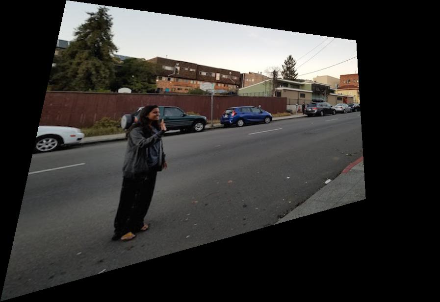
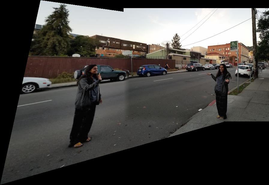
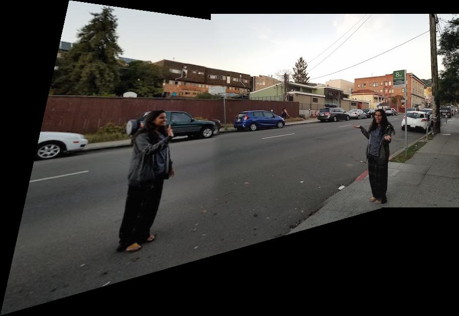
Here are the final mosaic results, with the part A hand-defined correspondence result on the left and the part B auto-stitched result on the right.
The above two sets of images are fairly similar. I believe this is because they are both landscape shots where the focus is farther away, so minute shifts are not noticeable. If you look closely, however, the glacier is slightly better aligned in the auto-stitched version on the right.
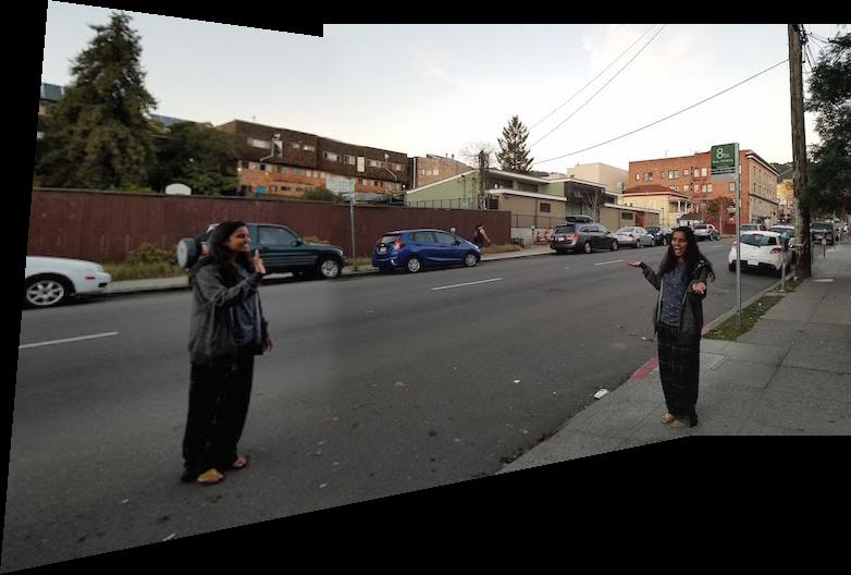
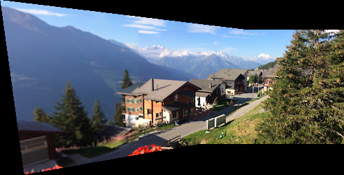
This is my favorite result. The difference is a lot more apparent. For example, in the hand-determined version, the sidewalk wedges awkwardly at the border of the two images. The auto-alignment handles this a lot better - there is hardly any misalignment with the sidewalk at all. Additionally, the green car in the back is a lot better aligned in the auto version.
I've always been quite amazed whenever Google Photos took my photos and automatically generated a panorama, without any additional information besides just the images themselves. It was very fun to be able to replicate that in this class. My favorite part was probably RANSAC because it is such a simple and intuitive, yet very powerful idea. Outliers are usually not adverserial in this sort of scenario, and would therefore not agree amongst themselves. Thus, taking "votes" to determine who's in and who's out is a wonderful idea.