Nicole Rasquinha and Alex Krentsel
Computational Photography
Project 7: Final Projects
Overview:
For our first project, we decided to do seam carving. There are many times that we want to be able to resize images. The standard way to resize an image (usually to make it smaller) is to remove rows/columns one by one until we reach the desired size.
For seam carving, we still take the same discrete steps - making the image 1 pixels shorter or thinner - until the image gets to the desired size, but instead of cutting out rows or columns, we take out “seams.” We define a seam as a series of pixels traveling either horizontally or vertically across an image, such that there is only one picture per row (or column), and each subsequent pixel is either one to the left, below, or one to the right of the previous pixel (for the vertical seam case).
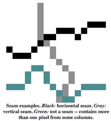 We find the best seam to remove by looking for the seam with the lowest total energy. There are many ways to define energy, but the way we used is the sum of the squared deltas between adjacent pixels in all colors. So for a particular pixel, we calculate its energy by looking at each color channel, and summing the squared difference between that pixel’s value and the values of the pixels above, below, to the right, and to the left.
Here is the original image.
Now, let's say we want to get rid of some of the background. Let's carve away 50 of the columns! This will reduce our image's x dimension by 50.
Looks good! The seams taken out were predominantly unimportant, low-gradient background pixels. We, the subjects of the photo, remain un-warped. Let's take it even further -- 100 columns off!
Still looks pretty good. However, at this point, the gradient in the sky becomes a lot more apparent. Let's see what happens when we remove rows instead! From left to right: original, 50 rows off, 100 rows off.
Just like in the column case, the 50 rows off image looks very good, but with 100 rows off, things start to break down. In fact, the result is even more drastic than with the columns since the image had more columns than rows to begin with.

Woof.
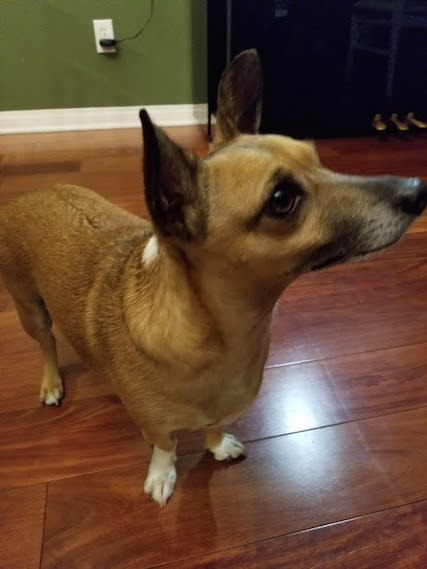
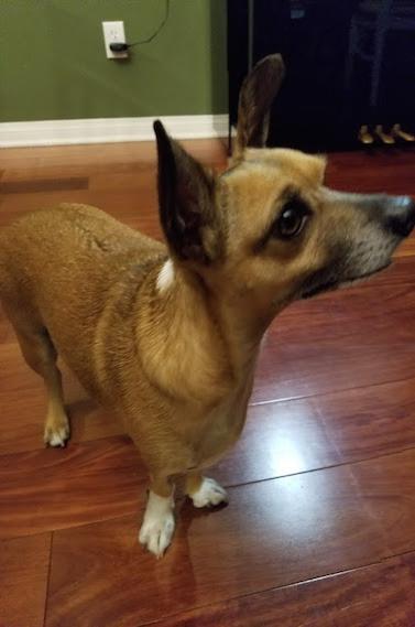
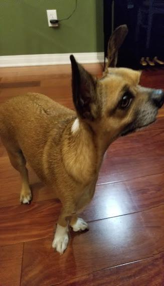
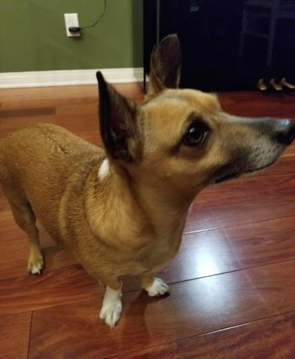
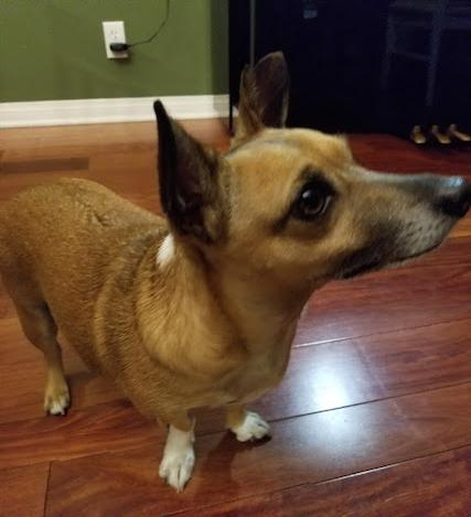
Woof.
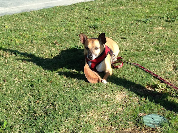
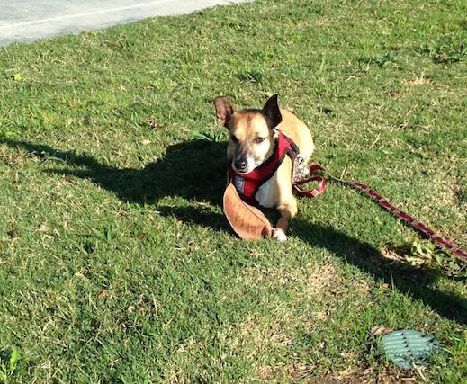
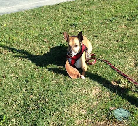
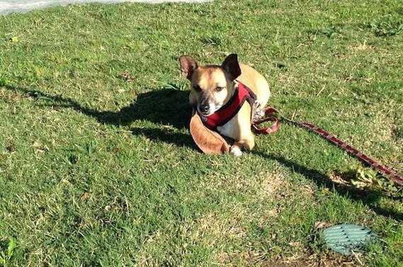
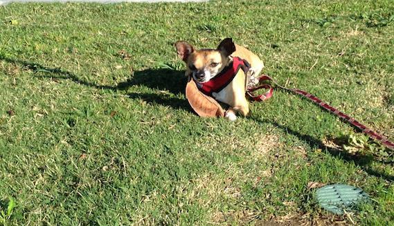
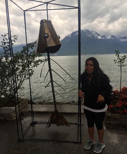
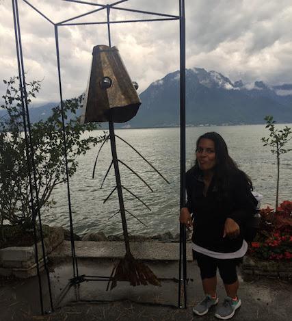
Here is a failure case. We believe this image did not work out so well because there is a lot of detail in the foreground. Even the images of Cadbury (my dog) suffer from this a little since Cadu takes up a large portion of the image and the background is grassy (so it has some edges). Since my outfit is very dark, and thus gradients are smaller in the shadow-y range, I am selected as the minimum vertical seam often. The result is quite strange:
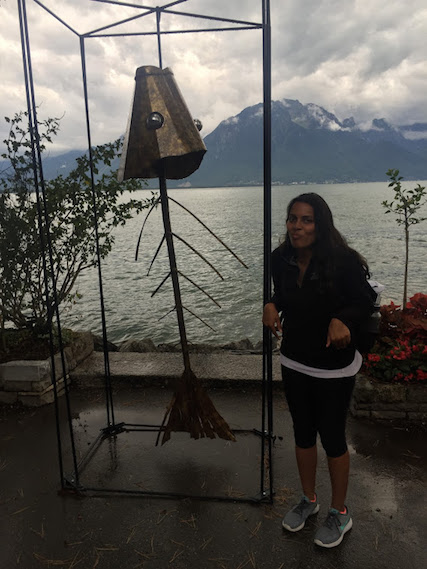
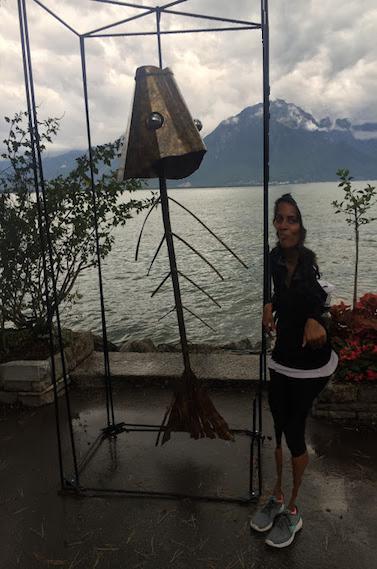
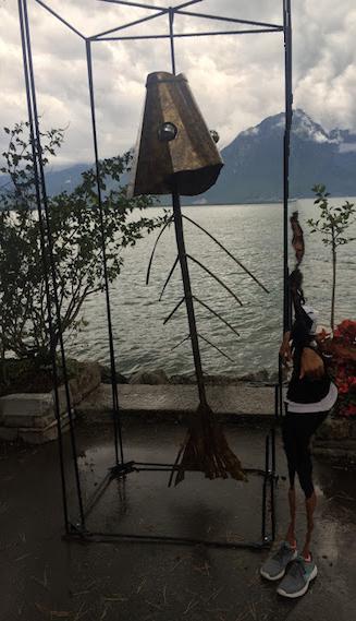
Since my leggings are black and I am standing with my upper legs quite close together, that portion of my body is selected on many of the minimum horizontal seams. Therefore, the resulting images make my legs appear shorter and shorter:
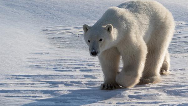
This image when removing vertical seams also did not work so well because of the many horizontal edges in the snow. Thus, the seams preferred going through the bear rather than through the background.
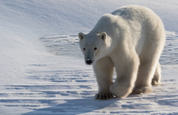
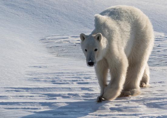
The horizontal seams worked much better since they go in the same direction as the snow edges.
Overview:
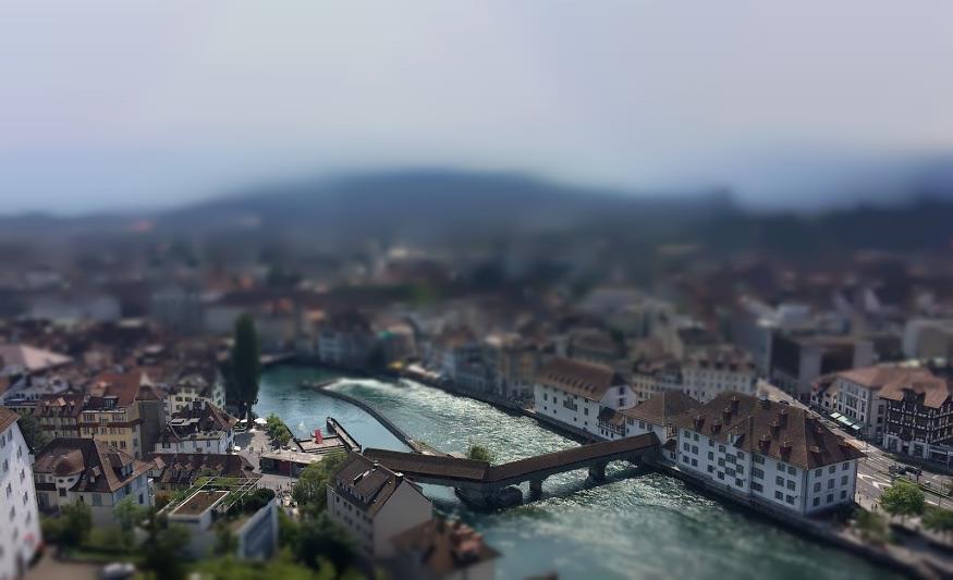
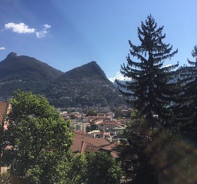
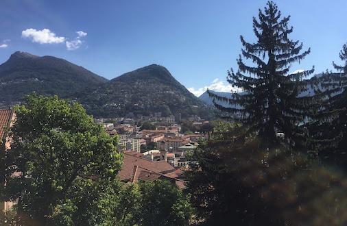
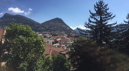
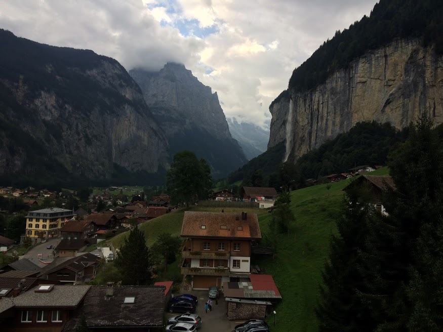
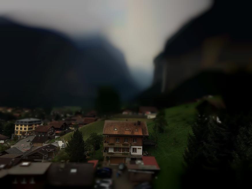
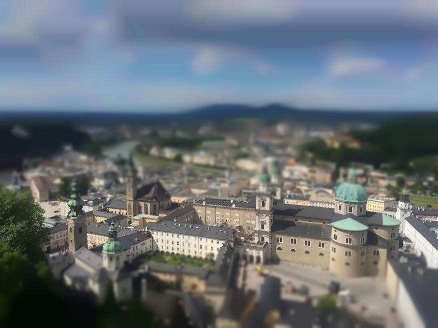
For our second project, we decided to do fake miniatures. For fake miniatures, we take full sized images (of cities, landscapes, etc.) and manipulate them to make them look like photos of a miniature model of the place. We do this by choosing a center of focus and increasingly blurring the image farther from the center of focus to make the image seem focused on a small part. In this way, it makes it seem like the picture is of a miniature replica, as the focus (and lack of focus around it) imply that the scale must have been small. There are four main steps. First, we provide a focus line, which will be the center of the part of the image that is not blurred. Then, we set a depth of field, which will be how much around the focus line isn’t blurred. Next, we blur the image, blurring each pixel more the farther it is from the focus line (+ the depth of field). Finally, to make theimage look more miniatured, we play with the saturation, increasing it slightly.
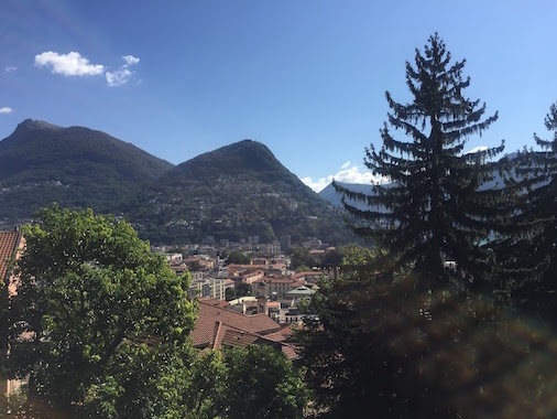
This image was taken from the project spec itself as a sanity check that our algorithm works well. Here is the original image.
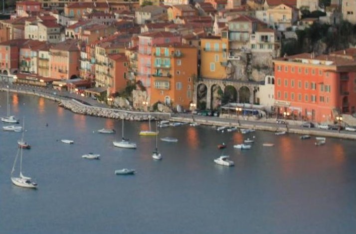
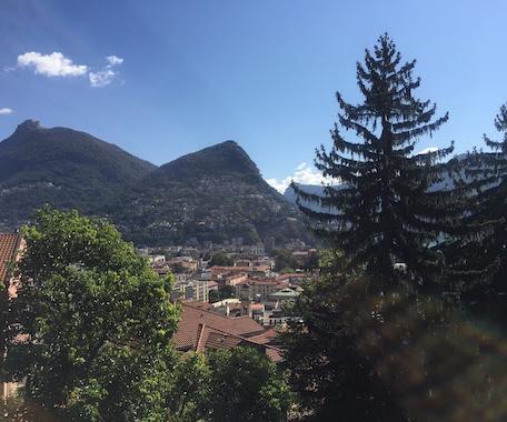
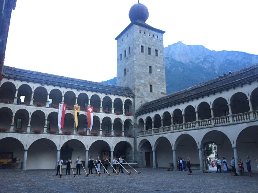
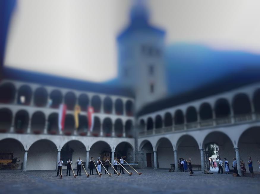
Here is the result focusing on the chunk of rows around the road.

This looks pretty good already. But to make it look even more miniatured, we can adjust the saturation, yielding this result:
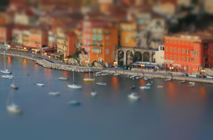
I think the result is very good, and the saturation and blurring levels we chose appear to look even better than the spec. Let's see some more examples. For all following examples, we'll only show the final version (with both blurring and saturation adjusted), leaving out the image without saturation adjusted.
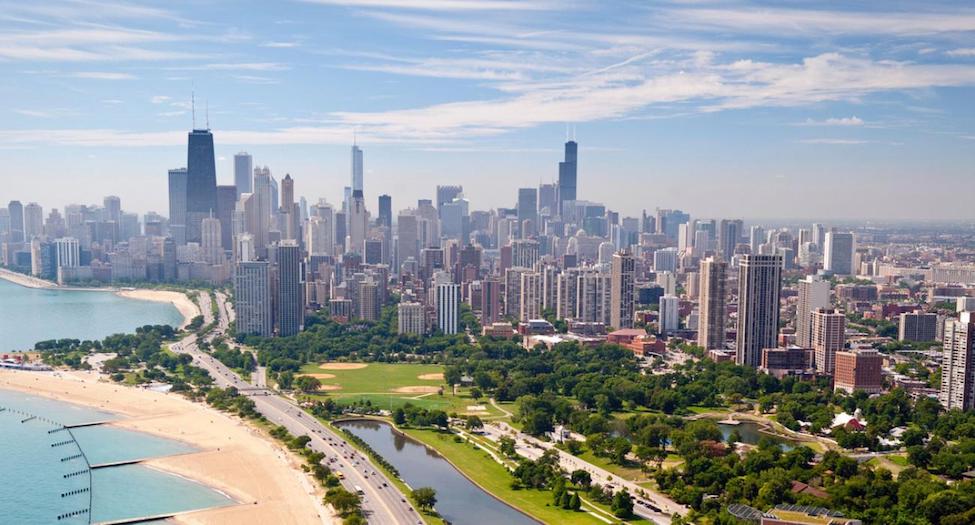
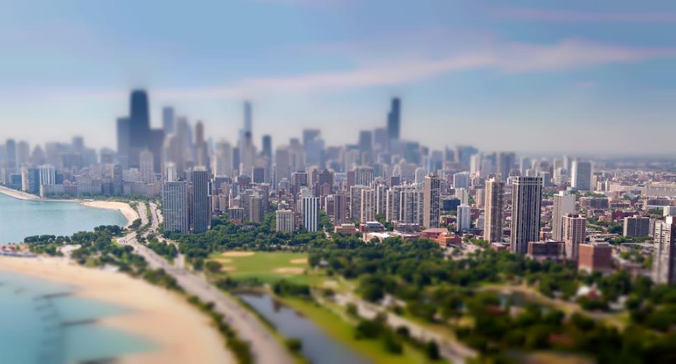 Image Source
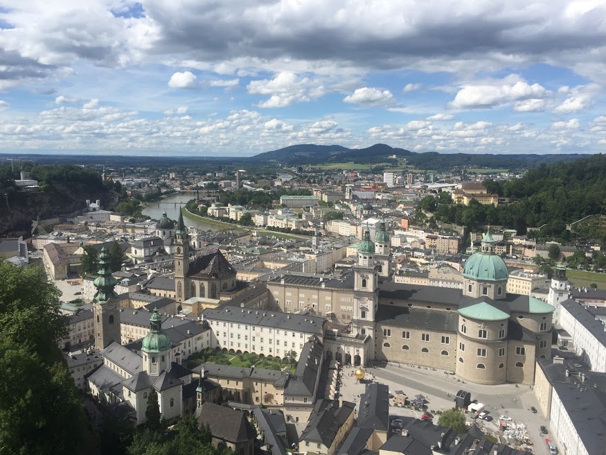
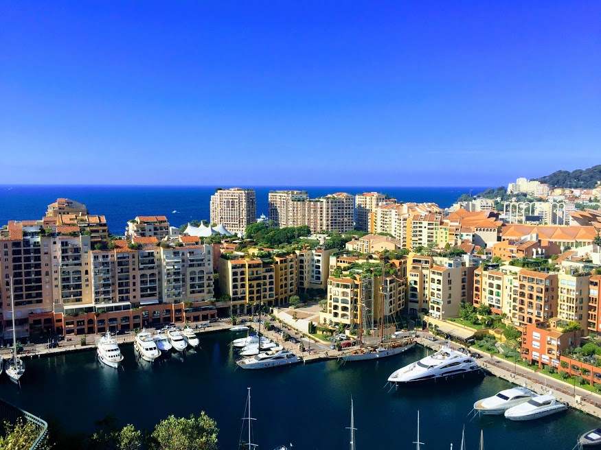
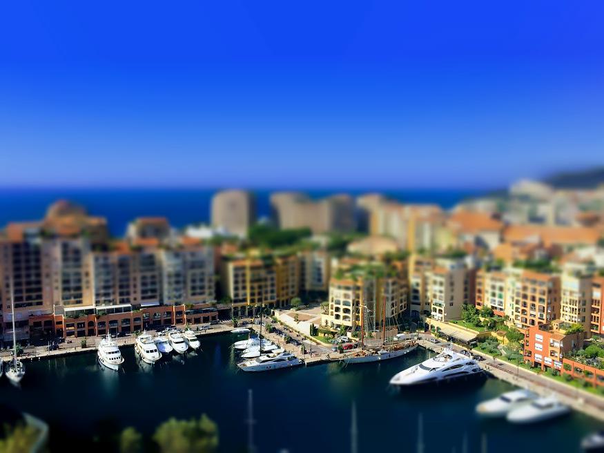
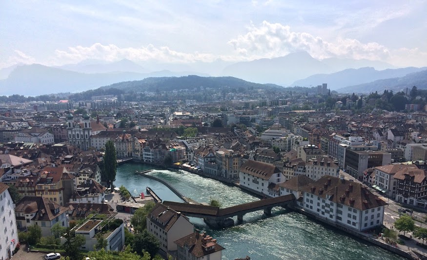
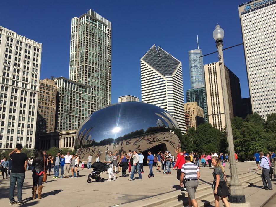
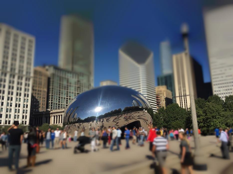
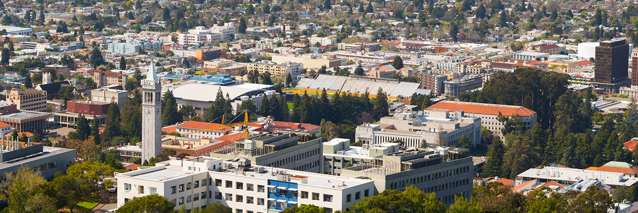
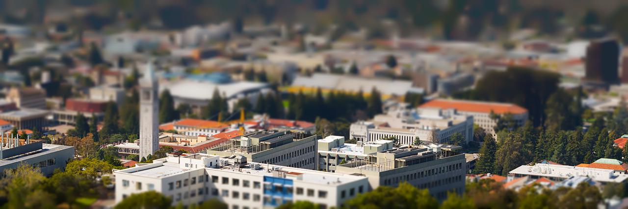 Image Source
Here is our failure case for this project. There isn't much depth in this image, and there's a building that spans the entire image vertically, making it a poor candidate for fake miniaturizing.
Overview:
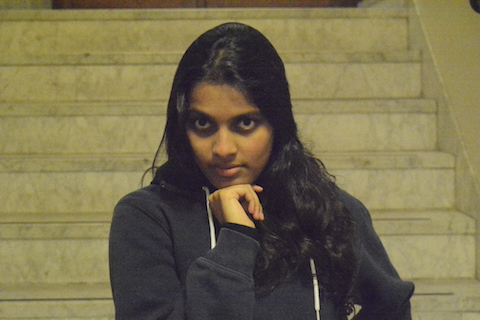
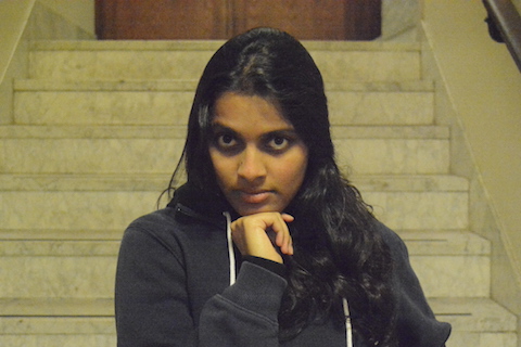
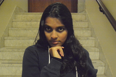
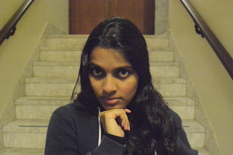
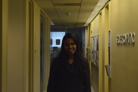
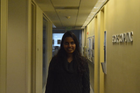
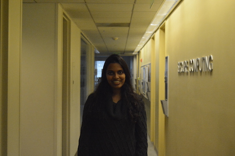
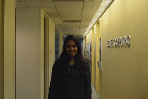
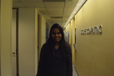
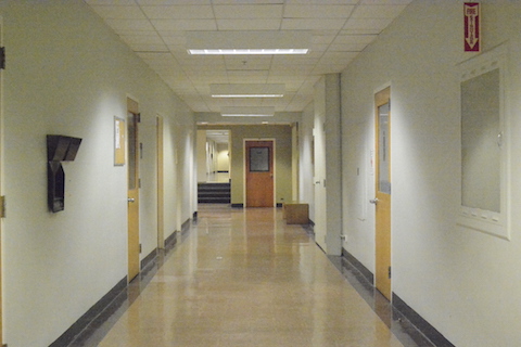
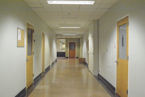
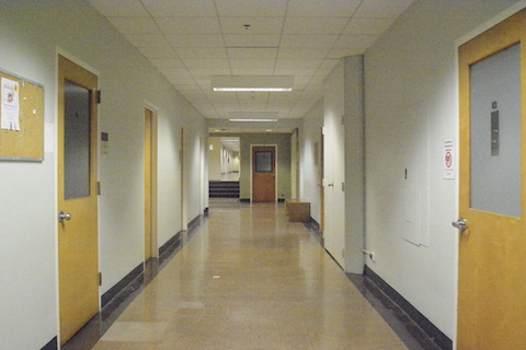
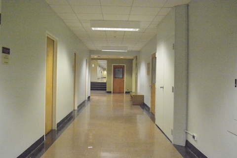
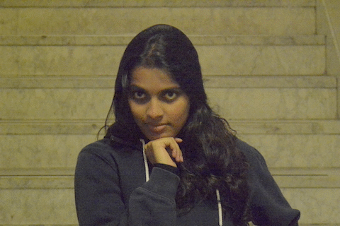
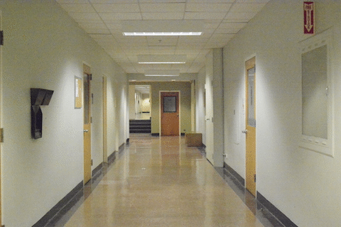
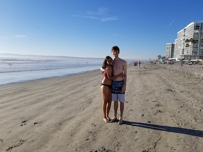
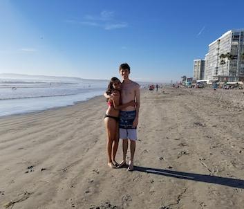
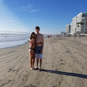
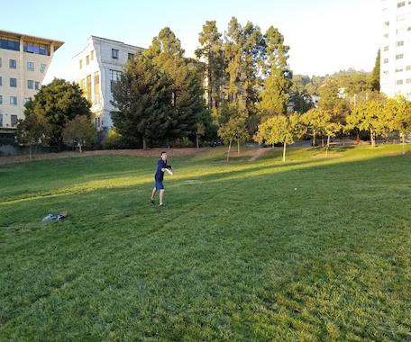
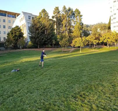
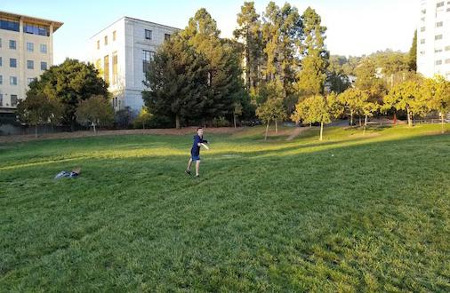
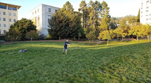
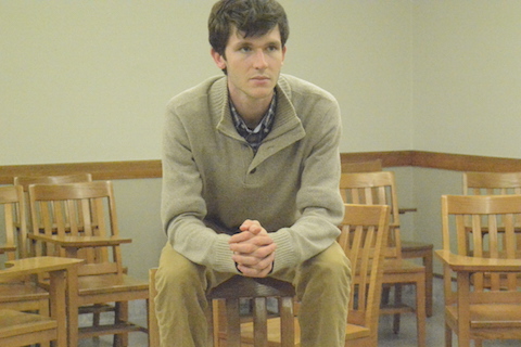
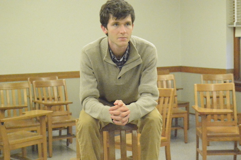
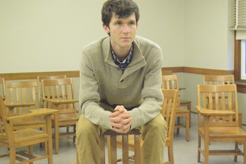
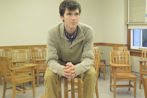
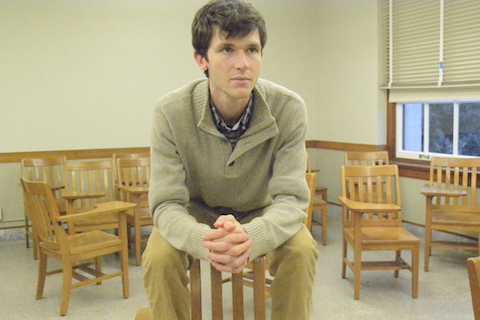
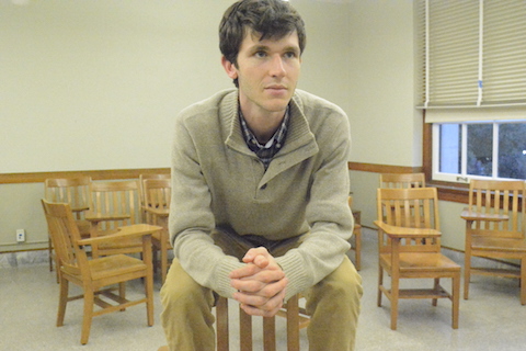
For our final project, we decided to do the Vertigo Shot project. The Vertigo Shot is named after the movie, Vertigo, where this shot was used most famously. To do a vertigo shot, we first start out far away and zoom in on the subject. We take a picture there, then move in, closer to to the subject, zooming out as we get closer. In this way, the subject stays the same size in the frame of the image, but the background keeps warping as the field of view changes. The effect is pretty cool. The background stretches or warps while the subject stays in the same place and the same size throughout the shot. In the movies, this was done with a camera on a rolling trolly with continuous zoom, but for this project, we take still images, varying the zoom each time. For Bells and Whistles, we combine the images for each of our sequences into GIFs.
We used a Nikon D7100 Digital SLR Camera to take our photos. We took two sets of photos in hallways (one with Nicole as the subject on the 7th floor of Soda, and one with a door as the subject in Dwinelle), one set of photos with Nicole as the subject in front of a staircase, and then one set of photos with Alex in an empty classroom in Wheeler Hall. It was difficult to find the right amount of lighting. A lot of shots that we took were underexposed and so we had to bump up the ISO. It was also hard to keep the subject in exactly the same place between pictures (as evidenced by the GIFs) after moving closer or farther away.
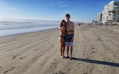
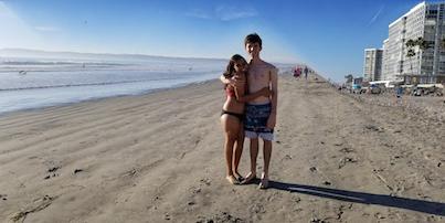
Here are the images of Alex starting from farthest away and highest zoom, moving to closer and less zoom.
Very cute! Let's see some more examples.