


All images were photographed by me, unless stated otherwise.
The tilt shift is an effect that simulates a miniature scene from a scene of any size. By narrowing the apparent depth of field of an image, we can create an illusion that the camera lens is much closer to the subject than it actually is, creating the feeling that the subject is actually miniature.
First we select a line in our image to be our focus line. The focus line will be a region in the image that remains focused. We also pick a point above and below the line to indicate the width of the band around the focus line.
We then create masks of bands centered at the focus line. We use these masks to selectively blur parts of the image with a gaussian filter, with bands further away from the focus line being blurred more. We then take each of these pieces and blend them together using gaussian blending with a blurred alpha mask.
Finally, we increase the saturation of our resulting image by converting it into HSV format and multiplying the saturation by a scalar.

There are many hyperparameters to tune for this project. Here we present images that we obtained using hyperparameters that produced "good enough" images.
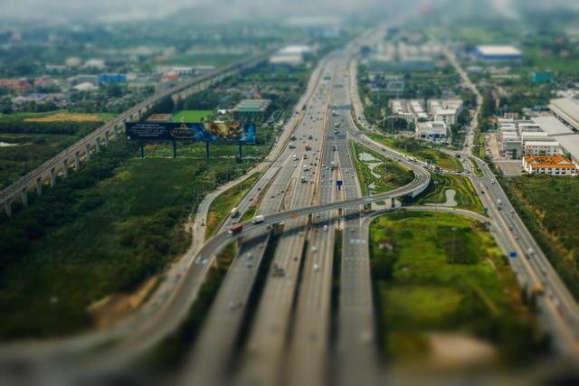
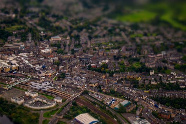
Two of the images were obtained online. The image of Stirling City Center was taken from from here, and the image of Bankok Highway was taken from here.
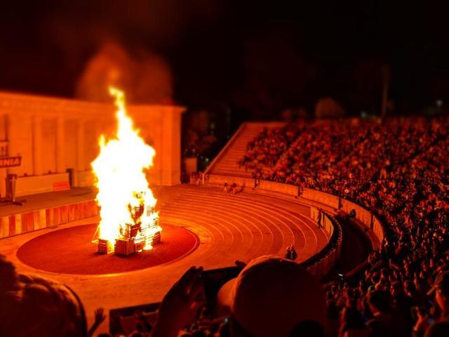
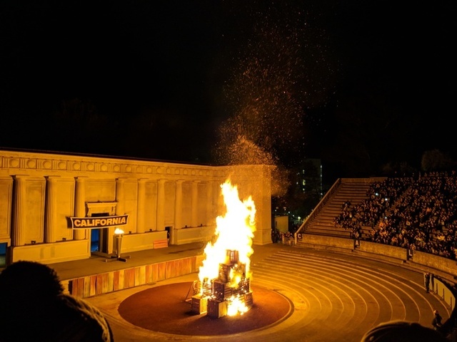
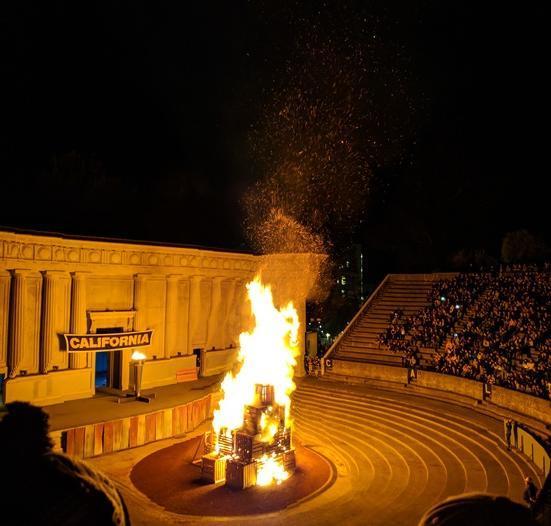
| Big Game Bonfire | Fake Miniature |
 |
 |
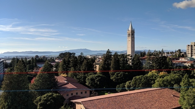
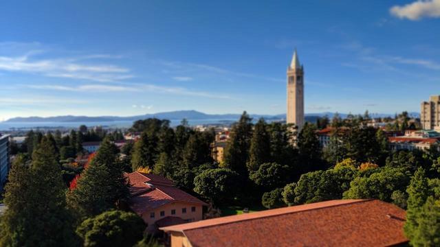
| Campanile | Fake Miniature |
 |
|
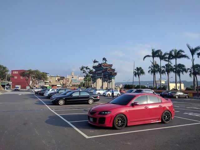
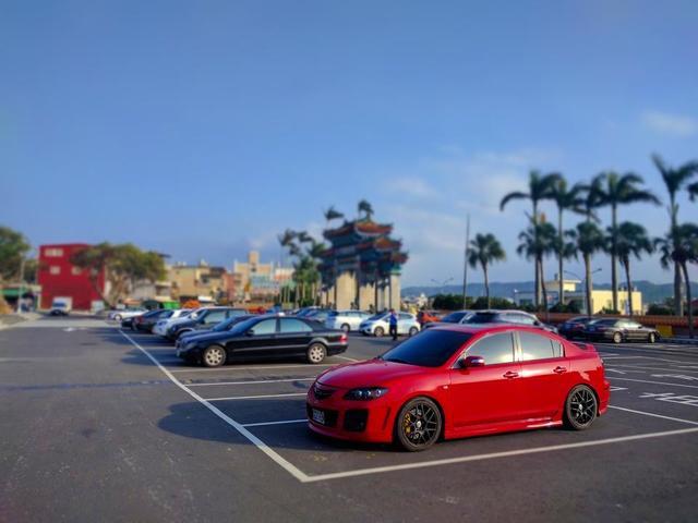
| Car | Fake Miniature |
 |
 |
| Glade North | Fake Miniature |
 |
 |
| Glade West | Fake Miniature |
 |
 |
| Bangkok Highway | Fake Miniature |
 |
 |
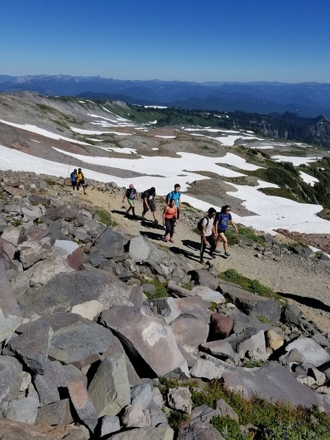
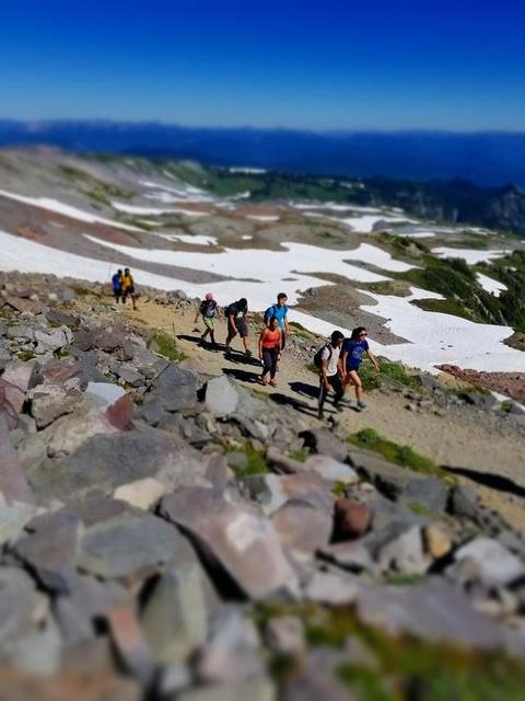
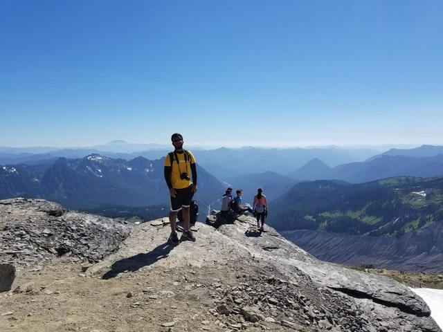
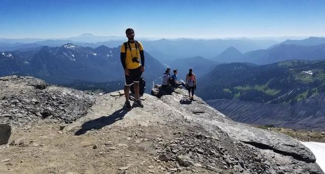
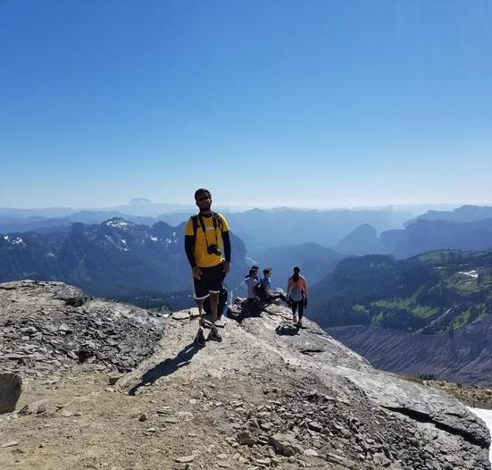
| Hiking Rainier | Fake Miniature |
 |
 |
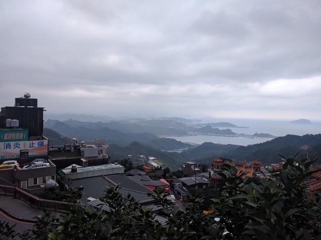
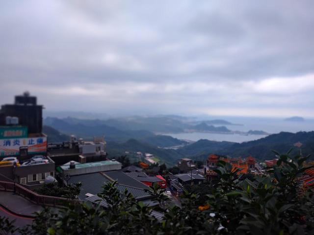
| Jiufen, Taiwan | Fake Miniature |
 |
 |
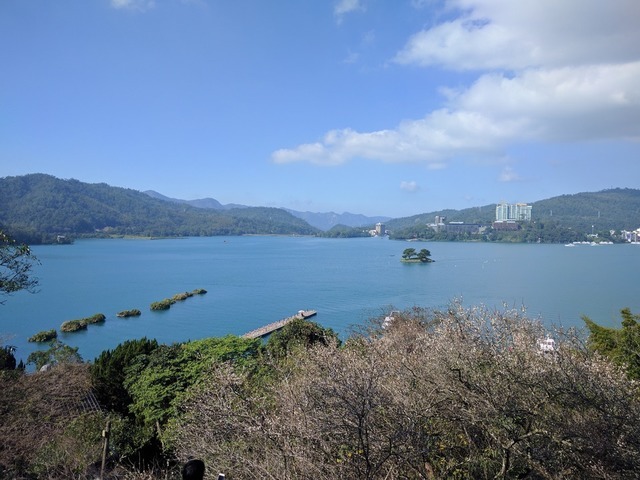
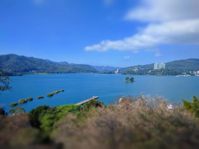
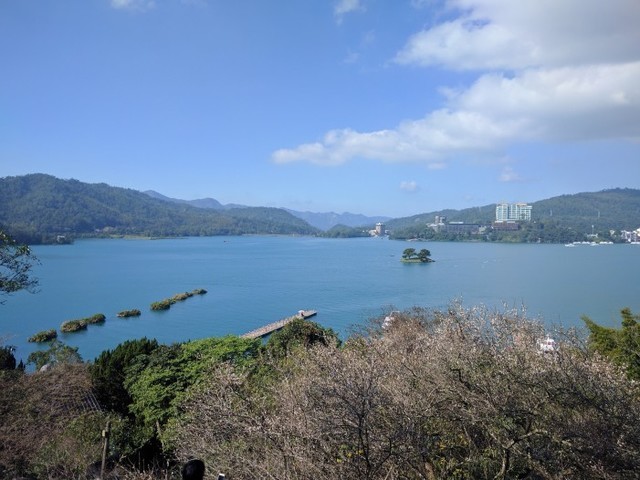
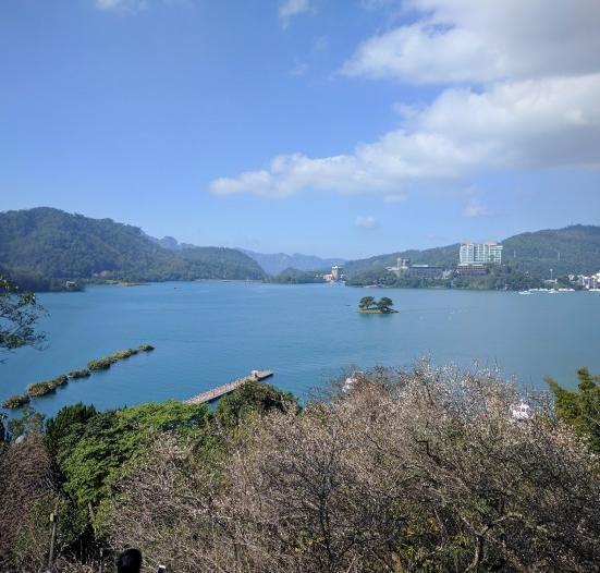
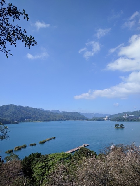
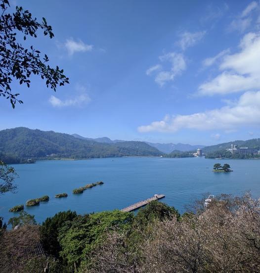
| Sun Moon Lake, Taiwan | Fake Miniature |
 |
 |
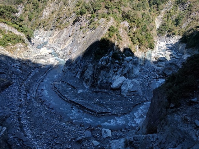
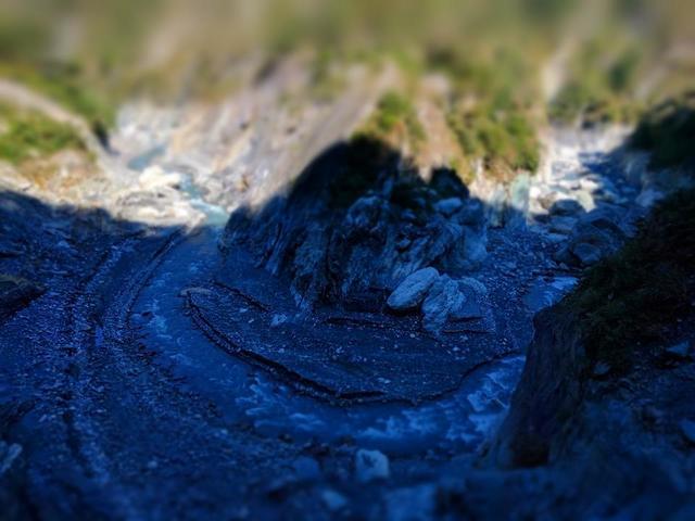
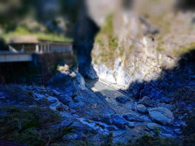
| Riverbend at Taroko Gorge, Taiwan | Fake Miniature |
 |
 |
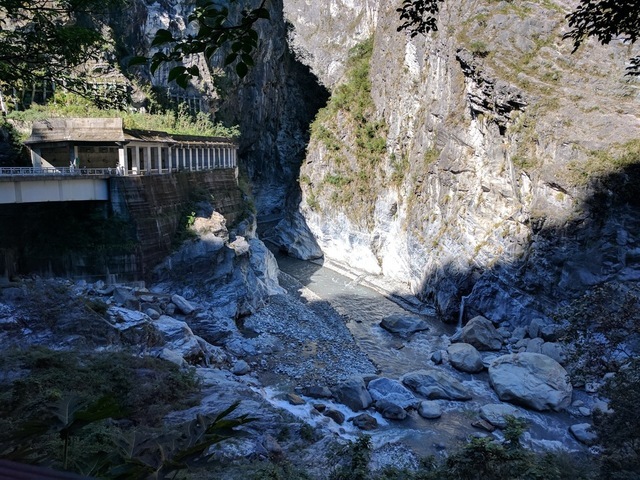
| Joining Rivers at Taroko Gorge, Taiwan | Fake Miniature |
 |
 |
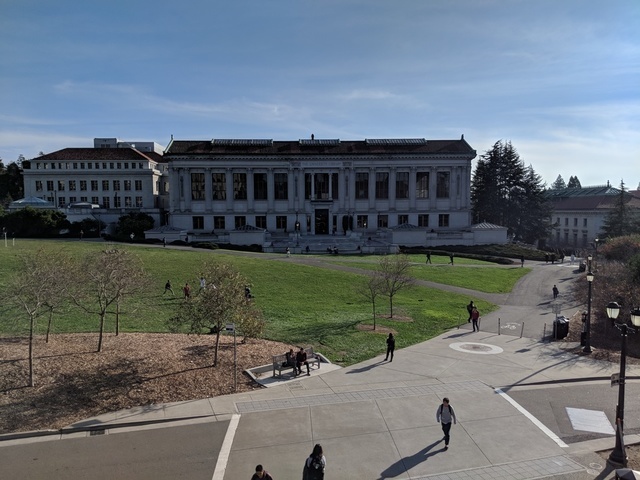
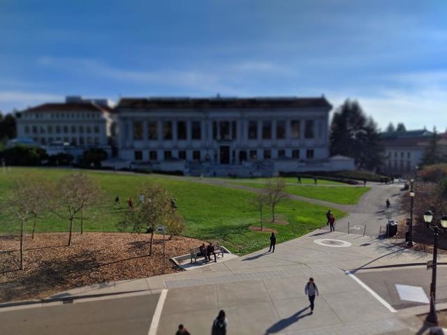
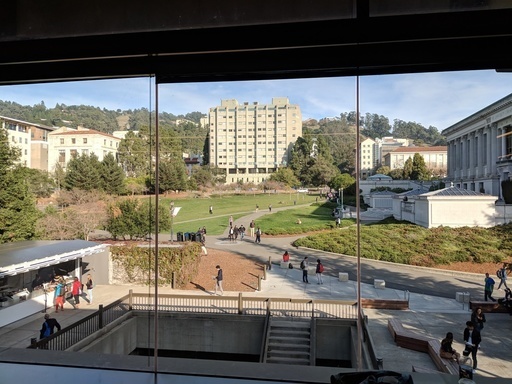
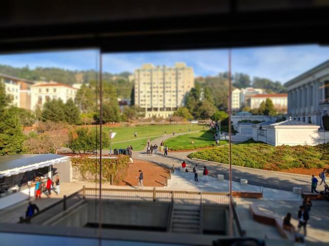
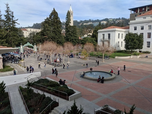
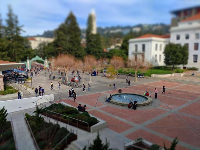
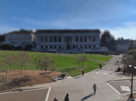
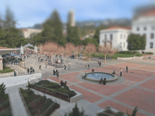
| Sproul Plaza | Fake Miniature |
 |
 |
| Stirling City Centre, Scotland | Fake Miniature |
 |
 |
It's harder to mimic a miniature when you have objects that take up a lot of vertical space in the image. Since we use height as a proxy for depth, these objects end up being partially blurred, even though they're completely at the same depth. I had to use constant blurring outside the focus line for my Campanile image to address this, but the effect is still visible in the bonfire image.
As a consequence, images work best when the objects occupy very little vertical space and when your image is from a higher point of view. Higher points of view also provide more space for simulating depth to make the miniature more convincing.
For bells and whistles I took a series of pictures from a relatively high vantage point and created a fake stop motion animation. There are some issues with the animations because my smartphone adjusted color exposure settings throughout the pictures. The gifs have been reduced in size to meet the upload limit.
| Memorial Glade from SSEAL |
 |
| Memorial Glade from Moffit Library |
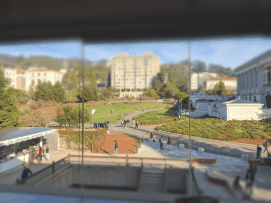 |
| Sproul Plaza from MLK Terrace |
 |
The main idea behind seam carving is that images can be condensed by removing pixels that are less important than others, especially when contributing to the subject of the photo. If we assign each pixel an importance using an energy function, we can use these values to find the seam (a path of pixels going between opposite edges of the image) with the lowest total energy and then remove it to shrink the picture.
In this implementation, the energy function assigned to each function is the sum of its vertical and horizontal gradients. That is, for every pixel, we take the difference in value between the neighbors above and below it, and to the sides of it, square the differences, then sum all of them together. We then use dynamic programming to calculate the lowest energy seam.
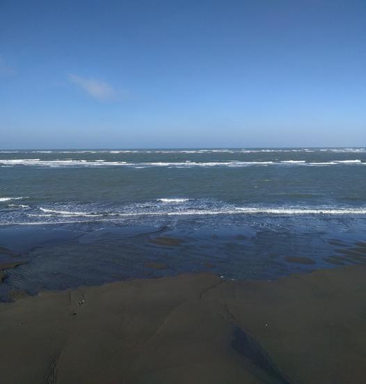
| Beach | 150 Horizontal Seams | |
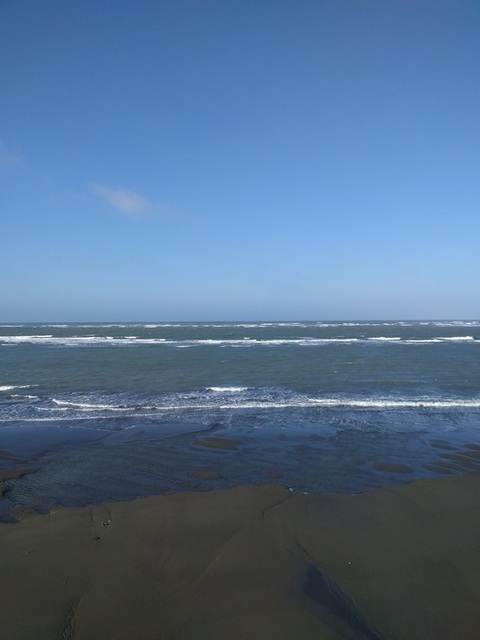 |
 |
|
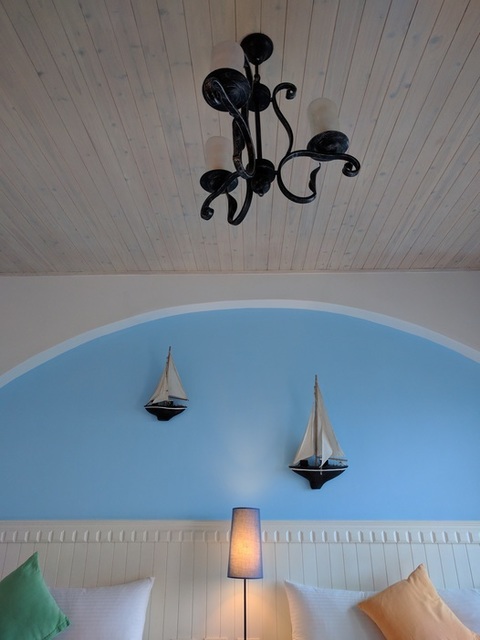
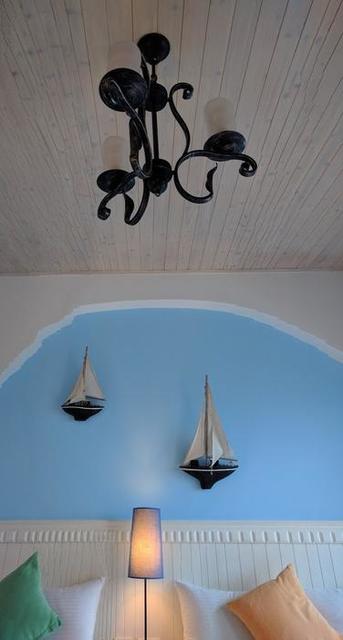
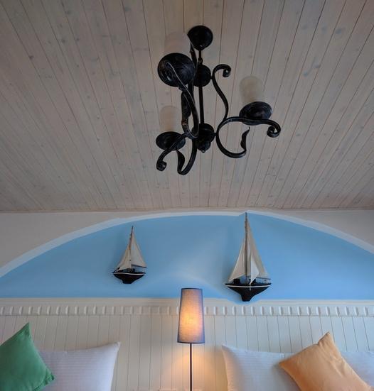
| Bedroom | 150 Vertical Seams | 150 Horizontal Seams |
 |
 |
 |
| Bonfire | 150 Vertical Seams | |
 |
 | \
|
| Chris | 150 Horizontal Seams | |
 |
 |
|
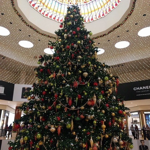
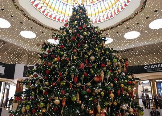
| Christmas Tree | 150 Horizontal Seams | 150 Vertical Seams |
 |
 |
 |
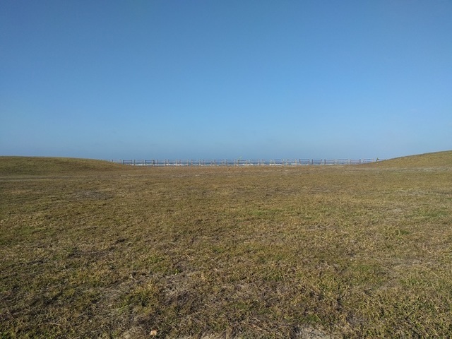
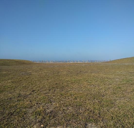
| Field | 150 Vertical Seams | |
 |
 |
|
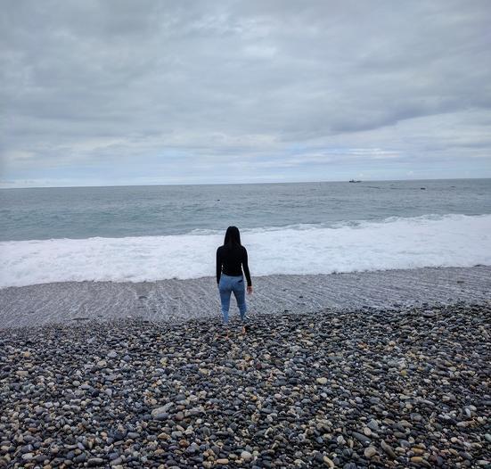
| Lake, Landscape | 150 Vertical Seams | |
 |
 |
|
| Lake, Portrait | 150 Vertical Seams | |
 |
 |
|
| Library Bridges | 150 Vertical Seams | |
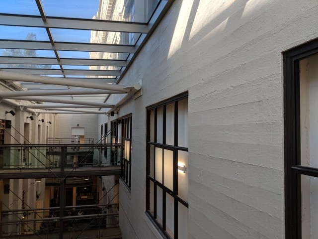 |
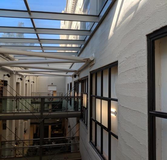 |
|
| Michelle | 150 Horizontal Seams | |
 |
 |
|
| Stones | 150 Horizontal Seams | |
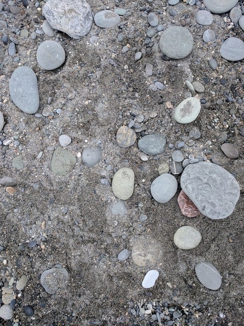 |
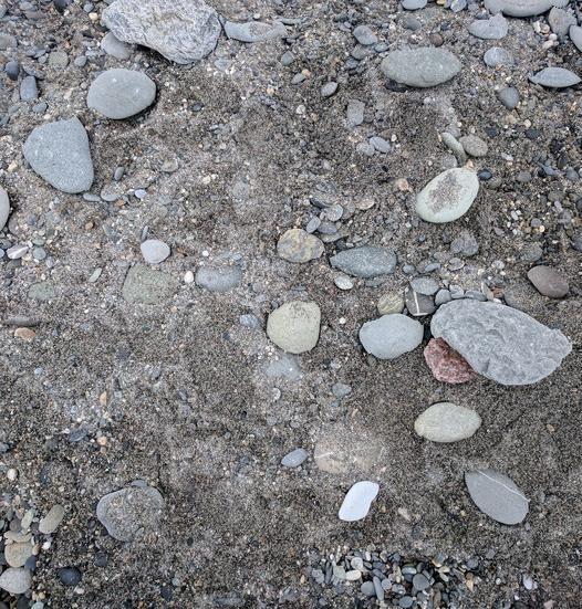 |
|
| Trunk | 150 Horizontal Seams | |
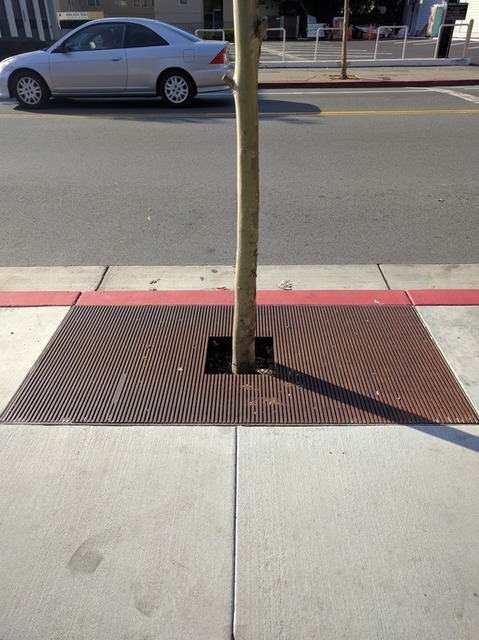 |
 |
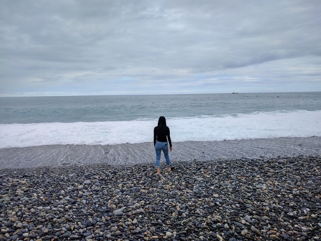
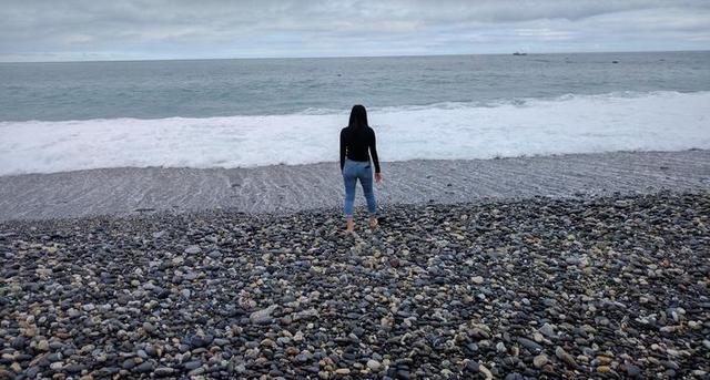
For the most part, these images are considered "relatively bad" because they don't preserve something about the image, like human legs or clearly straight walls.
| Chris | 150 Vertical Seams |
|
 |
| Library Hallway | 150 Vertical Seams |
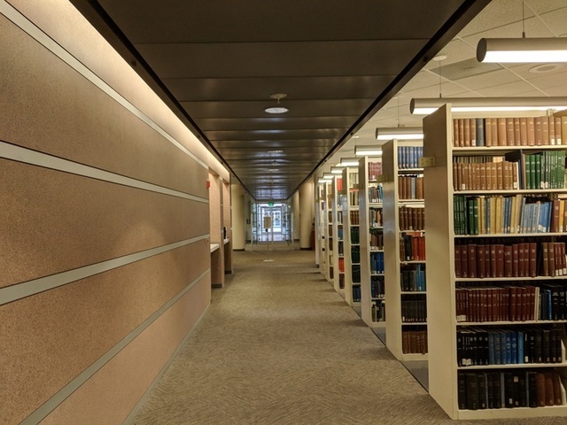 |
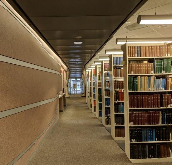 |
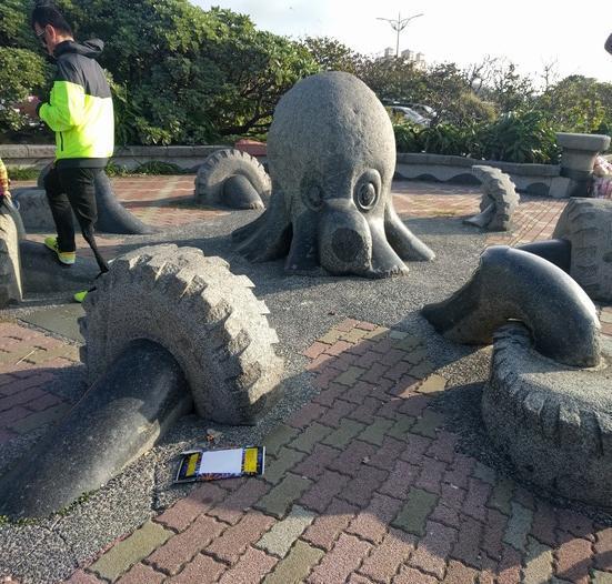
| Octopus Sculpture | 150 Vertical Seams |
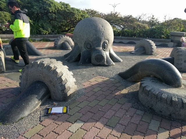 |
 |
| Michelle | 150 Vertical Seams |
|
 |
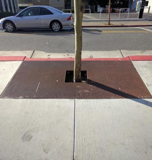
| Trunk | 150 Vertical Seams |
|
 |
Flat, homogenous regions are indeed usually cut out using seam carving. What was surprising is that for the pictures with people in them, the people's legs usually became very spindly. I suspect this was because legs were generally relatively large homogenous regions parallel to the seam direction. However, when using horizontal seams, the people were much better and untouched. This seems to indicate that seam carving behaves the worst when there's material parallel to the seam direction.