James Lin, CS194-26-abr
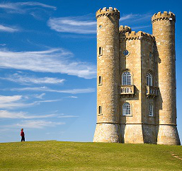
In close-up photography, the short distance between the lens and the subject causes the cone of light coming from a point on the subject to the lens to be very obtuse, which in turns decreases the depth of field.
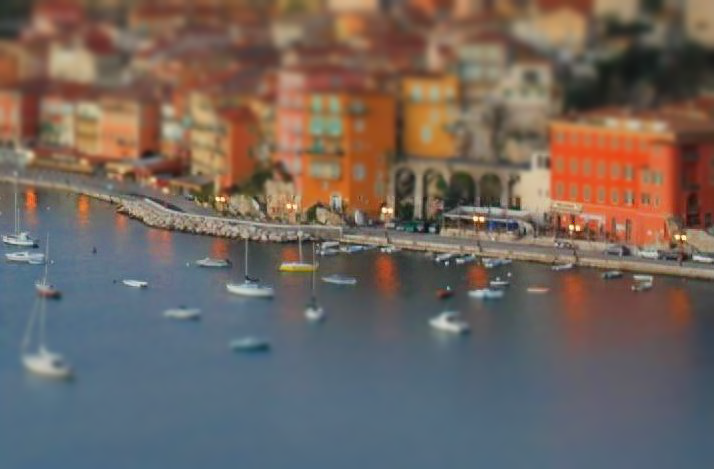
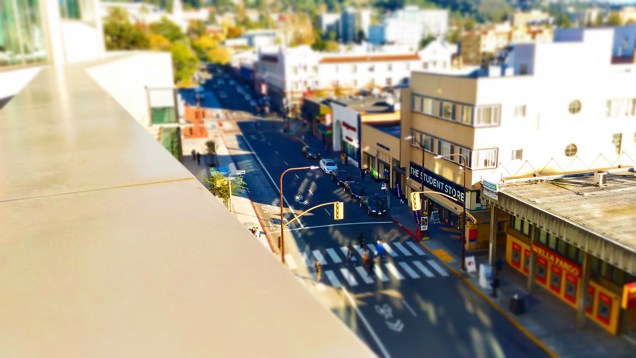
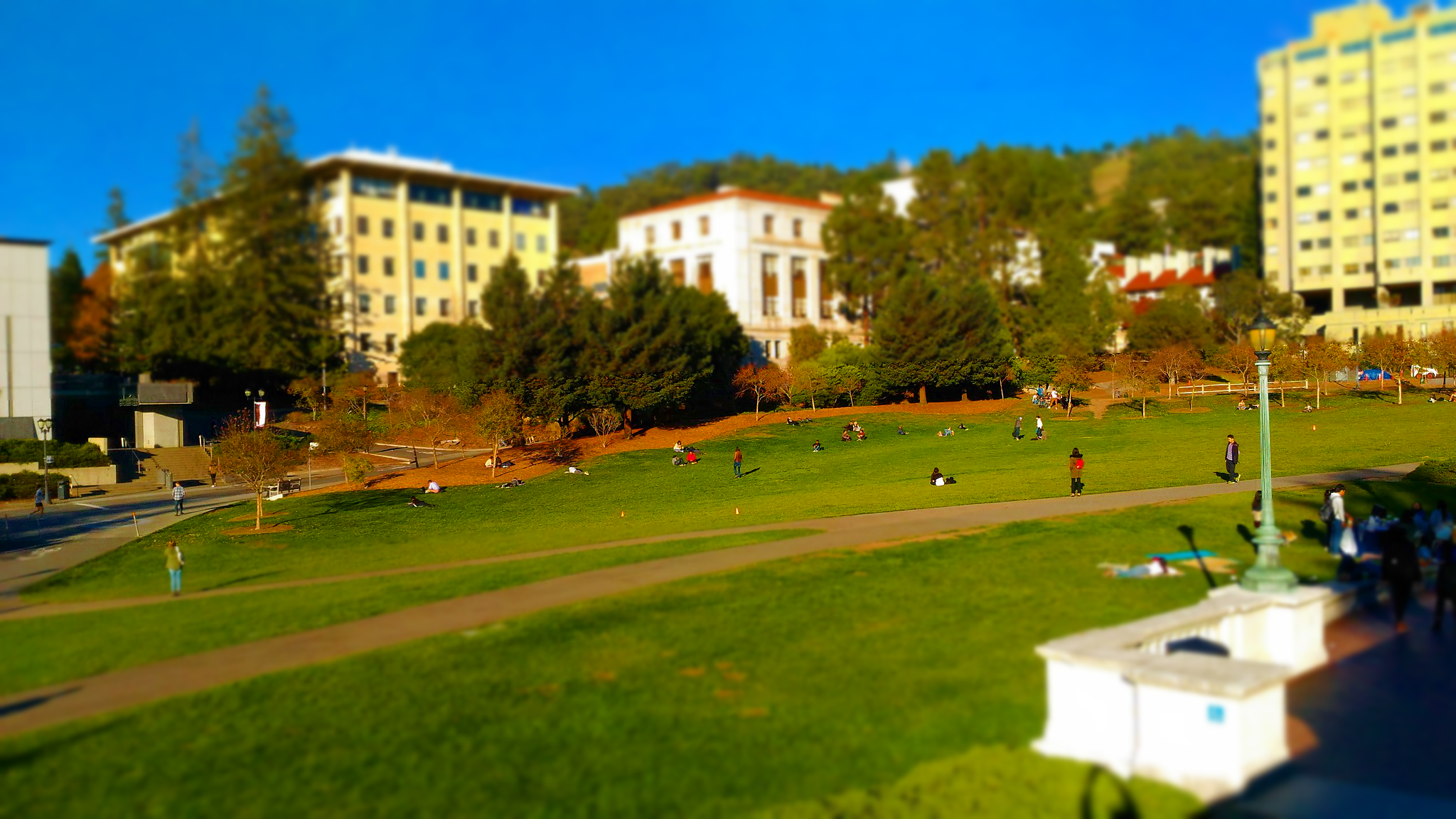
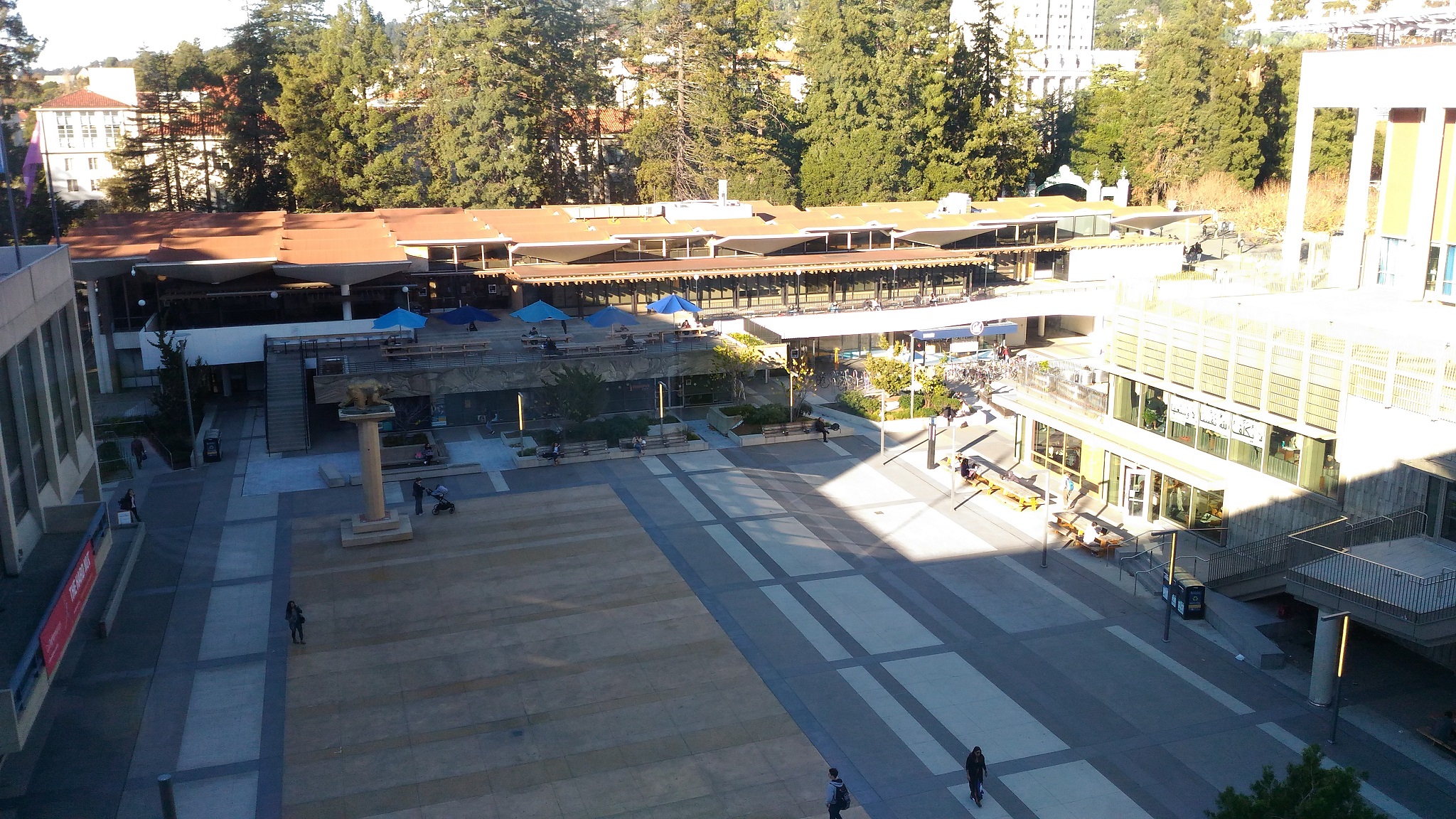
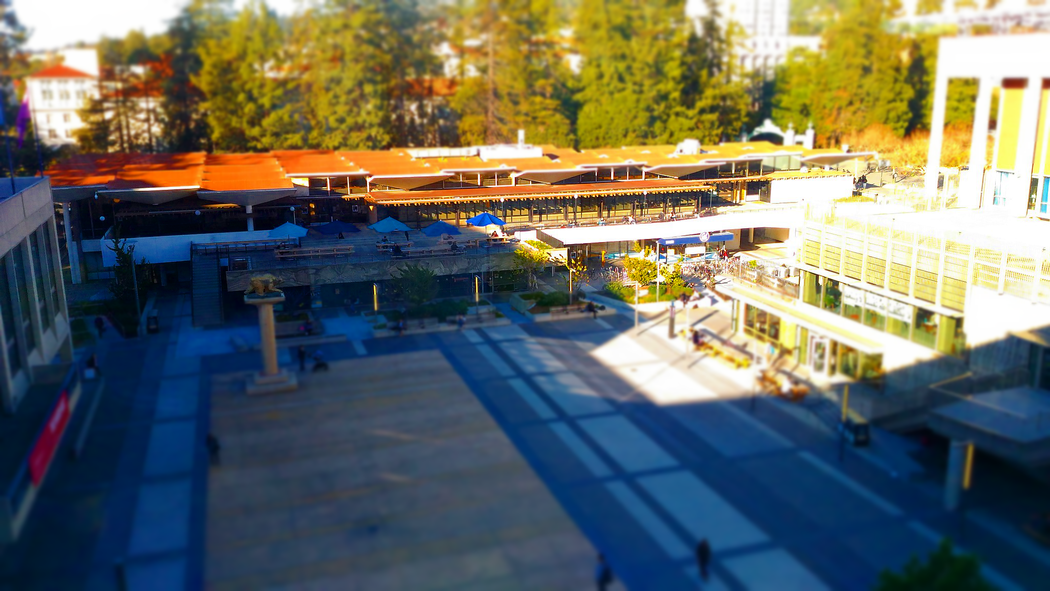
In miniature faking, we turn regular photos of landscapes or otherwise large objects into looking like figurines, or miniatures. We do this by defining a focus line and blurring the parts of the image distant from this line, which simulates the effect of a small depth of field.
The reason this works is because of an assumption we make of our images: that distance from the focus line roughly corresponds to depth from the camera. This sounds like a strong assumption, but in fact holds true for many landscape photos taken from high vantage points.
With regards to actual implementation, we construct a gaussian stack of the original image. Then we sample pixels from corresponding levels of the stack, depending on how close that pixel is from the focus line. The closer the pixel,the lower on the stack. We finish by saturating the image to give the illusion of the paint used for miniatures.
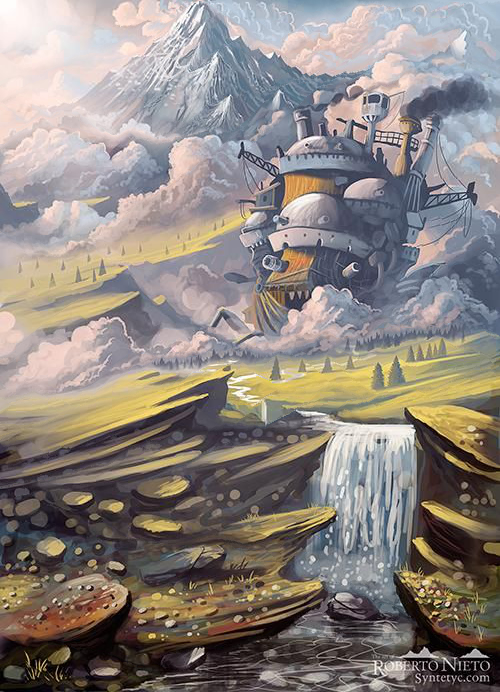
Here are the results. You will likely have to open the images in a new tab to see the effect properly. First picture is courtesy of the CS194 site and the last is from washington.org.


Final Project 2: Seam Carving
Seam carving is a content-aware method of resizing an image. Traditional rescaling techniques treat all parts of an image equally. But in reality, there are certain parts of the image that we attribute more importance to. Seam carving makes the assumption that important sections of the image contain high amounts of energy, and tries to remove low-energy "seams" from the image while preserving the rest.
The algorithm is as follows: in order to make an image 1 pixel skinnier, we first compute the energy of each pixel in the image. We then find the vertical seam (a connected path) that goes from top to bottom with the lowest total energy, and remove that seam from the image. This process is repeated until the desired size is met. A similar process is used for making an image shorter.
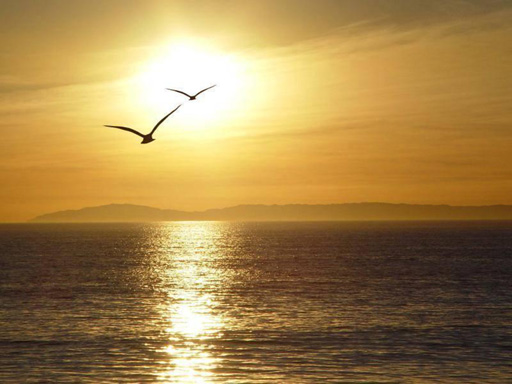
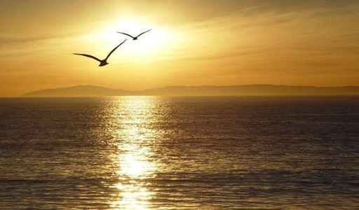
Below is an example of a seam that would be removed from an image. Notice that it stays on the right side of the image, where there are less clouds (and hence less energy).
What decides the quality of this algorithm is the energy function. We decided to go with a simple SSD for the gradient to a pixel's neighbors. As noted in the paper, there are many different valid energy functions and different functions work better in different situations.
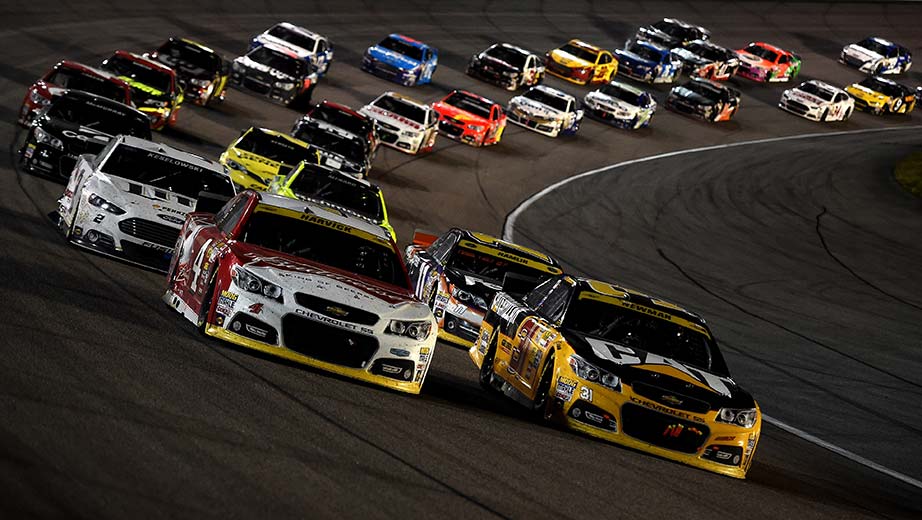
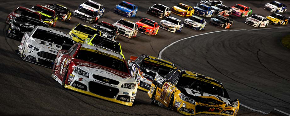
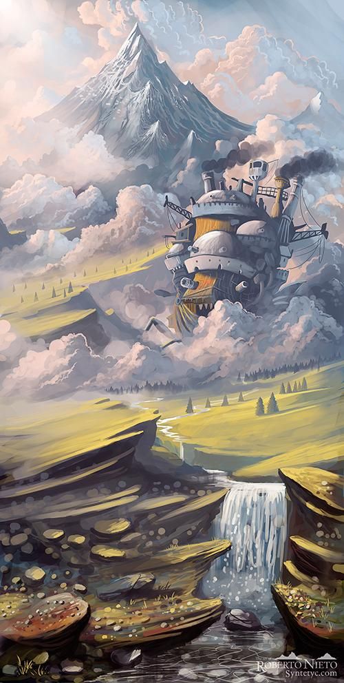
Here were the results. Credit for the first picture goes to wikipedia, the second to Eric Yuan's blog, the third to Owen Jow, the fourth to Pininterest, the fifth to the BeFunky Blog, the sixth to Blizzard. The two "failures" are from Nascar and Time Magazine.
I particularly like the the artwork of Howl's Moving Castle - even comparing the two side by side it can be difficult to pick out what parts of the image the algorithm removed, simply because all the features remain consistent (and this is a feature rich artwork).


Of course, this didn't end up working with all images. In particular, once an algorithm removed all of the low-hanging fruit, it would start creating artifacts as it continued to carve out seams.