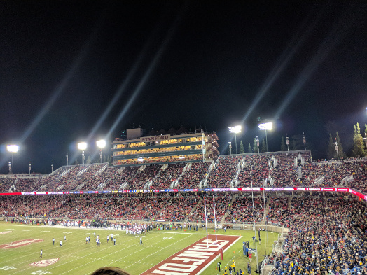
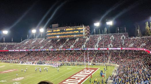
This is my first example of seam carving: I took it during the 2017 Big Game (GO BEARS). On the left is the original image. I framed the original as such because I wanted to capture the entire stadium, and getting half of a frame of someone's hair was unappealing to me. On the right, is a seam-carved(vertically) image. It removes a lot of the empty and negative space on the top of the image. The technique works quite well here, as there is a clear area that should be removed from the image. As an amusing side effect, the flare of the stadium lights curves right. Happiy, the algorithm preserves all of the most important information from the image.
Couch Drawing
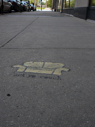
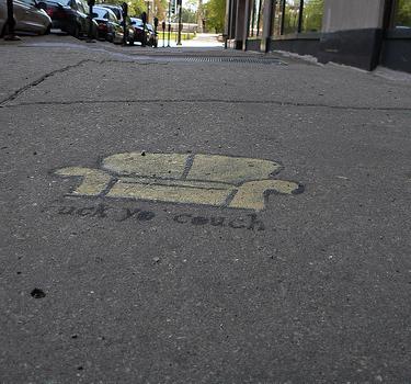
This is an example image given to us. Seam carving works really well on it - The algorithm chooses the empty pavement above and below (mostly above) to remove since they don't add to the information of the image. Unfortunately, this does mess up the beautiful composition of the original image. On the plus side, it preserves the drawing pretty much exactly.
House
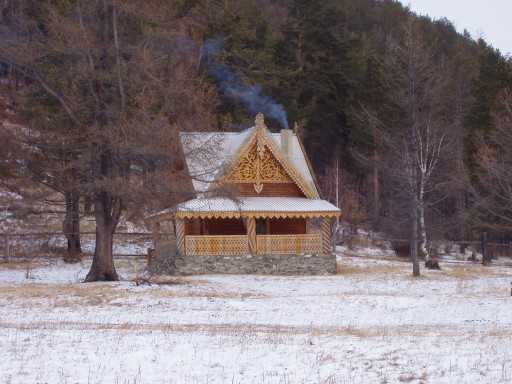
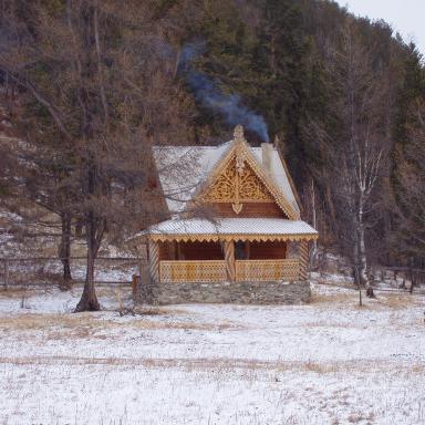
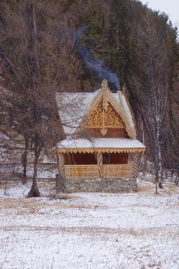
This is an example image given to us. Seam carving again works really well on it - The algorithm chooses space between the trees to delete for the most part. I cropped it even further down to see how the algorithm would deal with not having anything to easily delete. It's clearly taken some of the seams from the house (while preserving its larger structure!) as well as some of the seams from the trees (while preserving their existence). The result is an image that is clearly of the cabin in the woods, just half as large.
Sea
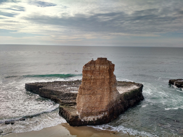
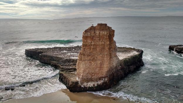
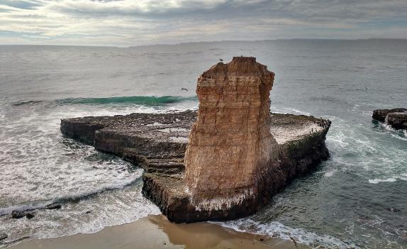
This is an image I took of a stone megalith in the ocean is a great candidate for seam carving. It has lots of empty space that is great for framing but not so great for space constrained layout. I cropped vertically and then horizontally. The vertical crop basically didn't touch the monolith. The horizontal crop began to remove pixels from the monolith, resulting in a slightly different shape.
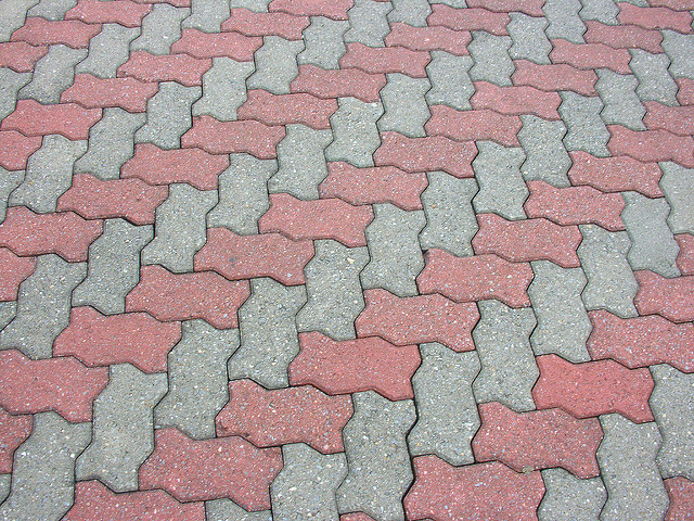
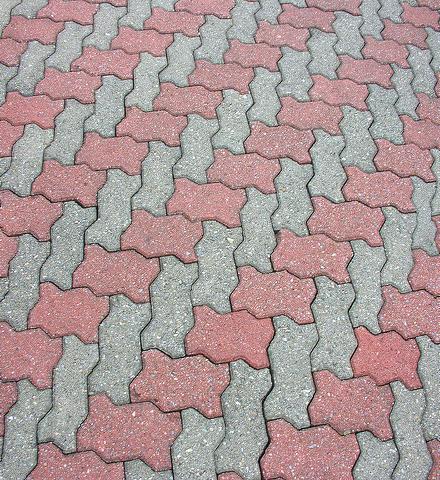
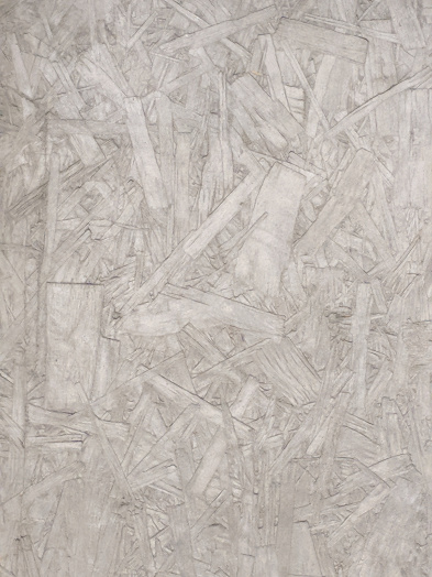
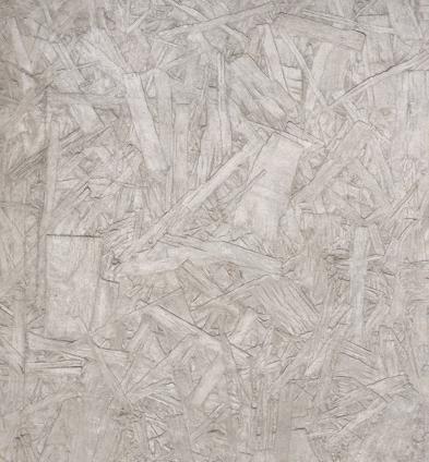
Tile
 Source
This is an image from Flickr by chrisbb@prodigy.net. The image is of a fairly unremarkable outdoor floor tile. I thought it'd be perfect for testing seam-carving's effect on simple geometries. I liked the result quite a lot - the image looks like its been simply scaled down horizontally, preserving the pattern up to a scale factor, which I think is the right approach.
Wall
After my previous success, I wanted to further investigate the algorithm's response to complex geometry. This is a picture of the "scraped" concrete pattern common inside Eshleman and MLK. The algorithm behaves similarly as before, by seemingly scaling the image and not changing the image's pattern by avoiding the edges in the concrete.
Failures
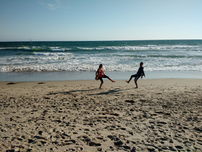
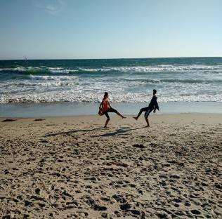
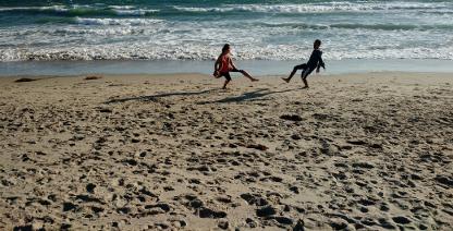
Here, the algorithm frankly didn't work out. The trouble in my horizontal crop is that sand has a ton of variation, meaning large derivatives. As a result, my friend's head is diced up. Sorry Pranav! In the vertical crop, after we run out of sky pixels to delete, the algorithm once again starts to shrink my friends instead of removing the irrelevant sand from the bottom.
Conclusion
I thought this project was a really innovative approach at solving image resizing. We've been locked into just scaling the photo for so long that we are only now understanding the power of content based image resizing. I learned that computers can learn useful things about the content of an image without a 50 million layer convolutional neural net.
Fake Miniatures
This project was all about simulating the effect of tilt shift cameras. These cool cameras create the single plane of focus that they capture, while leaving most of the image increasingly blurred. I simulate that through an iterative algorithm in which I blur an image more and more, as well as increasing the saturation of certain parts of the image. We hand define a line of focus, then leave a certain area around that line unblurred - that line defines the subject of our image.
Below, the left image is the original, and the cropped ones are on the right
Bridge

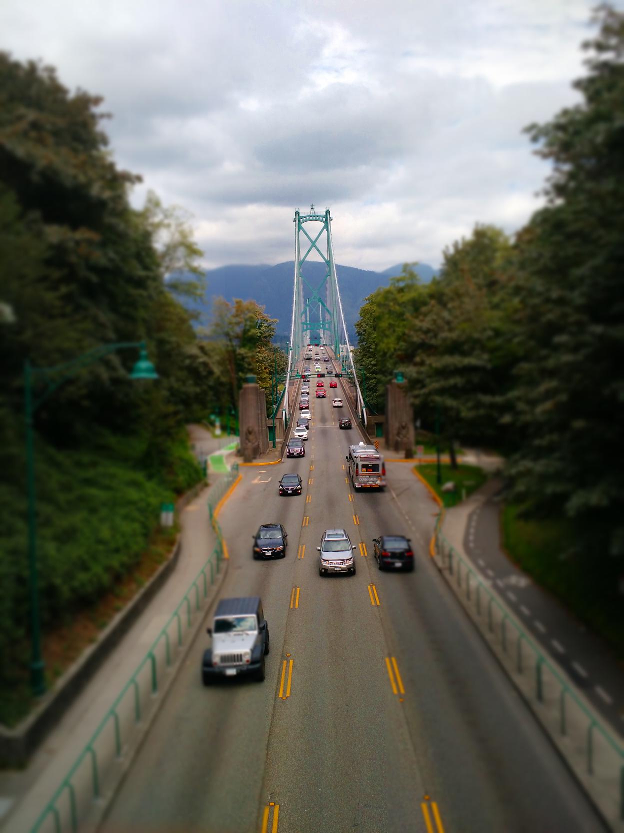
This is an image of a bridge emerging from under an underpass. I took the picture standing on top of the underpass. In this case, I don't think the miniature effect worked that well, mostly because the colors were fairly bland. As a result, saturating them heavily didn't cause a huge visual difference, robbing us of the fake miniatures illusion.
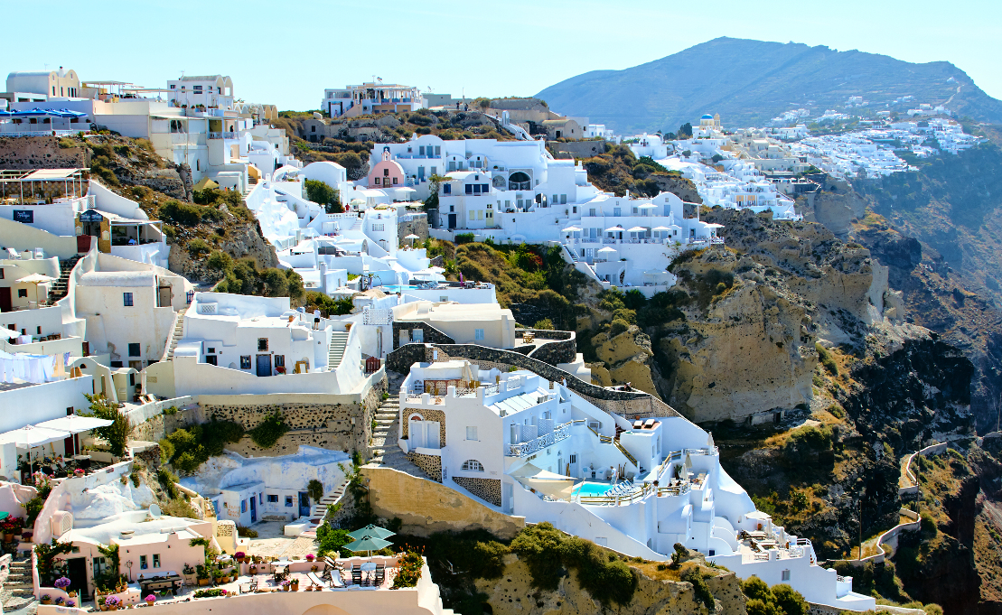
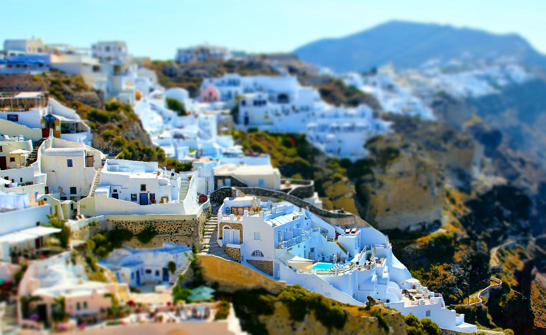
Greece
 Source
This is an image of Santorini by Pedro Szekeley. I chose it because of I could see where I could define a line of focus. I thought the output was really great - Santorini's beautiful colors let the masked region really pop. Moreover, there is enough content in the background so that the blur is meaningful and noticeable.
Parker
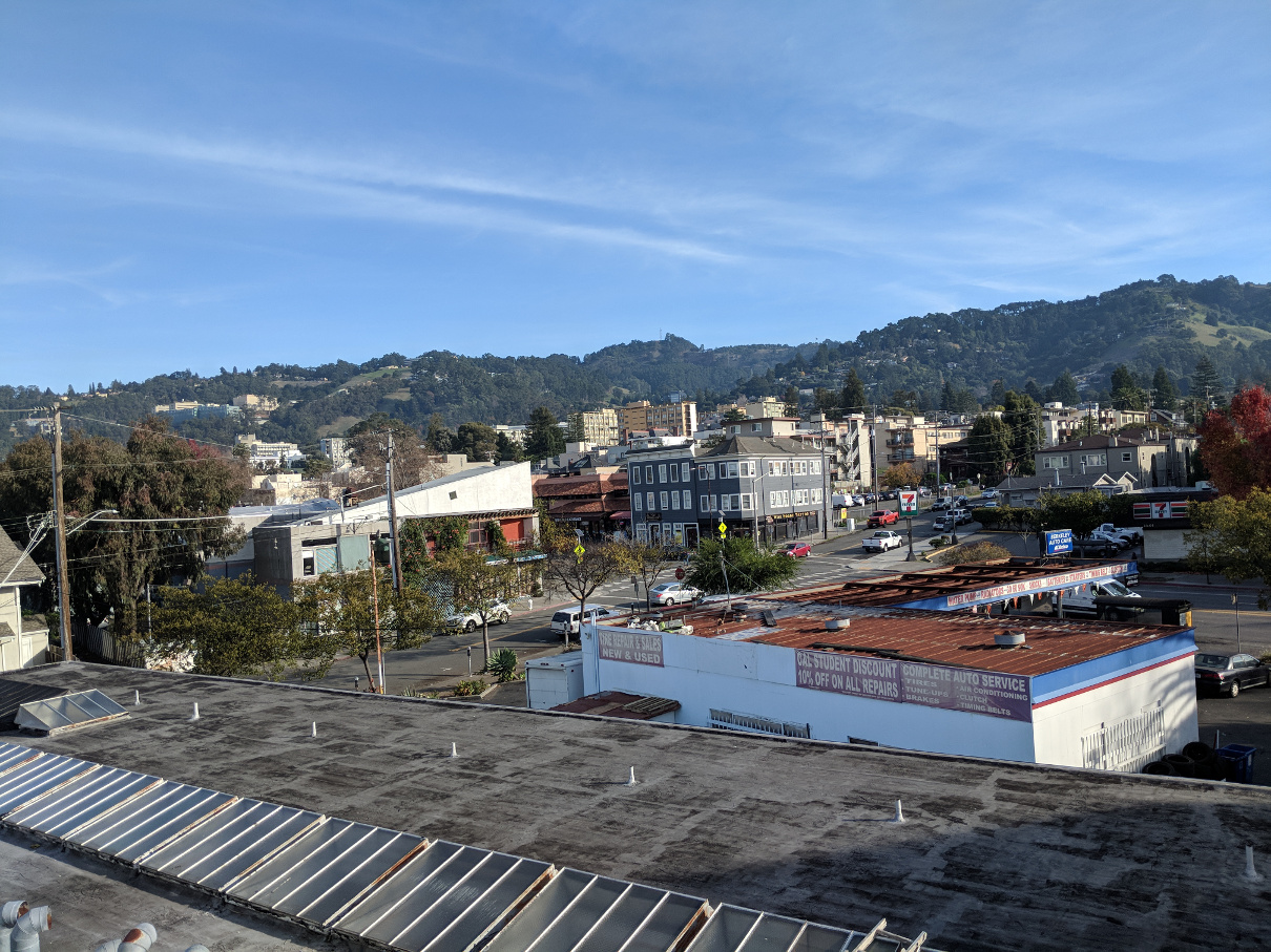
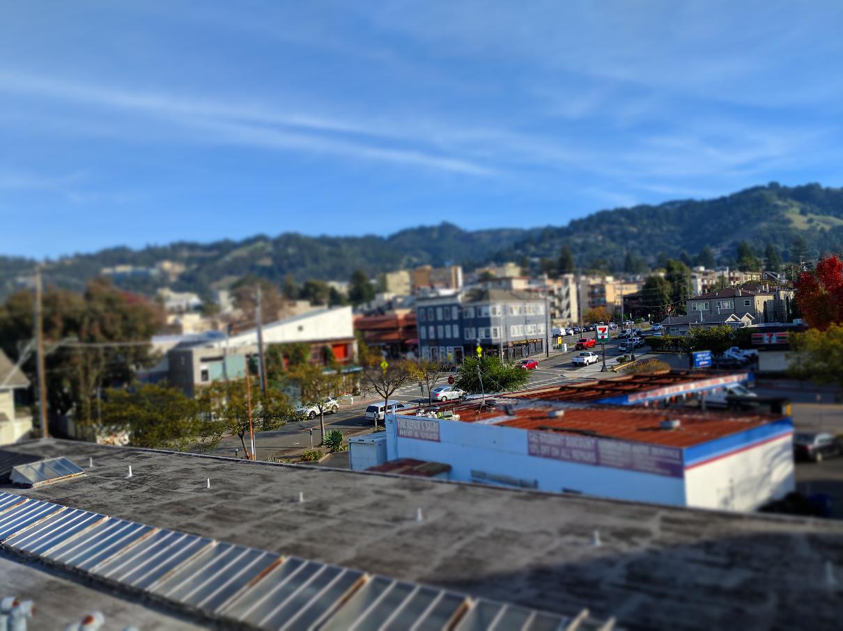
I thought this example worked fairly well as far as creating a defining a line of focus, but I think being obstructed partially by buildings hurt the illusion. I still think the cars and buildings look like miniatures, and I love the effect of the blur on this image.
Parker
 Source
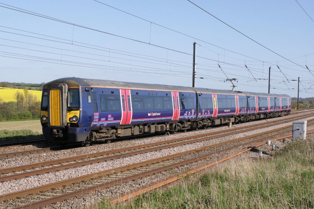
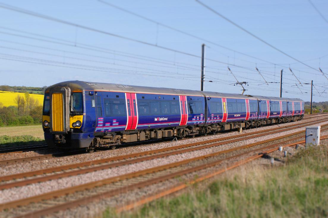
This image was taken off a Flickr page owned by Hugh Llewelyn. The train is easily picked as a line of focus, but I think that the fake miniatures illusion is not created here mainly because of the lack of other actual objects in the foregrouund and background that could help the illusion.
Conclusion
I thought this project was really interesting - we mostly used old techniques that we had learned in previous projects. However, I learned to apply them in new and creative ways that make a meaningful artistic difference in an photograph. I also learned about the power of context - blurring other objects was almost more important than boosting the color and not blurring the focus.