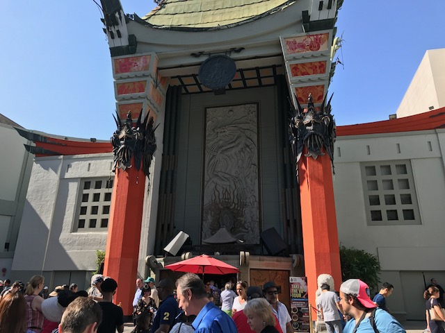
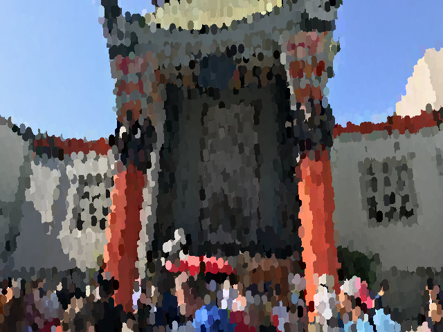
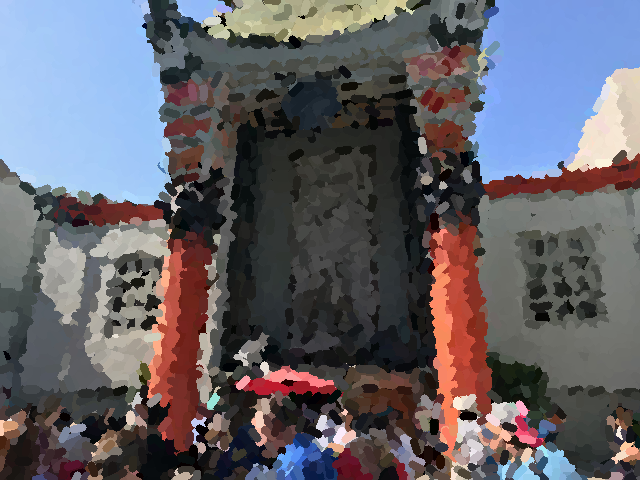
Chinese Theater in Hollywood
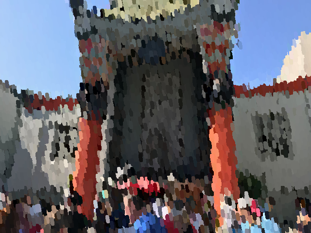
Chinese Theater Impressionist Radius = 4, Length = 10

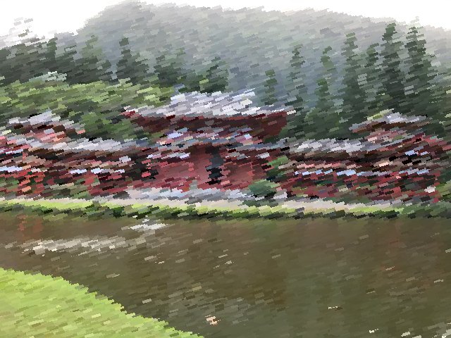
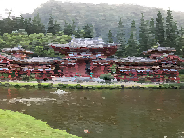
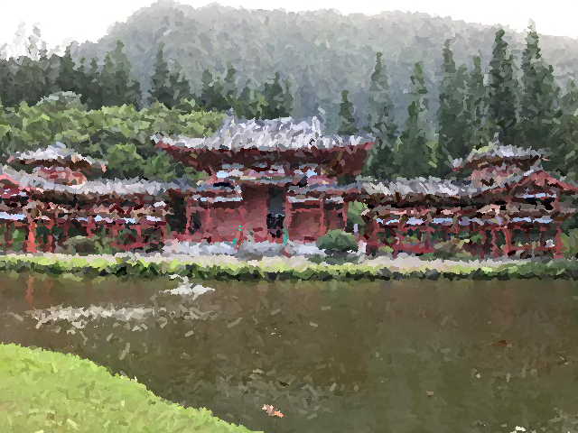
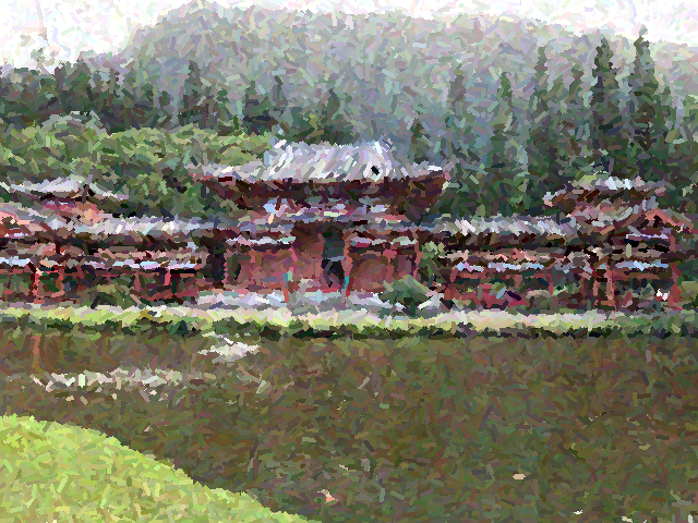
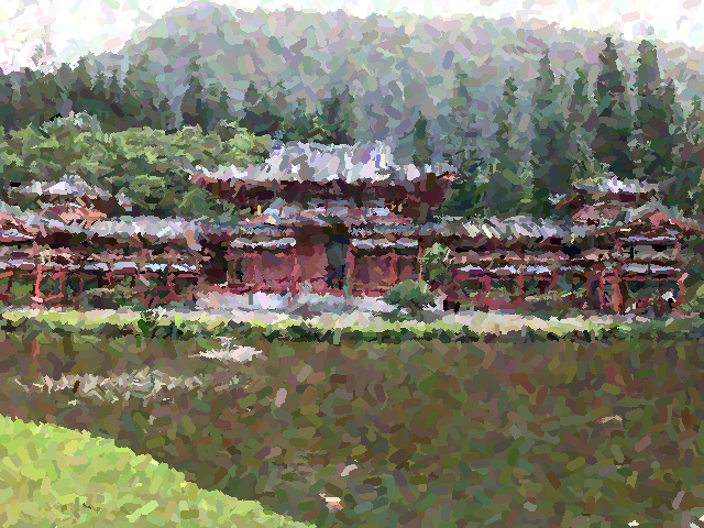
Byodo-In Temple in Hawaii

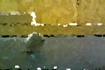
Temple Impressionist Radius = 4, Length = 10
Temple Impressionist Radius = 2, Length = 10
This project is a reimplementation of the paper Fake Impressionist Paintings for Images and Video by Patrick Callahan, who based his own work on the paper Processing Images and Video for an Impressionist Effect by Peter Litwinowicz. The main idea of this project is to render photos in such a way that they look like impressionist paintings to the typical observer. The difficulty with making a real image look impressionistic is that impressionist paintings are all about imprecise, small brushtrokes, and rendering an image with varying, unsteady strokes that capture essence rather than precise details is not a natural task for something as precise and routine based as a computer algorithm. Somehow, these images have to be recreated with the imperfections that we see in real human produced paintings. Ultimately, I ended up writing code that creates brush strokes that are colored based on randomly chosen image centers in the original photo. Then, I built off of this algorithm to clip at edges which I detected using a canny edge detector, orient strokes such that they were normal to edges, and add variations to color, intensity, and stroke direction to each stroke.
For making impressionist renderings of real images, I start by following the method used by Patrick Callahan, which involves randomnly choosing image centers and making brush strokes based on this center. In particular, the stroke is influenced by the center coordinates, a brush stroke radius r which is defined by the user, a length L which is also defined by the user, a brush stroke direction theta which is randomly decided in this first algorithm, and the color of the center pixel. The results of this first basic randomly chosen brush stroke method are presented below for some of my own images. One thing I noticed that was interesting was that images with lots of different structures or edges cramped close together needed smaller radius brush strokes to capture the essence of the photo properly.
|
Chinese Theater in Hollywood |
Chinese Theater Impressionist Radius = 4, Length = 10 |
|
|
Byodo-In Temple in Hawaii |
Temple Impressionist Radius = 4, Length = 10 |
Temple Impressionist Radius = 2, Length = 10 |
The temple image has a lot of intricate features, so to capture the essence of the image in my rendering, a smaller brush radius was more effective. In both of my examples however, we see that strokes procede past edge boundaries, distorting shapes of some of the objects in the image. For instance, there is a grid of black squares on the walls of the Chinese Theater that are completeley distorted or erased in the impressonist version of the image. I next implemented Patrick's edge clipping idea to preserve boundaries/shapes in impressionist renderings. It is also obvious that each stroke is in the same direction making the result look very processed. This is dealt with in a later algorithm.
For edge clipping, I first used a canny edge detector to detect the edges in a grayscale version of the given image. Then given the edges of the image, I would make sure when drawing each stroke to move back and forth from the center of the stroke and clip the stroke at any pixel that was part of an edge. This allowed me to preserve edge boundaries in the final rendering. My results are shown below.
|
Chinese Theater in Hollywood |
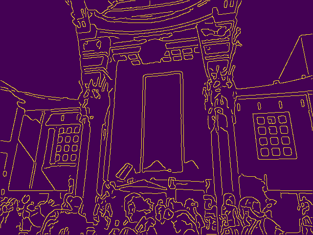
Chinese Theater Edge Plot |
Chinese Theater Impressionist Without Clipping Radius = 4, Length = 10 |
Chinese Theater Impressionist Edge Clipped Radius = 4, Length = 10 |
|
Byodo-In Temple in Hawaii |
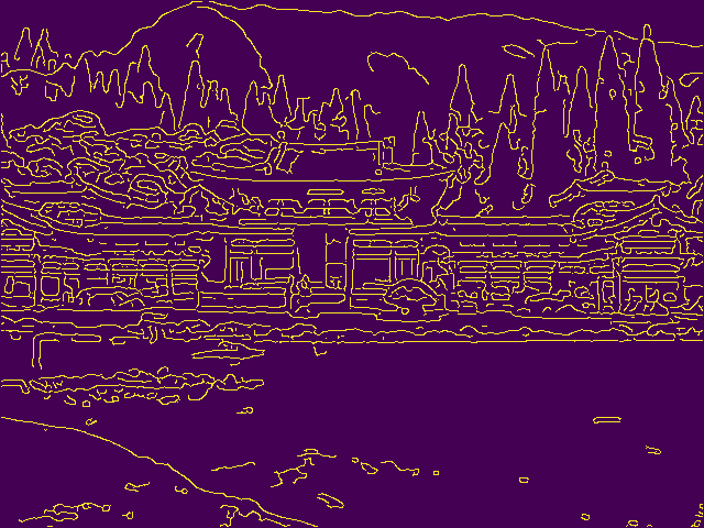
Temple Edge Plot |
Temple Impressionist Without Clipping Radius = 2, Length = 10 |
Temple Impressionist Edge Clipped Radius = 2, Length = 10 |
As seen when placing the edge clipped and non edge clipped images side by side, the strucuture of objects in the edge clipped images seem to be more preserved. For instance, in the theater picture, we can more clearly make out the cap on one of the tourists and the grid of black boxes is more clear, if still slightly distorted. In the temple images, we also see that the color has not bled out of the frames of some of the structures into the rest of the image. The strokes are all still oriented in one direction so that becomes the next thing I tried to fix.
Rather than picking one direction and painting all strokes in this direction, orienting strokes normal to the gradient of the image will make the rendering more natural, so I calculate the x and y gradients of the image and set theta = arctan(y-gradient, x-gradient) + pi/2 for each stroke center that we choose. The results of this gradient normal orienting are shown below.
|
Theater Impressionist Random Orientation Radius = 4, Length = 10 |
Theater Impressionist Gradient Normal Orientation Radius = 4, Length = 10 |
|
Temple Impressionist Random Orientation Radius = 2, Length = 10 |
Temple Impressionist Gradient Normal Orientation Radius = 2, Length = 10 |
While it is somewhat difficult to see, using the gradient normal to align brush strokes creates a more natural looking painting, since the strokes all seem to be in different directions depending on the flow of the image leading to the result looking more human.
Finally, to make the rendering feel more natural and human, I follow Patrick's example and try to add a random variation to the R,G,B values of each stroke, the intensity of the stroke, and the orientation of the stroke. The results are shown below.
|
Theater Impressionist Gradient Normal Orientation Radius = 4, Length = 10 |
Theater Impressionist With Perturbations Radius = 4, Length = 10 |
|
Temple Impressionist Gradient Normal Orientation Radius = 2, Length = 10 |
Temple Impressionist With Perturbations Radius = 2, Length = 10 |
Coast Picture Radius = 2, Length = 10 |
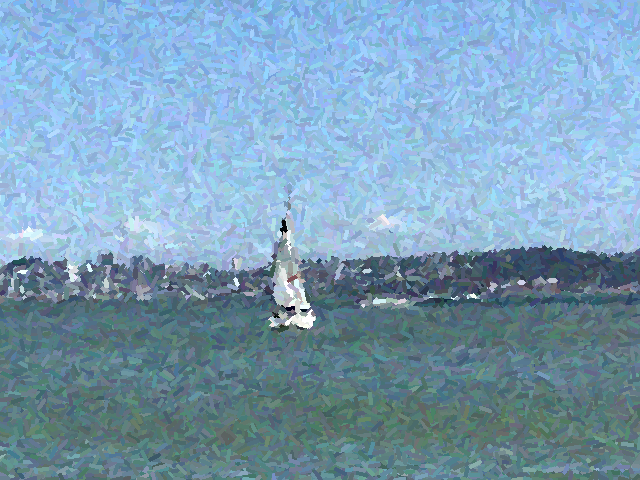
Coast Picture Impressionist Radius = 2, Length = 10 |
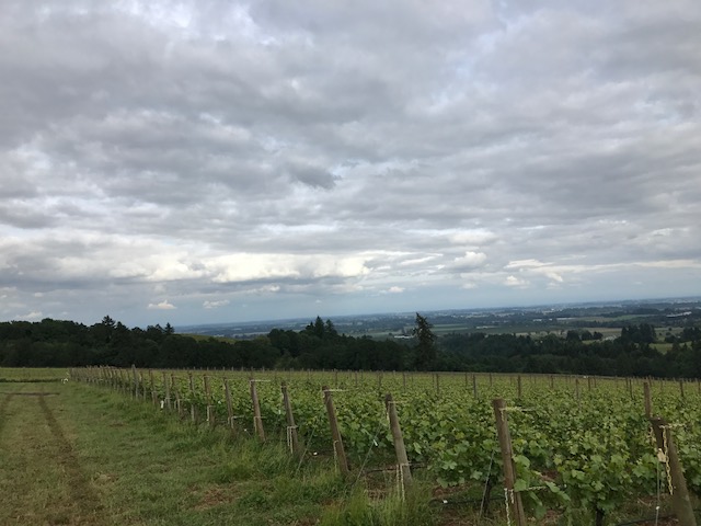
Vine Picture Radius = 2, Length = 10 |
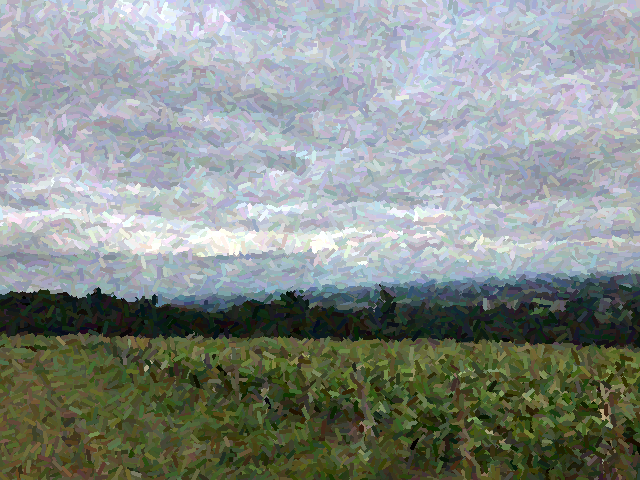
Vine Picture Impressionist Radius = 2, Length = 10 |
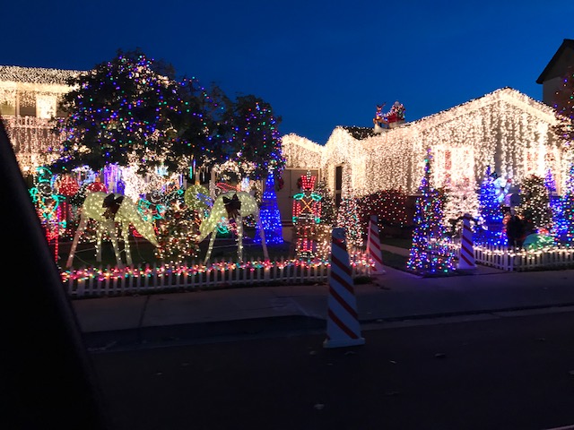
Christmas Lights Picture Radius = 2, Length = 10 |
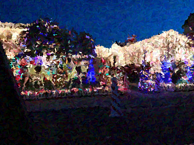
Chrismas Lights Picture Impressionist Radius = 2, Length = 10 |
I also implemented an algorithm that uses optical flow and the Lucas-Kanade method to shift brush strokes so that an impressionist rendering of two images in a sequence were consistent. I took the x and y gradients in a neighborhood of 8 pixels and set this to be my matrix A, while my vector b consisted of the gradients in time between the two frames in the image sequence for the corresponding pixels. Solving Ax=b would give me x and y velocities which I add to my image centers to shift my strokes for the next frame in the sequence. I tested my code on an example given in Patrick's paper as shown below. One issue with this is that shifting image centers leaves a couple of empty spots in the image.
Frame 1 |
Frame 2 |
Frame 1 Impressionist |
Frame 2 Impressionist |
When I observed that images with more edges and objects in them needed smaller brush strokes to properly capture their essence, I realized that maybe edge data could be used to determine how big the radius of the brush stroke would be. I look at the number of edge pixels in a neighborhood of 8 pixels around a stroke center and adjust the user given radius depending on the number that I find. The result on my temple picture is shown below and looks quite nice.
|
Temple |
Temple Impressionist with Adjusting Radius from 1 to 4 |
Overall this was a really fun final project, and thank you to both Professor Efros and Jun-Yan for making this class so great!