Overview
For this project, I took images of the Prokudin-Gorskii glass plate images and produced a color image. To do this, the image was split into three, with represented red, green, and blue channel color values. By aligning and overlaying these images, they could be combined to create a color image.
Details
The first step of this project was to split the glass plate image into three, and shift them relative to each other such that when they were overlayed, the image would be clearly visible and aligned. To determine if two images were aligned, the sum of squared differences was computed between the pair. The normalized cross-correlation was also tested, but did not make much of a difference.
Small images
One issue that arose when attempting to align a few of the images was the fact that the borders affected the image aligning too much and they would not be aligned properly. Therefore, I decided to crop all of the images and remove some of the borders for each. This worked and fixed the aligning for all of the small images.
Large images
For the second part of this project, the large images were too large to shift across all potential values. Because of this, an image pyramid was implemented in which the image was scaled down by a factor of two at each level. These relative sized images were first aligned, with the estimate being updated at each level. Each of these shifts were applied recursively until the original image was returned. This improved the performance of aligning large images significantly and returned a properly aligned image.
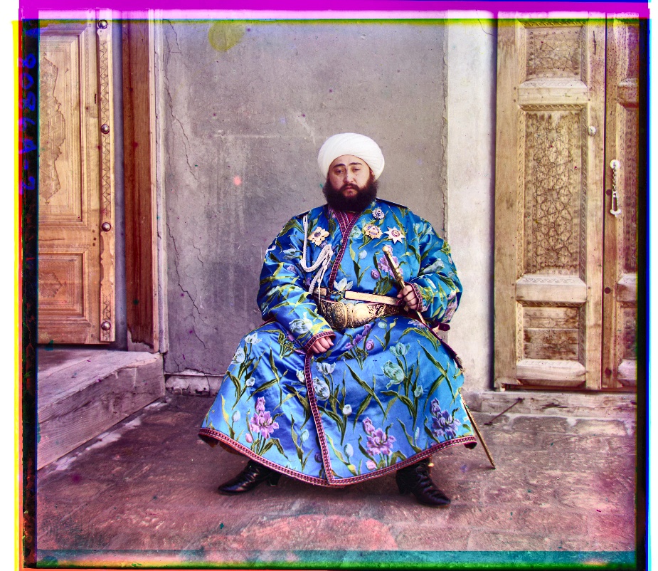
This worked for most of the large images, except for emir.tif. This was due to huge difference in pixel values in the different color channels, where his blue clothes were white in one image, while it was dark in another. This would return a very large difference when we evaluated the difference between these images even if they were aligned properly. Therefore, a different approach was needed. I decided to opt for edge detection and used skimage.filters.roberts. Now, the disparities in the different colored suit did not affect the alignment. This also worked very well for all the other images.
Small Images
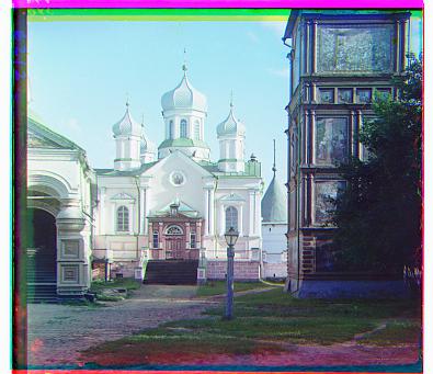
Cathedral - Green: (5, 2), Red: (12, 3)
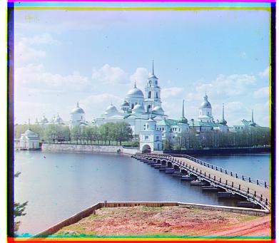
Monastery - Green : (-3, 2), Red: (3, 2)
Nativity - Green: (3, 1), Red: (7, 0)
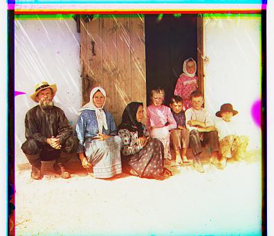
Settlers - Green: (7, 0), Red: (14, -1)
Big Images
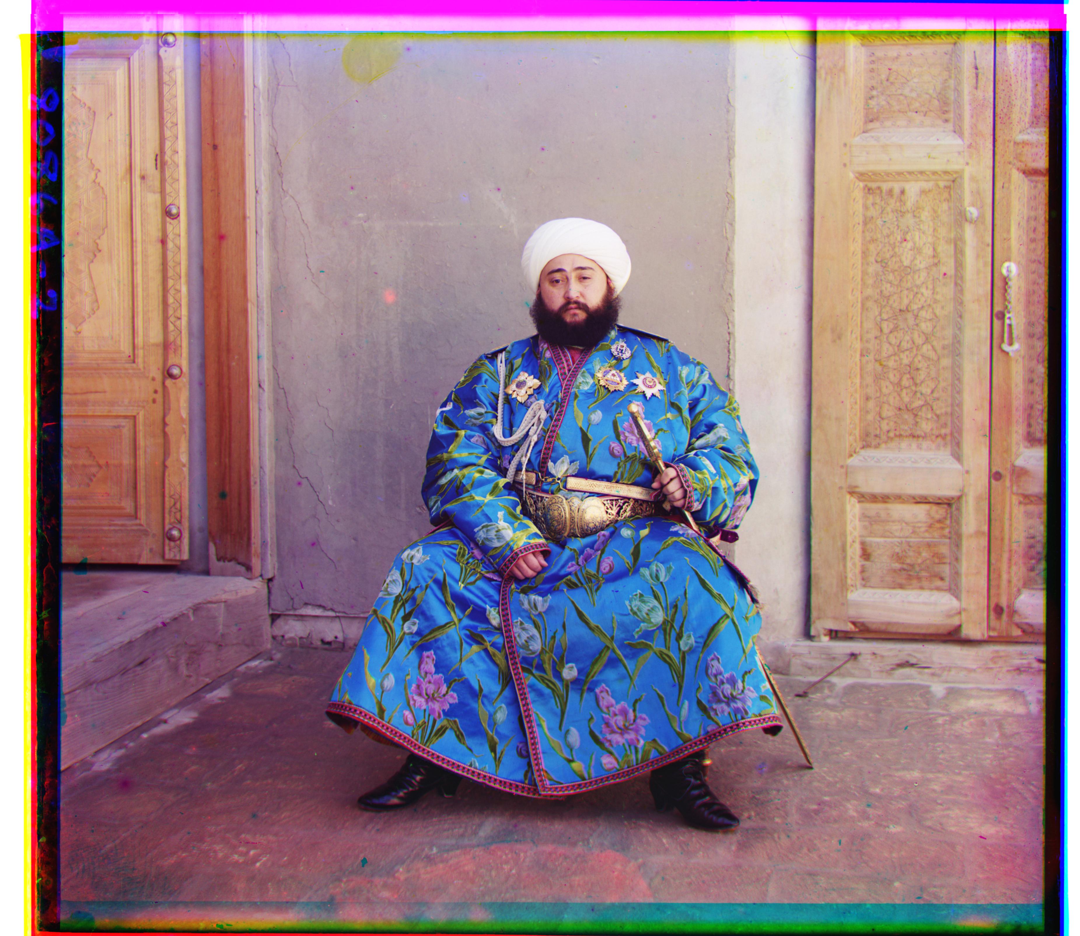
Emir (49, 24) (107, 40)
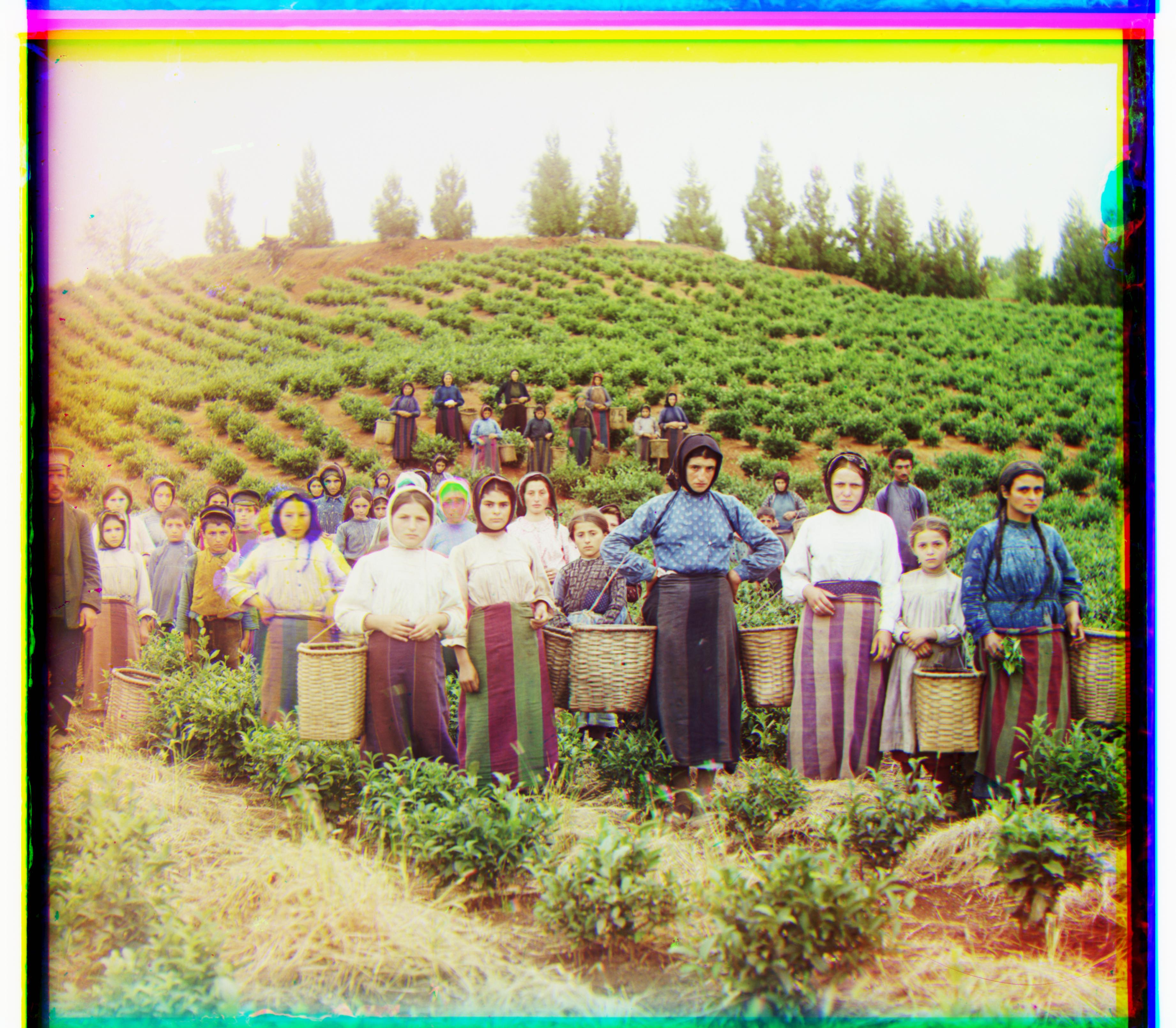
Harvesters - Green: (59, 19), Red: (123, 18)
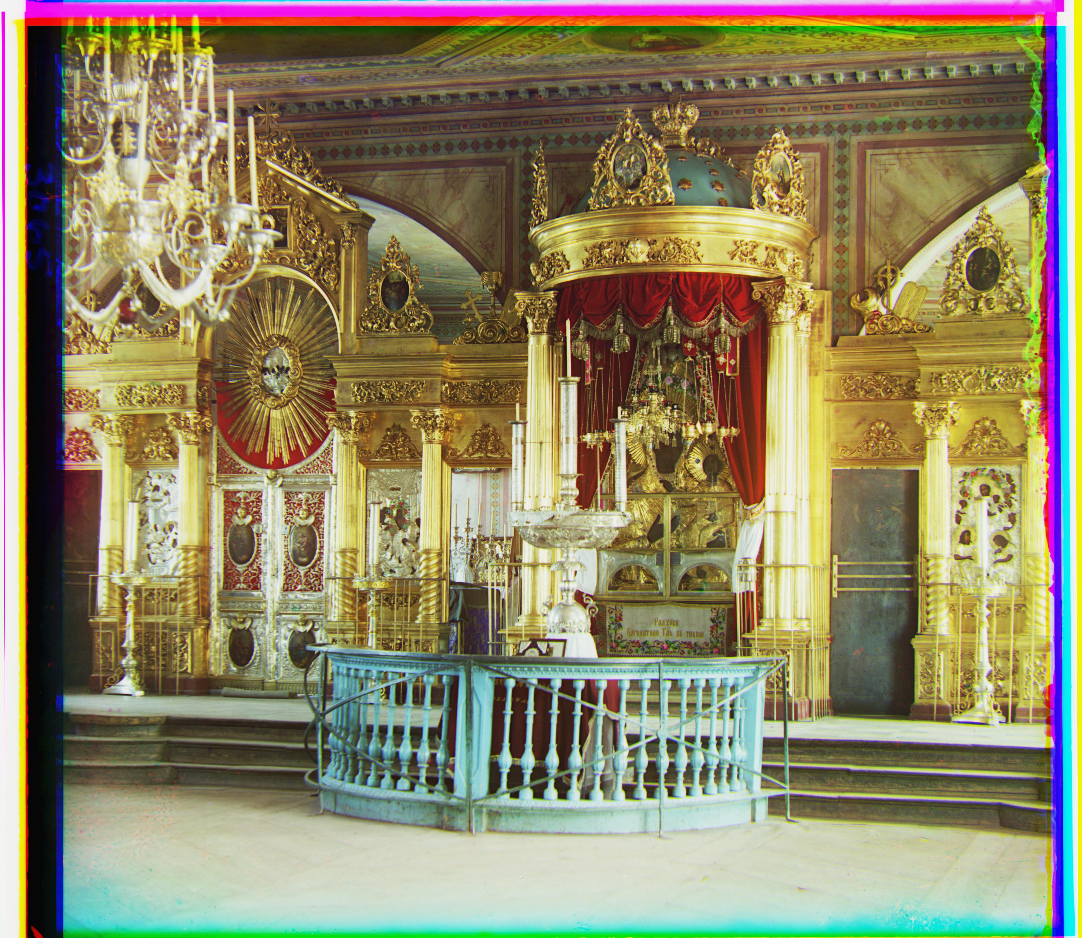
Icon - Green: (40, 18), Red: (89, 24)
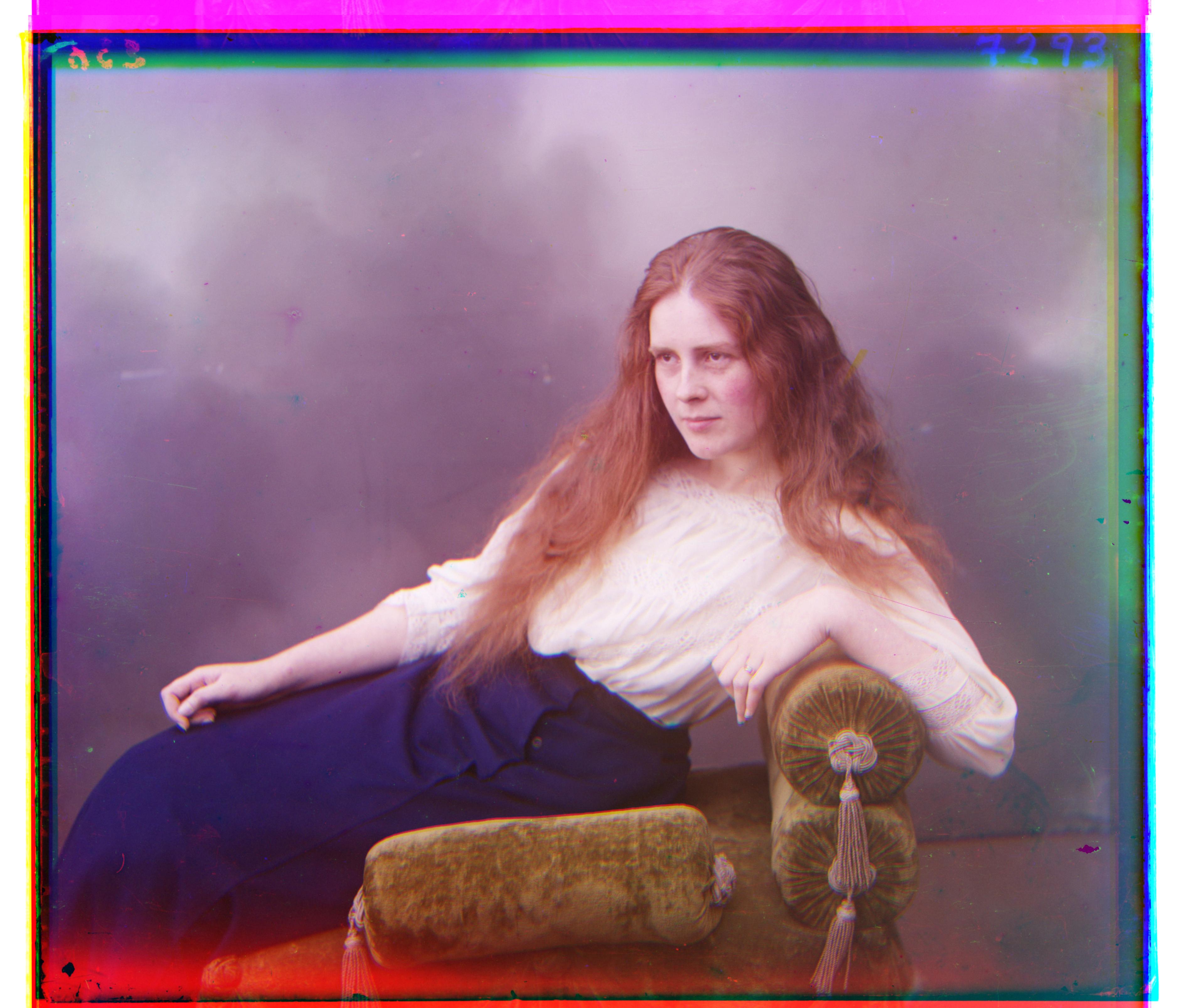
Lady - Green: (48, 7), Red: (105, 11)
Self Portrait - Green: (77, 29), Red: (175, 37)
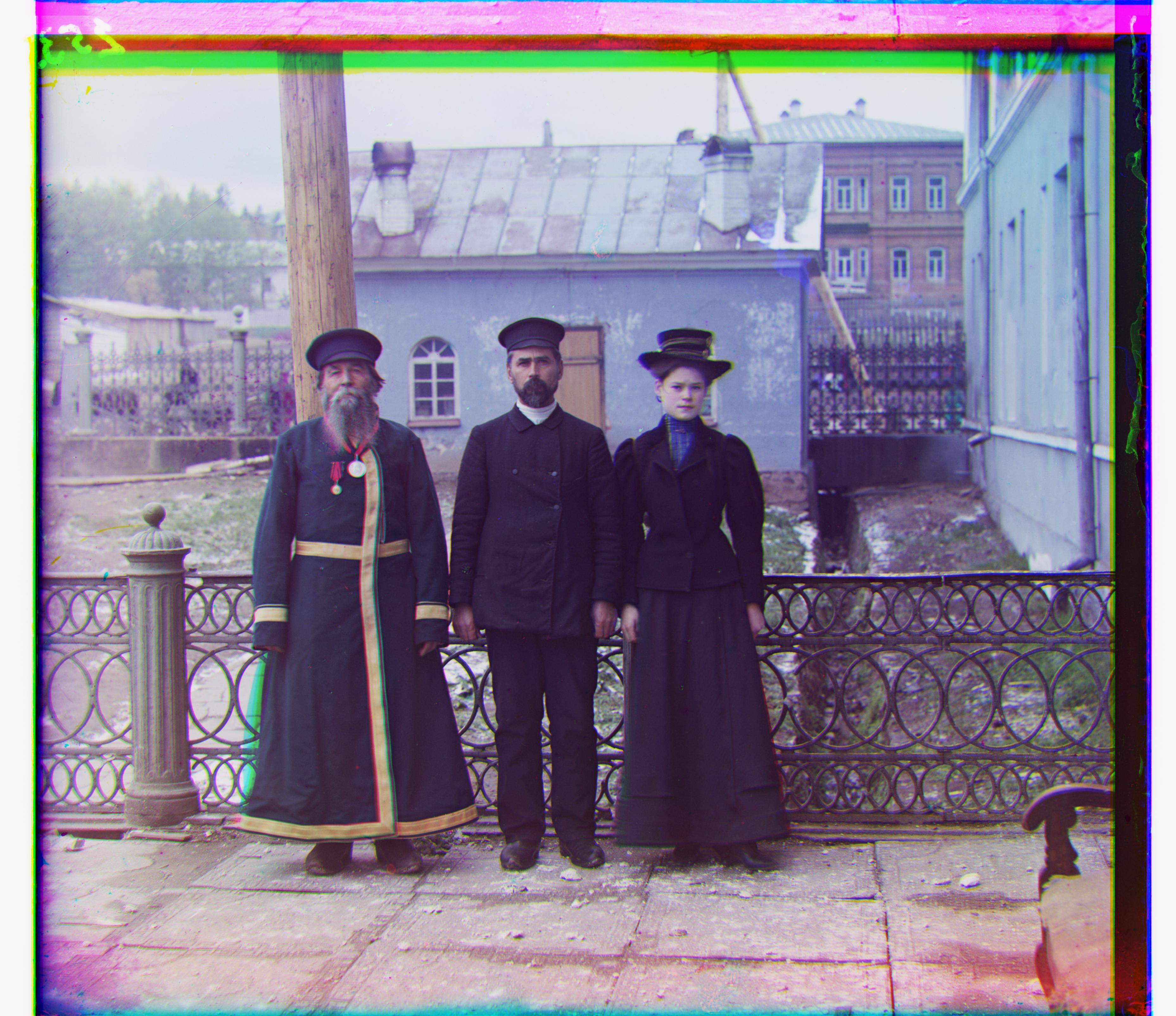
Three Generations - Green: (49, 15), Red: (108, 12)
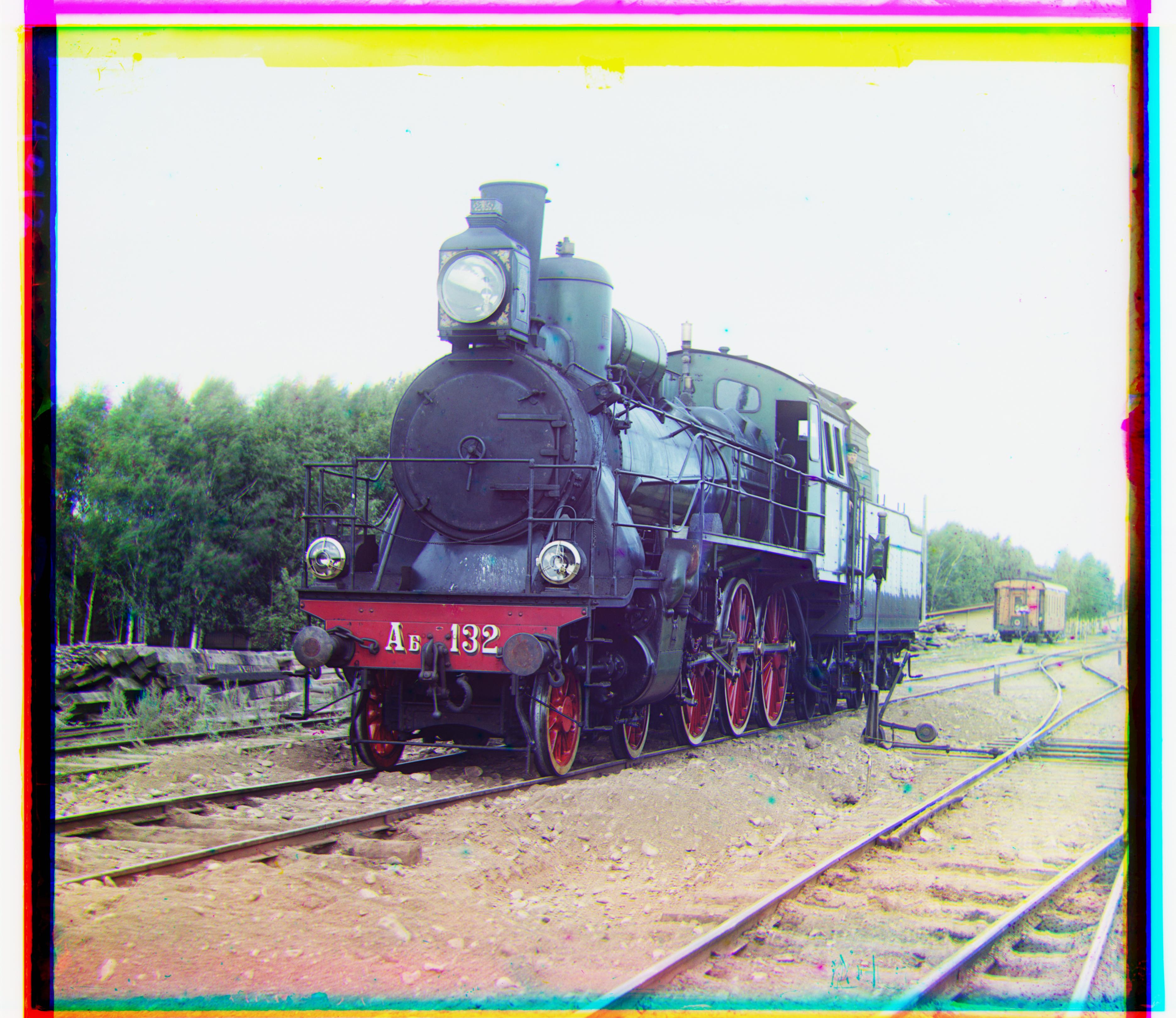
Train - Green: (42, 6), Red: (85, 32)
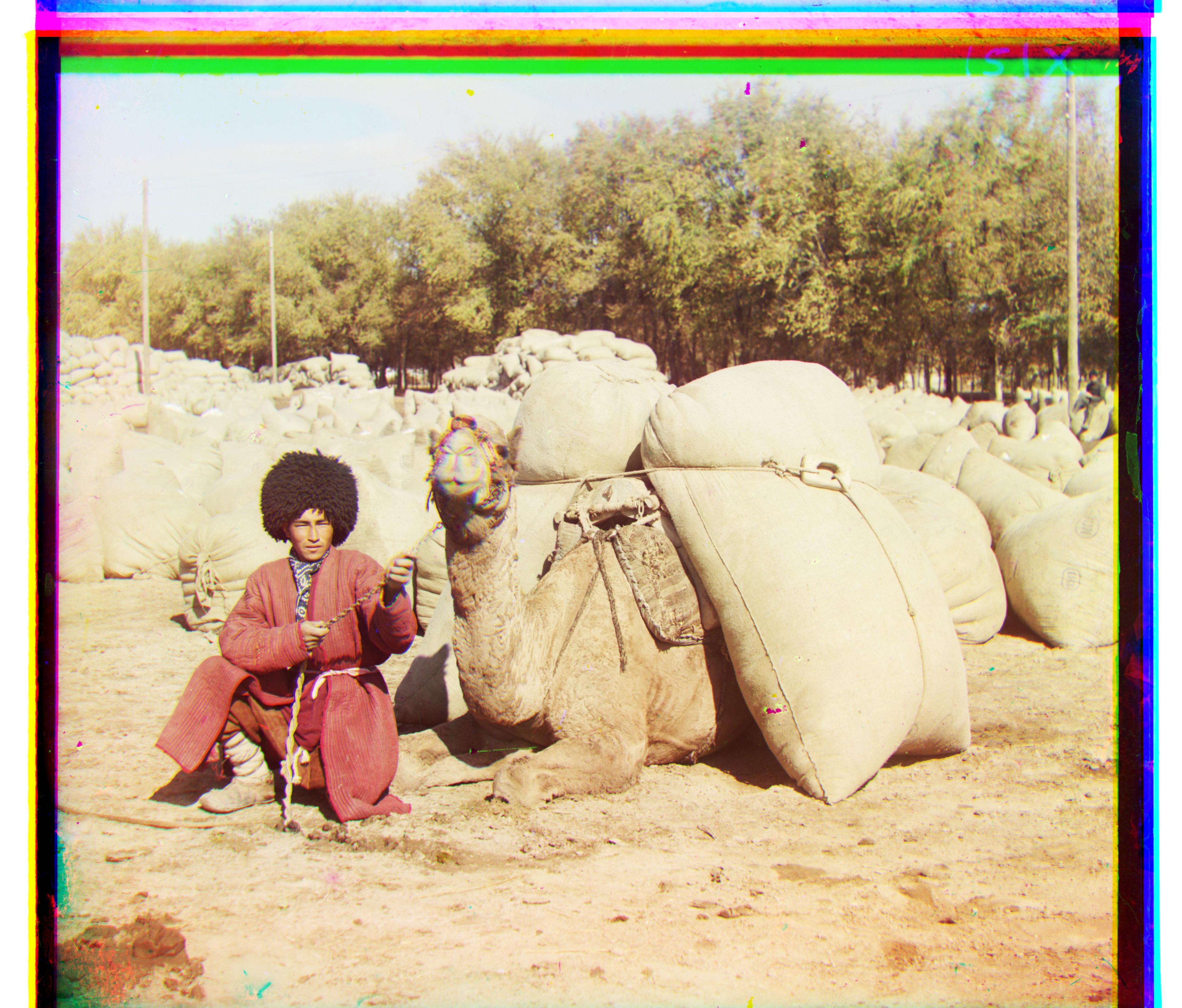
Turkmen - Green: (56, 22), Red: (117, 29)
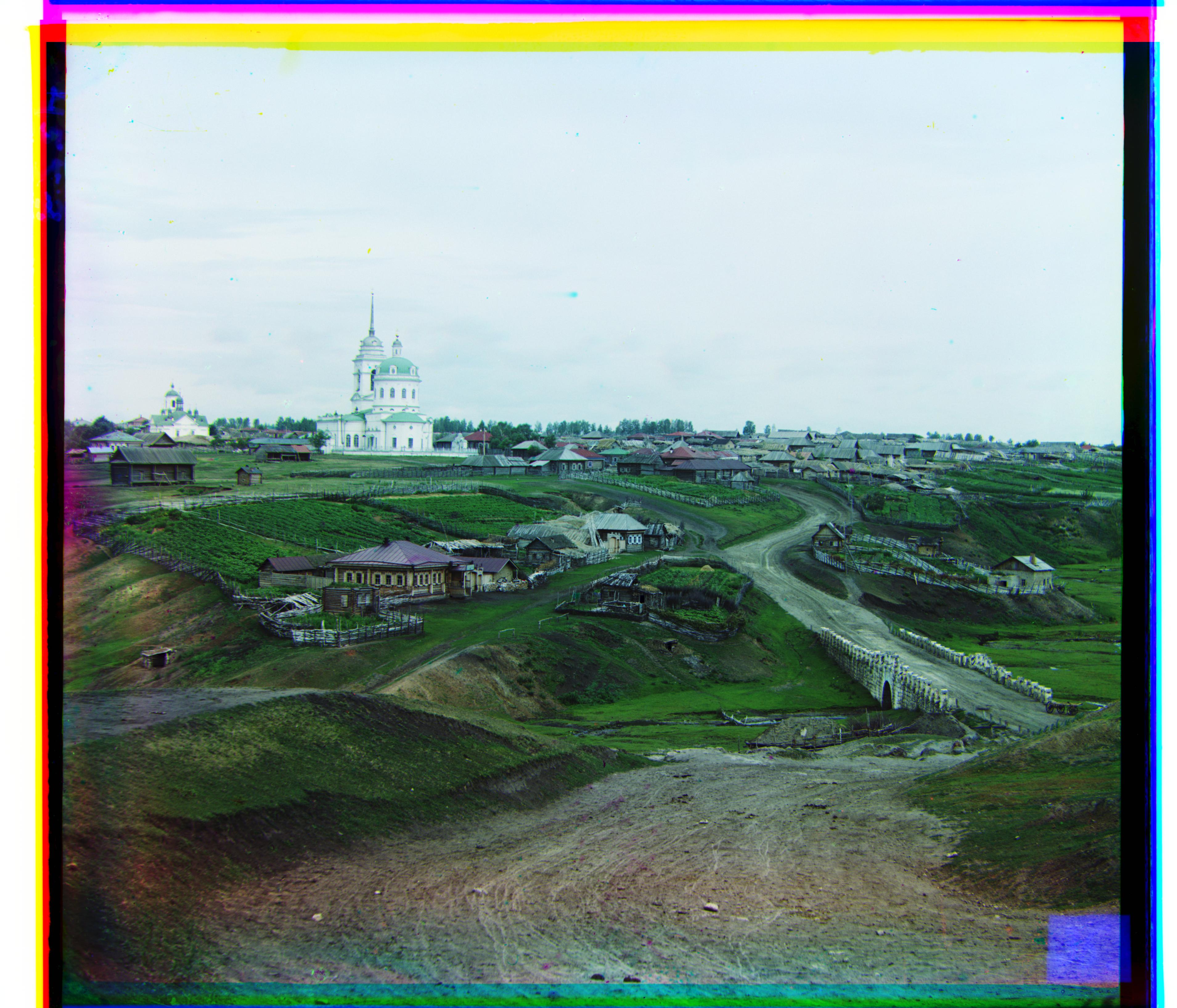
Village - Green: (64, 13), Red: (136, 23)
Custom Images
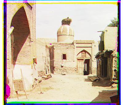
Custom Image 1 - Green: (4, 3), Red: (8, 2)
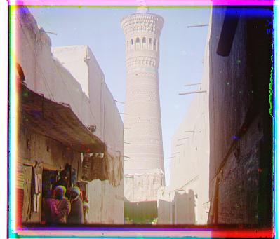
Custom Image 2 - Green : (2, 1), Red: (7, 4)
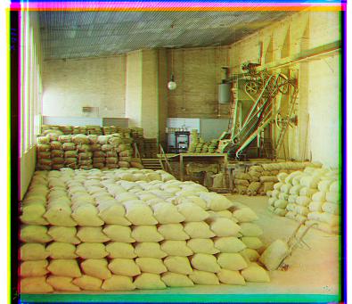
Custom Image 3 - Green: (5, 3), Red: (12, 1)
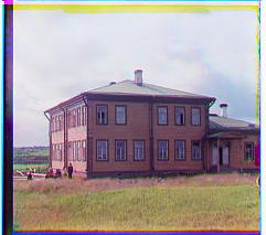
Custom Image 4 - Green: (1, 1), Red: (4, 1)
Bells and Whistles
Better Features
I used roberts edge detection instead of the raw RBG difference for images. This worked very well for images that had a lot of color disparity, such as the blue in emir.tif.
Contrast
I adjusted the contrast of the image automatically. I did this by using histogram equalization, using CLAHE, which equalizes in small blocks and equalized in these confined regions. This made each image much clearer, with the darks being darker, and the lights being lighter. This improved the overall image quality and didnt have edges and colors blend together as much.