My Approach:
Each image is divided into the three equal component by default. In the beginning, I used exhastive search over the [-15, 15] interval in both vertical and horizontal direction. In other words, I fixed the blue channel, and moved the red and green channels at most 15 pixel in each direction to align with the blue one. The alignment is measured in terms of sum of squared difference (SSD): lower SSD means better alignment.
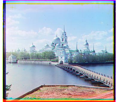
This naive approach worked reasonably well for small images, but the performance drops when applied on larger images (like the tifs). Therefore, I implememted the image pyrimad method, where I would shrink the image by a factor of 0.0078125 to start with, and only consider moving at most 1 pixel in each direction to align the downscaled image. Moving a significantly downscaled (by factor f) image by 1 pixel is equivalent to moving the original image by a siginificantly large number (1/f) of pixels in the original image. By starting with very small factors, I was able to move the image by a huge number of pixels in the first steps, and resort to fine-tune in the end. I record the number of pixels at each step and add them up in the end to get the total displacement.
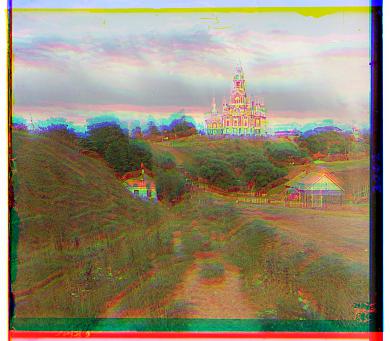
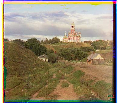
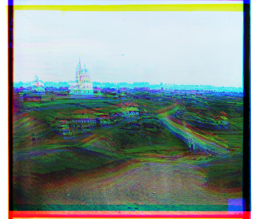
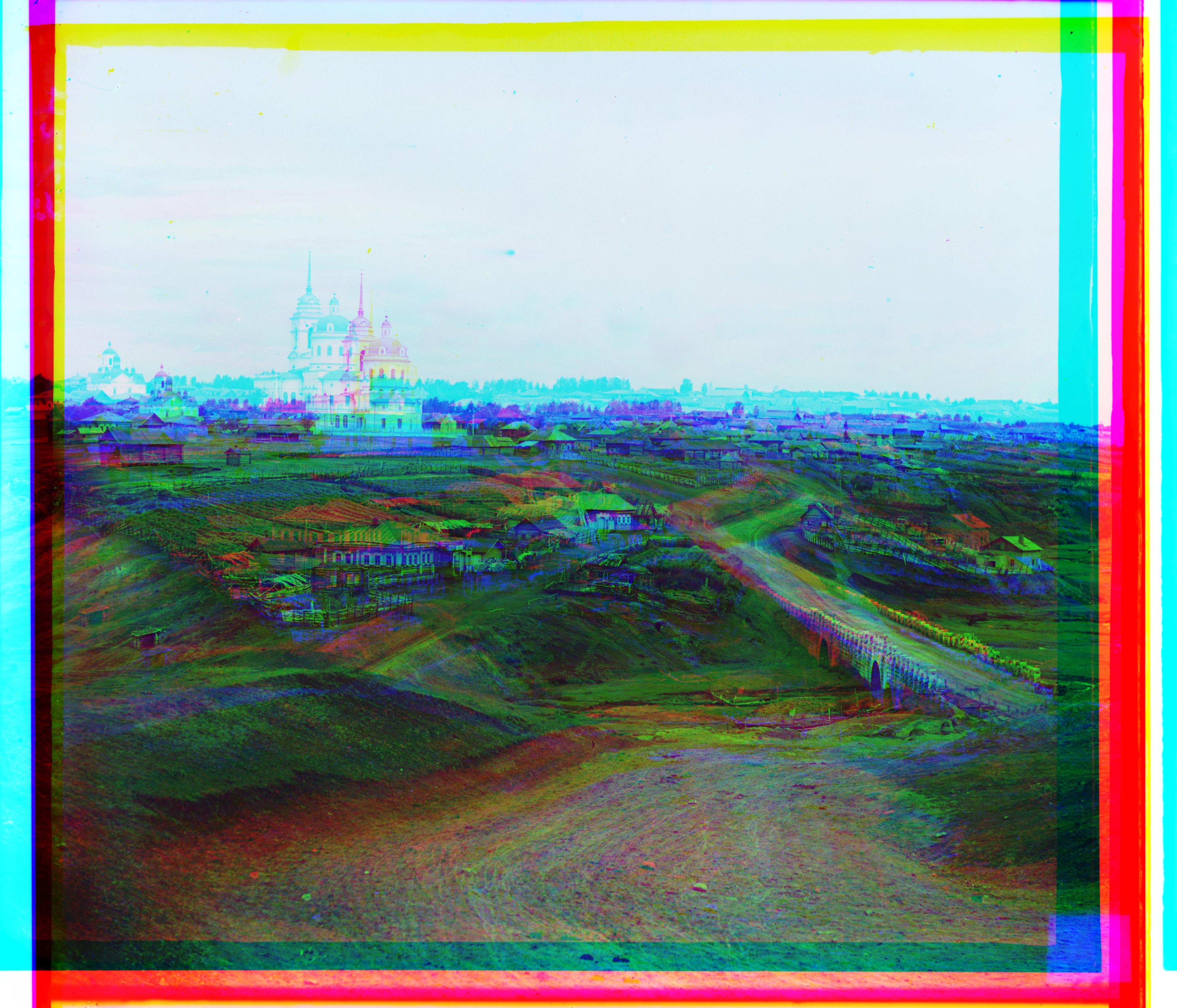
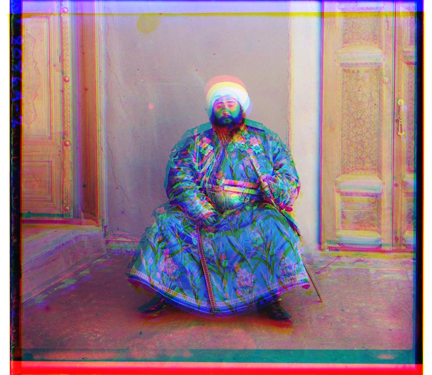
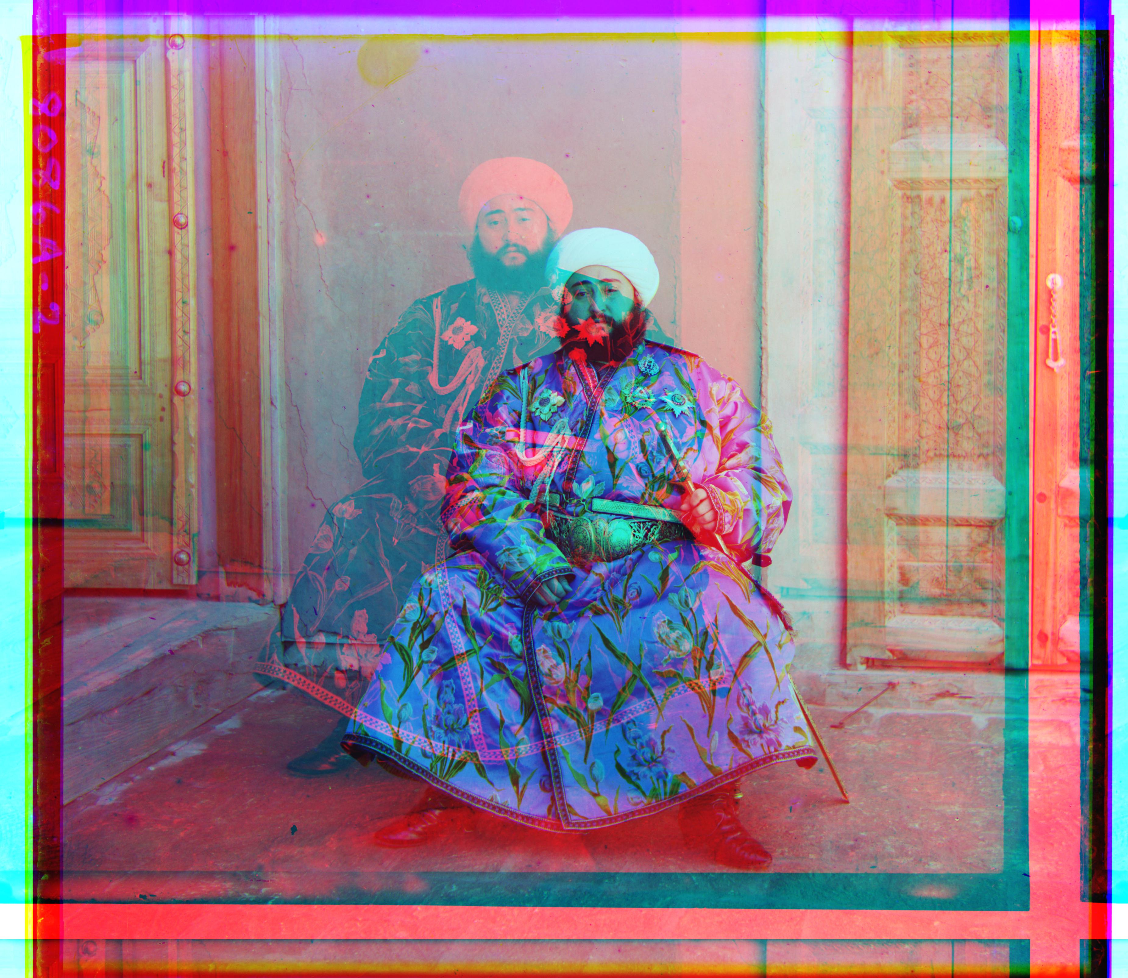
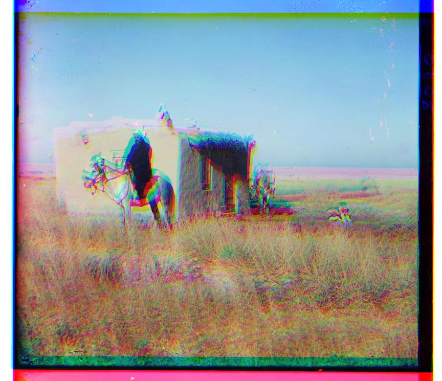
Image pyrimad allows me to move large images effectively, but some of the images, small or large, are still mis-aligned. I learnt from lecture that the edges of the scan (which have either very high or low values) could mess up the alignment. Therefore, I cropped 12.5% of all the channels on all four sides before passing them into alignment function. That have improved the results by a huge margin, and every image except for emir.tif and village.tif become visually well-aligned.
Bells and Wistles: Automatic Contrasting, Automatic White Balance
Before performing further operations, I cropped 6.25% on the four edges of all the resulting image (after channel shifting). Admittedly, this is a relative crude method, but I was able to get rid of most of the black/monocolor edges.
Automatic Contrasting
To make automatic contrasting possible, I first looked at the image in grey scale to identify the dimmest and brightest pixels. To set the dimmest pixel to 0 and the brightest pixel to 1, I shiftted the color specturum of all the point by the color of dimmest pixel, then scale up to make the brightest pixel 1.
The results are quite mixed: most of the images remains the same. Some images gain realism from automatic contrasting (make the white appear more pure), while others suffer from it because the natural range of the image is smaller.
Images with wide range of color are indifferent to auto-contrasting.

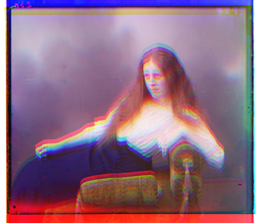
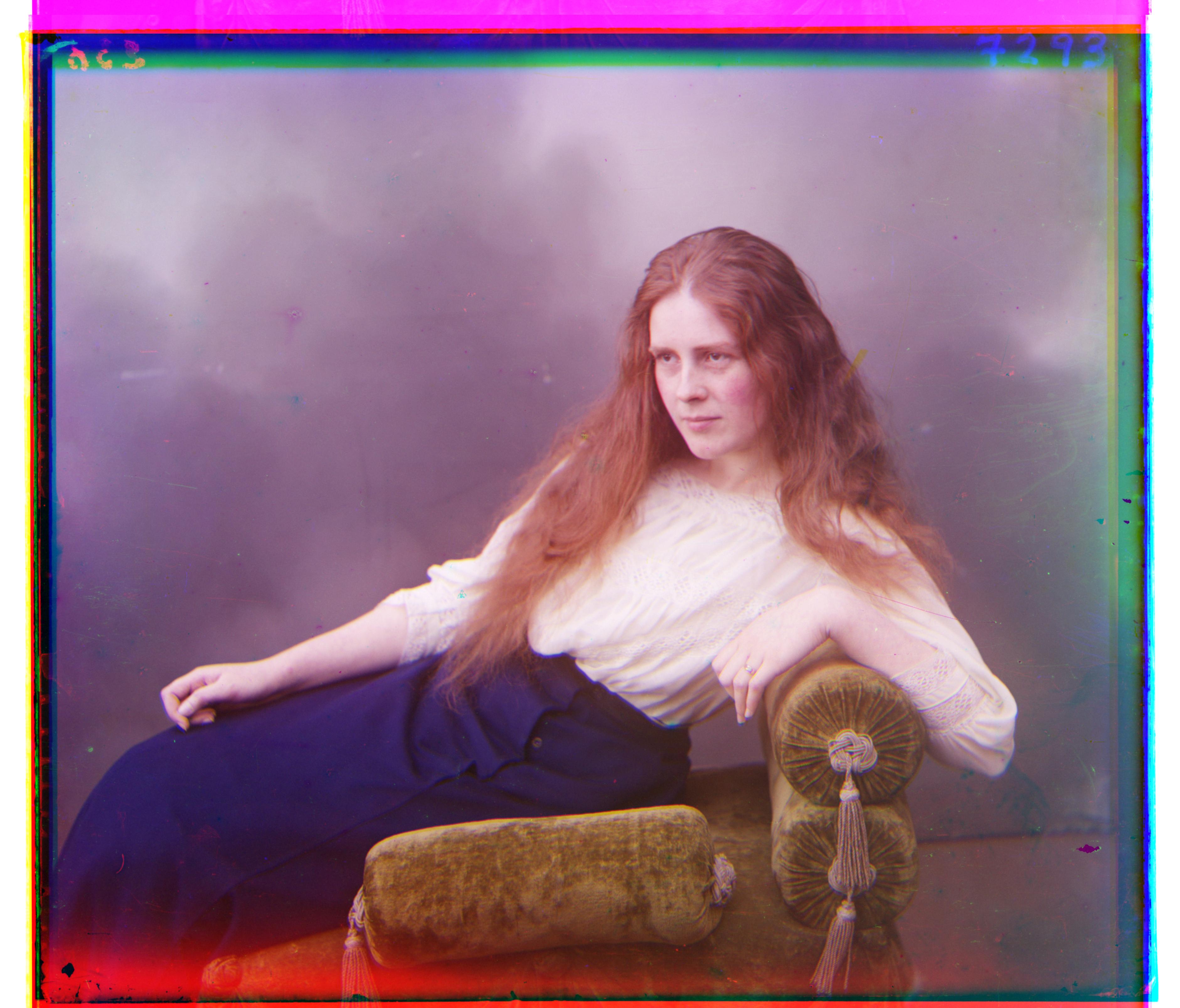
lady.tif.jpg before auto-contrasting
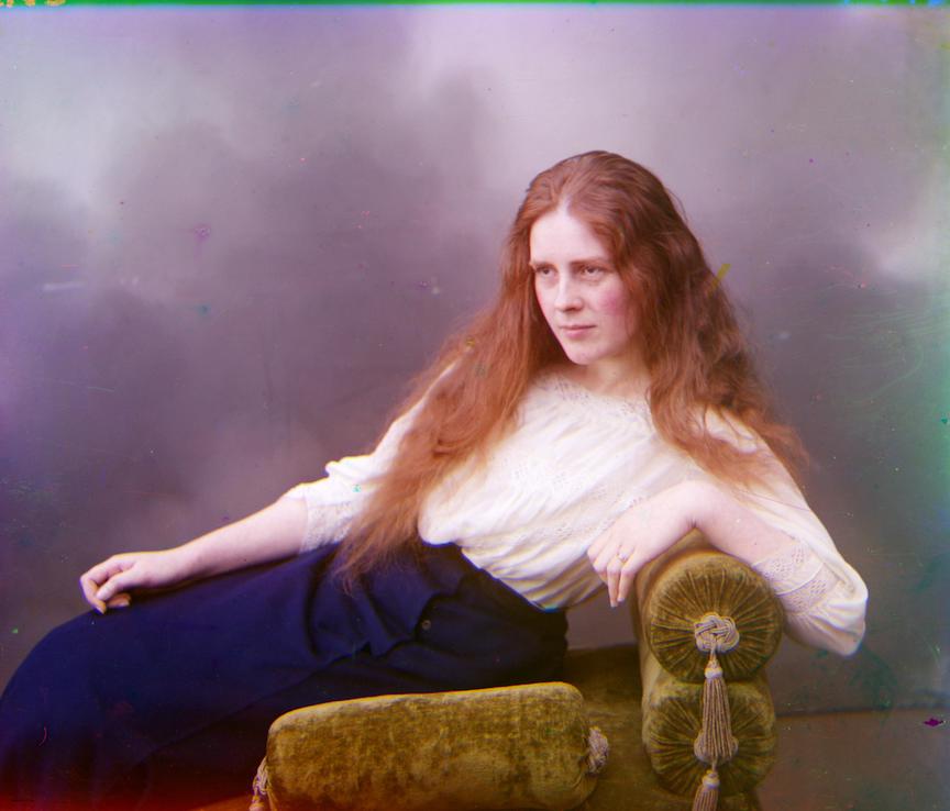
After auto-contrasting (basically the same)
Images with narrower range of color, and the extremes are supposed to be black/white benefit from auto-contrasting.
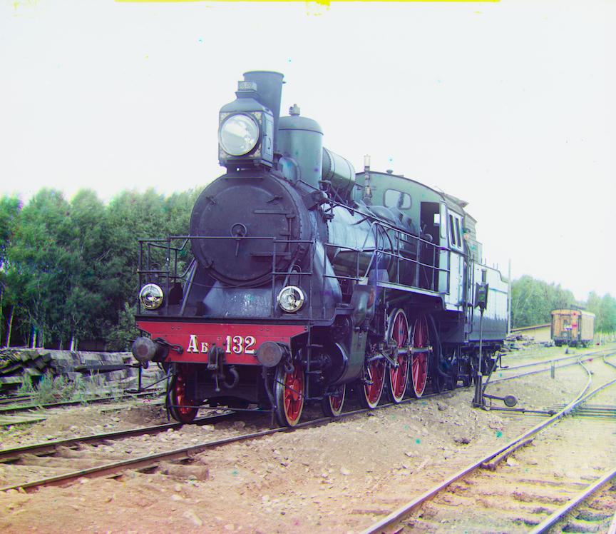
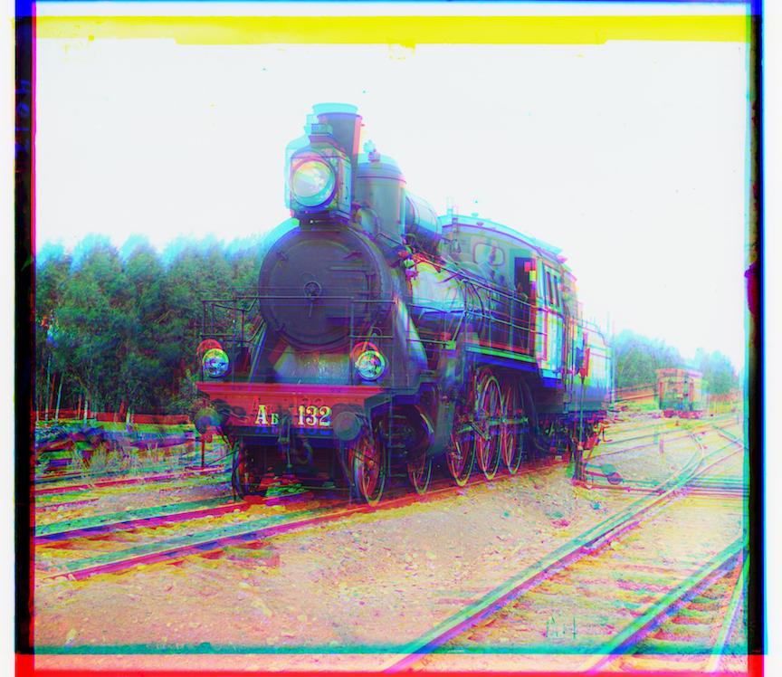
train.tif.jpg before auto-contrasting
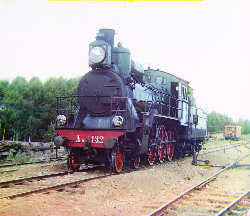
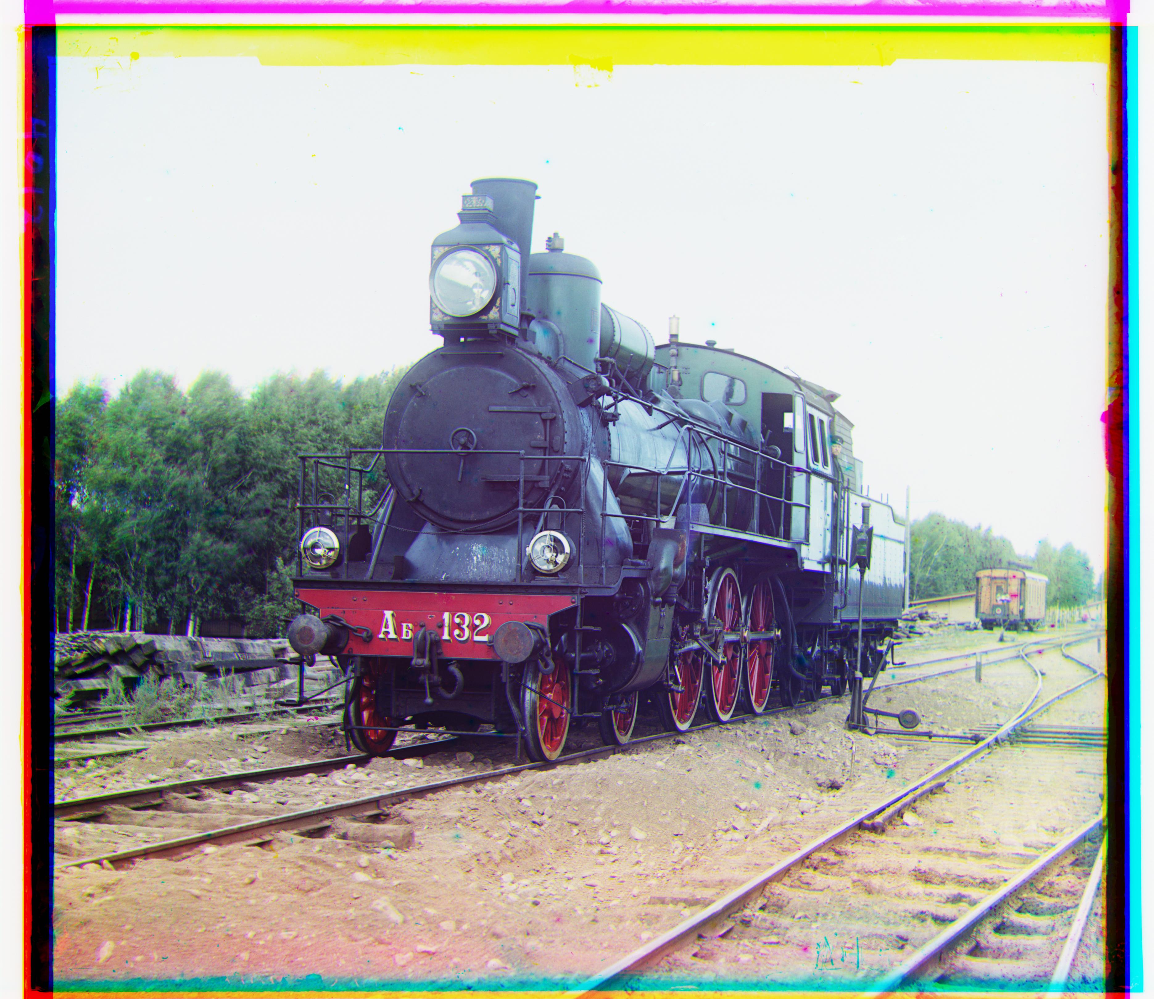
After auto-contrasting (the sky is whiter)
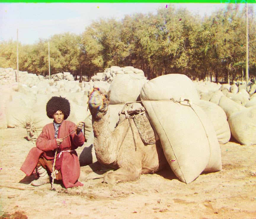
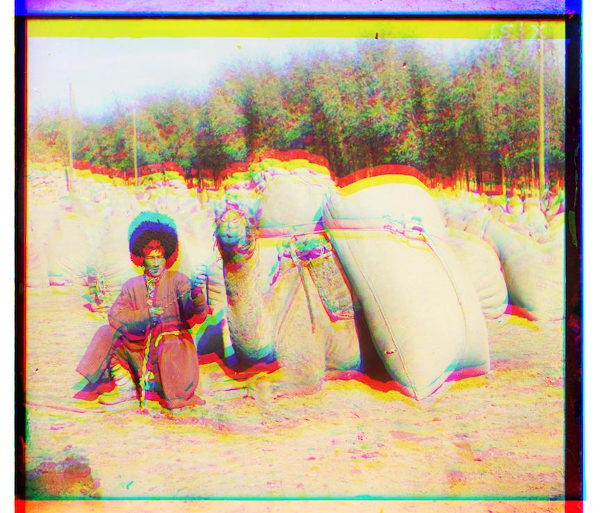
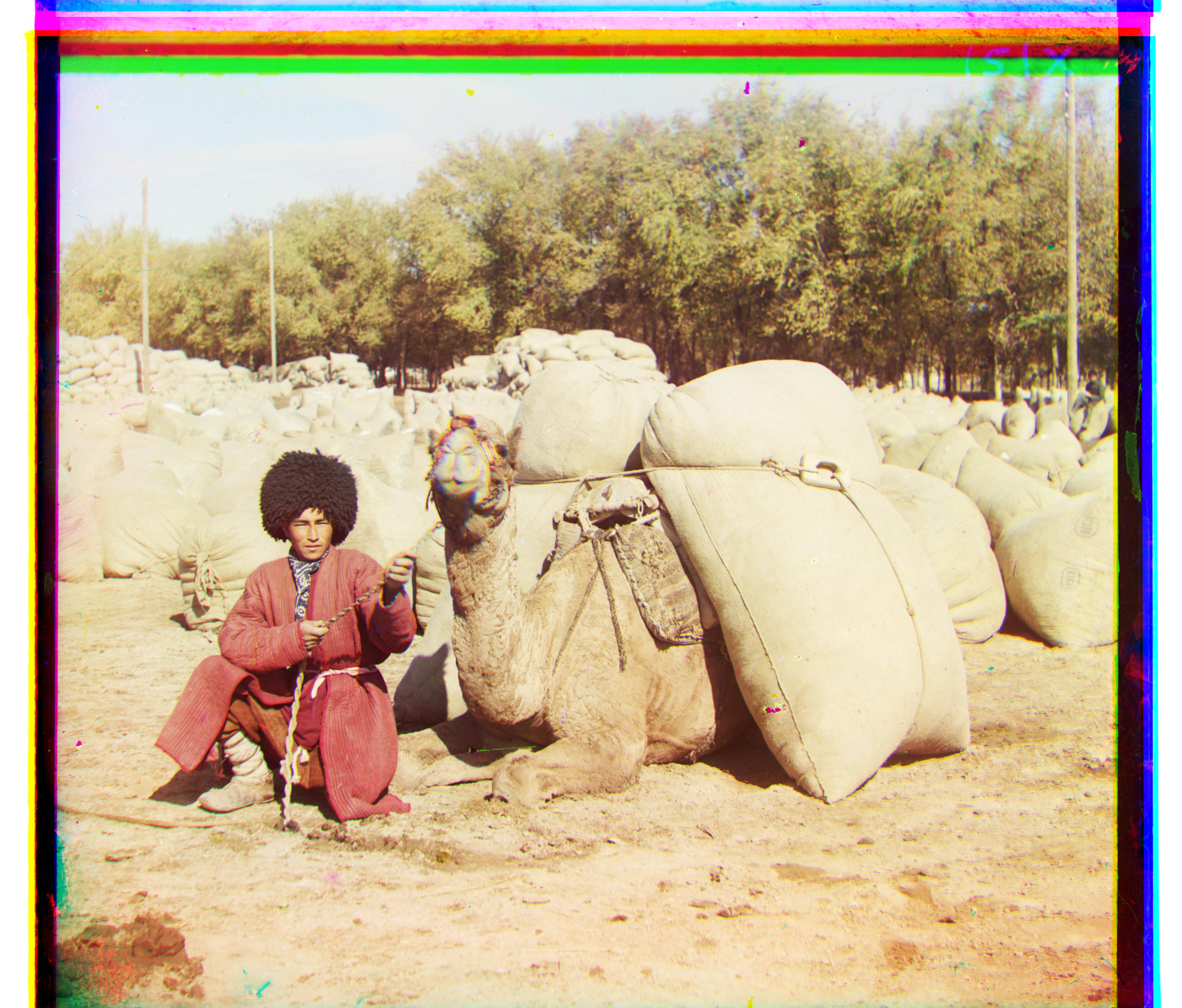
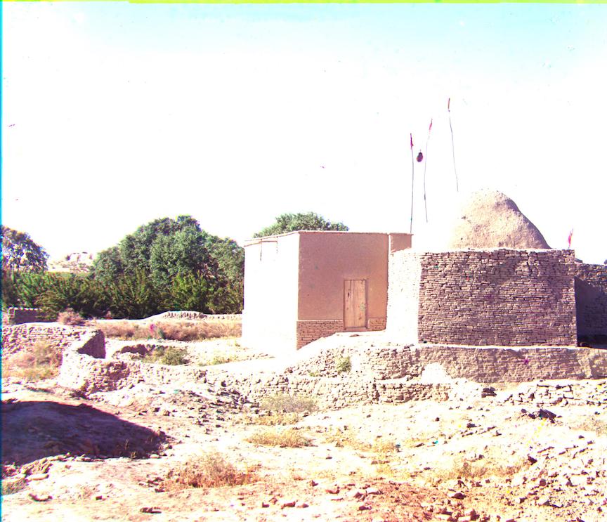
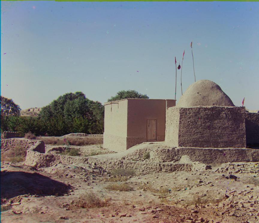
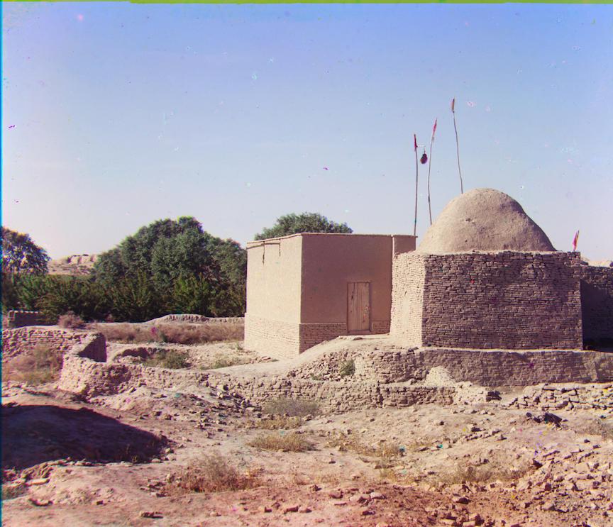
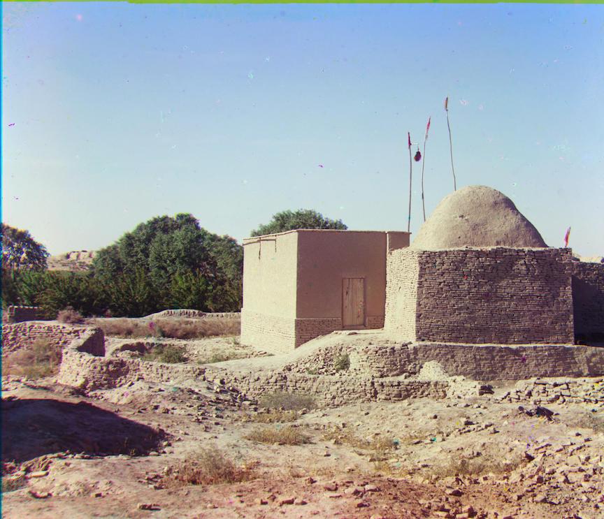
turkmen.tif.jpg before auto-contrasting
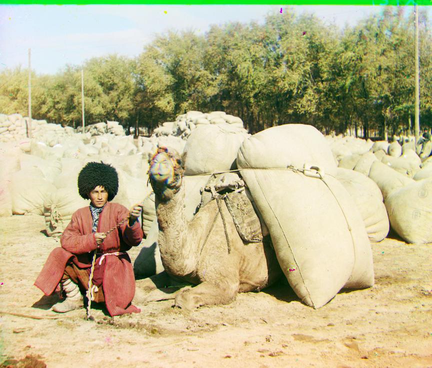
After auto-contrasting (trees are noticably greener)
Images with natually narrow range of color become worse because the colors become polorized.
borodinskom.tif.jpg before auto-contrasting
After auto-contrasting (the brown color becomes streched out, and the image is less realistic)
Automatic White Balance
I took the relatively simple way in automatic balancing: I just manipulate the shape of the image so that I can take the average over all the colors. Then I compute the factor which would set the average color to be grey ([0.5, 0.5, 0.5]) or white ([1, 1, 1]). In the next step, I multiply all the pixels in the image by the factor I computed in the last step, clipping the values that are out of bound. After those operations, I get the output image
White Balancing
Most images are way too bright when we set the mean color to white ([1, 1, 1]). A few example can be seen here:
train.tif.jpg after white balancing, image is sharper.
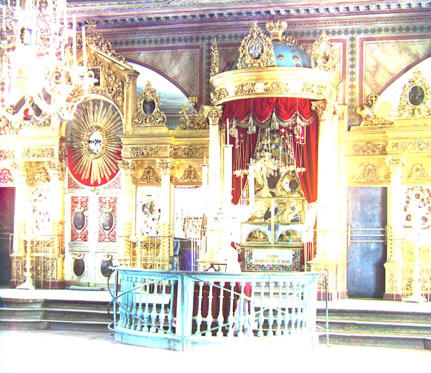
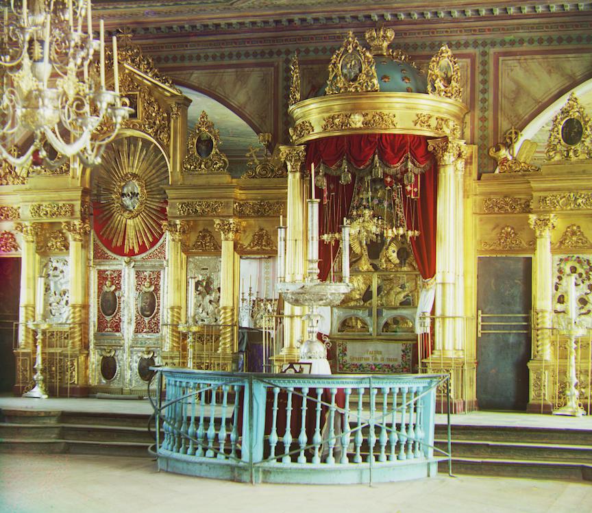
icon.tif.jpg after white balancing, items appear more glamorous.
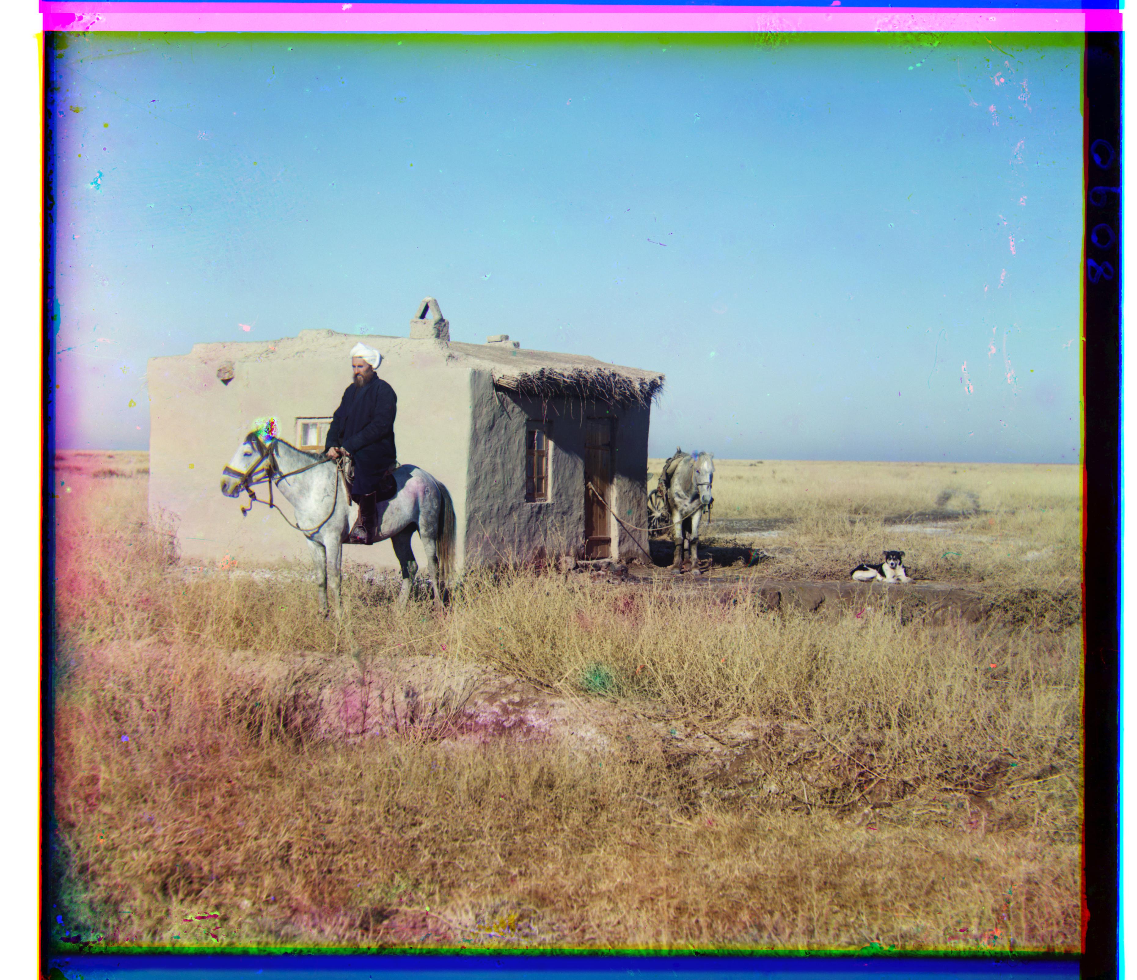
adobe.tif.jpg after white balancing
borodinskom.tif.jpg after white balancing
Grey Balancing
Since white balancing naively results in overly bright images, I attempt grey balancing next by setting the mean color to grey([0.5, 0.5, 0.5]). The image becomes way darker.
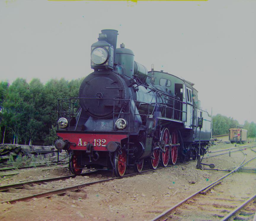
train.tif.jpg after grey balancing
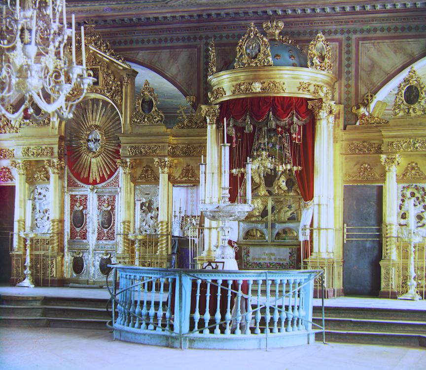
icon.tif.jpg after grey balancing
adobe.tif.jpg after grey balancing, better than the original.
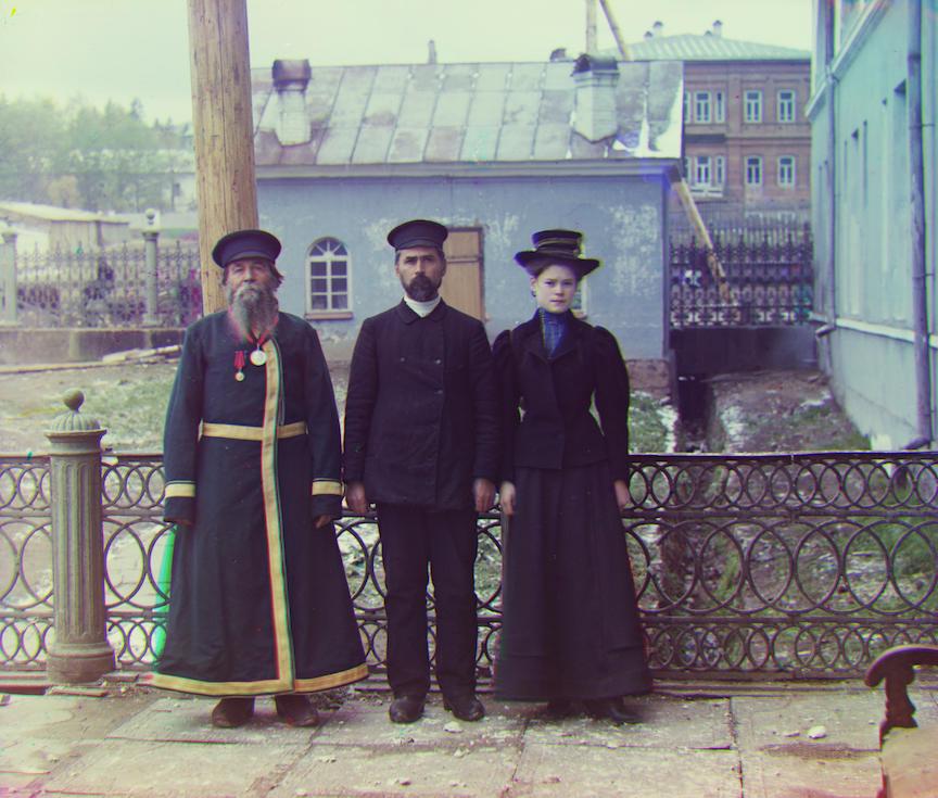
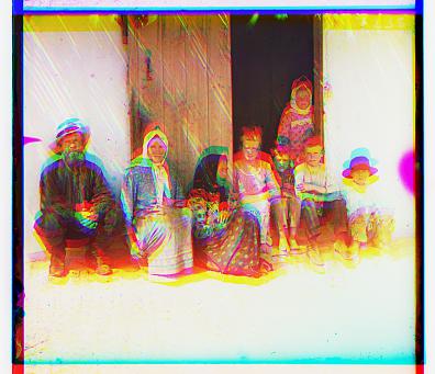
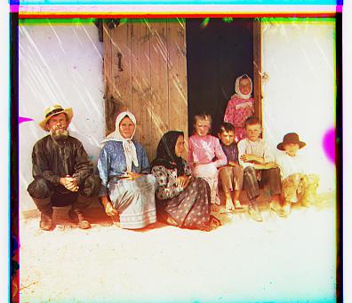
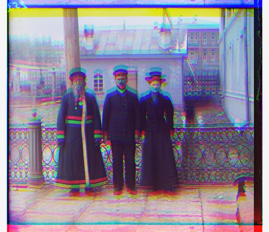
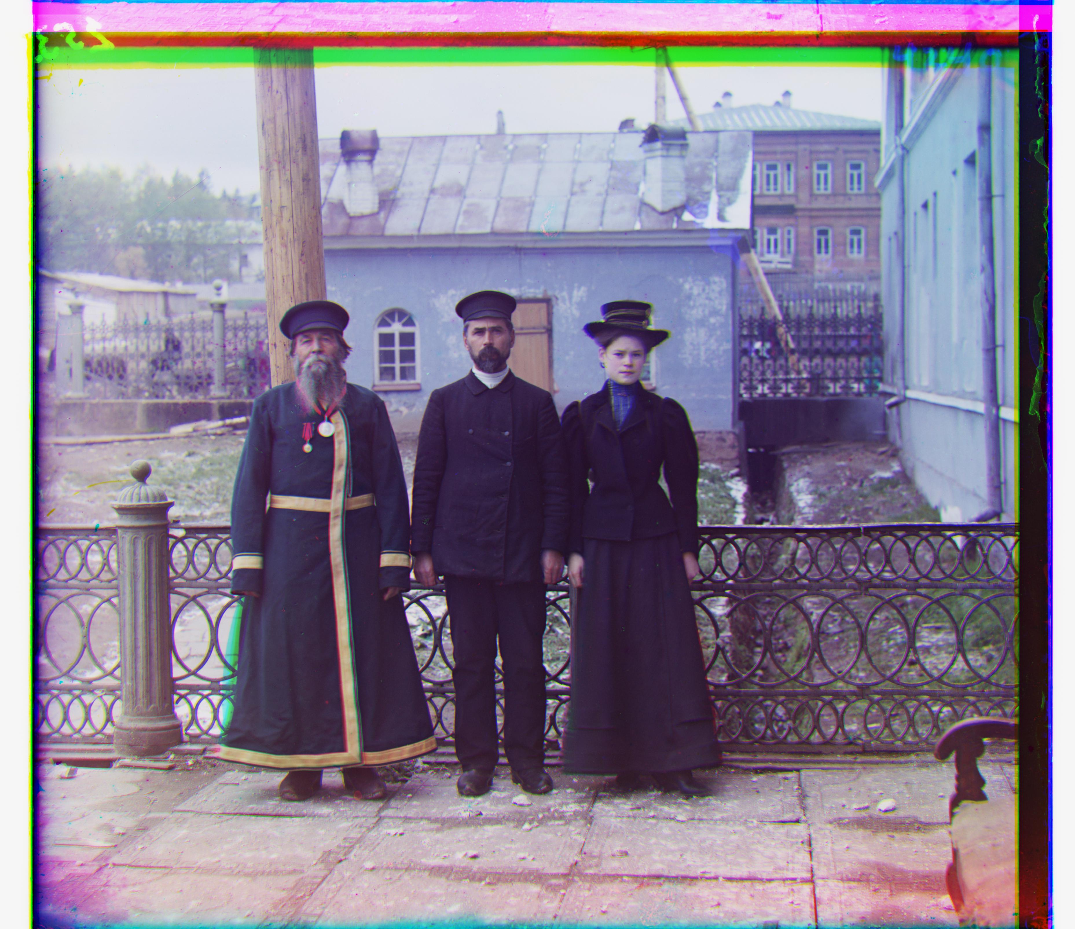
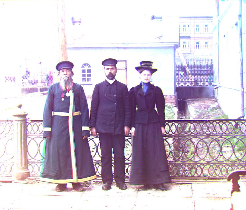
three_generations.tif.jpg after grey balancing, better than the original.
As we can see, balancing an image by setting the mean pixel to white usually results in effect similar to over-exposure, and setting the mean pixel to grey usually results in effect similar to under-exposure. The natural question to ask is: how can we find a happy spot? Let's get into the Extras!
Bells and Whistles - the Extra: True-Grey Balance
The problem we see from above is, simply put, the image becomes too bright when using white ([1, 1, 1]) balance, and becomes too dark when using grey [0.5, 0.5, 0.5] balance. With some contemplation, I can see one fundamental reason behind this: the intensity of the whole image actually increase as a whole if the average pixel is darker than [1, 1, 1] (which is almost always guaranteed), and decrease as a whole if the average pixel is brighter than [0.5, 0.5, 0.5]. Since we are seeking balance in the three channel, why not evenly distribute the sum of values in the three channels? For example, if the average channel is [0.3, 0.8, 0.7], the color on grey scale (true_grey) that, would not change the intensity of the whole image, would be [0.6, 0.6, 0.6]. If you check them, you will see the three channels sum to 1.8 before and after the true-grey balancing. So this is the basic idea, and let's see how it work in practice.
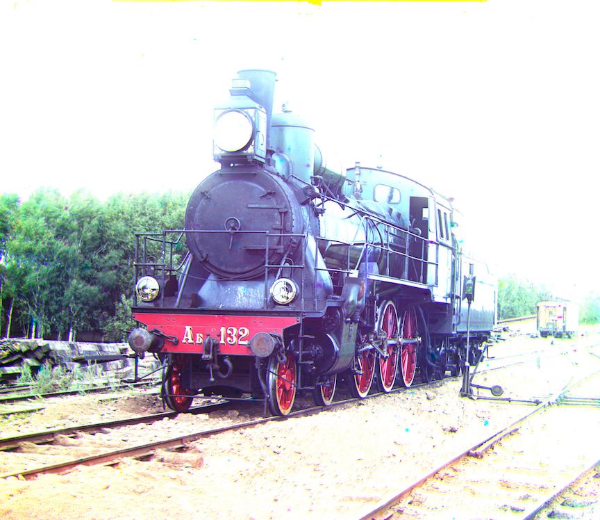
cropped and aligned train.tif.jpg
After grey balance

After true-grey (0.665659593391) balance
cropped and aligned icon.tif.jpg
After grey balance
After true-grey (0.486195752566) balance
Look slightly too blue than the original image, but work reasonably well.
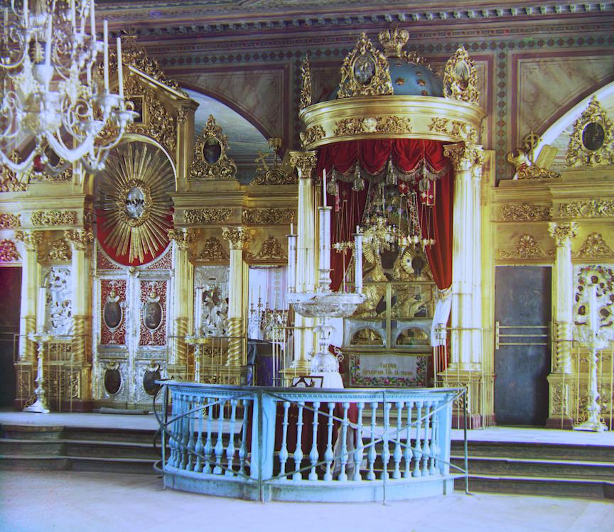
cropped and aligned icon.tif.jpg
After grey balance
After true-grey (0.620234307158) balance
Image is more natural. The color of the sky and the trees look more natural
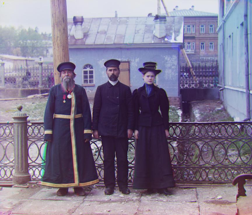
cropped and aligned three_generation.tif.jpg
After grey balance

After true-grey (0.515321683999) balance
Not suprised that grey balance work well (true-grey really close to 0.5)