
Rescale factor: 0.995, Angle shift: 0 degrees
by Zeyana Musthafa
This project is finishing something that was started way back in the 19th century by a Russian dude called Sergei Mikhailovich Prokudin-Gorskii. He had this crazy idea at a time when photographs were still in black and white, to go around Russia taking color photographs. How did he do that when color photographs weren’t even a thing..? Let’s just say he improvised.
So basically he took three photos of the exact same scene each with a different colored filter. Check out the images below. They're one set of many many photos taken by Prokudin-Gorskii. Individually they just look like regular old black and white photos, but the magic happens when you stack the three on top of each other. And that's exactly what we'll be doing to bring these photos back to life!
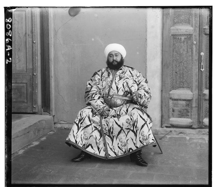
Blue filter
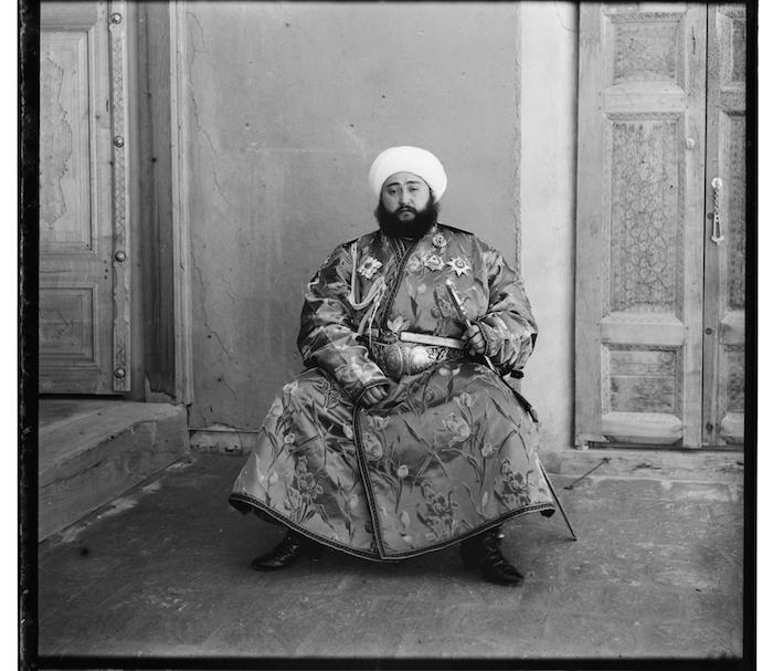
Green filter
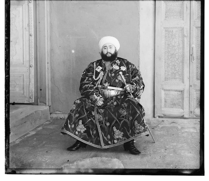
Red filter
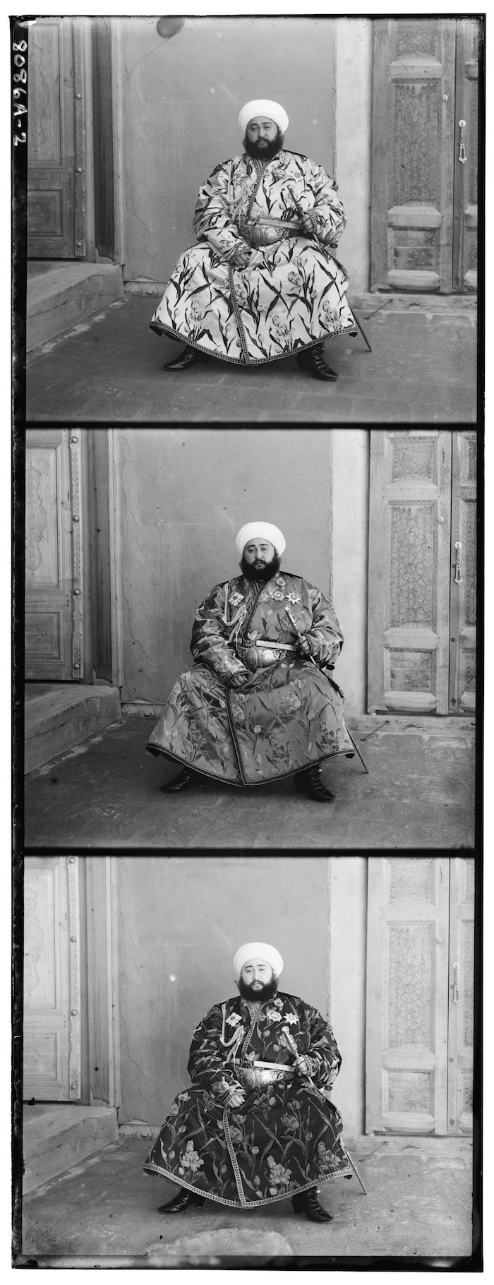
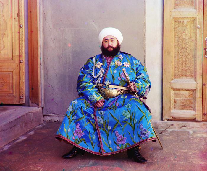
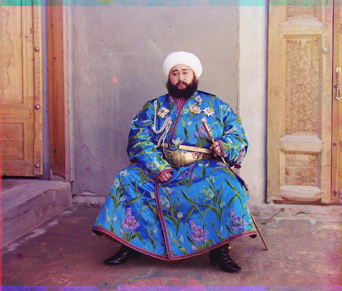
<< To the left is what we've got to work with.
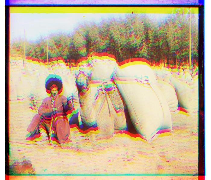
Let's split the three and stack them up and see the Emir of Bukhara in full color. >>
Bada bing, badaboom!
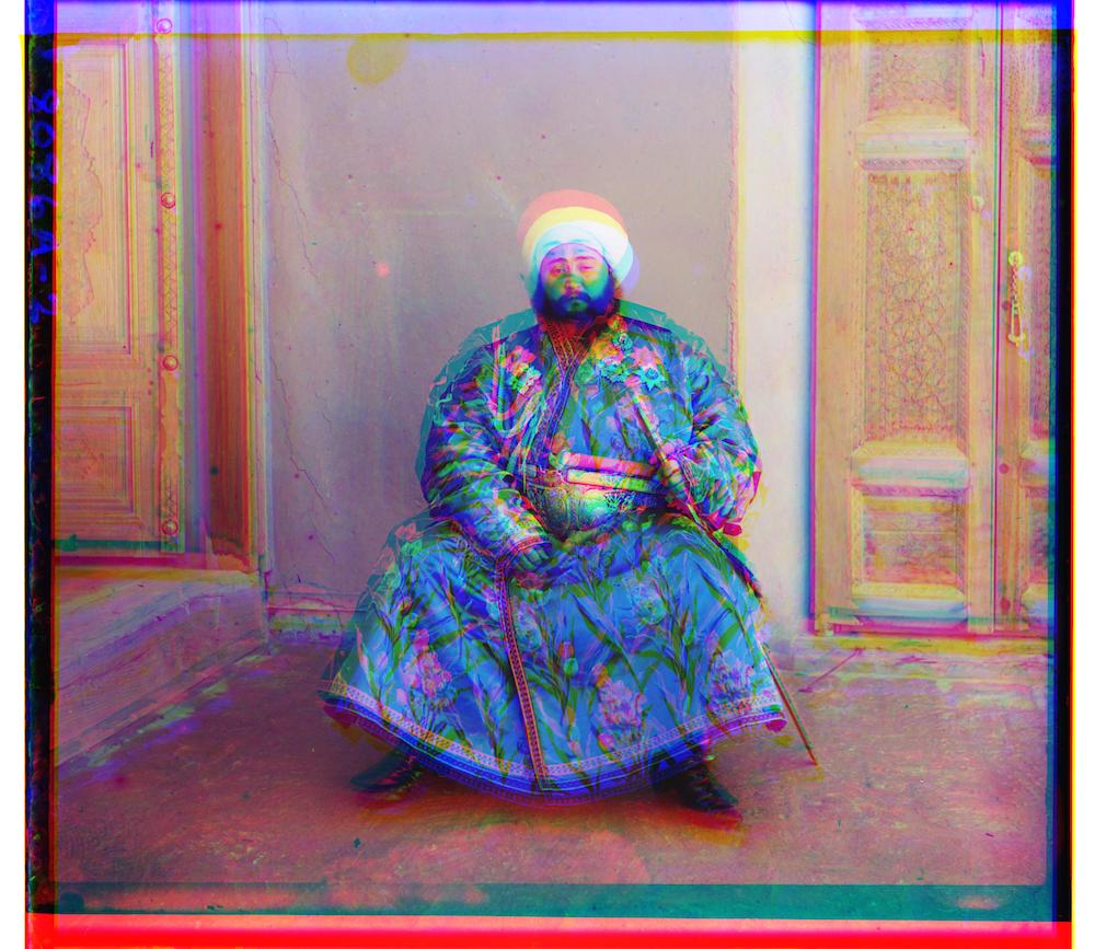
Ummm... doesn't look quite right does it? Turns out we'll need to fiddle them around a bit before everything aligns correctly.
Alright, starting with the most naive approach possible:
Why not keep shifting one color channel on top of another over a set of intervals and use the most aligned displacements we stumble across. Straightforward enough.
And if the idea of exhaustivlely search makes you uneasy, fret not. The code still runs pretty fast when the images are low res.
Quick rundown before we get our hands dirty:
One more thing, we need some metric to let the program know what is and isn't considered 'aligned'.
I tried working with two simple ones that measure the similarities between pixels in two images.
Namely, the Sum of Squared Differences (SSD) and the Normalized cross-correlation (NCC).
<< All the fancy math behind them.
(ok technically more like take 23 but no one needs to see all the ones where my code was spewing out random things)
To the left we have contestent number 1: SSD, to the right we've got contestent number 2: NCC. Drrrrumroll please!
SSD
Red: x=-1, y=14, Green: x=0, y=7
It turns out we've got a tie!
For both metrics, the red and green layers ended up with the exact same displacements over the blue base.
NCC

Red: x=-1, y=14, Green: x=0, y=7
*Pssst try hovering in and out of the images for some psychedelic before and after shots*
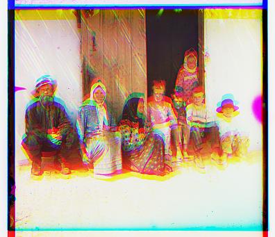
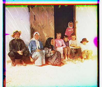
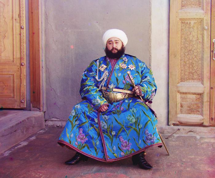
Red: x=-15, y=-15, Green: x=14, y=14
TL:DR no, not exactly.
What you're looking at is the result of running exactly what we did before but now on a higher resolution picture.
Try hovering your mouse over it. The new image you see is when we didn't do anything to it.
It got worse after running the program! Not only that, but it also took about 4.6 minutes to run!
Clearly, we need to search a waaay wider range to align it better, but if it took almost 5 minutes for such a short range, I can't bear the thought of torturing my computer trying a [100,-100] interval.
Which means we'll need to tweak our approach.
Cue the clever workaround:
How it it works is by downsampling the image by some factor and estimating the alignment when it's all pixelated, then go up a level, updating the estimate until we eventually reach back up to the actual image. By then, fingers crossed the image comes out aligned.
Some deets:
You know the drill, hover in and out of the image to see the transformation unfold.
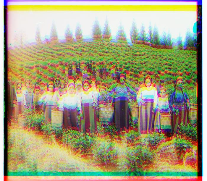
Red: x=22, y=-89, Green: x=16, y=42
Red: x=-13, y=95, Green: x=-5, y=118
Red: x=-14, y=108, Green: x=-8, y=110
Red: x=-19, y=79, Green: x=16, y=56
Hmmm, those don't look quite right.
Turns out we got a little lucky with that other image. Because there's one more step we should take care of to reach the promised Land of Alignment.
See those black borders around the images? They're screwing with our metric.
Thankfully, we have an easy enough solution: crop them out.
For now I'm just handwavily chopping off 100 pixels from the top and bottom and 200 off the sides.
But *spoilers* I'll be upgrading to a more methodic way in the bells and whistles section.
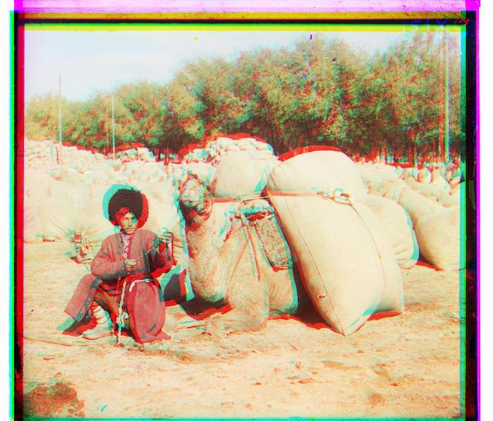
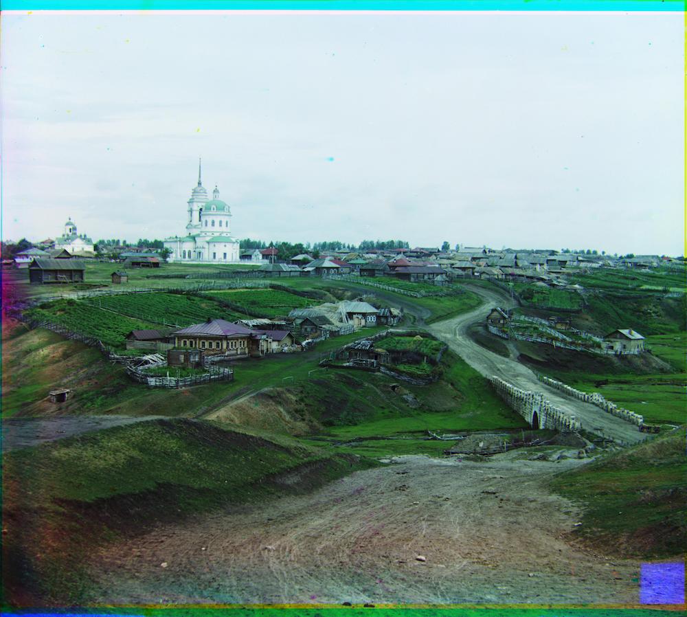
Red: x=13, y=121, Green: x=17, y=61
Red: x=32, y=88, Green: x=6, y=44
Red: x=25, y=114, Green: x=18, y=56
Look at them nice crisp pictures.
We still need to take care of those funny colors showing up from shifting the layers around. That and some other fun stuff are in the bells and whistles section. But what we have so far's not too shabby.
Exceeept while running through the rest of the images I realized there were two stubborn ones that still refused to align right.
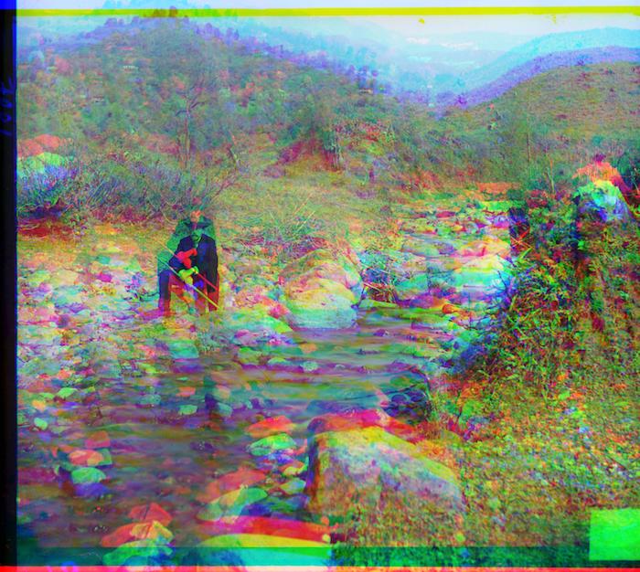
Red: x=27, y=126, Green: x=29, y=80
Red: x=13, y=90, Green: x=12, y=65
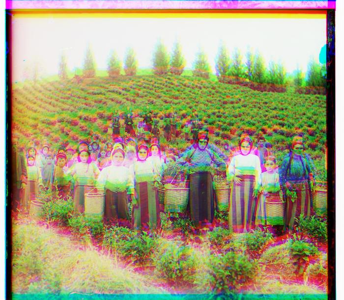
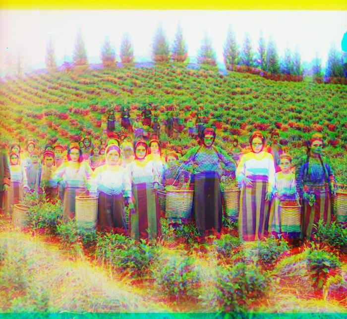
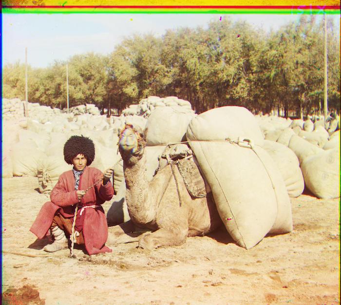
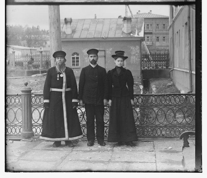
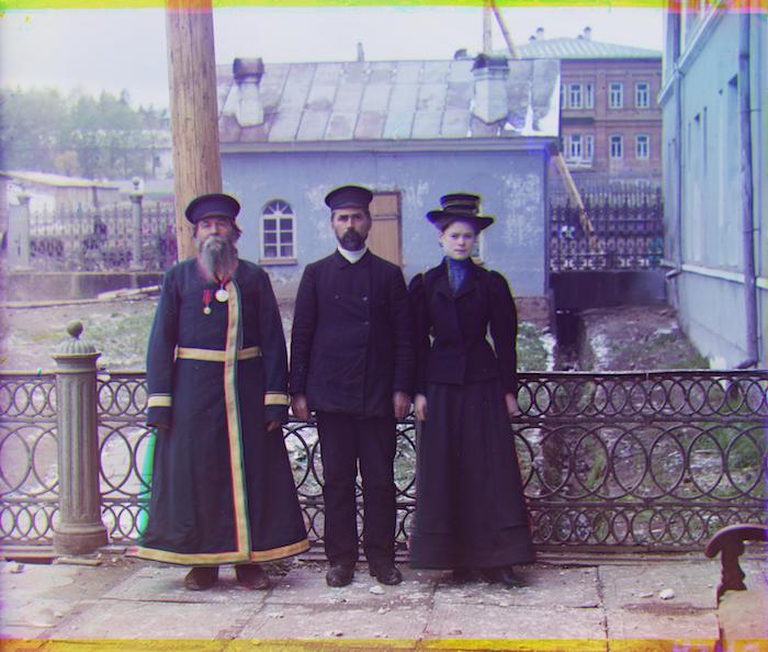
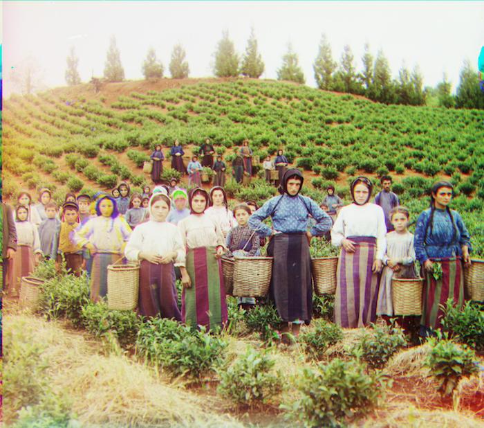
Notice how there's a whole lot of green in those images. And remember how way in the beginning I mentioned that the base I was using was the blue color channel? Don't blame ya if you don't.
Well it turns out that using the green color channel as the base is much more effective for these ones. You can see for yourself with the difference between the left and the right.
The best part is that the rest of the images also work just fine using green as the base. Win-win!
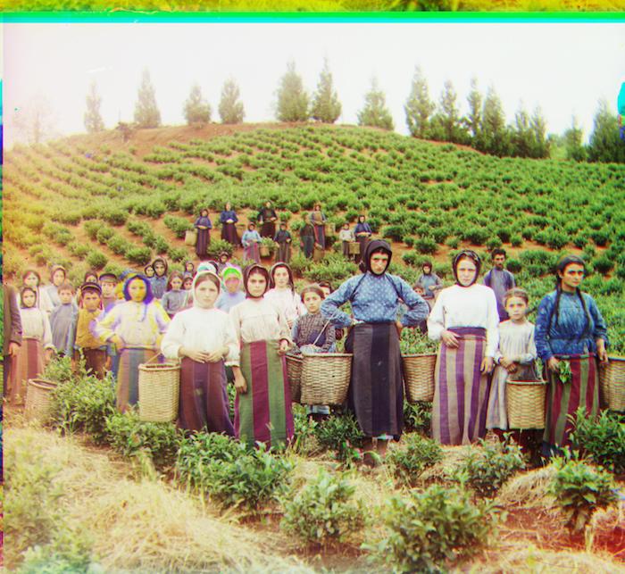
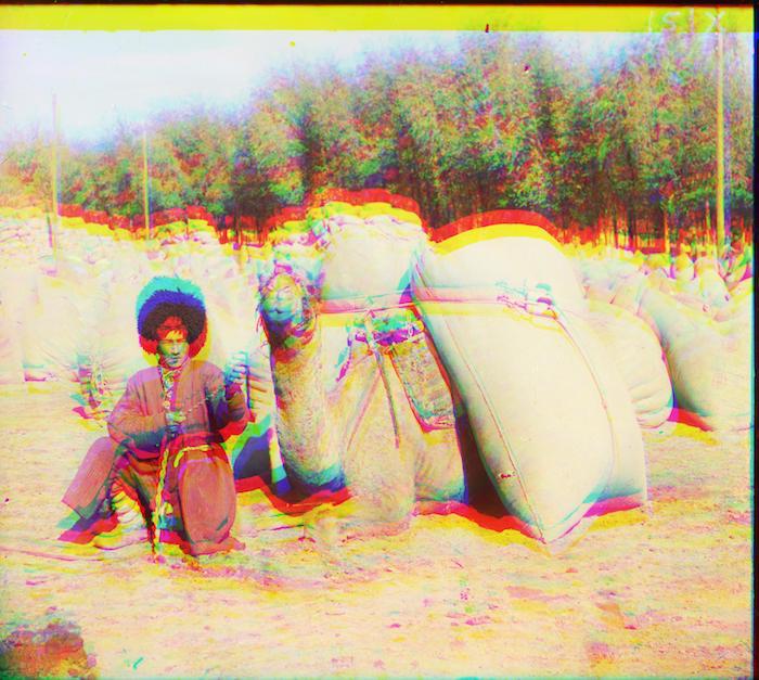
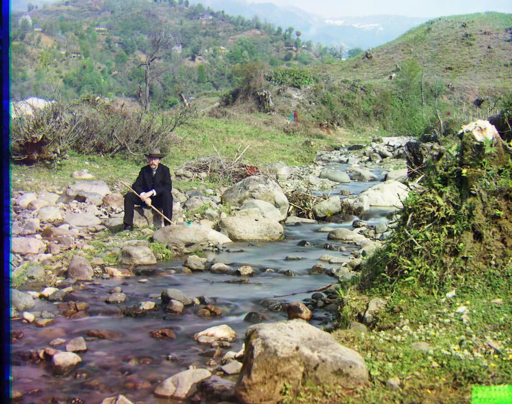
Red: x=8, y=98, Blue: x=-29, y=-80
Red: x=10, y=72, Blue: x=-12, y=-65
Initially, I cropped the black borders around images by a fixed amount but then I decided to get a little fancy and use edge detection instead.
The method is still at the mercy of *significant* abnormalities in the border but for most cases it works perfectly fine.
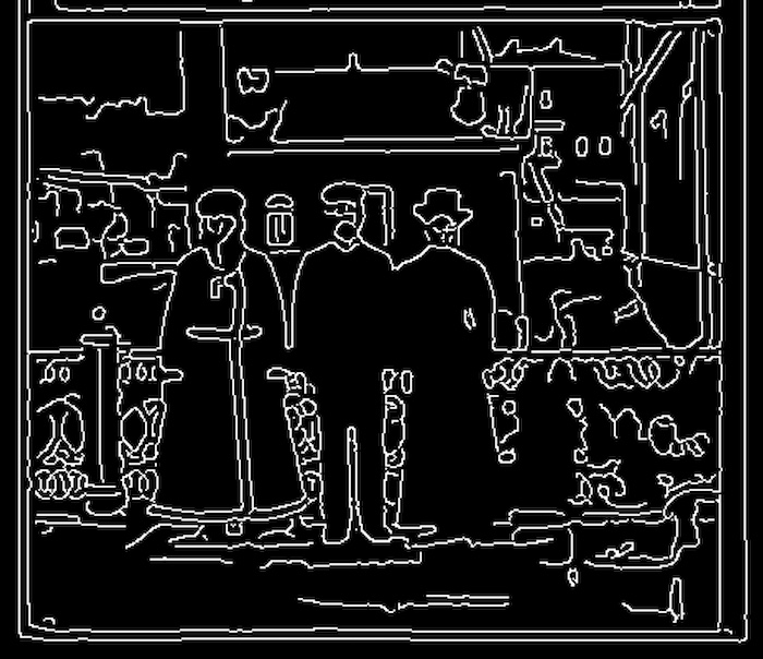
When I fed in a 0.125 rescaled image (I downsampled since it runs faster and the border doesn't get lost in the details), the Canny edge detector function spits out what you see above right.
The premise was to pick out the edge that represents the border by searching inward at a couple points from each side until it hits an edge.
We already did most of the cropping heavylifting before aligning the image, so there's not a whole lot to crop afterwards.
Better yet, getting rid of the random colors from shifting the layers is a lot simpler because the amount to crop is just the amount the layer was displaced by.
Since I already knew how much that was, it mostly just involved some index slicing.
We're living in the era of instagram and filters, so no image deserves to be seen without peppering it up a little first.
I've decided to go for a low-key "I just woke up (but I've got enough make-up on to still look good)" selfie effect.
To put it more literally, I'll be messing around with the contrast a tad so that the colors pop without going overboard.
What I did:
After playing around with some functions in the scikit-image package, the first transformation I did was 'adjust_sigmoid'.
Then I rescaled the intensities to be over the full range [0,1] (0 and 1 are as dark and light as you can get with the color channels).
only adjust_sigmoid:
only rescale_intensity:
< cut_off=0.5, gain=7
^ cut_off=0.65, gain=3
< cut_off=0.45, gain=3
range= (0.1, 1) >
range= (0, 1) ^
range= (0, 0.9) >
(If you think it looks the same as what we started with, hovering into the image will change it back to the original.)
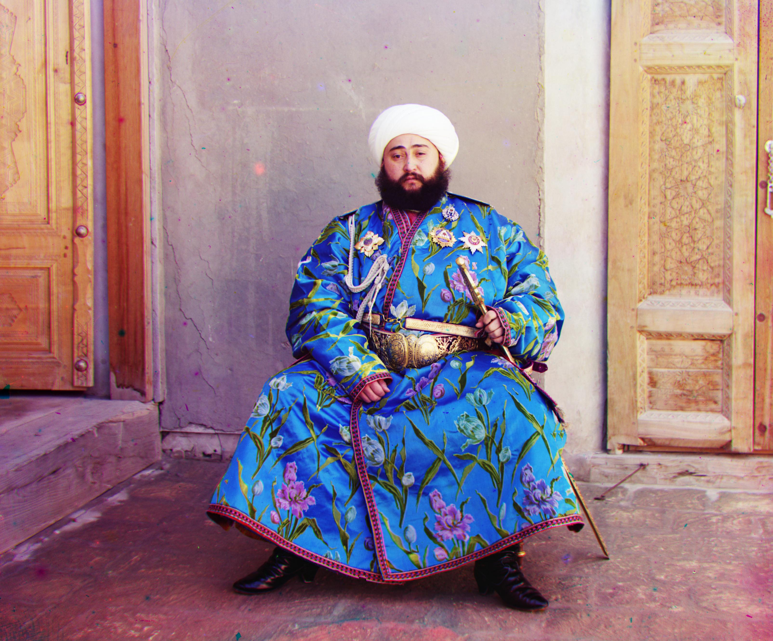
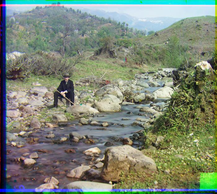
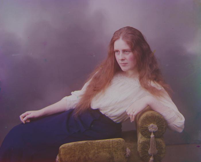
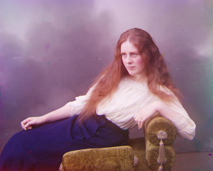
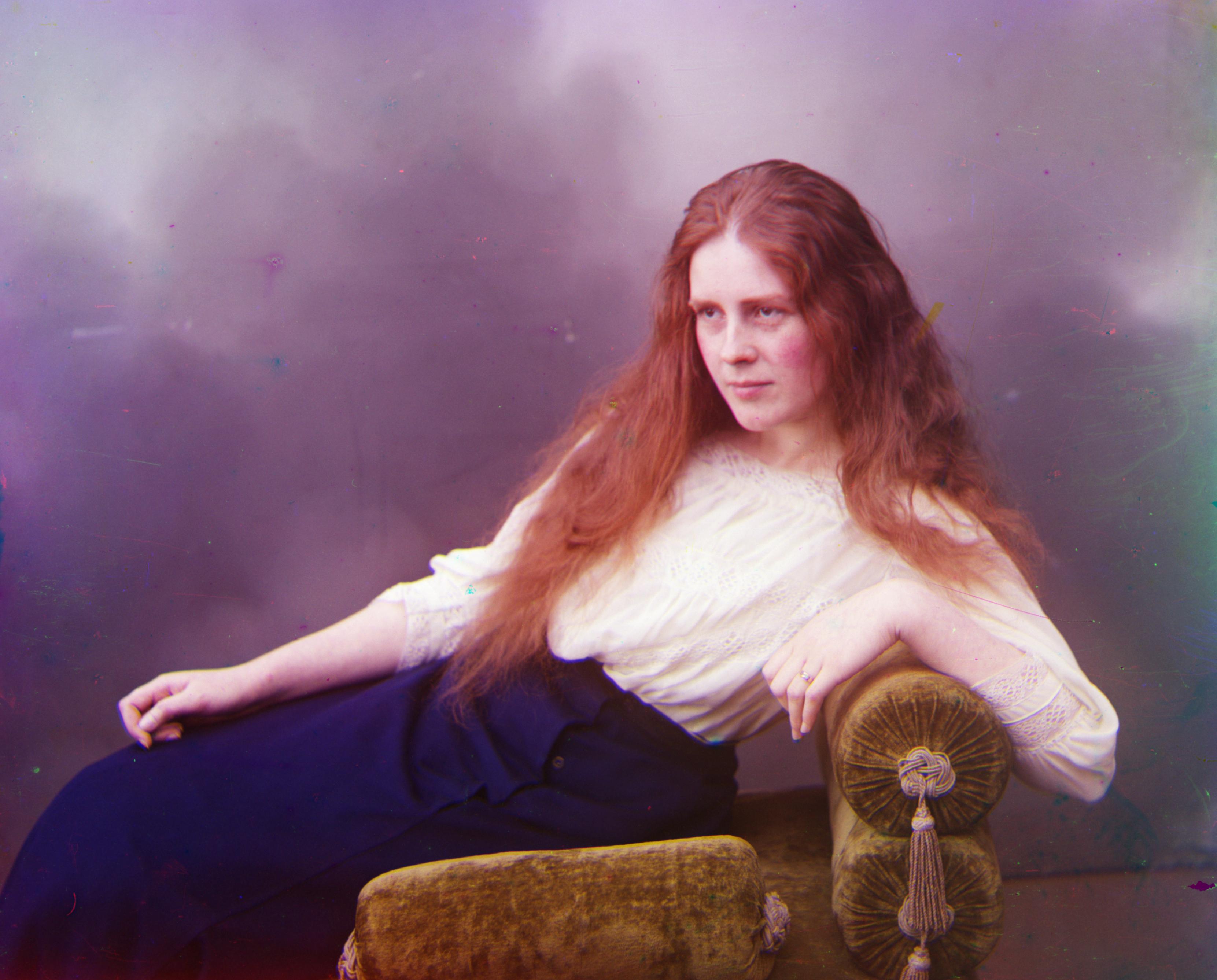
Being the bloody perfectionist I am with these types of things, I wanted to know: can we align the images even more precisely. If you're squinting at the images trying to see what's wrong with them as they are now, don't worry. They look pretty aligned to me as well.
But. but. Maybe, we could get it a teensy bit better.
Besides, it just involves adding two more for loops. So why the heck not.
Plan of Attack (besides the x and y translations)
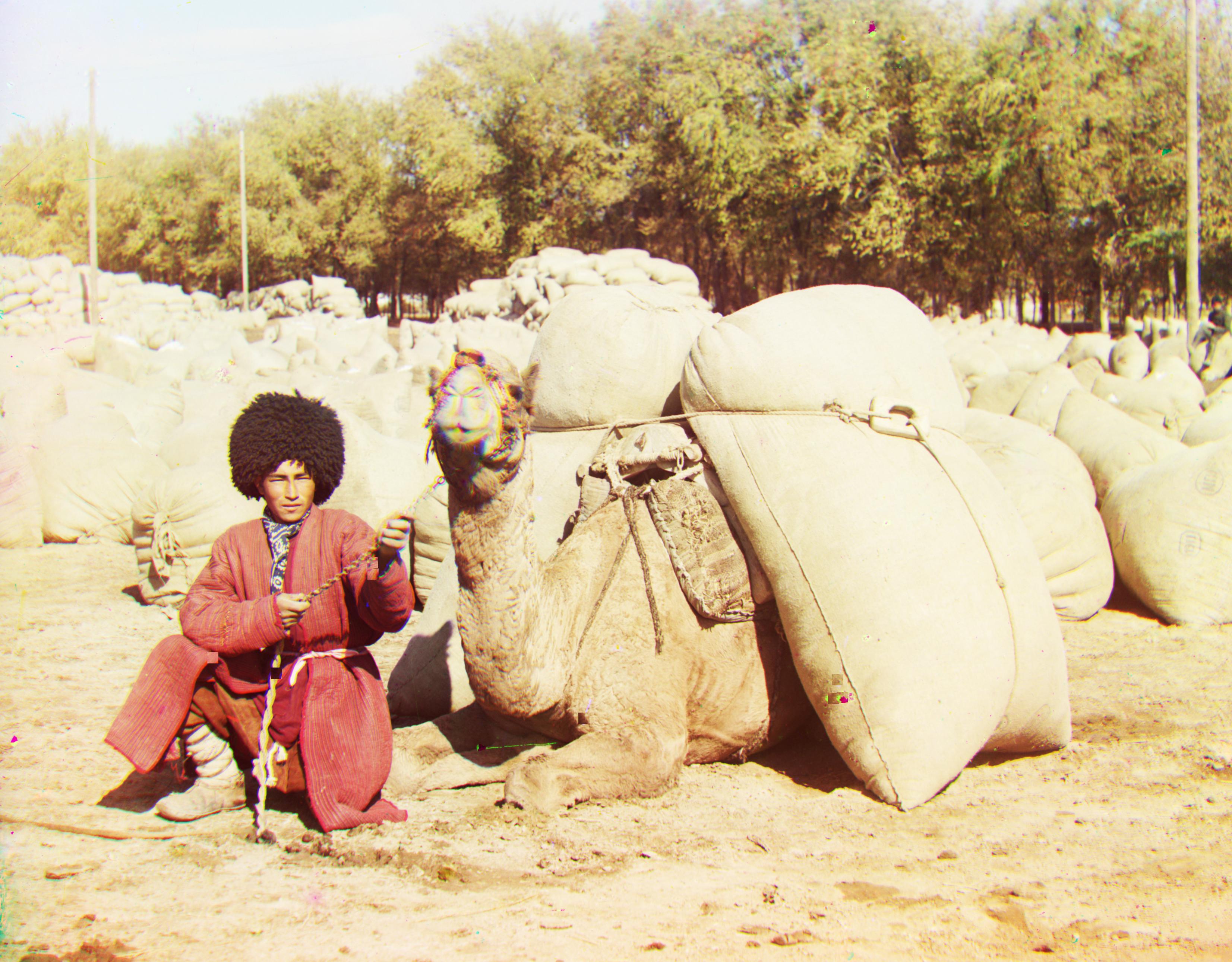
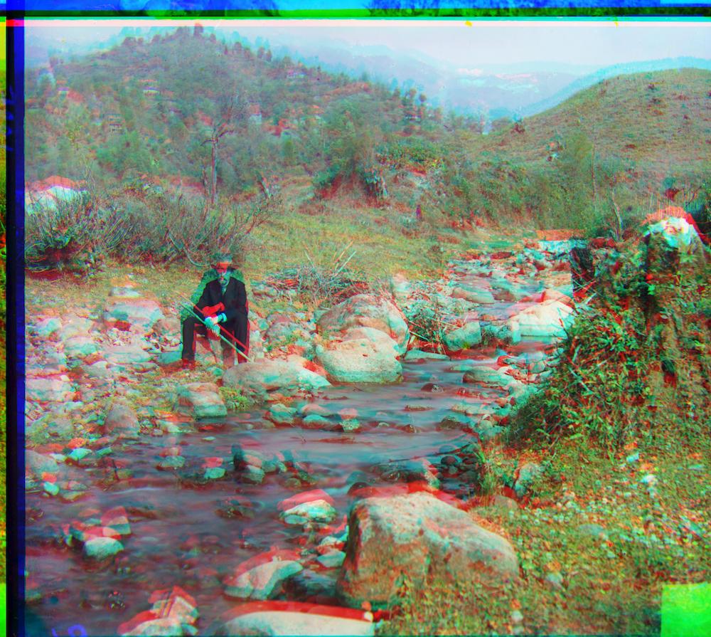
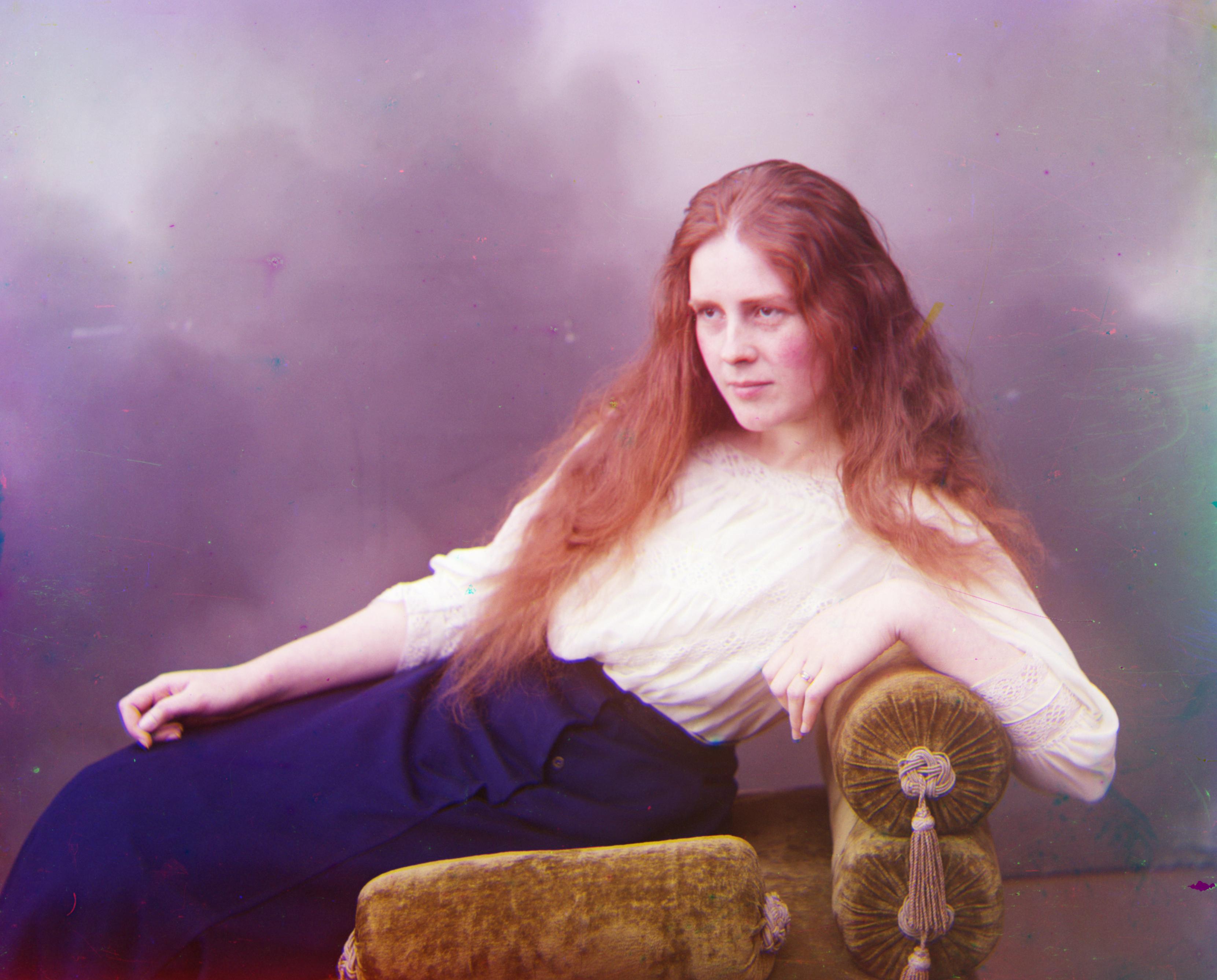
Rescale factor: 0.995, Angle shift: 0 degrees
After running all of the usual stuff to find the best x and y displacement, I tried rescaling the top color channel by 0.95 and 1.01 to see if it aligns better with the base channel. Not rescaling at all was better.
I then tried 0.90 and 1.1. Not rescaling was still better. Then I tried 0.995 and 1.001. Finally, at that point, SSD decided 0.995 was the slightly better option.
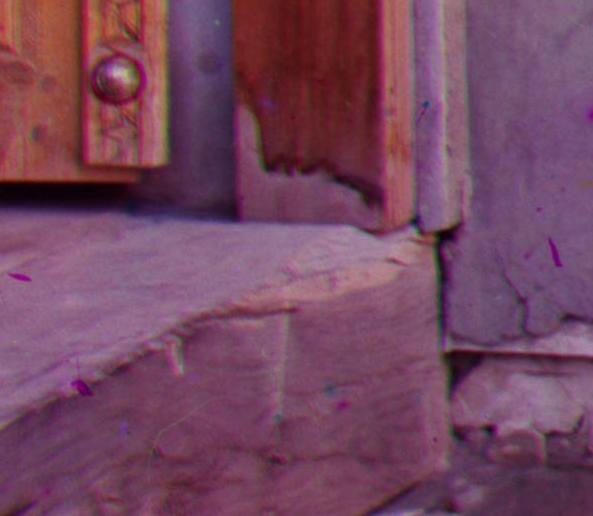
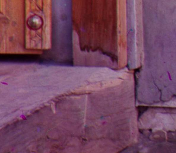
I save the result and stare at it long and hard. It took me a while, but you can kind of tell near the sides of the image.
Do you see the difference with the two zoomed in images on the left? The top is a liiiittle bit fuzzier than the bottom one rescaled by 0.995.
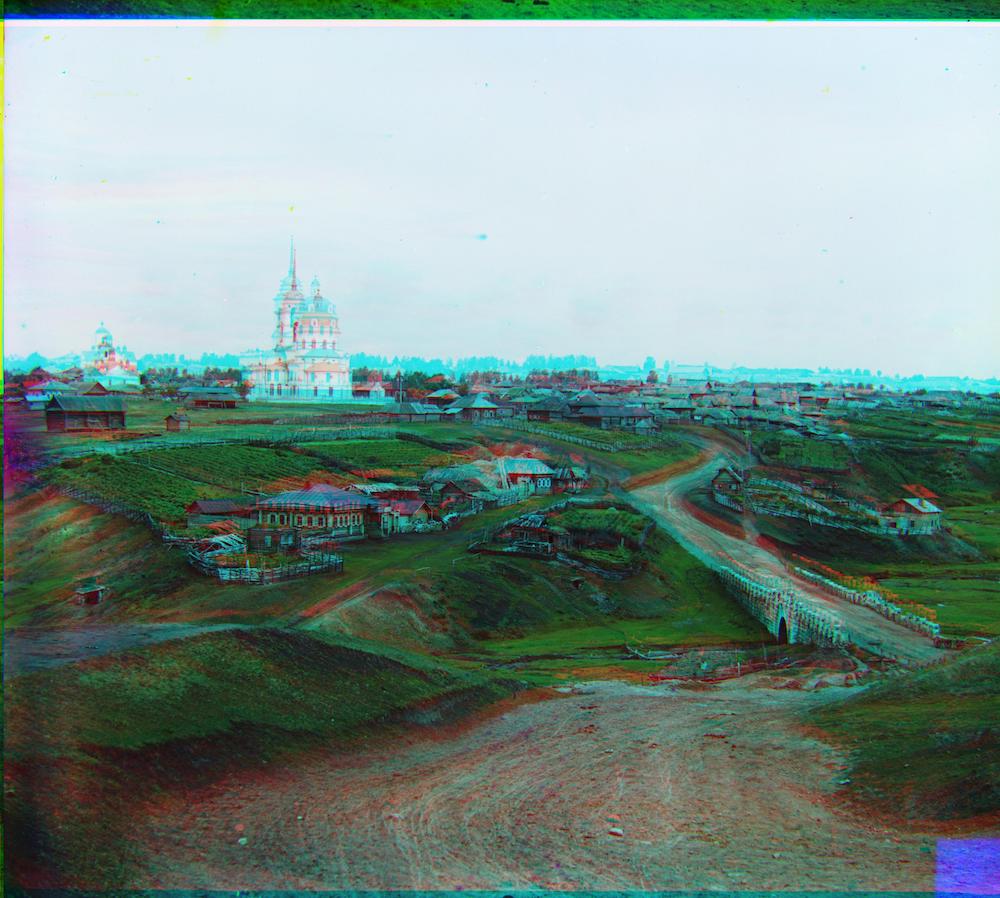
As for doing small rotations. I tried shifting by 1, 0.5, 0.1, -0.1, -0.5, -1 degrees. None of them fared better than what we already had. Not to mention that it literally took like an hour and a half to run!
There could be some tiny angle shift that minutely improves the image, but I've decided to rest my case there.
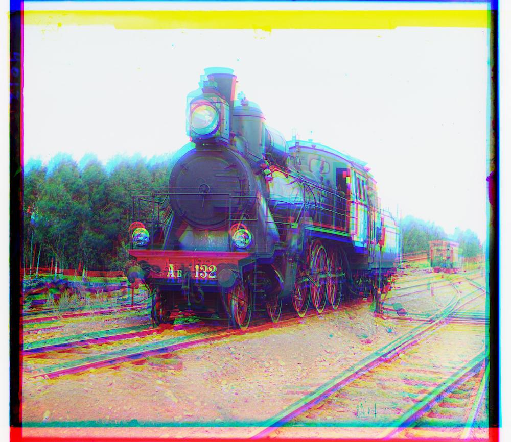
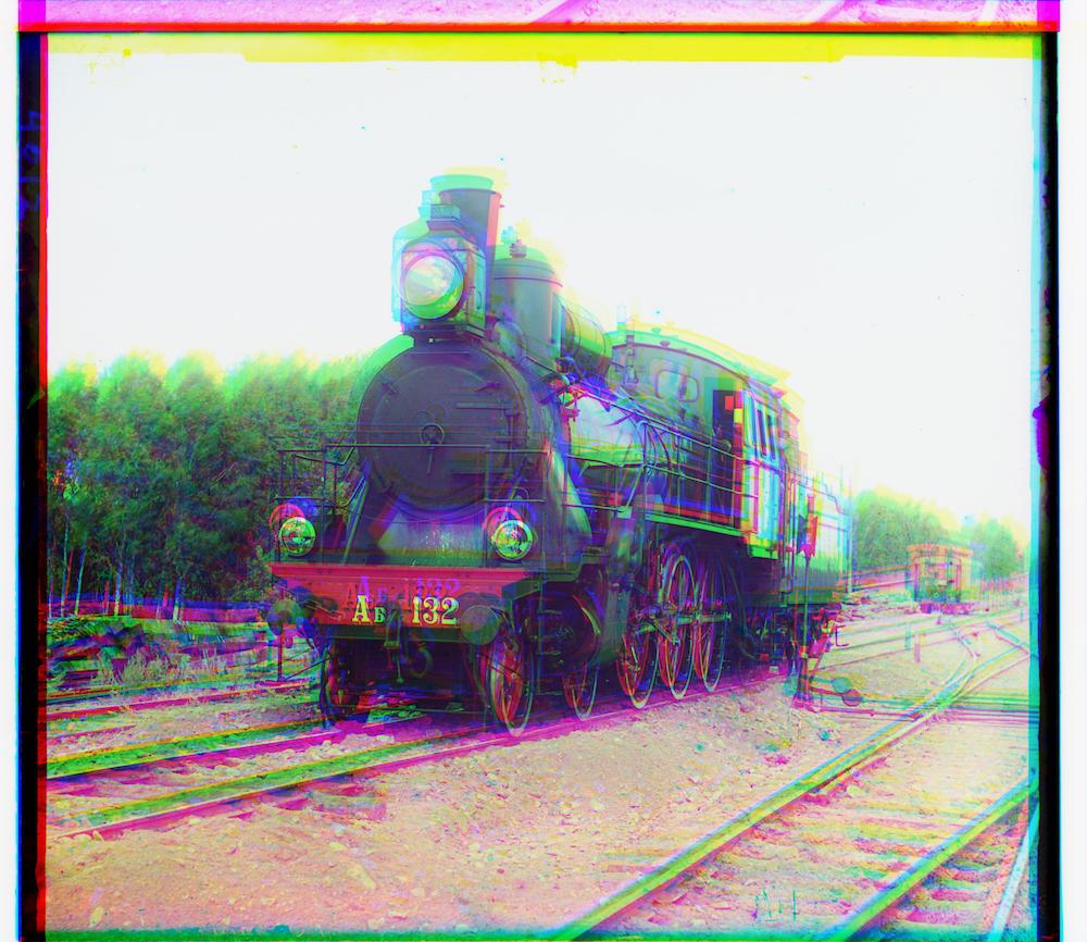
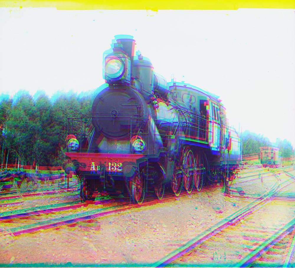
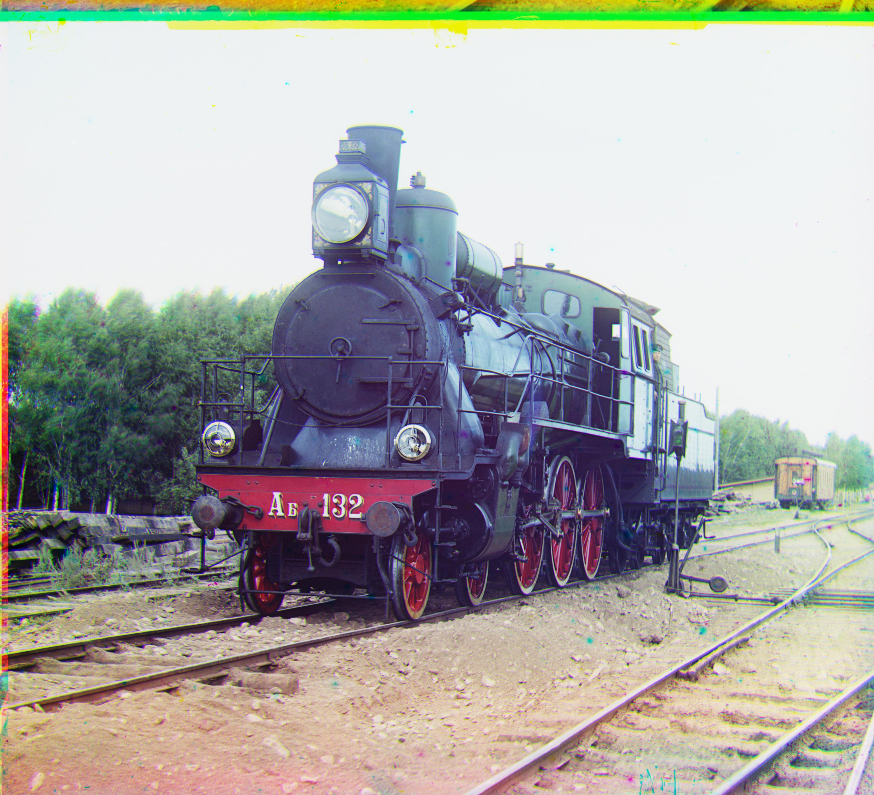
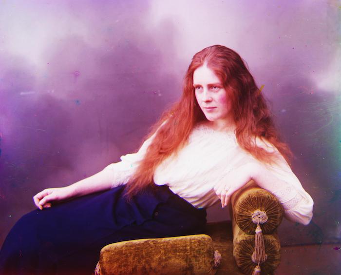
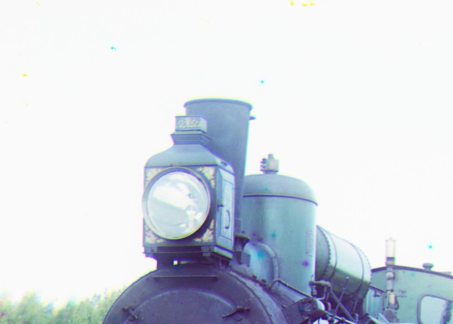
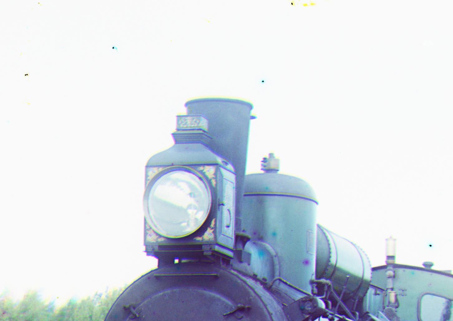
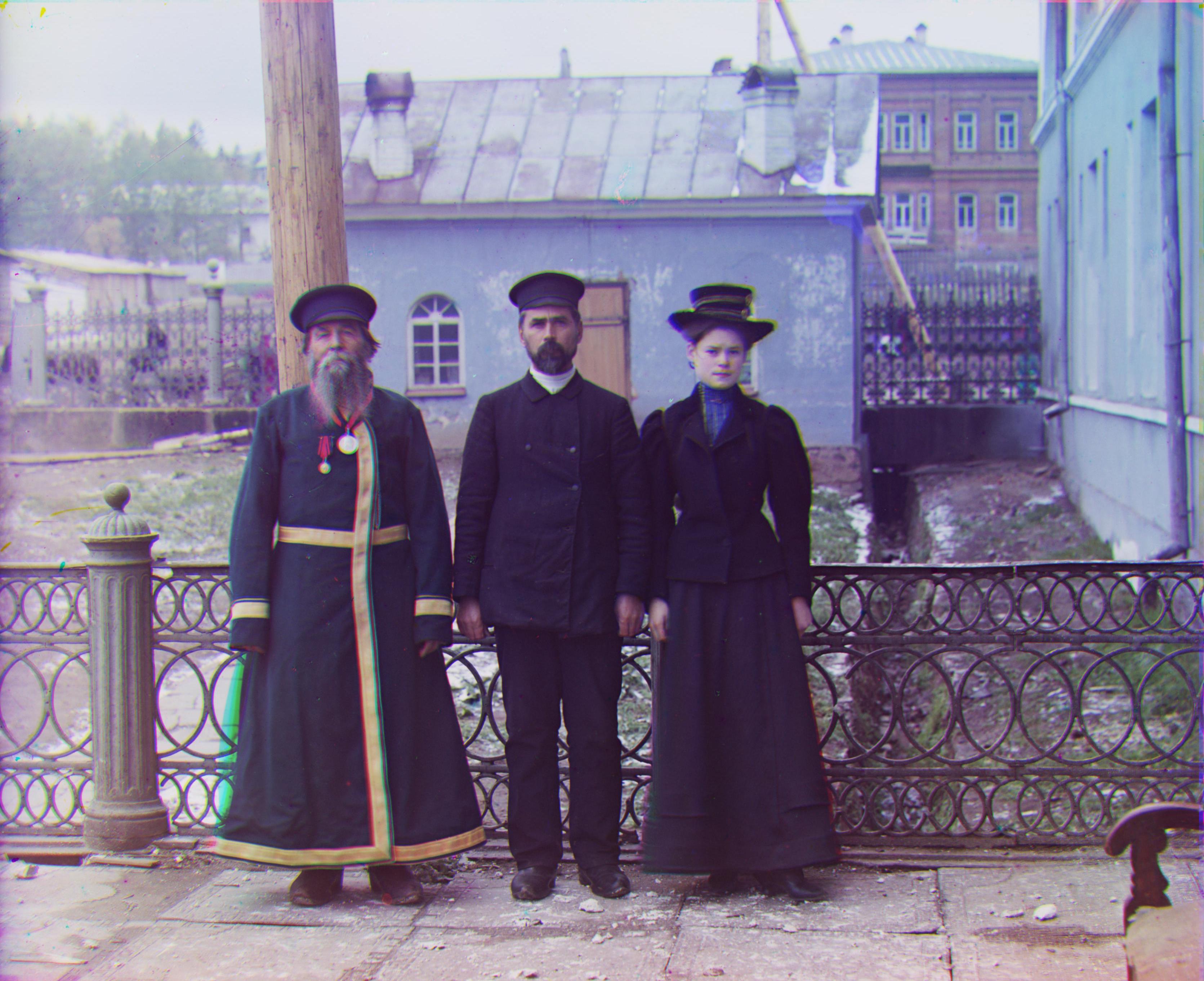
We're down to the last bells and whistles. To close it off, I wanted to try one last thing to improve the images we have. Most people may be able to live with this, but I in my very being refused to do so. And I'm referring to those pesky little colored splotches (circled a few in the train image for your convenience) that slightly detract from, you know, p.e.r.f.e.c.t.i.o.n.
After simpler things like gaussian blurs didn't work out well enough for my liking, I narrowed it down to a two step strategy: 1. Identify splotches, 2. Eliminate splotches.
I tried different ways to follow through on step one like finding where in the array one color channel was close to black while the others weren't. Except that resulted in too much of non-splotchy parts being identified as a splotch.
So then I went back to our trusty SSD and tried to run the formula on each pixel in the image array. If a pixel in one color channel had a high SSD with the same pixel position in the other two channels then it would most likely be a splotch. I tested a bunch of cut-off values and SSD values greater than 0.74 was a good compromise between finding a lot of the actual splotches without touching other non-splotchy entities.
The second part, with a good identification system in place was easier. I did something similar to what Photoshop does, which was to replace the splotchy areas with the neighbouring area's pixels. With more time, it could probably be finessed with a fancier algorithm to make cut and paste more smoothed. But since the splotchy areas are only about 30 pixels wide, it's not very noticeable with the current method unless you really zoom in.
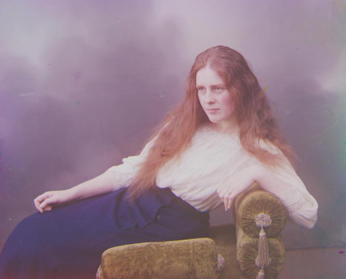
Hopefully you see the different splotches in the image above? The black dots you see over them below is indicating what the algorithm detected as a 'splotch'

(Try to spot all the places the process was able to eliminate splotches by hovering in on the image to see the original.)
Red: x=10, y=72, Blue: x=-12, y=-65
Red: x=5, y=48, Blue: x=-17, y=-41
Red: x=7, y=61, Blue: x=-21, y=-56
Red: x=32, y=88, Blue: x=6, y=44
Red: x=3, y=62, Blue: x=-9, y=-48
Red: x=17, y=57, Blue: x=-24, y=-49
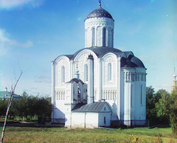
Red: x=13, y=121, Blue: x=17, y=61
Red: x=8, y=98, Blue: x=-29, y=-79
Red: x=24, y=76, Blue: x=-39, y=-71
Red: x=10, y=57, Blue: x=-27, y=-51
Red: x=7, y=99, Blue: x=-10, y=-57
Red: x=-3, y=58, Blue: x=-14, y=-54
Red: x=1, y=6, Blue: x=-2, y=3
Red: x=-1, y=8, Blue: x=0, y=-7
Red: x=1, y=7, Blue: x=-2, y=-5