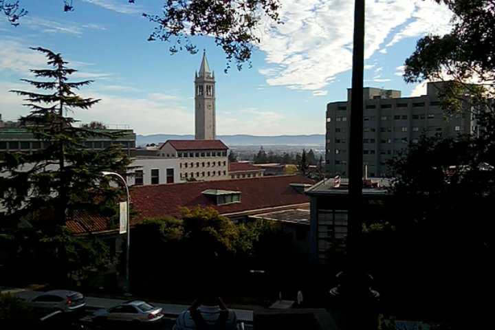
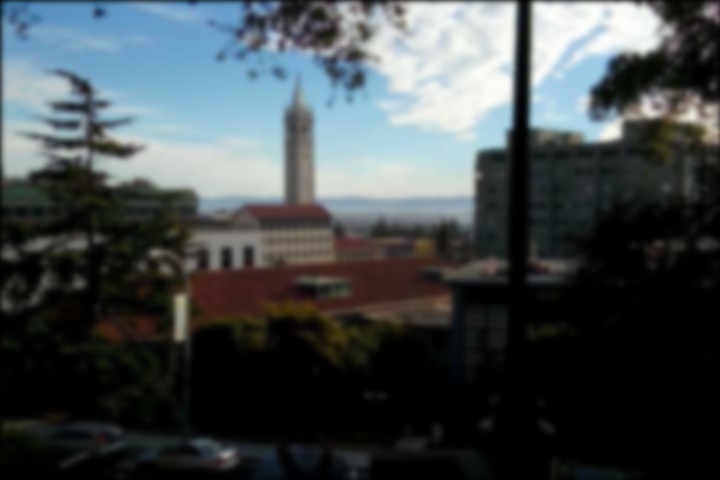
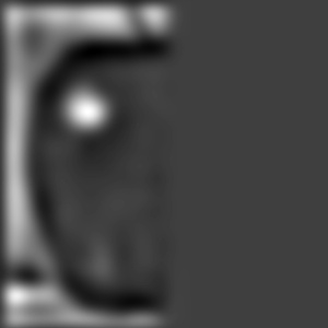
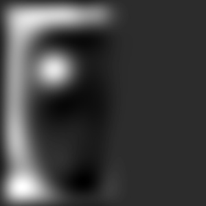
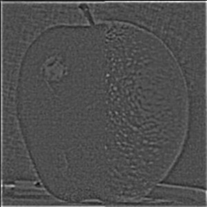
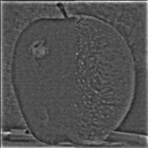
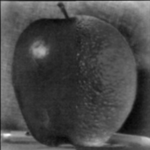
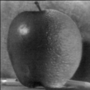
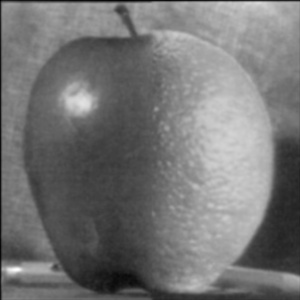
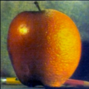
Sharpen
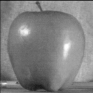
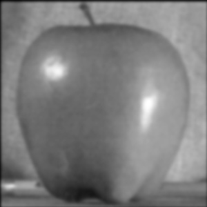
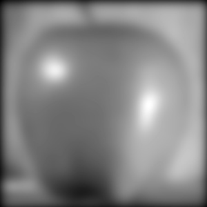
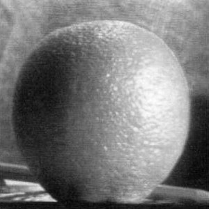
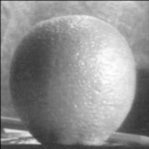
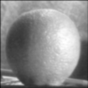
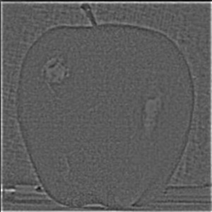
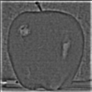
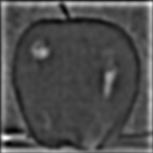
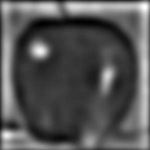
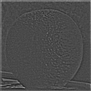
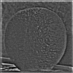
As a start to the project, I used the unsharp masking technique to sharpen images. Given an image, I first blurred the image using the Gaussian filter, then subtract the blurred version from the original image so to remove its details. I then multiplied the details by some constant alpha, then readd the emphasized details back to the original image so to create the sharpened effect.
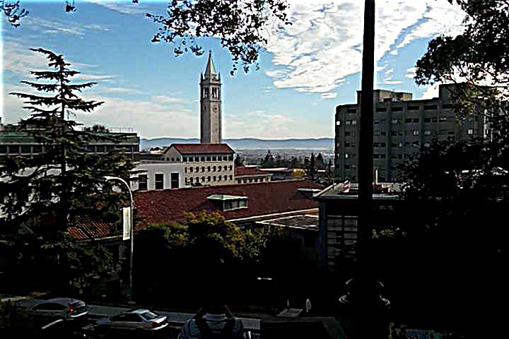
a = 1.2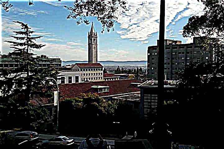
a = 3The bigger the alpha, the sharper the details will become.
Hybrid Pictures
I created hybrid images using the approach described in this paper written by Oliva, Torralba, and Schyns. Hybrid images are images that look different at different distances, and they are created by blending the high frequency portions of one image with the low-frequency portions of another image. The high frequency portions of the image will dominate perception when the image is seen closeup, while the low frequency portions of the image will dominate when the image is seen at a distance.
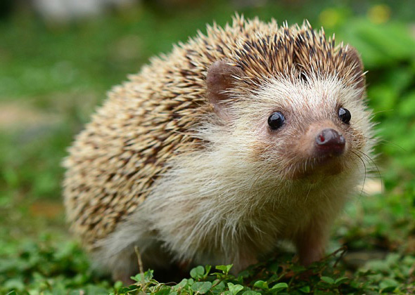
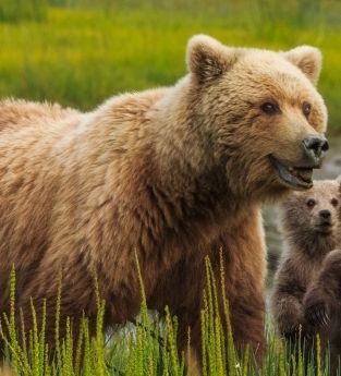
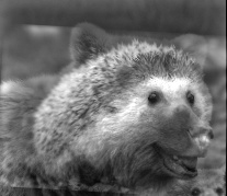
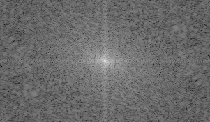
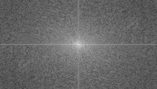
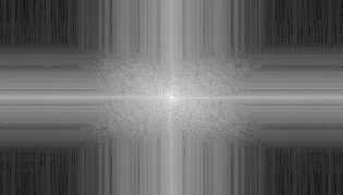
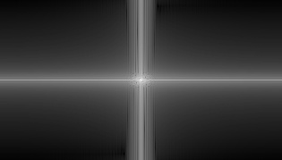
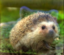
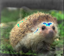
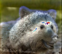
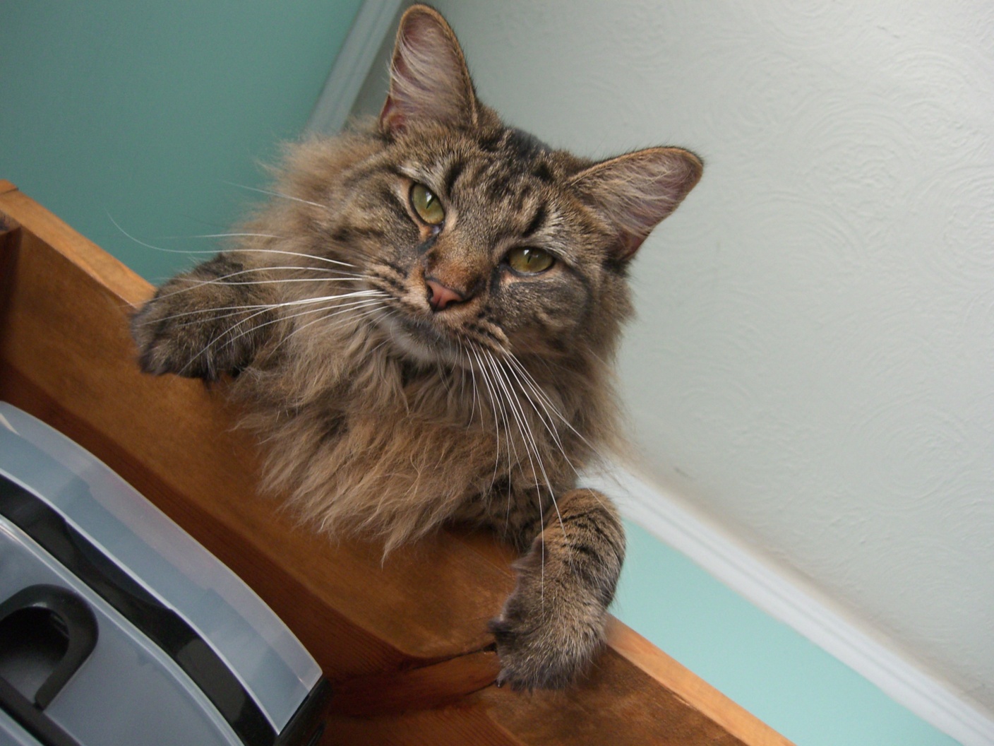
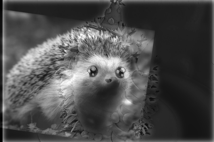
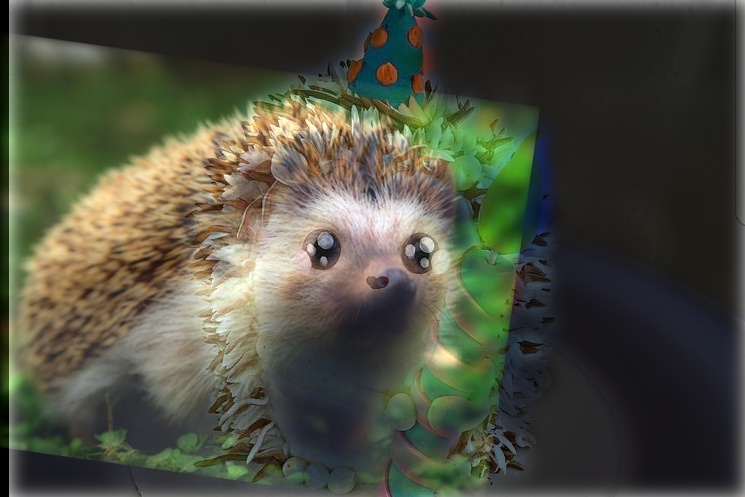
1. Porcupine + Bear
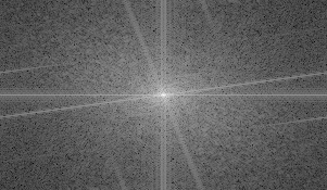
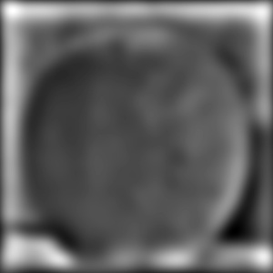
Fourier analysis corresponding to above results
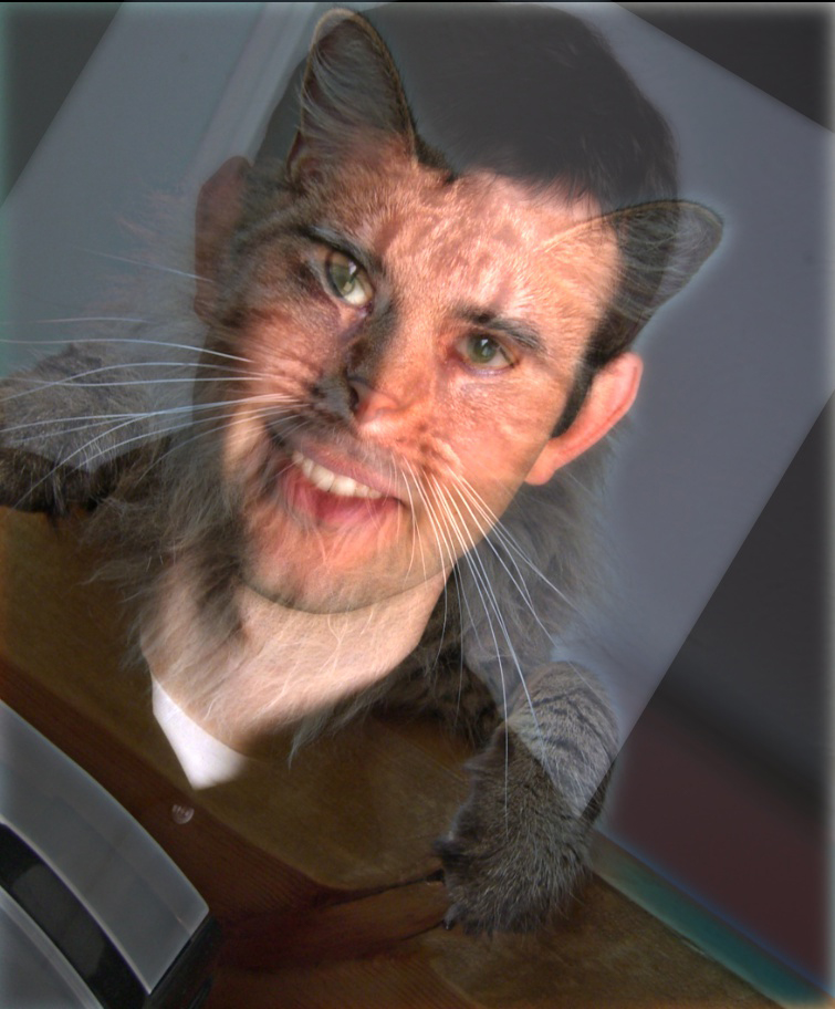
For colored results, I found out that the final result looks better if I use color for both the high frequency and low frequency pictures.
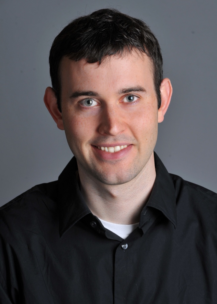
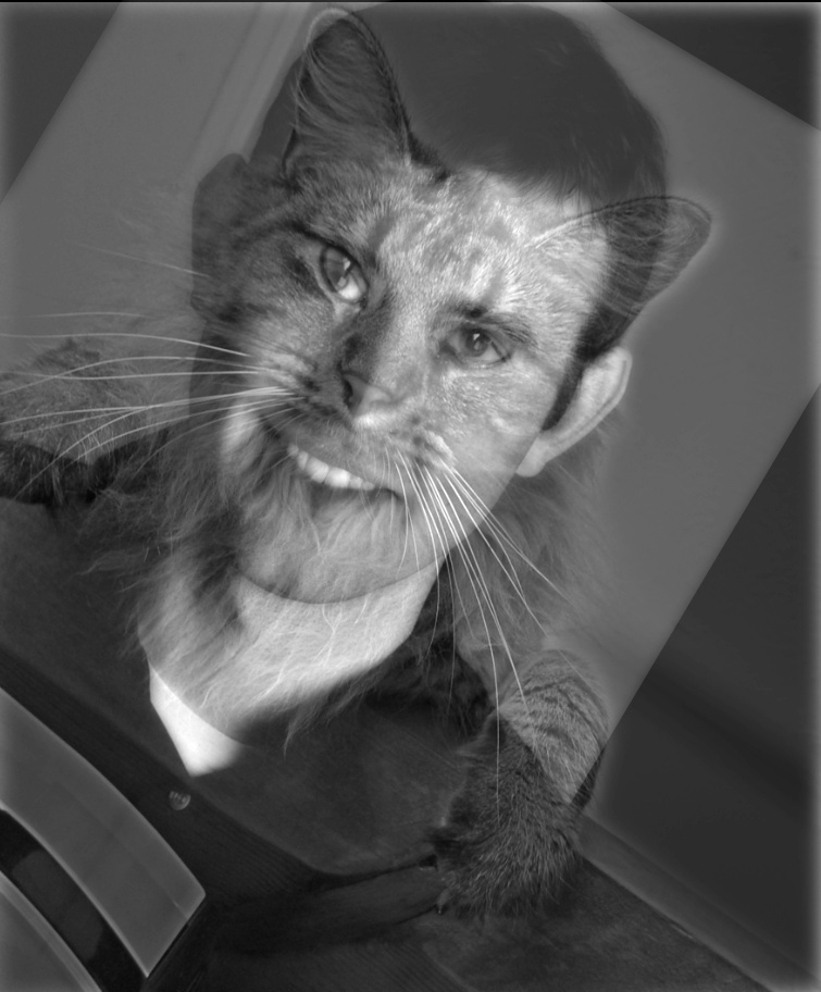
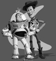
2. Derek + Nutmeg
3. Porcupine + Cake: Blending failed in this case mostly because the cake picture is too bright, thus it doesn't feel as if it's dominating perception even when seeing the image close up.
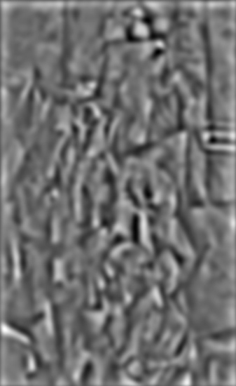
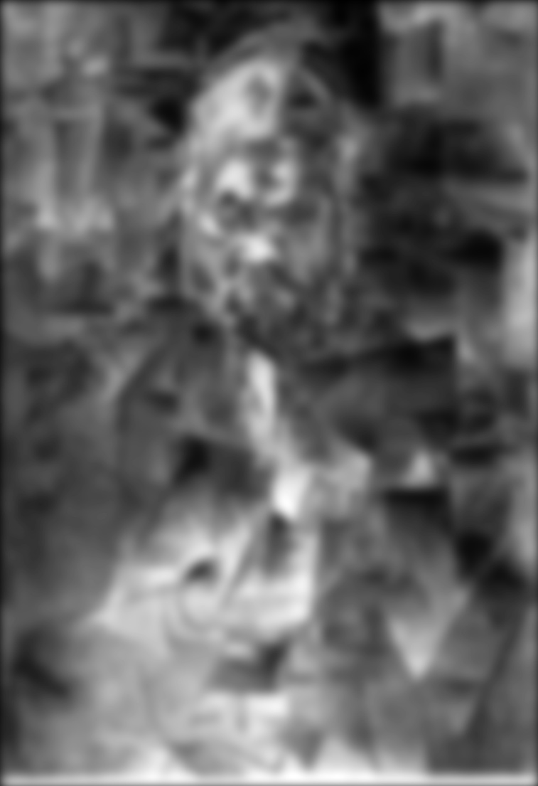
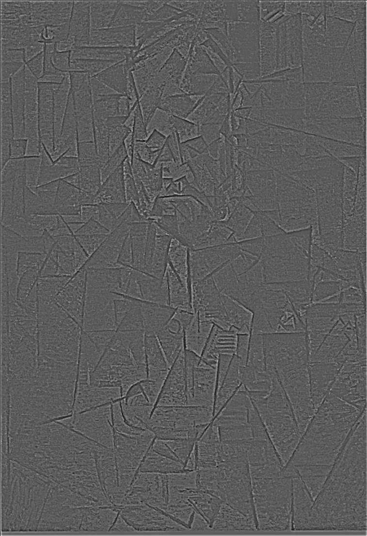
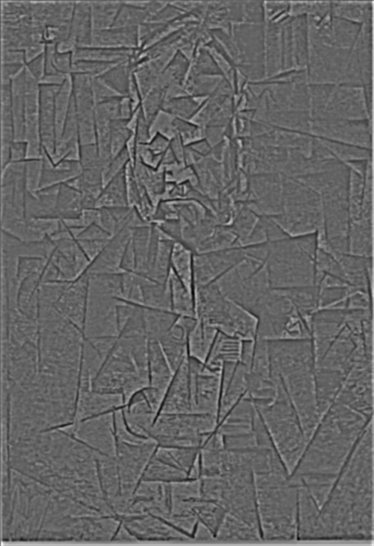
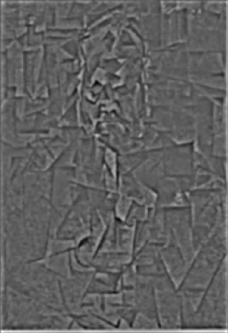
Stacks
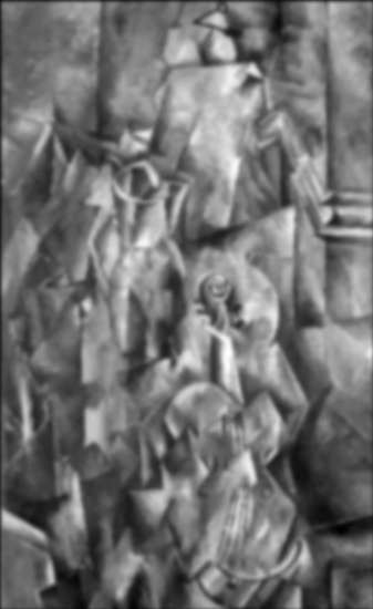
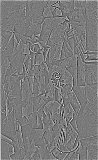
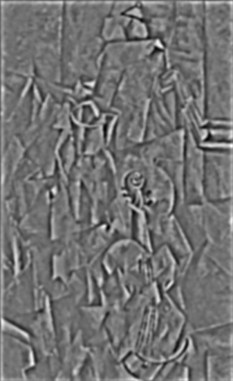
I implemented Gaussian and Laplacian stacks. The Gaussian stack is created by convolving the image with the Gaussian filter with increasing sigma at each level. While each layer of the Laplacian stack is created by taking the different between two Gaussian stack layers.
In the examples below, the first row of pictures is the Gaussian stack, and the second row is the Laplacian stack.
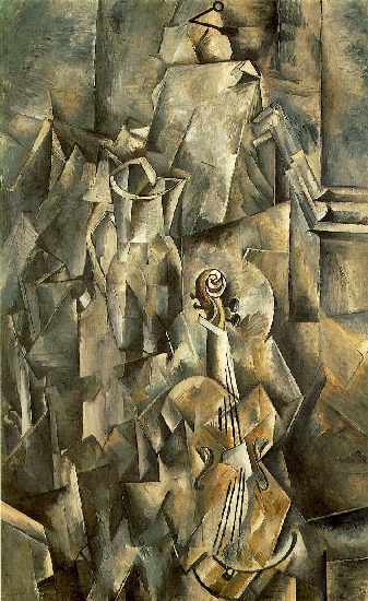
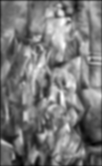
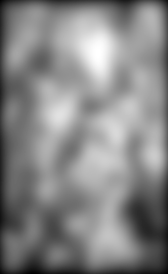
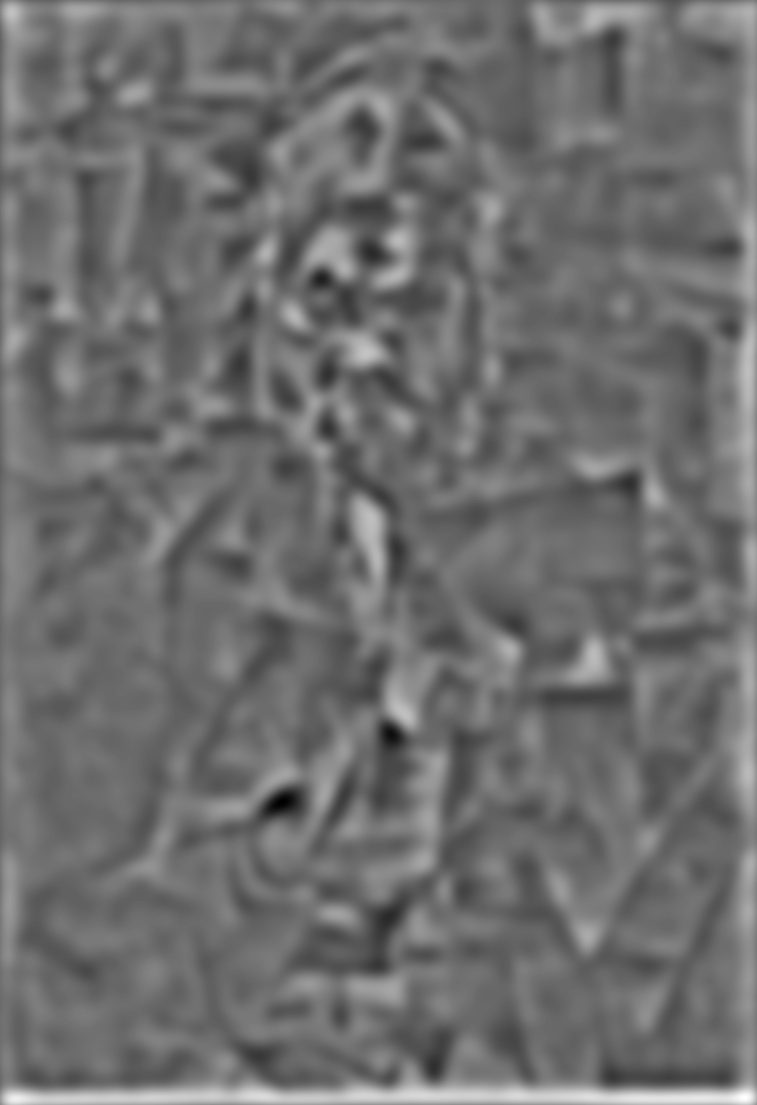
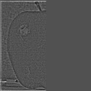
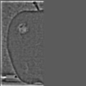
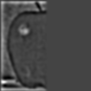
1. Braque's Violin and Candlestick


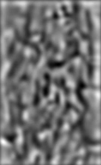
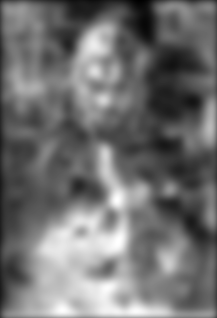
2. Picasso's Portrait of Ambroise Vollard


Multiresolution Blending
In multiresolution blending, I utilized the Gaussian and Laplacian stacks to seamlessly blend two pictures together. I actually used 8 layers for the Gaussian stack because I found that the blending is smoother with layers.
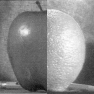
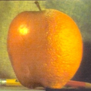
1.Oraple
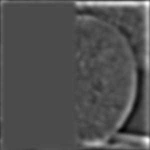
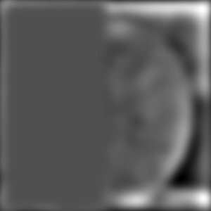
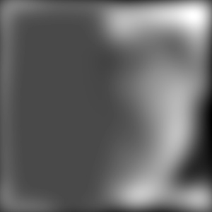
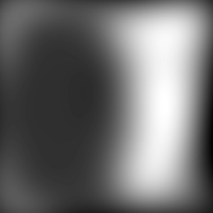
Gaussian Stacks


Laplacian Stack

Blending Stack

Final Result Stack
Grayscale Result
Colored Result


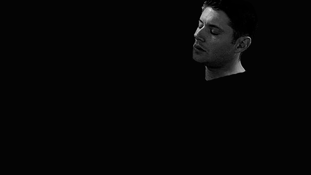
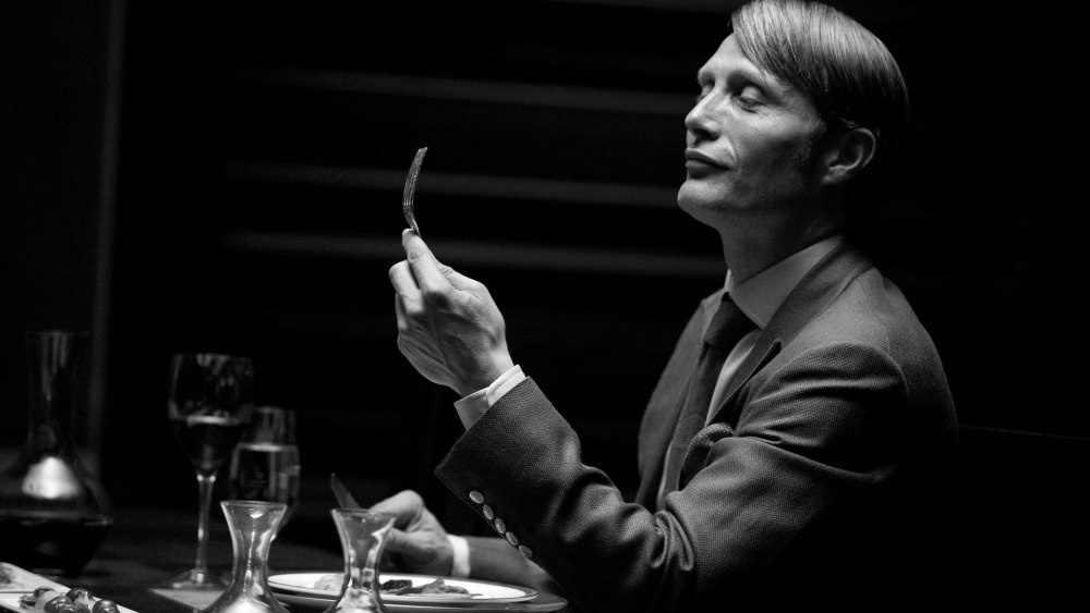
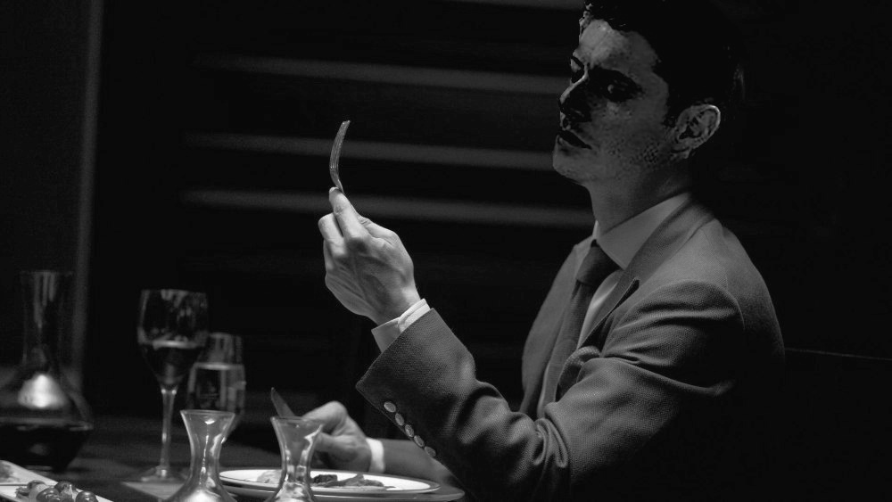
2. Pretty Face + Nice Suit
Inputs
Final Result Stack


Grayscale Result
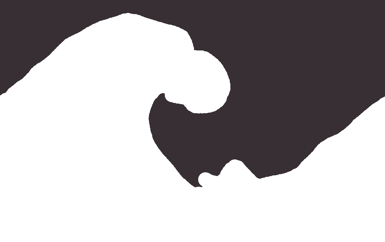
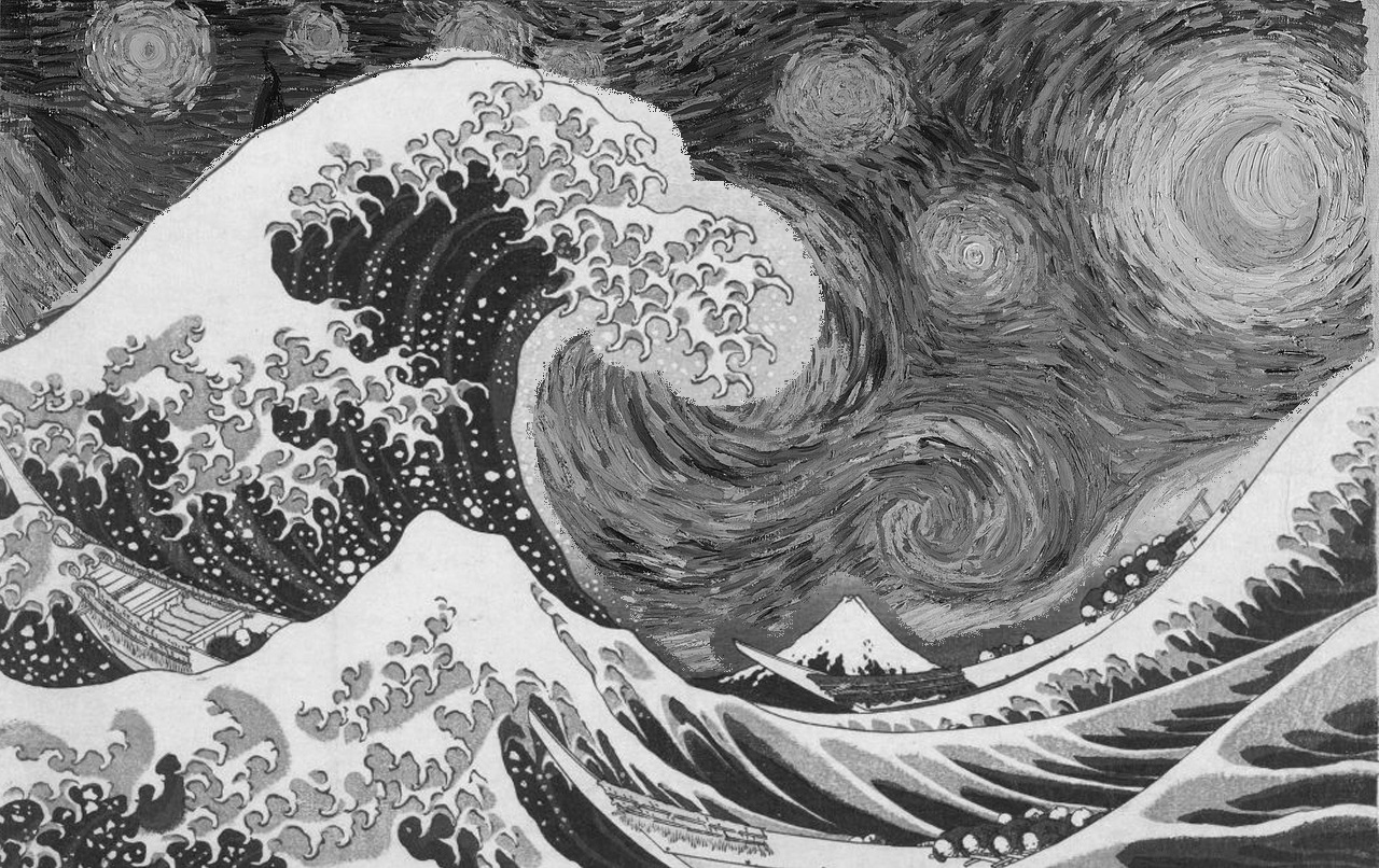
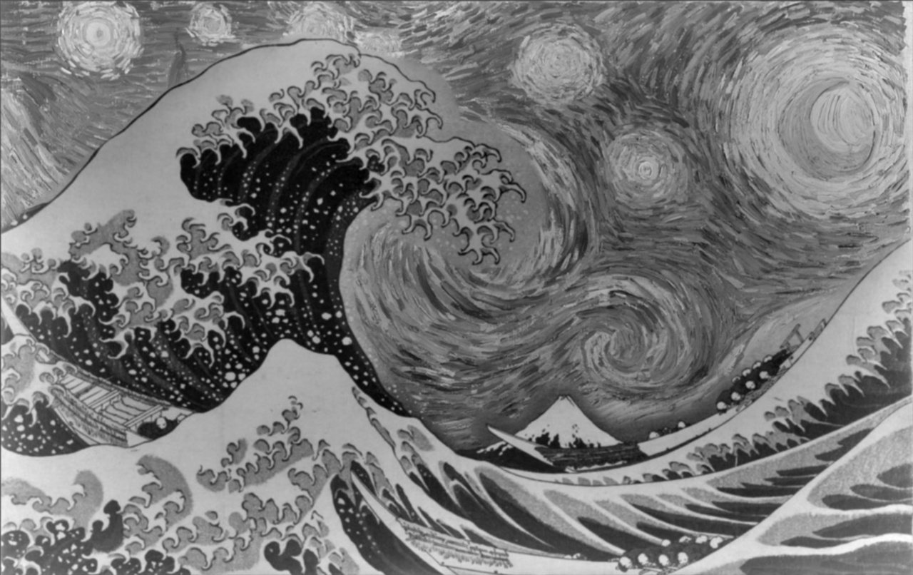
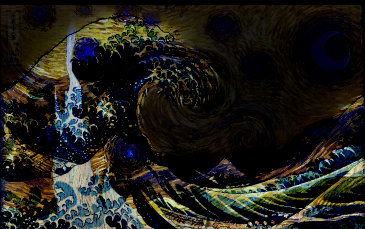
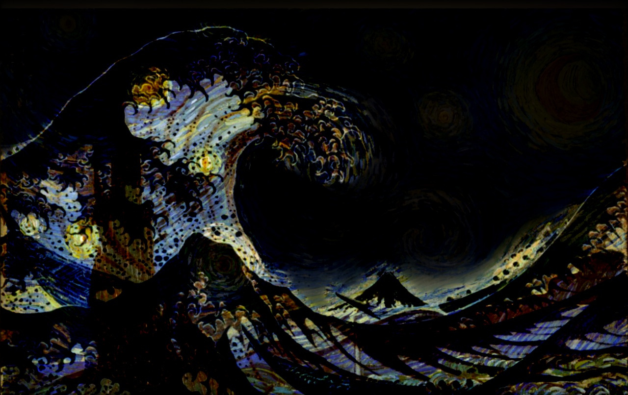
3. Starry Waves
Inputs
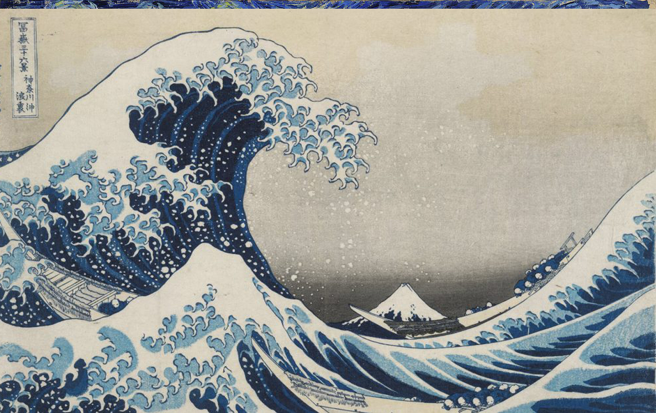
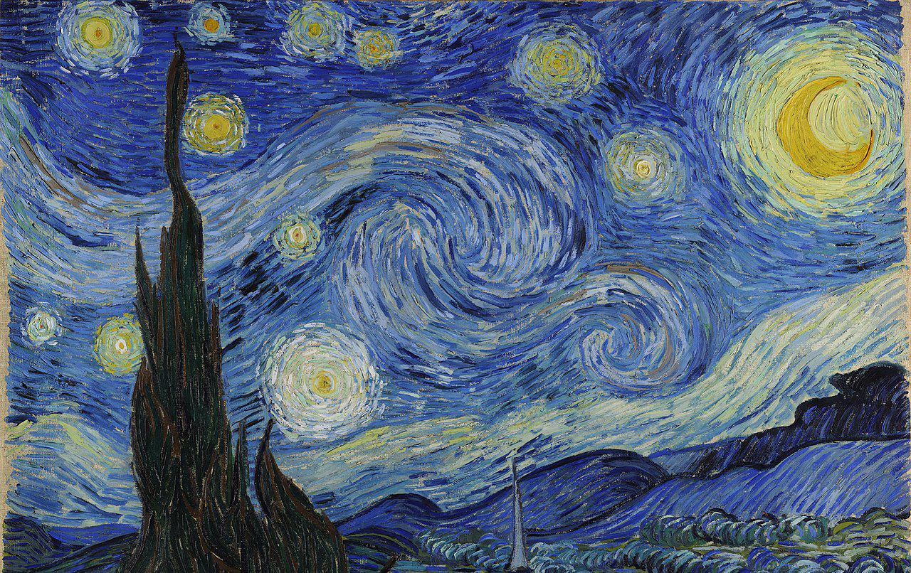
Grayscale Results: As you can see below, directly copying Waves's masked area to Starry Night (left) will cause ugly sharp edges, while the edges are more naturally blurred with multires blending (right). However, multires did not perfectly blend the edges with Starry Night's background, as you can still see awkward gray areas near the tips of the waves.
Failed Colored Results: Since multires blending use weighted sum of the source and target images to create new pixels, if the difference between color intensities between the 2 images is great, the blended result is not smooth.
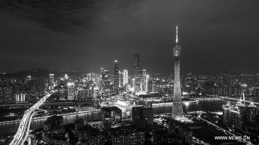
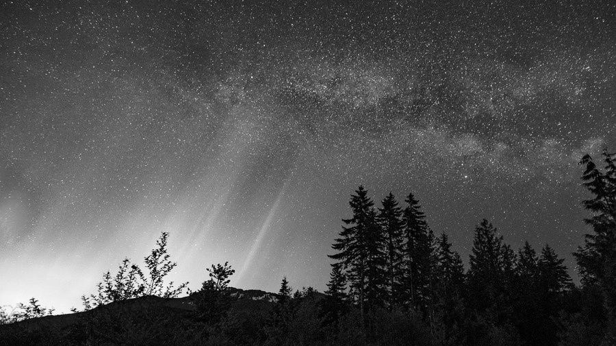
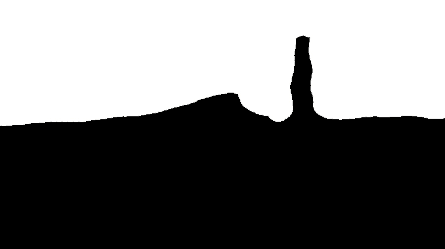
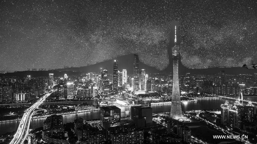
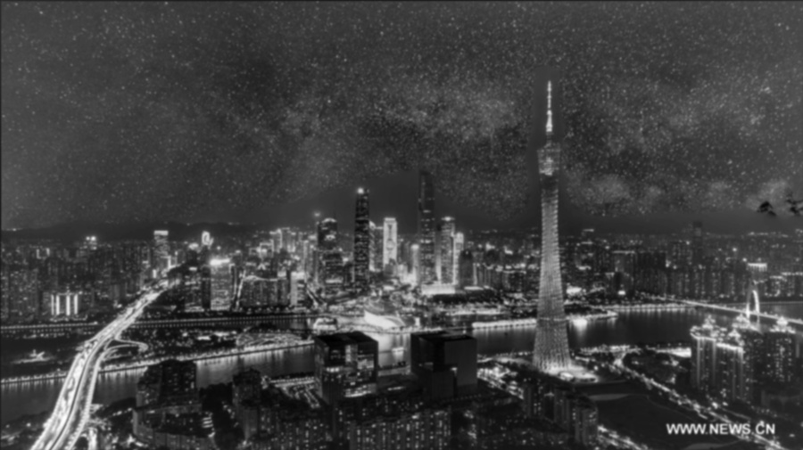
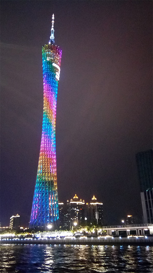
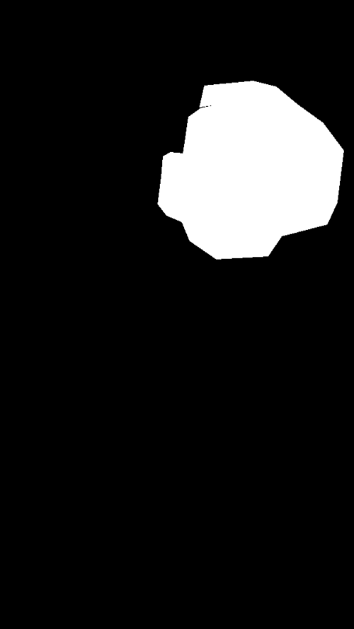
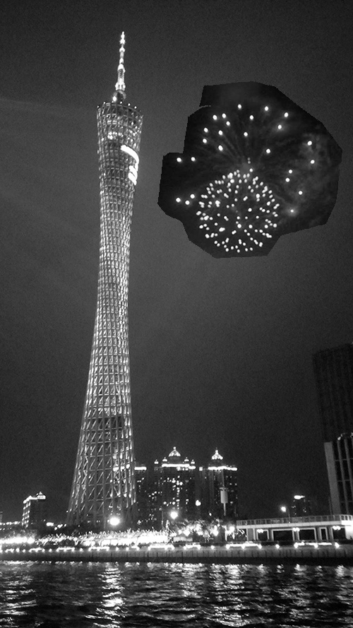
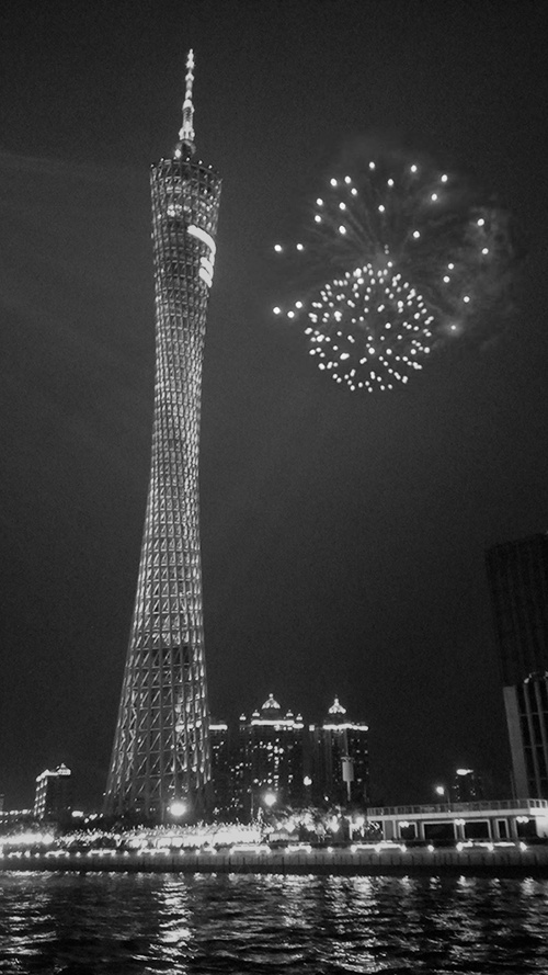
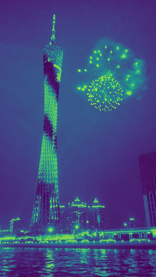
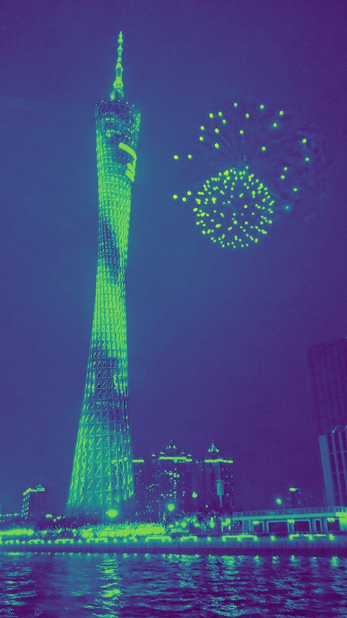
4. Stars in Guangzhou
Inputs
Part 2: Gradient Domain Fushion
In this part of the project, I used gradient-domain processing to smoothly blend pictures together. Since people usually care more about the gradient of an image rather than the overall intensity of the image's pixels, we can smoothly blend images together by maximally preserve the gradient of the source image.
Specifically, I implemented the Poisson Blending algorithm based on the following least squares formation:

In this objective function, we're given the pixel intensities of a source image s and a target image t, and we're trying to solve for new pixel intensity values v. Each i is a within the mask, and each j is a neighbor of i. Essentially the first summation of the function is trying to minimize the difference between source and optimal pixel values within the mask, while the second summation is trying to minimize the difference between pixels from the source image that are within the mask and the pixels from the target image that are bordering the mask, so to achieve a smooth blending effect.
Toy Problem
The constraints of this problem specify that the top left corner of the new image should match that of the old image, so the resulting new image has the same gradients as the old image.

Possion Blending
0. Revisiting the Oraple
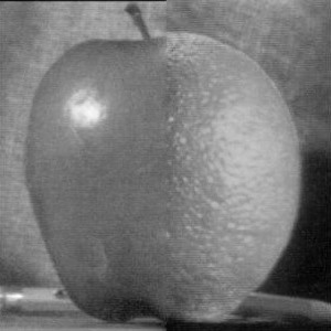
As you can see in the results above, Poisson Blending (right) has a smoother color blending than Multiresolution Blending (left). This is because Poisson Blending tries to maximally preserve the gradient level of the original target image, so it matched the source image's gradient with the target image's gradient.
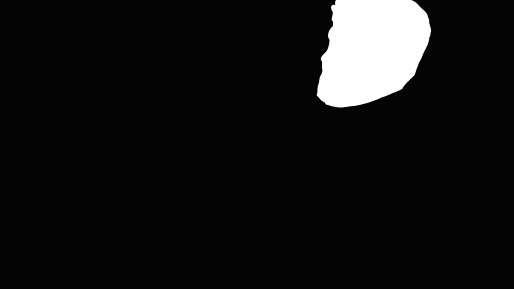
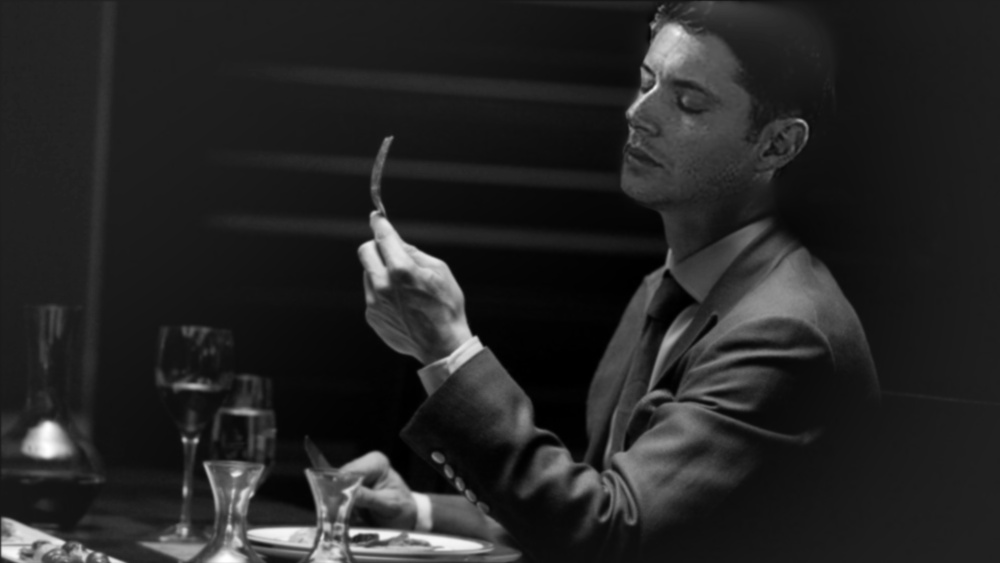
0.5. Pretty Face + Nice Suit 2.0
In this case, because Poisson Blending tried matching the source image's gradient to the target image's gradient, the face is darker and the highlights from the source image is lost. The colored version also look uneven in color intensity.
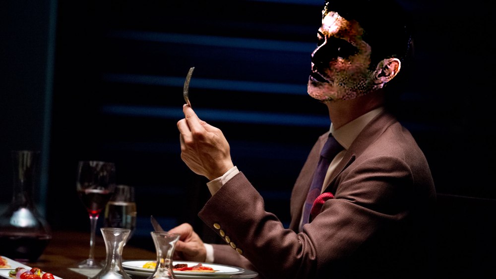
Thus, I think Poisson Blending should be used if you want an output image that has about the same gradients as the original target image. If you want to keep the gradients from the source image, like the highlights of the face, then you should use multiresolution blending instead.
Extras
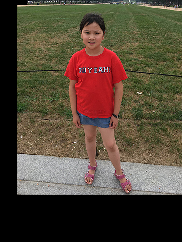
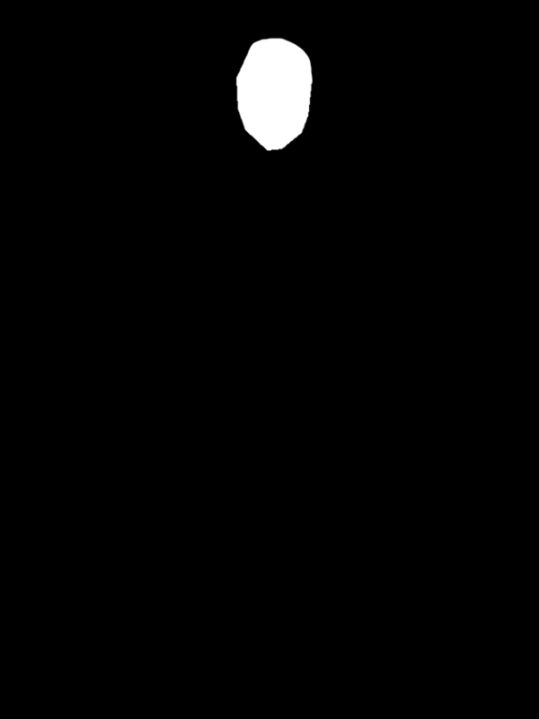
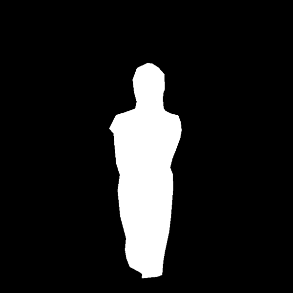
1. My sister wants her face on everything.

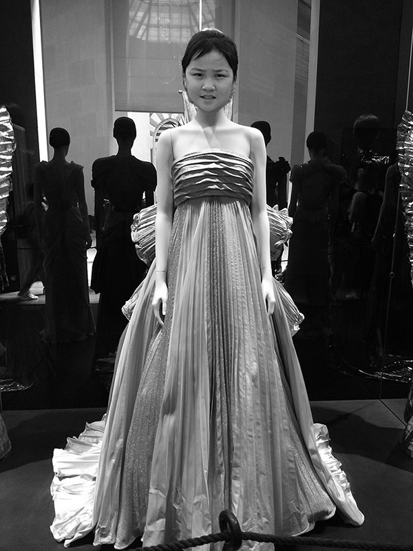
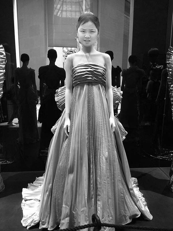

As you can see above, my sister's face is lighter and matches the mannequin's skin color in the Poisson Blending result, because the gradient level of the target image is maximally perserved.
2. I wished there were fireworks in Guangzhou.
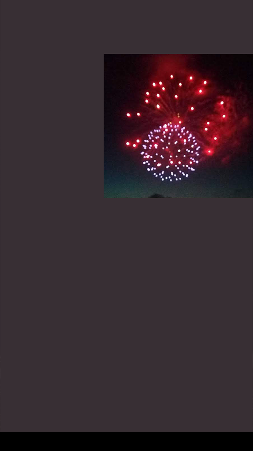
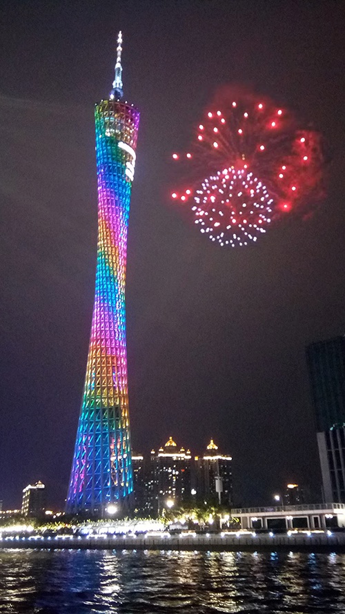
Breakdown of Colored Result

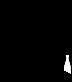
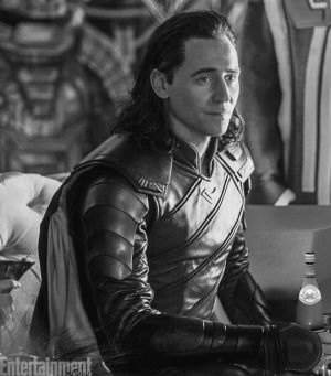
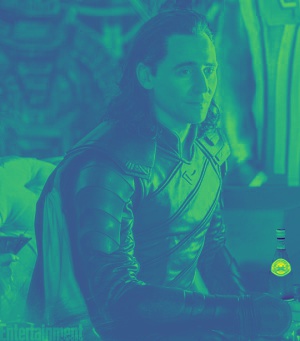
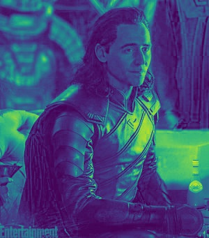
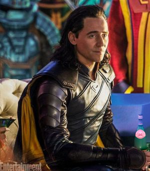
4. My roommate likes Loki and sparkling water, but the two are not mutually exclusive.
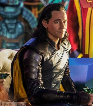
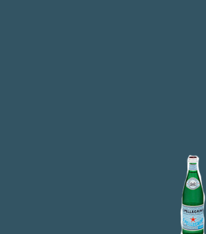
Colored version

5. I didn't realize there was bird poop on the wall behind me until it was too late.
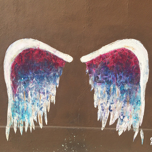
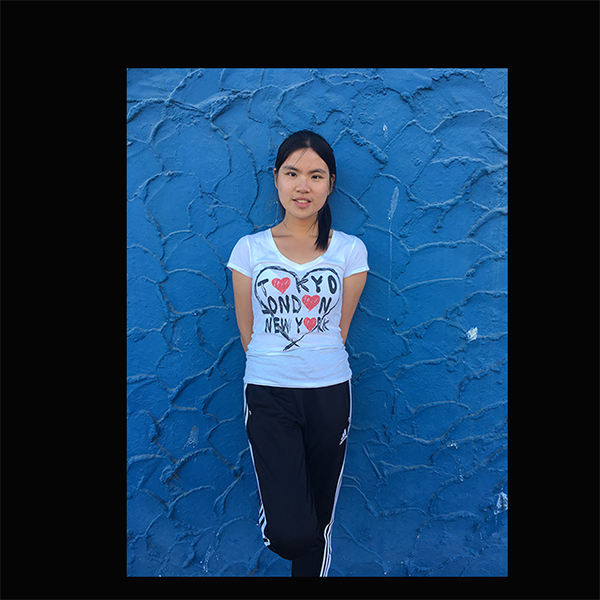
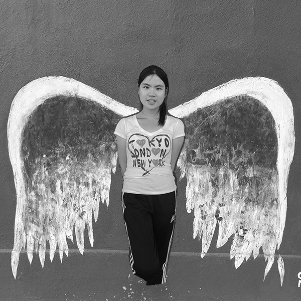
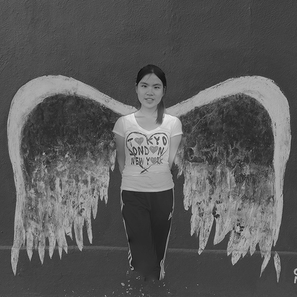
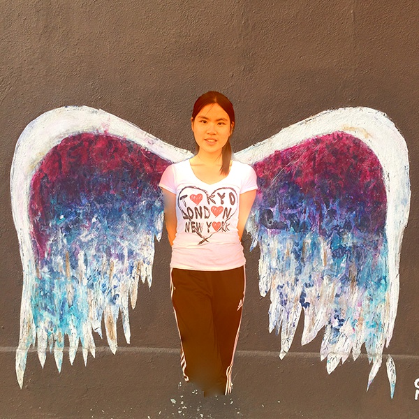
There is a sharp countour edge around the source image in the Direct Paste output (left), which is then smoothly blended together with the background in the Poisson Blended output (middle). In the colored version (right), however, Poisson Blending overly blended the edges of the source image with the background such that the sleeves of the shirt is pink and the left arm is slightly blue.