Part 1: Frequency Domain
Part 1.1: Warmup
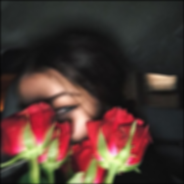
We learned in class that by subtracting out a Gaussian-blurred image from the image itself, we are left with the details of the image. By then multiplying these details with an alpha of our choice and adding it to the original image, we can obtain a sharpened image!
In this part, I applied this technique to an image of a woman holding roses.
I picked the size of my kernel to be twice the size of sigma because the kernel should expand as sigma increases in order to account for the greater blurring effect we are trying to achieve. Thanks to a student on Piazza for explaining this rule of thumb.

Original
Blurred
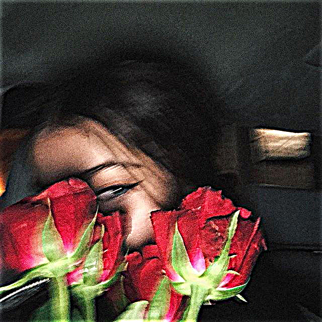
Sharpened
I chose alpha (alpha = 2) through vanilla trial and error. Intuitively I know that as alpha increases I'm adding more and more of the detail. As you add more and more detail the image tends to become more grainy, which is generally not what we want. To illustrate this, I've included an image of alpha = 10 below.
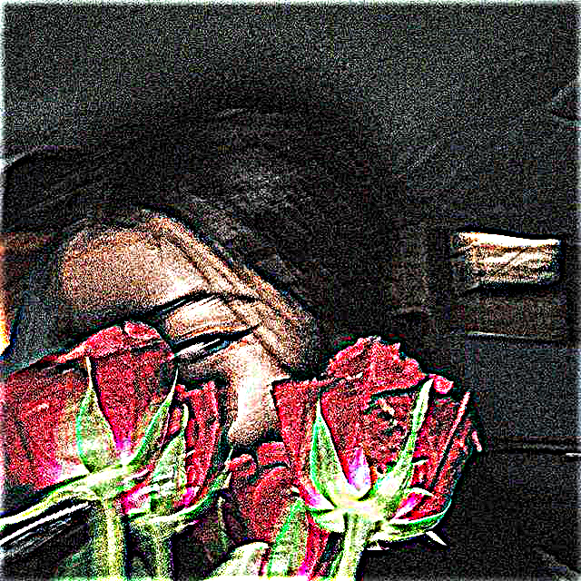
Sharpened; alpha = 10
Part 1.2: Hybrid Images
To create these hybrid images, I low-pass filtered and high-pass filtered two different images and then combined them! Thus, when seeing the images from different distances, you can see different images!
Again, for these images I did a lot of trial and error to figure out which sigmas to use for the Gaussians. Each hybrid image required a different amount of "blur".
For example, for the Derek & Nutmeg picture I used a sigma1 of 14 and a sigma2 of 10. For my baby Karuna and adult Karuna hybrid I used a sigma1 of 6 and a sigma2 of 3.
Choosing sigma was also correlated to the nubmer of pixels in the image; with smaller images I'd generally have smaller sigmas.
Derek & Nutmeg
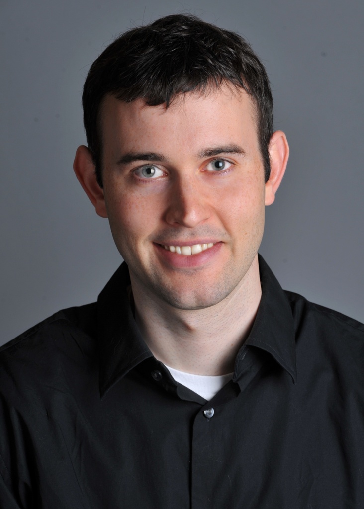
Derek
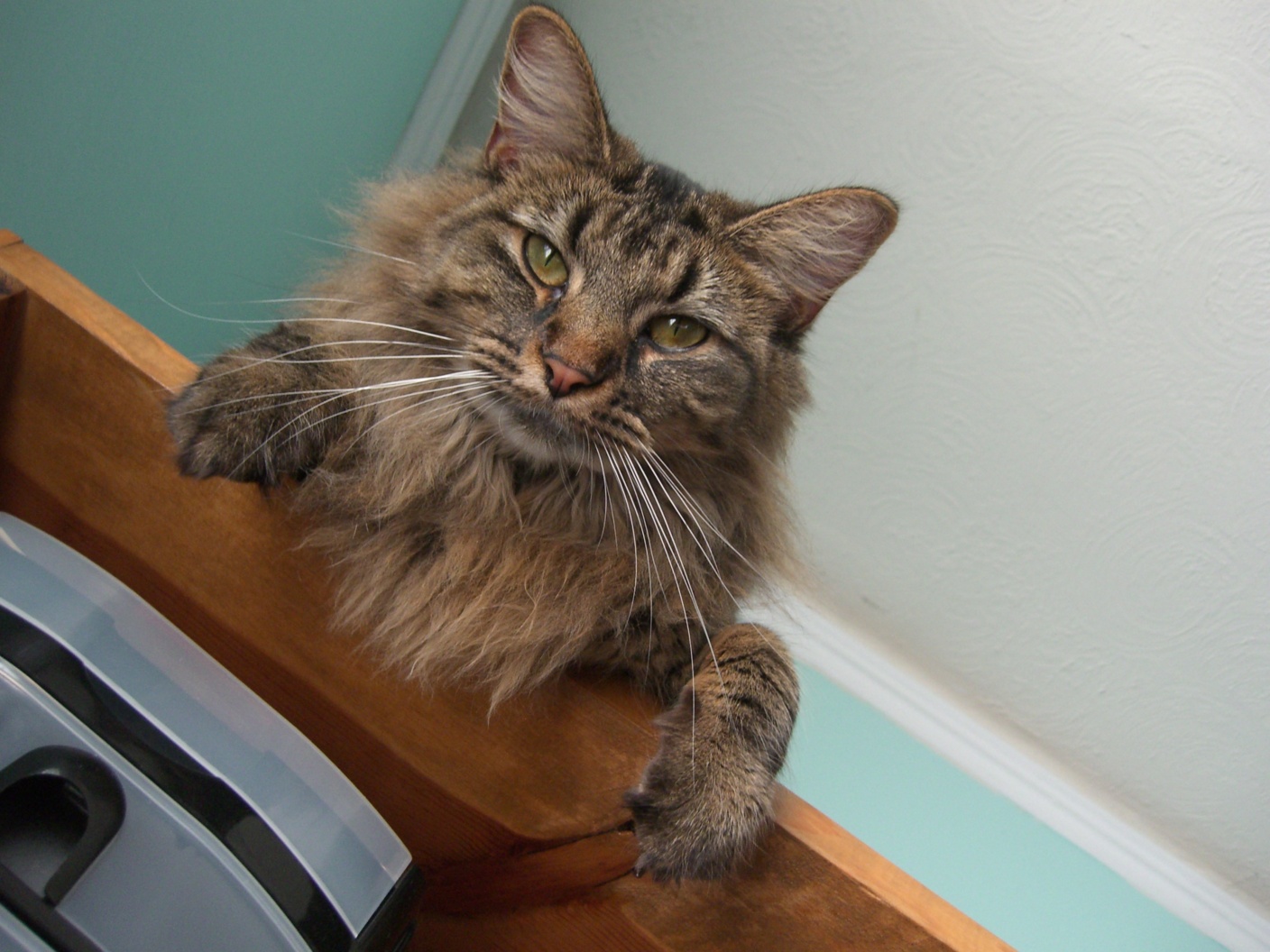
Nutmeg
Baby Dory & Adult Dory
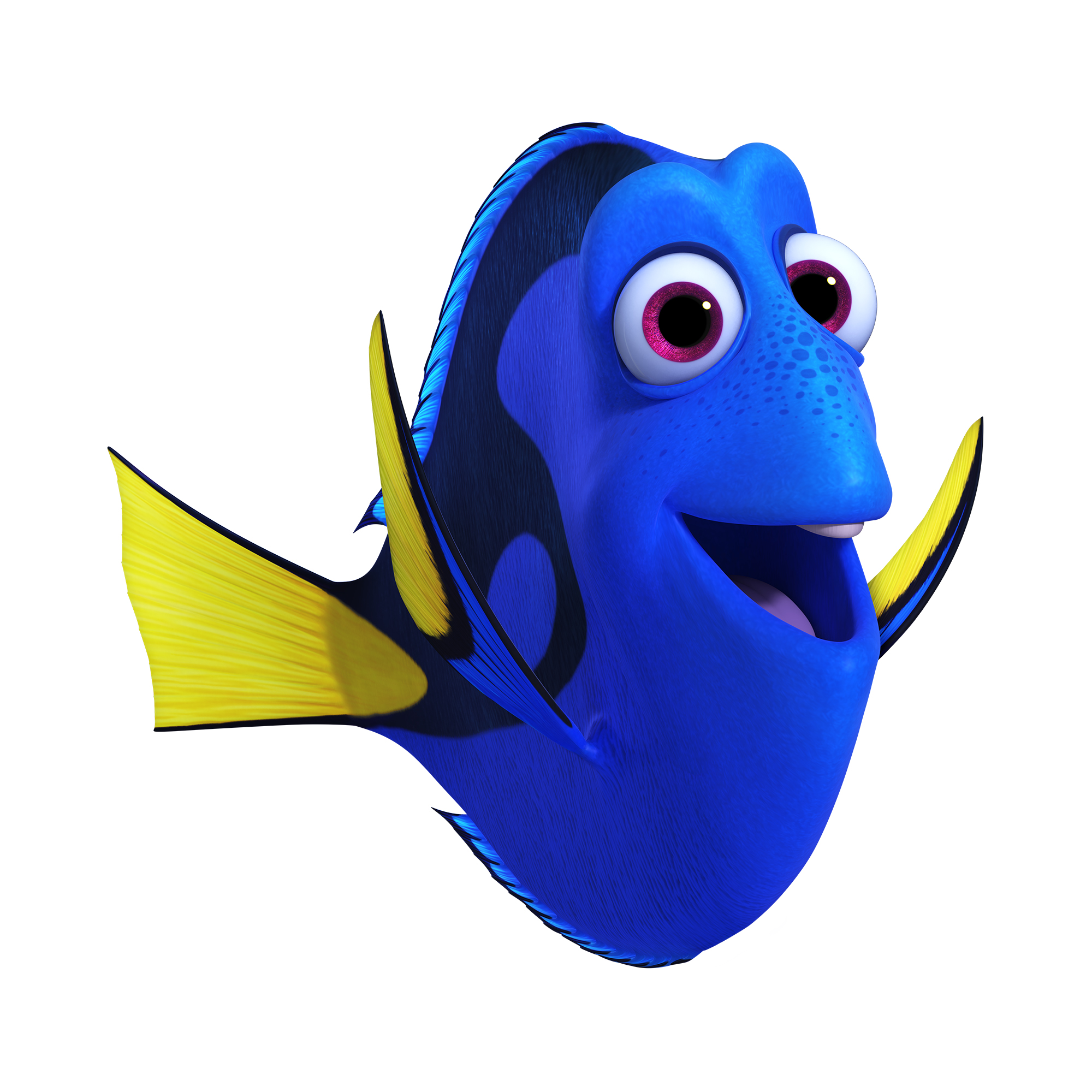
Adult Dory
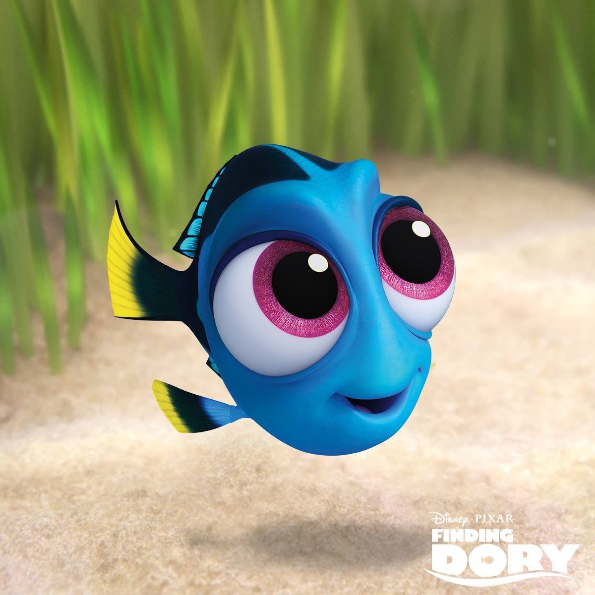
Baby Dory
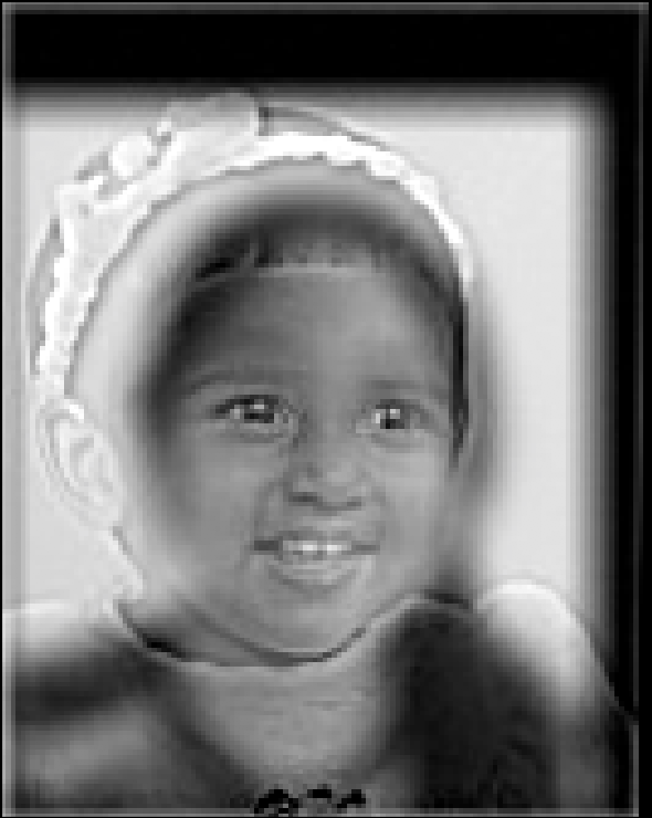
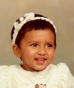
Baby Karuna & Adult Karuna
Adult Karuna
Baby Karuna
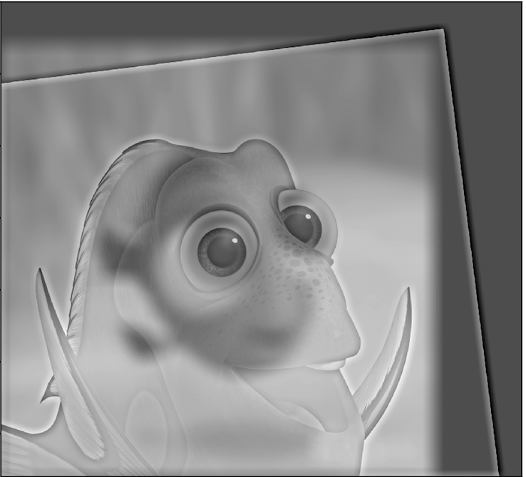
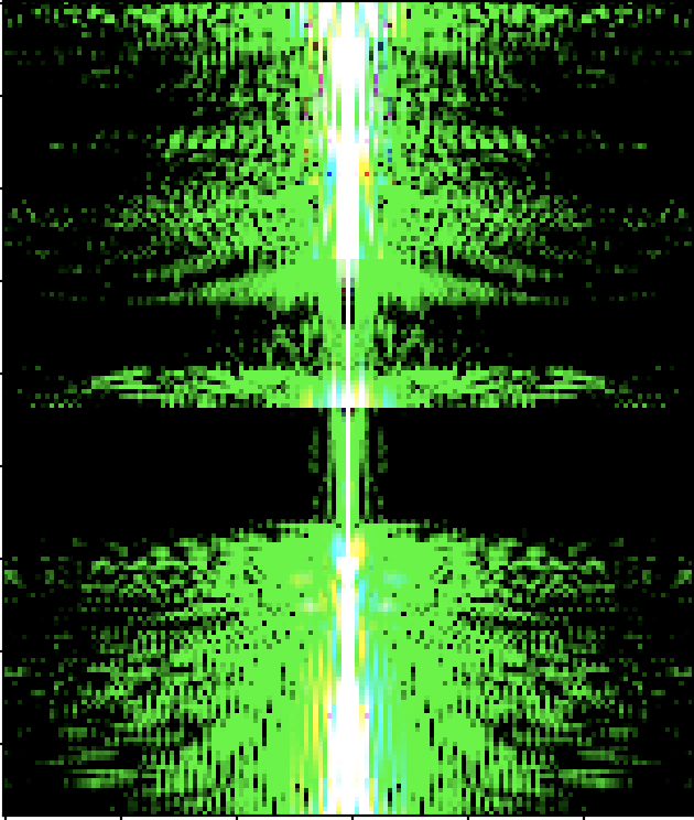
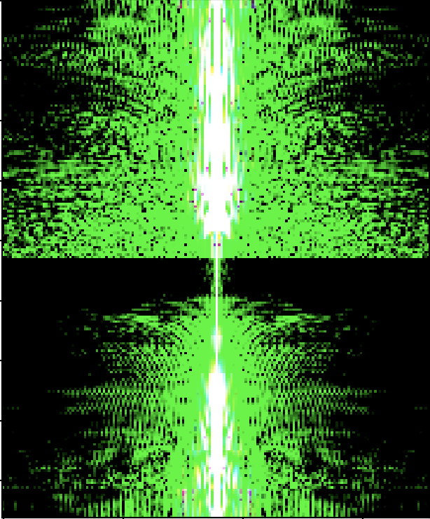
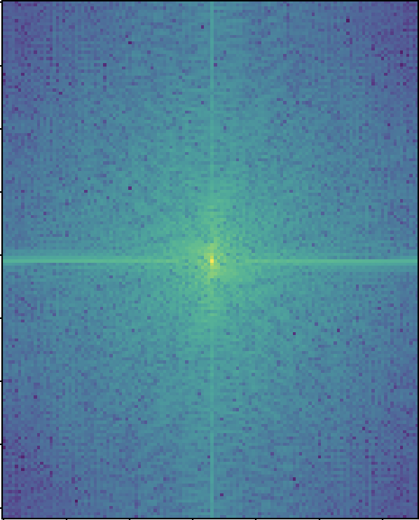
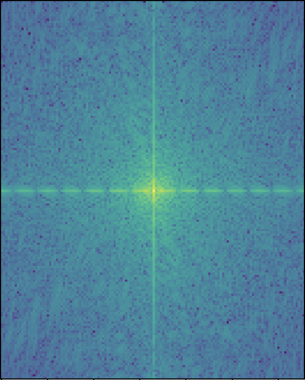
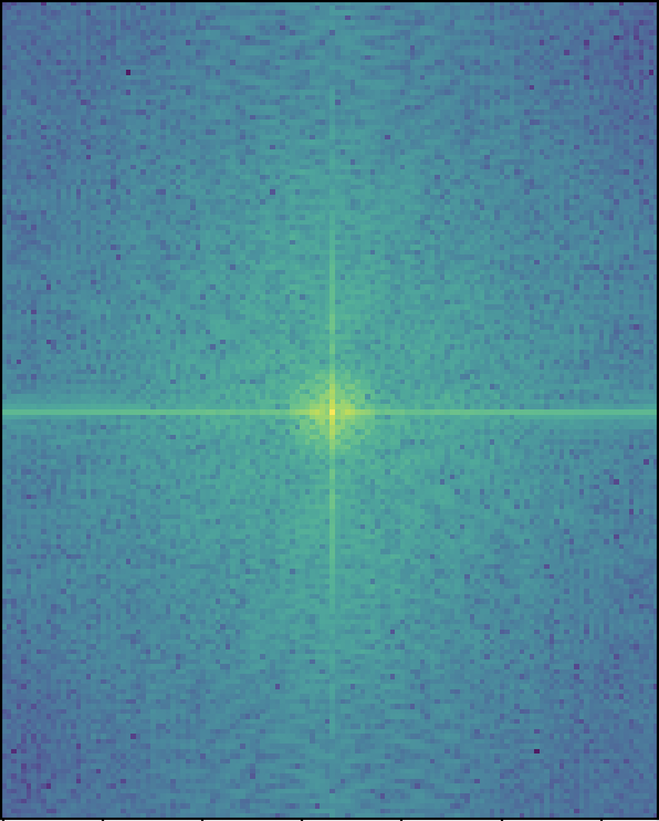
Here you can see the log magnitude of the Fourier transform for the images and the hybrid:
Im 1
Im 2
Aligned & Filtered Im 1
Aligned & Filtered Im 2
Hybrid
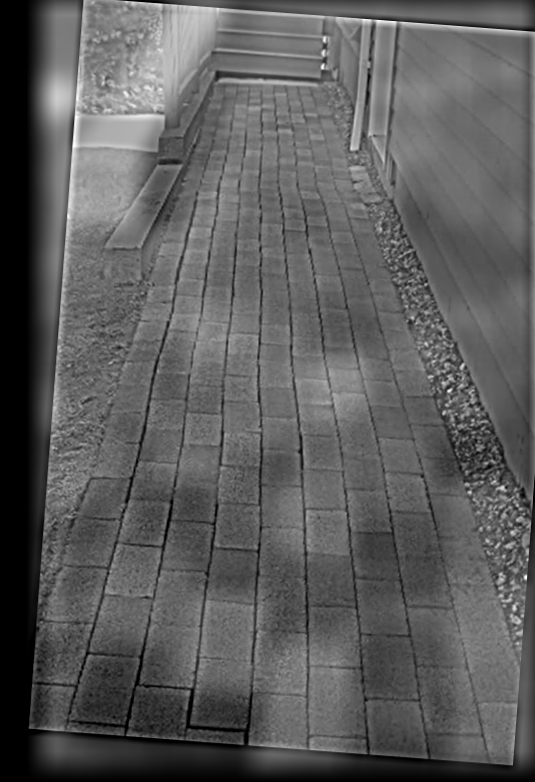
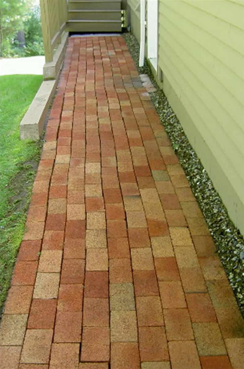
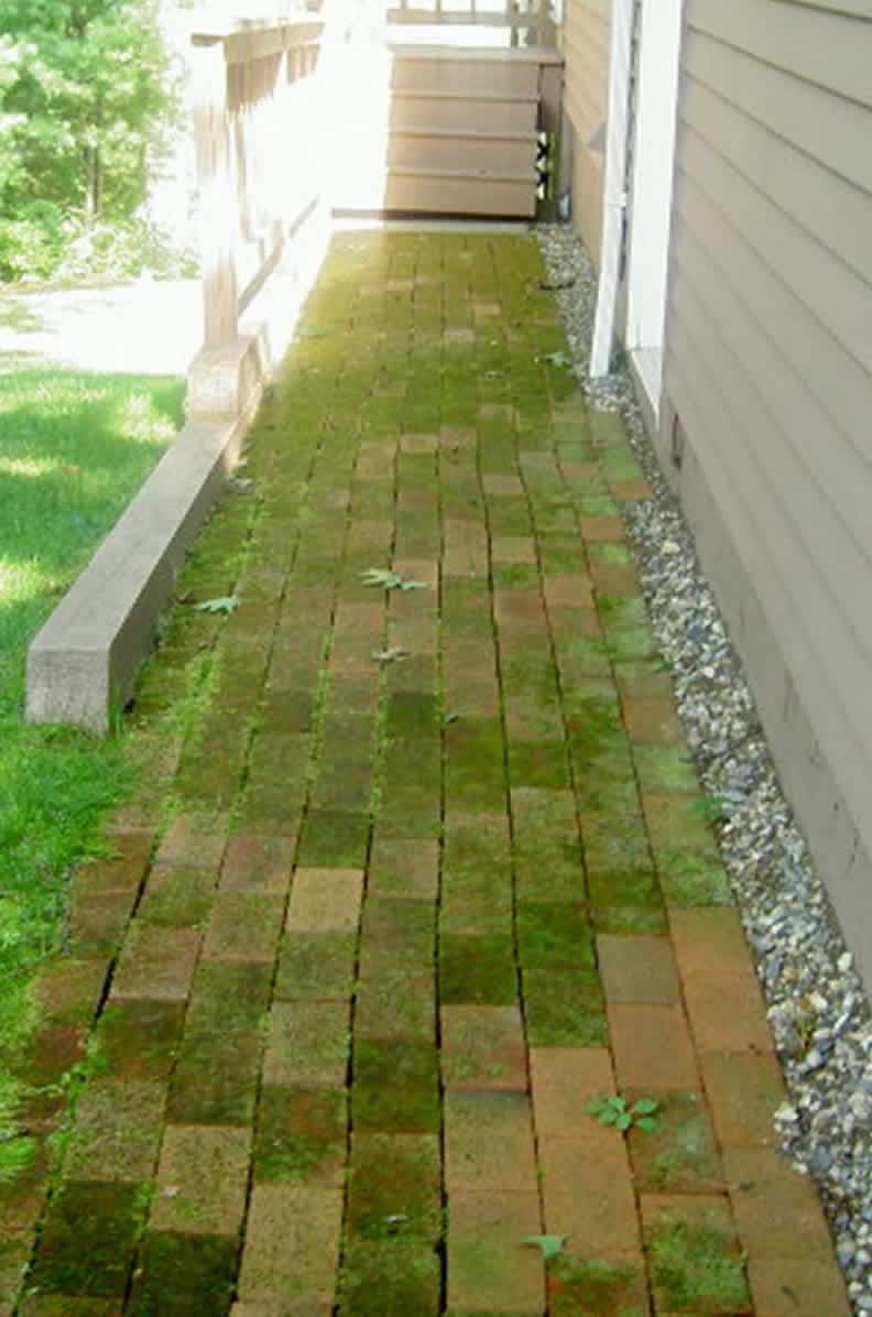
When I tried creating hybrids of images, not all of them were successes. Below is one of my multiple failures. Here I thought it would be really cool to see how powerwashing has an effect on surfaces. Unfortunately, I wasn't able to really make out the before image from the after image. This makes sense because the images are indeed roughly the same except for what just looks like different colors. Even if I was creating colored hybrid images, I doubt this would be a great hybrid image.
Generally, my hybrids failed if they were not the right kind of picture to make a hybrid out of. With hybrids in particular, I think there's definitely some images that work better than others just based on what the images are of and how well they intrinsically align.
Here's one of my multiple failed ones:
Generally failed because not right kind of picture to make a hybrid out of.
Powerwash hybrid
After Powerwash
Before Powerwash
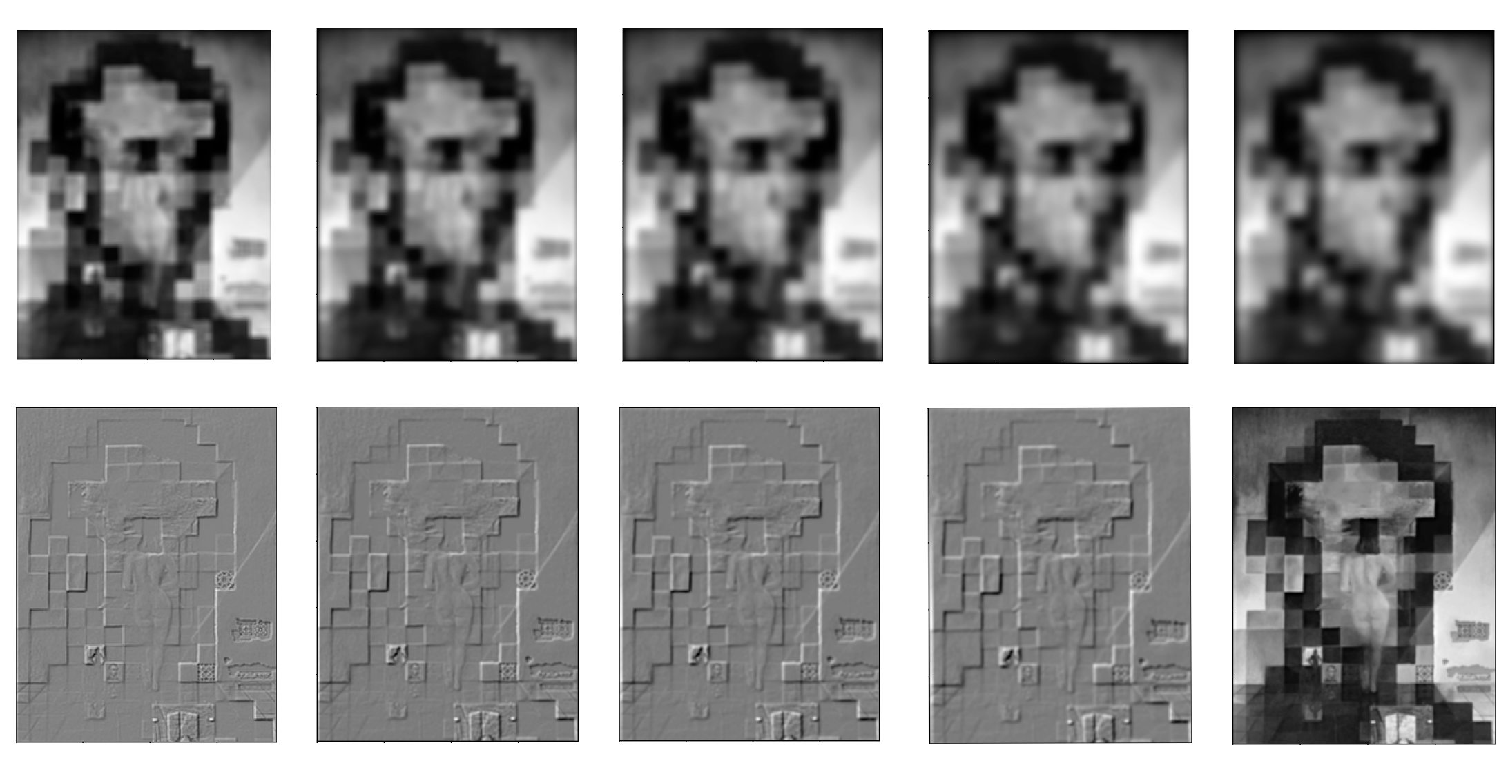
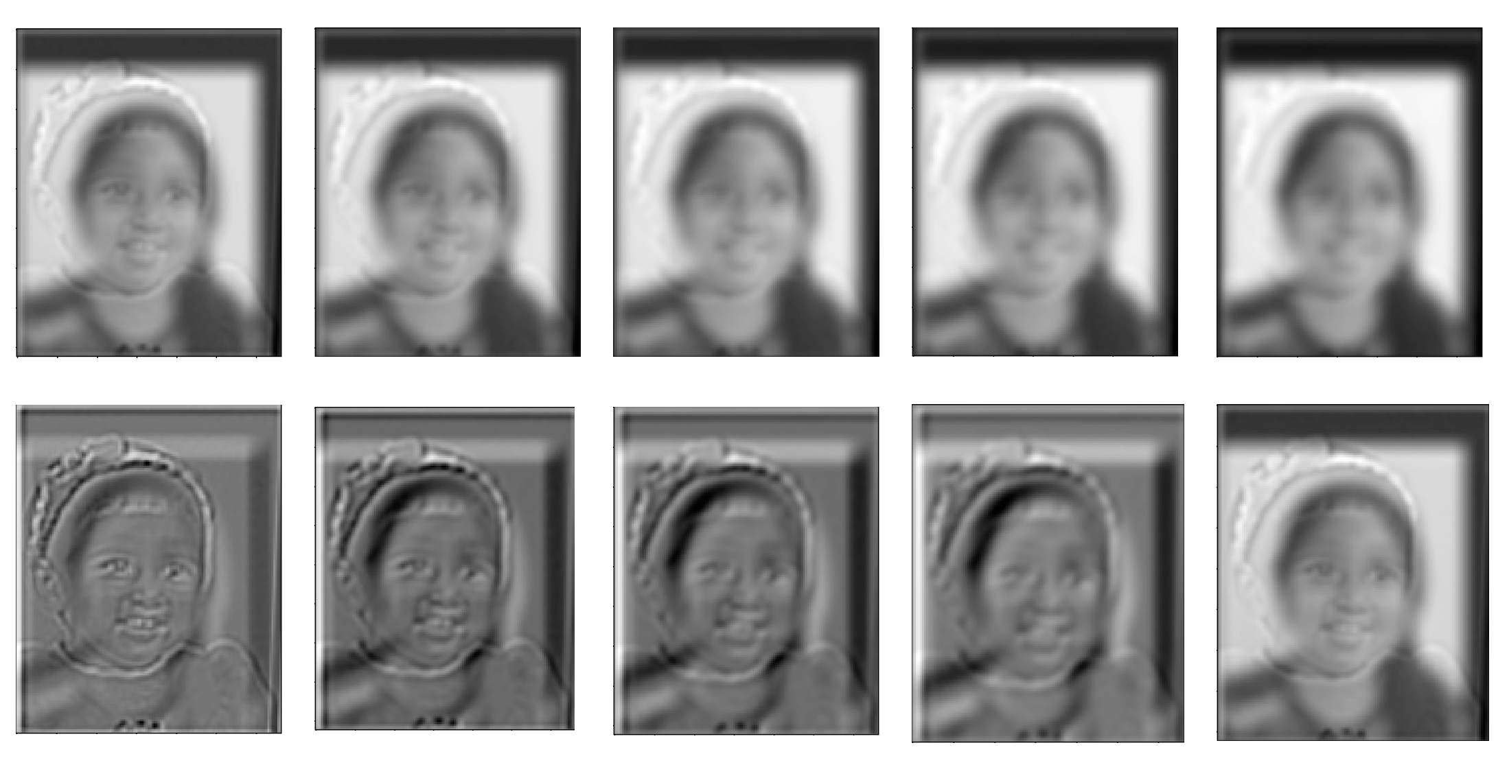
Part 1.3: Gaussian and Laplacian Stacks
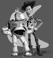
I created Gaussian and Laplacian stacks and ran them on the painting of Lincoln and Gala as well as on a hybrid image of myself.
For both of these once againn I looked for sigmas that experimentally looked correct.
For the Lincoln and Gala painting, I used a sigma of 6 for the Gaussian stack and a sigma of 2 for the Laplacian stack.
Below I used a sigma of 2 for the Gaussian stack and a sigma of 2 for the Laplacian stack.
Part 1.4: Multiresolution Blending
For multiresolution blending, Laplacian stacks were used in order to create a smooth, less noticeable seam when blending two images together.
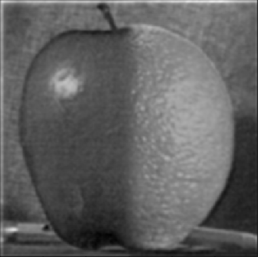
Oraple
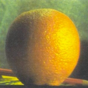
Orange

Apple

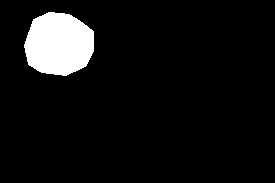
Mask
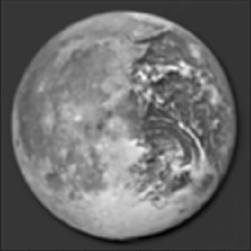
Earth + Moon
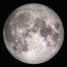
Moon
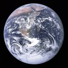
Earth

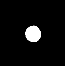
Mask
And this class has taught me that ......
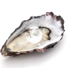
the world is my oyster!
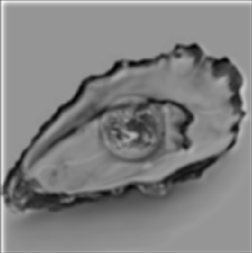
World is your oyster
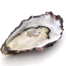
Oyster shell
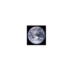
Earth

Mask
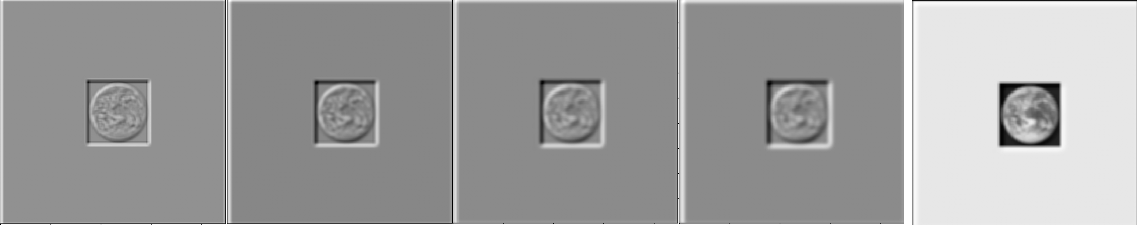
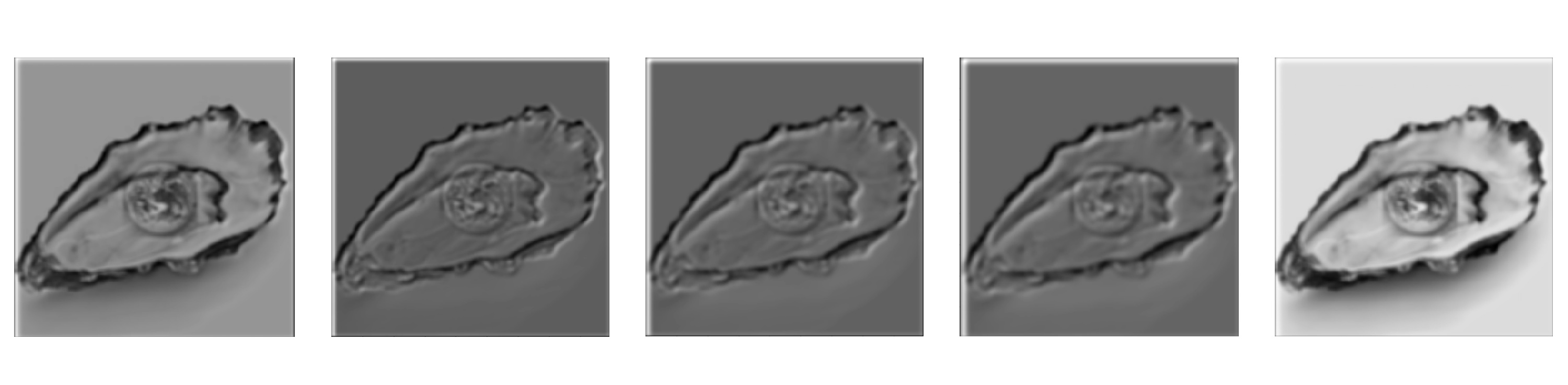
Here is the Laplacian stack of the earth image ("LA"):
Here is the Laplacian stack of the oyster shell image ("LB"):
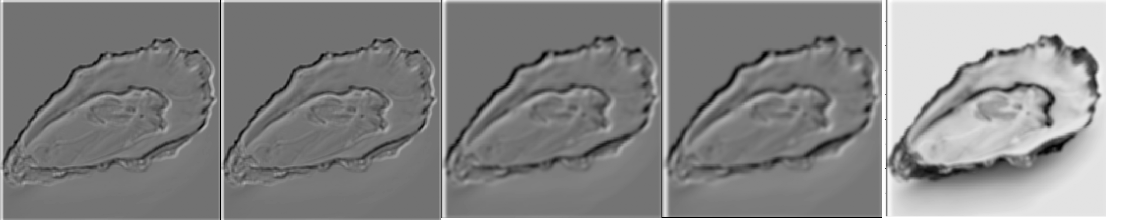
Here is the Laplacian stack of the combined stack "LS" from the Laplacians of the two images and the weights of the Gaussian of the mask:
Part 2: Gradient Domain Fushion
We learned in class (and have been learning through life, actually) that humans pick up on changes, on harsh contrasts. Therefore, the idea behind Poisson Blending is that by ensuring there are no harsh changes, our blend will actually be perceived pretty well.
We can quantify "changes" in images by referring to their horizontal and vertical gradients.
In order to make sure we actually preserve the source region we're trying to add to the target, we need to make sure that the gradients inside the source region remain the same. Thus we will have consntraints maintaining those gradients.
But we also want to blend the source image into the target! This means we want to account for the gradient between the boundary pixels of the source region and the boundary pixels at the region the source will be placed in the target. Our other set of constraints will aim to get these gradients as close to the gradients of these boundary pixels in the source image.
Solving these constraints amounts to an optimization problem which we can solve with least squares! In the Ax = b setup, x is the vector containing all the new values of the pixels. This is what we are solving for. A consists of 0s, 1s and -1s which form the coefficients for the new pixels involved in our constraints. The b vector contains the gradients of the source region (which we are trying to come as close to as possible) and for boundary constraints we also add to this value the value of the pixel at the corresponding boundary point in the target region.
Part 2.1: Toy Example
Toy Example Result!
Part 2.2: Poisson Blending
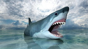
My favorite image is this one with a shark at the bottom of a waterfall. I especially like that there's a man staring head on at the shark. At first I tried to do this blend with a different image of a shark, but realized that that one didn't look so great (likely due to the position of the shark and the amount of shark that was able to be seen).
To make this work, I first selected the images that I wanted to blend. Then, I made sure to resize the source image as necessary to make sure that the image size wasn't too big or small for the location I wanted it to go in my target image. I then used the starter code provided by Nikhil to generate the shark and waterfall masks by selecting points to form a polygon.
After this, I ran least squares to figure out the new pixel values and programmatically changed the pixel values of the target image to these newly calculated ones!
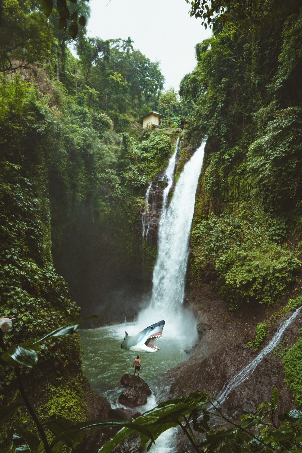
Shark in Waterfall (Blended)
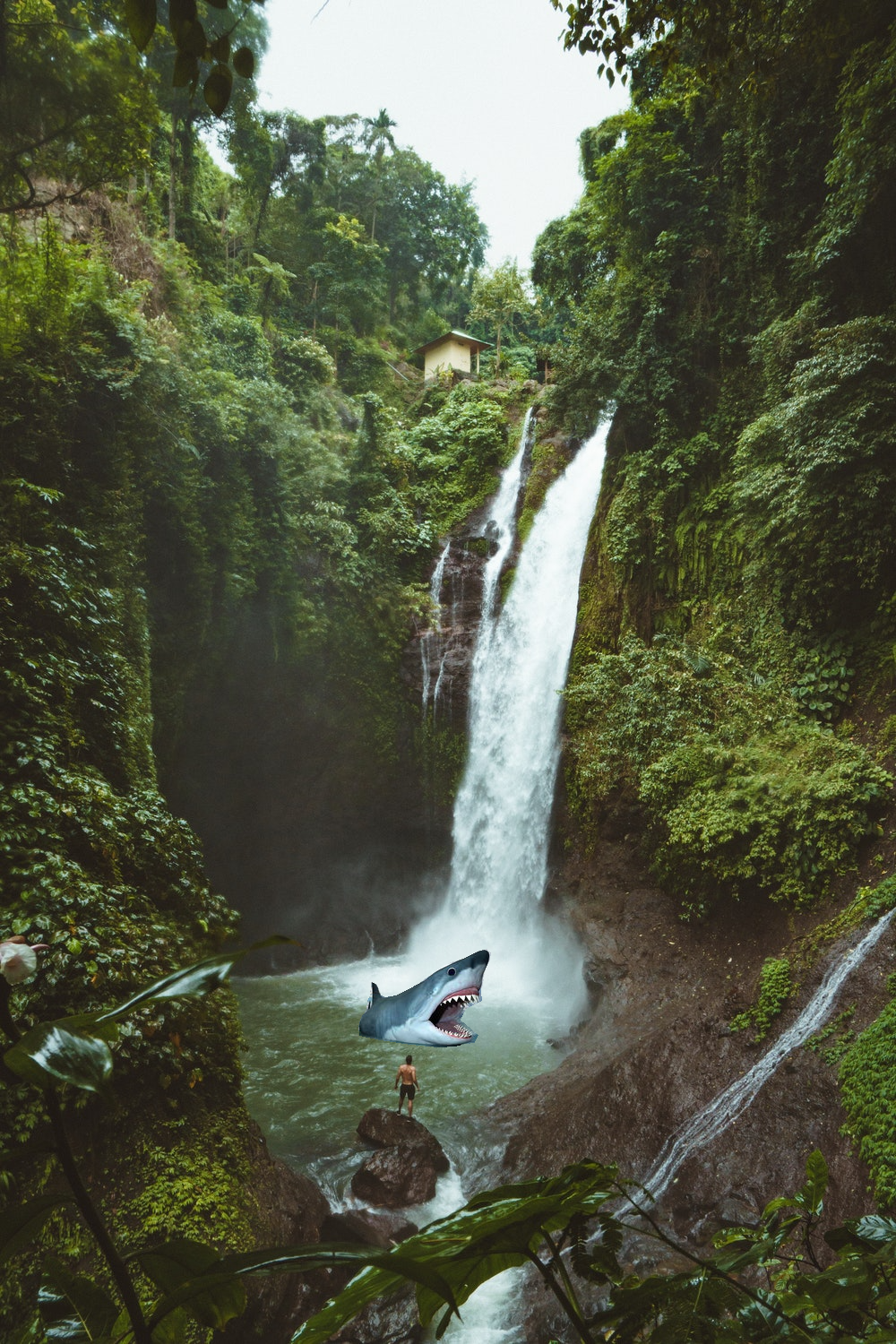
Shark in Waterfall (Not Blended)
Shark
Shark Mask

Waterfall
Waterfall Mask
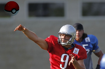
Football player throwing a Pokeball

Pokeball

Pokeball Mask
Football
Football Mask
Although I do enjoy the image of fireworks in Central Park during the day, and it turned out much better than I could have asked, I consider this my "failure" case because the colors are very different. Of course, this is expected with this algorithm because we care more about gradients than intensity in general.
Still, for an ideal blend in the ideal case, it would have been nice to be able to see similar colors.
For this part in general, many of the difficulties I faced were just difficulties debugging. For example, at one point I noticed that using both .png and .jpg images resulted in pixel values that made my penguin disappear. Switching to just .png led to much better results (aka a visible penguin)! Other issues had to do with the actual floating point values of the intensity in the images -- I was accidentally dividing by 255 when I didn't need to, and I wasn't using np.clip. I also originally setup my A and b incorrectly, placing the values from the target pixels at the boundaries in A (which should just have coefficients) instead of in b.
Fireworks in Central Park! During the day!

Fireworks

Fireworks Mask
Central Park
Central Park Mask
The following is my Poisson blending recreation of the "world is your oyster" image I created in part 1. Interestingly, it looks like the Laplacian pyramid blending technique did better! Of course, the Laplacian pyramid one has no color, so it's harder to compare, but still, it does look like it did better than the Poisson one.
The reason the Poisson blended one doesn't look as great is because of the stark contrast in color of the image of the Earth and of that of the oyster shell. In fact, because of this, the Earth looks a bit transparent or abstract. I cannot confirm that someone looking at this image would know that this is, in fact, the Earth. This teaches us that the Poisson blended approach is more appropriate when we don't necessarily care too much about replicating the exact colors of images as we have them in the source (or if we indeed want different colors, perhaps due to lighting differences). Otherwise, if we specifically care about the colors, it would be better to use the Laplacian pyramid blending approach.
Poisson Blending
Laplacian Pyramid Blending
Oyster Shell
Earth
Laplacian Pyramid Blending Mask
Poisson Blending Mask
|
|
|
|
|
|
Again, for these images I did a lot of trial and error to figure out which sigmas to use for the Gaussians. Each hybrid image required a different amount of "blur".
For example, for the Derek & Nutmeg picture I used a sigma1 of 14 and a sigma2 of 10. For my baby Karuna and adult Karuna hybrid I used a sigma1 of 6 and a sigma2 of 3.
Choosing sigma was also correlated to the nubmer of pixels in the image; with smaller images I'd generally have smaller sigmas.
|
|
|
|
|
|
|
|
|
|
|
|
Here you can see the log magnitude of the Fourier transform for the images and the hybrid:
|
|
|
|
|
|
When I tried creating hybrids of images, not all of them were successes. Below is one of my multiple failures. Here I thought it would be really cool to see how powerwashing has an effect on surfaces. Unfortunately, I wasn't able to really make out the before image from the after image. This makes sense because the images are indeed roughly the same except for what just looks like different colors. Even if I was creating colored hybrid images, I doubt this would be a great hybrid image.
Generally, my hybrids failed if they were not the right kind of picture to make a hybrid out of. With hybrids in particular, I think there's definitely some images that work better than others just based on what the images are of and how well they intrinsically align. Here's one of my multiple failed ones: Generally failed because not right kind of picture to make a hybrid out of.
|
|
|
|
Part 1.3: Gaussian and Laplacian Stacks
I created Gaussian and Laplacian stacks and ran them on the painting of Lincoln and Gala as well as on a hybrid image of myself.
For both of these once againn I looked for sigmas that experimentally looked correct.
For the Lincoln and Gala painting, I used a sigma of 6 for the Gaussian stack and a sigma of 2 for the Laplacian stack.
Below I used a sigma of 2 for the Gaussian stack and a sigma of 2 for the Laplacian stack.
Part 1.4: Multiresolution Blending
For multiresolution blending, Laplacian stacks were used in order to create a smooth, less noticeable seam when blending two images together.
Oraple
Orange
Apple
Mask
Earth + Moon
Moon
Earth
Mask
And this class has taught me that ......
the world is my oyster!
World is your oyster
Oyster shell
Earth
Mask
Here is the Laplacian stack of the earth image ("LA"):
Here is the Laplacian stack of the oyster shell image ("LB"):
Here is the Laplacian stack of the combined stack "LS" from the Laplacians of the two images and the weights of the Gaussian of the mask:
Part 2: Gradient Domain Fushion
We learned in class (and have been learning through life, actually) that humans pick up on changes, on harsh contrasts. Therefore, the idea behind Poisson Blending is that by ensuring there are no harsh changes, our blend will actually be perceived pretty well.
We can quantify "changes" in images by referring to their horizontal and vertical gradients.
In order to make sure we actually preserve the source region we're trying to add to the target, we need to make sure that the gradients inside the source region remain the same. Thus we will have consntraints maintaining those gradients.
But we also want to blend the source image into the target! This means we want to account for the gradient between the boundary pixels of the source region and the boundary pixels at the region the source will be placed in the target. Our other set of constraints will aim to get these gradients as close to the gradients of these boundary pixels in the source image.
Solving these constraints amounts to an optimization problem which we can solve with least squares! In the Ax = b setup, x is the vector containing all the new values of the pixels. This is what we are solving for. A consists of 0s, 1s and -1s which form the coefficients for the new pixels involved in our constraints. The b vector contains the gradients of the source region (which we are trying to come as close to as possible) and for boundary constraints we also add to this value the value of the pixel at the corresponding boundary point in the target region.
Part 2.1: Toy Example
Toy Example Result!
Part 2.2: Poisson Blending
My favorite image is this one with a shark at the bottom of a waterfall. I especially like that there's a man staring head on at the shark. At first I tried to do this blend with a different image of a shark, but realized that that one didn't look so great (likely due to the position of the shark and the amount of shark that was able to be seen).
To make this work, I first selected the images that I wanted to blend. Then, I made sure to resize the source image as necessary to make sure that the image size wasn't too big or small for the location I wanted it to go in my target image. I then used the starter code provided by Nikhil to generate the shark and waterfall masks by selecting points to form a polygon.
After this, I ran least squares to figure out the new pixel values and programmatically changed the pixel values of the target image to these newly calculated ones!
Shark in Waterfall (Blended)
Shark in Waterfall (Not Blended)
Shark
Shark Mask
Waterfall
Waterfall Mask
Football player throwing a Pokeball
Pokeball
Pokeball Mask
Football
Football Mask
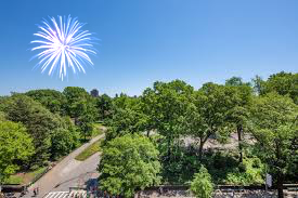
Although I do enjoy the image of fireworks in Central Park during the day, and it turned out much better than I could have asked, I consider this my "failure" case because the colors are very different. Of course, this is expected with this algorithm because we care more about gradients than intensity in general.
Still, for an ideal blend in the ideal case, it would have been nice to be able to see similar colors.
For this part in general, many of the difficulties I faced were just difficulties debugging. For example, at one point I noticed that using both .png and .jpg images resulted in pixel values that made my penguin disappear. Switching to just .png led to much better results (aka a visible penguin)! Other issues had to do with the actual floating point values of the intensity in the images -- I was accidentally dividing by 255 when I didn't need to, and I wasn't using np.clip. I also originally setup my A and b incorrectly, placing the values from the target pixels at the boundaries in A (which should just have coefficients) instead of in b.
Fireworks in Central Park! During the day!
Fireworks
Fireworks Mask
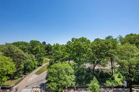
Central Park
Central Park Mask
The following is my Poisson blending recreation of the "world is your oyster" image I created in part 1. Interestingly, it looks like the Laplacian pyramid blending technique did better! Of course, the Laplacian pyramid one has no color, so it's harder to compare, but still, it does look like it did better than the Poisson one.
The reason the Poisson blended one doesn't look as great is because of the stark contrast in color of the image of the Earth and of that of the oyster shell. In fact, because of this, the Earth looks a bit transparent or abstract. I cannot confirm that someone looking at this image would know that this is, in fact, the Earth. This teaches us that the Poisson blended approach is more appropriate when we don't necessarily care too much about replicating the exact colors of images as we have them in the source (or if we indeed want different colors, perhaps due to lighting differences). Otherwise, if we specifically care about the colors, it would be better to use the Laplacian pyramid blending approach.
Poisson Blending
Laplacian Pyramid Blending
Oyster Shell
Earth
Laplacian Pyramid Blending Mask
Poisson Blending Mask
|
|
|
|
|
|
|
|
|
|
|
|
|
|
And this class has taught me that ...... the world is my oyster!
|
|
|
|
|
Here is the Laplacian stack of the earth image ("LA"):
|
|
Here is the Laplacian stack of the oyster shell image ("LB"):
|
|
Here is the Laplacian stack of the combined stack "LS" from the Laplacians of the two images and the weights of the Gaussian of the mask:
|
|
Part 2: Gradient Domain Fushion
We learned in class (and have been learning through life, actually) that humans pick up on changes, on harsh contrasts. Therefore, the idea behind Poisson Blending is that by ensuring there are no harsh changes, our blend will actually be perceived pretty well.We can quantify "changes" in images by referring to their horizontal and vertical gradients.
In order to make sure we actually preserve the source region we're trying to add to the target, we need to make sure that the gradients inside the source region remain the same. Thus we will have consntraints maintaining those gradients.
But we also want to blend the source image into the target! This means we want to account for the gradient between the boundary pixels of the source region and the boundary pixels at the region the source will be placed in the target. Our other set of constraints will aim to get these gradients as close to the gradients of these boundary pixels in the source image.
Solving these constraints amounts to an optimization problem which we can solve with least squares! In the Ax = b setup, x is the vector containing all the new values of the pixels. This is what we are solving for. A consists of 0s, 1s and -1s which form the coefficients for the new pixels involved in our constraints. The b vector contains the gradients of the source region (which we are trying to come as close to as possible) and for boundary constraints we also add to this value the value of the pixel at the corresponding boundary point in the target region.
Part 2.1: Toy Example
Toy Example Result!
Part 2.2: Poisson Blending
My favorite image is this one with a shark at the bottom of a waterfall. I especially like that there's a man staring head on at the shark. At first I tried to do this blend with a different image of a shark, but realized that that one didn't look so great (likely due to the position of the shark and the amount of shark that was able to be seen).
To make this work, I first selected the images that I wanted to blend. Then, I made sure to resize the source image as necessary to make sure that the image size wasn't too big or small for the location I wanted it to go in my target image. I then used the starter code provided by Nikhil to generate the shark and waterfall masks by selecting points to form a polygon.
After this, I ran least squares to figure out the new pixel values and programmatically changed the pixel values of the target image to these newly calculated ones!
Shark in Waterfall (Blended)
Shark in Waterfall (Not Blended)
Shark
Shark Mask
Waterfall
Waterfall Mask
Football player throwing a Pokeball
Pokeball
Pokeball Mask
Football
Football Mask
Although I do enjoy the image of fireworks in Central Park during the day, and it turned out much better than I could have asked, I consider this my "failure" case because the colors are very different. Of course, this is expected with this algorithm because we care more about gradients than intensity in general.
Still, for an ideal blend in the ideal case, it would have been nice to be able to see similar colors.
For this part in general, many of the difficulties I faced were just difficulties debugging. For example, at one point I noticed that using both .png and .jpg images resulted in pixel values that made my penguin disappear. Switching to just .png led to much better results (aka a visible penguin)! Other issues had to do with the actual floating point values of the intensity in the images -- I was accidentally dividing by 255 when I didn't need to, and I wasn't using np.clip. I also originally setup my A and b incorrectly, placing the values from the target pixels at the boundaries in A (which should just have coefficients) instead of in b.
Fireworks in Central Park! During the day!
Fireworks
Fireworks Mask
Central Park
Central Park Mask
The following is my Poisson blending recreation of the "world is your oyster" image I created in part 1. Interestingly, it looks like the Laplacian pyramid blending technique did better! Of course, the Laplacian pyramid one has no color, so it's harder to compare, but still, it does look like it did better than the Poisson one.
The reason the Poisson blended one doesn't look as great is because of the stark contrast in color of the image of the Earth and of that of the oyster shell. In fact, because of this, the Earth looks a bit transparent or abstract. I cannot confirm that someone looking at this image would know that this is, in fact, the Earth. This teaches us that the Poisson blended approach is more appropriate when we don't necessarily care too much about replicating the exact colors of images as we have them in the source (or if we indeed want different colors, perhaps due to lighting differences). Otherwise, if we specifically care about the colors, it would be better to use the Laplacian pyramid blending approach.
Poisson Blending
Laplacian Pyramid Blending
Oyster Shell
Earth
Laplacian Pyramid Blending Mask
Poisson Blending Mask
|
|
To make this work, I first selected the images that I wanted to blend. Then, I made sure to resize the source image as necessary to make sure that the image size wasn't too big or small for the location I wanted it to go in my target image. I then used the starter code provided by Nikhil to generate the shark and waterfall masks by selecting points to form a polygon.
After this, I ran least squares to figure out the new pixel values and programmatically changed the pixel values of the target image to these newly calculated ones!
|
|
|
|
|
|
|
|
|
|
|
|
|
|
Although I do enjoy the image of fireworks in Central Park during the day, and it turned out much better than I could have asked, I consider this my "failure" case because the colors are very different. Of course, this is expected with this algorithm because we care more about gradients than intensity in general.
Still, for an ideal blend in the ideal case, it would have been nice to be able to see similar colors.
For this part in general, many of the difficulties I faced were just difficulties debugging. For example, at one point I noticed that using both .png and .jpg images resulted in pixel values that made my penguin disappear. Switching to just .png led to much better results (aka a visible penguin)! Other issues had to do with the actual floating point values of the intensity in the images -- I was accidentally dividing by 255 when I didn't need to, and I wasn't using np.clip. I also originally setup my A and b incorrectly, placing the values from the target pixels at the boundaries in A (which should just have coefficients) instead of in b.
|
|
|
|
|
|
The following is my Poisson blending recreation of the "world is your oyster" image I created in part 1. Interestingly, it looks like the Laplacian pyramid blending technique did better! Of course, the Laplacian pyramid one has no color, so it's harder to compare, but still, it does look like it did better than the Poisson one.
The reason the Poisson blended one doesn't look as great is because of the stark contrast in color of the image of the Earth and of that of the oyster shell. In fact, because of this, the Earth looks a bit transparent or abstract. I cannot confirm that someone looking at this image would know that this is, in fact, the Earth. This teaches us that the Poisson blended approach is more appropriate when we don't necessarily care too much about replicating the exact colors of images as we have them in the source (or if we indeed want different colors, perhaps due to lighting differences). Otherwise, if we specifically care about the colors, it would be better to use the Laplacian pyramid blending approach.
|
|
|
|
|
|
|
|