cs194-26-acw)|
|
|
|
|
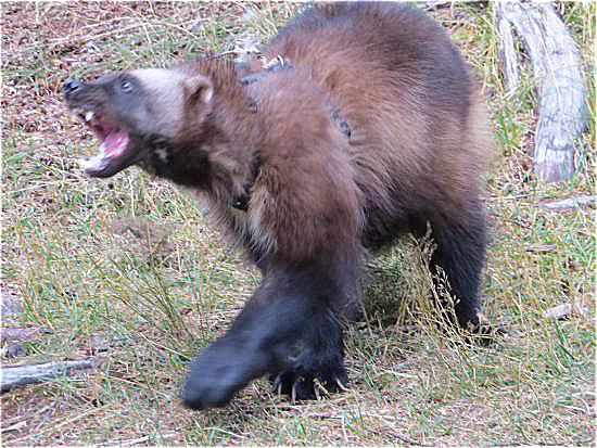
I took a blurry image of a wolverine and sharpened it using the unsharp mask.
To do this, the input image is convolved with a Gaussian kernel (in this case, with a sigma of 1). Then, the blurred image is subtracted from the input image to get a high-pass filtered copy of the image. Finally, some multiple (alpha, in this case 2.0) of high-pass filtered copy is added back to the original input image to amplify the high frequency components.
This is applied to each of the color channels of the image separately.

|
|
In this part, I constructed hybrid images with a relatively simple technique.
Low frequency components are extracted from one image (using the Gaussian blur described above), and high frequency components are extracted from the other image (by subtracting the Gaussian blurred from the original, described above).
The two images are aligned and averaged together to produce a simple composite image. If viewed from afar (or squinted eyes), the low frequency image will stand out. If viewed up close, the high frequency image will stand out.
First I blended the example images, with pretty good results:
|
|
|
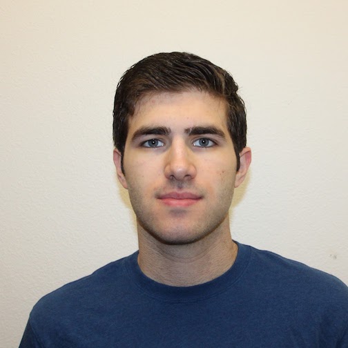
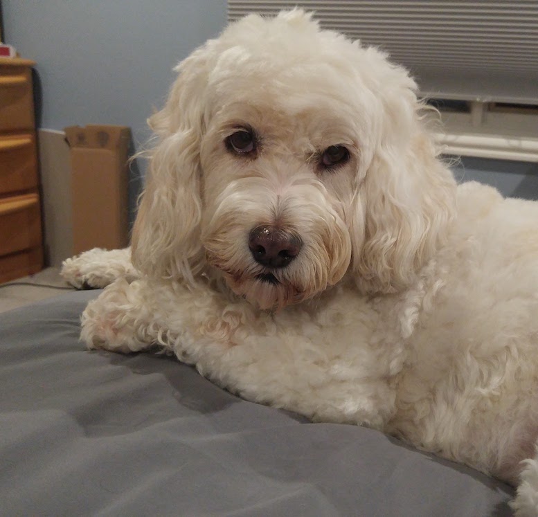
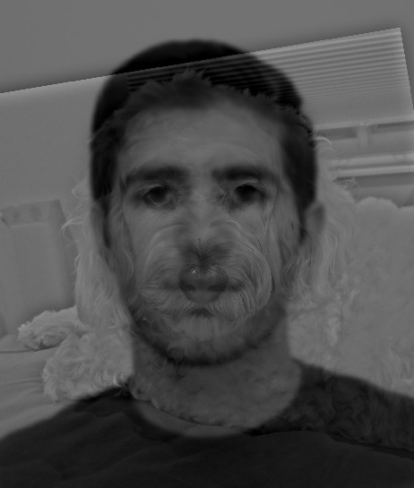
Then I tried blending a photograph of myself and my dog, which worked out less well. I tried a bunch of different combinations of sigmas, but for whatever reason I just couldn't get the images to combine well. Part of it is that my dog and I have difference face shapes, so if I line up our eyes, the bottom half of our faces overlap in weird ways.
|
|
|
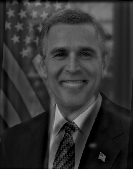
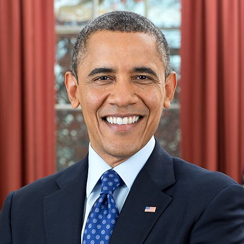
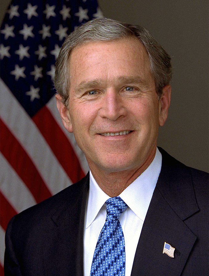
Finally, I tried blending an image of Barack Obama and George Bush, which worked the best:
|
|
|
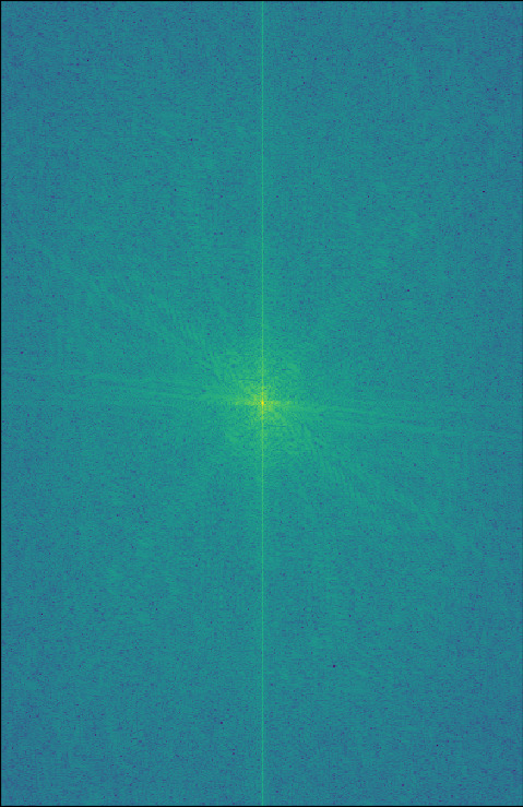
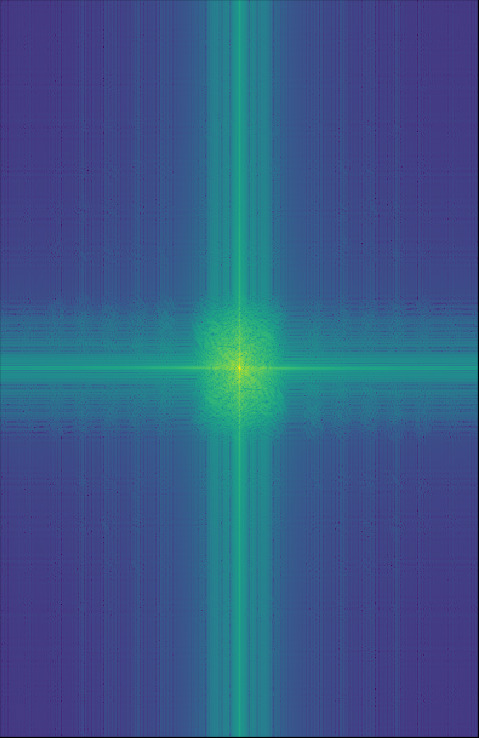
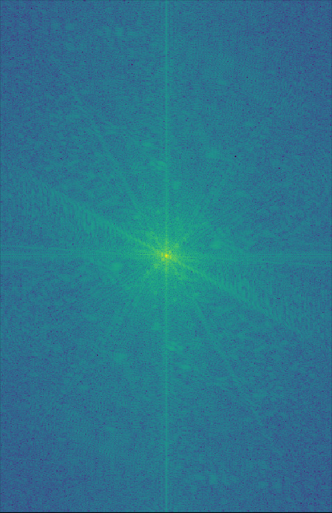
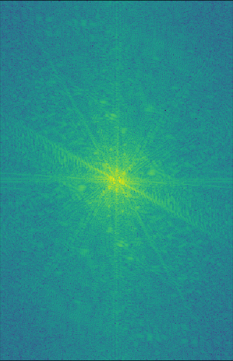
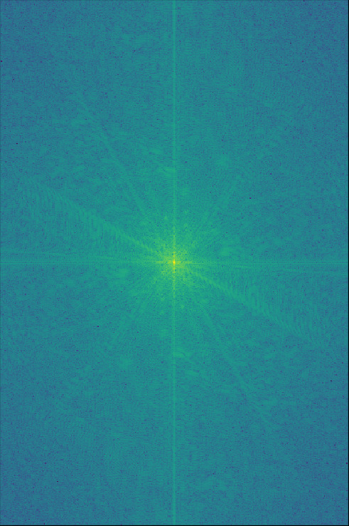
I took the Fourier transform of each of the images for Obushma:
|
|
|
|
|
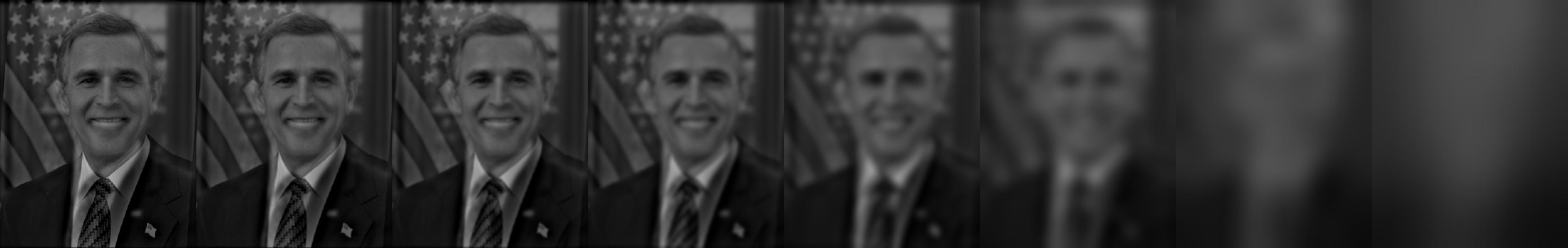
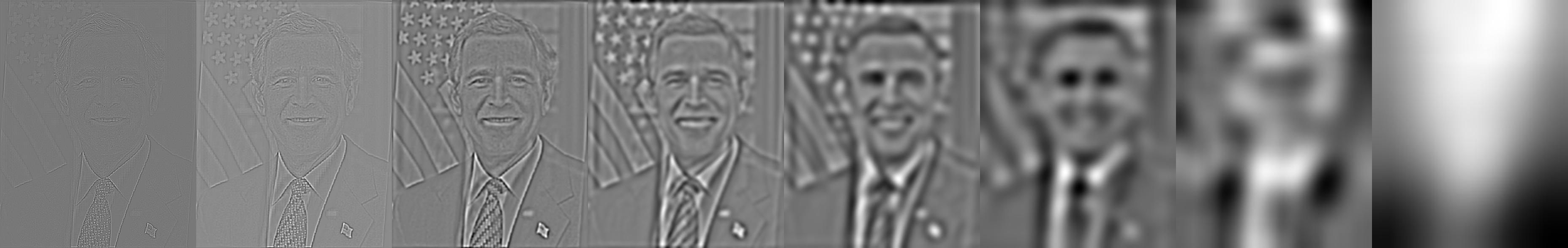
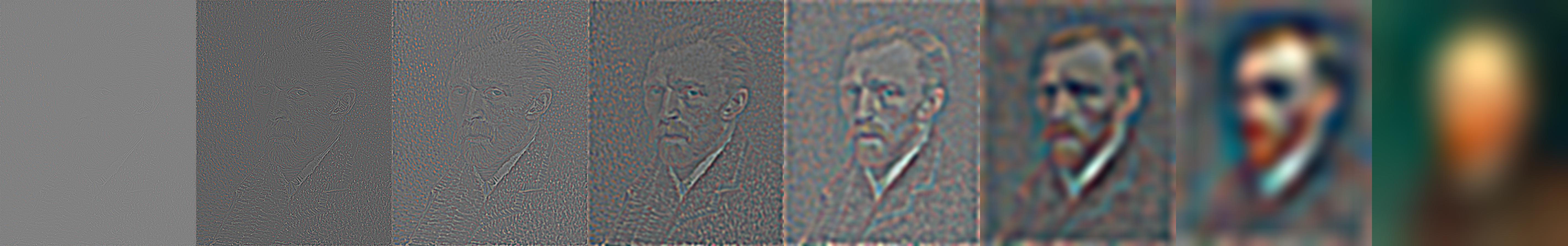
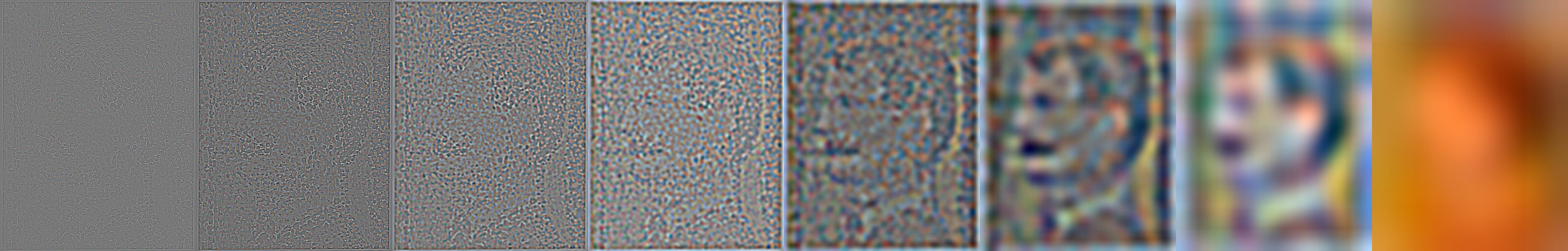
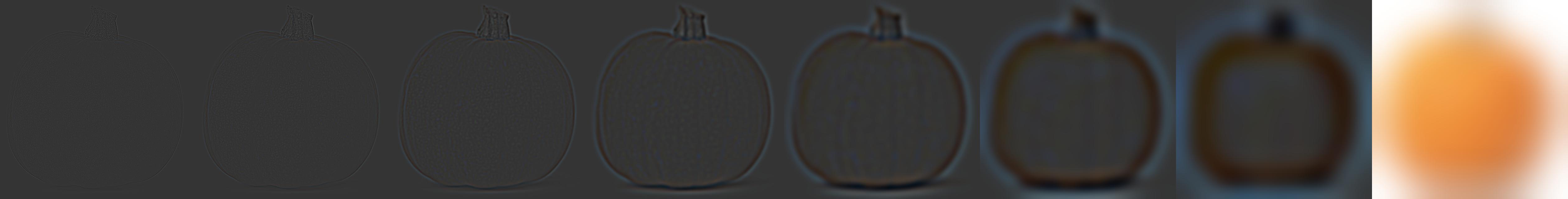
A Gaussian stack is a stack of images, where each is a further blurred copy of the previous. The images end up progressively low-pass filtered. A Laplacian stack takes the difference between the original and each of the blurred images, producing a series of band-pass filtered images. These stacks (primarily Laplacian) can reveal varying spacial frequency structures.
Below are the Gaussian and Laplacian stacks for the Obushma hybrid image from above. You can see that the left images, which represent the high frequency components of the image, look just like George Bush. The further to the right you go, the closer it looks like Barack Obama, with the two rightmost images looking just like a blurred photograph of Obama.
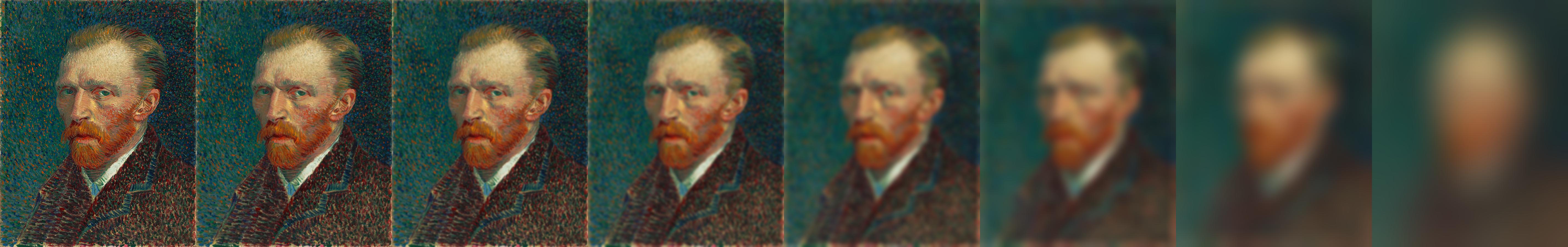
Below are the stacks for Van Gogh's Self Portrait (1887). You can clearly see in the high frequency components the individual brush strokes, and the overall picture of Van Gogh as the band-pass filter shifts to the lower frequency components.
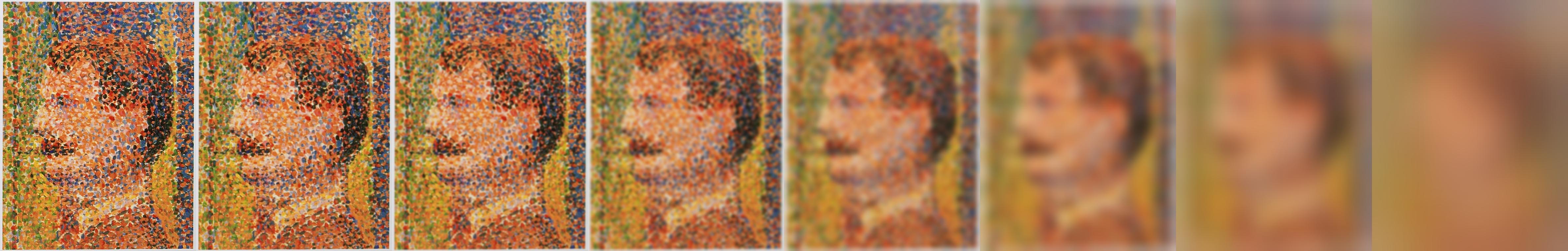
In this zoom into Georges Seurat's Parade de Cirque (1887-88), the effect is more pronounced, owing to Seurat's strong pointilism.
Finally, in Salvador Dali's Slave Market with the Disappearing Bust of Voltaire (1940), you can see the bust of Voltaire shift as it passes through the filters.


If you try to seamlessly blend two images that have strong components across multiple spacial frequencies, you'll find that the images don't blend well, because either you blend them quickly (over a short distance) and the low frequency components stand out, or you blend them slowly (over a long distance), and the high frequency components look out of place.
We can remedy this by blending each of the spacial frequency components separately, at separate rates, before combining the separately blending components.
Concretely, we can do this by blending each corresponding layer of the Laplacian stacks (above). We use a blending mask (black for 100% of the left image, white for 100% of the right image), and Gaussian blur the mask at the same rate as each layer of the Laplacian stacks. With this method, we can find the optimal blending distance for each spacial frequency.
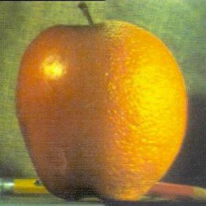
The first example is the oraple, the sample image from the Burt and Adelson (1983) paper:

|

|

|
|
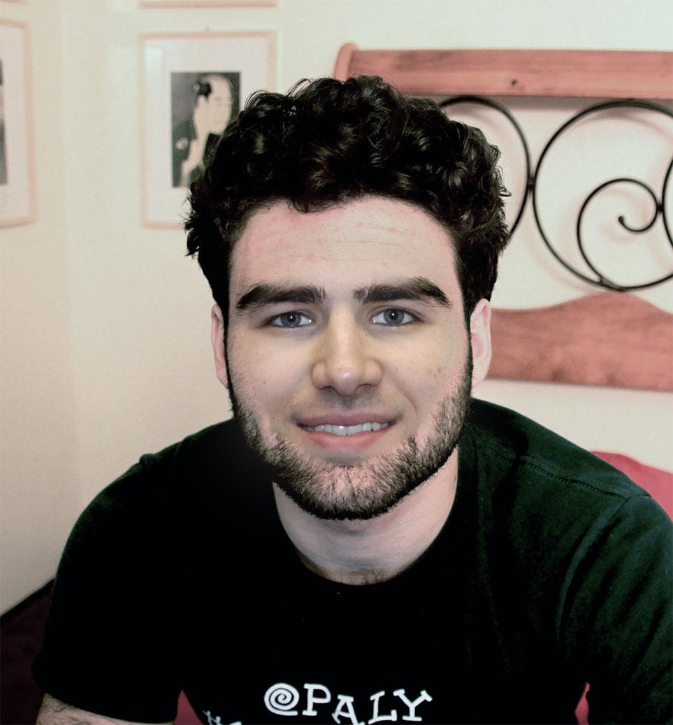
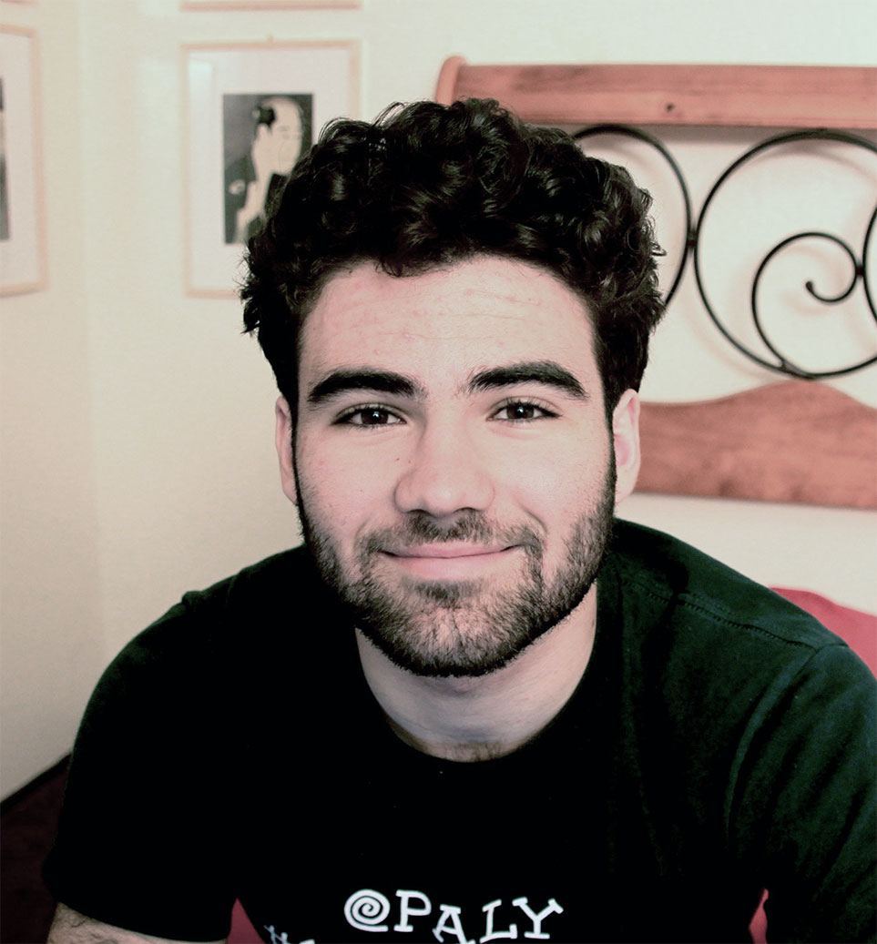
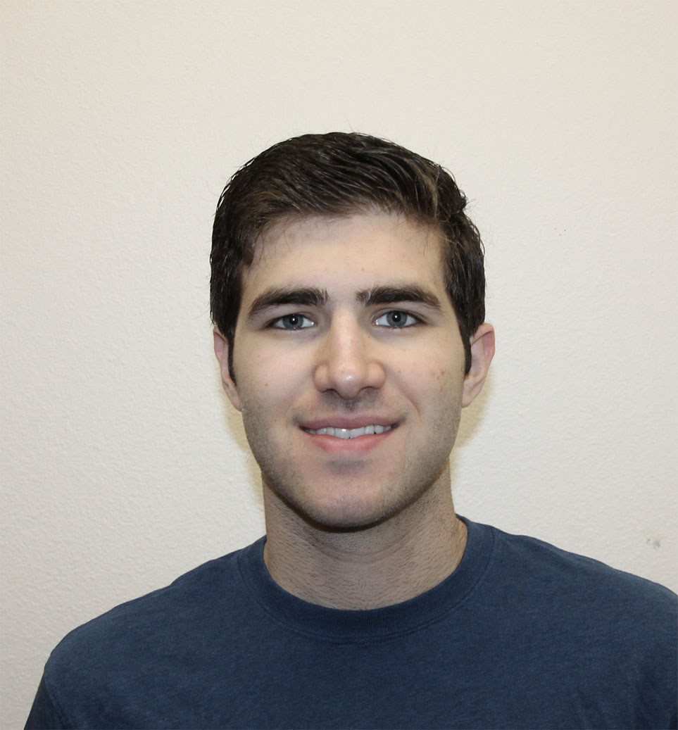
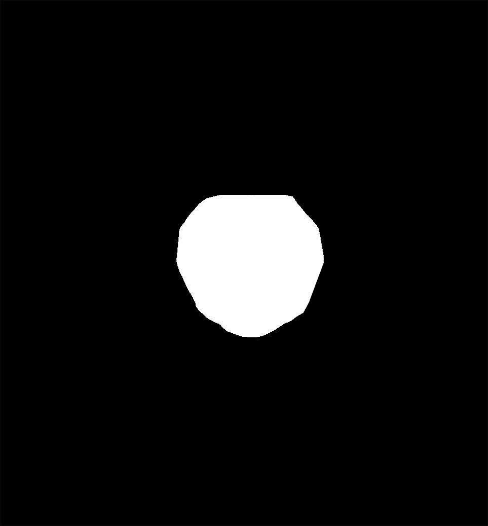
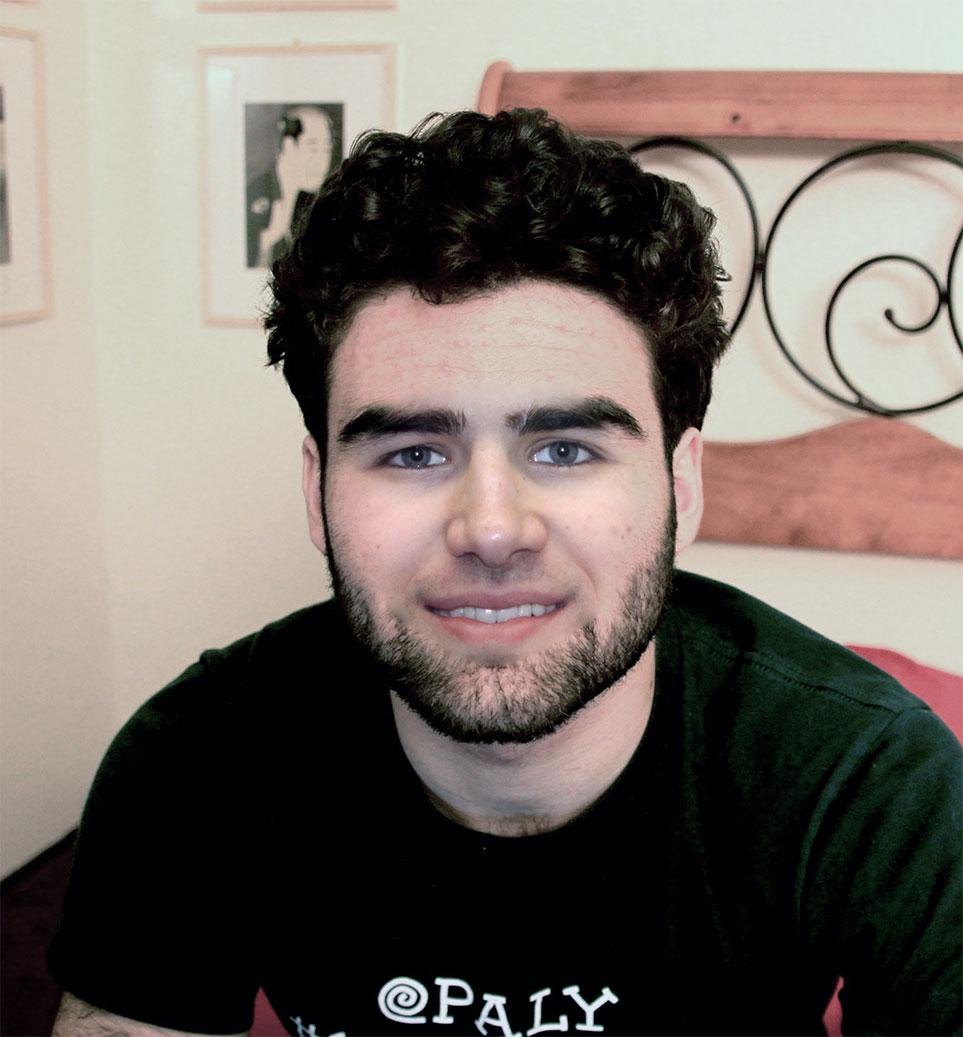
Next, I took a photograph of my roommate and I, and created a mask to place my face onto my roommate. It works alright, but not amazingly -- mostly because of the difference in facial hair.
|
|
|
|
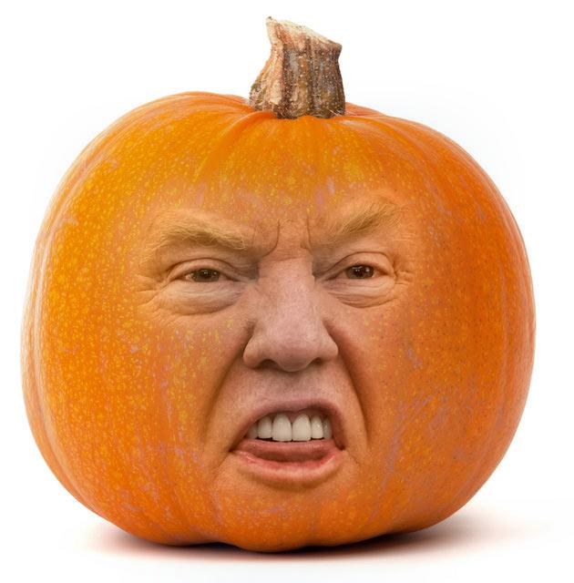
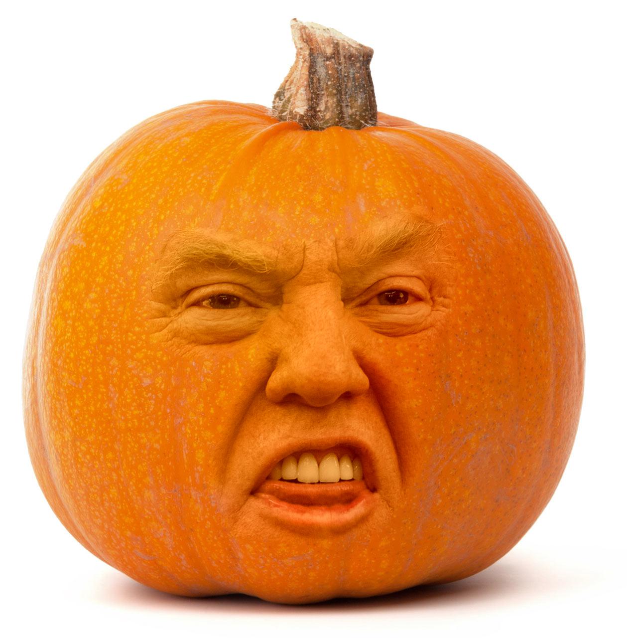
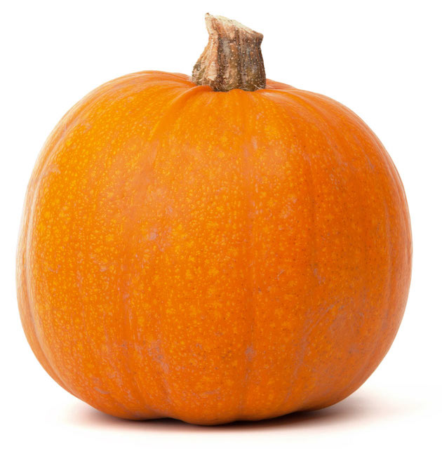
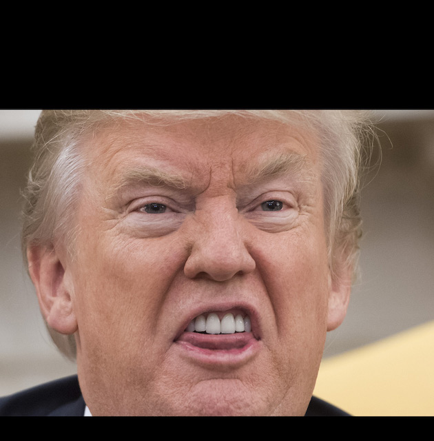
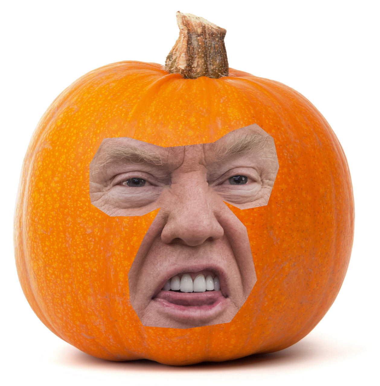
Finally, I took a picture of Donald Trump and a pumpkin. I hate the image, but it works too well to not show.
|
|
|
|
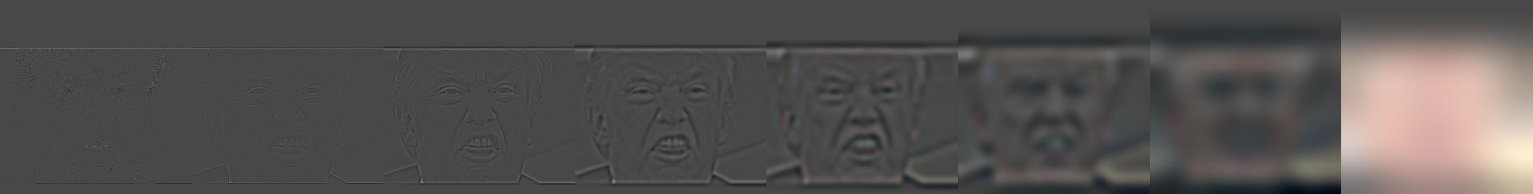
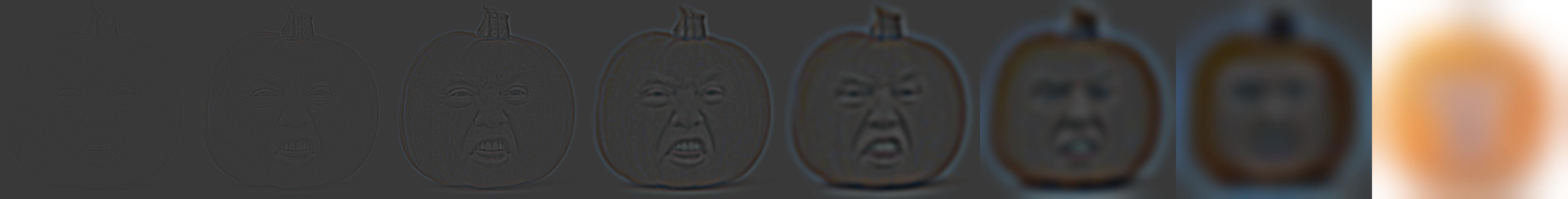
Below are the Laplacian stacks for Donald Trump, the pumpkin, and the Trumpkin:
Instead of blending in the spacial frequency domain, we can instead blend in the gradient domain.
Humans are most sensitive to gradients, so if we copied over the gradients from one image into another image, we could accomplish a pretty good blend. However, if the gradients in the path around the blending mask don't match perfectly from the source image to the destination image, we'll get a lot of artifacts and the blend won't look good.
Since it's unlikely we'd ever find two images with matching edge gradients, we instead construct the problem as a least squares optimization problem: we want to find some set of pixel intensities in a shape v, such that we minimize the squared error of each of the quantities: the gradient within the source image versus the gradient in the constructed shape v [in both horizontal and vertical directions], and the difference between pixels in the destination bordering pixels inside of the shape v.
This has the effect of matching the gradients from the source image, while blending in and drawing color from the border of the mask in the destination image. Assuming the source image and destination image are roughly a similar hue and texture, this can produce very convincing blended images.
To make sure I could properly solve this type of gradient least squares problem, I first tried out a toy problem, where an image was reconstructed by taking the gradients and the value of the top-left pixel, and solving for the image. The results are not visually interesting -- just the same image repeated twice.
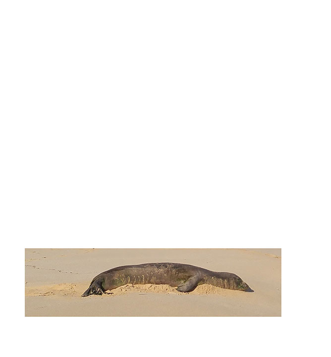
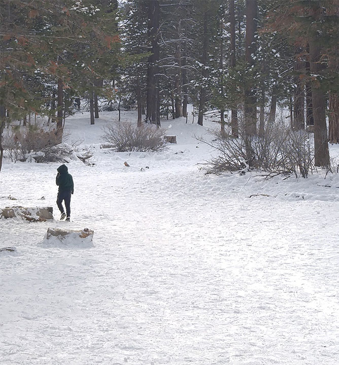
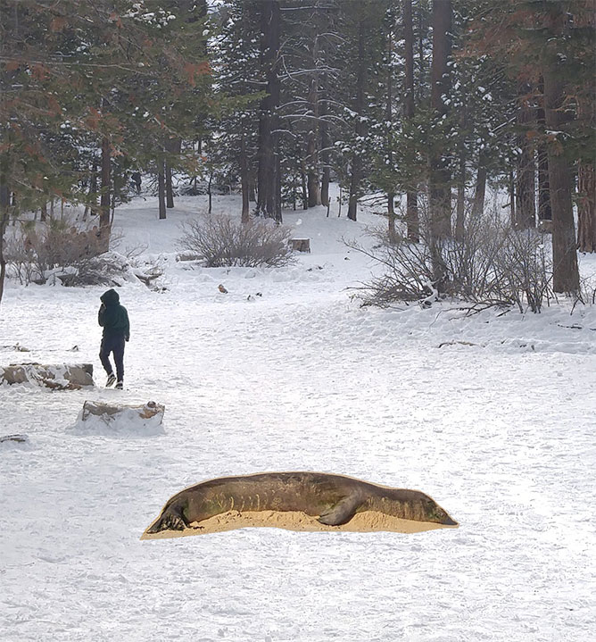
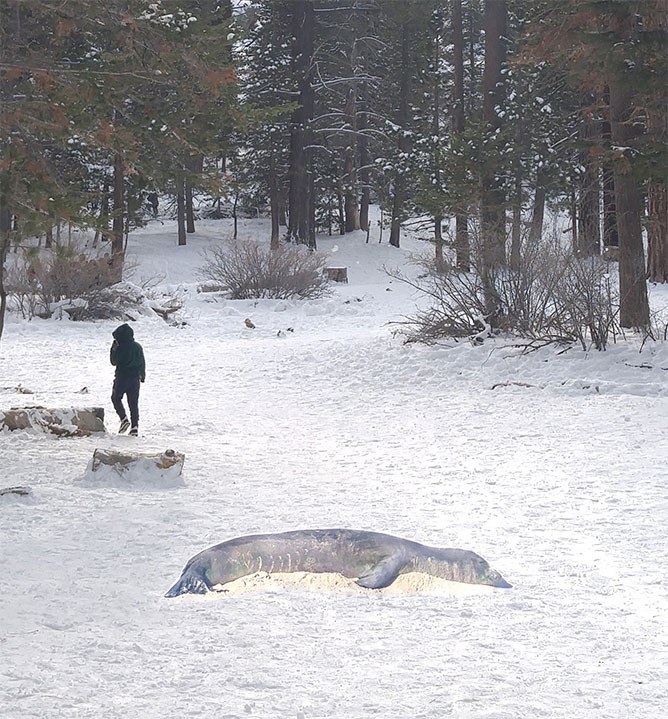
I took an photograph of an elephant seal (from Hawaii) and imposed it onto a snowy image from San Jacinto Peak.
|
|
|
|
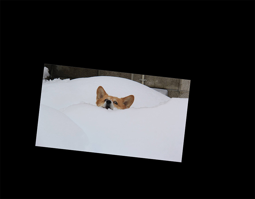
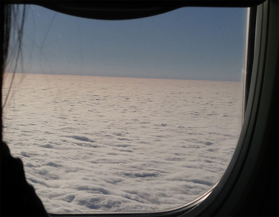
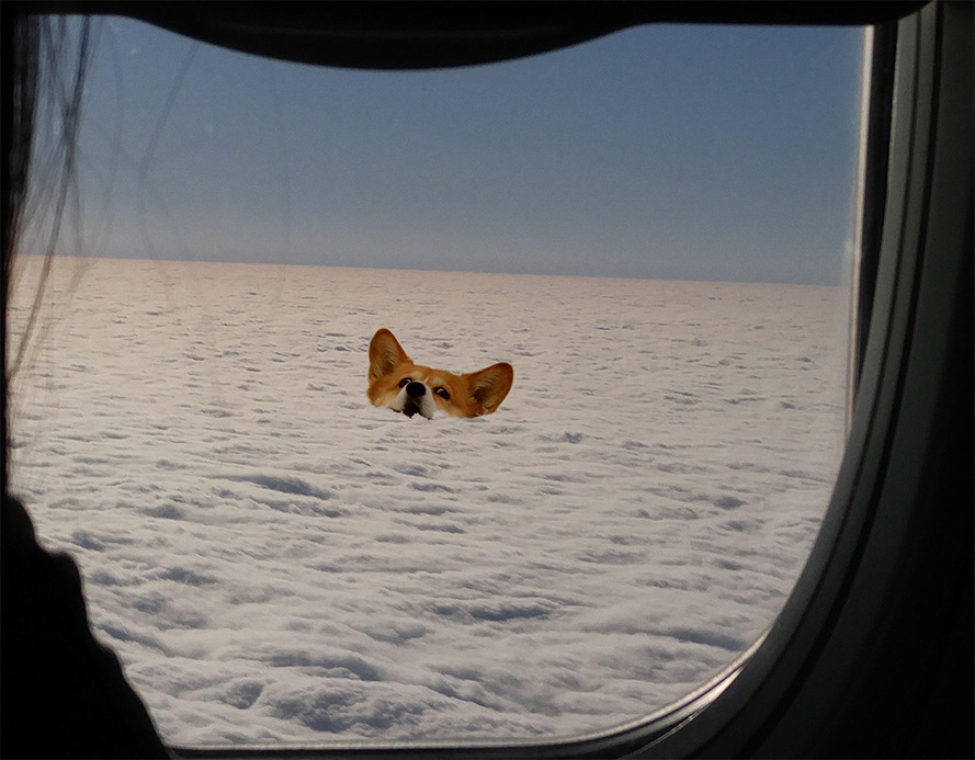
Next, I took a photograph of clouds outside of an airplane window, and imposed upon it a picture of a surprised-looking Corgi.
|
|

|
|
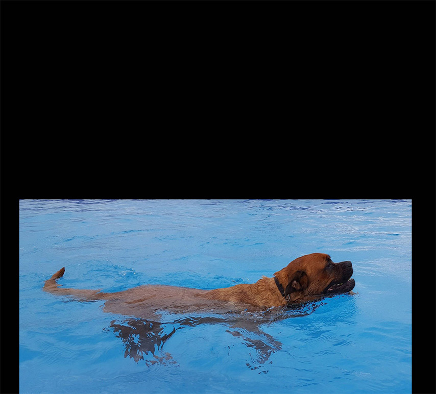
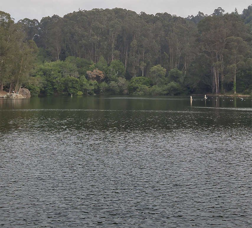
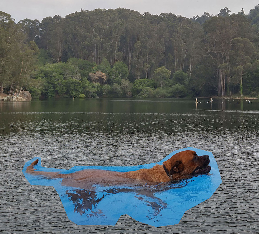
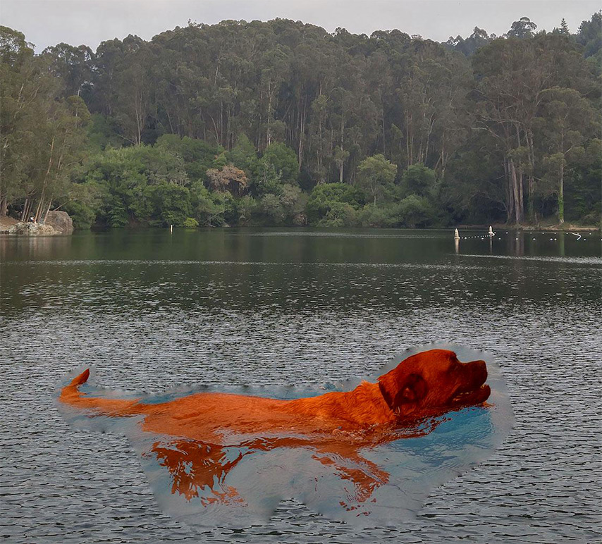
Next, I tried taking a photograph of a dog swimming in water, and put it in a picture of Lake Anza (scaled up to look more interesting). It did not work very well, at all.
The very edges are blended decently, but the color of the inside is completely screwed up. I believe this is because the hues of the source and destination images are very different (blueish versus greenish), and thus the hue of the final image is entirely unrealistic.
Additionally, the water in the destination image is a lot higher frequency than the water in the source image, so there's a weird blurring around the edges of the dog.
|
|
|
|
Finally, I took the image of the Trumpkin from before and re-blended it using the Poisson blending techniques. Unfortunately, the results are excellent and exceedingly convincing.

|

|
|
|
Here's a side-by-side comparison of the two blend types:
|
|
|
While they're both blended wonderfully (terrifyingly), the Poisson-blended one has a key advantage: Trump's face is perfectly color matched to the pumpkin. In fact, it looks like an exceedingly life-like carving of a pumpkin, rather than Trump's face pasted onto and blurred onto a pumpkin.
I've shown these images to a number of people, and they seem to be shocked by the blending in the second (Poisson) blending. However, I don't quite get the same visceral reaction to the first one. They're both definitely great examples of blending, however.
I also took the image of me and my roommate and reblended them using the Poisson blending.
|
|
|
There's not too much of a difference here, but the colors on our skin are better matched. In both cases, the results are slightly screwed up due to the difference in facial hair.