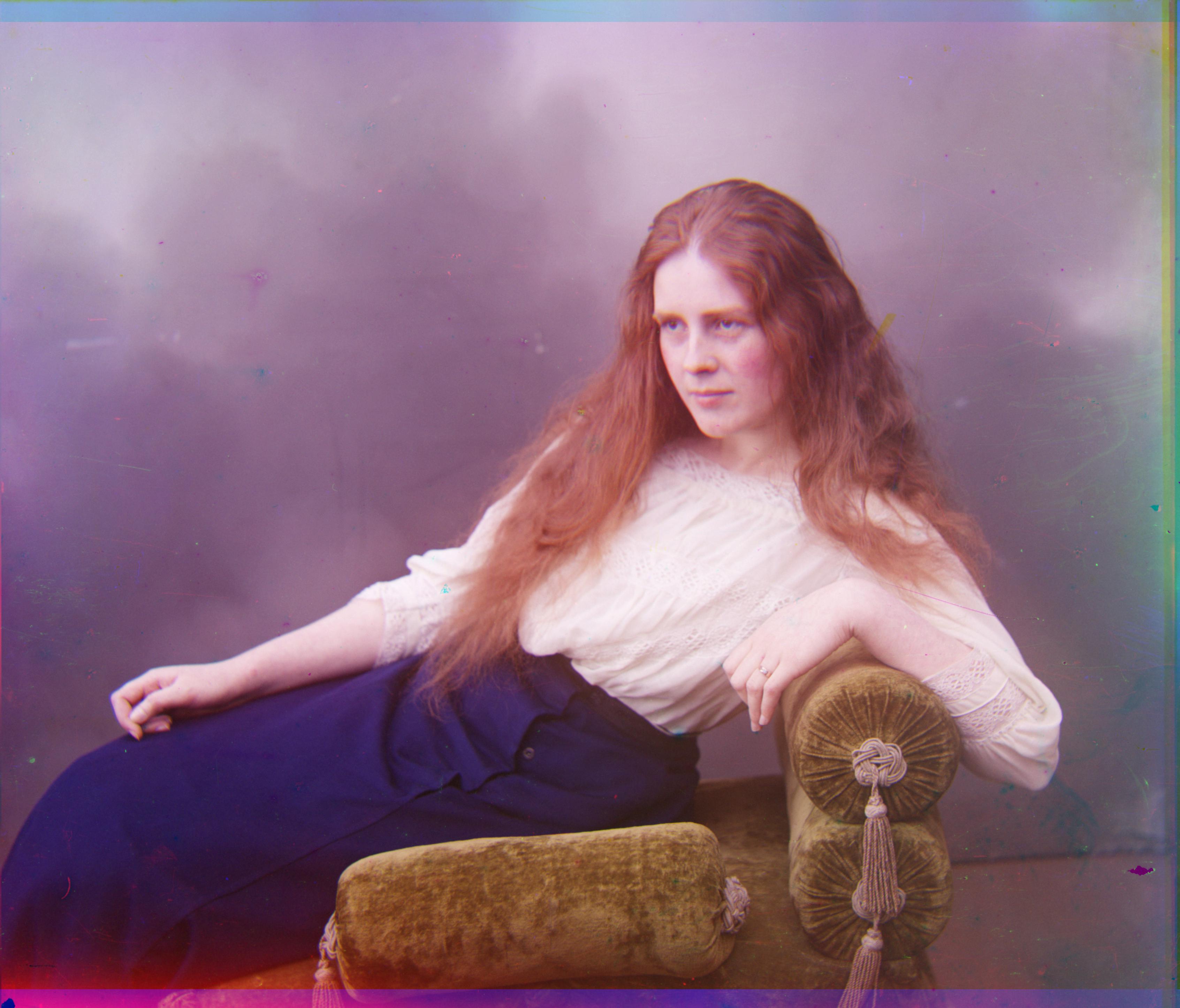
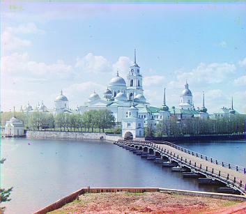
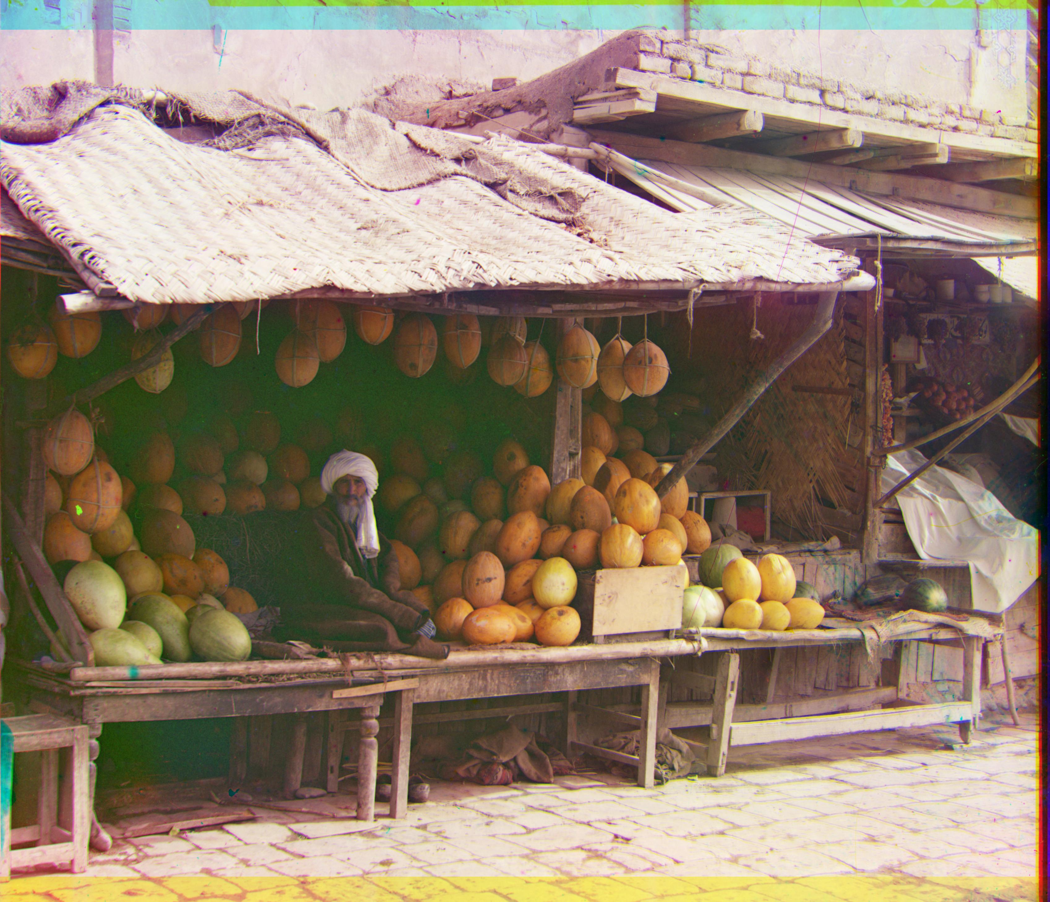
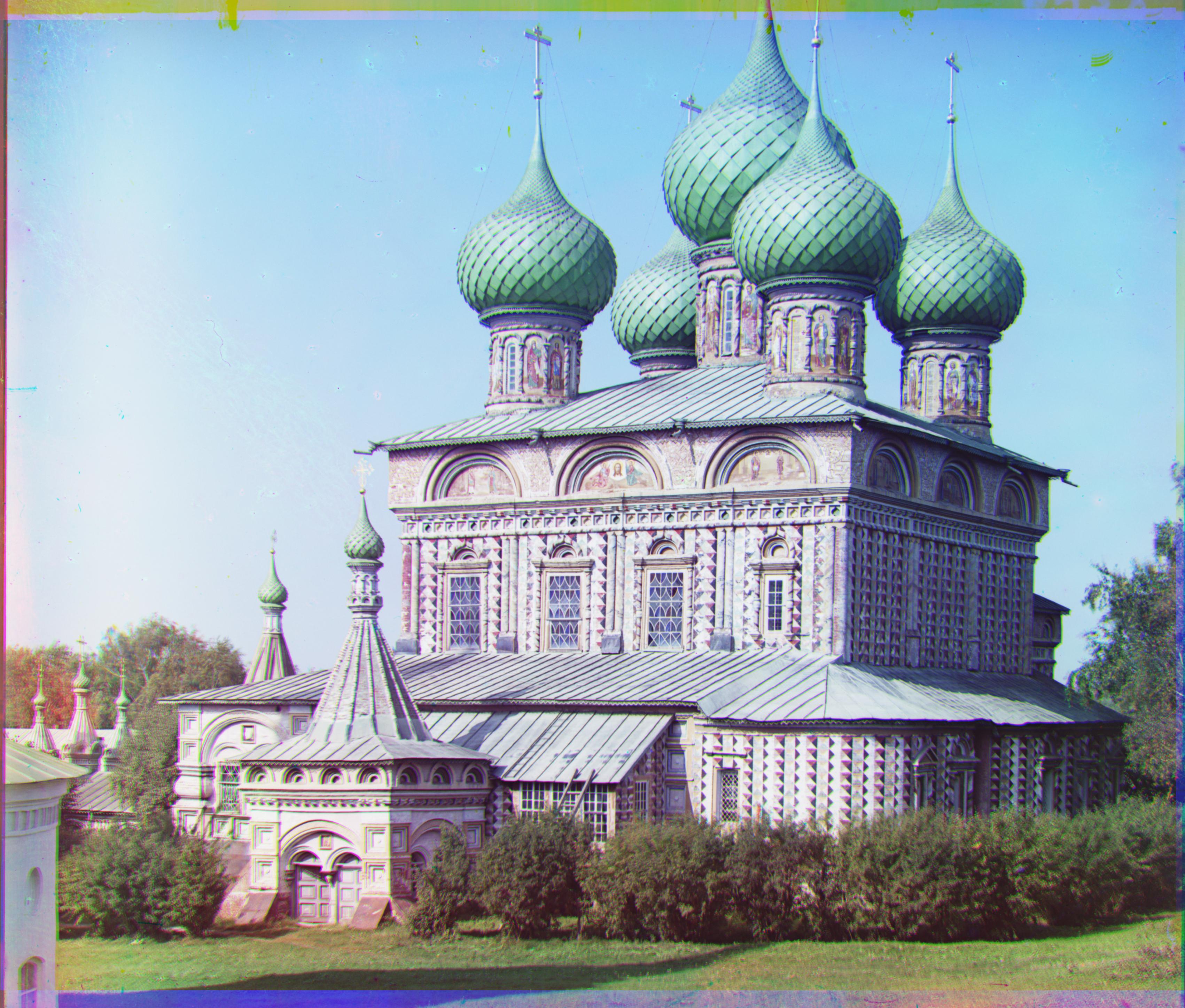
Goal: Take the digitized Prokudin-Gorskii glass plate images and, using image processing techniques, automatically produce a color image with as few visual artifacts as possible.
Methodology
Split the original image into 3 parts
Remove the border by chopping off about 5% on each side. I experimented with various borders and cutoff the smallest border that was sufficient for all of the images provided to us.
Align the blue & red image to the green image by finding the displacement vector with the smallest Normalized Cross-Correlation (dot product of the normalized image vectors) or the smallest Sum of Squared Differences (aka L2 norm). I saw minimal difference between the results for NCC aand SSD. I aligned with the green image instead of the blue image since green is in the center of the visible color spectrum. My hypothesis is that green would align better with the blue and red colors since it is closer in wavelength.
Normal Align: Check all displacement vectors within a search window of 5% (of the max dimension of the image) in each direction. This method is slower than the image pyramid method and runs too slowly for .tiff images. I chose 5% instead of using the suggested constant 15 pixel window since smaller images will typically have smaller displacement windows and large images will need large displacement windows.
Image Pyramid: Resize the image to 21.6% and find the displacement vector within a 20 pixel range in each direction. Next, scale up the image and displacement vector by (1 / 0.6) and find the new displacement vector within 7 pixels of the current displaacement vector. Repeat this until we reach the original image size. I chose 60% resizing at each level instead of 50% since I wanted to reduce the number of levels to reduce unnecessary computation. Additionally, since the original vector displacement at ~20% nearly identified the end displacement I found, it wasn't necessary to refine over the extra level.
Shift the original image for the red and blue channels by their respective calculuated displacement vectors and stack them using np.dstack
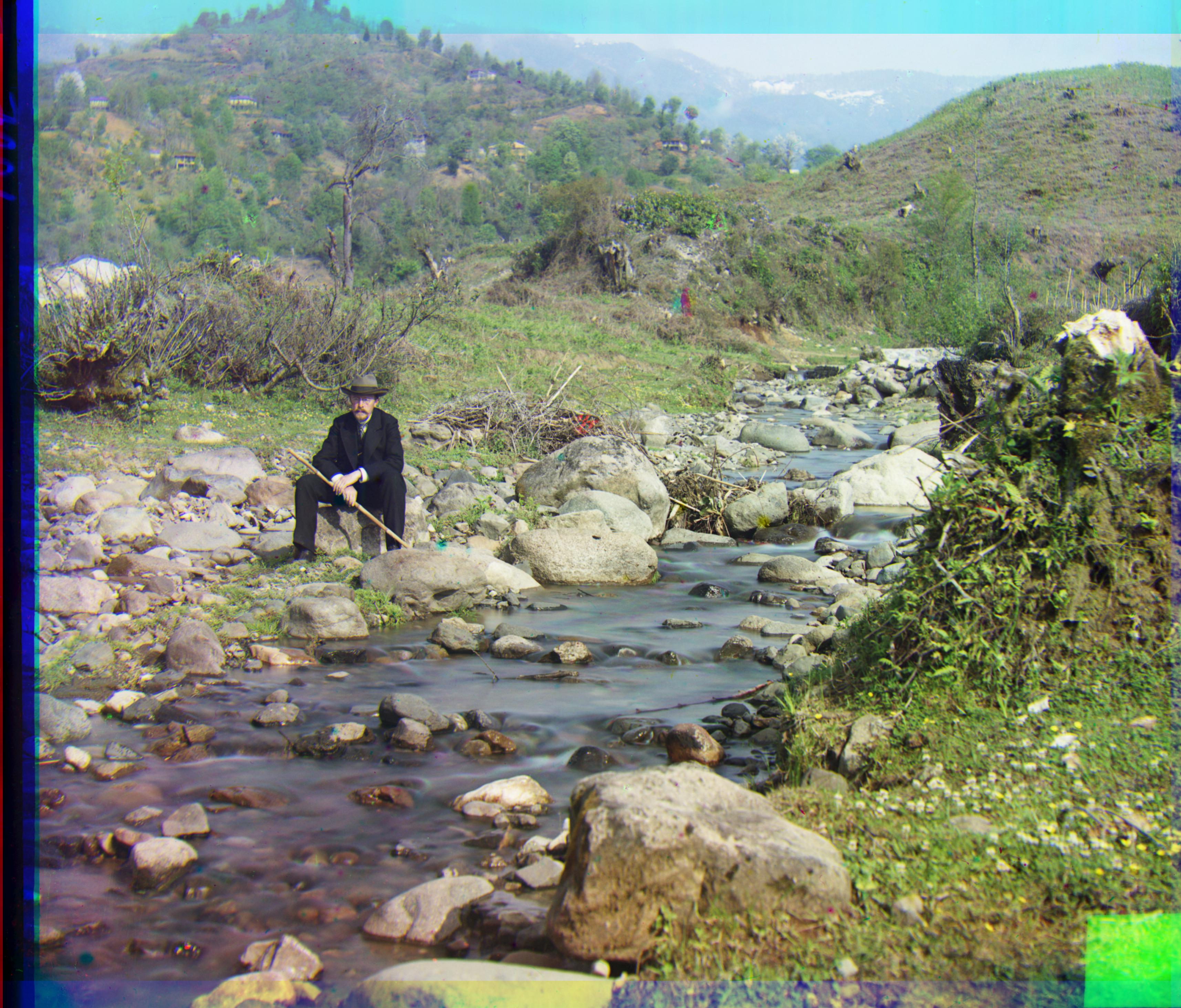
When I increase the contrast by linearly stretching the current colors by setting the 5th percentile value on each color to 0 and setting the 95th percentile of each color to 255, the brightness was too high in the new images. So instead I chose to make a smaller change and set the min value to 0 and the max value to 255. The contrasting didn't make much of an effect on the image since most images had values close to 0 and 255 and all of the jpgs had values at exactly 0 and 1 for all channels. I think the blue/green colors are closer to correct in this image and the shadows are a bit darker.
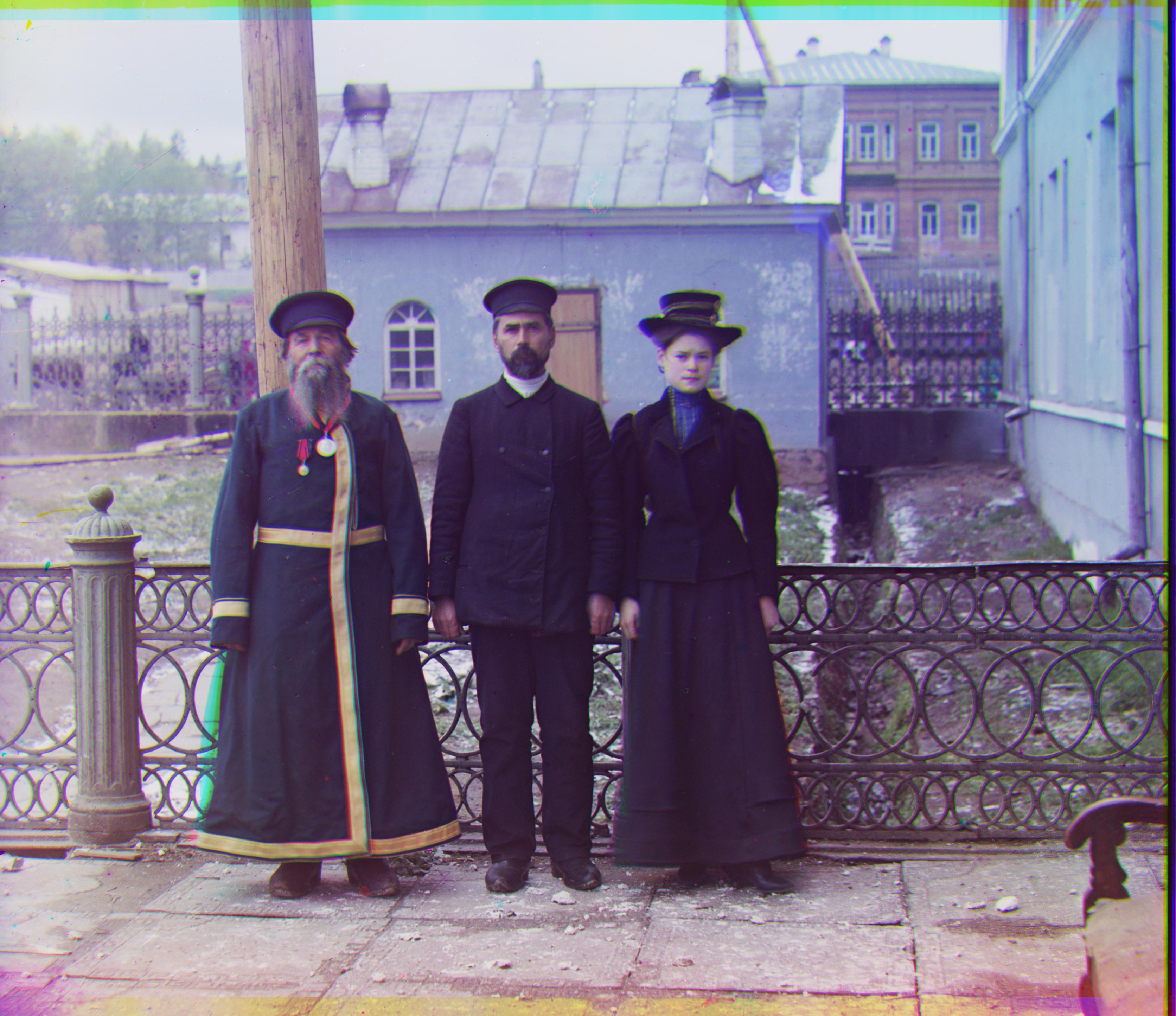
Three Generations with Auto-ContrastThree Generations without Auto-ContrastIcon with Auto-ContrastIcon without Auto-Contrast
Better Features: Roberts Edge Detection
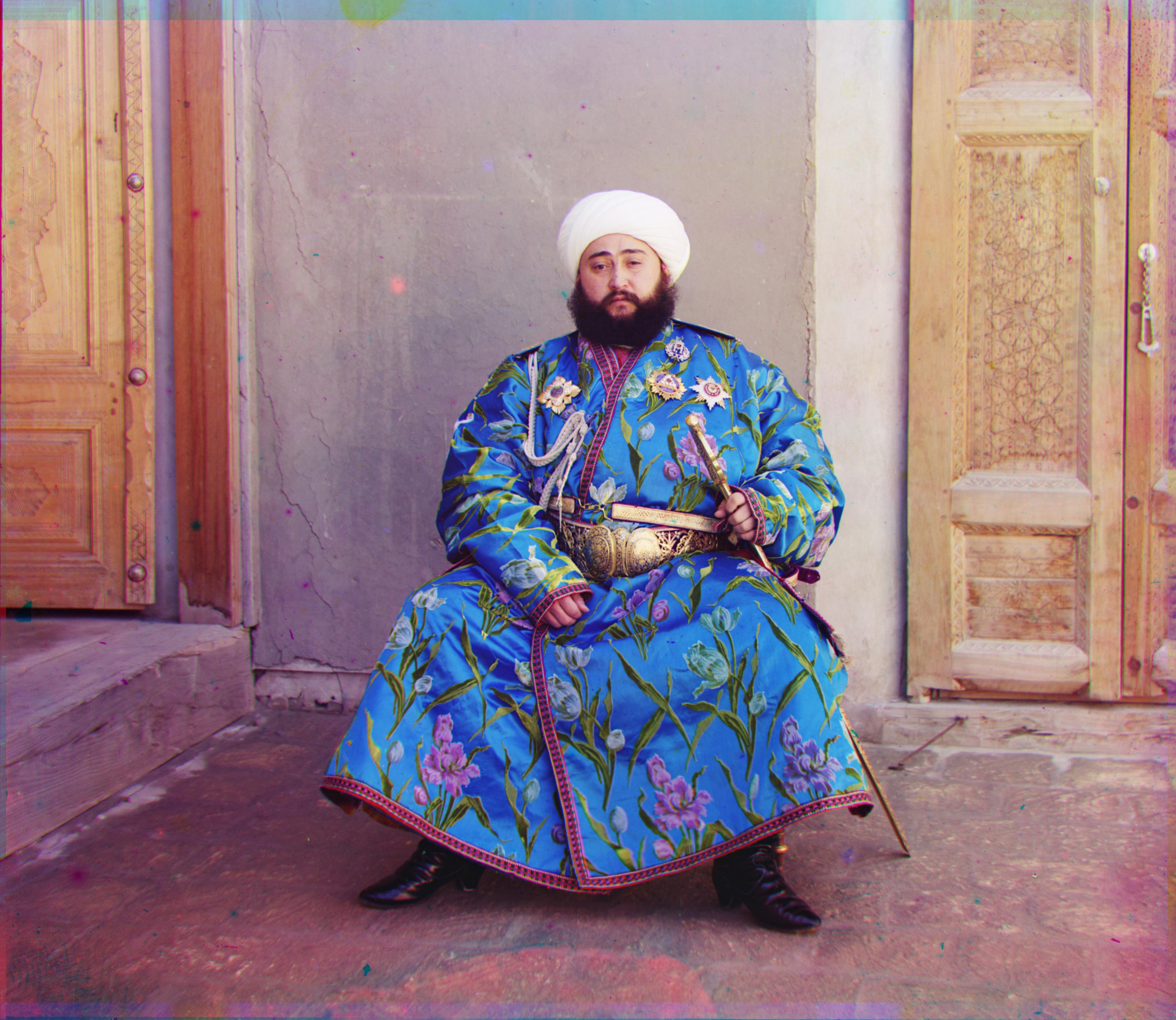
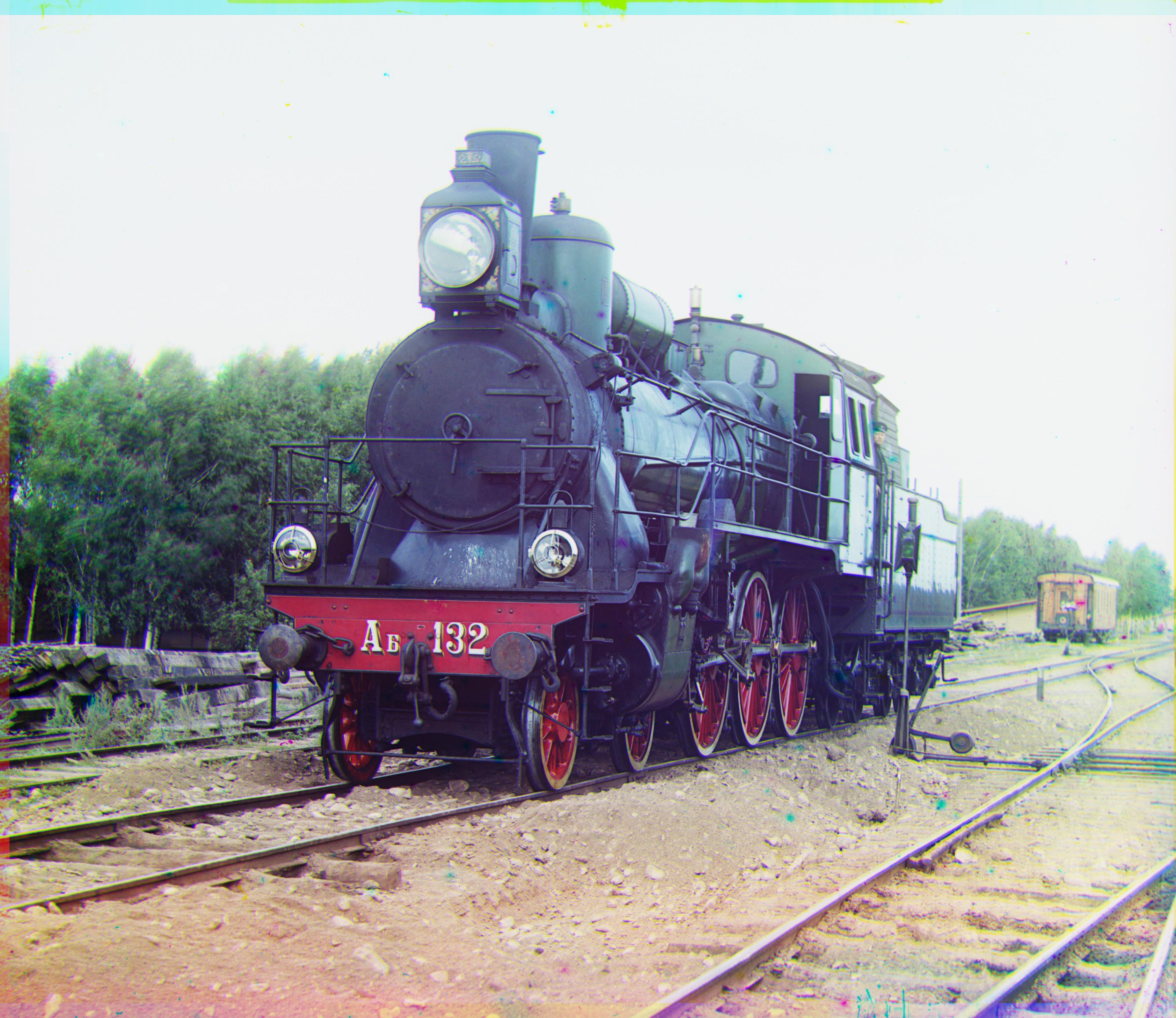
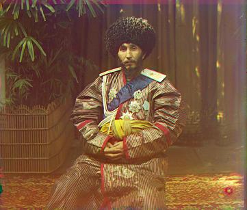
Edge Detection: My edge detection did not change the result significantly since the images already aligned very well with just the image pyramid. I think the Roberts Edge Detection led to slightly sharper image for emir.