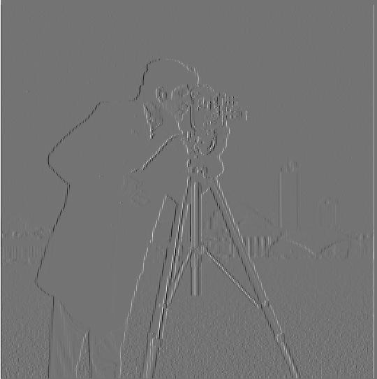
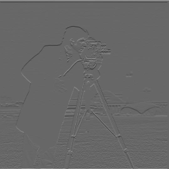
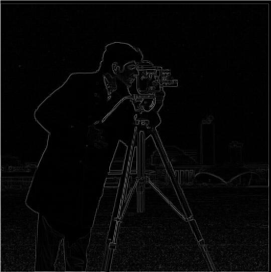
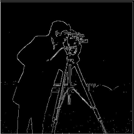
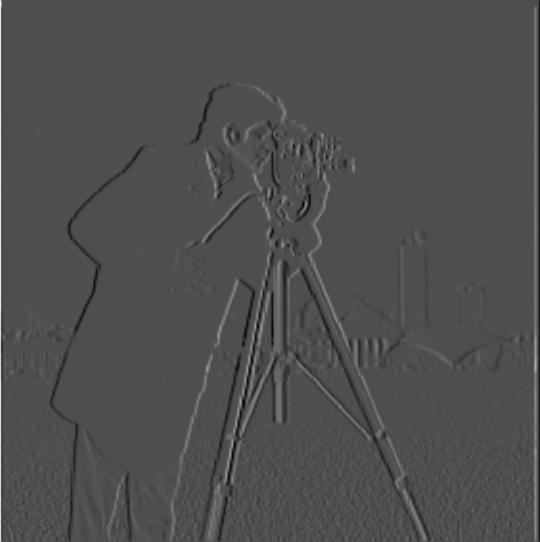
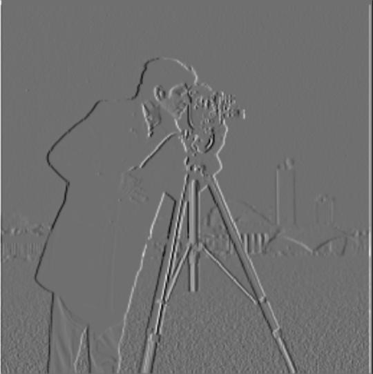
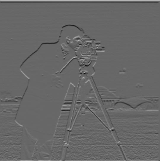
Gradient magnitude computation was as simply as applying the Pythagorean formula to the results of convolving the image once with a dx finite difference operator, and again with a dy finite difference operator. Adjusting the threshold gave me finer control over how to binarize the edge and, in the process, get rid of some noise and attempt to emphasize the real edges. The images are included below, in the following order: Partial X, Partial Y, Gradient Magnitude, Edge.
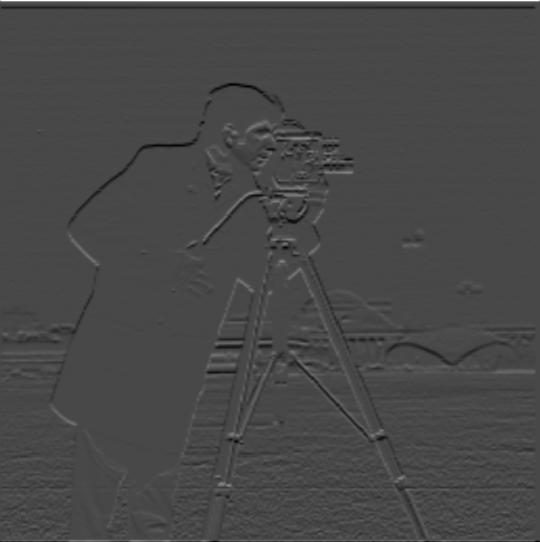
Blurring the image and then convolving with a Gaussian results in a different appearance. We get a better outline of the image; the blurring helps to reduce some of the noise. Additionally, the blurring makes the edges more distinct (and noticably wider).
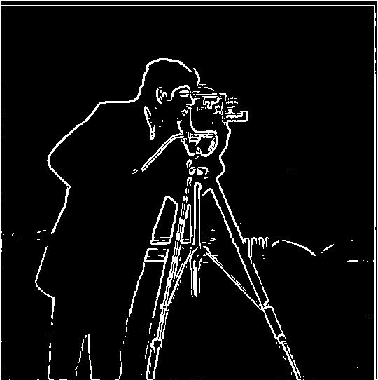
Here, in the same order as before, the result if we create a DoG filter. This produces the same results as doing the convolutions separately, but presumably more quickly as we do fewer convolutions with the image itself. Interestingly enough, the intermediate steps appear a little different: but I chalk that up to the way certain values are cut off during processing the images. The end result is the same in either case.

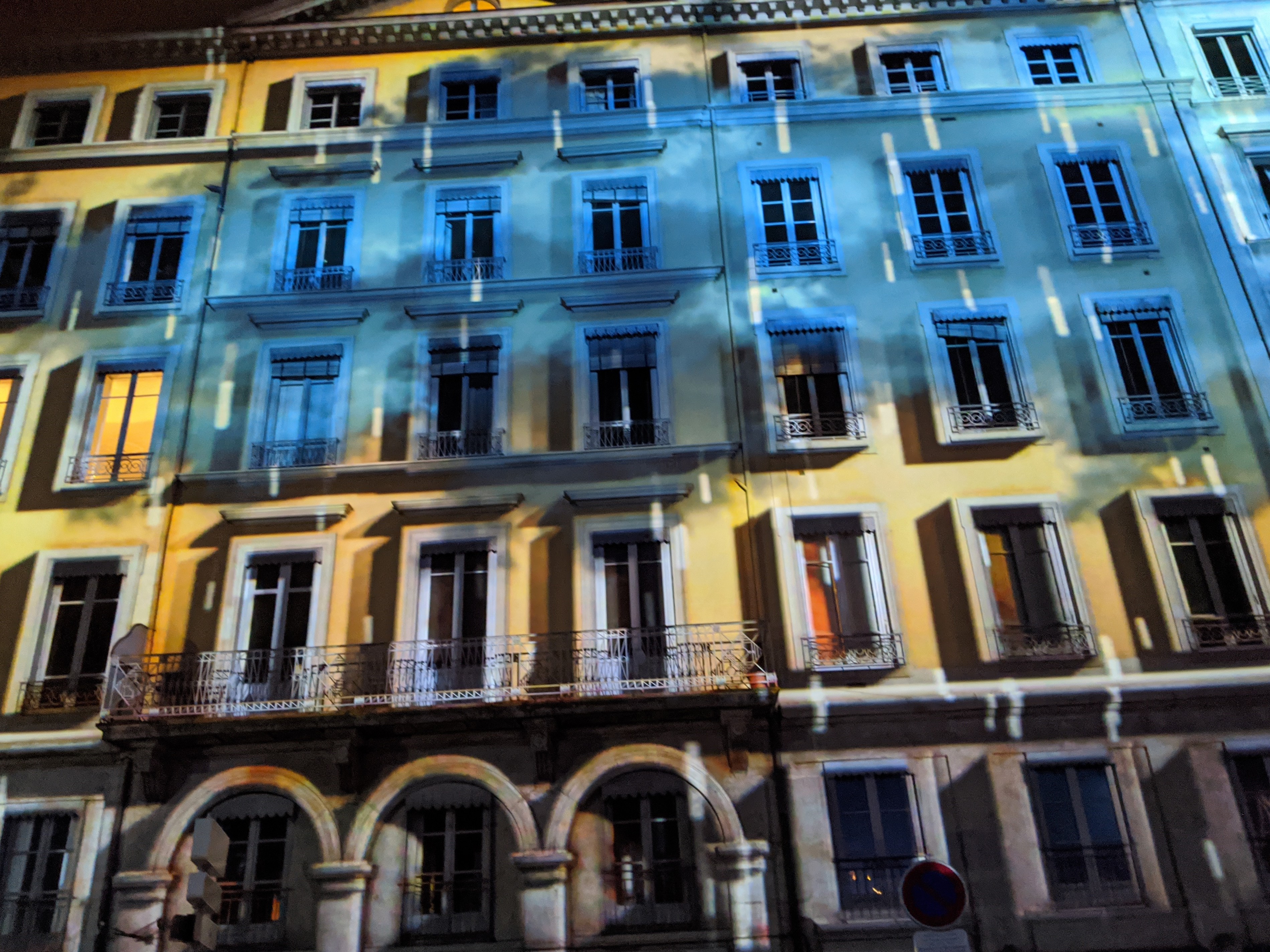
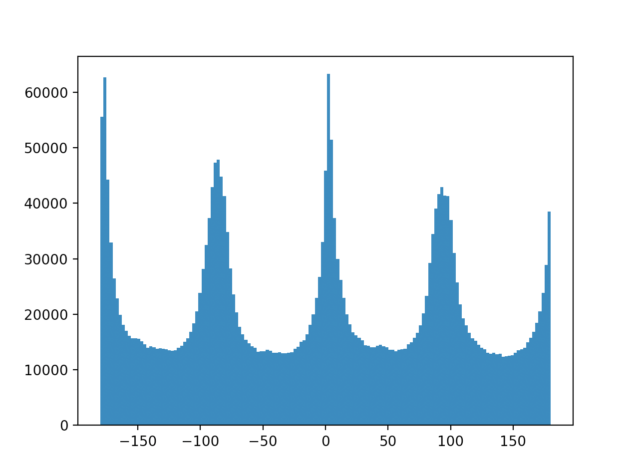
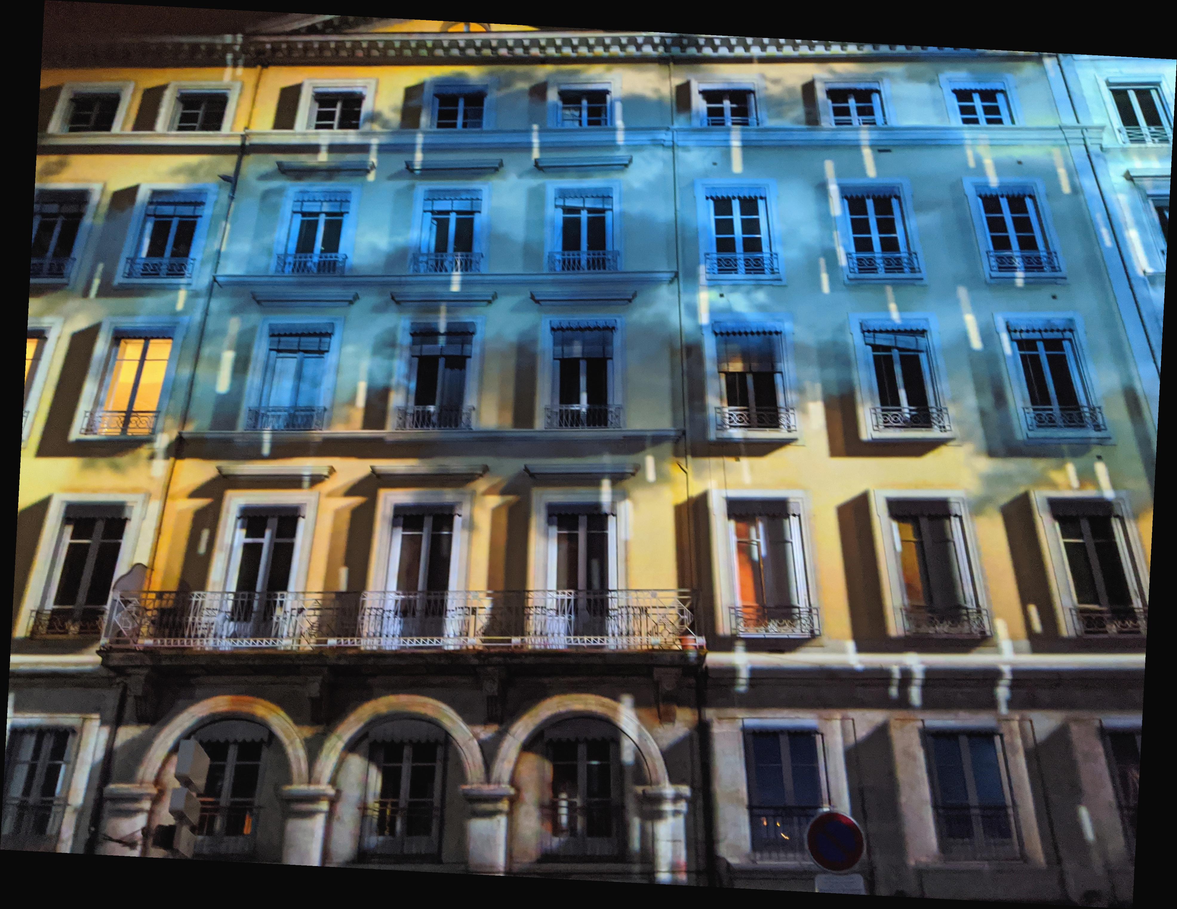
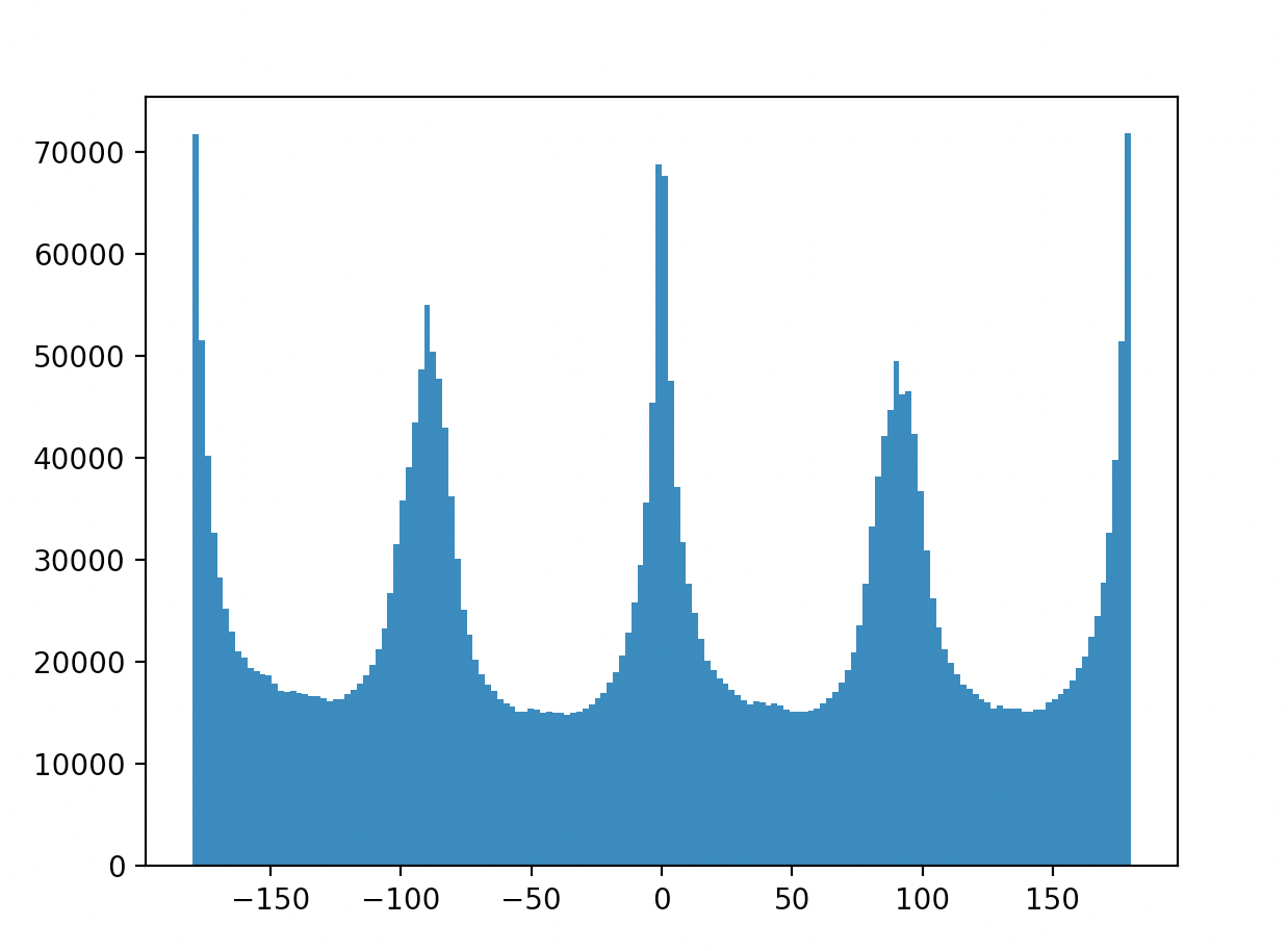
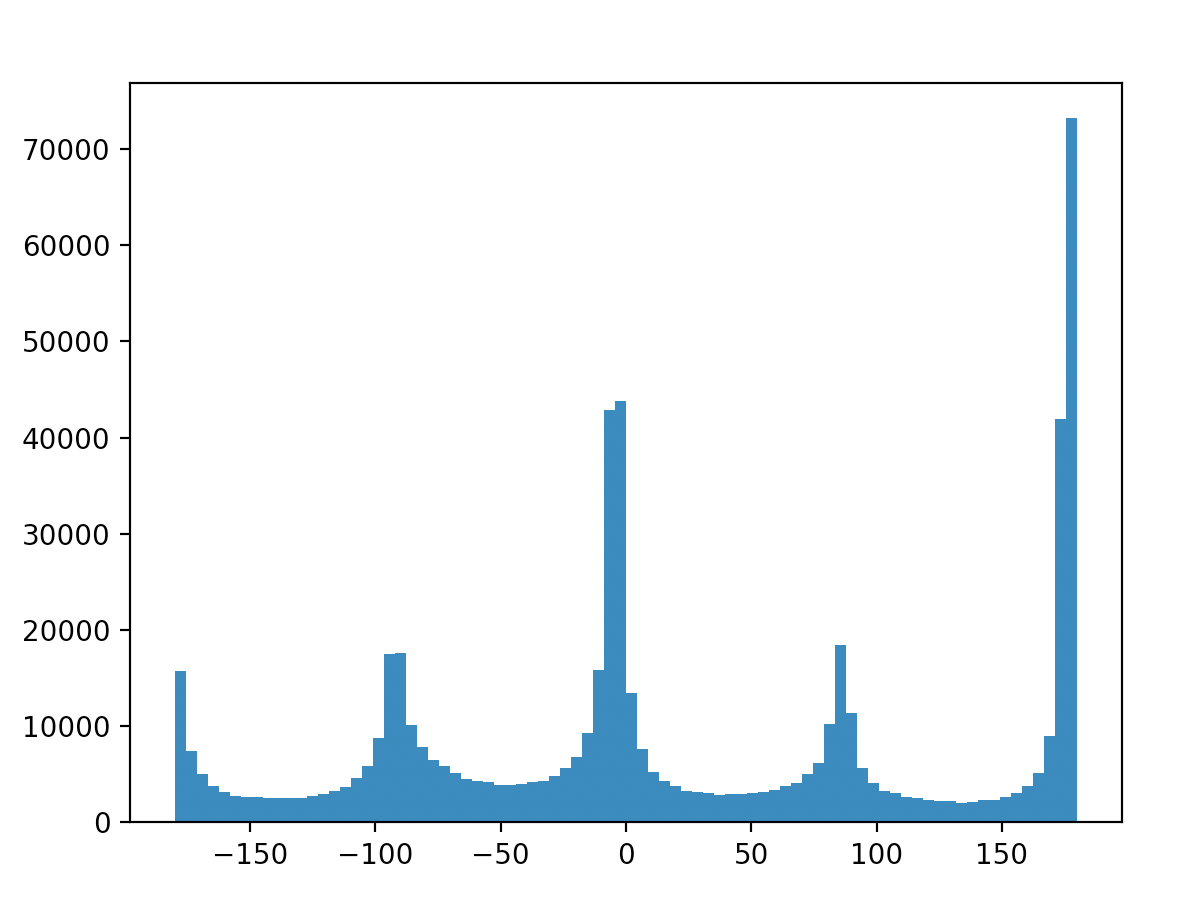
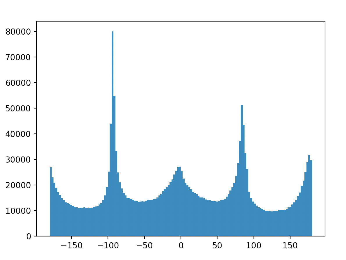
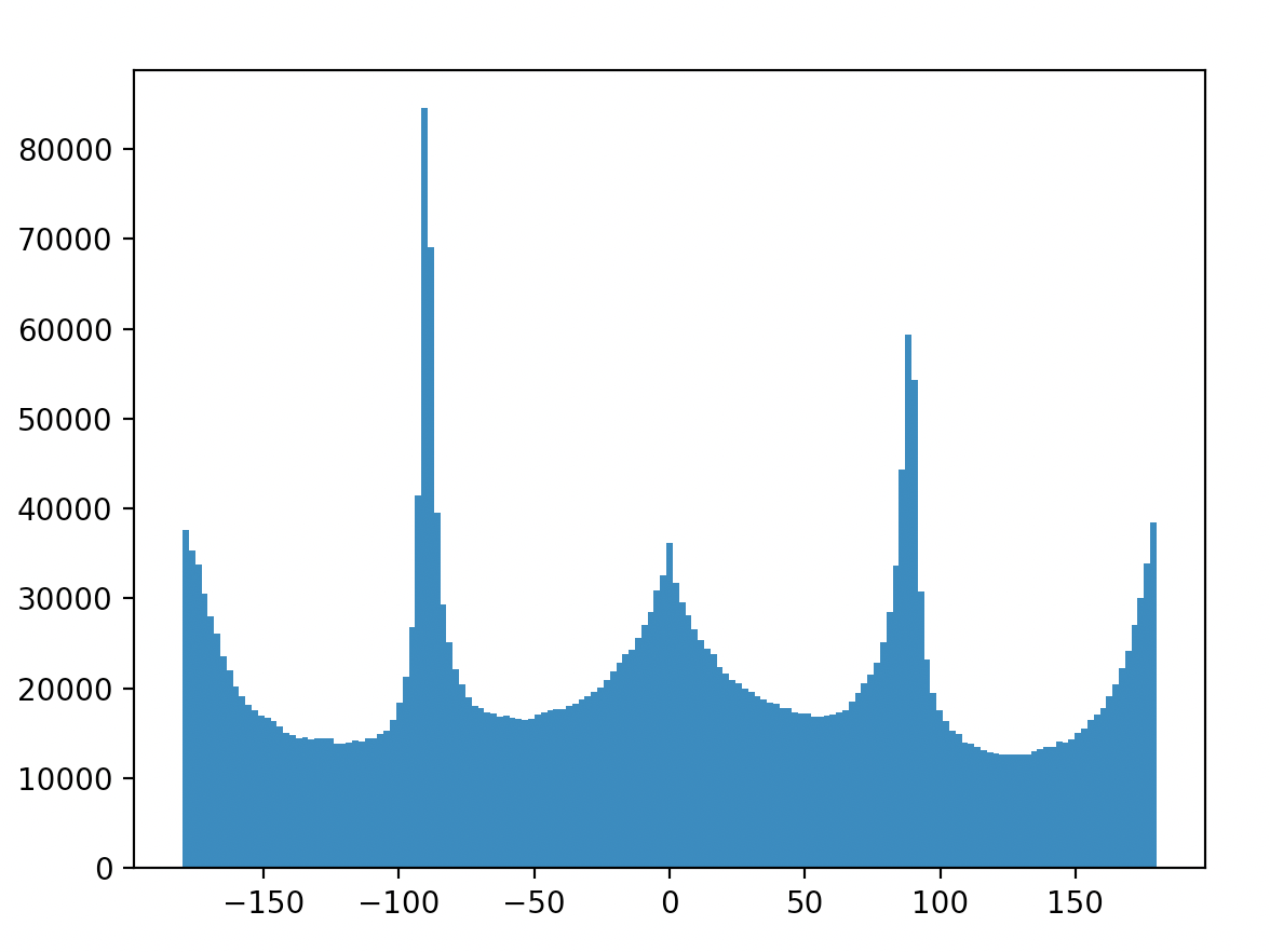
For this part, I took the advice of cropping to the center. This helped dramatically by avoiding accidentally interpreting areas of a rotated image outside of the actual image as horizontal and vertical edges. Below, I've included the original image, the rotated image, and the edge angle histograms for each for the provided facade.jpg and three additional images. For most of these, besides the failure case, you can observe that the straightened images histograms possess higher peaks around vertical and horizontal angles, as intended.
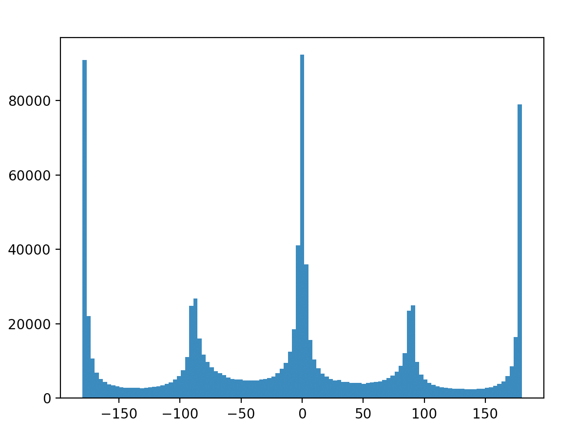
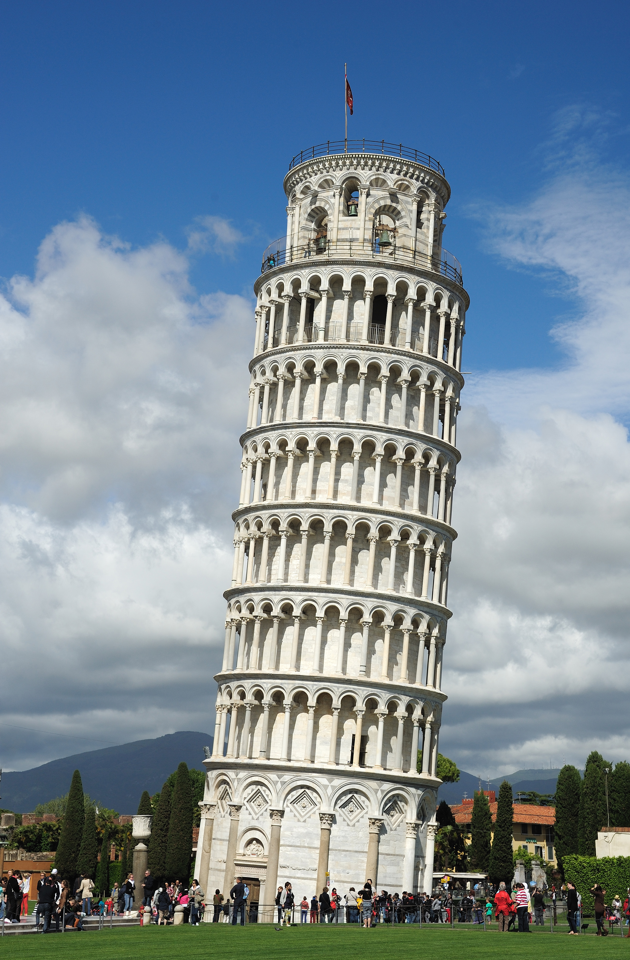
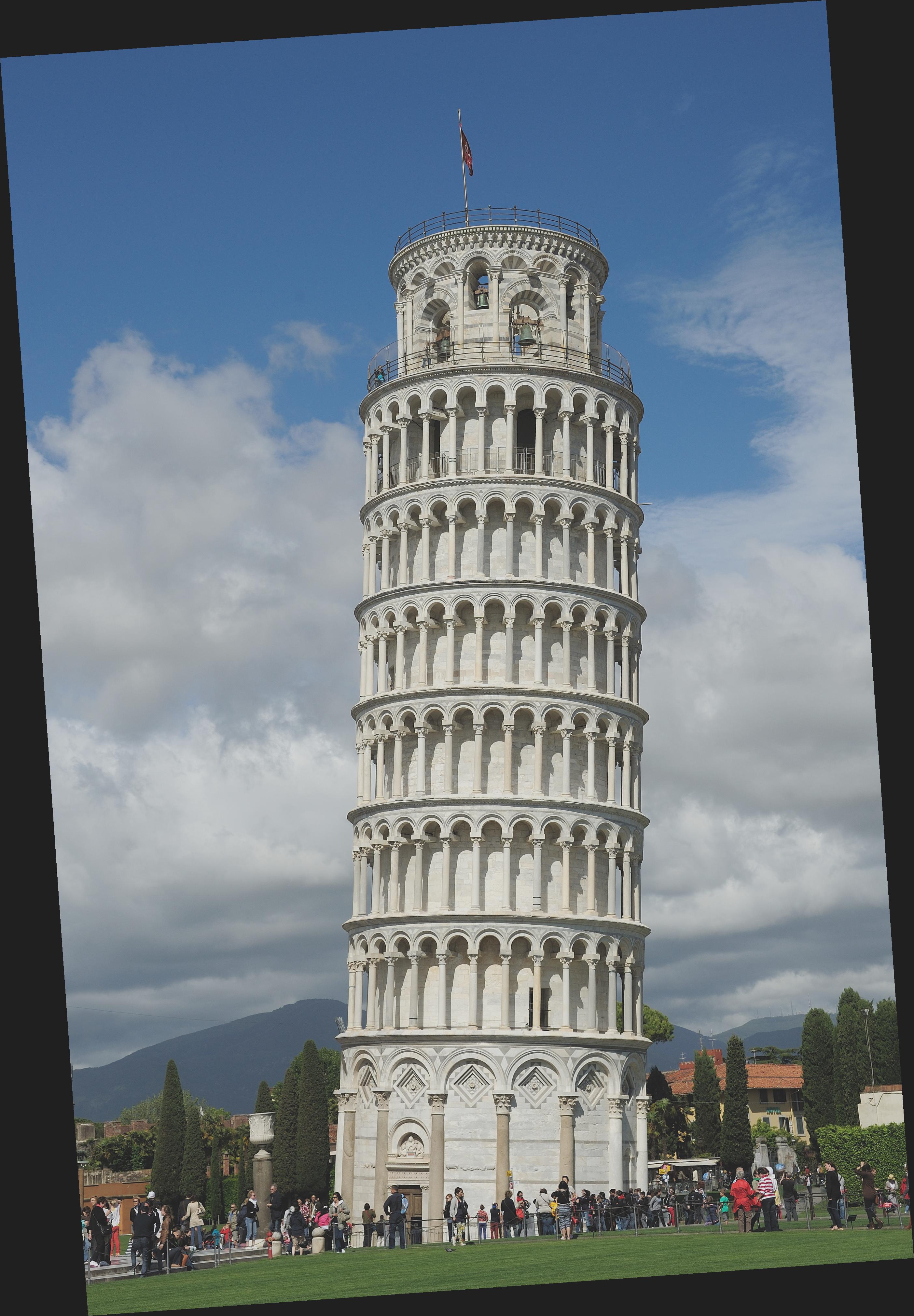
I personally find this one amusing. While yes, technically, the original image of the Leaning Tower of Pisa is straight (because the tower is indeed actually tilted in real life), it was interesting to see that my algorithm could "straighten" it. In this regard, the algorithm for straightening technically succeeded - even though the original image was already "straight" with respect to the ground and horizon.
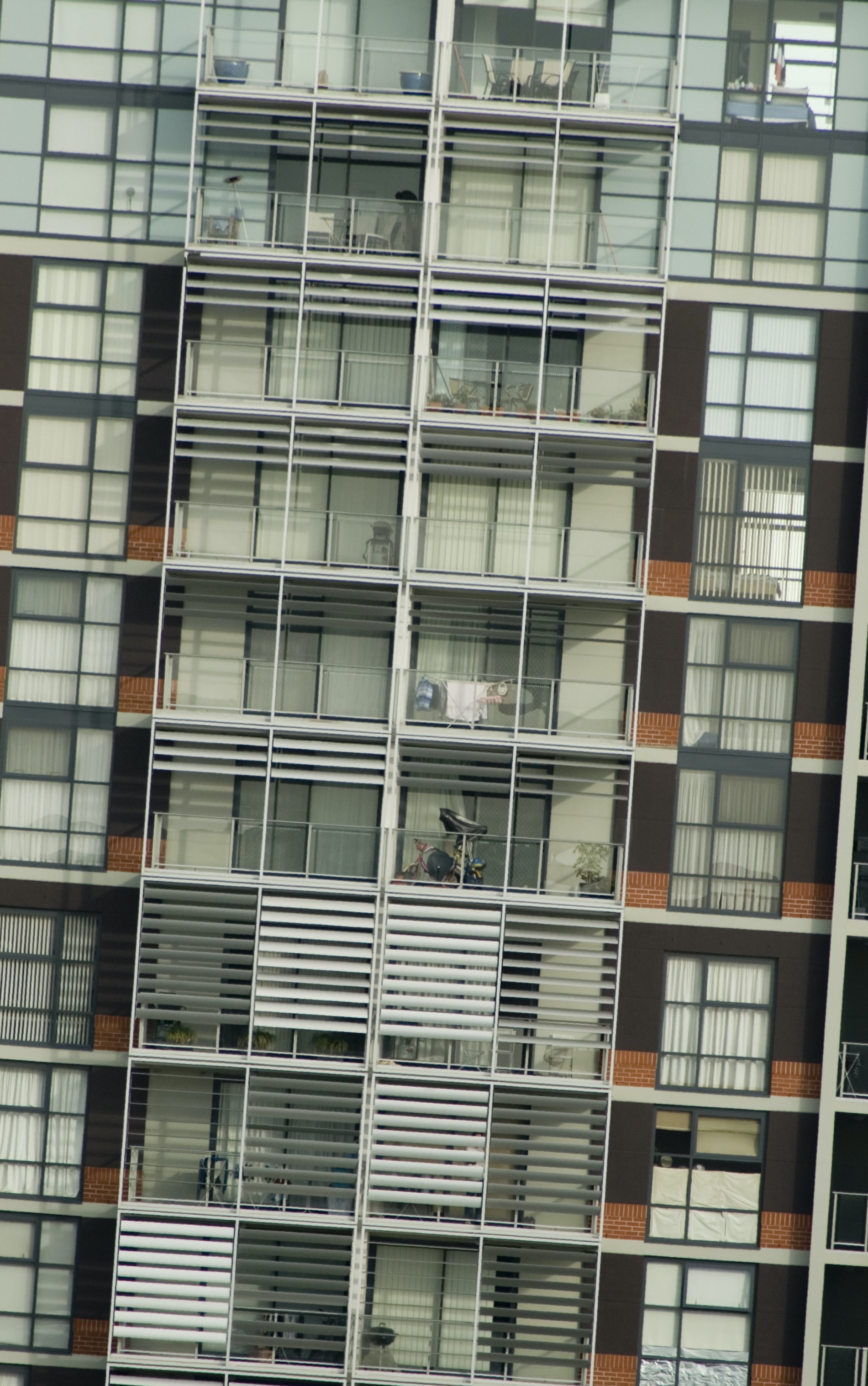
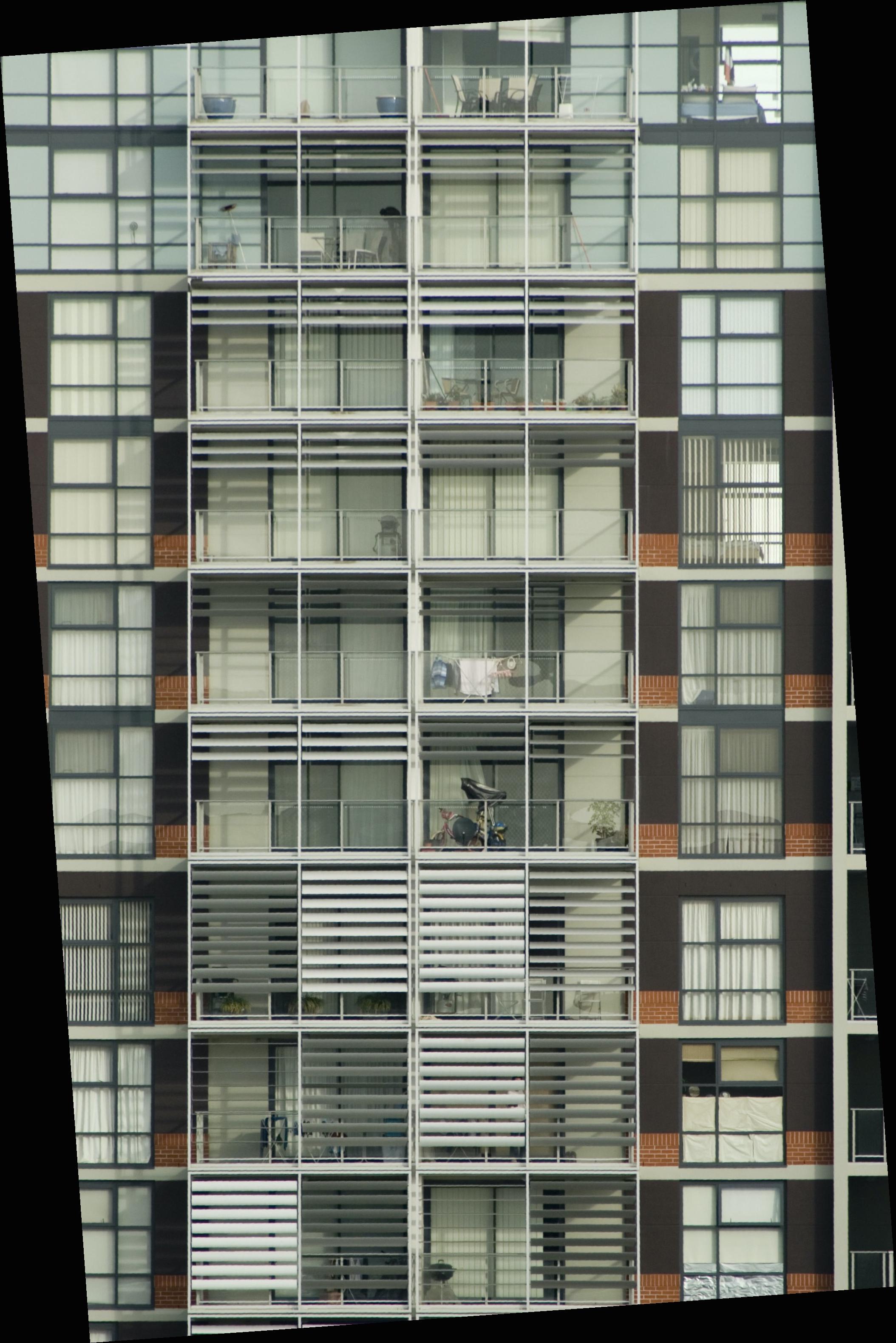
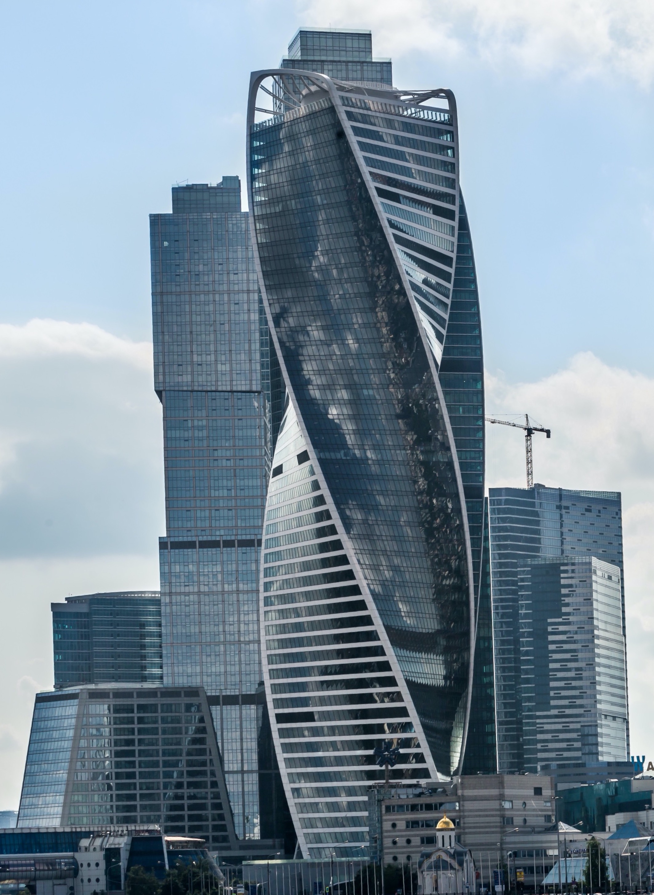
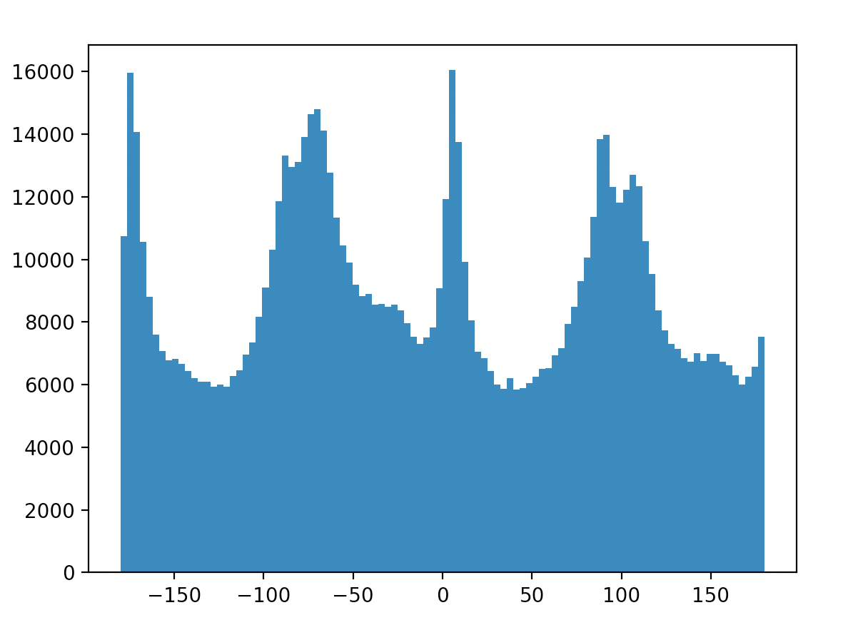
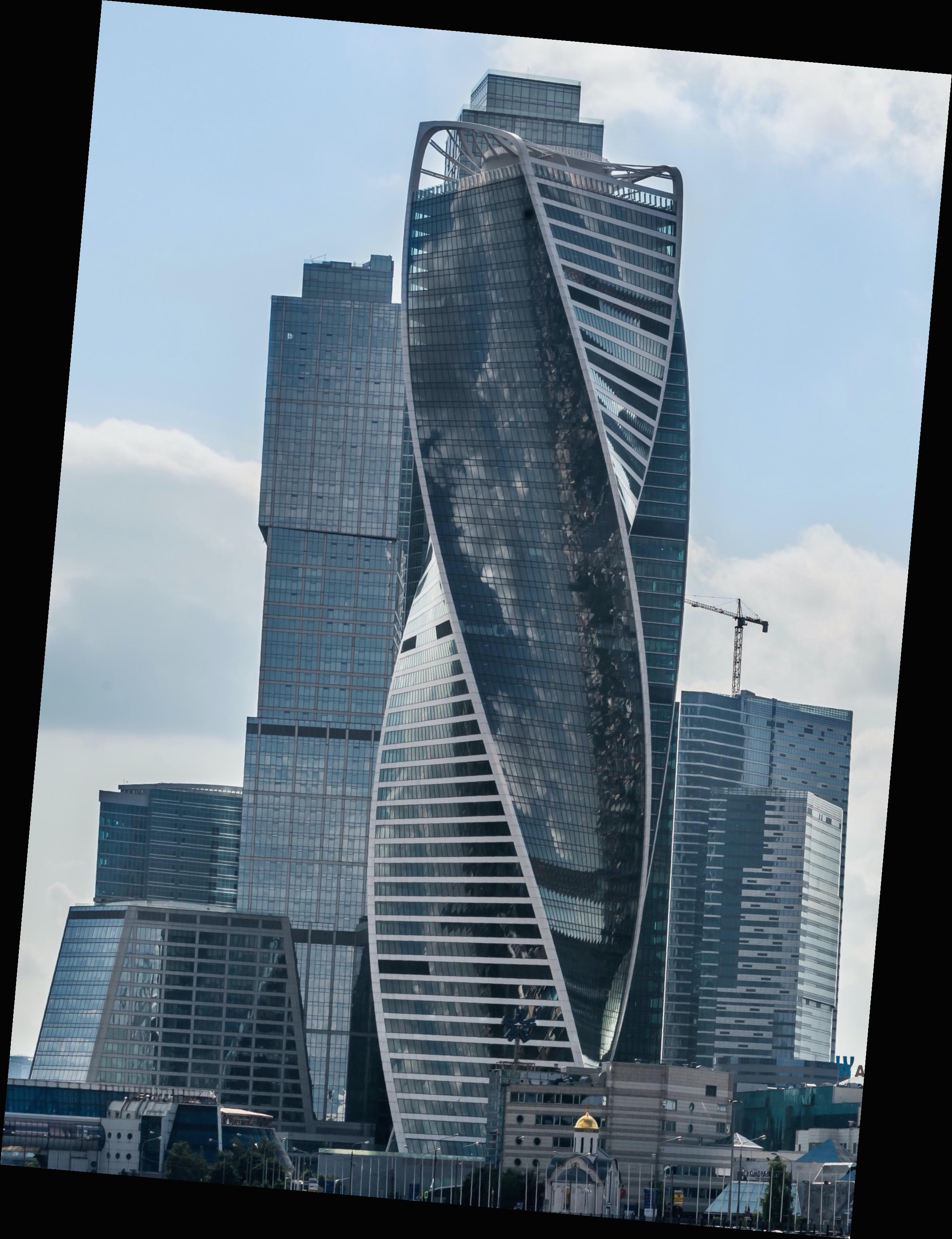
In this image, the algorithm failed. As you can see, the original image is not quite perfectly straight, but it is also not too far off. In the "straightened" image, the central tower is noticably more off-kilter. This is because the building itself contains a lot of geometry that isn't at perpendicular or parallel planes with respect to the ground/horizon. The algorithm fundamentally depends upon that property, and so does a poor job when the property is untrue of the original image.

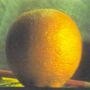
Below are included the originals (left) and the "sharpened" (right) images. As an additional note, when I evaluating the "sharpening" by taking a sharp image, blurring it, and "sharpening" it, the resulting image is not as sharp as the original. Moreover, the resulting image contains artifacts and some blurred areas that are clearly "lossy" in the sense that the blurring process eliminated data from the original that simply could not be reconstructed with the "sharpening" technique, as it is only re-using information present in the blurred image.
The effects of "sharpening" are subtle at best. I can tell that there is some level of difference between the original and the new image, but it is relatively minimal. It was extremely difficult to achieve a higher level of sharpening without also darkening the image. This made sense to me because adding part of the image back to itself in greater and greater quantities should naturally just increase the magnitude of parts of the image, to the point that it appears simply darkened.

It is even more difficult to see the sharpening on this image (it is there if you look closely enough). Otherwise, the observations made about taj.jpg hold true in this scenario as well.
Hybrid images are created by combining the high frequency portions of one image with the low frequency portions of another. With some alignment, this can create the visual illusion of seeing one image up close, and another entirely from a distance. The high frequency portions are most easily seen up close where the eye can detect in "high resolution", and the low frequency portions are better and more easily perceived from afar.
As you can see, Nutmeg appears up close and Derek reappears from afar. Here, I decided to use color instead of just grayscale, and it certainly adds to the effect. The alignment process leaves the image tilted, but that is not particularly problematic.
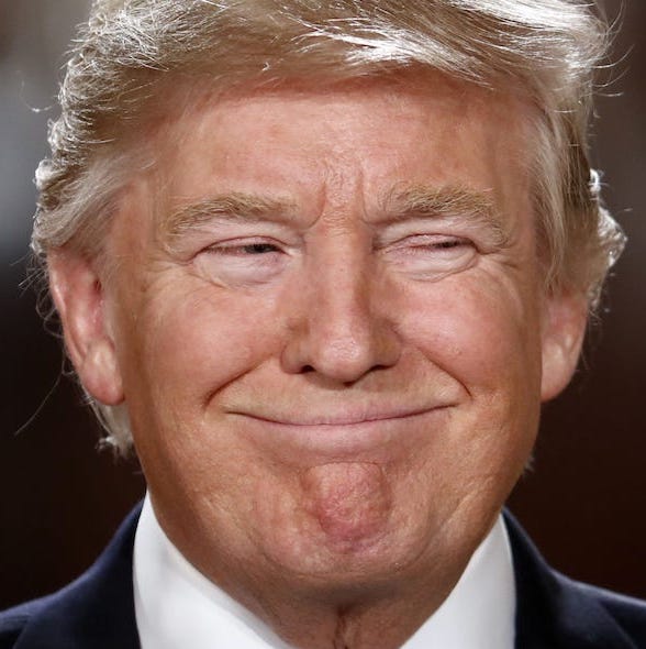
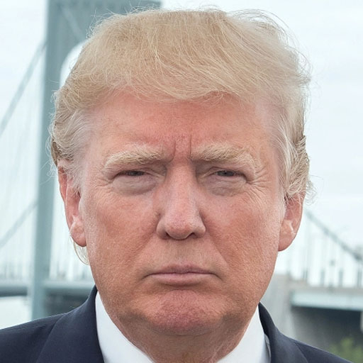
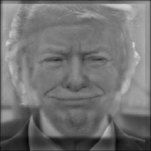
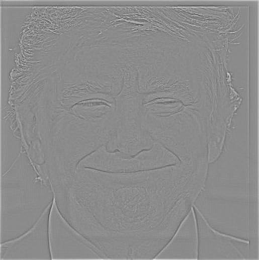
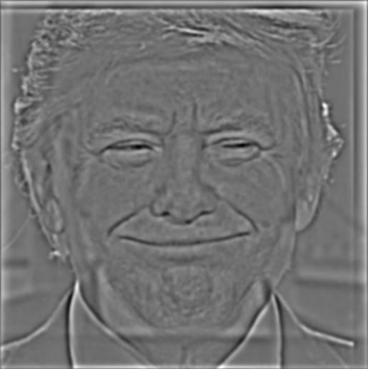
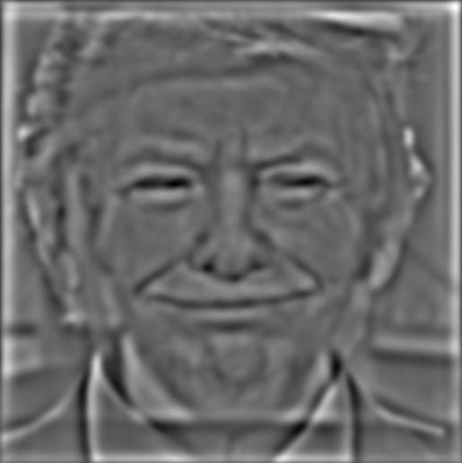
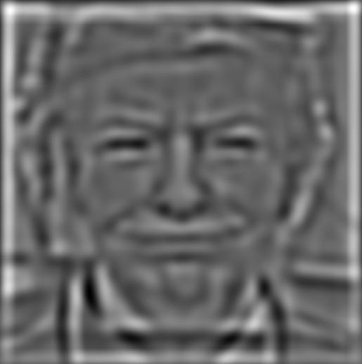
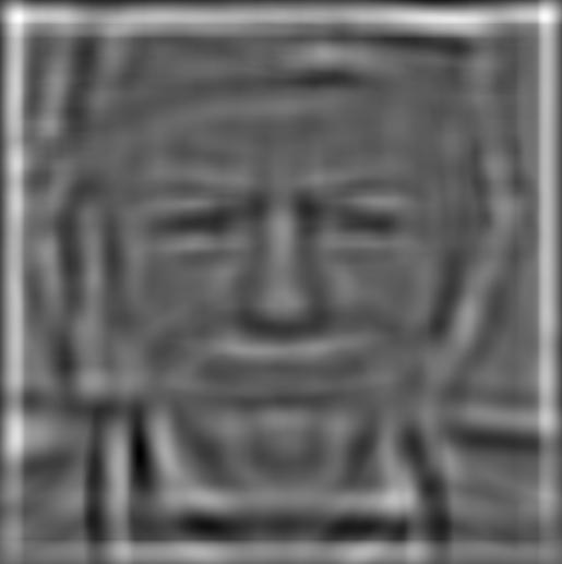
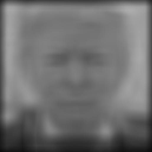
This combines an image of President Trump smiling with an image of President Trump with an upset expression. The effect is noticable: you can clearly see the smile at some distances and not so well at others. This was definitely my favorite (and so I will also include an analysis of the Fourier domain for these images).
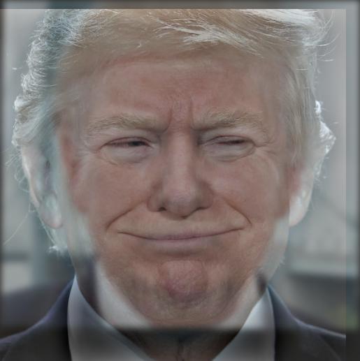
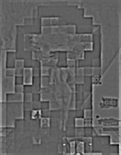
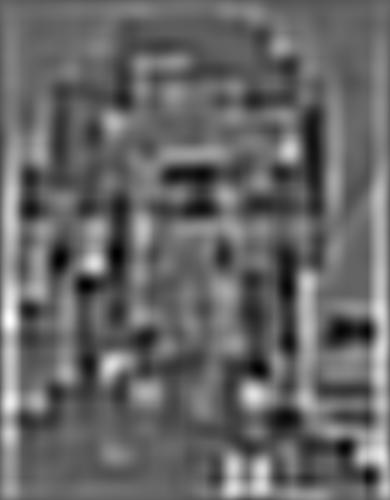
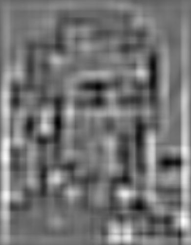
Below, the following images in order: FFT of President Trump happy, FFT of President Trump upset, FFT of high-pass on President Trump happy, FFT of low-pass on President Trump upset, and FFT of the final result.
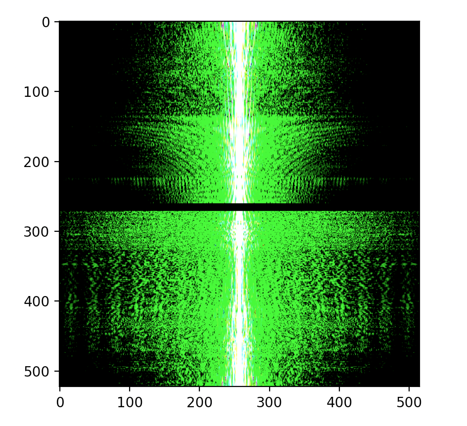
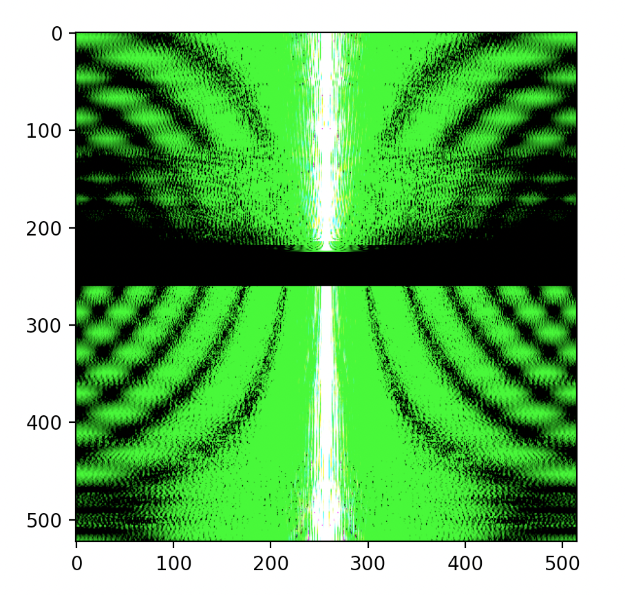
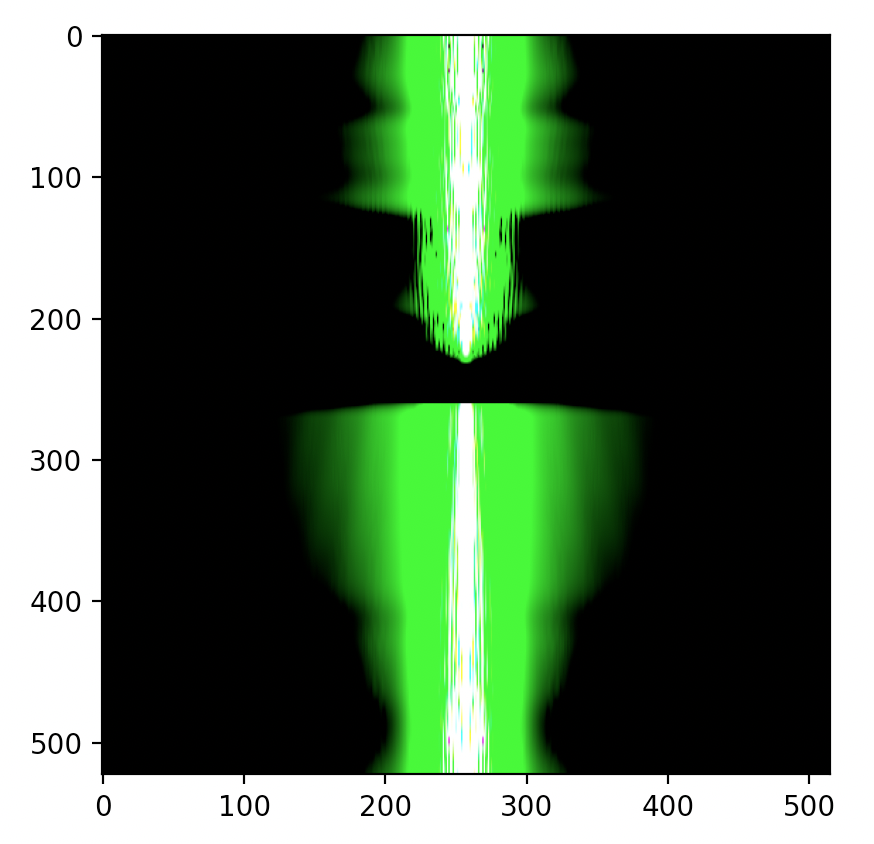

Between President Trump happy and the high-pass filtered version, you can see, especially near the center and along the vertical center line, there are small differences. However, the differences are not very apparent. Between President Trump upset and the low-pass filtered version, the change is dramatic: tons and tons of the flared-out regions in the original FFT are gone, leaving us with a distinct, very solid vertical section. The final combination image is approximately a combination of the two, but due to some averaging, it loses some of the high frequency information. I'm not entirely sure why the FFT's all came out looking very flared.
This is a failure case. The dog image, no matter the parameters I chose, remained too "strongly" in the final photo. It became too difficult to see the pufferfish. I believe this is due to a number of reasons including the fact that both the dog and the pufferfish are approximately the same color, they occupy the same spatial area, and it is possible the pufferfish image has lots of high frequency parts that don't show up through a low-pass filter.
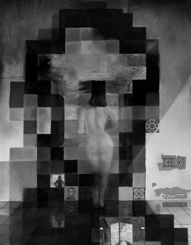
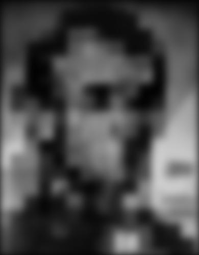
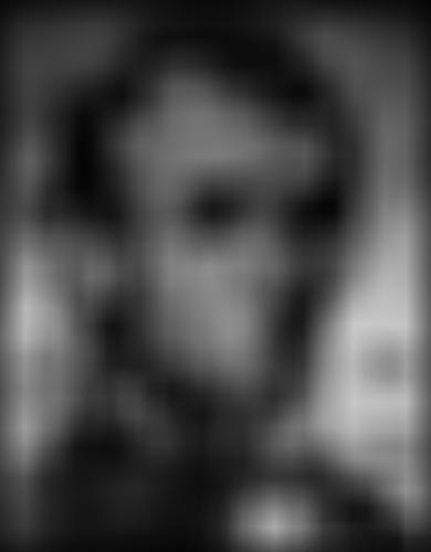
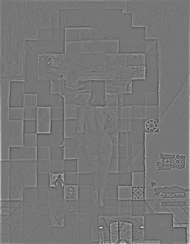
I've included the Gaussian and Laplacian stacks below for two images, the Lincoln image (Dali) and the President Trump Hybrid image from earlier. The methodology I used was to use a Gaussian with a fixed aperture size, and then increase the sigma of the Gaussian as we traverse the stack. The sigma increases by a power of 2 each time, for greater blurring. The Laplacian is computed through the addition of one Gaussian and the subtraction of the next. As such, the Laplacian stack "ends" one before the Gaussian stack does, but I've included the last Gaussian as the last "Laplacian" for practical reasons (and for Part 2.4).
As you can see, the Gaussian stack increases in blurriness (as intended) and quickly Lincoln is the only part of the image seen. The Laplacian stack begins with a relatively clear image of the woman, but over time both Lincoln and the woman become difficult to see. This aligns with what we know about the image: Lincoln is the low frequency portion, and the woman is part of the high frequency portion.


Again, we notice a similar effect as with the Lincoln image. In the Gaussian stack, only the image of upset President Trump remains. This makes sense: upset President Trump is encoded into this image with the low frequencies, which remain through Gaussian filters (low-pass filters). In the beginning of the Laplacian stack, we see, very clearly, happy President Trump. Toward the end, everything becomes more vague, but happy President Trump remains. This aligns with what I know about how this image was created: happy President Trump is the high frequency part and upset President Trump is the low frequency part.


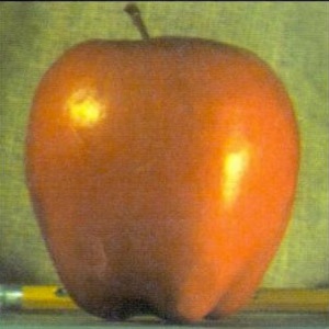
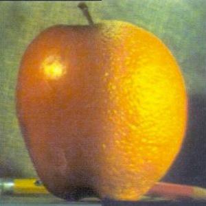
Here, I used the Gaussian and Laplacian stacks from the above part. Additionally, I followed the recommendation in the spec and implemented the algorithm specified on page 230, which accomodates for the fact that the stack does not help blur the seam as well as the pyramid. For each image, I include, in the following order: original image 1, combined image, original image 2, mask used. Moreover, I chose to do this portion of the project in color, which has lead to some spectacular results.
The original. I was unable to get the seam quite as smoothly as the paper did, but I got it close enough to the point that I am satisfied with the result.

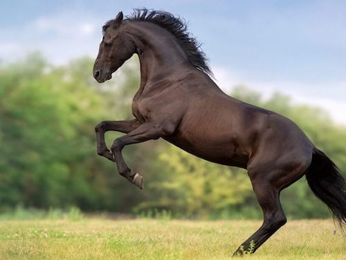
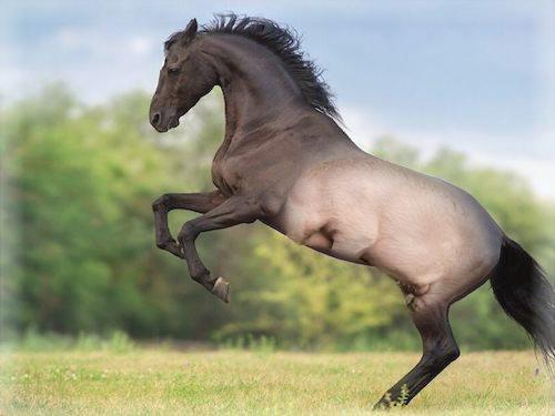
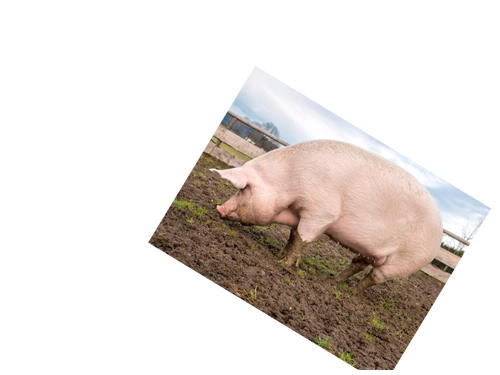
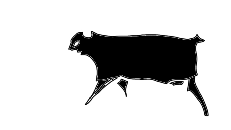
I had the odd idea of giving the hind regions of a horse the same appearance as the hind regions of a pig. Don't ask. The result is an oddly colored horse, which at first glance, doesn't appear to have anything wrong with it beyond the "discoloration". A closer look reveals the truth.
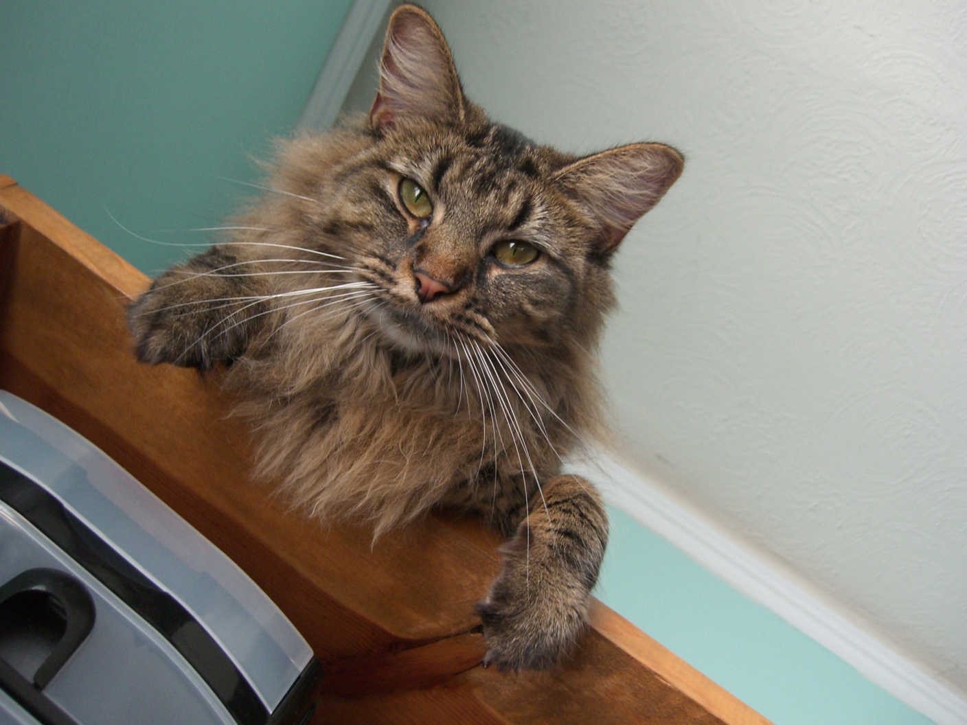
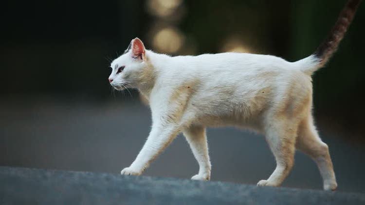
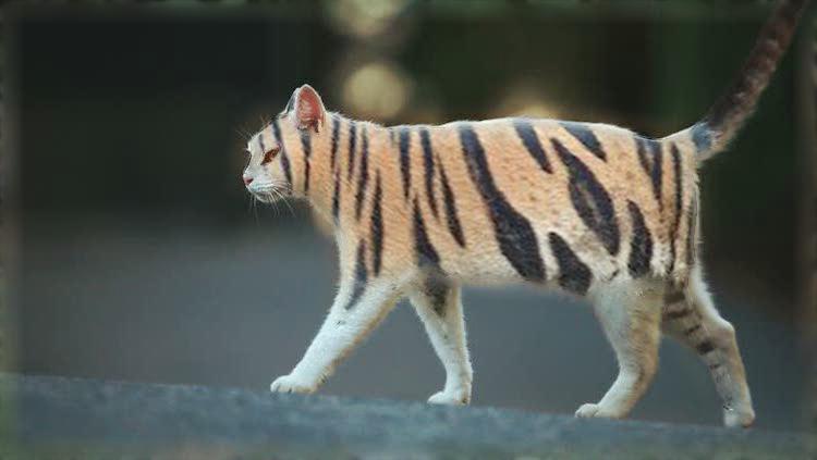
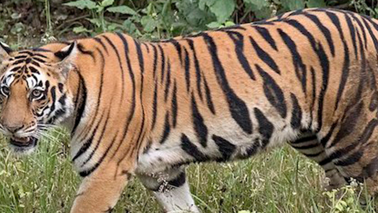
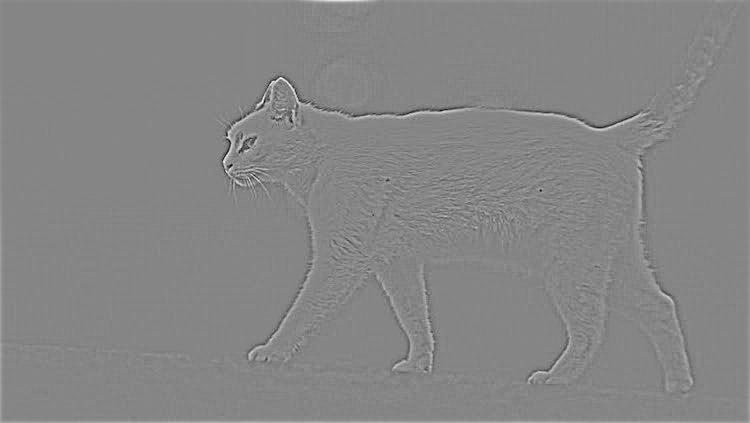
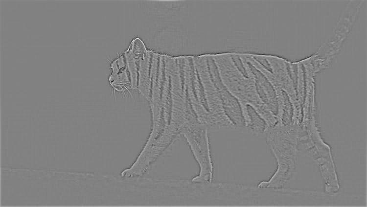
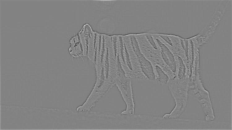
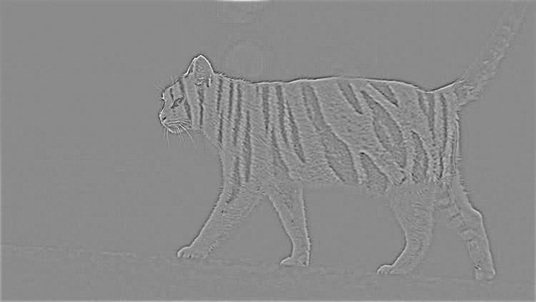
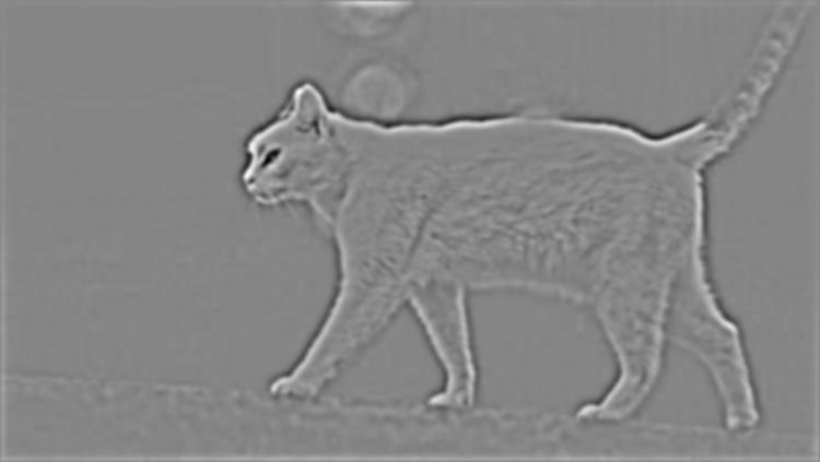
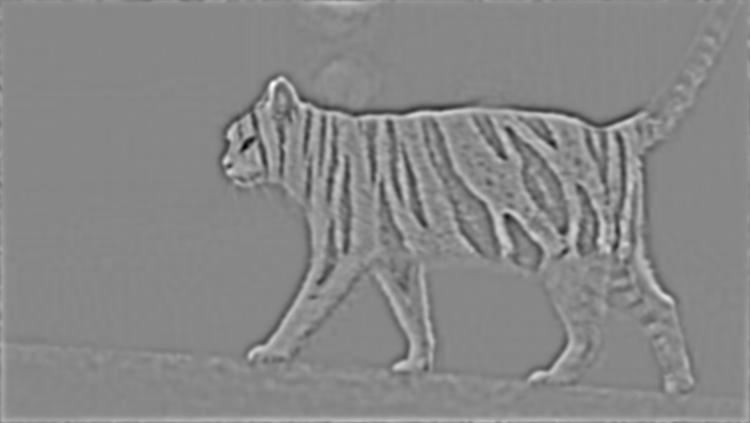
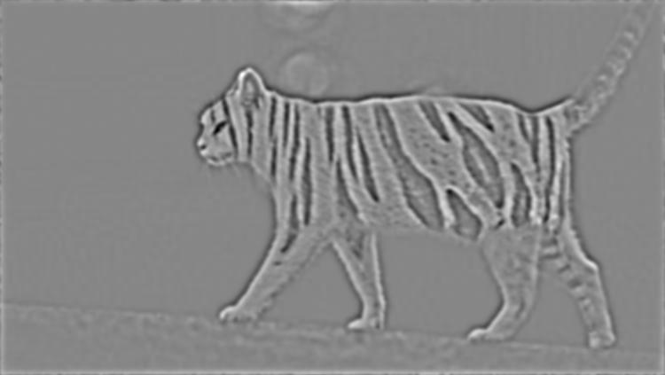
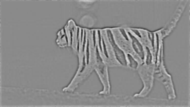
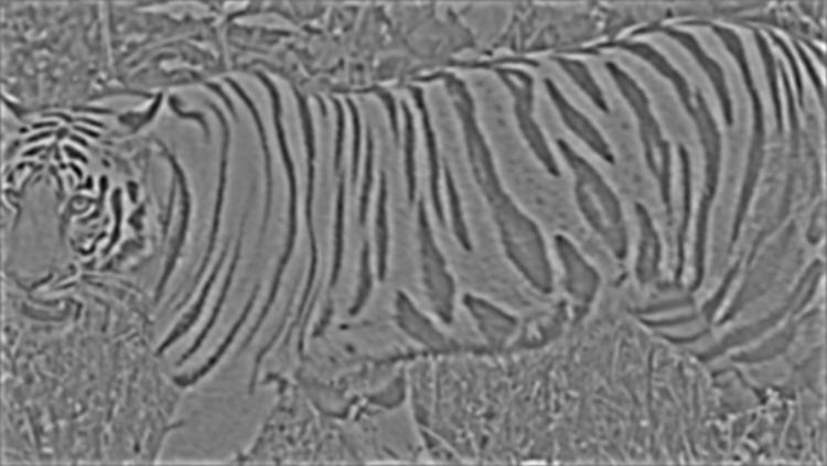
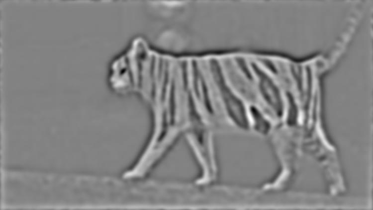
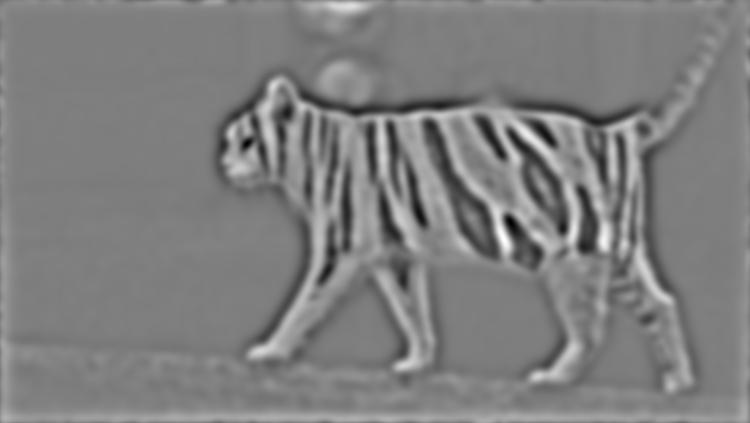
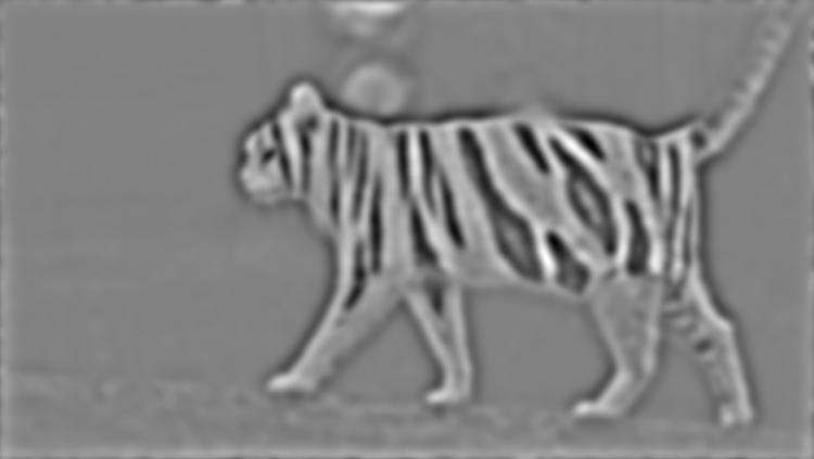
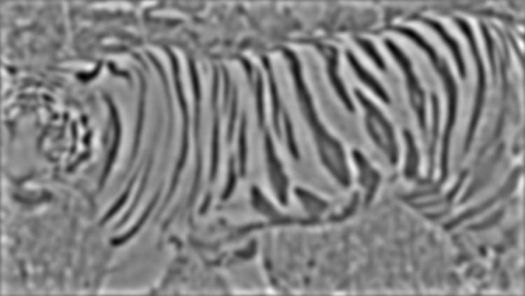
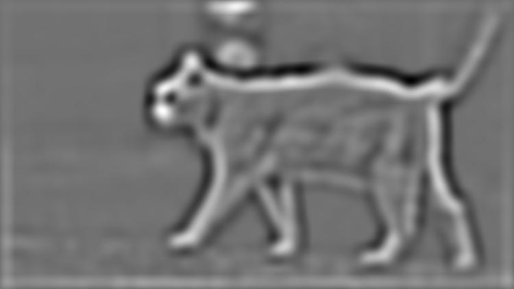
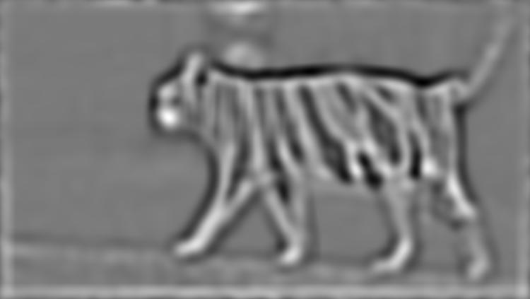
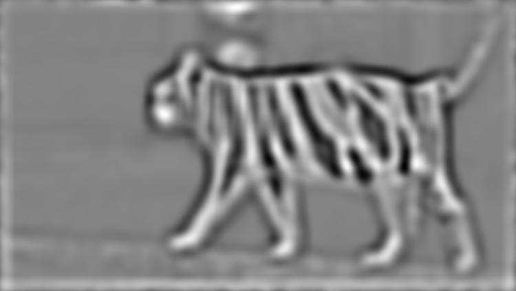
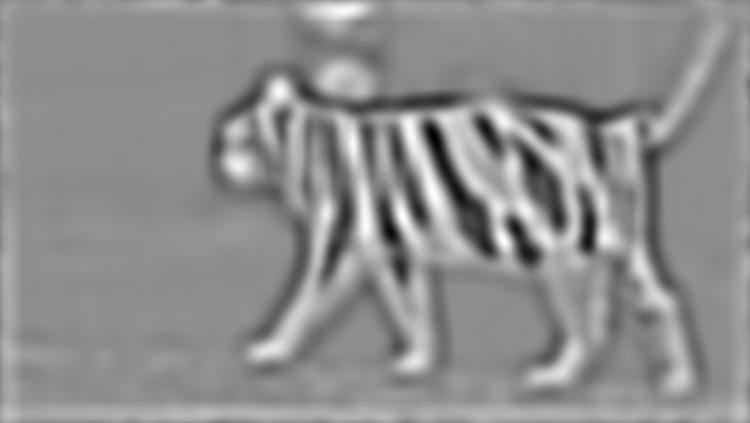
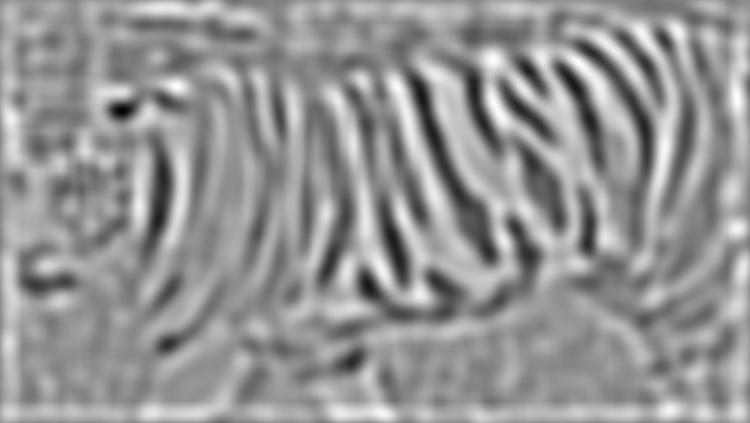
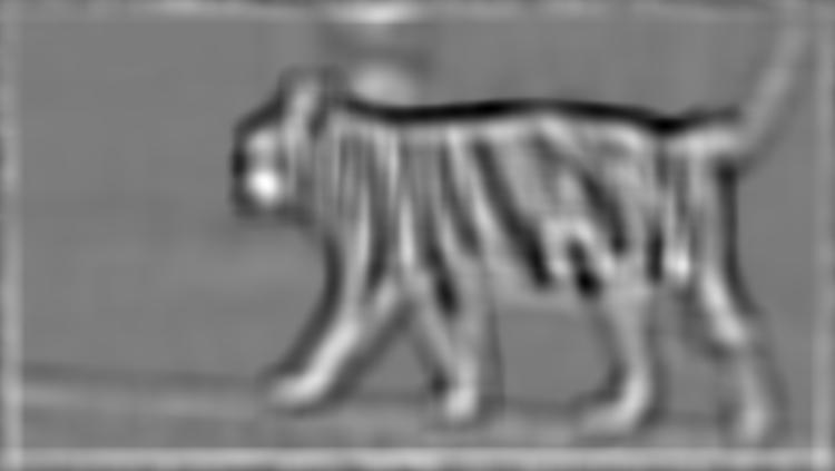
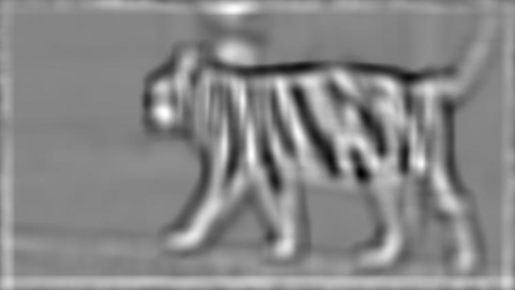
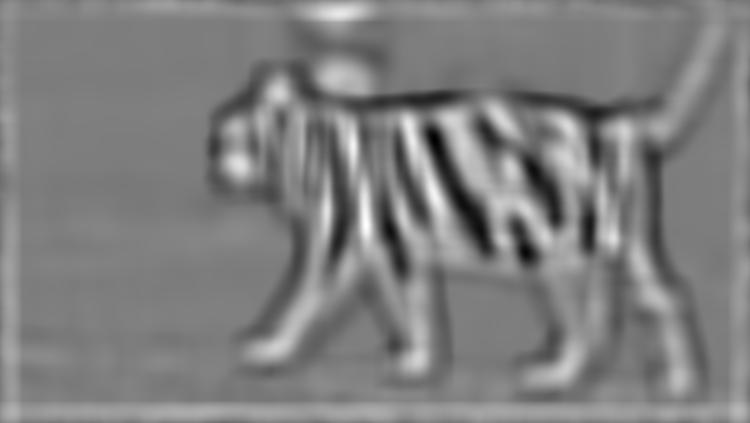
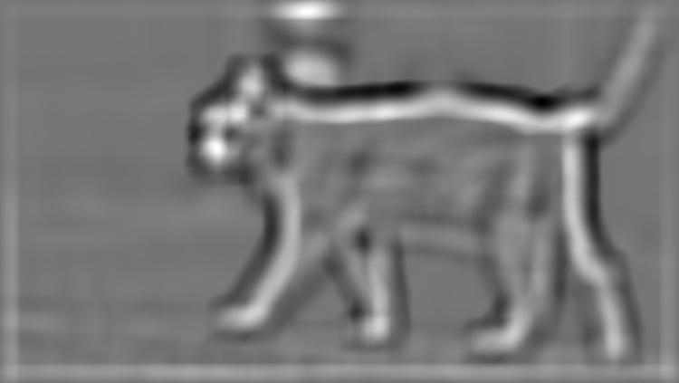
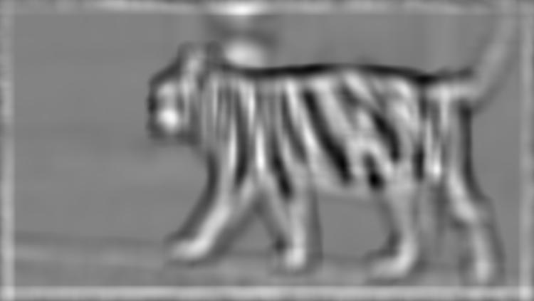
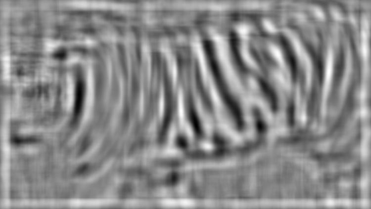
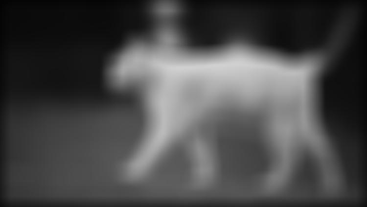
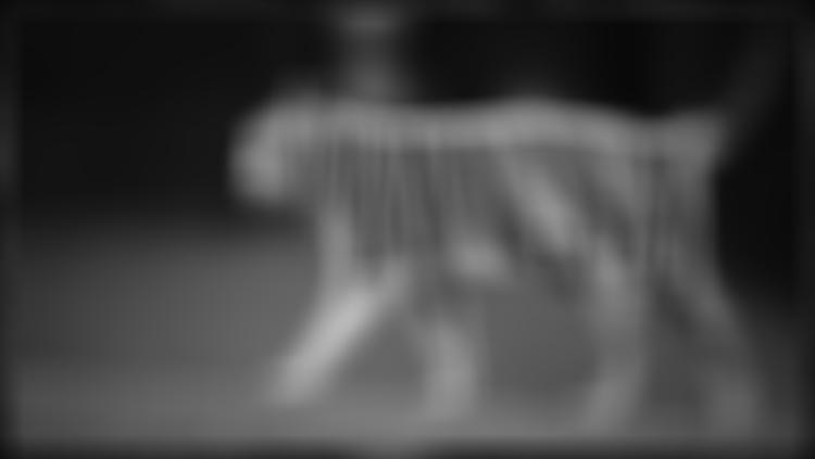
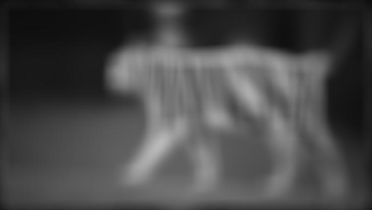
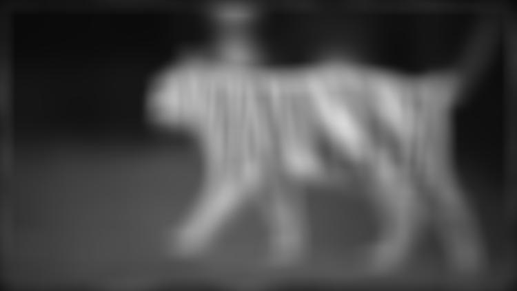
BY FAR my favorite. I am a huge fan of cats of a specific type known as Bengal cats. These are very very expensive cats to own, but they are absolutely gorgeous. While I cannot remotely afford to own one, I have decided to create a bootleg version of a Bengal cat through the combination of a standard, white cat and the fur coat of a tiger (yes, I am aware Bengals are typically leopard-spotted). I chose the mask in such a way to mimic the natural shape and coloration of the white cat, and left key features like the eyes, mouth, nose, ears, paws, and tail untouched (because melding those areas would reduce the fidelity of features we pay attention to, while adjusting the coat texture does not immediately strike us as odd).
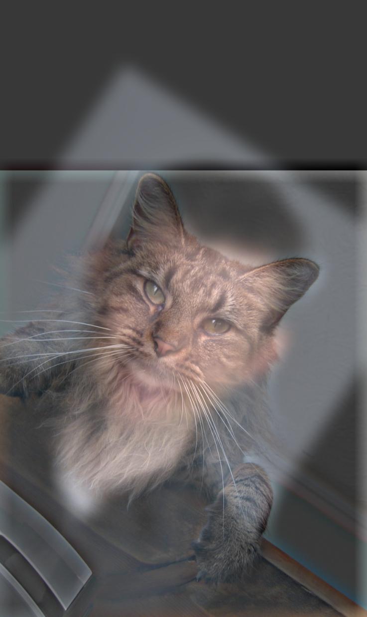
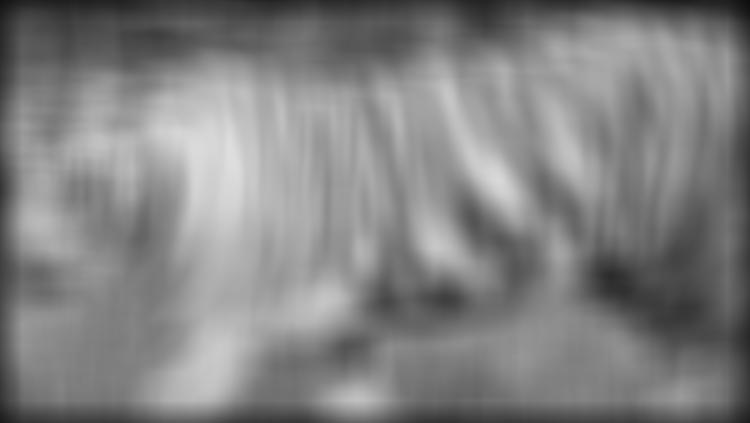
I have included below the process of applying my Laplacian stacks and the masked input images.
To interpret: the leftmost image is the cat, the rightmost image is the tiger, and the middle images are the R, G, and B color channels blended at that layer.


Definitely, at the end of the day, the most important thing I learned about this project was actually not directly related to the content of the programming. Instead, I learned that to get images to look the way I want (or more accurately, to get my algorithms to work the way I want), I needed to really try tons of different ideas and test out lots of parameters. Visualizing my work along the way was incredibly useful.