Overview
In this project, I created a warp function that can be used to rectify images and create mosaics using a homography.
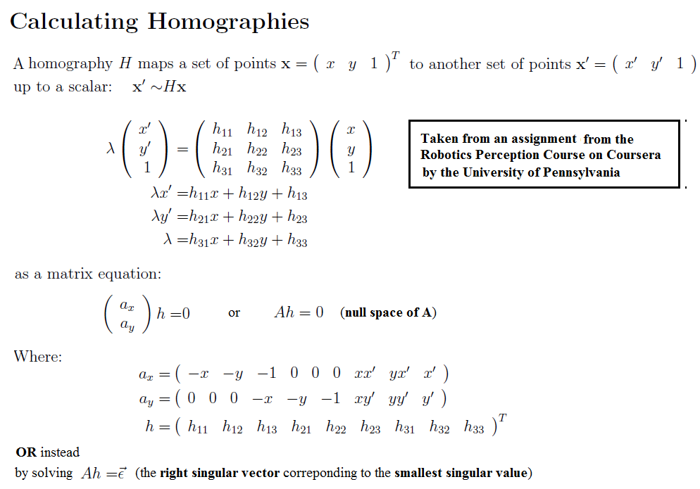
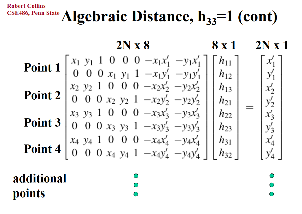
Part A1: Recover Homographies
In order to calculate a proper homography for aligning two images using the formula p' = Hp, I used these two guides I found on Google images for proper construction of a homography using A * H = b. I used the A matrix formula from the first guide and modified (negated) the b vector formula from the second image. Then, I could find the 8 points needed for H.
|
|
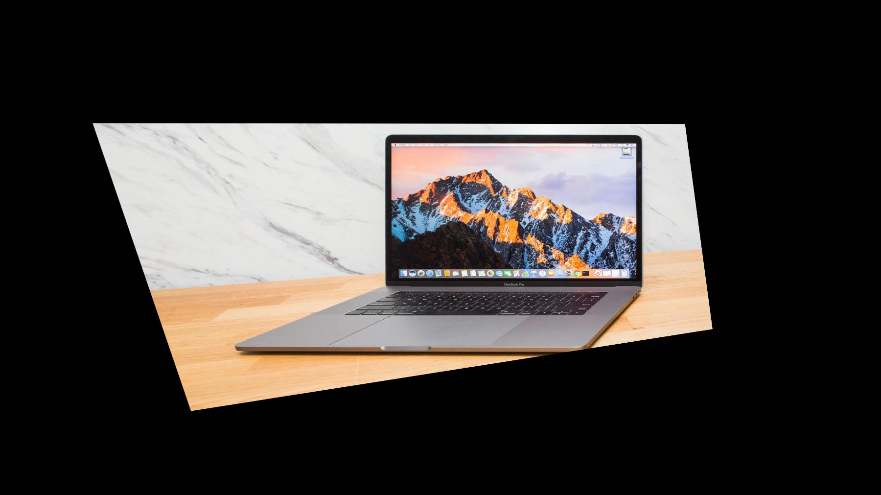
Part A2: Warping Images
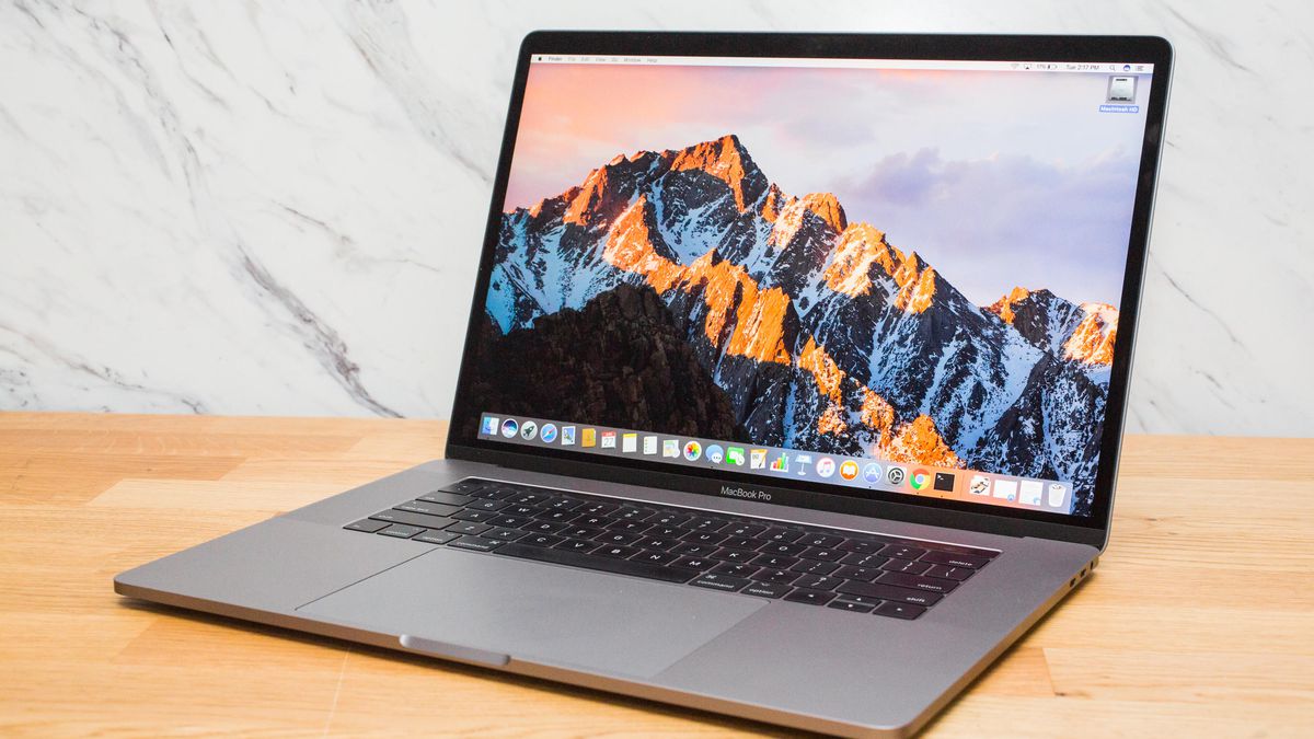
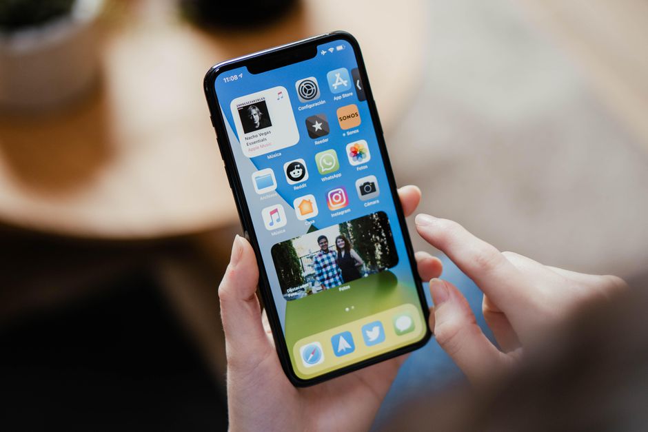
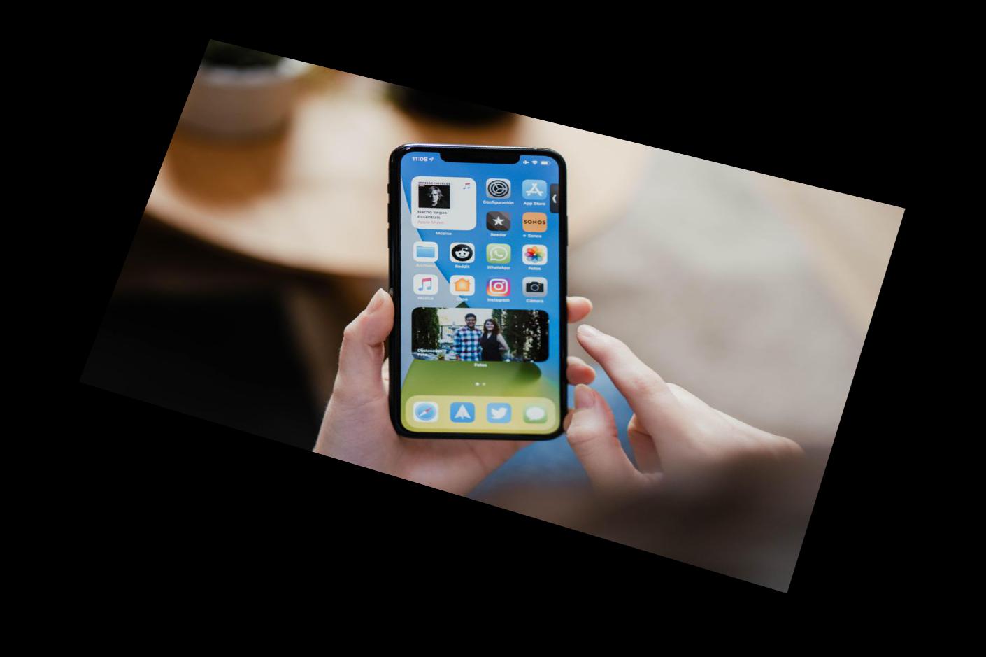
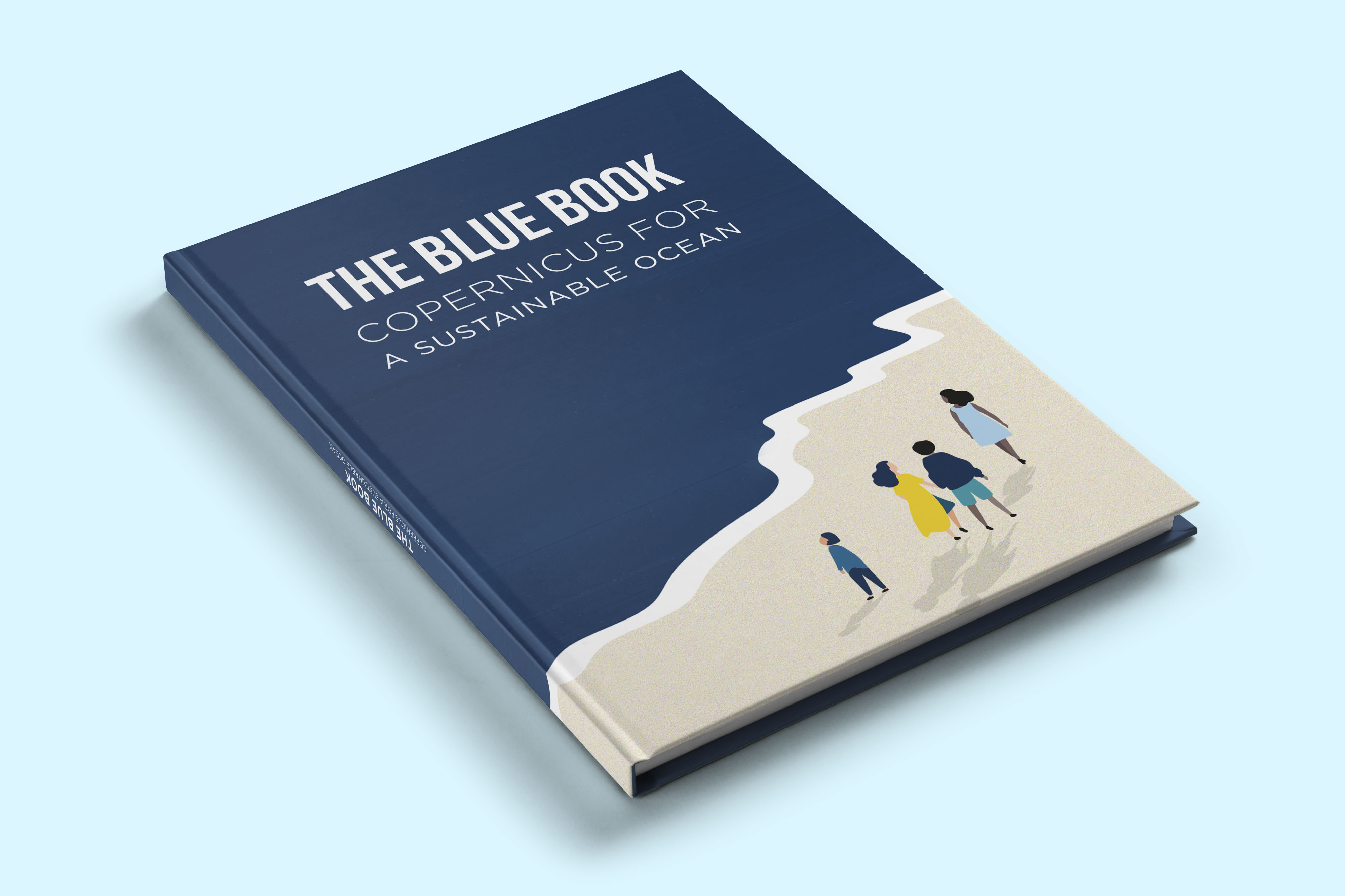
In this section, I built a similar warp function to the one we used in Project 3. First, I created two functions to retrieve corresponding points from images. The first function retrieved pre-selected points that I found using Photoshop. The second function, which I took from my own Project 3, allowed me to hand-select the points I wanted to use. After selecting corresponding points, I apply H to the corners of my image to find the shape of the rectified image. Then, I apply inverse of H to my original image to map the image to this new shape. Here are a few rectified image examples. I straightened out the screen of a laptop (although I left the keyboard unstraightened), an iPhone, and a book.
|
|
|
|
|

|
Part A3: Mosaic
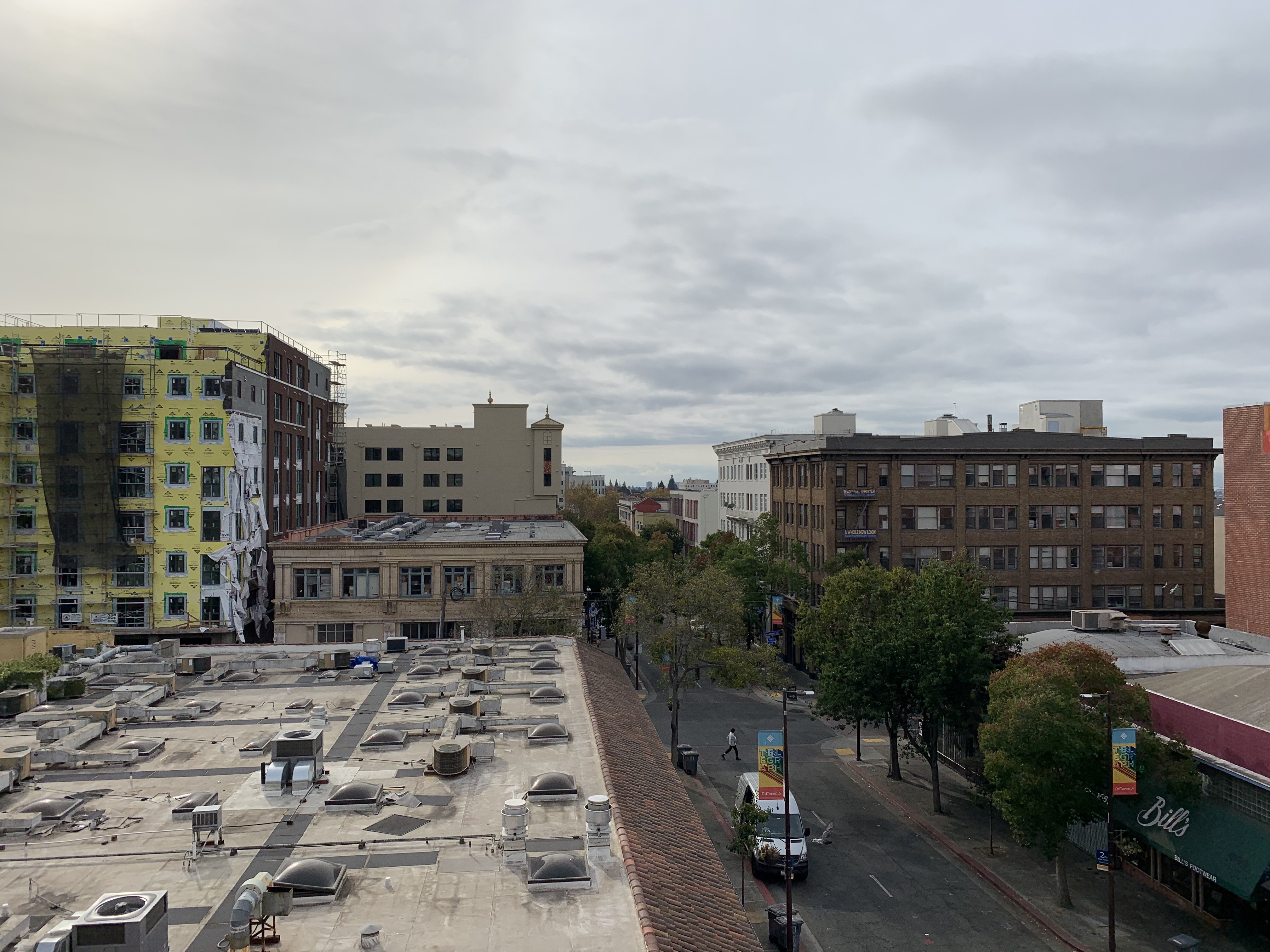
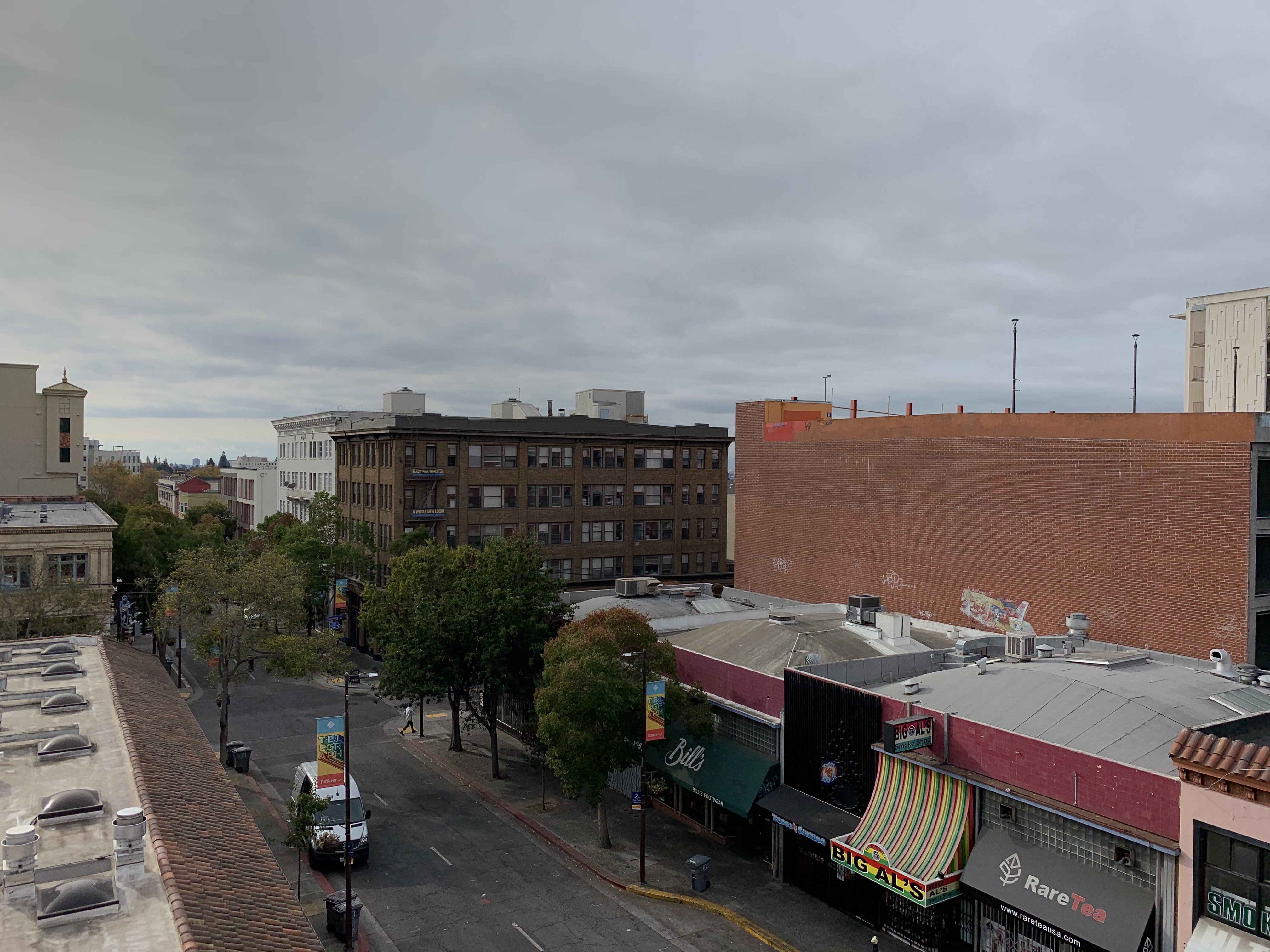
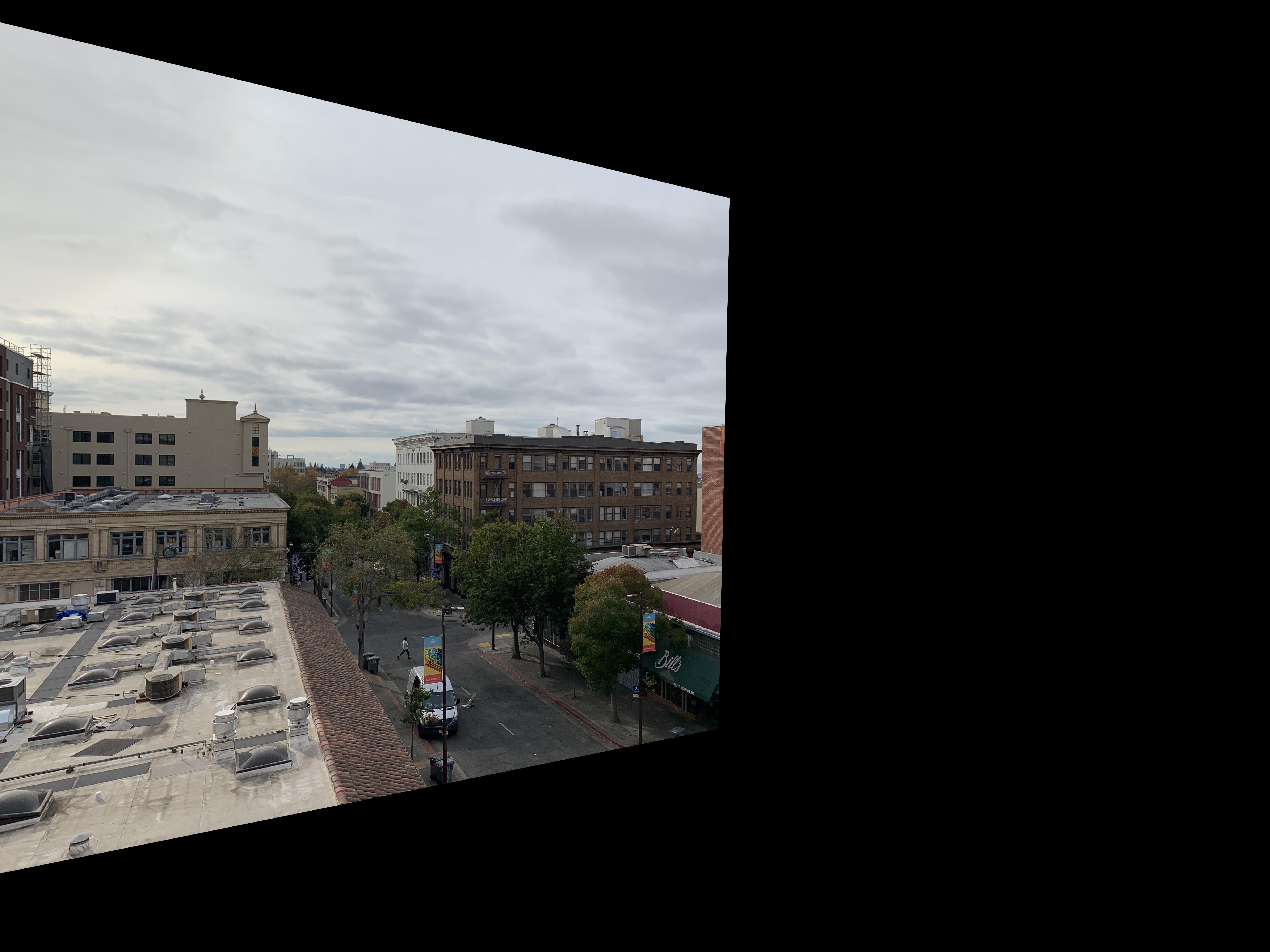
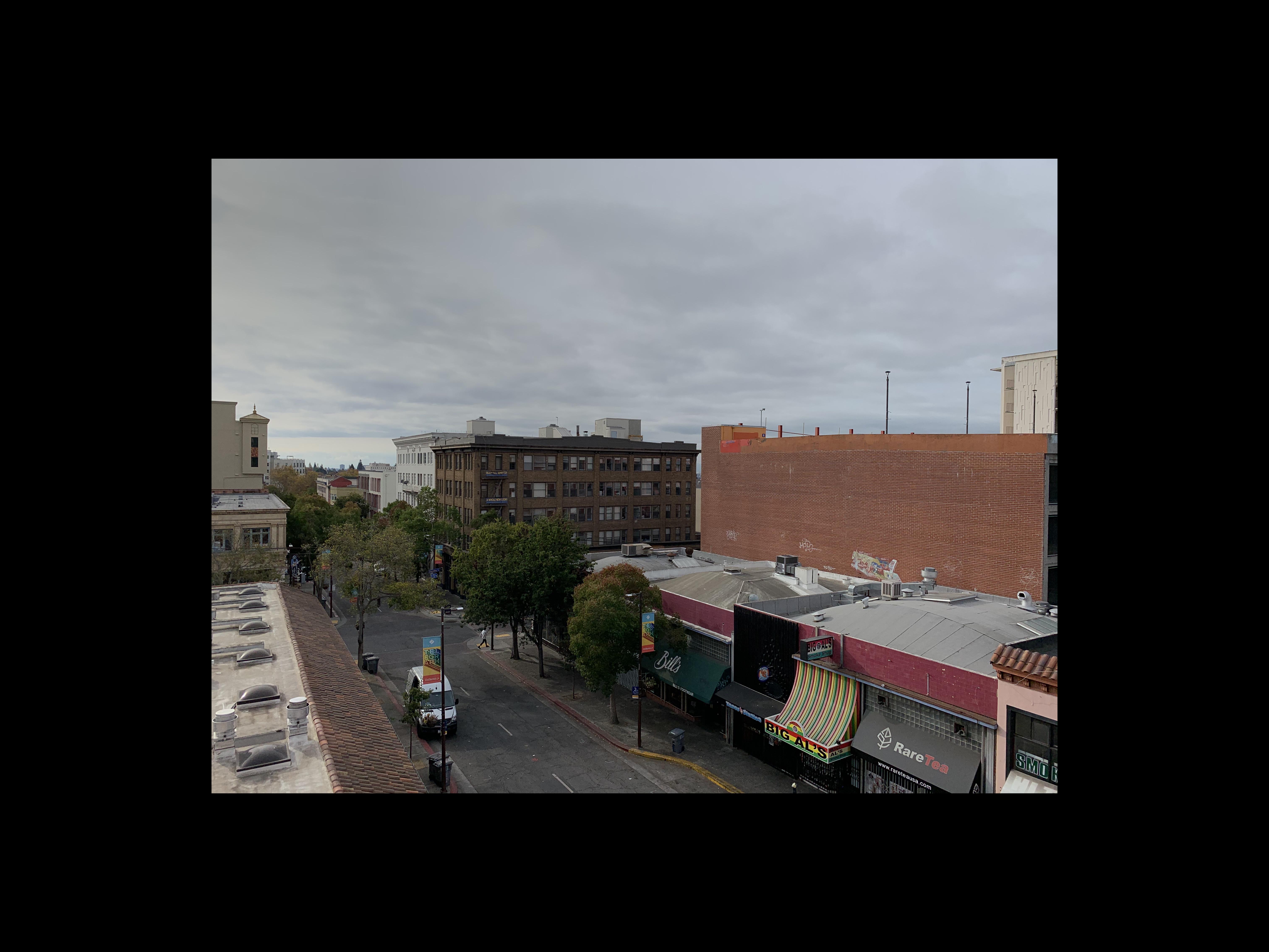
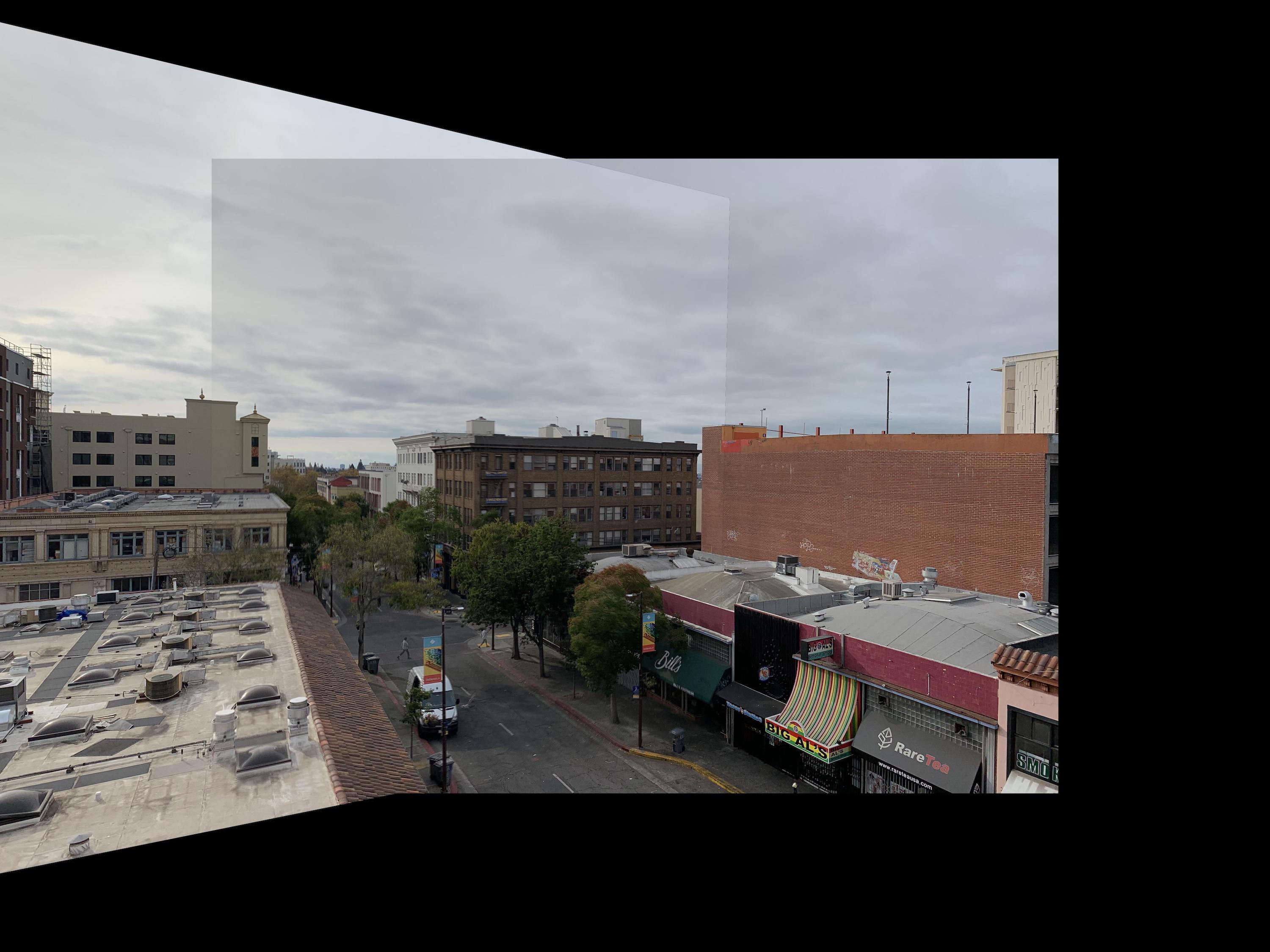
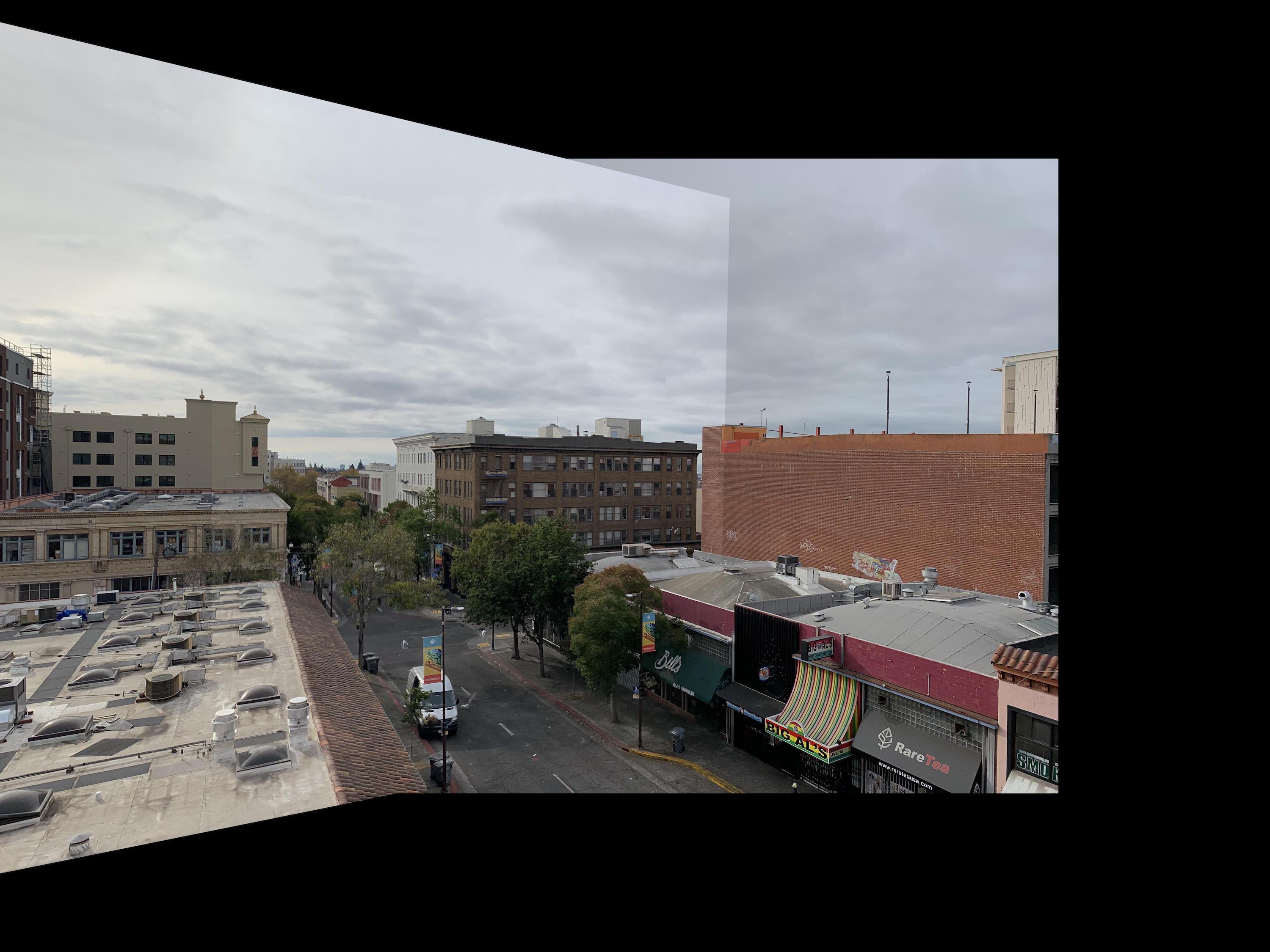
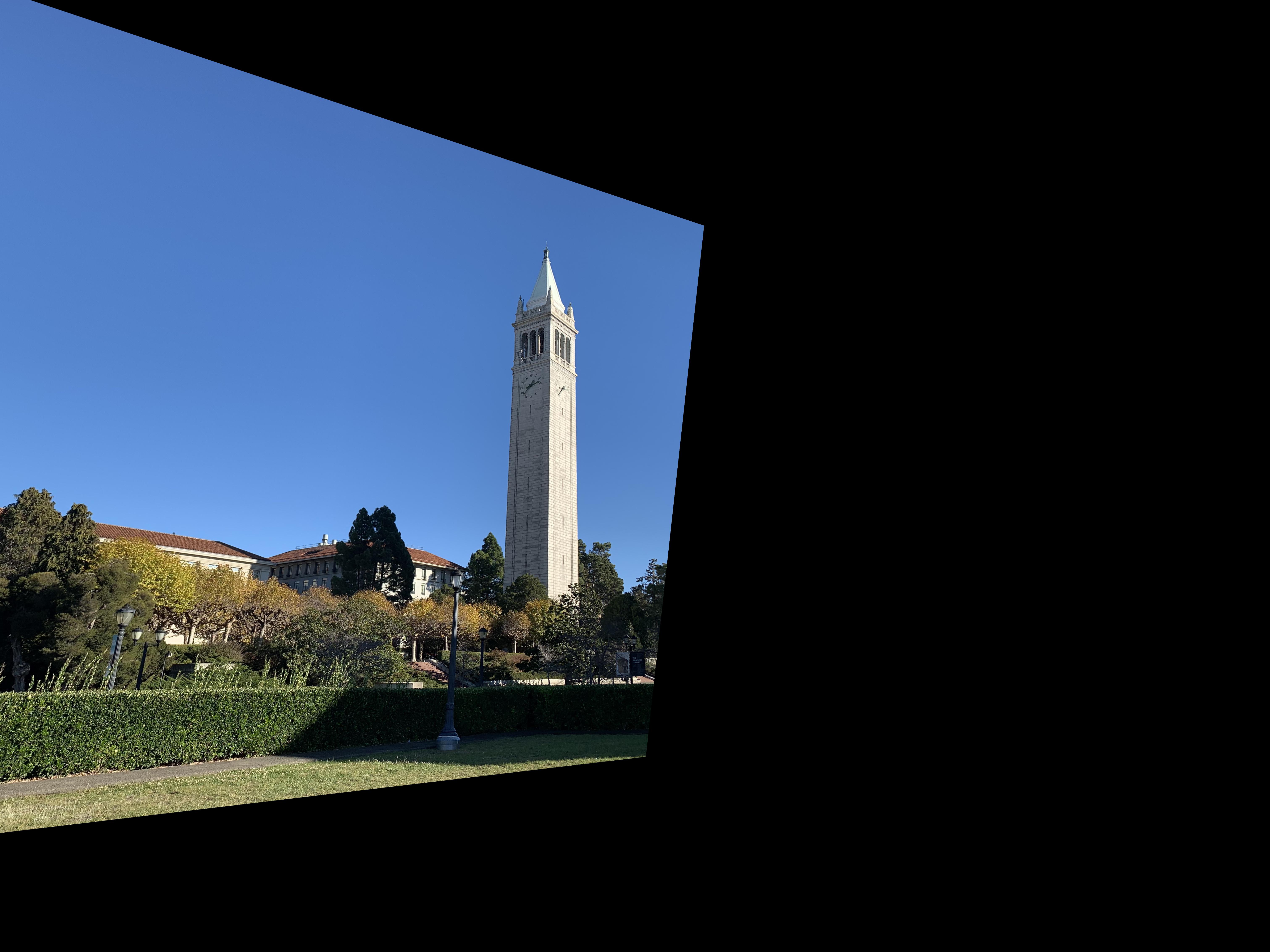
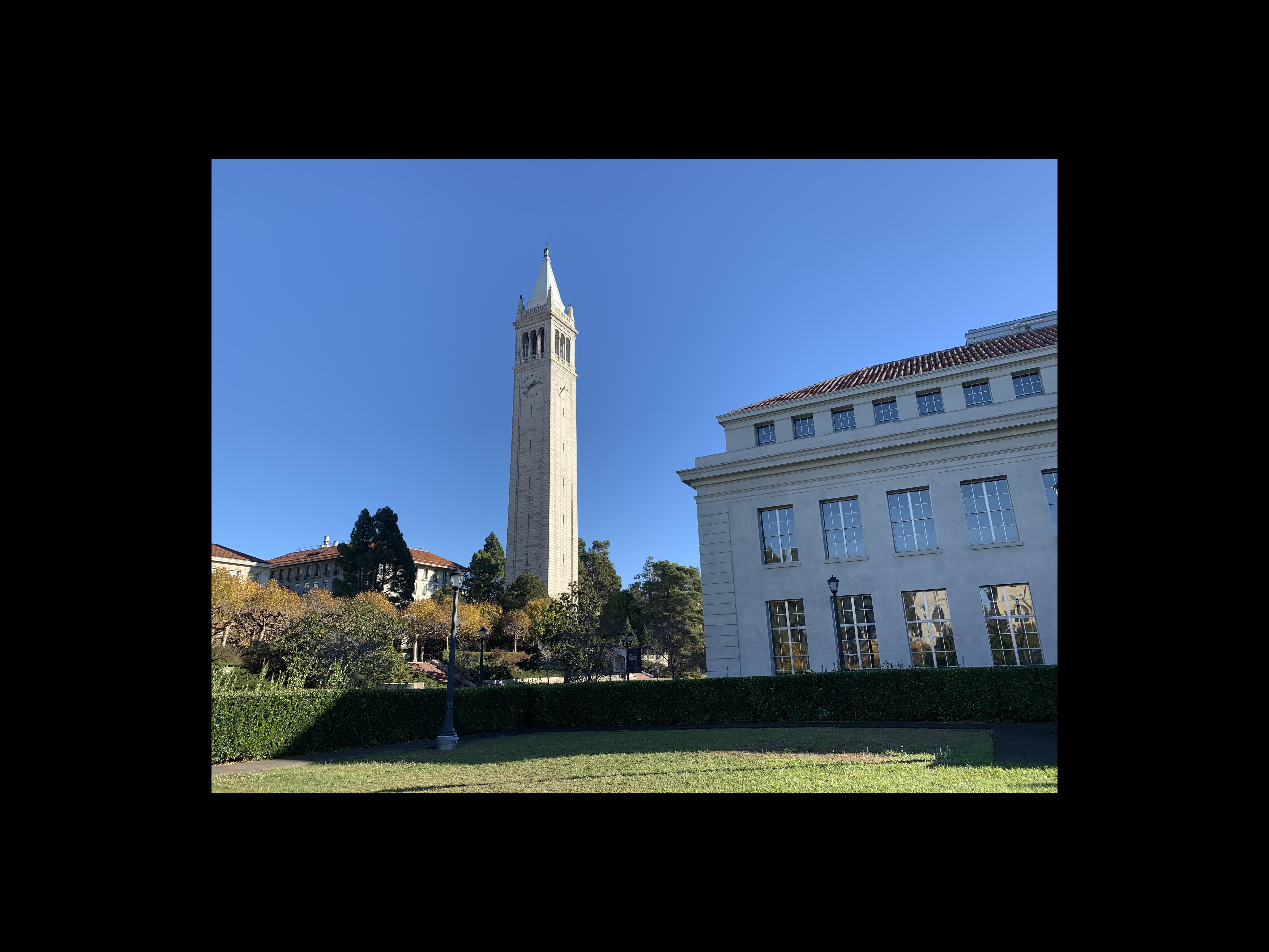
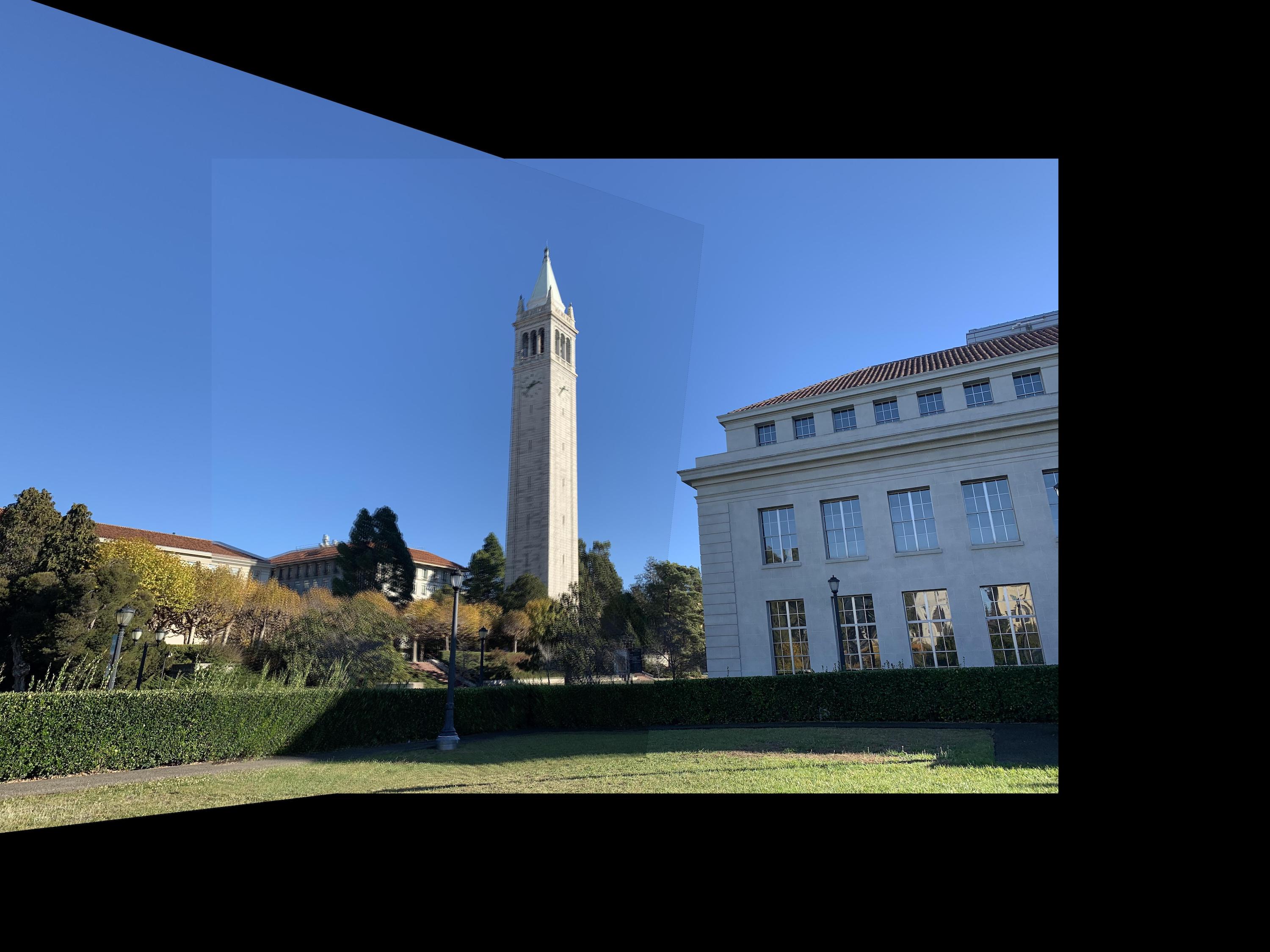
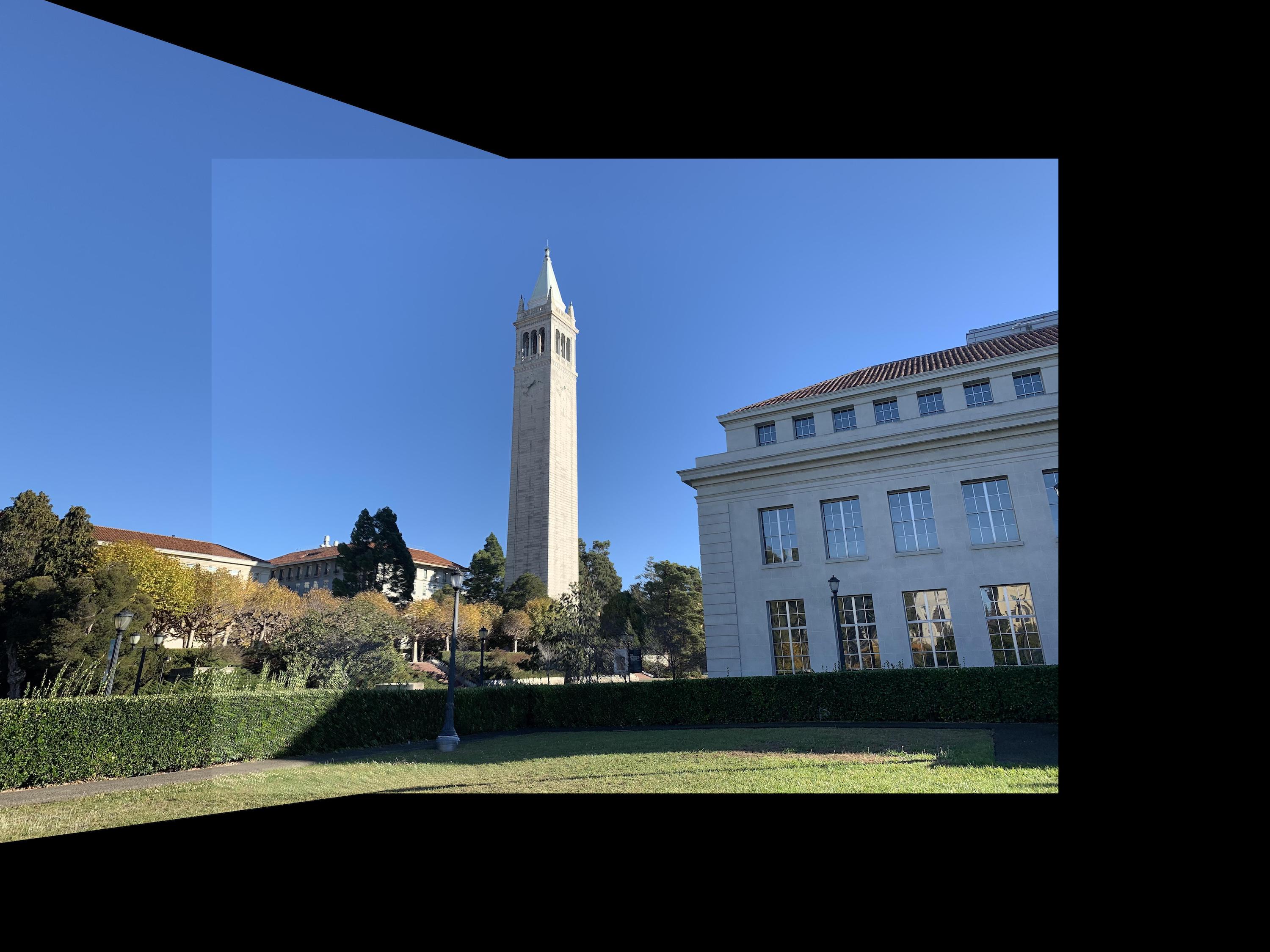
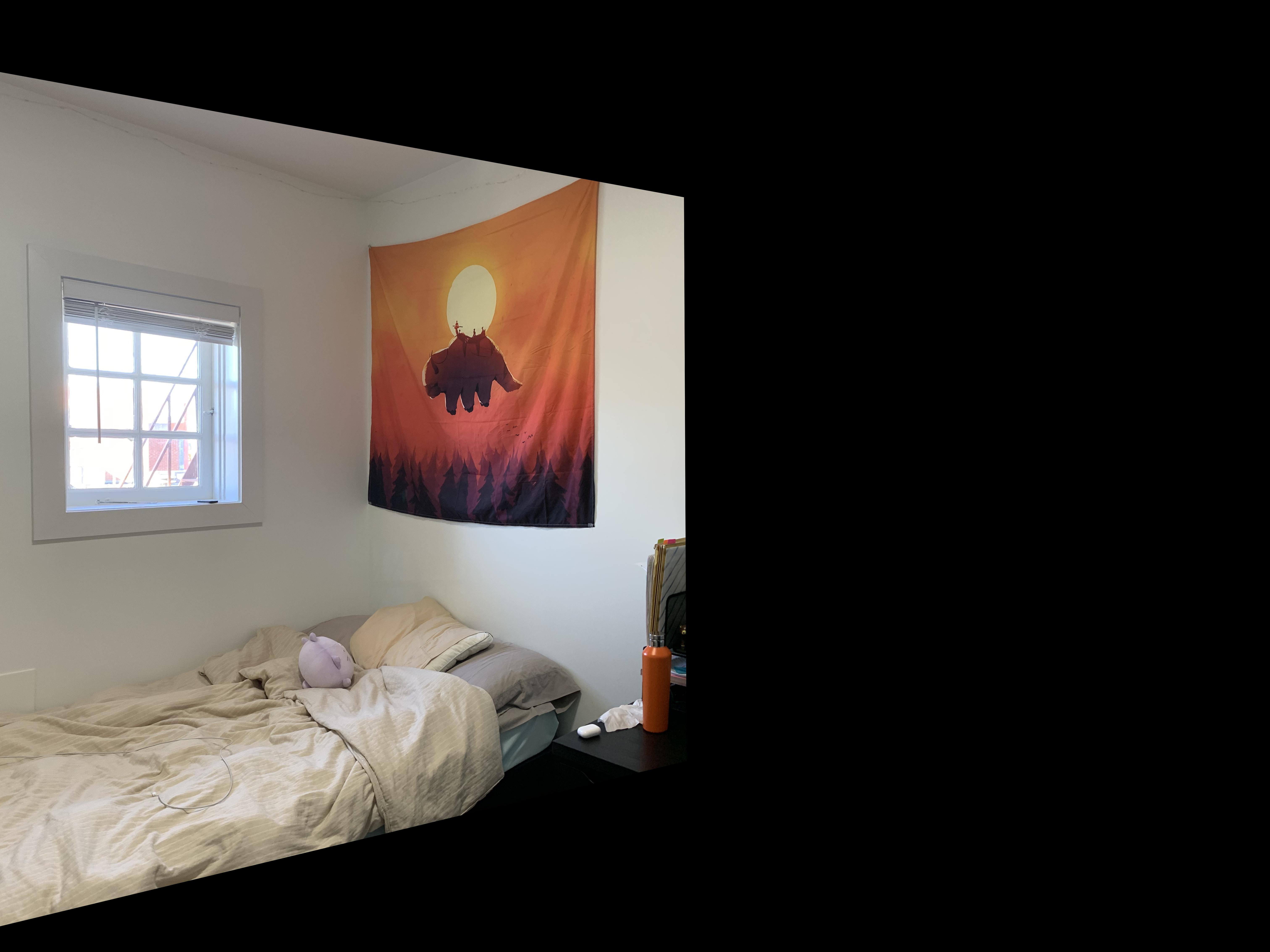
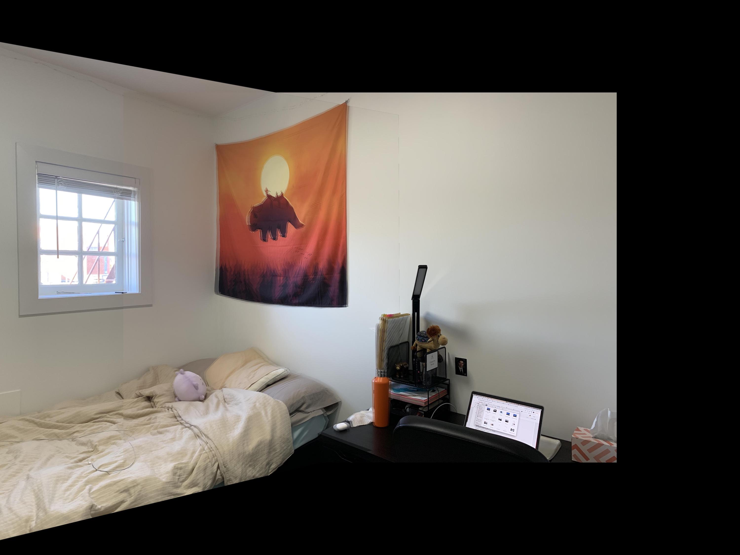
For the final section of part A, I used my warping function from before to create image mosaics, essentially creating our own panoramic pictures. I first found a homographic matrix using corresponding points selected from two images from the same viewpoint. Then, I warped the first image to the points of the second image. Finally, I created a function that blends the two images at their meeting points by summing 1/2 the color of one image and 1/2 the color of the other. The more points I selected around the image, the better the results.
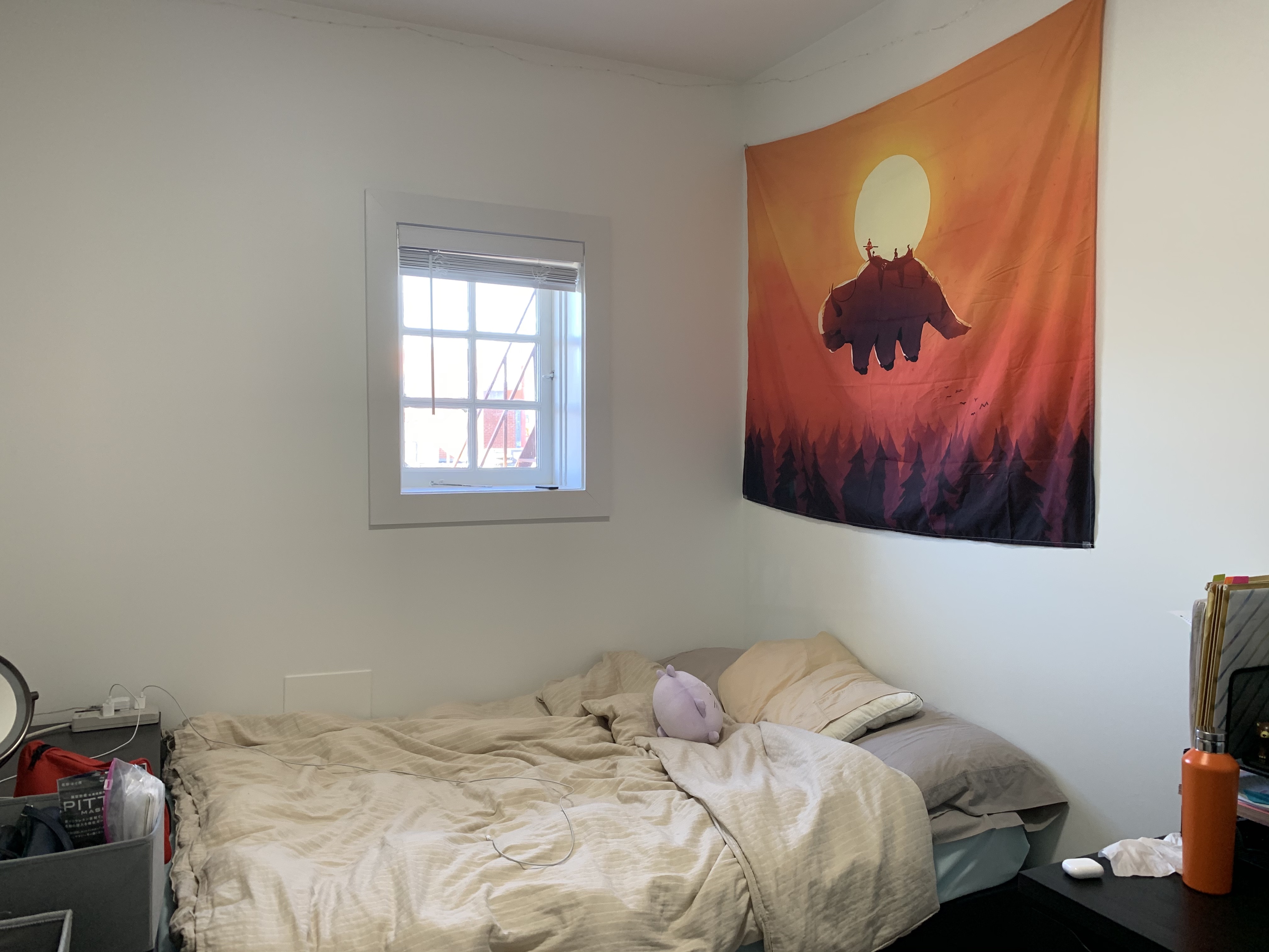
At first for my telegraph mosaic, I had only selected one point on the left side of the first image, so my result was overlapping and blurred on the left side. Adding one extra corresponding point on the left side fixed this problem. The sharper edges in the sky and walls of the average blended images come from the changes in lighting from my iPhone's automatic settings. Since the lighting didn't match up completely, the weighted averaging didn't match the color of my blended area up exactly to the color on the other side of the edge. Also, since my points were manually selected for the campanile image, there is a bit of a blurring effect due to the error of my hand selection (and also the motion of the tree leaves due to wind). This also occured with my room images, where I manually selected those points as well. Since the corresponding points (and tree leaves) aren't in the exact locations, the weighted averaging causes a blur in the misalignment. This isn't seen as much in the first mosaic of the buildings, where I more carefully and accurately pre-selected points from Photoshop, and there are fewer trees. In order to remedy this, I also tested taking just the maximum color value of the two images. This ended up clearing the edge on one side of the image, but sharpening the edge on the other. However, this did also solve the issue of the slight blur from my error in hand selecting points, which looks slightly cleaner. Overall, I would say max looks cleaner despite having one strong edge in each image.
Telegraph
|
|
|
|
|
|
Campanile
|
|
|
|
|
|
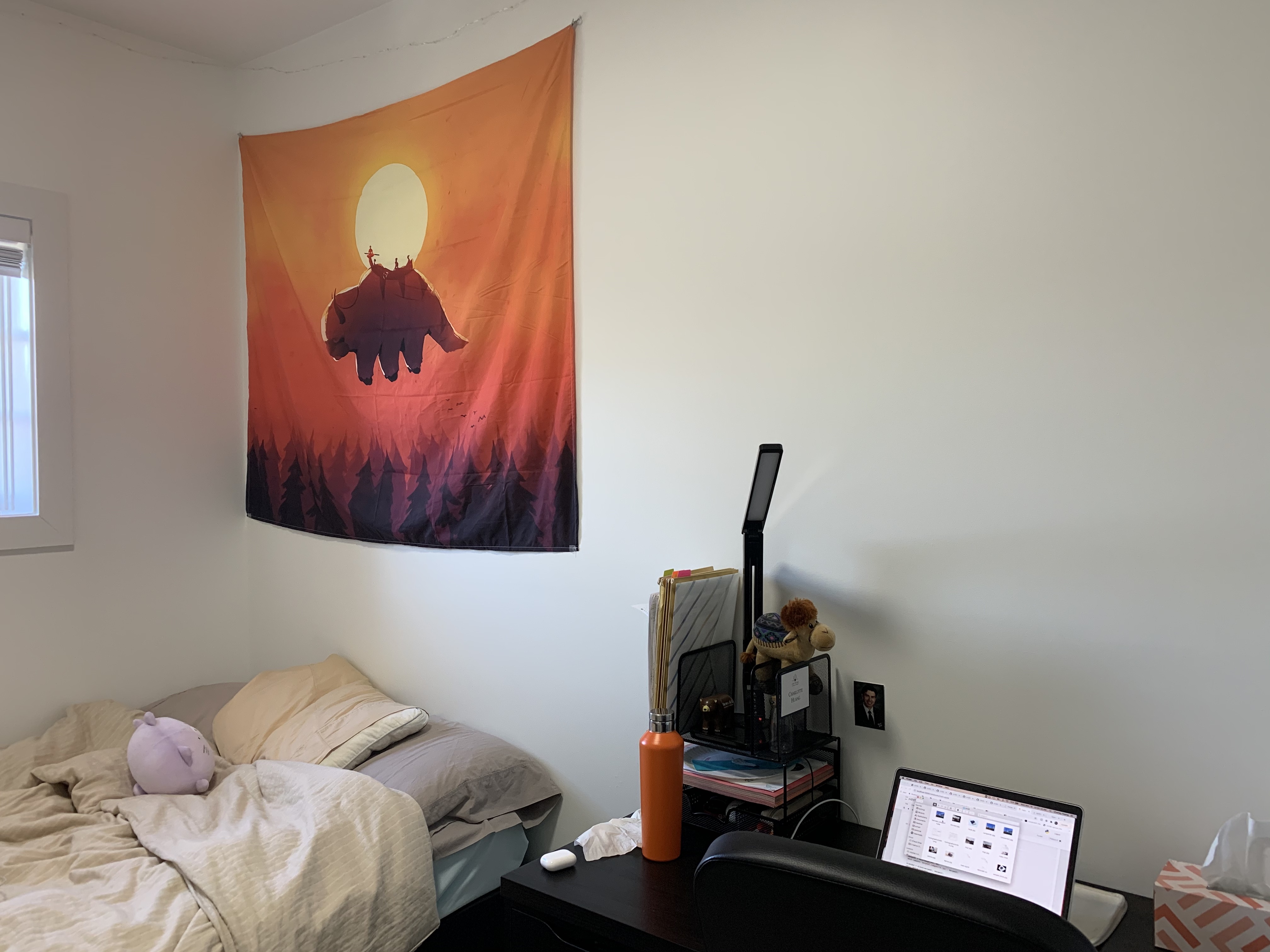
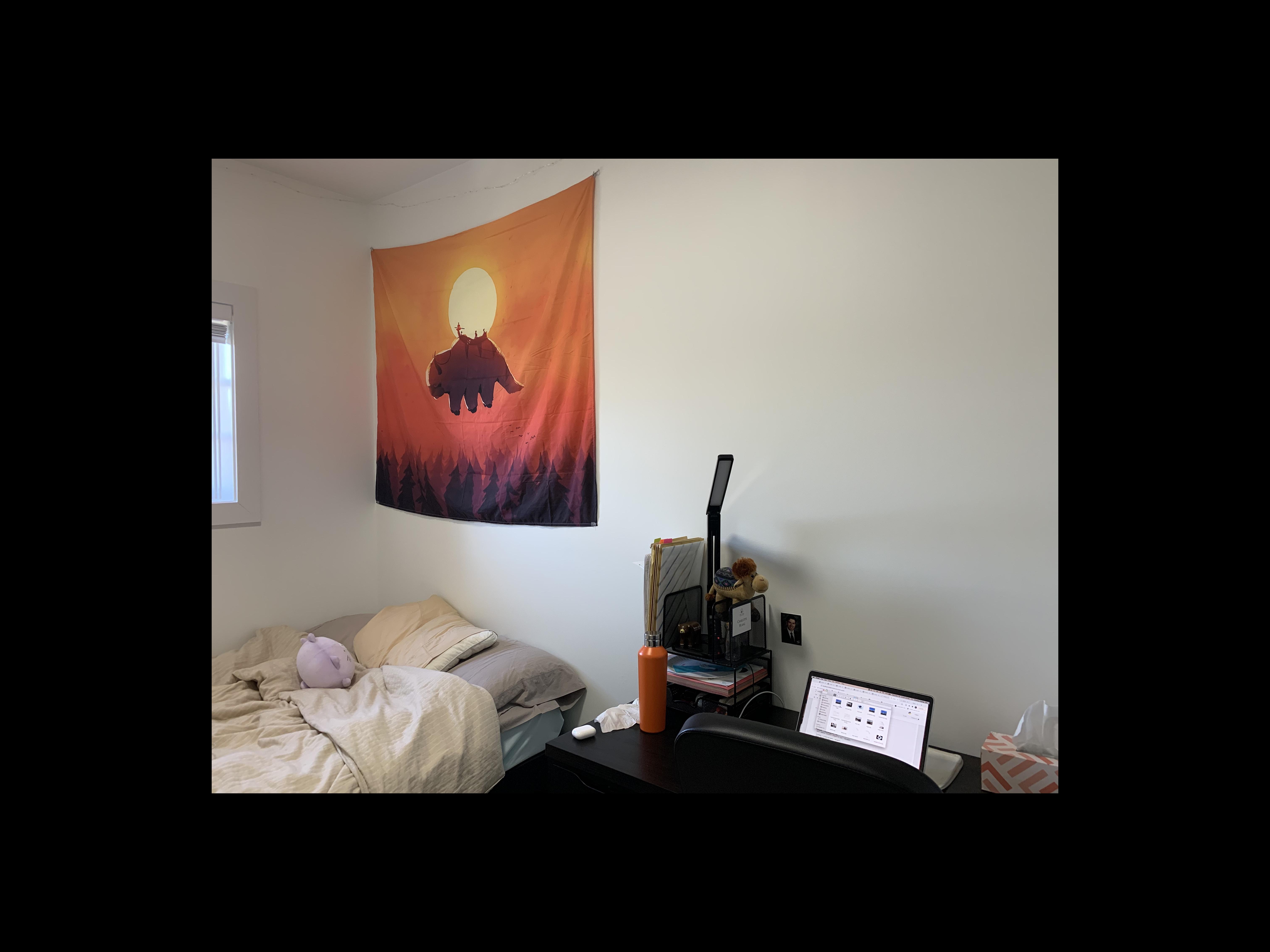
My Room
|
|
|
|
|

|
What I've Learned
The coolest thing was that the distribution of the points really matters. Seeing that my images were slightly unaligned at one section of the image and being able to fix it completely by adding only one point in that region was super cool.