Overview
In this project, I created a warp function that can be used
to rectify images and create mosaics using a homography.
Part A1: Recover Homographies
In order to calculate a proper homography for aligning two images using
the formula p' = Hp, I used these two guides I found on Google images for
proper construction of a homography using A * H = b. I used the A matrix
formula from the first guide and modified (negated) the b vector formula from the
second image. Then, I could find the 8 points needed for H.
Part A2: Warping Images
In this section, I built a similar warp function to the one we used in
Project 3. First, I created two functions to retrieve corresponding points
from images. The first function retrieved pre-selected points that I found
using Photoshop. The second function, which I took from my own Project 3,
allowed me to hand-select the points I wanted to use. After selecting
corresponding points, I apply H to the corners of my image to find the shape
of the rectified image. Then, I apply inverse of H to my original image
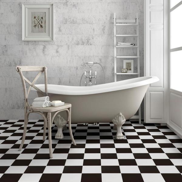
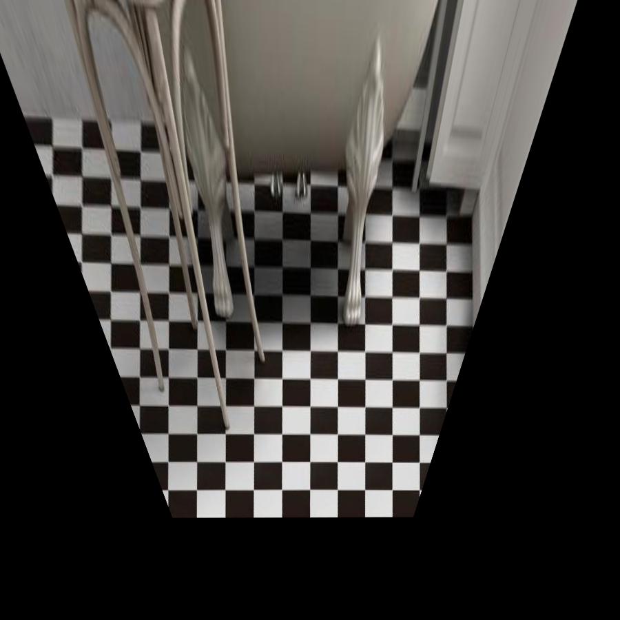
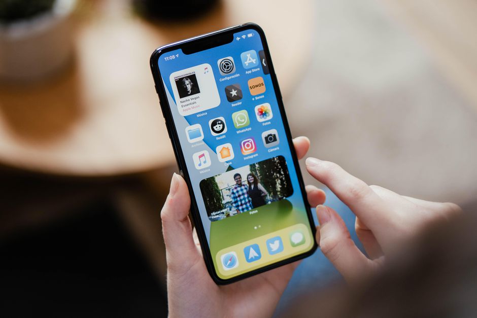
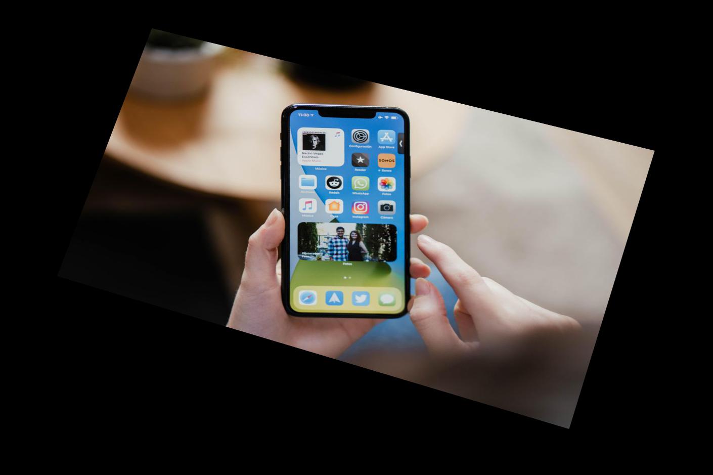
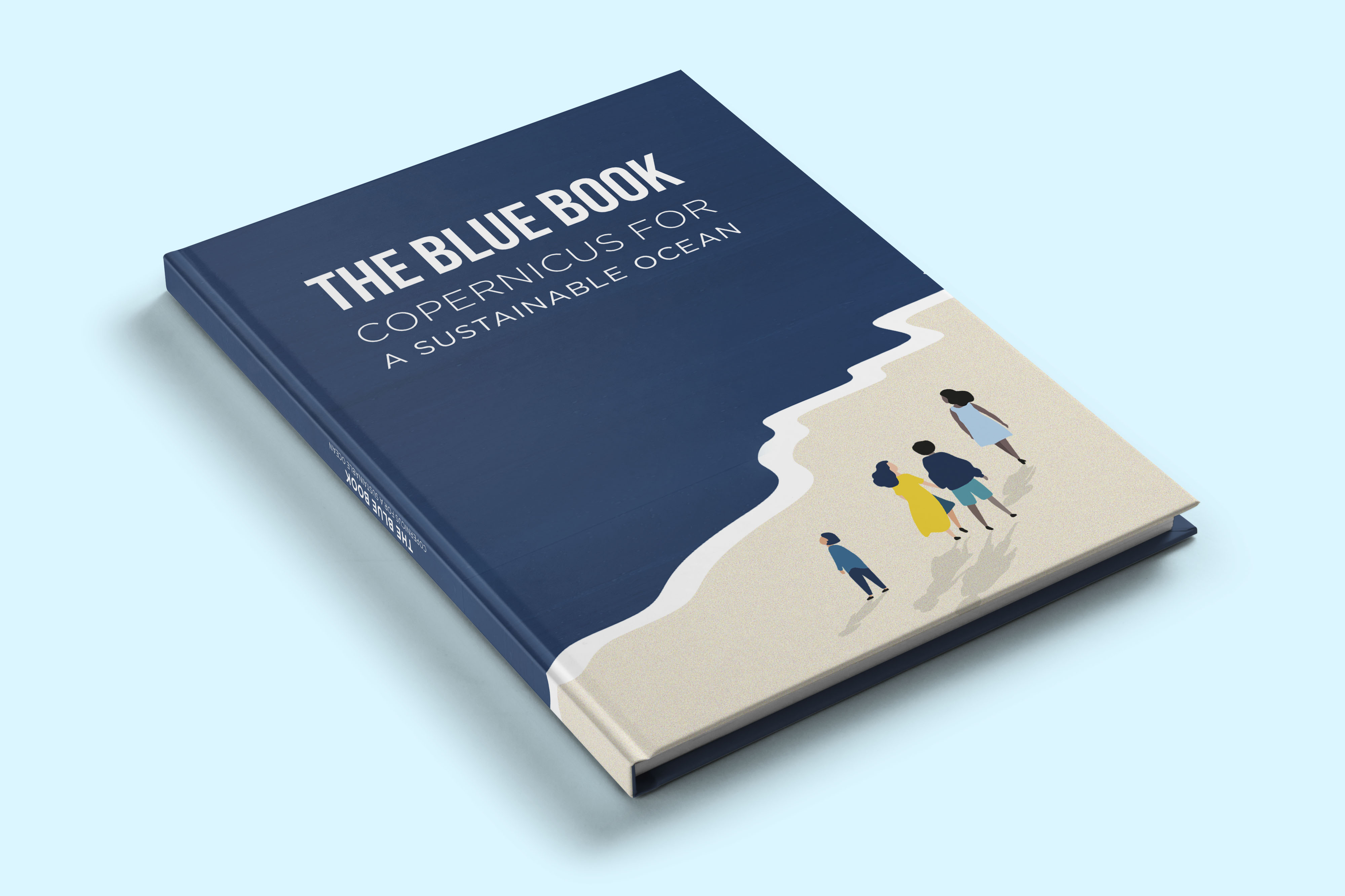
to map the image to this new shape. Here are a few rectified image
examples. I straightened out a bathroom floor, an iPhone, and a book.
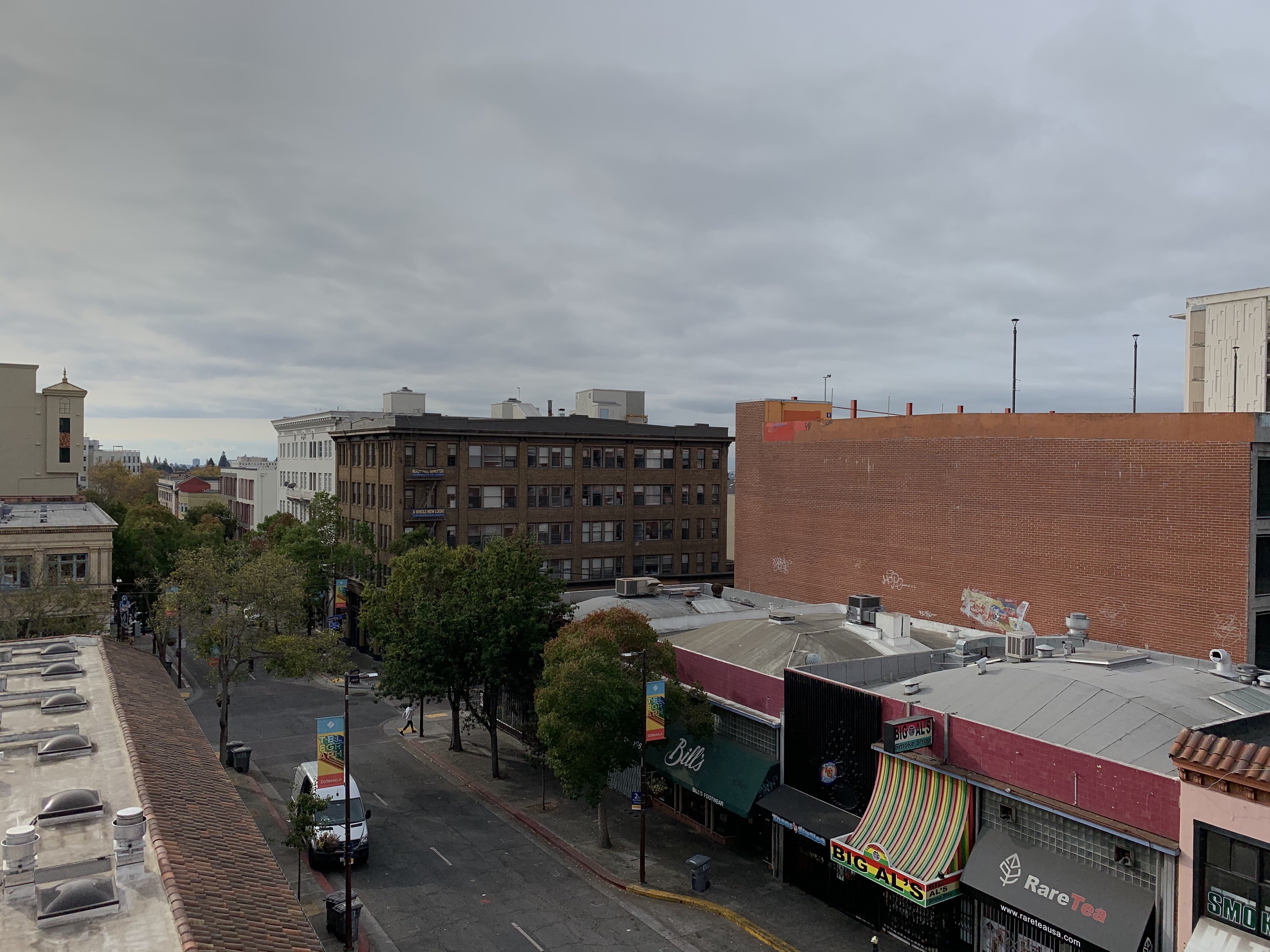
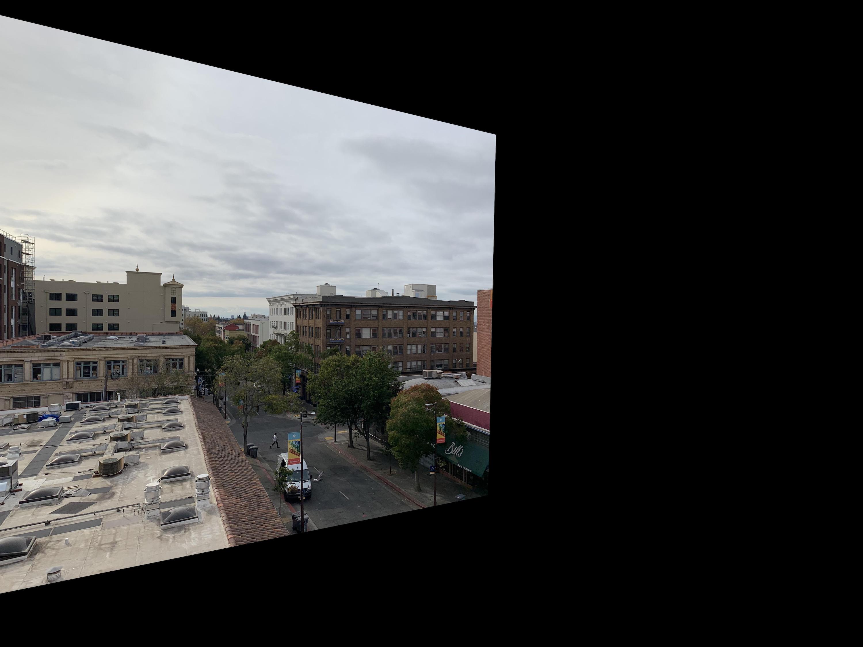
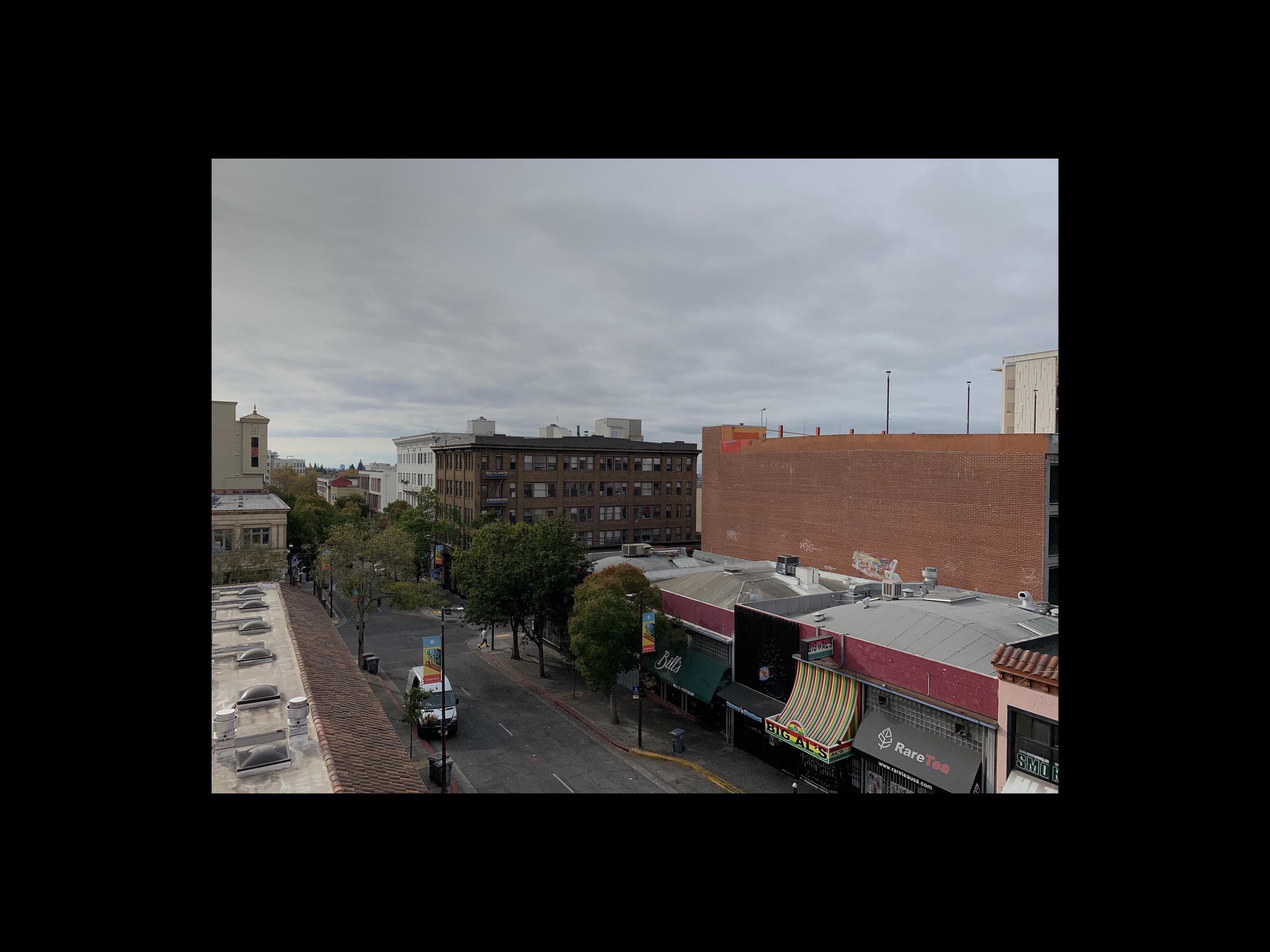
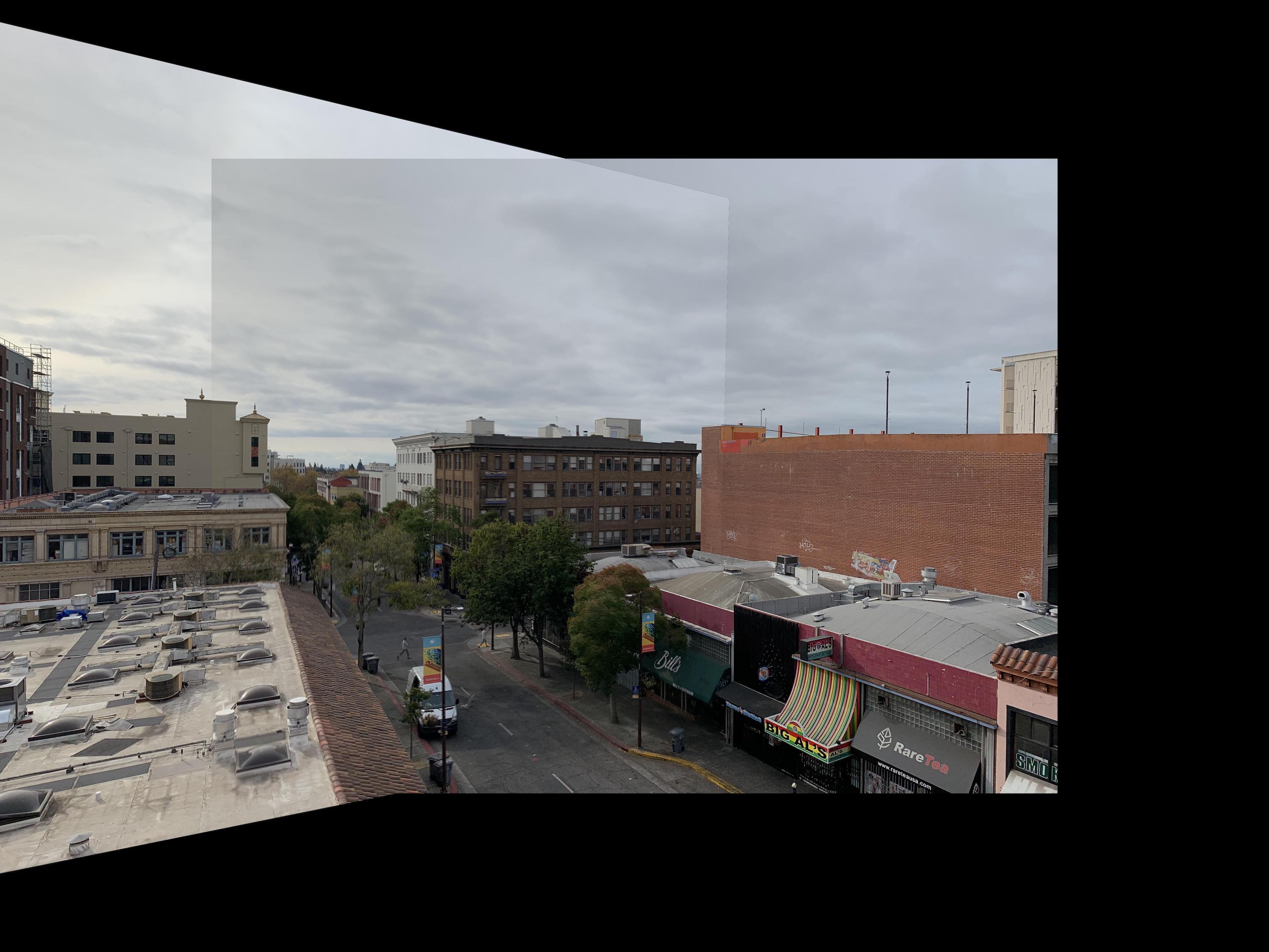
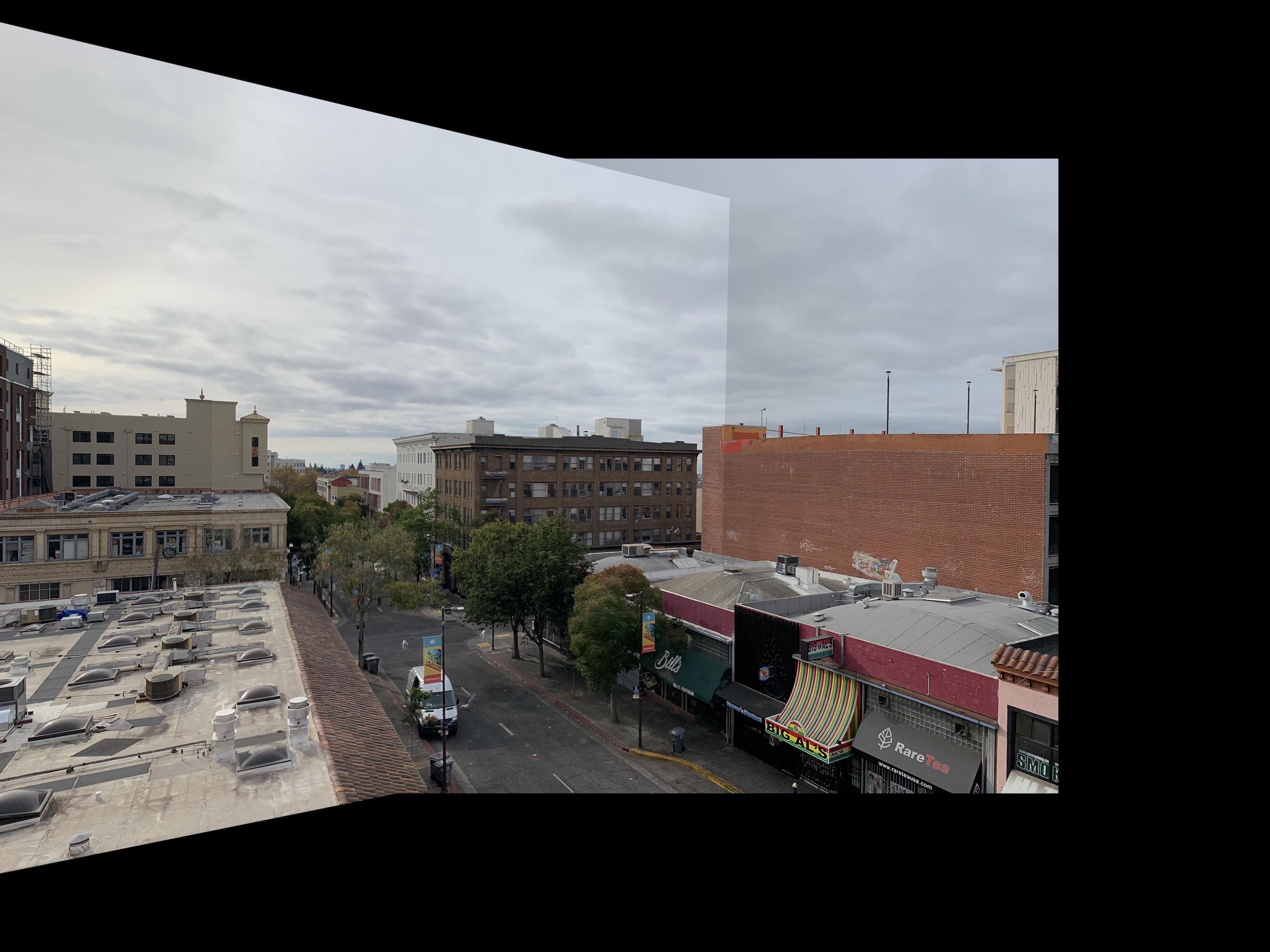
Part A3: Mosaic
For the final section of part A, I used my warping function from before
to create image mosaics, essentially creating our own panoramic pictures.
I first found a homographic matrix using corresponding points selected
from two images from the same viewpoint. Then, I warped the first image to the
points of the second image. Finally, I created a function that blends the
two images at their meeting points by summing 1/2 the color of one image
and 1/2 the color of the other. The more points I selected around the image,
the better the results.
At first for my telegraph mosaic, I had only selected
one point on the left side of the first image, so my result was overlapping and
blurred on the left side. Adding one extra corresponding point on the left
side fixed this problem. The sharper edges in the sky and walls of the average blended images come
from the changes in lighting from my iPhone's automatic settings. Since
the lighting didn't match up completely, the weighted averaging didn't
match the color of my blended area up exactly to the color on the other
side of the edge. Also, since my points were manually selected for
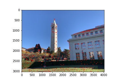
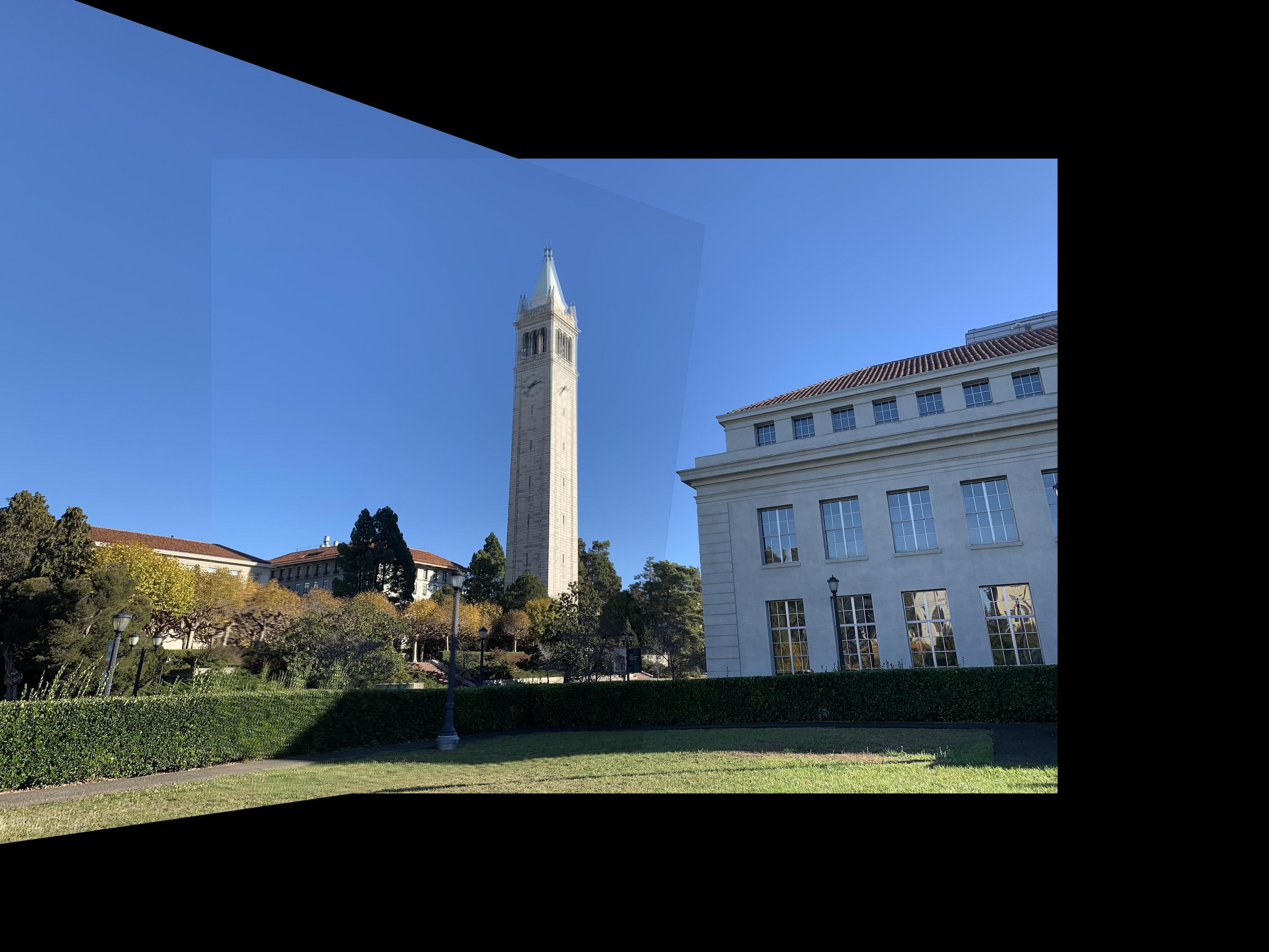
the campanile image, there is a bit of a blurring effect due to the error
of my hand selection (and also the motion of the tree leaves due to wind).
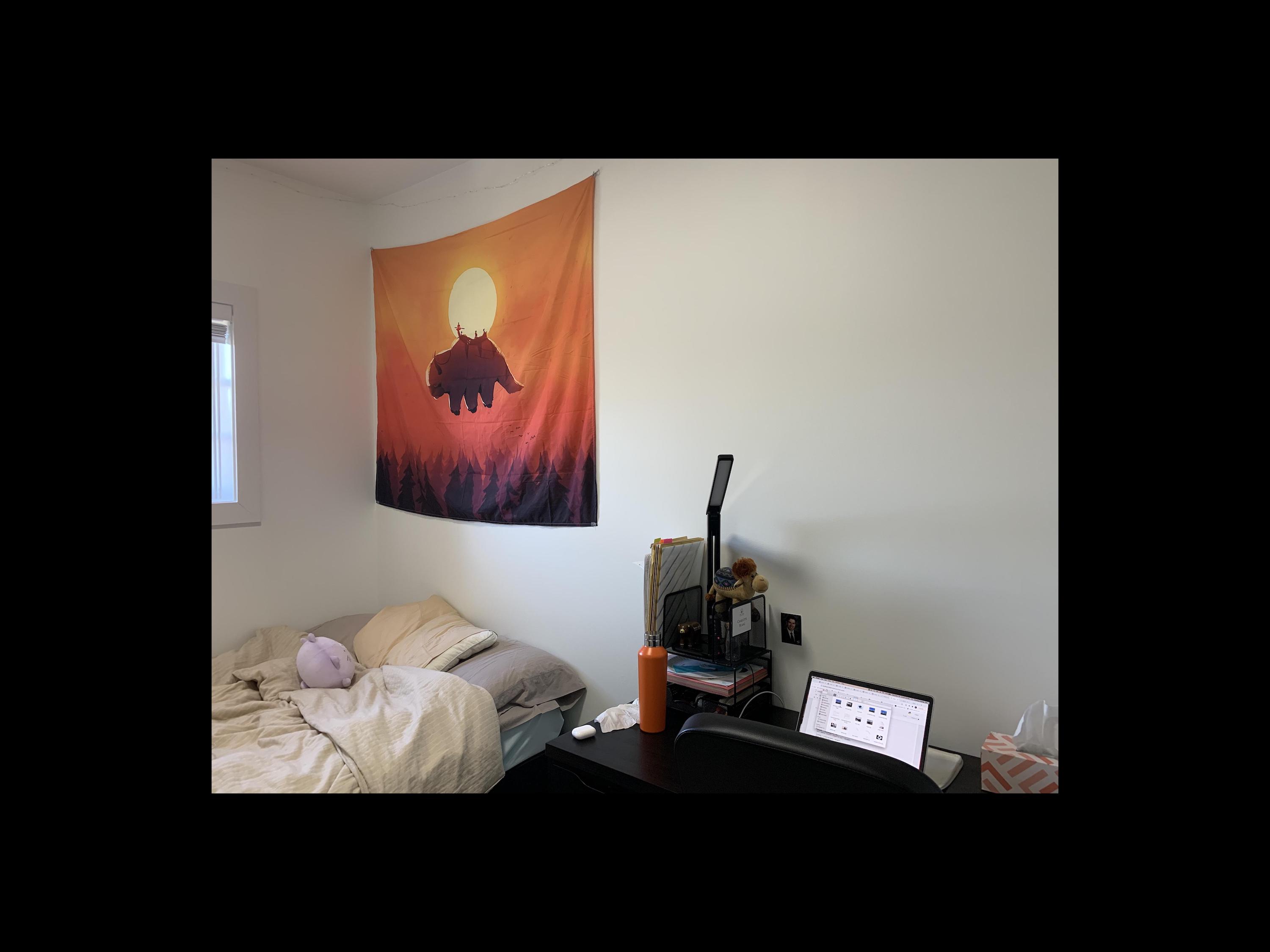
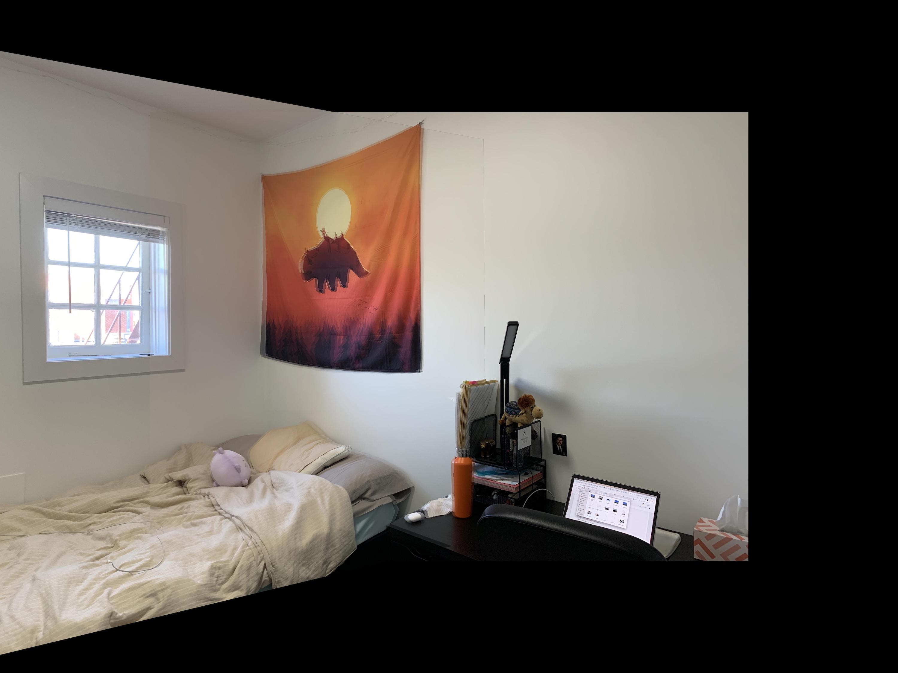
This also occured with my room images, where I manually selected those points as well.
Since the corresponding points (and tree leaves) aren't in the exact
locations, the weighted averaging causes a blur in the misalignment. This
isn't seen as much in the first mosaic of the buildings, where I more carefully
and accurately pre-selected points from Photoshop, and there are fewer trees.
In order to remedy this, I also tested taking just the maximum color value
of the two images. This ended up clearing the edge on one side of the image,
but sharpening the edge on the other. However, this did also solve the issue
of the slight blur from my error in hand selecting points, which looks
slightly cleaner. Overall, I would say max looks cleaner despite having
one strong edge in each image.
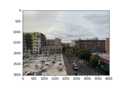
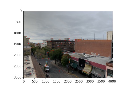
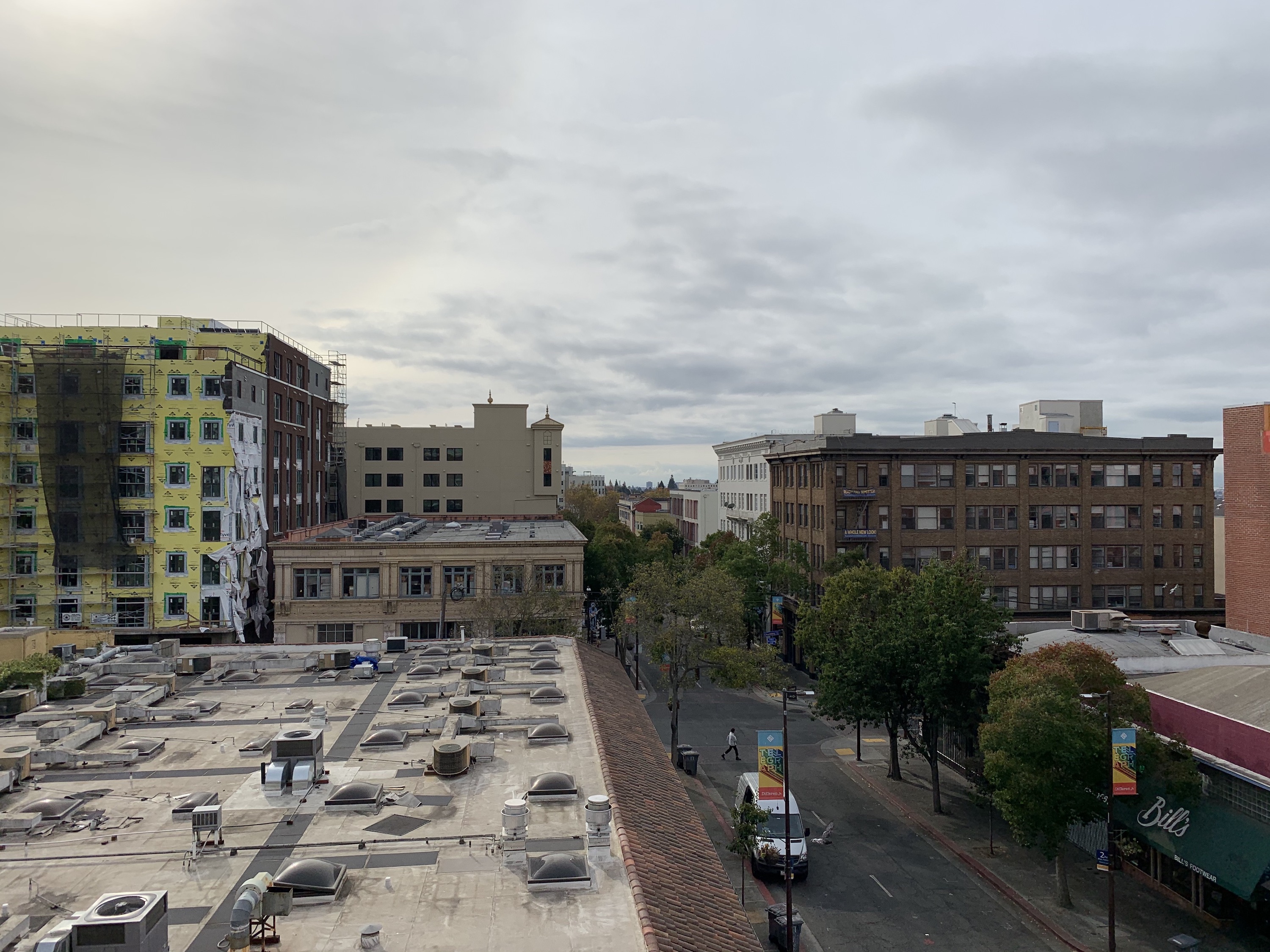
Telegraph
|
|
|
|
 Averaged Blending
|
 Max Blending
|
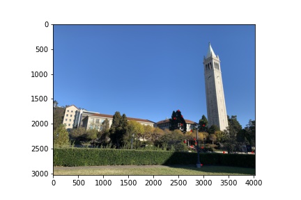
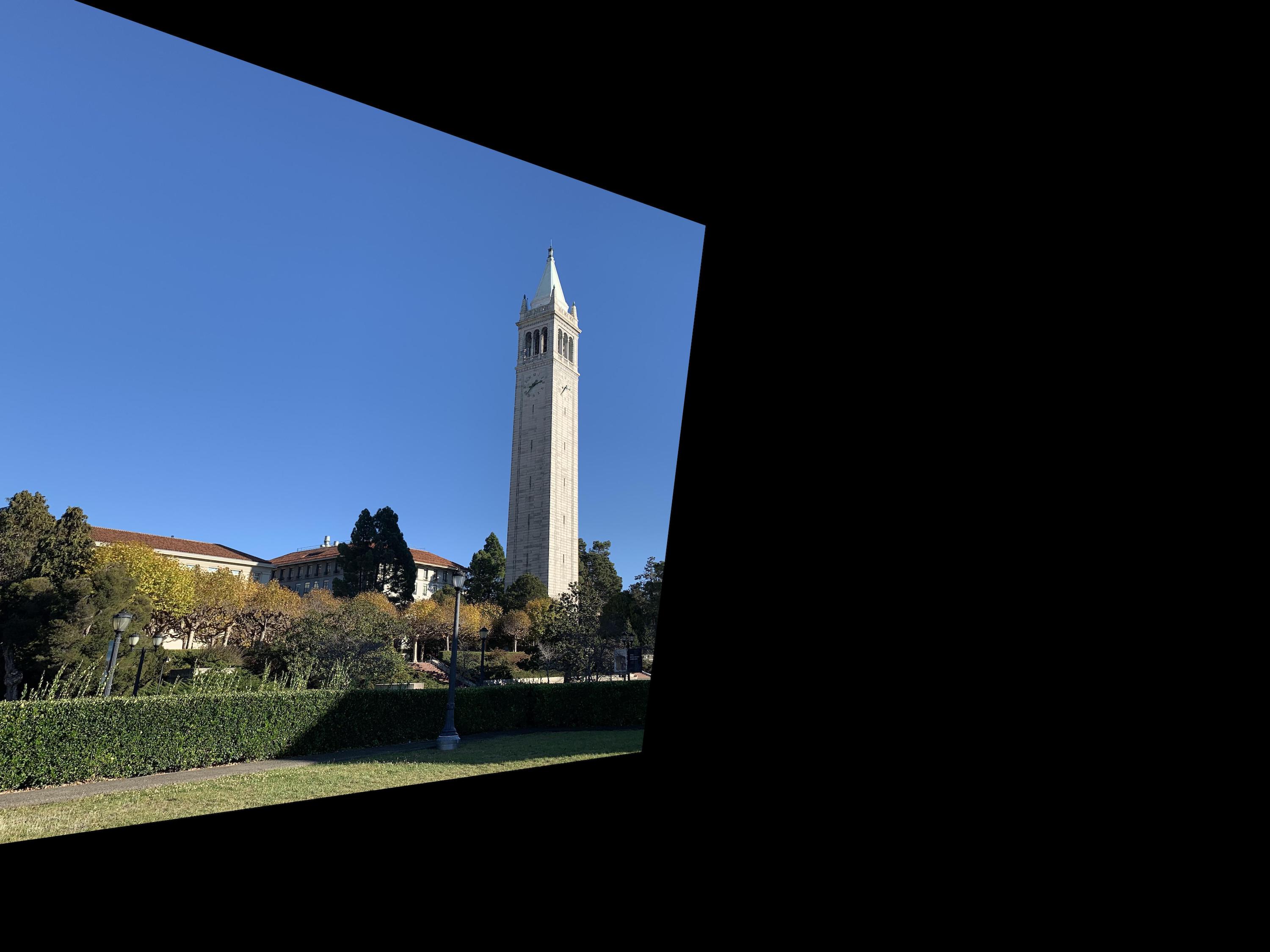
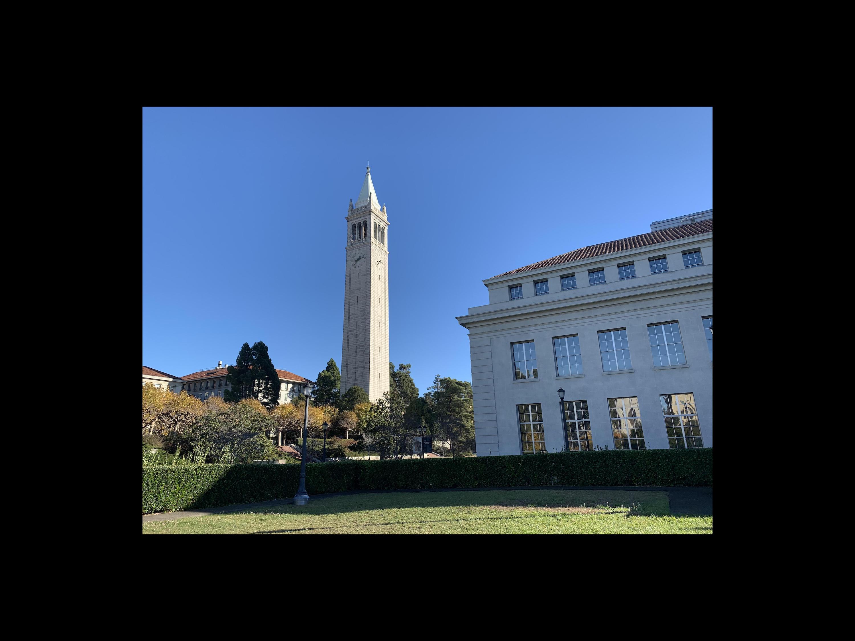
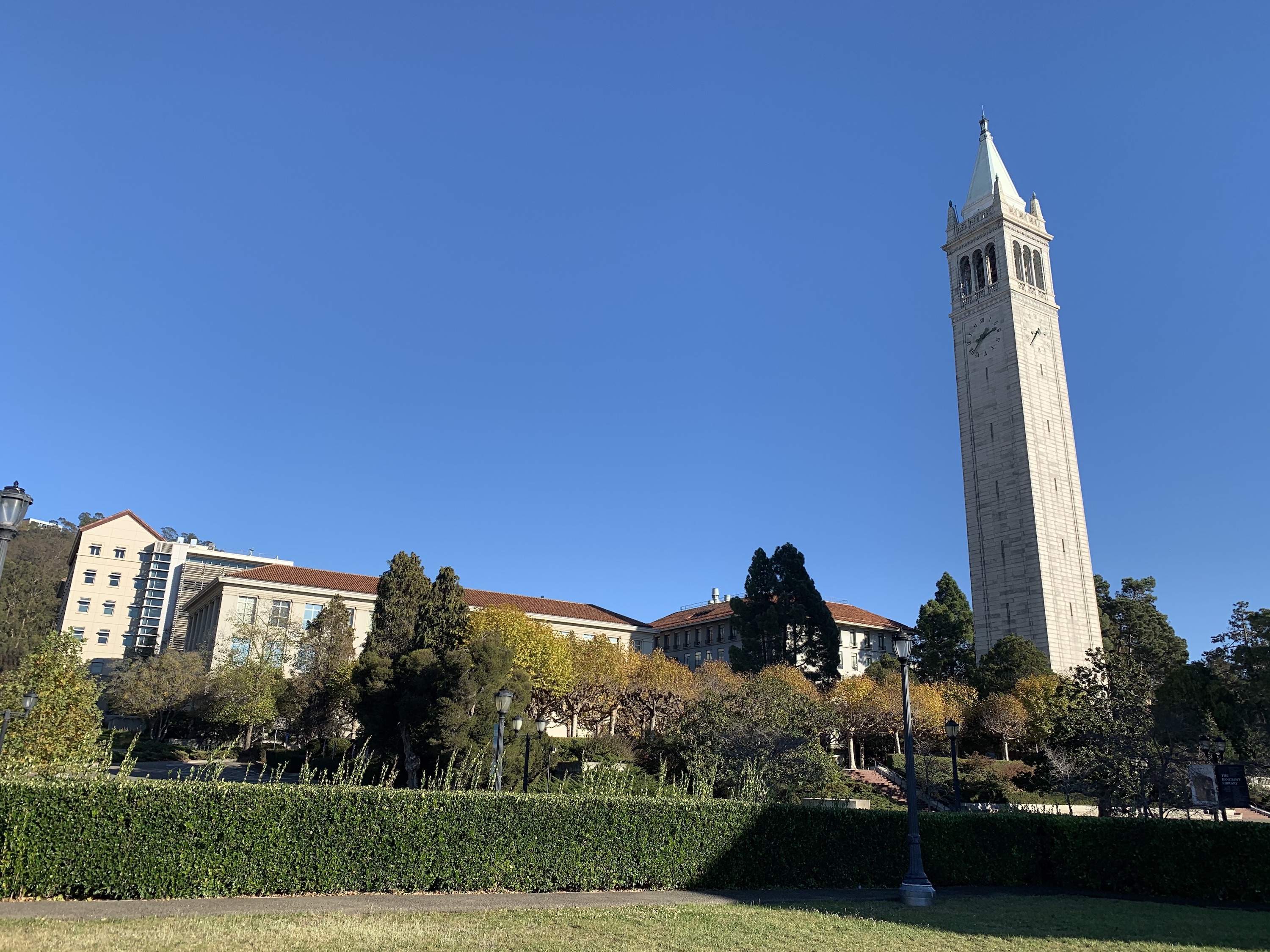
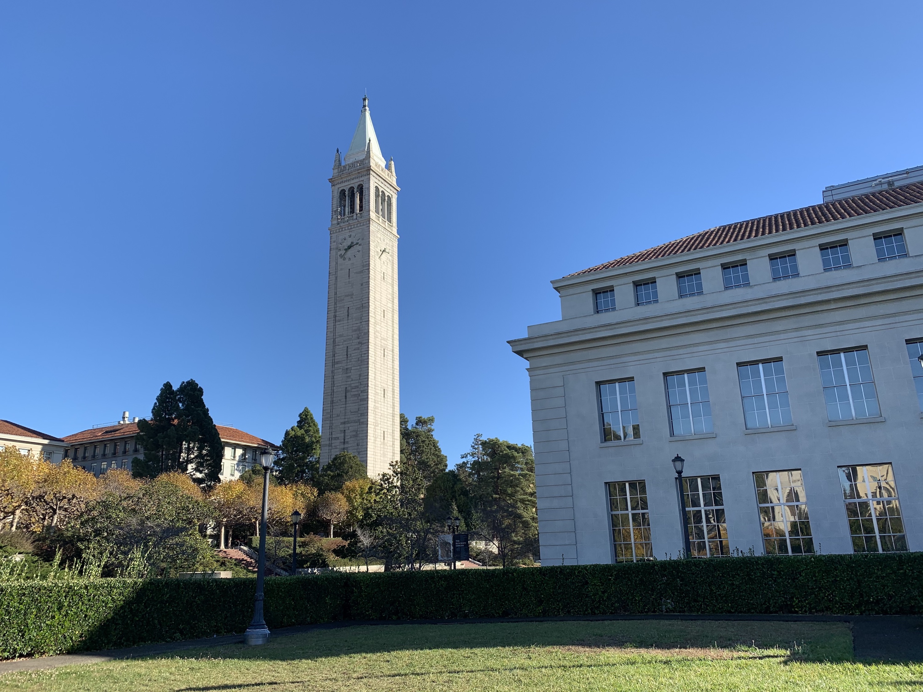
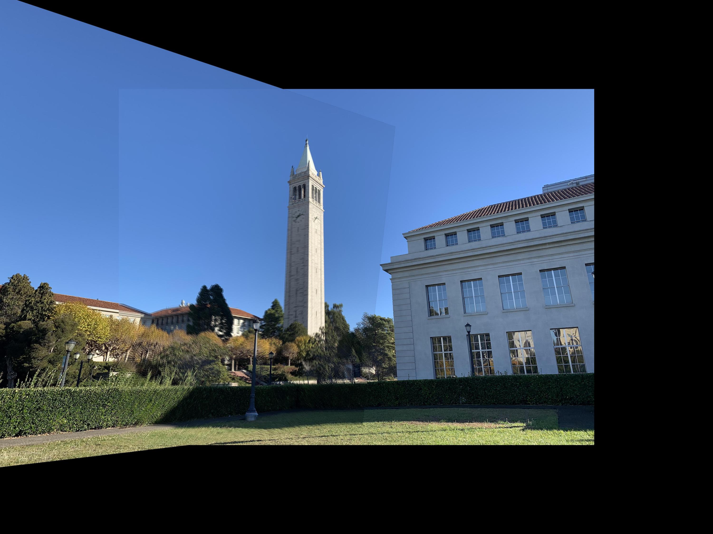
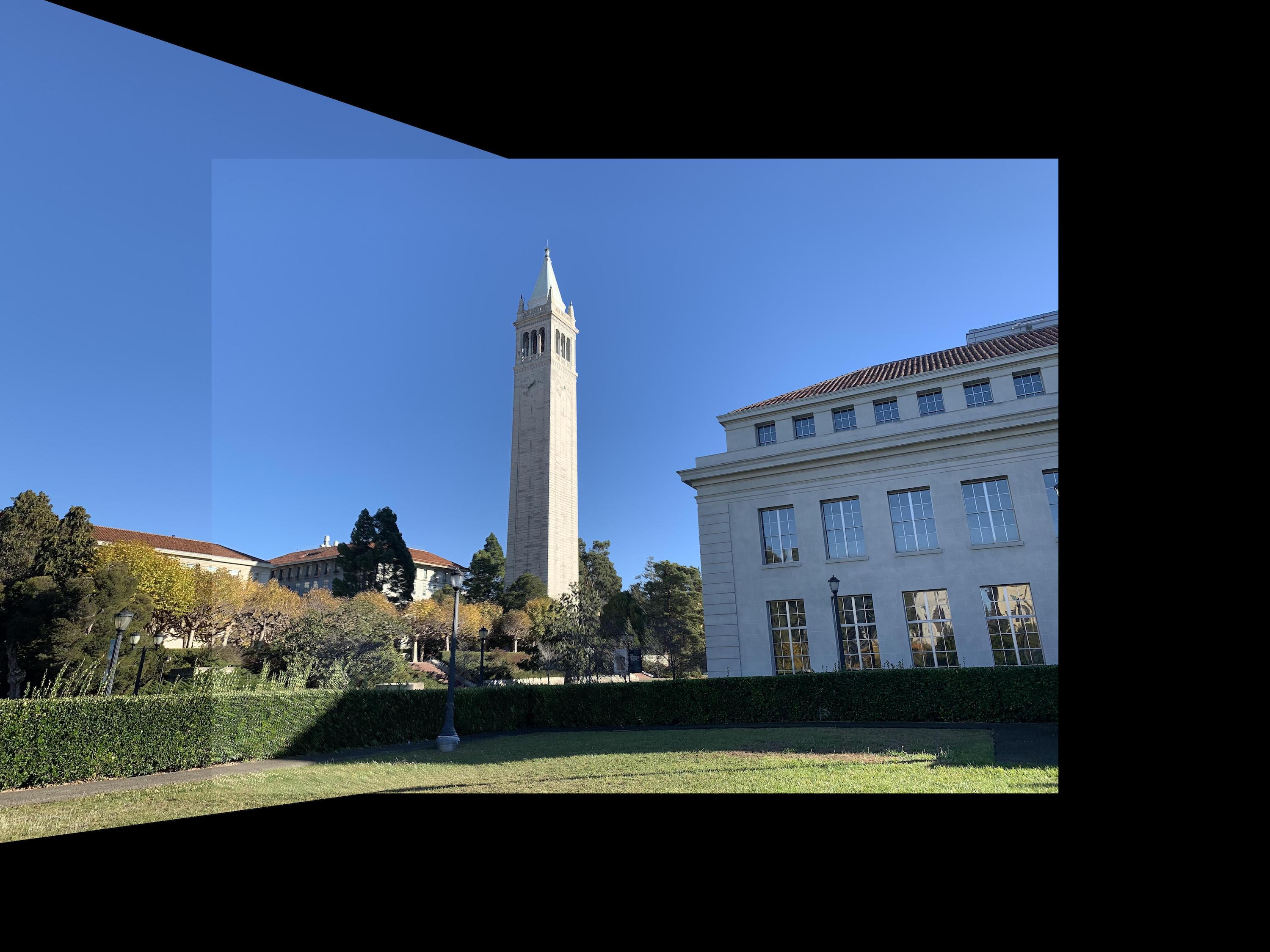
Campanile
|
|
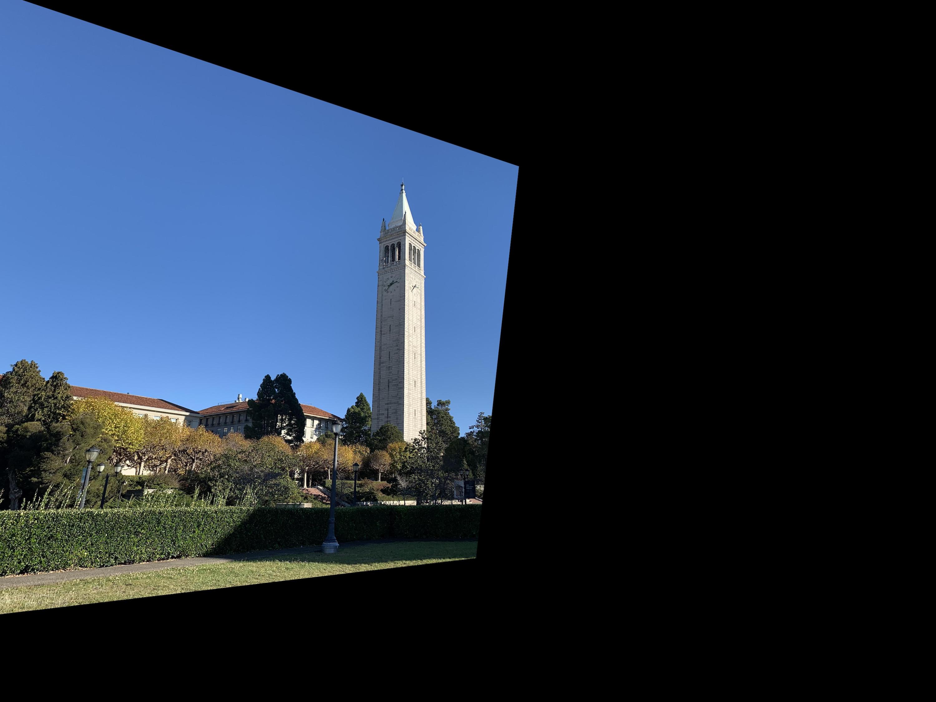
|

|
 Averaged Blending
|
 Max Blending
|
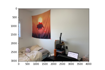
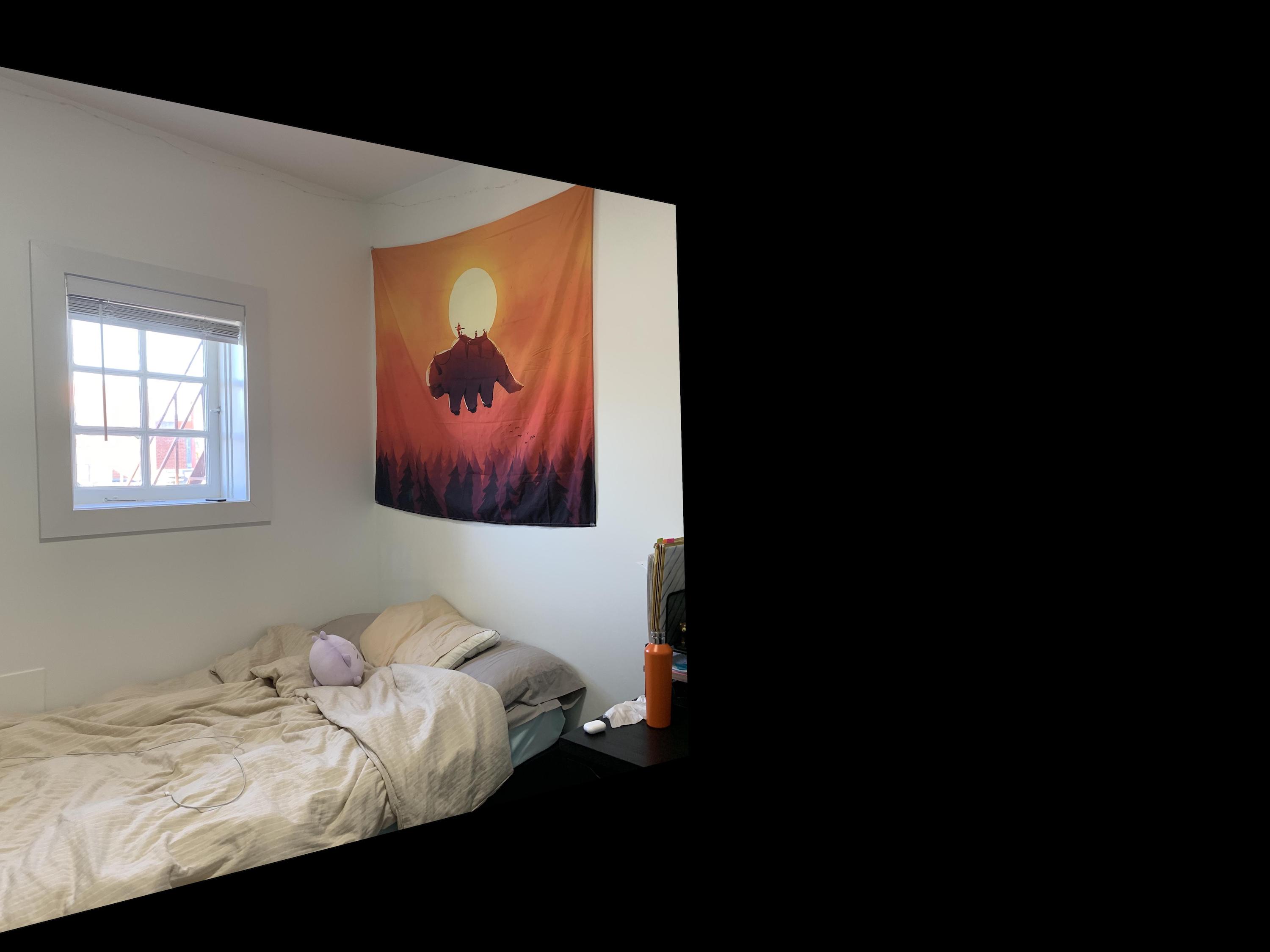
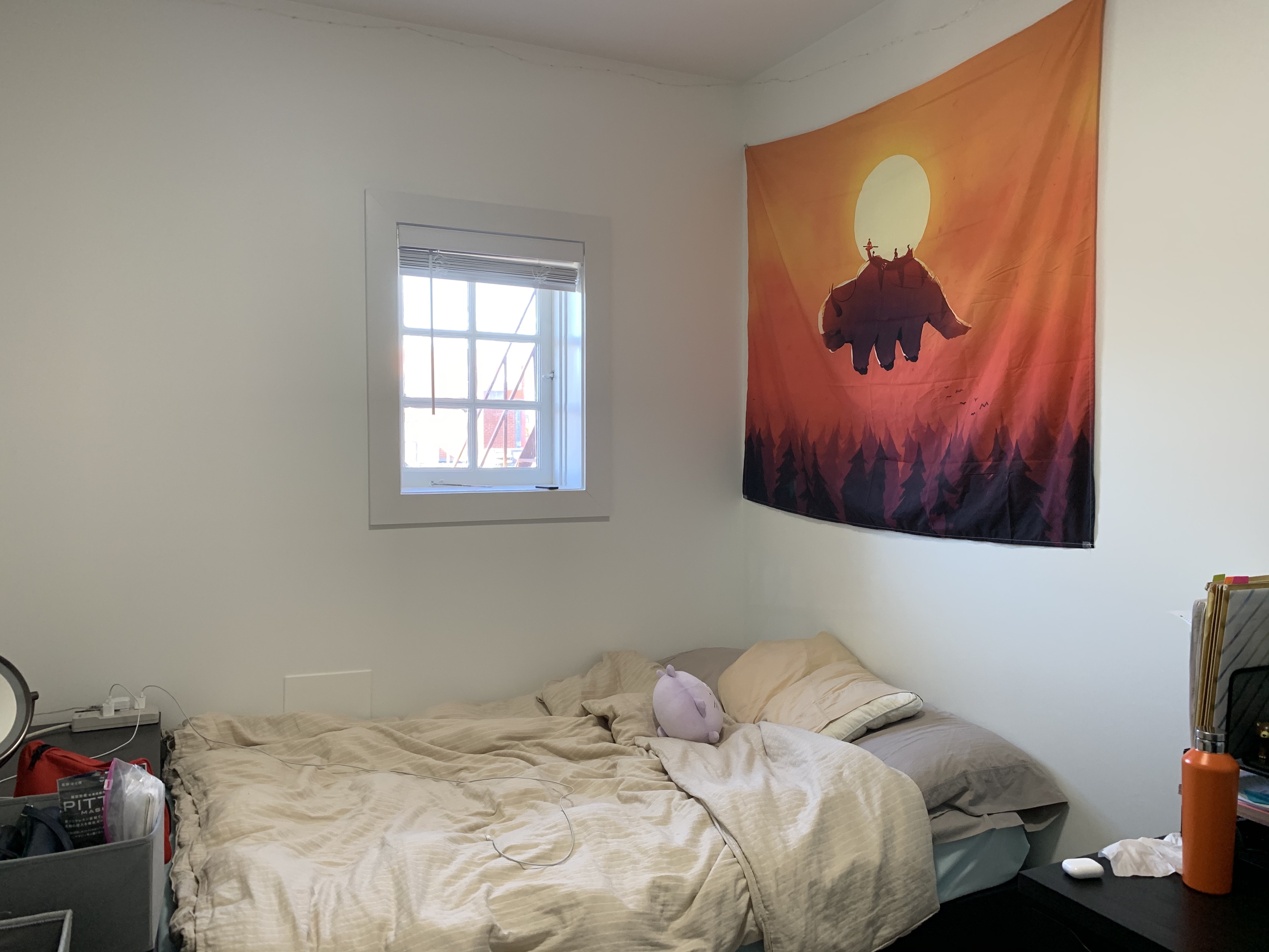
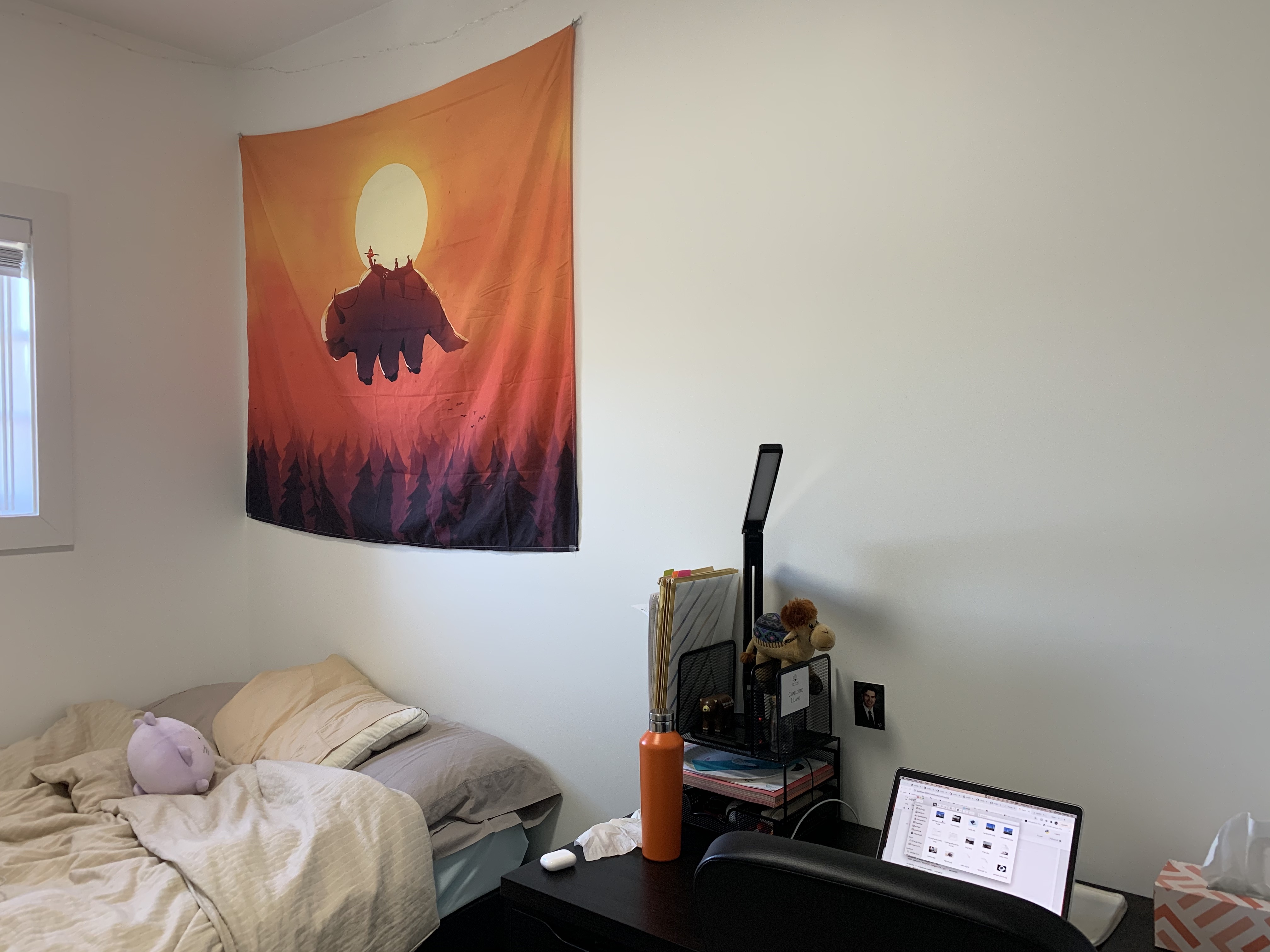
My Room
|
|

|
|
 Averaged Blending
|
 Max Blending
|
What I've Learned: Part A
The coolest thing from part A was that the distribution of the points really
matters. Seeing that my images were slightly unaligned at one
section of the image and being able to fix it completely by adding
only one point in that region was super cool.
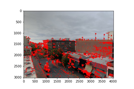
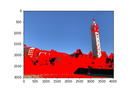
Part B1: Harris Corner Detector
First, I used the given code to use a Harris detector to
distinguish corners in each of my images that I was looking
to stitch together.
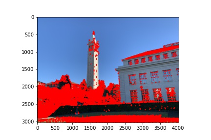
Part B2: Adaptive Non-Maximal Suppression
Since there are too many corners, as seen in the last figures,
I implemented adaptive non-maximal suppression to choose
specific corners that were evenly spaced throughout the image.
Now, there are fewer but evenly spaced out corners. I used
the 500 corners with the highest radiuses.
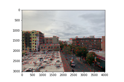
Part B3: Feature Matching
For the next part of the project, I created feature descriptors
by creating 40x40 pixel patches around each corner from my
ANMS function, and then downsizing them to a 8x8 pixel.
Creating descriptors for the two images I want to stitch together
allowed me to match the patches of each image by (for each
patch in image 1) finding the most similar patch in image 2.
My 1-NN / 2-NN ratio was 0.2. Here are the points that were
matched.
Part B4: RANSAC
After matching corner points based on their surrounding
patches, I performed RANSAC on the two images corresponding
points. I used around 1000 loops of RANSAC (choosing a random
sample of 4 points to create a homography and finding the
points that it accurately maps), found the homography that
created the highest number of accurately mapped points, and
used those correctly mapped points to create a
homography to warp my image. I ended up testing varying
epsilon thresholds between 0 and 20 and ultimately used
different thresholds for each mosaic. The higher thresholds
seemed to work better in my case. This section was particularly
difficult because of the padding I added in my warp and
computeH. I had to translate back and forth a lot between
padding and no padding. For part B, I did not include max
blending and instead only included average blending, which
unfortunately caused mildly sharp edges due to the automatic
lighting differences that my iPhone placed on the sky and walls.
Telegraph
 epsilon = 5
|
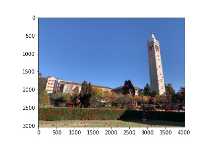
Campanile
 epsilon = 20
|
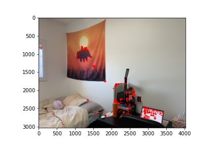
My Room
 epsilon = 10
|
As you can see from my results above, my Telegraph mosaic
worked very well with epsilon of 5. The only section of
the image it didn't look as good/better on was the Bill's
tent at the bottom. There weren't any matched corners
in the word Bill's, so my auto-stitcher didn't align
that section, while in my manual stitching, I placed a
key point in the word Bill. My campanile mosaic had
trouble aligning the top of the tower with all epsilons.
I tried 0.5, 5, 10, and 20 as my epsilon, and they looked
relatively similar, with the issue being the top of the tower.
This is because the tower is slightly rotated in the two
images, but we didn't implement rotations into our descriptors,
so my RANSAC didn't count any points on the tower as
matches. Thus, the tower is slightly blurry at the top,
as there were no corresponding points in that area.
For the room mosaic, I also tried epsilons of 0.5, 5, 10, and 20
and due to the issue of rotation, they all looked around the same, with not
many points were matched on my bed or my desk. Thus, my
desk is a little blurry in the final mosaic, since there
were no corresponding points in those areas.
What I've Learned: Part B
The coolest thing I learned from part B is that this thresholding
and mathematical procedure can get very accurate
points, despite not having been trained or manually
inputted. I think if I were able to combine this function
with some manual correspondences to even out the point
distribution, I think the mosaics would be close to perfect.