Project 1: Images of the Russian Empire
Colorizing the Prokudin-Gorskii photo collection
Aaron Sun 3033976755 Fall 2021
Project Overview
Sergei Prokudin-Gorskii, a photographer in the Russian Empire, set out to create a documentary of Russia aimed at educating children about the vast culture and landscape of the country. He gained permission from Tsar Nicholas II to document the empire, which he did from 1909 to 1915. He was among the first to promote color photography using 3 channels of colors. At the time, cameras were unable to take color photos, but he used colored filters (red, green, and blue) in order to take photos which could eventually be turned into colored photos.
Now, a portion of his images are saved by the US Library of Congress. Using some basic image processing, we will try to bring the past to life and colorize these century-old images.
Processing the Input
First off, let's look at one of our inputs.
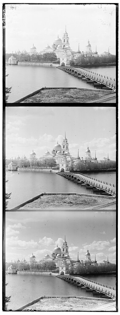
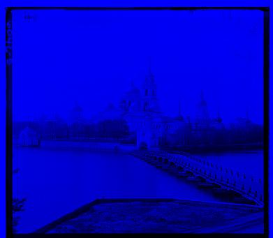
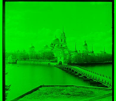
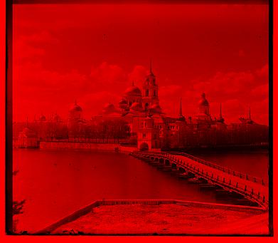
The three color channels have been combined into a single image. From top to bottom are the blue, green, and red channels. In order to work with these, we first need to get each individual channel. Luckily, we are able to split the image into the separate channel images quite simply. Since each image is the same size, we can split the image vertically in 3 in order to find each channel.
That went surprisingly well. Now how will we actually combine these images?
Single-Scale Alignment
The Main Idea
The first technique which we will use to align images is by comparing raw pixels. Since we observe the different channels are highly correlated, we expect that the "correct" alignment will result in the channels being very similar in value. Or at least, relative value.
The our procedure is as follows: we will choose a channel to align the other channels to. We chose green for reasons we will explain shortly. Then for the red and blue channels, we looped over a range of possible shifts dx, dy of [-20, 20]. For each dx, dy, we translated the image of the other channel, and calculated a metric to indicate how good the fit is.
We used the L2 norm as a metric, which is simply the sum of the squares of the differences of each pixel. We also tested using the normalized cross-correlation as a metric, but observed that this gave not as good results. In the case of the L2 norm, we want the metric to be as small as possible for the best fit.
Finally, by taking the translations with the best fit score we find our alignment.
Minor Adjustments
We see that our image still isn't perfect. Doing a small amount of extra processing before running our alignment algorithm will achieve better results.
First, we must acknowledge that the color channels may be correlated, but can differ signifcantly in absolute magnitude. However, we can take steps to account for this. In order to ignore the effects of differences between channels due to brightness or other effects, we first normalized the two images. We did this by subtracting the mean and then dividing by the standard deviation of the image.
In addition, we also should note the impact of the border on our alignment process. Clearly, each channel has a different border which is unrelated to the actual image. This border comes from the fact that the images are scanned negatives. We want to ignore these borders, so we crop the image on the edges by 20 percent. This way the center of the image is preserved and we can ignore these edge effects. We cropped 20 percent of each edge to make sure any edge artifacts were eliminated. Also as a bonus, the algorithm runs more quickly! Life is better when things run more quickly.
Multi-scale Alignment
So far, we've been focusing on low resolution images which are less than 500 pixels in each dimension. For that reason, it's easy for us to align the images by searching over a range of displacements in [-20, 20]. But what if we had a large image, such that the optimal displacement fell outside this range? We could increase the range of our search, but this would severely hamper our runtime as the image size increases.
Rather, we can combat this problem with a more robust solution: image pyramid. An image pyramid is a term used to describe an image and a set of downscaled versions of the image. The pyramid comes from the decreasing size of each subsequent layer. So the bottom layer is the original image, the second layer is downsampled so each side is half the length of the original, the next is one-fourth, and so on.
We can use a pyramid in order to derease the range we search. Suppose we find for a image scaled down by 2 that the ideal translation in the x-axis is 8. Then when we consider the original image, given our previous result was correct, the ideal translation must lie between 14 and 18, as these translations are the finer details which we missed in the downsampled version.
We use this logic and repeat this structure, such that we can make the image as small as we want and then make the image larger and larger with our estimate becoming more and more precise. This allows us to operate on much larger images. While in theory the runtime is still around O(n^2) since we need to run our L2 metric on the original image, it "feels" more like O(log n) since we only have to look at a few pixels on half the image, a one-fourth of the image, etc.
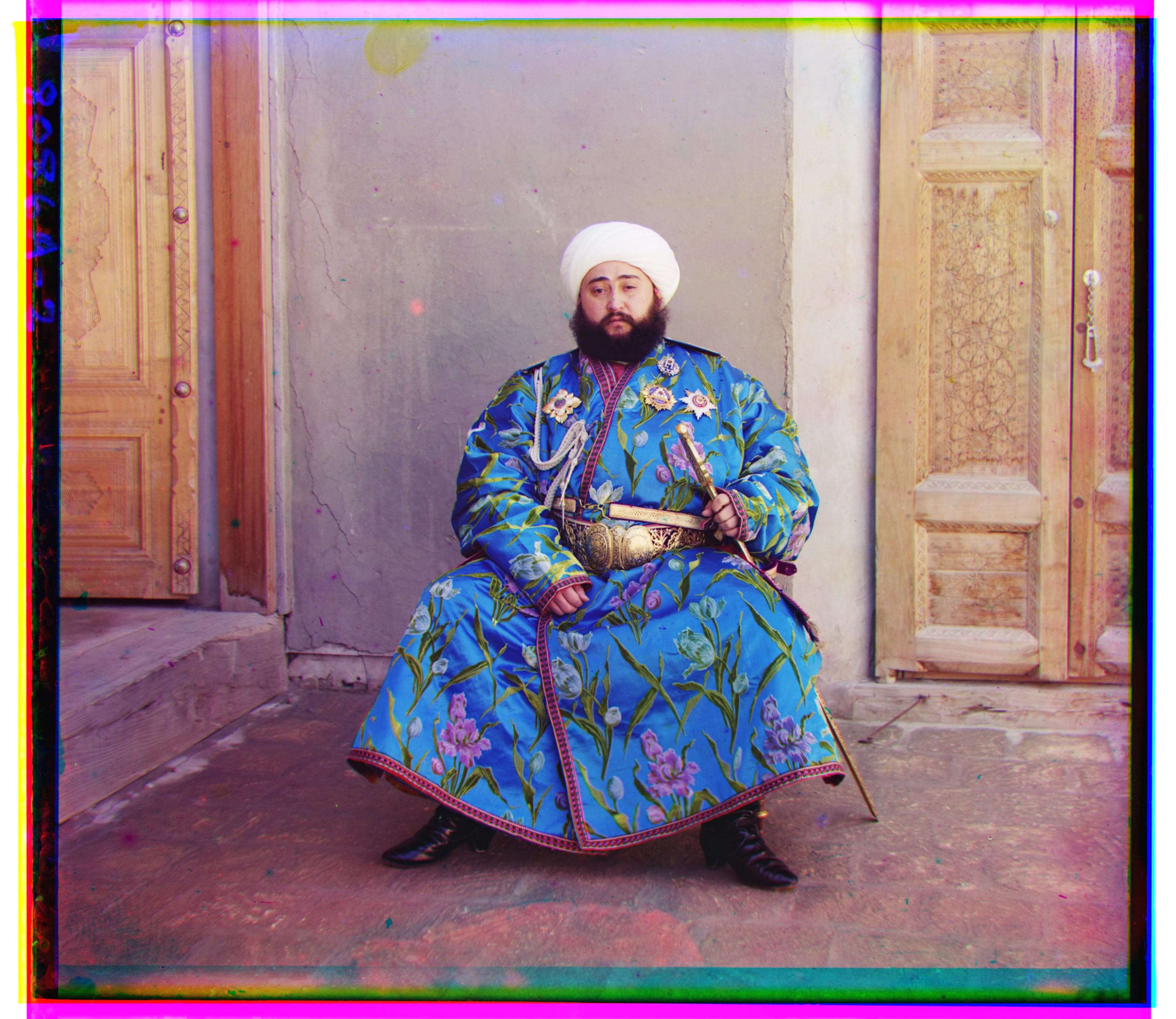
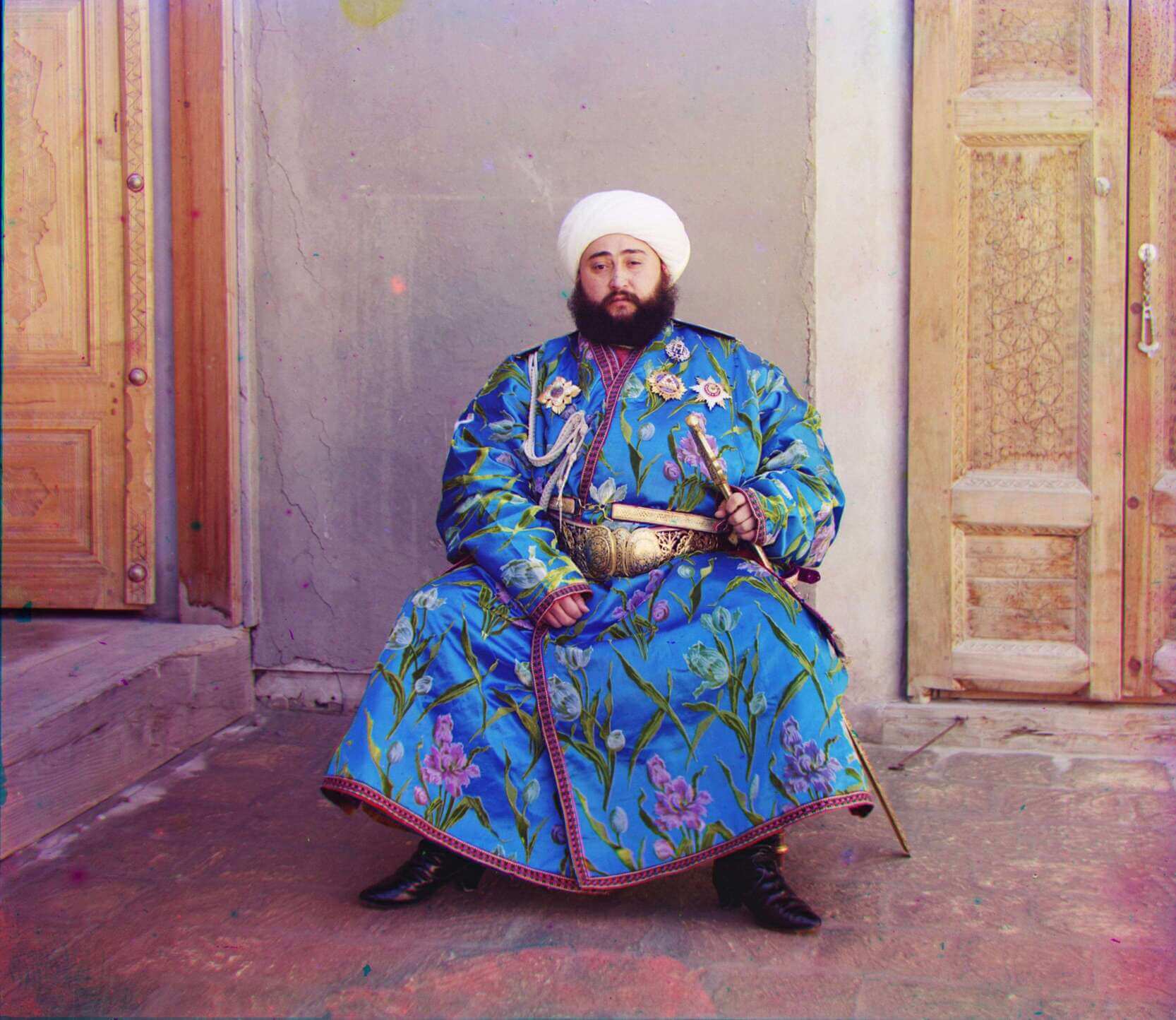
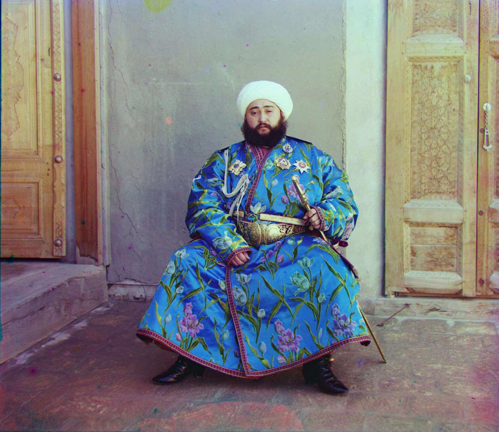
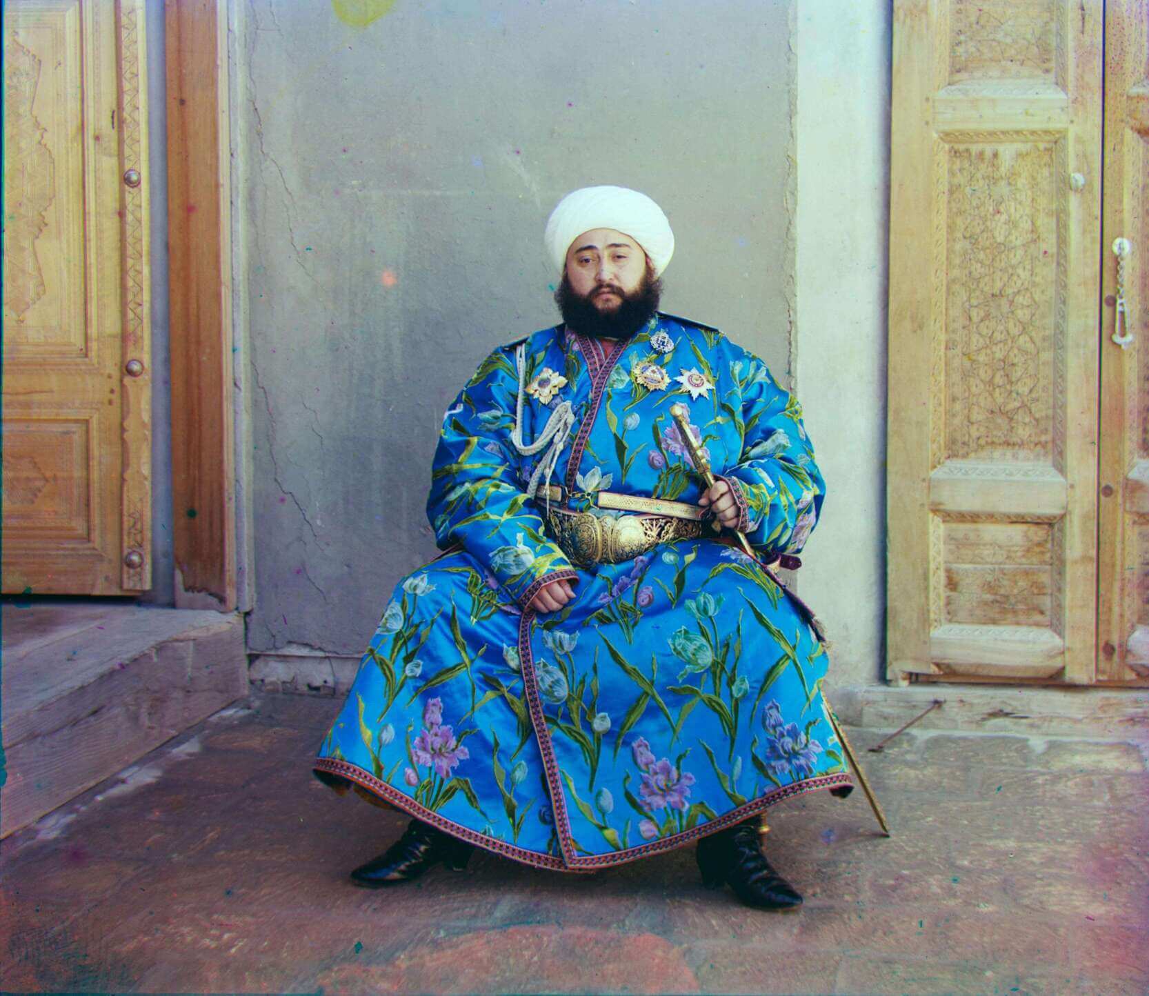
A Note About Emir
I just spent a lovely afternoon with Emir. Emir ruled over an autonomous city-state in 1911 when his photo was taken by Sergei Prokudin-Gorskii. For some reason, when aligning using the blue channel as a base which I was intially doing, this comes out:
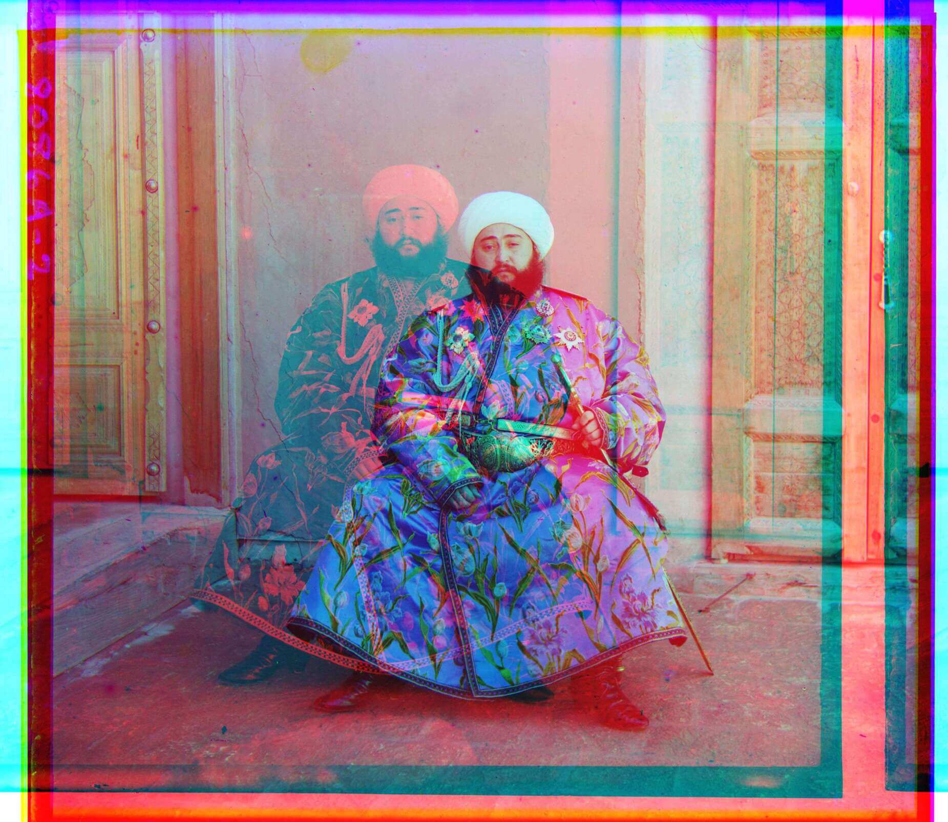
Apparently, Emir has lost all attachments to this earth and is moving on to the spectral realm. Well after some tinkering, I found out that using the green channel as a base channel fixes this problem completely. It's not immediately clear why this is the case - possibly this image just has a strange interaction between the red and blue channels. Here's the fixed version:
Further Improvements (Bells and Whistles)
Clearly, these images could use some improvements. Let's look at some ways we explored improving these images.
Cropping Borders
The most obvious fix we can implement is cropping the weird artifacts on the borders. Since most of our images are consistently sized and has similar borders, we choose a fixed 5 percent crop on the borders.
White Balancing
Next, we implemented automatic white balancing in order to fix some of the colors in our images. We actually ran into a few problems when trying to implement this.
Our first attempt was setting brightest pixel (as defined in grayscale) in the image to be defined as white. However, this led to some trouble for dimmer images. When the brightest color is not very bright, setting that color to white can lead to the photo becoming too bright.
Then we tried instead to find the average color over the entire image, and set that image equal to gray (given by 128 in each channel). Once again, this had issues for the intensity of the image. We saw brighter photos being naturally darkened by this process, an effect which we want to generally avoid.
Clearly, these problems come from the fact that balancing in RGB space leads to intensity changes in the image. We end up making dim images brighter and brighter images dimmer. To circumvent this, we switched instead to CIE l*a*b space, which has a separate luminance (L) channel and two color channels (a and b).
Then we can use a similar process to before by finding the average color (in only the a and b channel) and then setting that equal to gray.
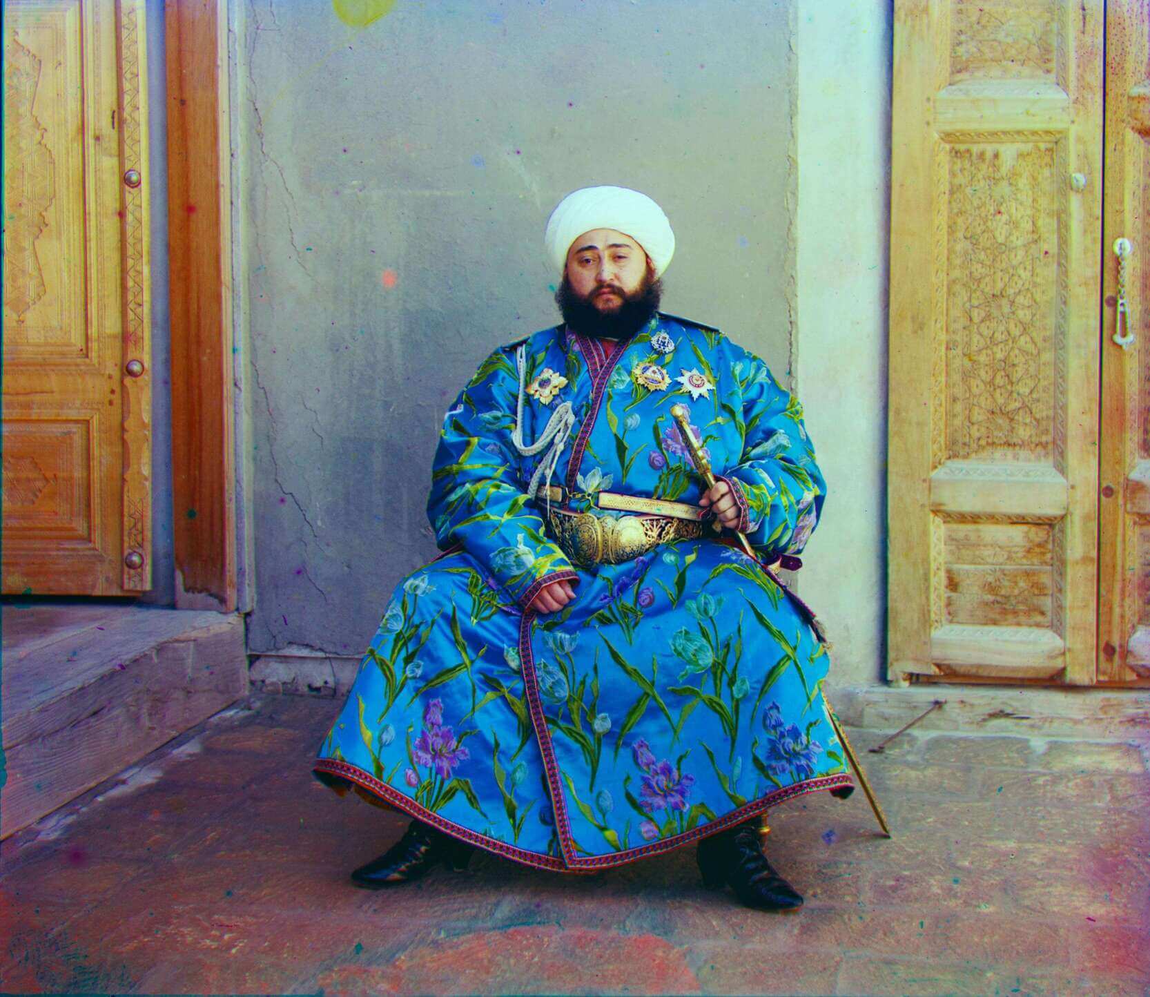
Saturation and Contrast
Looking one more time at the photo of Emir, we see that it's somewhat lacking in pop factor and looks a bit faded. We can fix this by increasing the saturation of the image.
Increasing saturation is a cinch in the HSV (hue, saturation, value) space. We can just increase the saturation value by a set factor. Toying around with the factor eventually led us to increase the saturation on each image by 1.5.
We have a similar effect for the photo of Sergei Prokudin-Gorskii, the man himself. His photo just is a bit faded somehow - particularly, everything looks a bit dull.
We can touch this up a bit with some contrast. To increase contrast, we map the pixels below a certain value in intensity to black and above a certain intensity to white. Then we have a linear mapping in between those ranges. This means our darker colors become even darker while our lighter colors become brighter. Once again, this transformation is much more simple in the L*a*b space.
Final Images
Looking at the post-processed images, it's clear that some of them turned out better than others. Whenever I tweaked the settings of contrast/saturation/AWB, I found some images became better while others became worse. This is probably inevitable - our current operations are too simple to work smoothly on all cases. Regardless, I think it's quite neat what we started from (an image of 3 channels) to what we ended up making.
| Image Name | Aligned Image | Processed Image | Blue (dx, dy) | Red (dx, dy) |
|---|---|---|---|---|
| cathedral.jpg | 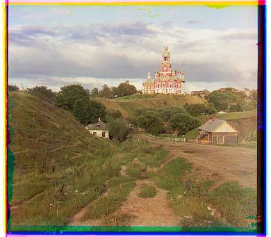 |
 |
Blue (-5, -2) | Red (7, 1) |
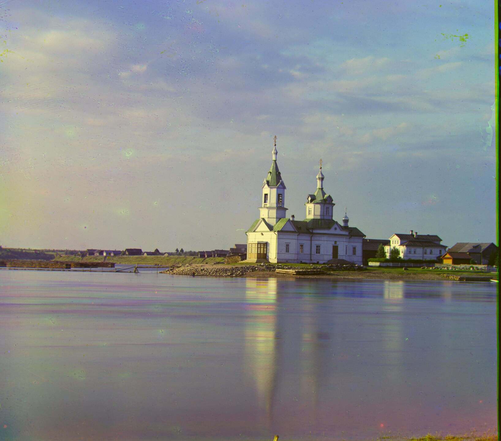
| church.tif | 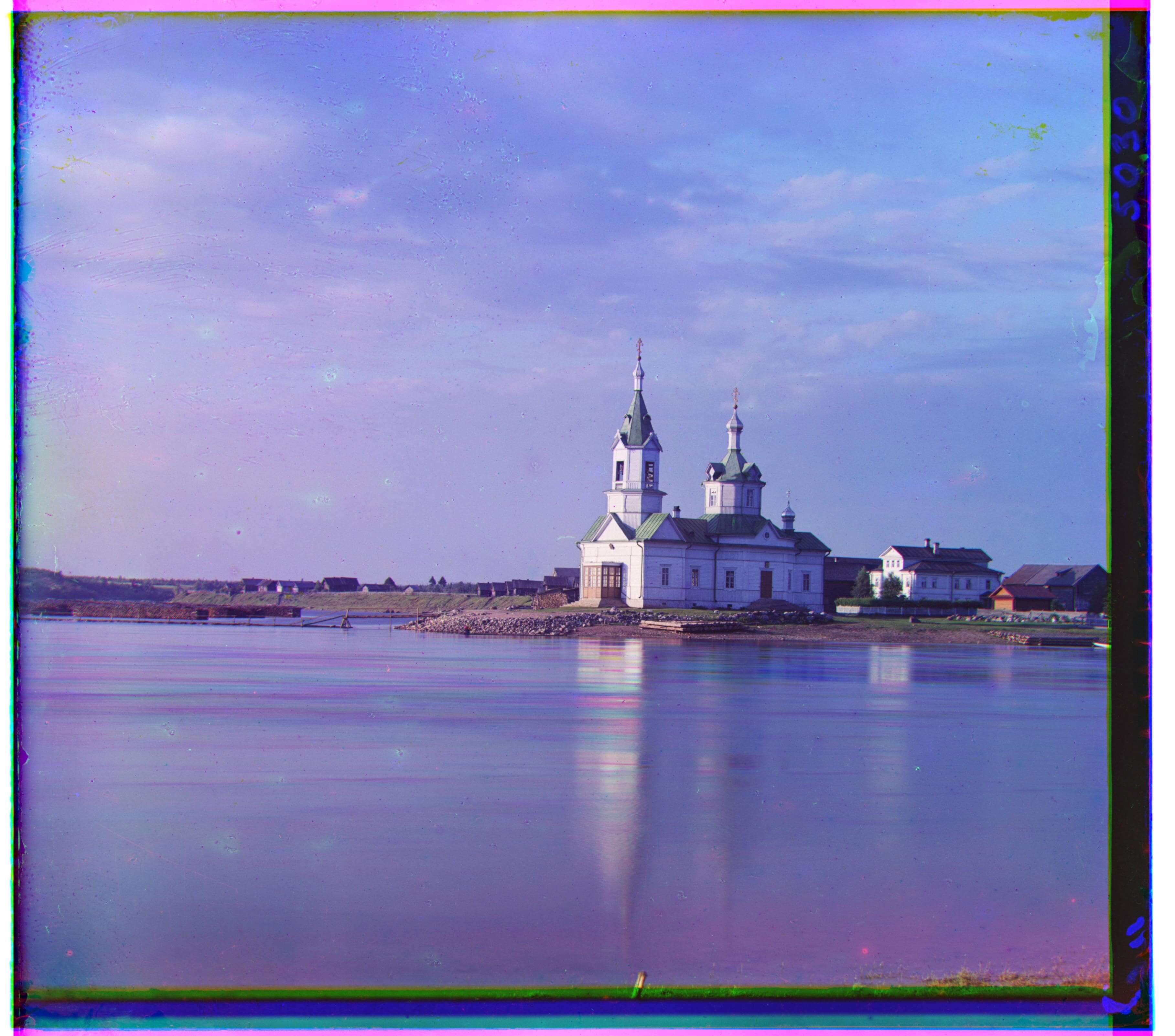 |
 |
Blue (-25, -4) | Red (33, -8) |
| emir.tif | |
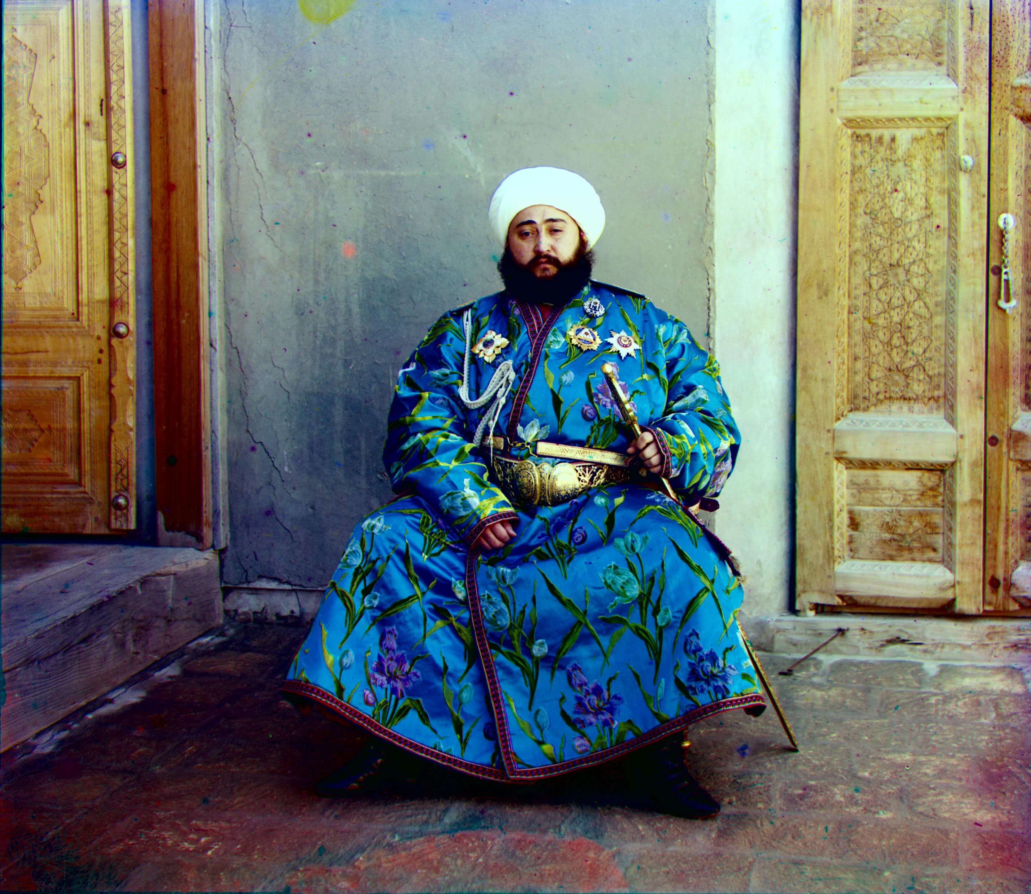 |
Blue (-49, -24) | Red (57, 17) |
| harvesters.tif | 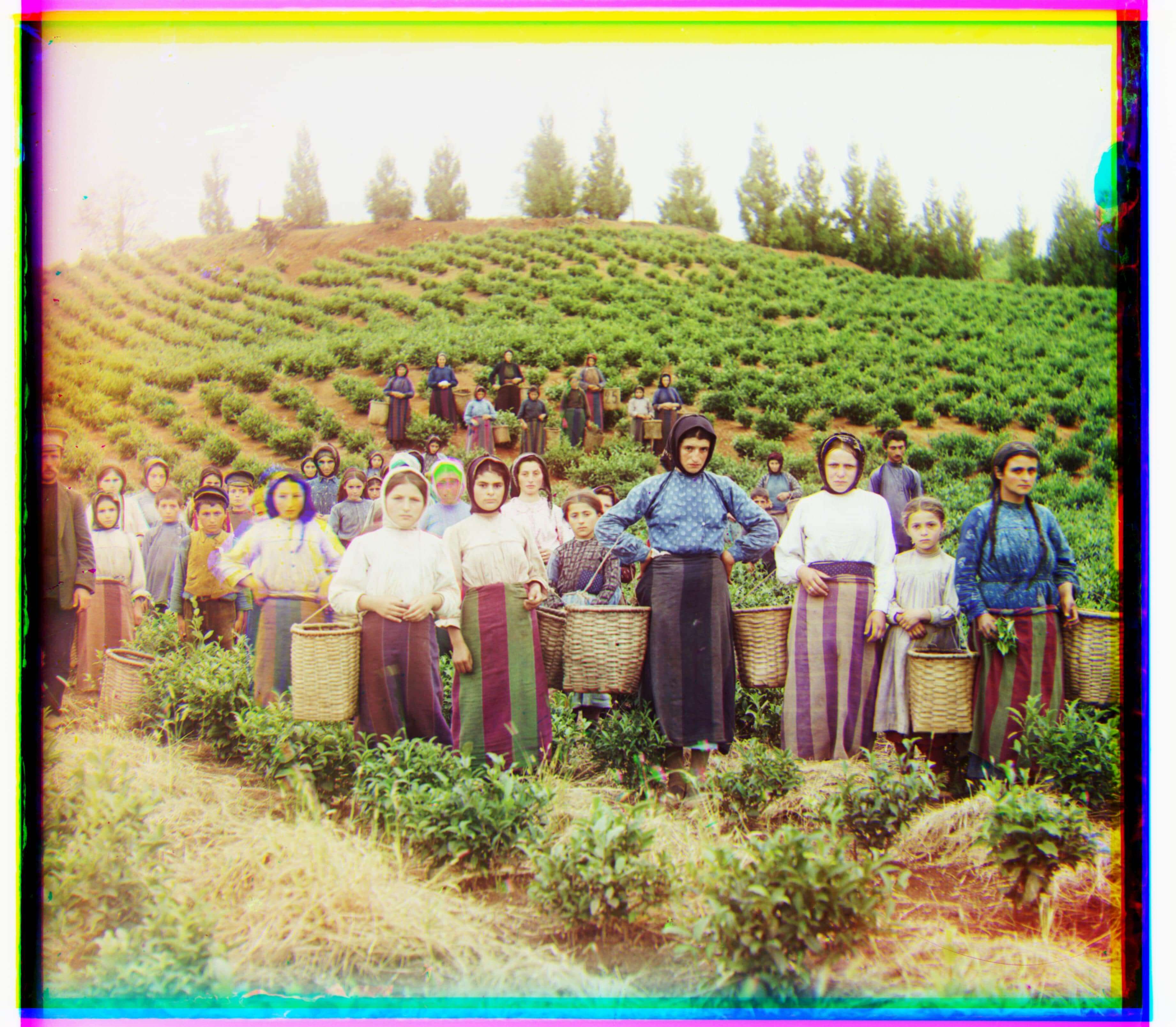 |
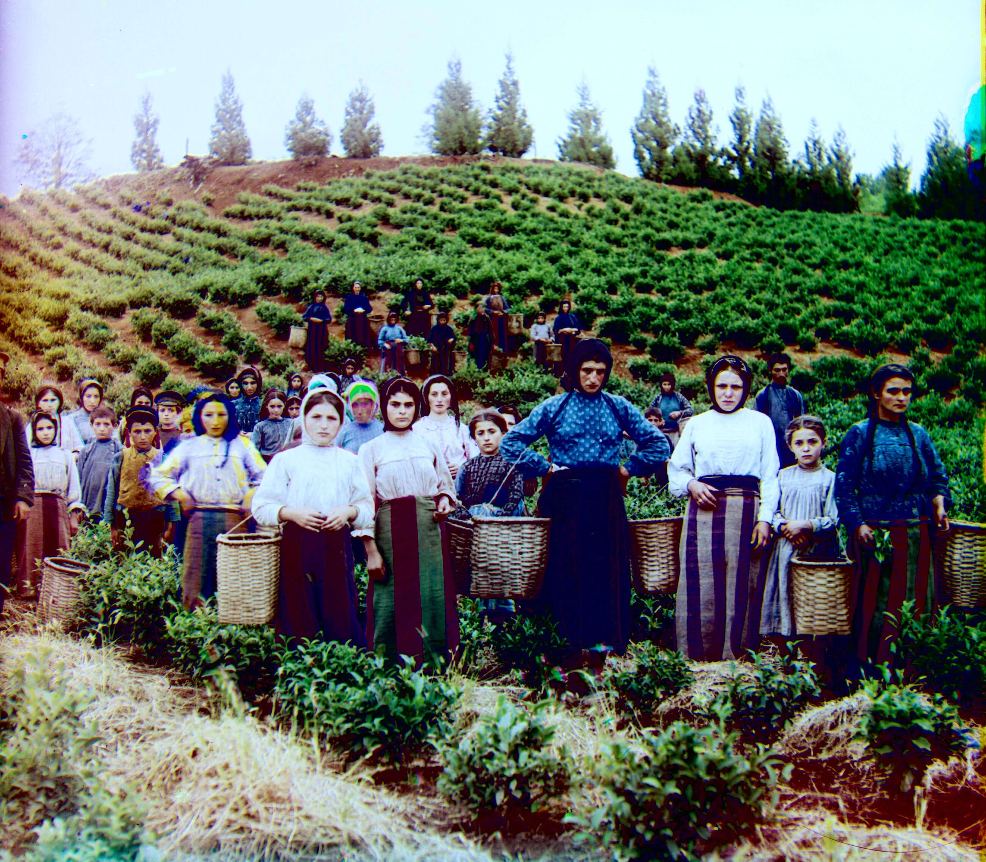 |
Blue (-59, -17) | Red (65, -3) |
| icon.tif | Blue (-40, -17) | Red (48, 5) | ||
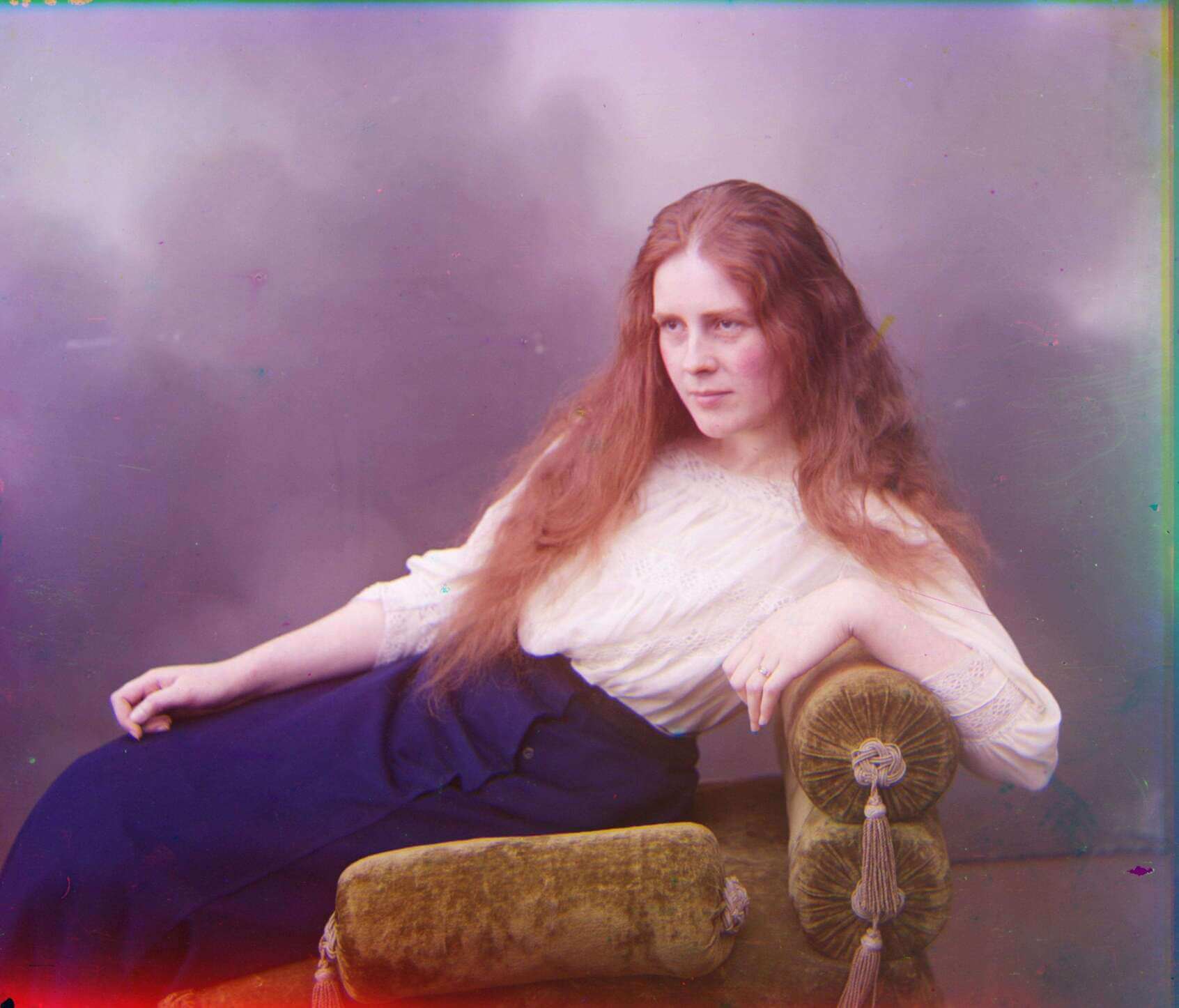
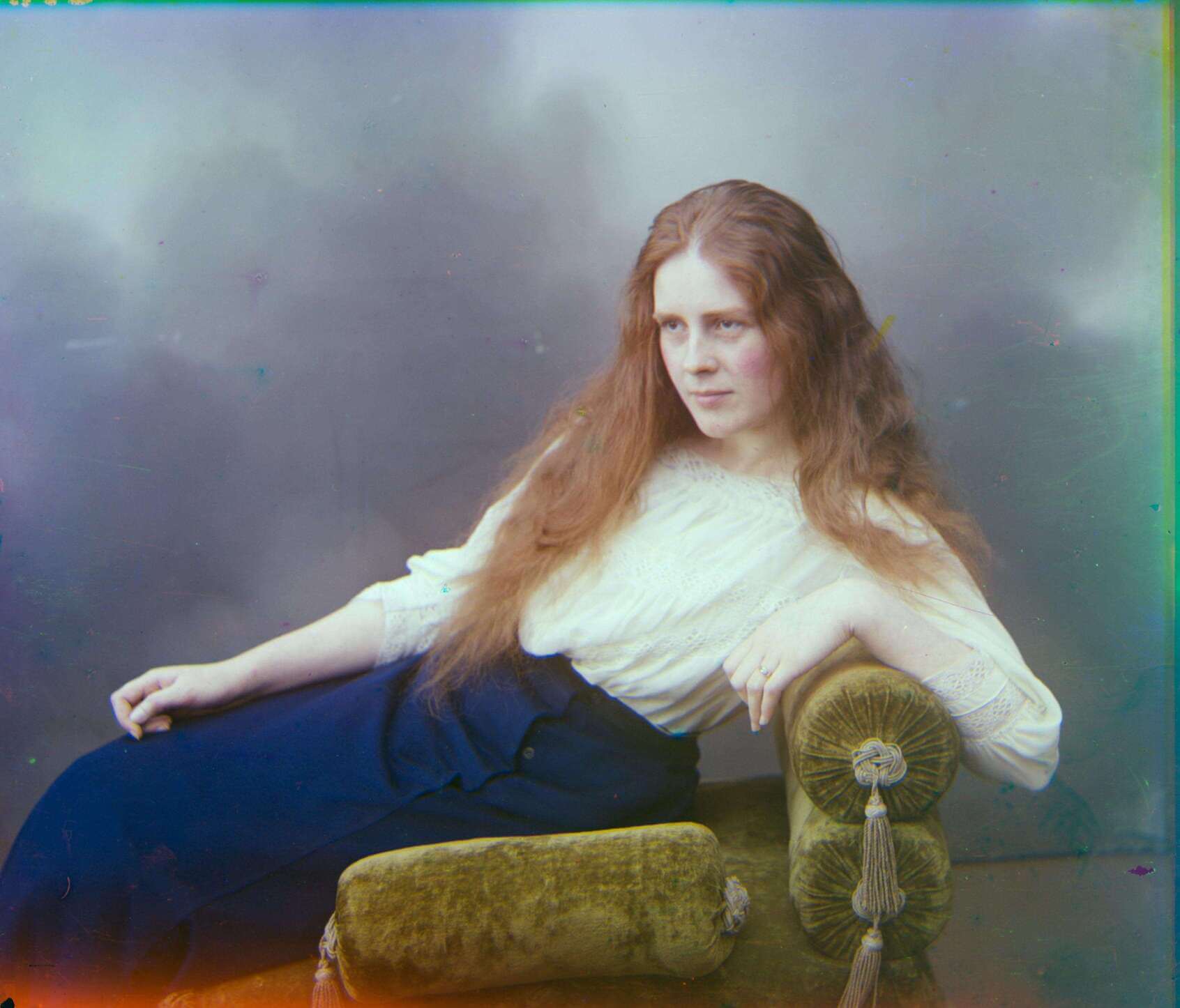
| lady.tif | 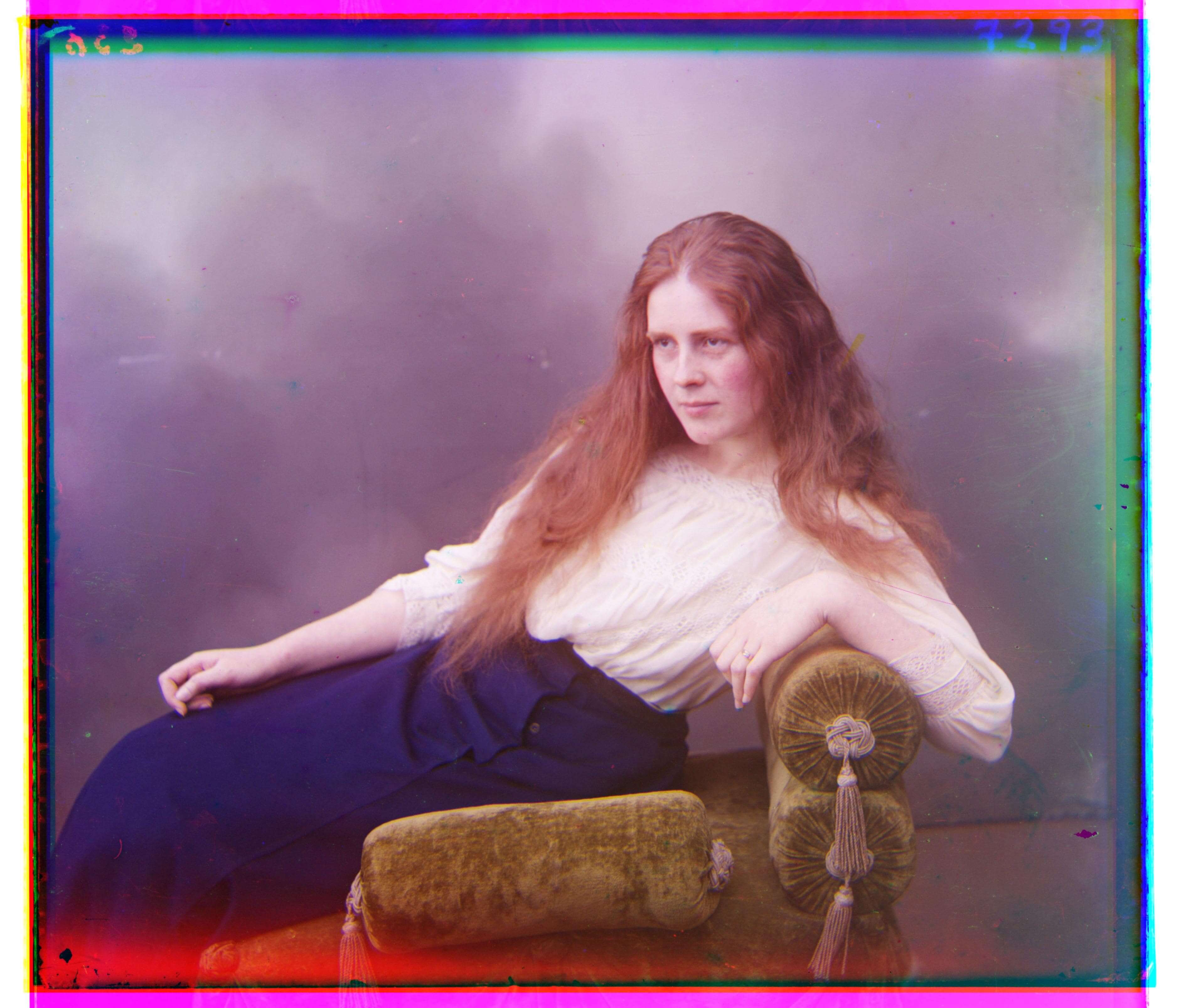 |
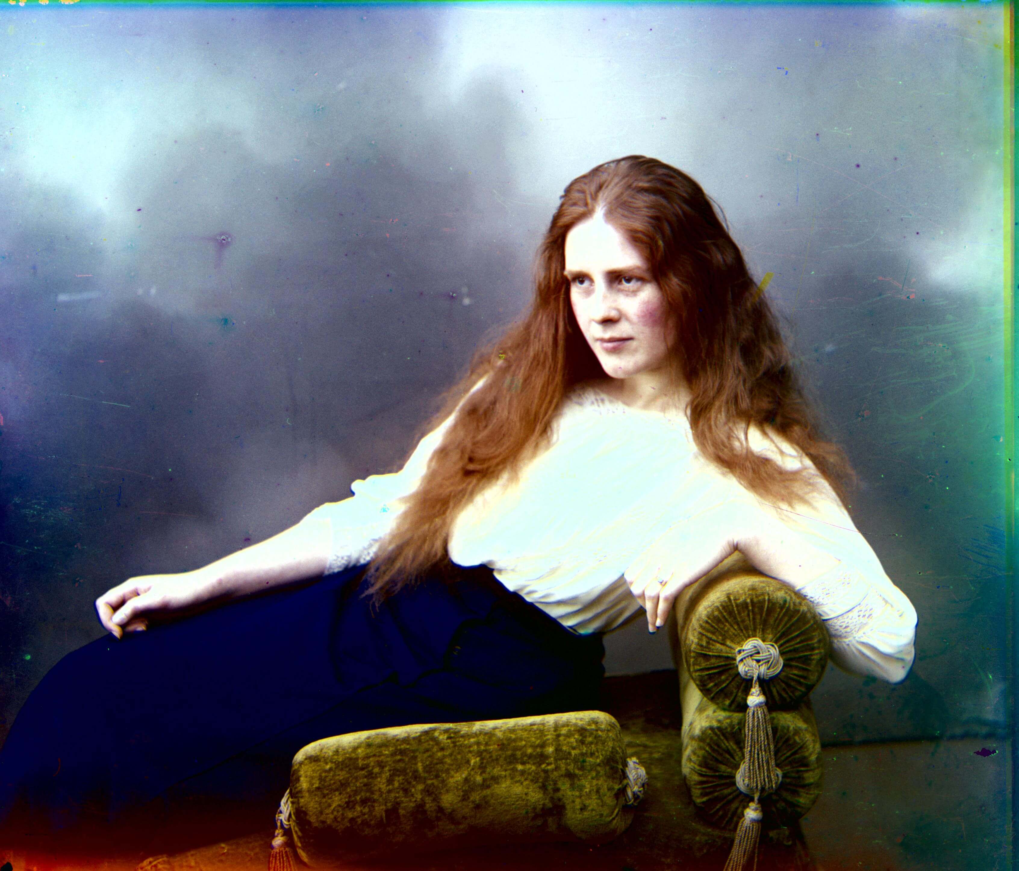 |
Blue (-49, -8) | Red (61, 3) |
| melons.tif | 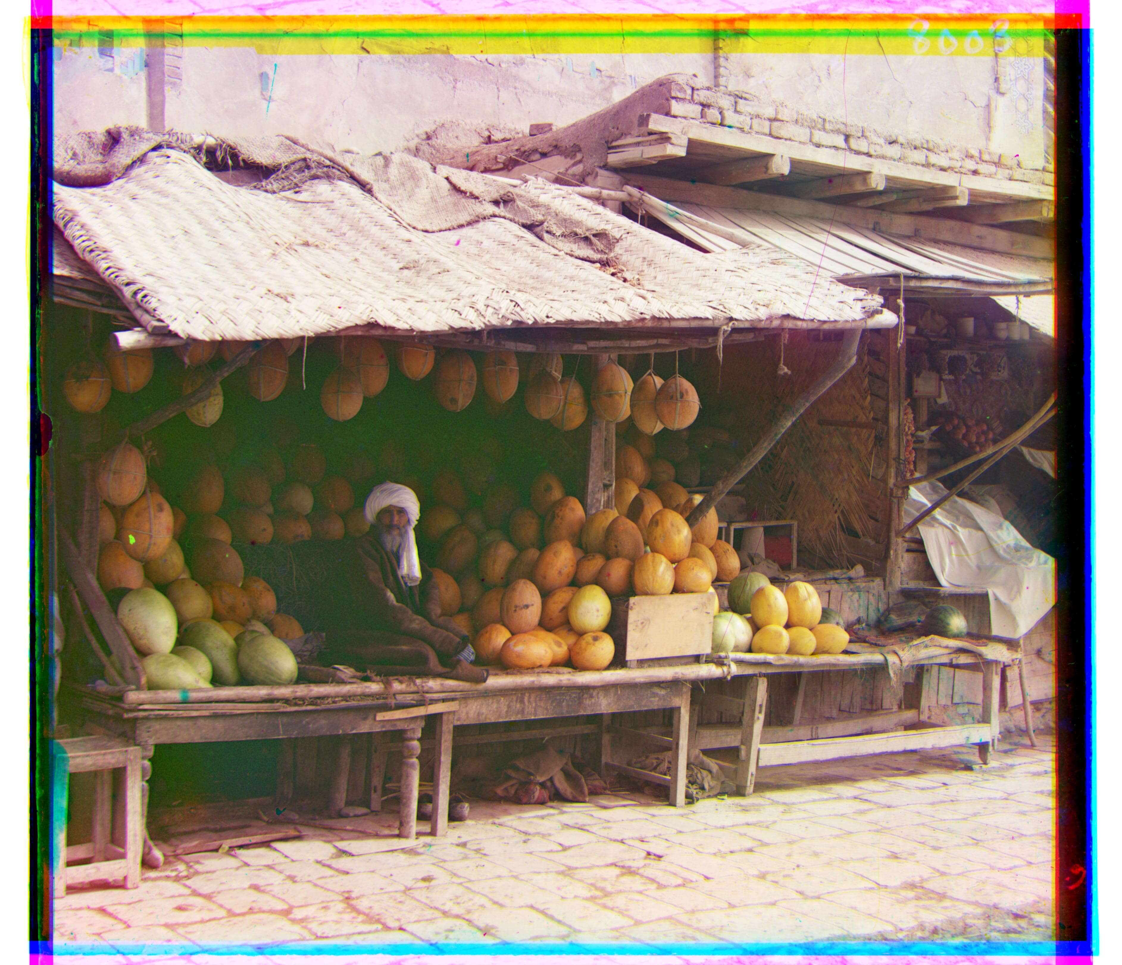 |
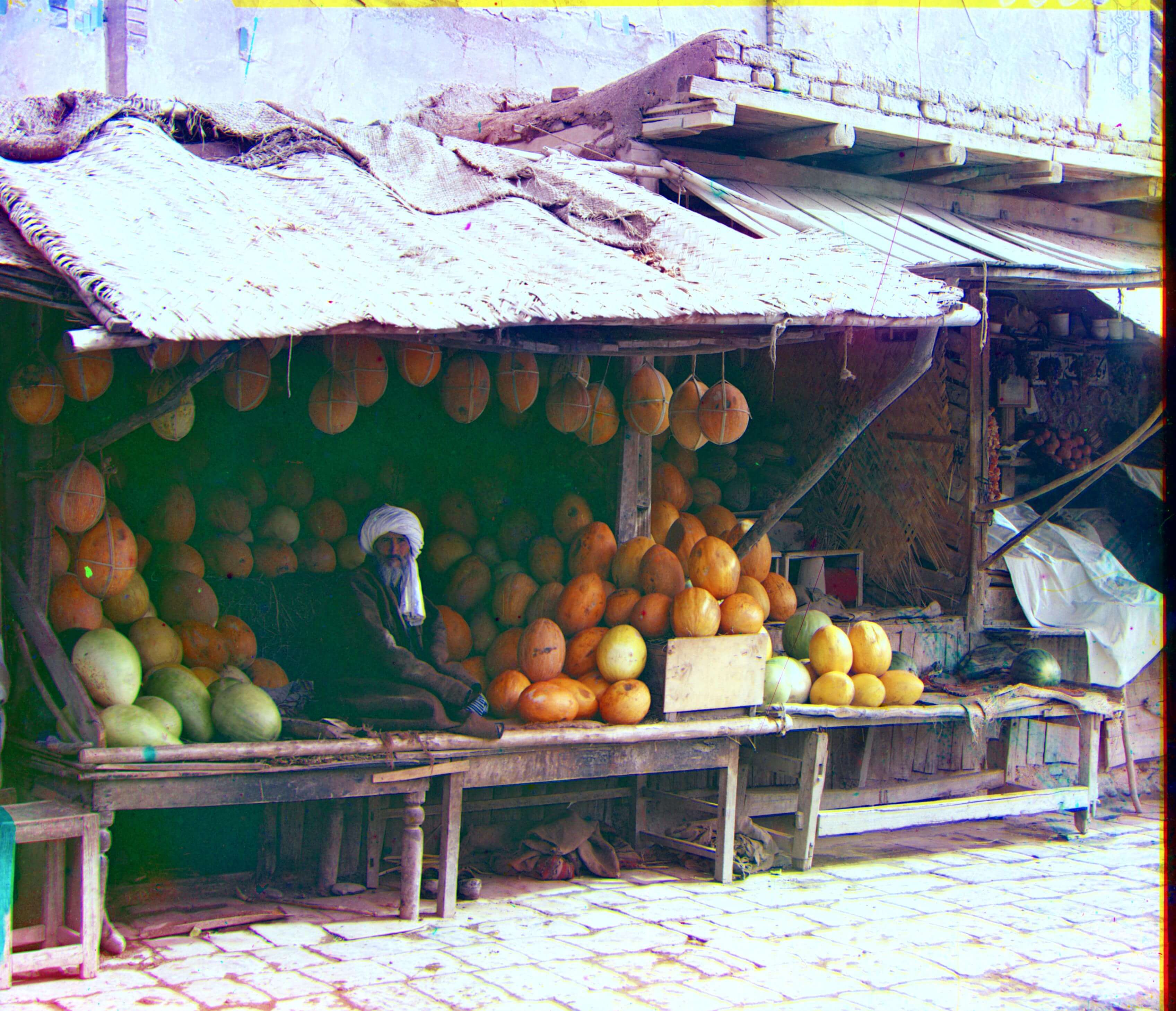 |
Blue (-81, -10) | Red (96, 3) |
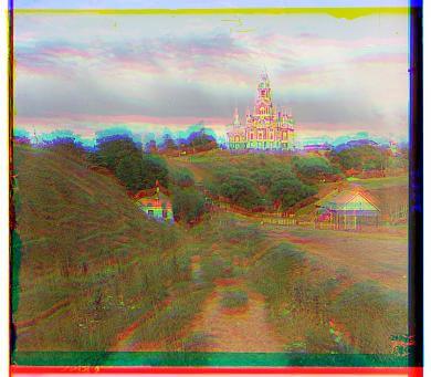
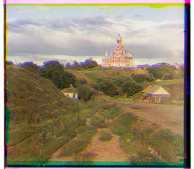
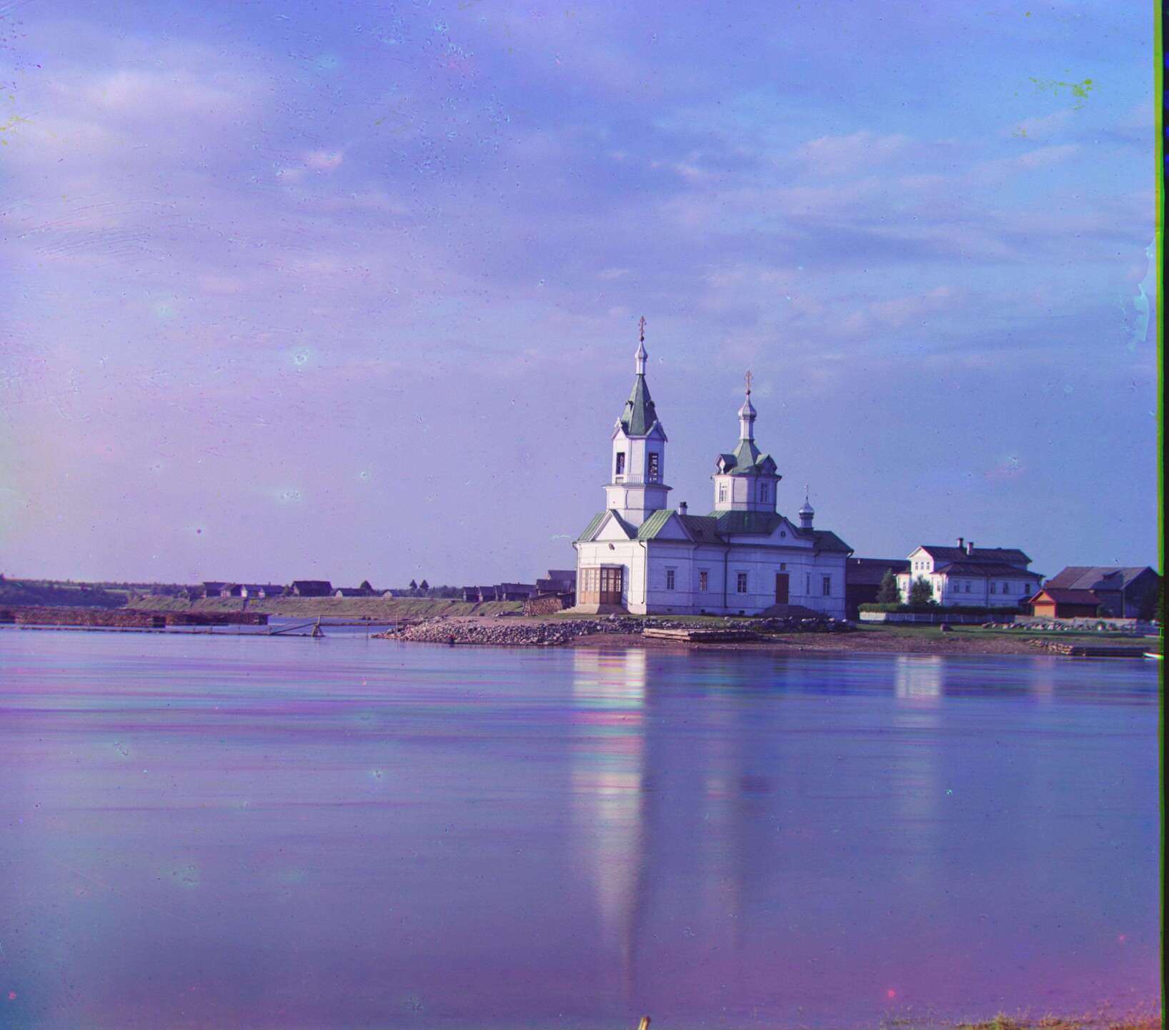
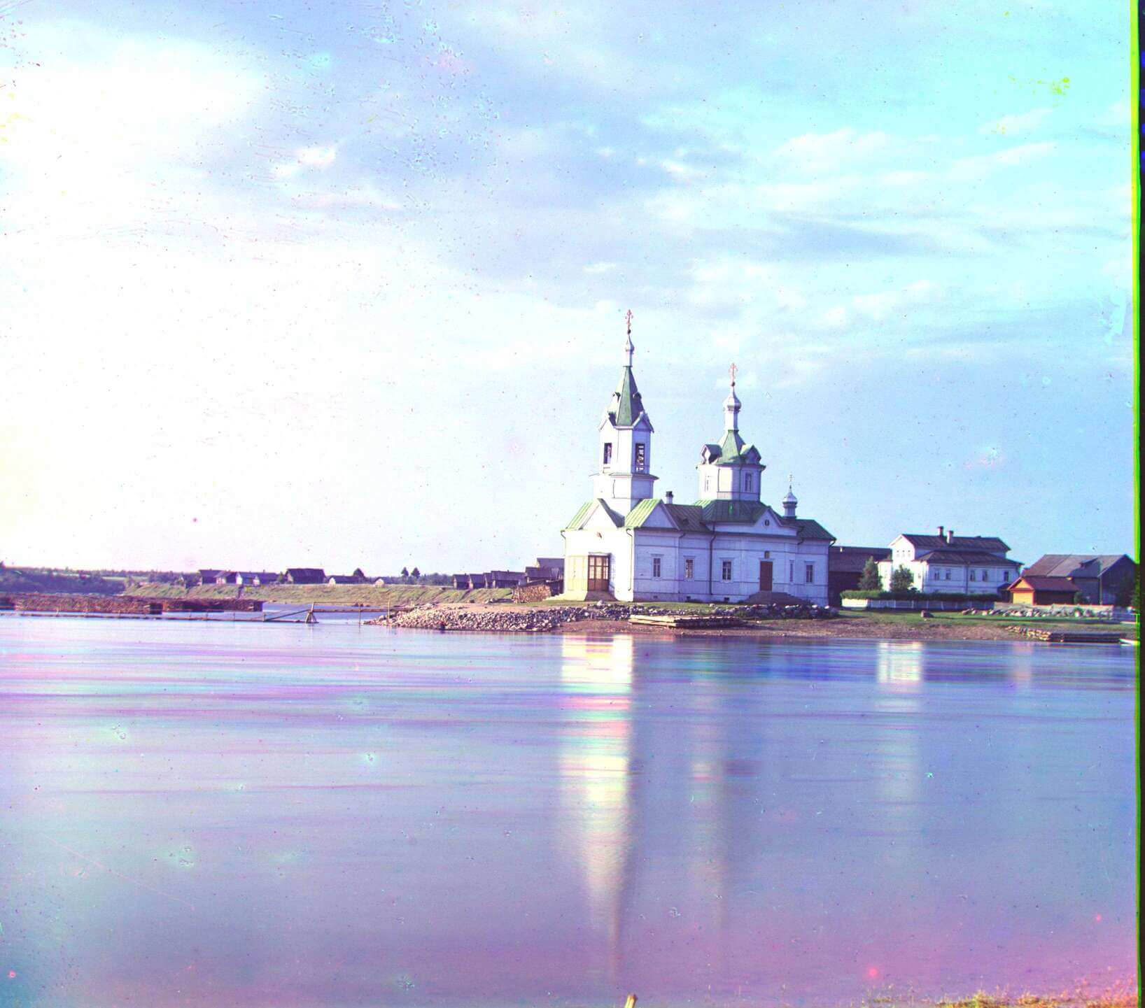
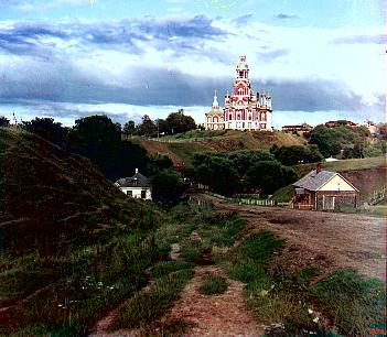
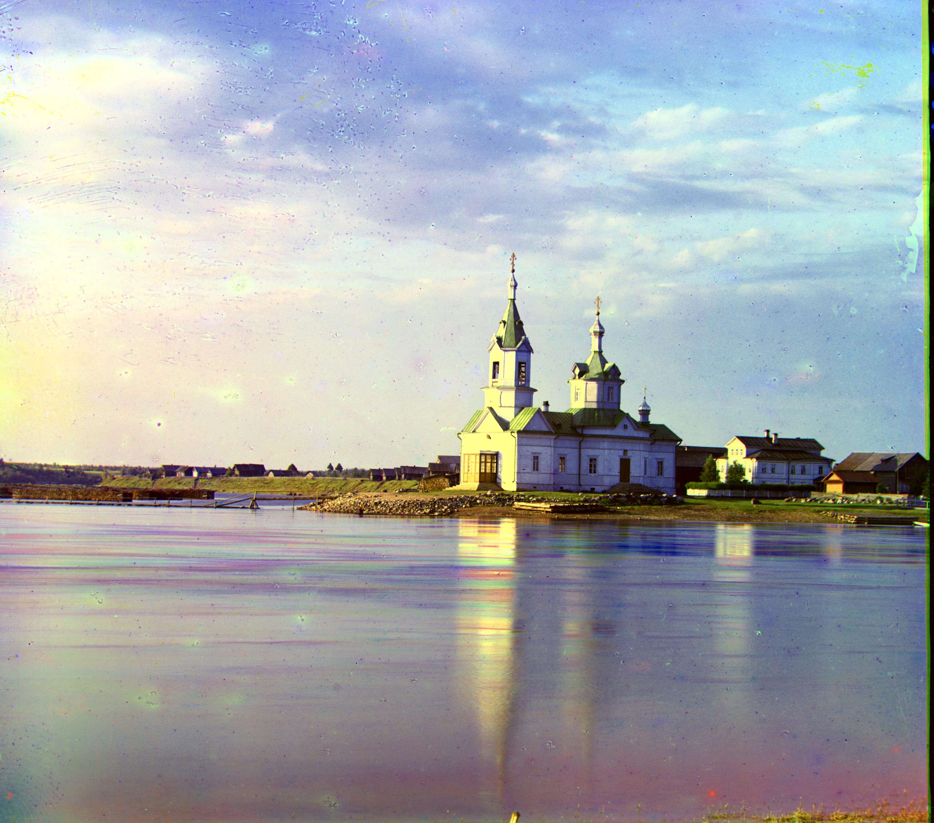
| monastery.jpg | 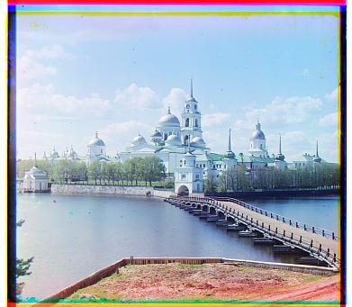 |
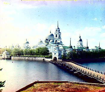 |
Blue (3, -2) | Red (6, 1) |
| onion_church.tif | 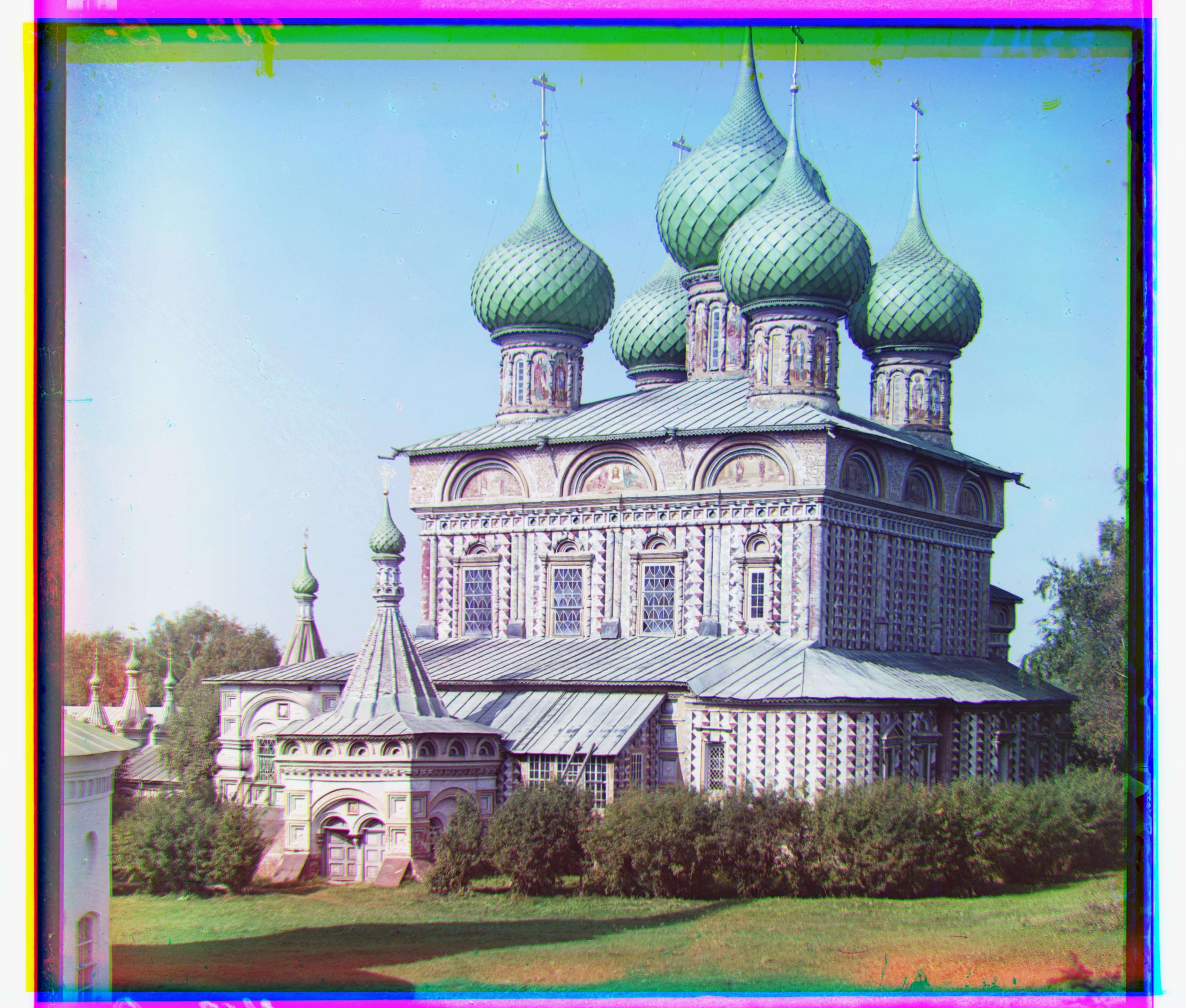 |
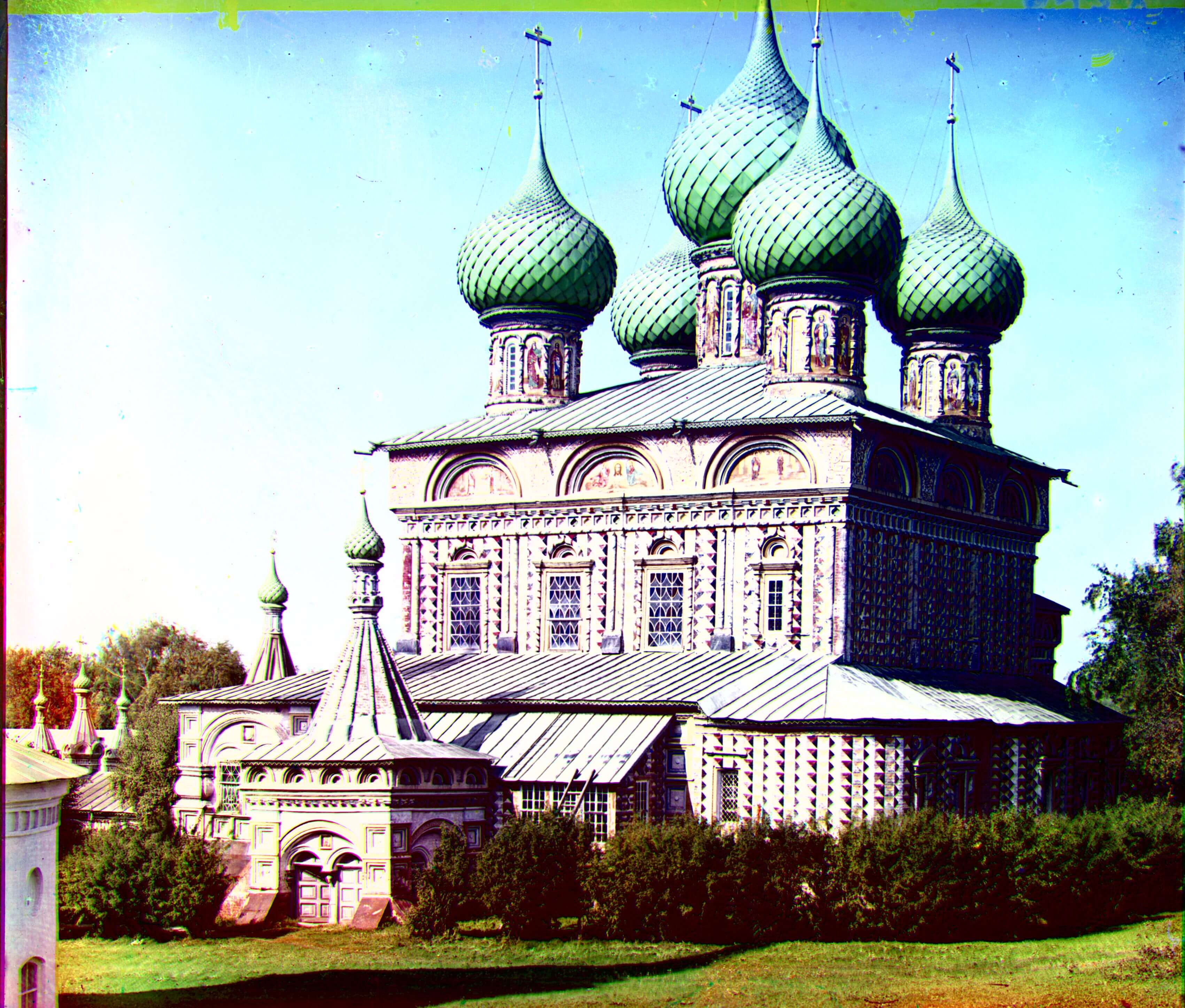 |
Blue (-51, -26) | Red (57, 10) |
| self_portrait.tif | 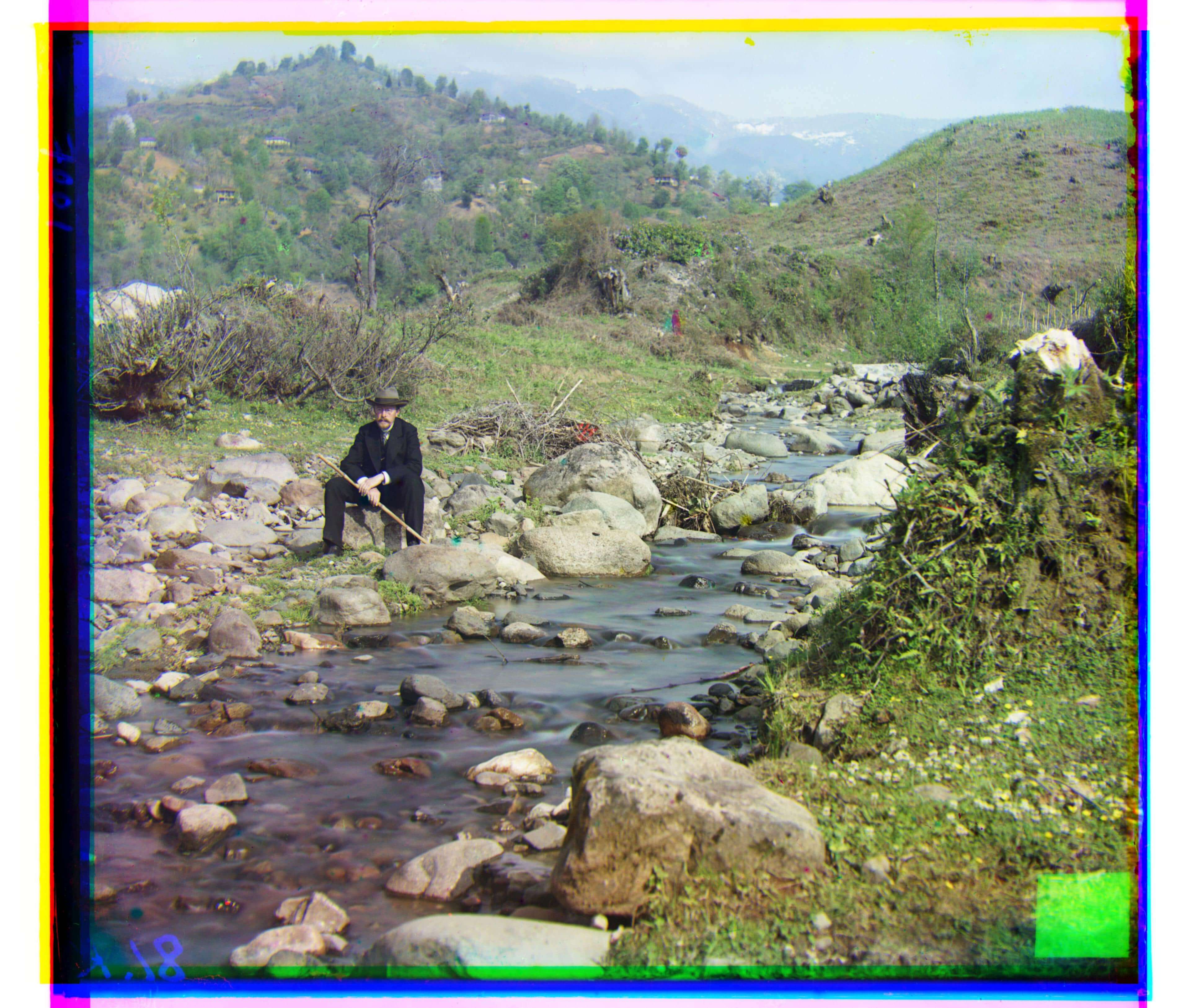 |
|
Blue (-78, -29) | Red (98, 8) |
| three_generations.tif | 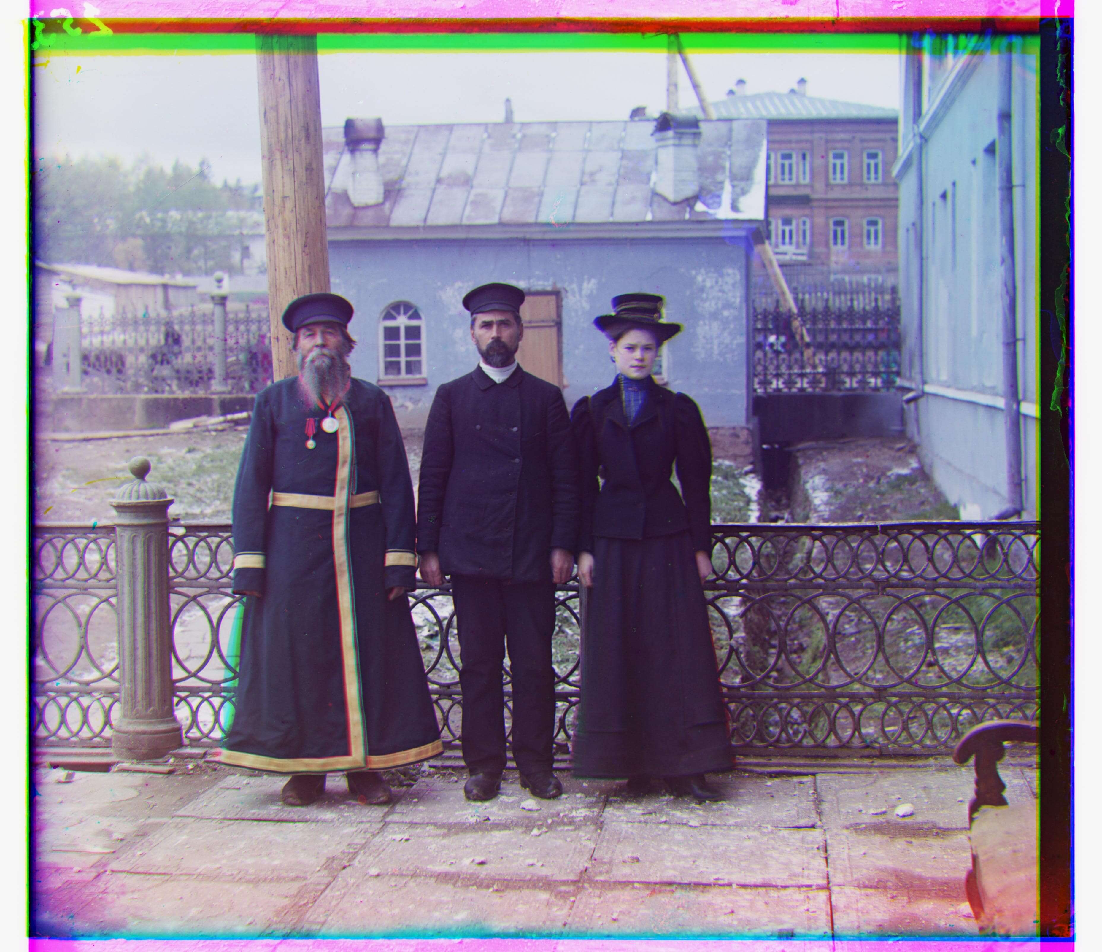 |
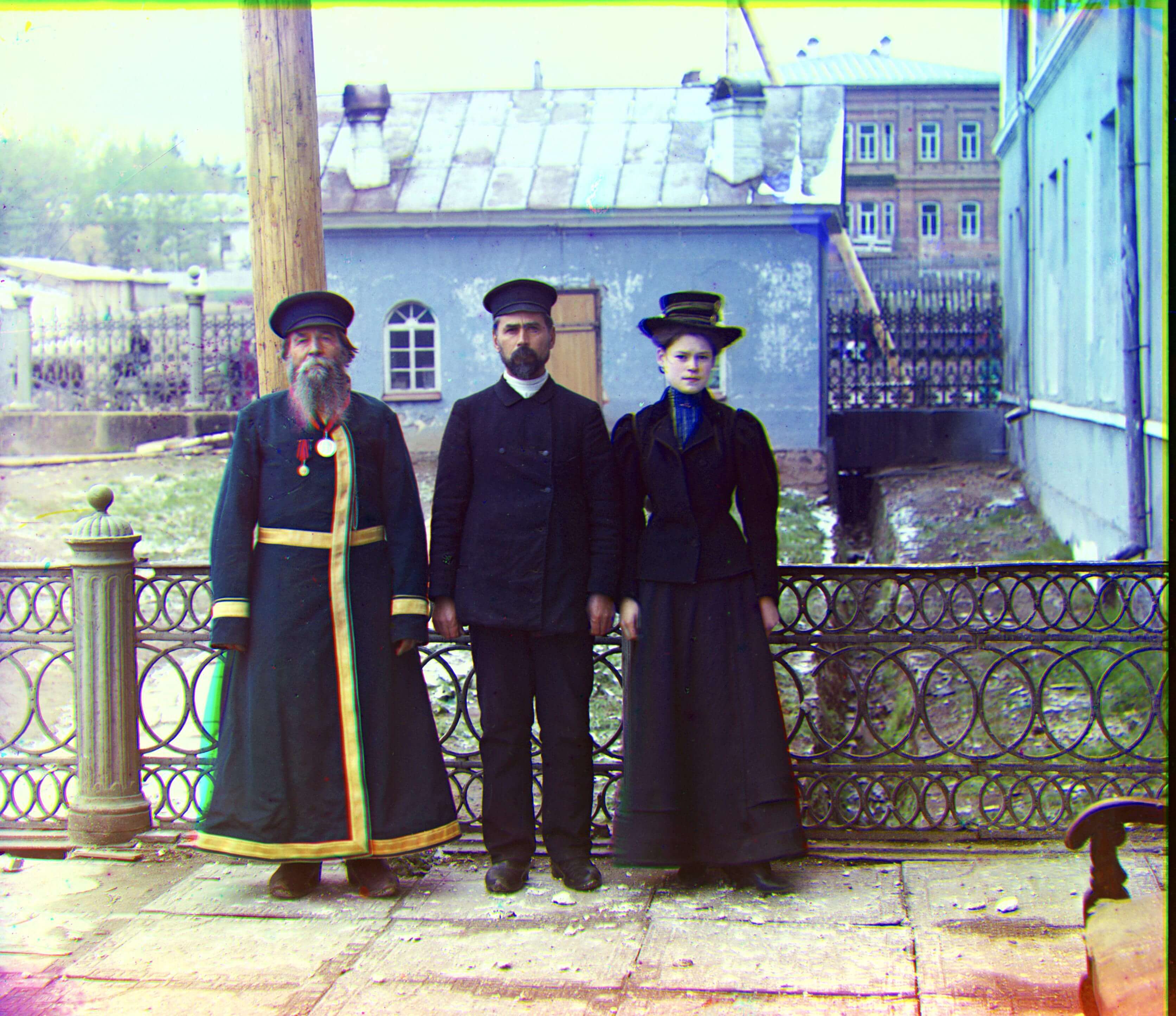 |
Blue (-50, -14) | Red (59, -3) |
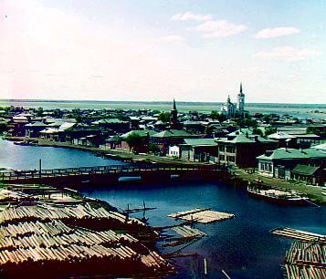
| tobolsk.jpg | 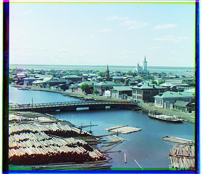 |
 |
Blue (-3, -3) | Red (4, 1) |
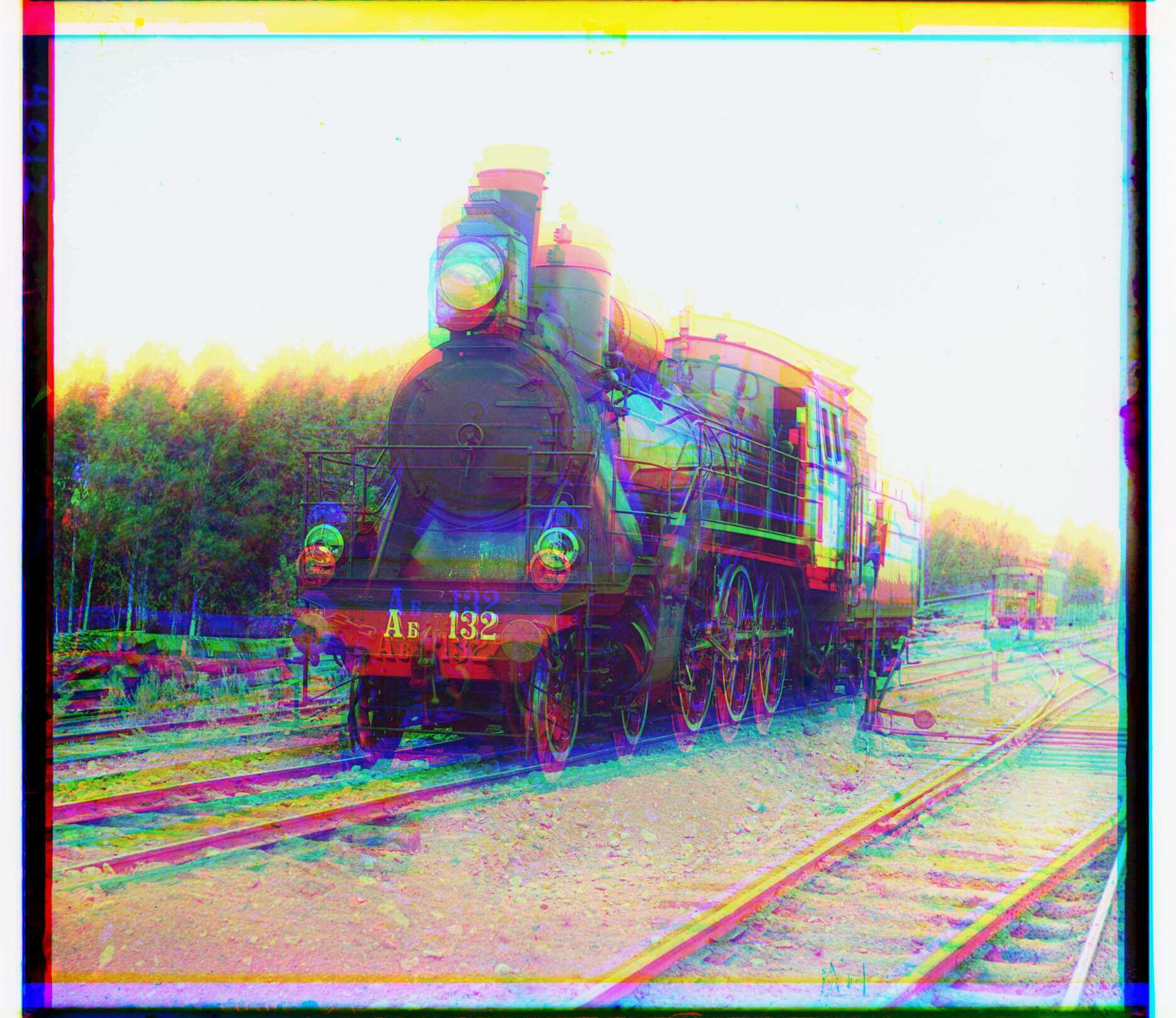
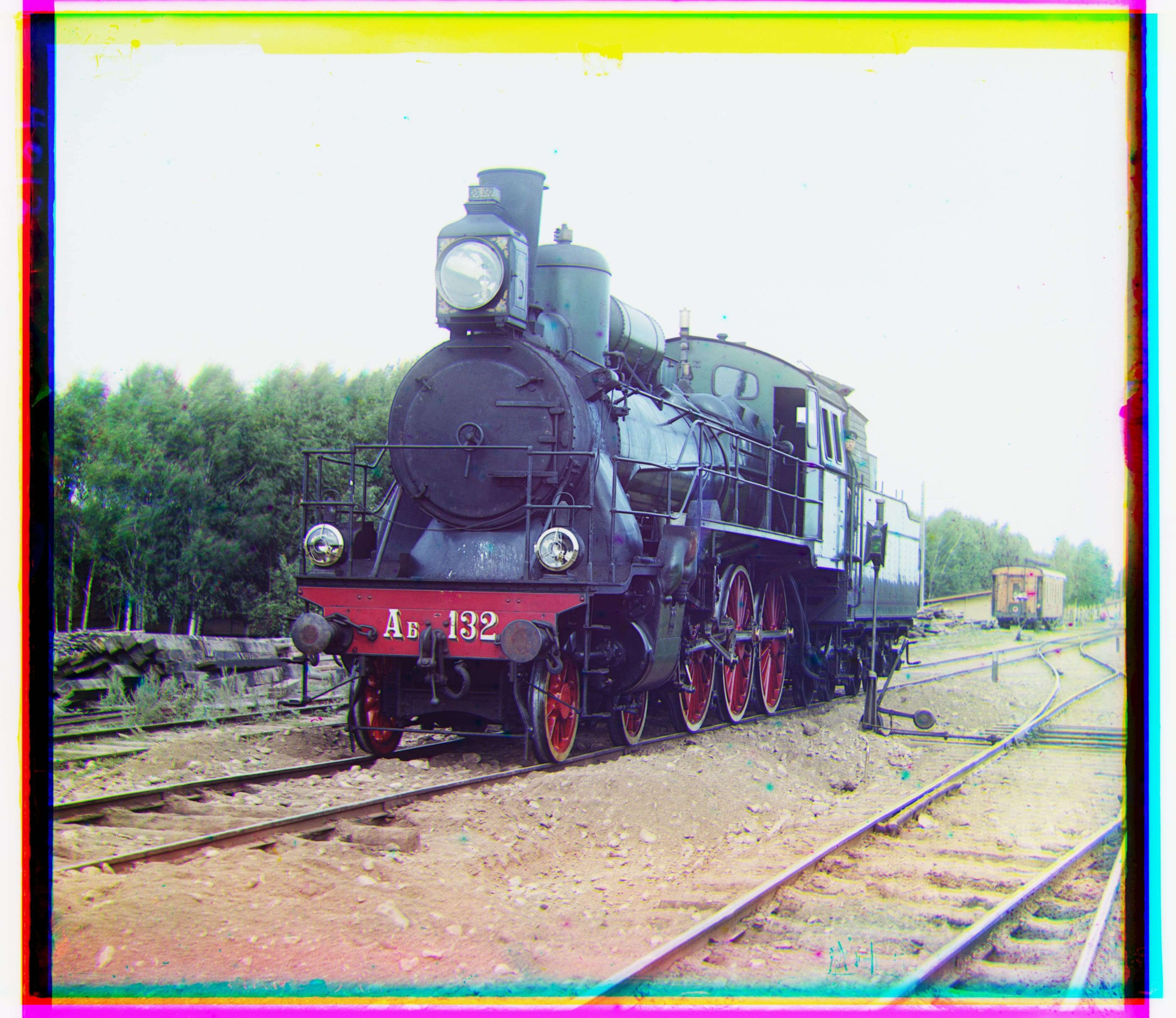
| train.tif | |
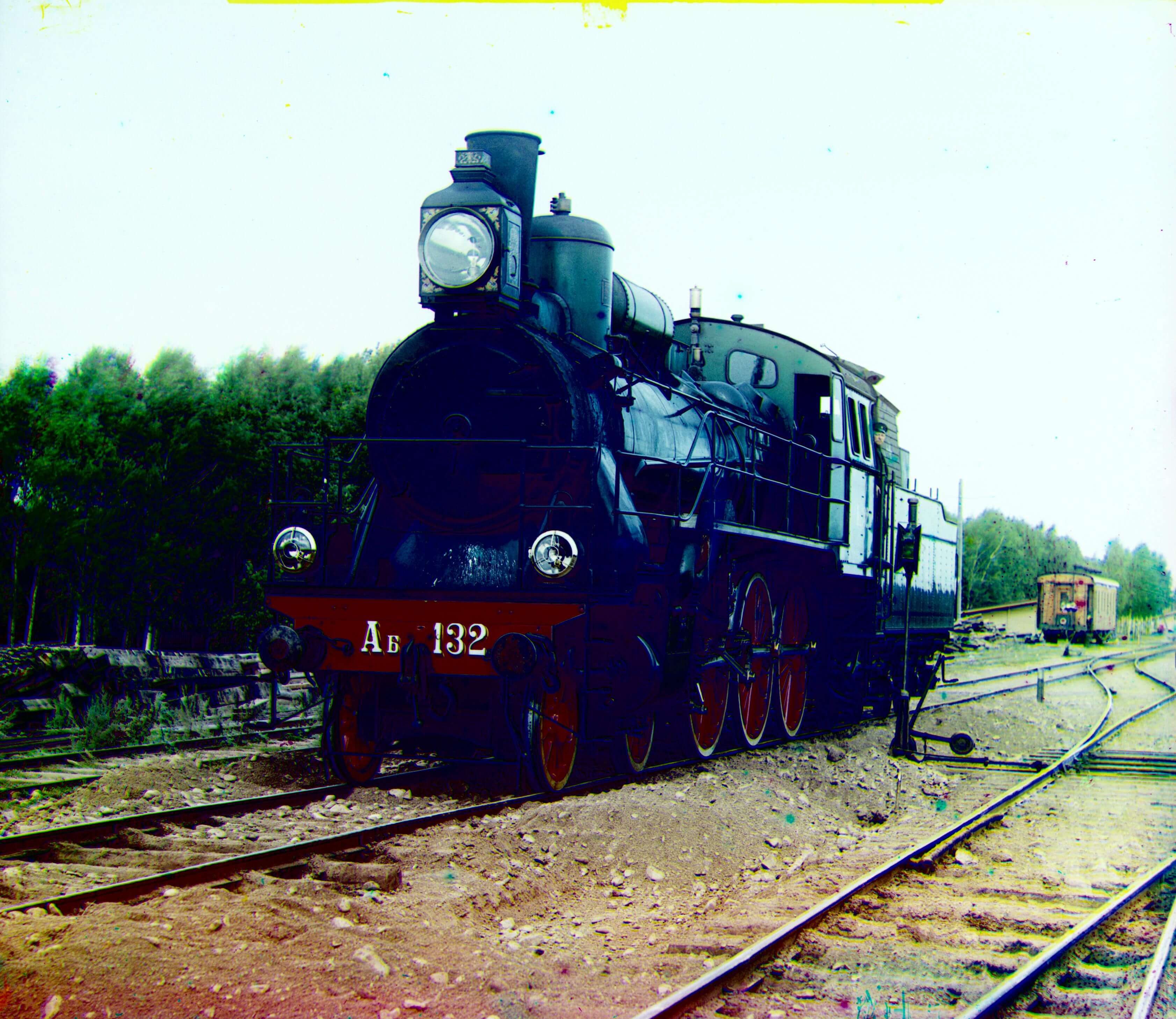 |
Blue (-42, -6) | Red (43, 26) |
| workshop.tif | 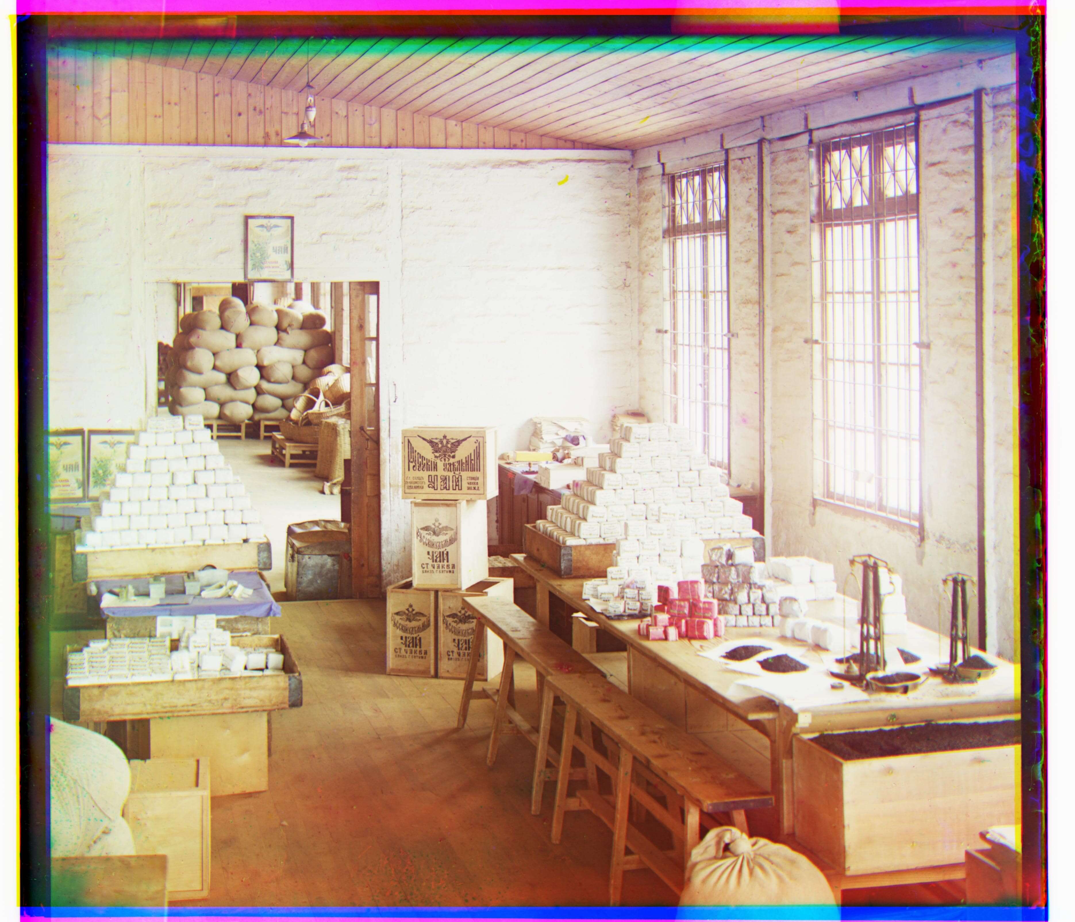 |
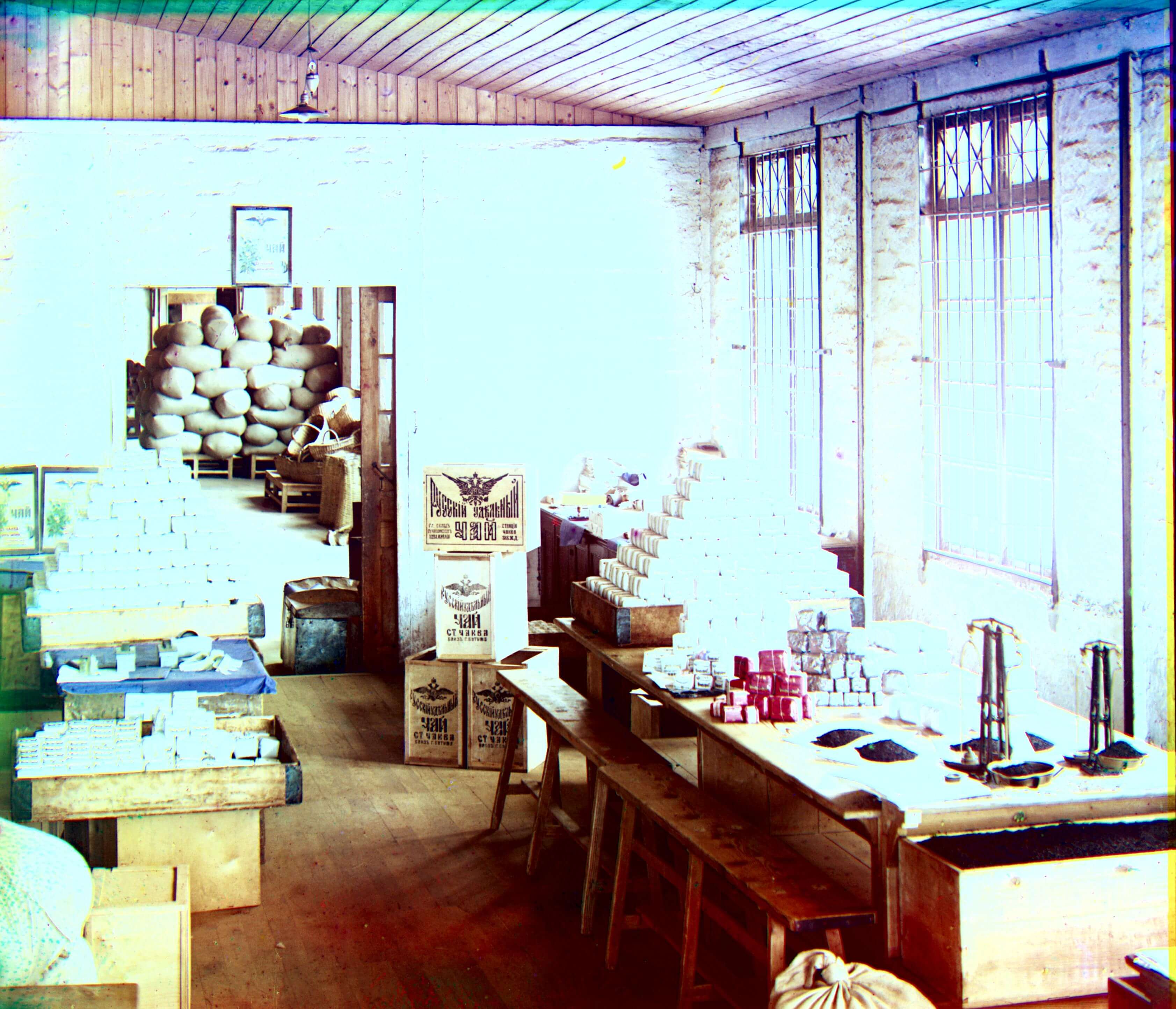 |
Blue (-53, 1) | Red (52, -11) |
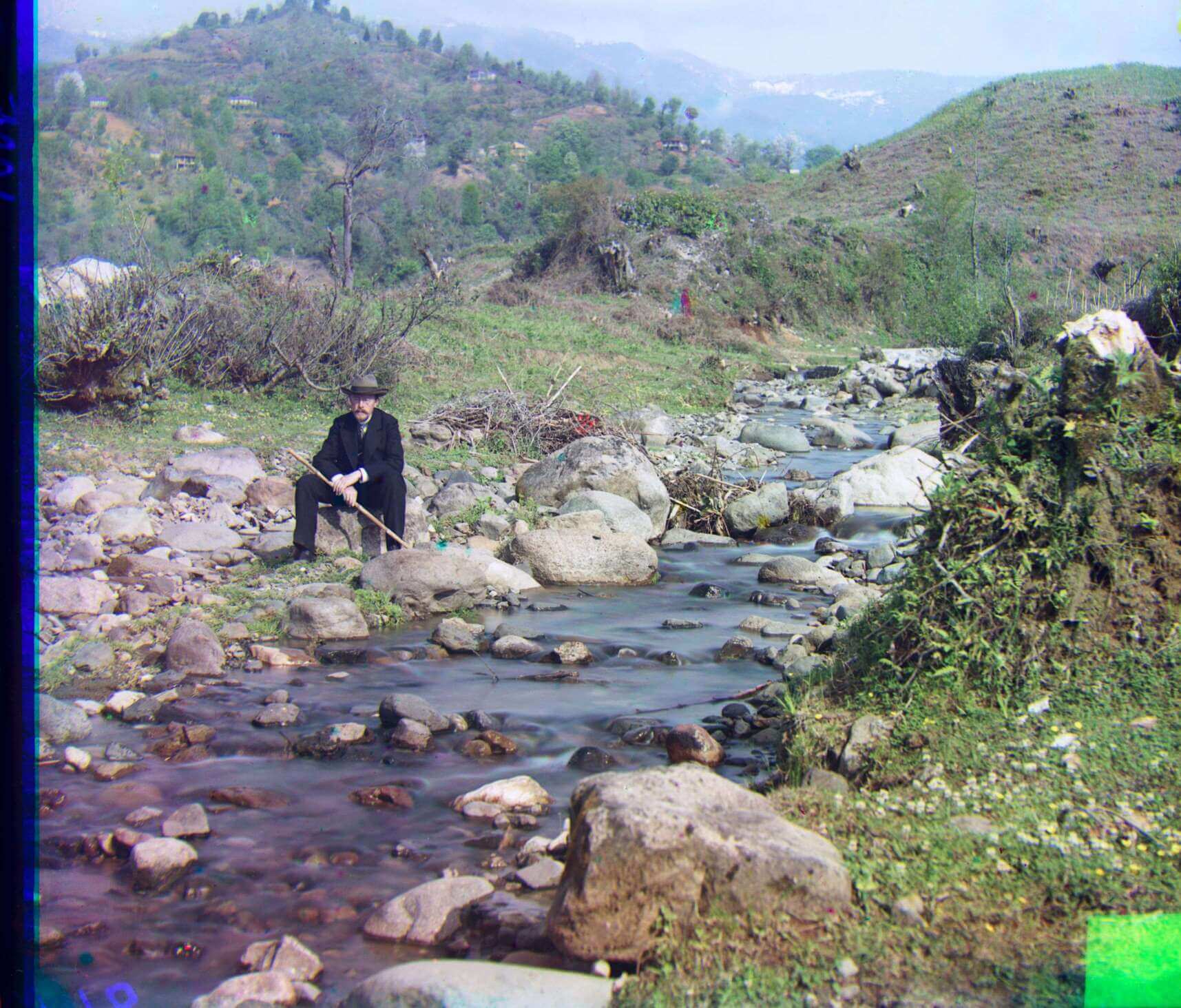
Bonus Images!
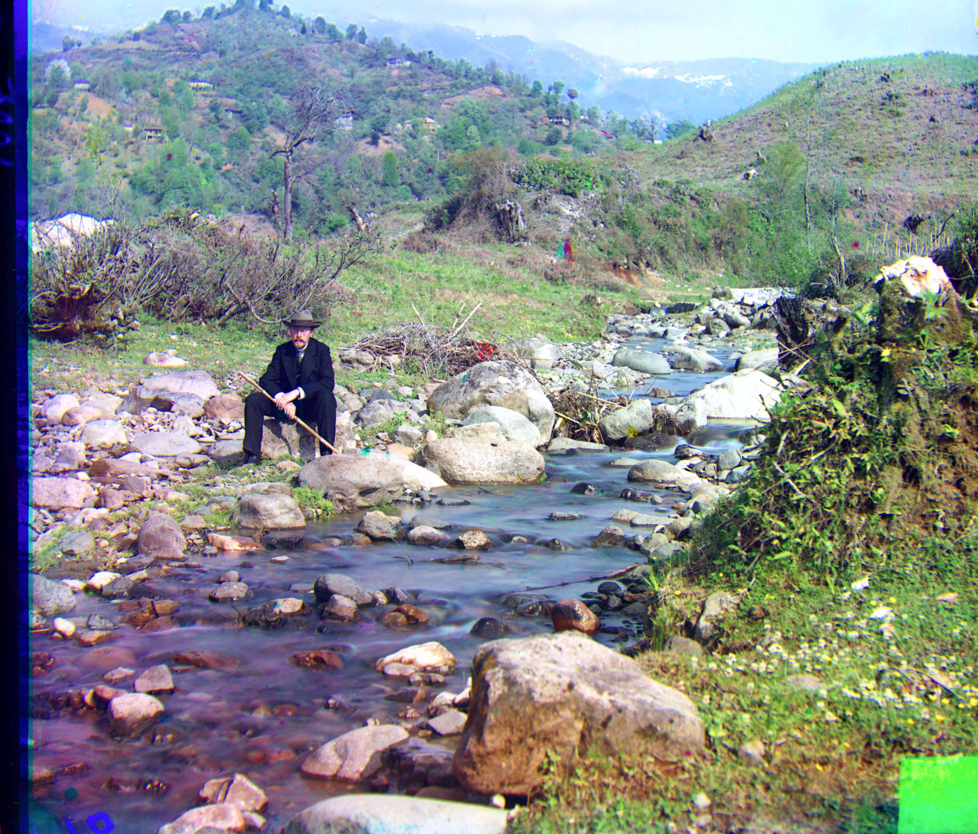
My favorite kind of scenery is water. So I also chose some images of water that Sergei Prokudin-Gorskii took to also process.
| Image Name | Aligned Image | Processed Image | Blue (dx, dy) | Red (dx, dy) |
|---|---|---|---|---|
| On the way to Iurezan Bridge.tif | 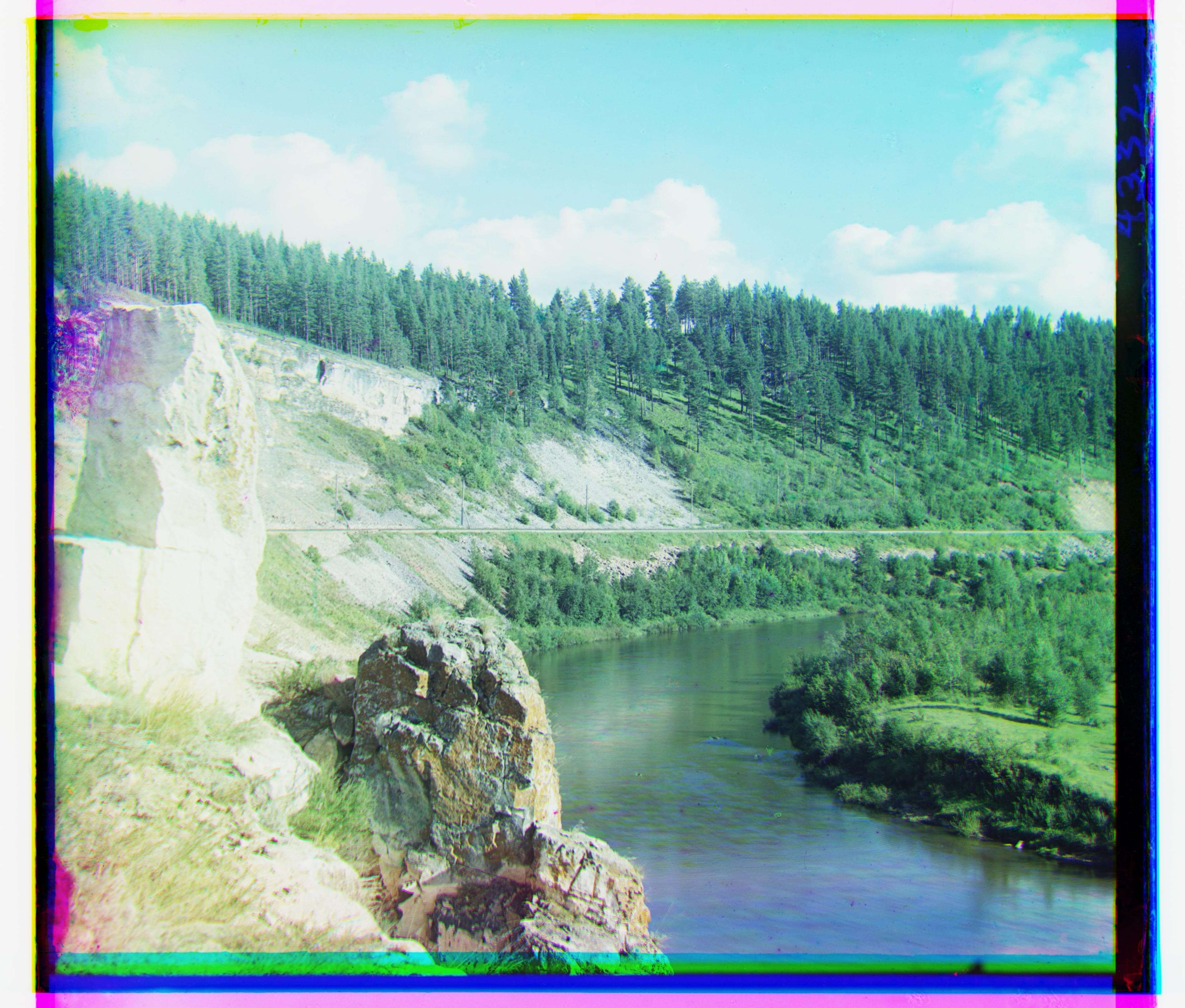 |
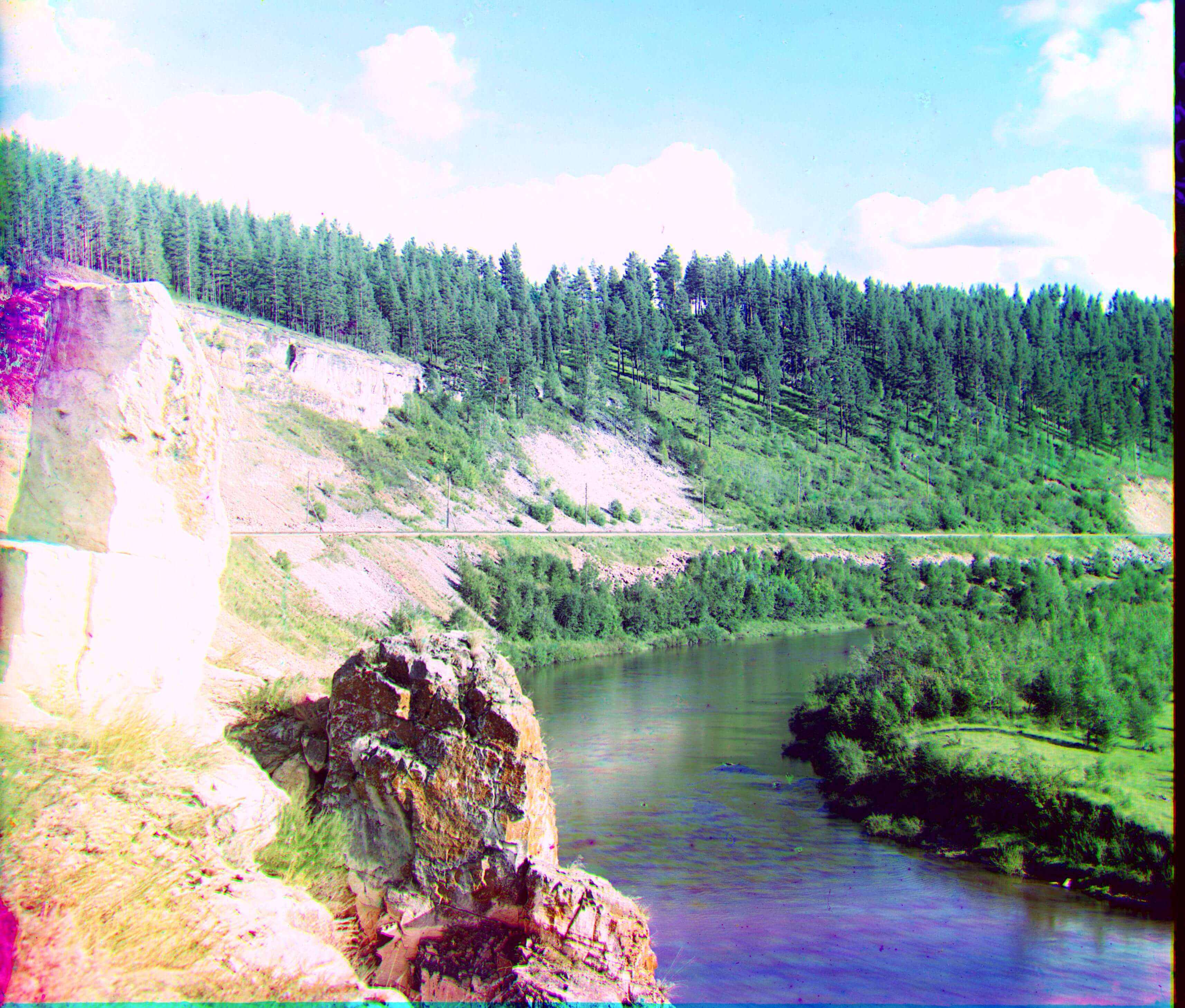 |
Blue (-49, -13) | Red (62, -3) |
| Suna River before the Kivach waterfall.tif | 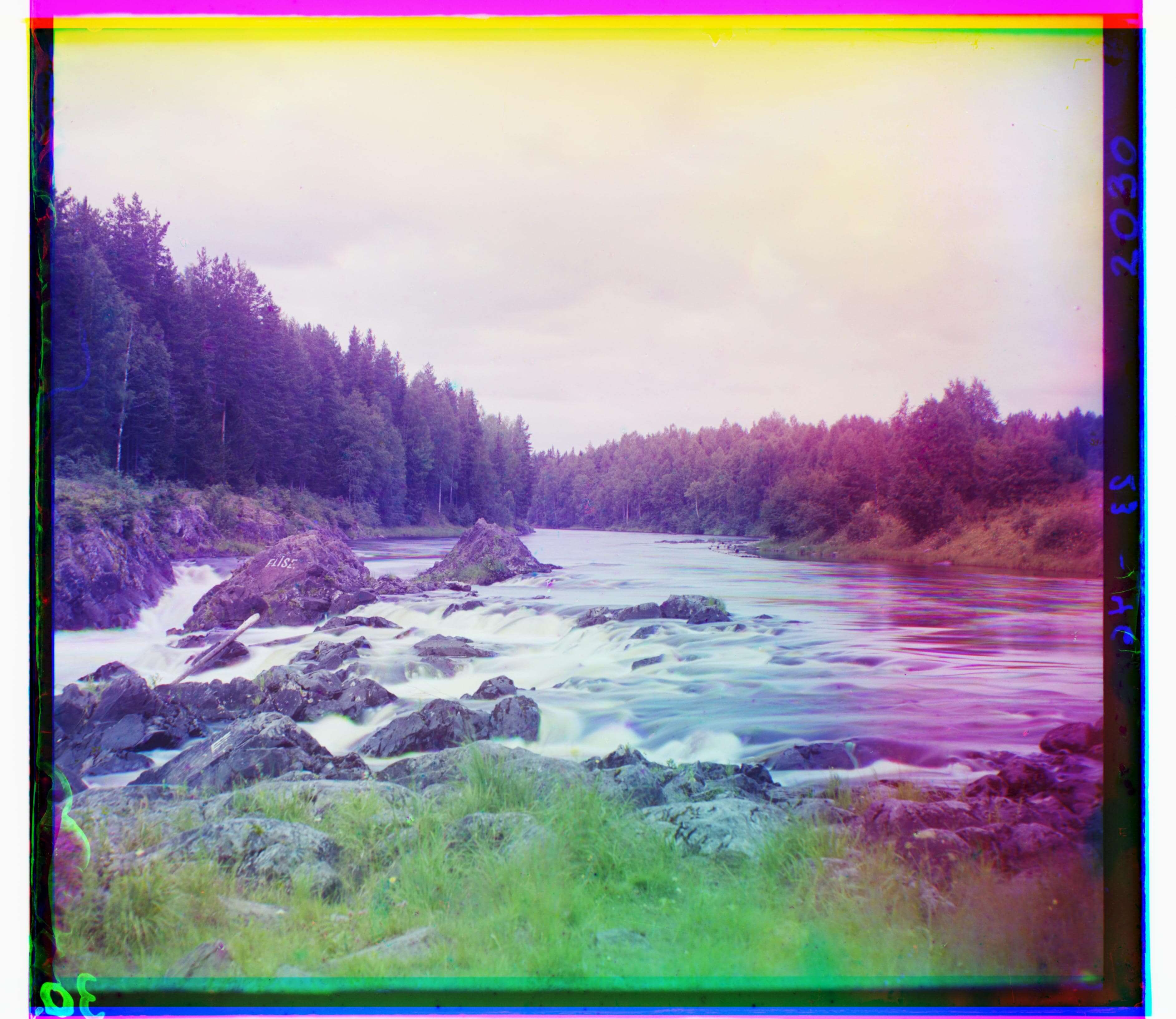 |
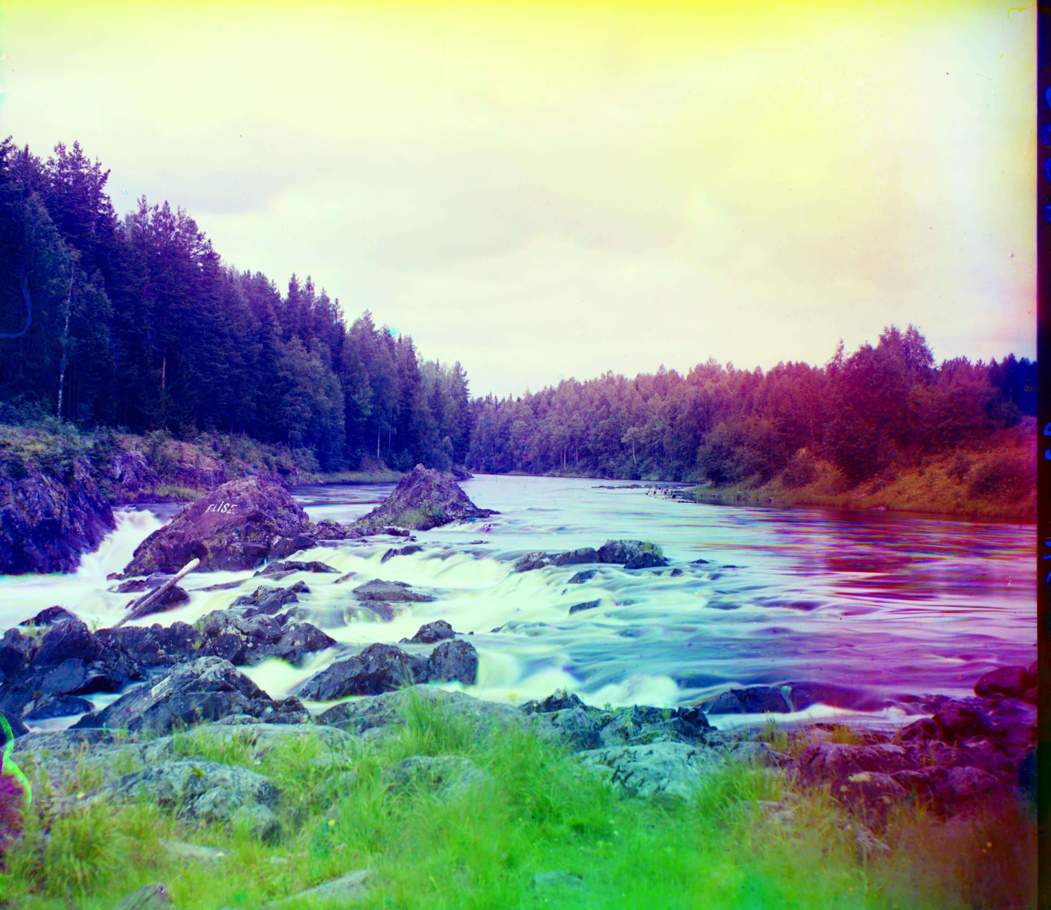 |
Blue (-39, -1) | Red (91, 1) |
| View of Ostrechiny.tif | 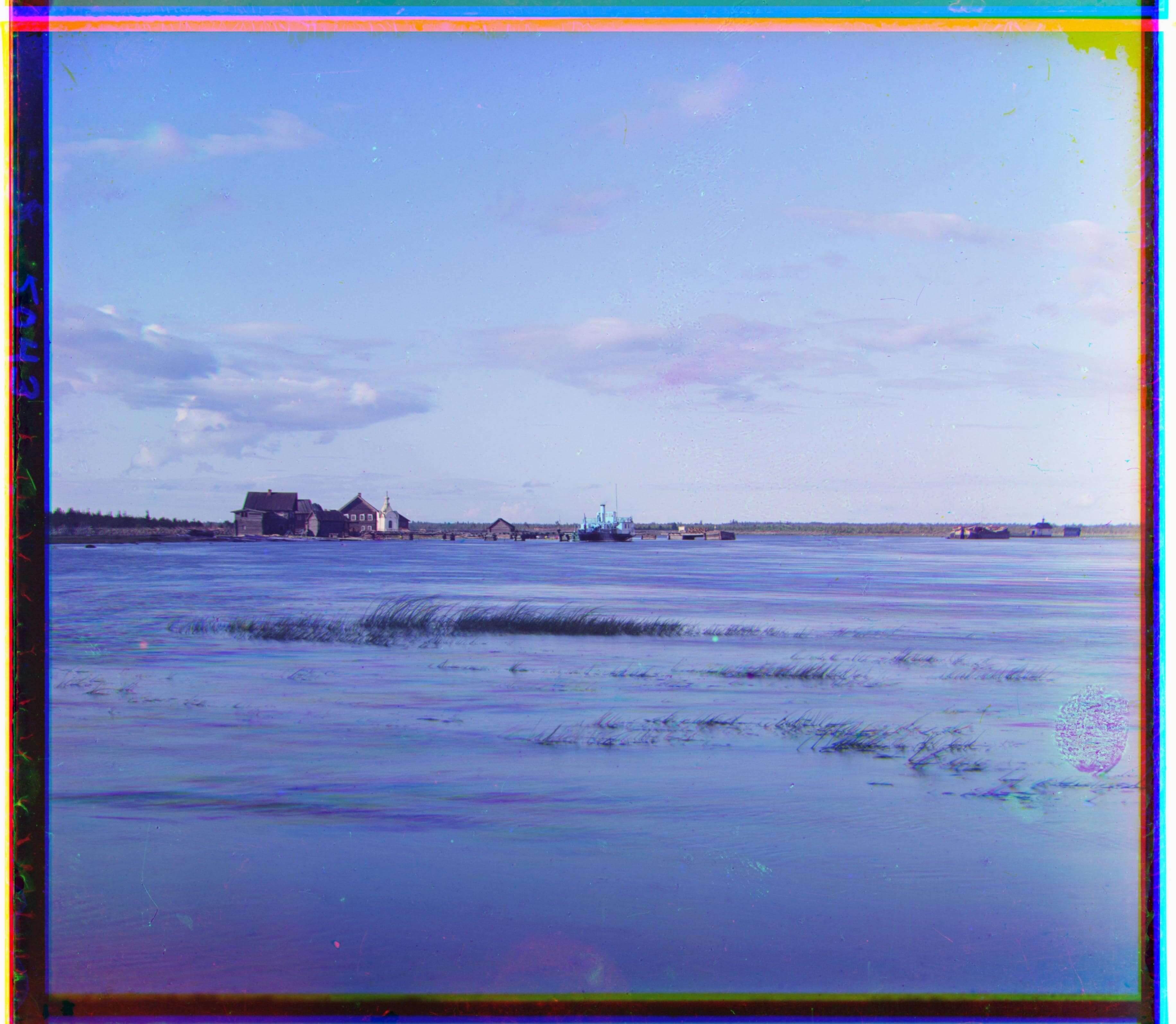 |
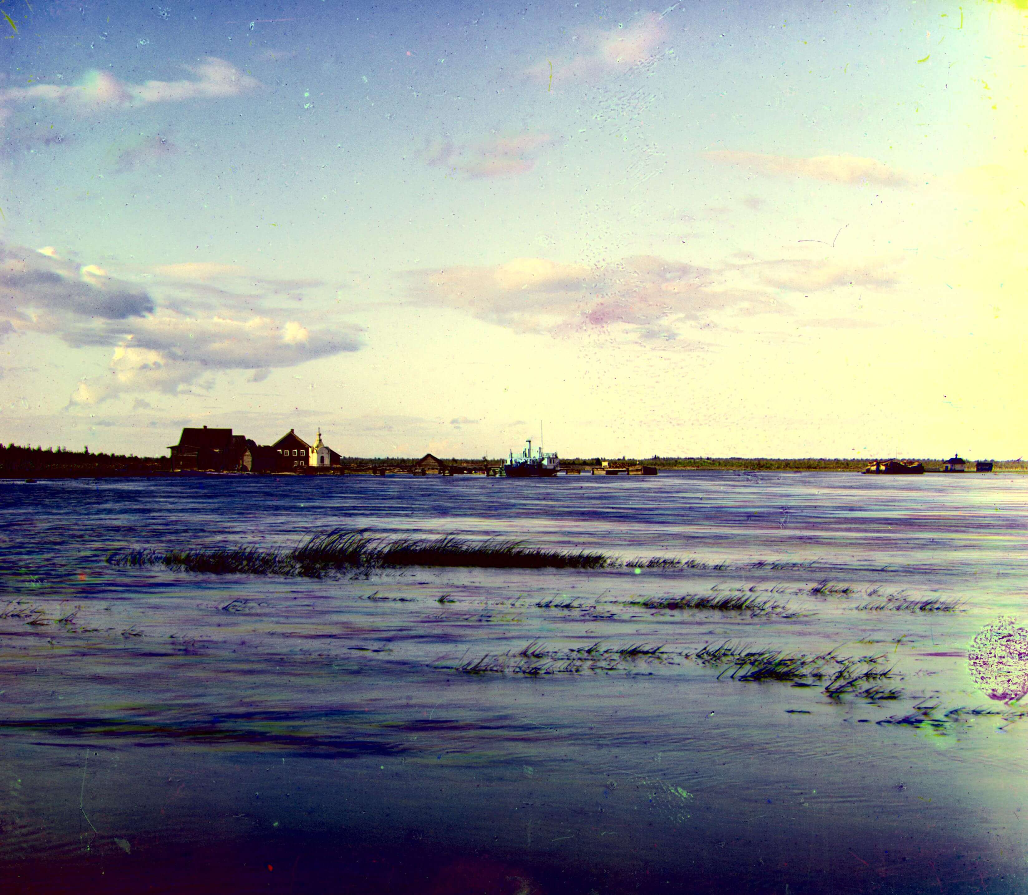 |
Blue (19, -13) | Red (98, 11) |