
Taj Mahal
COMPSCI 194-26: Computational Photography & Computer Vision
Professors Alyosha Efros & Angjoo Kanazawa
September 10th, 2021
Nick Kisel
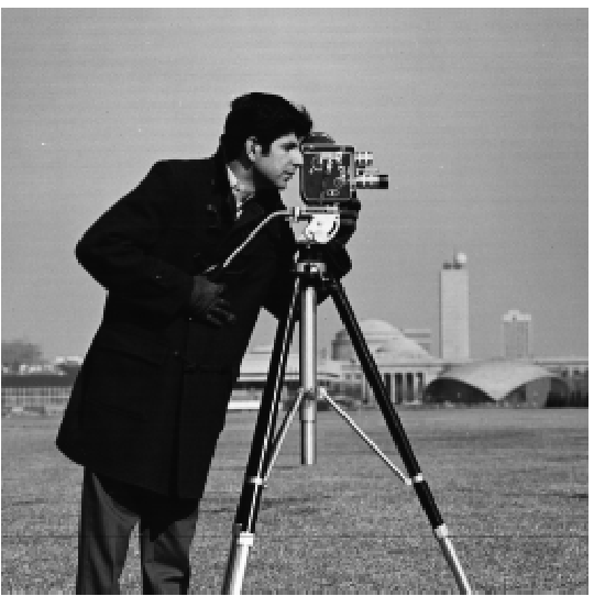
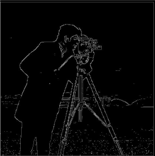
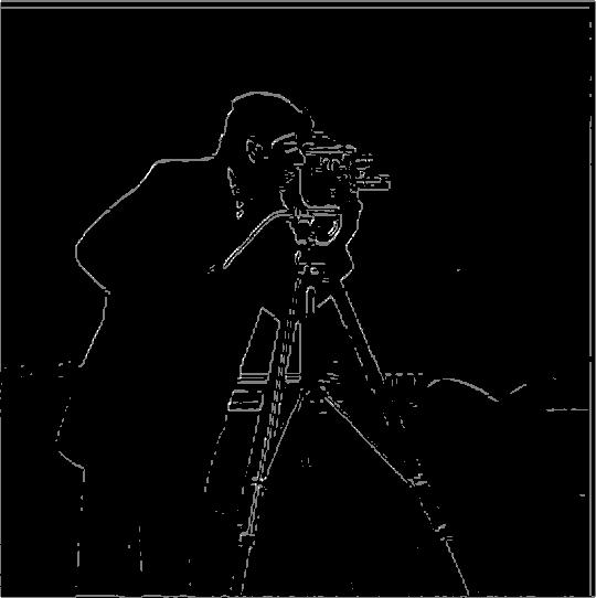
Taking the partial derivative of the cameraman image in the x & y directions to find its edges.
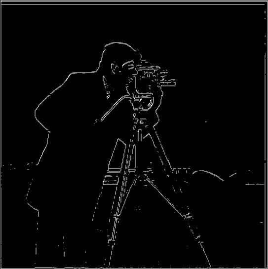
Simply taking the derivative of the cameraman image results in a mess - since almost every pixel differs from its neighbors, you end up seeing edges practically everywhere. In this case, a threshold for the strength of an edge is useful for throwing out meaningless edges. This greatly improves edge detection on the original image, but there remain some strong differences in the color of the scenery particularly underneath the cameraman.
While the grass has lots of color changes over individual pixels, it can still be thought of as a green block overall. To remedy the noise in the grass, I took the Gaussian G(4, 1) of the image and found that most of the aforementioned noise was gone, and the silhouette of the man & his camera was yet stronger than before. Using the Gaussian to smooth out the grass brings us to that blurred, generalized green area and removes the edges. As a result, you can't see any specks representing the high volume of edges in the grass in the resultant image!
Testing the commutativity of convolution.
I replicated the previous experiment, where I took the gaussian of an image before convolving it in the x and y directions. Then, I took the derivative of the gaussian in both the x & y directions before applying each derivative-of-gaussian to the image and combining their results. As you can see, the output of the two processes is exactly the same.
at left: before; at right, after smoothing with the Gaussian G(4, 1)


at left: derivative applied after Gaussian;
at right, derivative of Gaussian applied
The unsharp masking technique utilizes the same Gaussian as before, but subtracts that Gaussian from the original image. The resultant matrix contains just the sharp corners of the image without much of the original solid color. This process allows us to add the sharp corners into the image once more to amplify their sharpness. In the sharpened Taj Mahal, you might be able to see artifacts in the sky around the building's edges that look like a digital version of a mirage. Note that radically increasing the sharpness results in the corners and edges of the photo becoming so bright that the contrast of the rest of the photo decreases; this manifests slightly in the blurred-then-sharpened version.
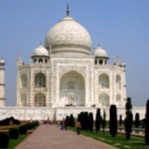
Taj Mahal

Taj Mahal after Gaussian
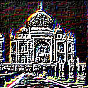
Taj, minus the Gaussian

Sharpened Taj Mahal
This process can be useful in moderation, but it doesn't particularly restore blurry photos well. You'll note that the edges of the Taj Mahal become sharper, but none of the inner patterns re-appear. You'd need to feed the computer a lot of different surfaces through deep learning to add detail where there isn't any, as the unsharp mask probably doesn't restore the detail in the ways you'd like.
Taj Mahal
Blurred, then sharpened Taj Mahal
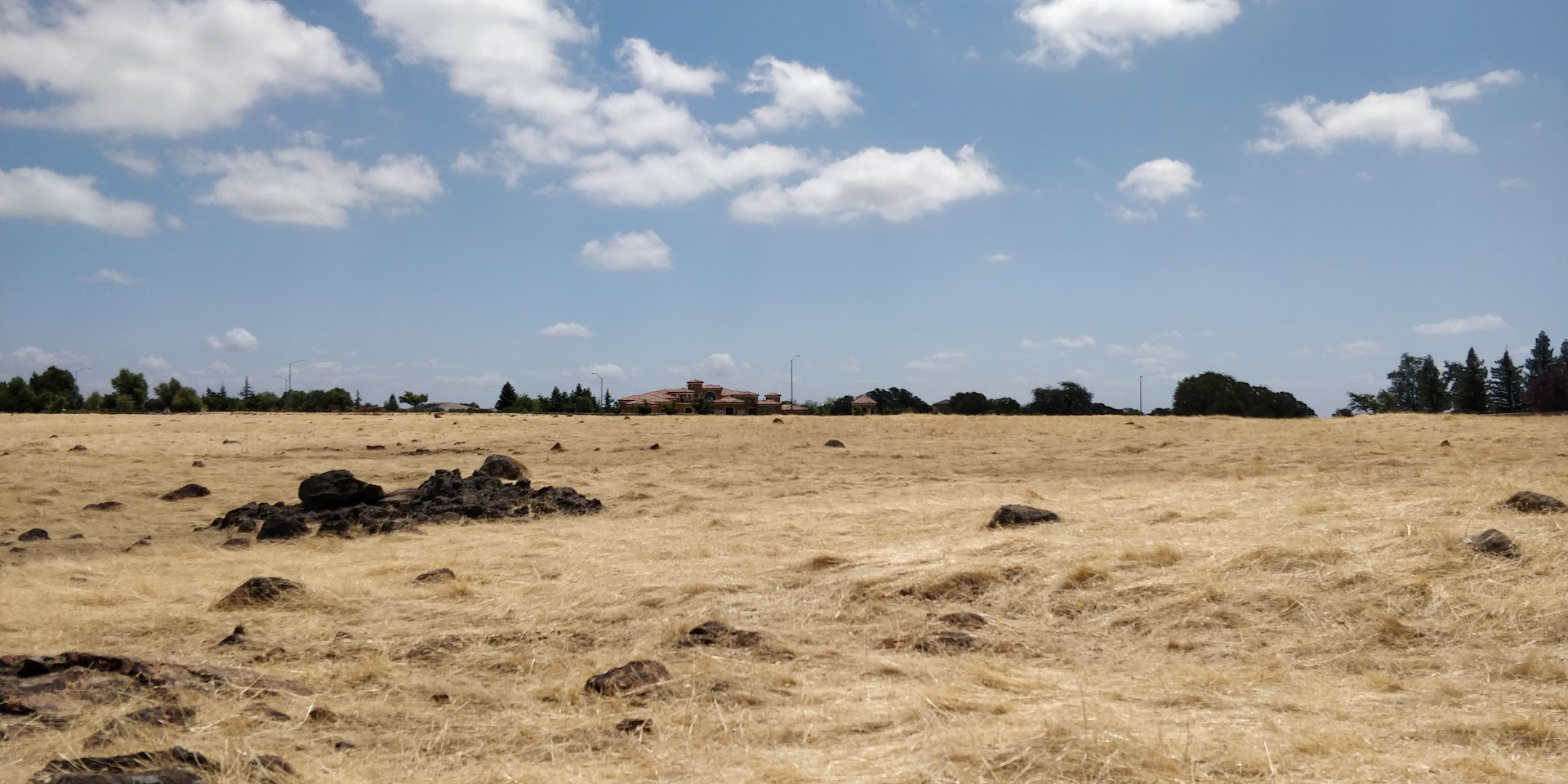
Plains

Blurred & sharpened plains
Using the low-pass filtering of the Gaussian and the sharpening of the unsharp filter, I combined the low frequencies of one image with the high frequencies of another to create their combination.
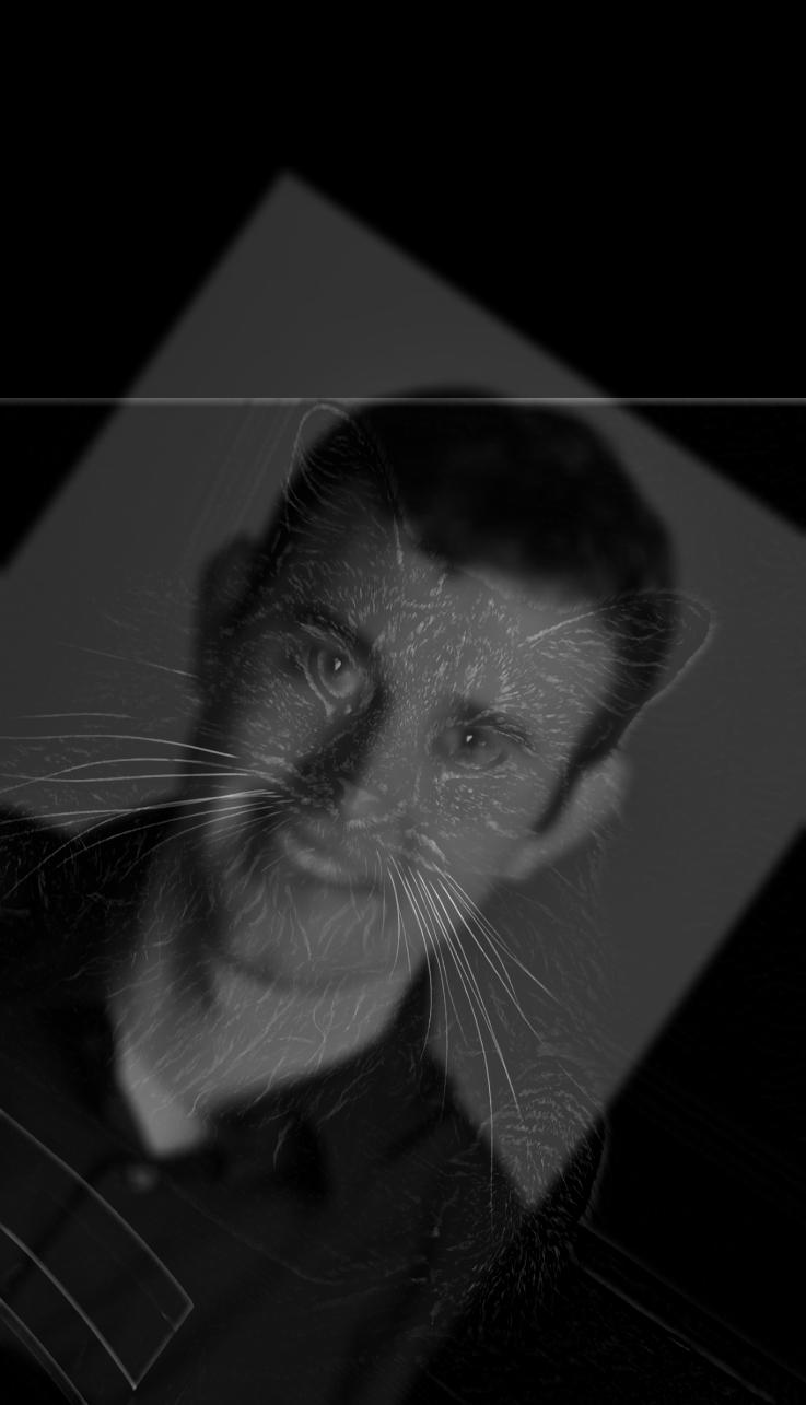
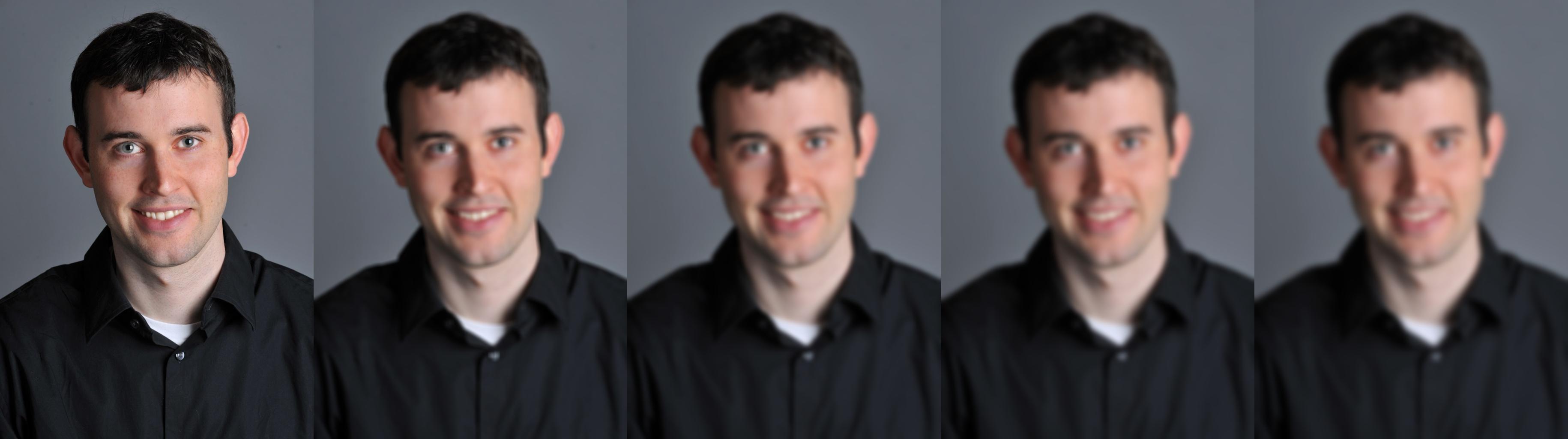
Low frequencies of Derek with the high frequencies of Nutmeg.
Sometimes, it's really hard to get these images working. It turns out that many features - facial, scenic, etc. - need to align in order to mask any afterimages.
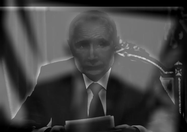
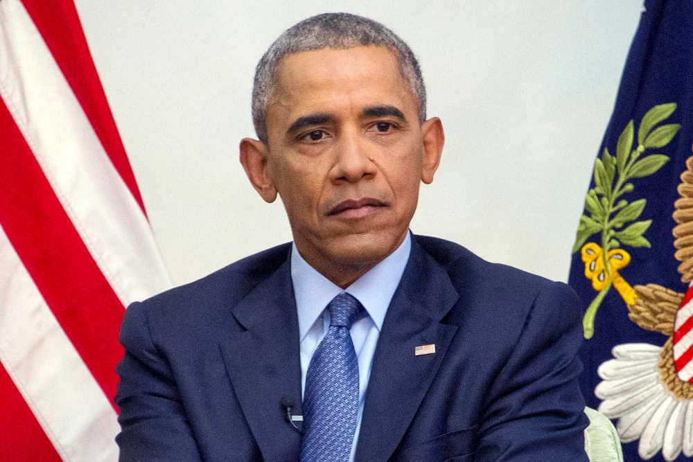
For example, it's hard to make Obama/Putin work, no matter how you line them up.
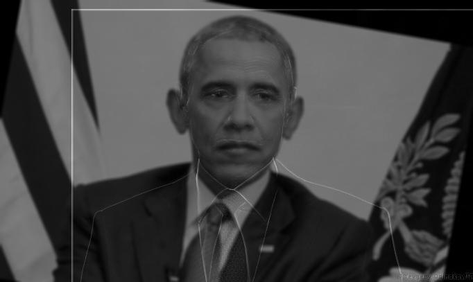
Okay, like maybe you can see it in the second one, but it's not very impressive.
If you're just having fun, though, you can ignore the inconsistencies and spear on ahead. This photo is definitely Putin from afar, before you start seeing the Mona Lisa's likeness up close. Squint your eyes for help!
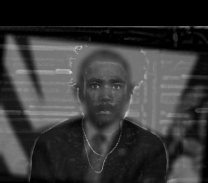
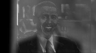
Even for all its strange inconsistencies, I enjoy this one. I will admit that it's not exactly Obama I see from afar here,
but it's distinctly a moustached man wearing a suit and tie, sitting in the Oval Office and staring directly at you.
Then, when you come closer, you see that it's not just a tie, but a chain too.
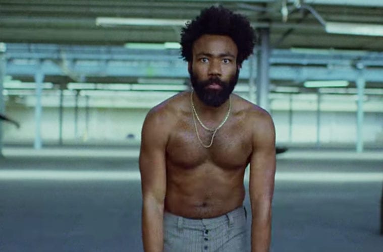
You notice the hair and distinct facial features of Childish Gambino in his "This is America" music video.
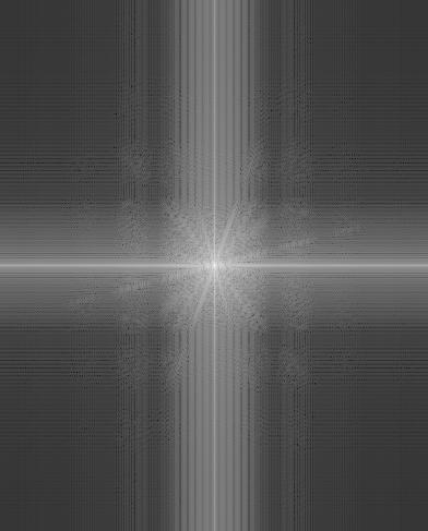
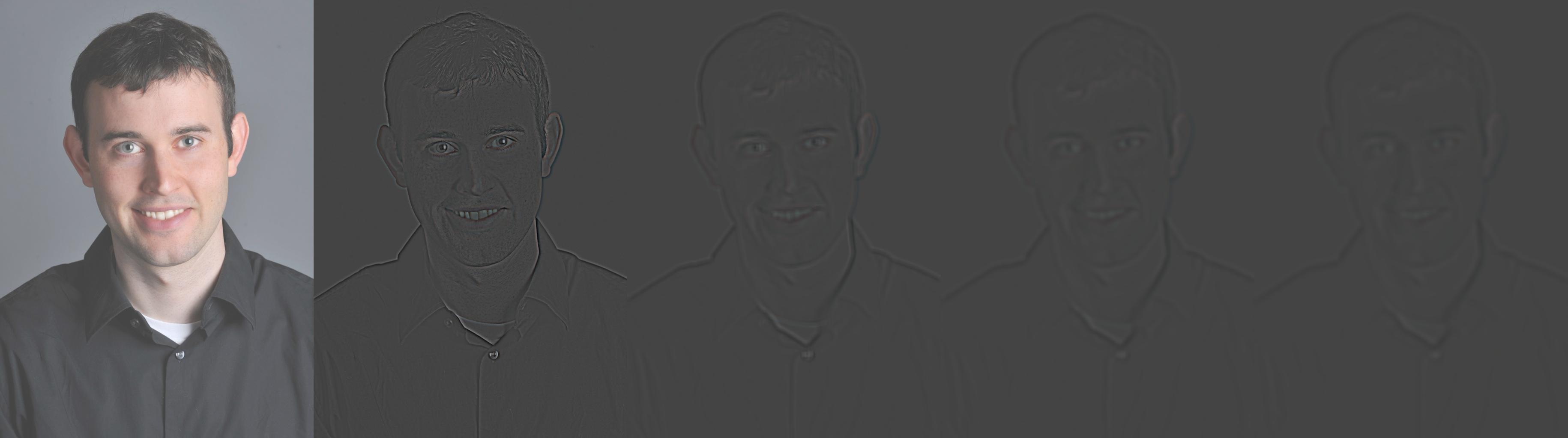
Here's the frequency spectrum of this combination of photos;
note the lack of highs on the left (the dark corners) and the abundance of highs (the noisy corners) on the right.
Starting from the original image, I iteratively applied the Gaussian to consecutive blurred versions of the same image, resulting in a five-image stack of more and more blurry photos. Then, for each level of the Gaussian stack, I subtracted the previous level's Gaussian blurred image and set it aside into a separate stack - the Laplacian stack. The Laplacian stack essentially represents unmask filters on different sets of frequencies for the photo; in other words, the edges of the photo at different blur levels.
top: Apple; middle: Combination; bottom: Orange


Here's the oraple from the other side! I'm happy with how the two intersect in such a natural way both at the bottom and top.
Building an oraple of your own has a few steps:
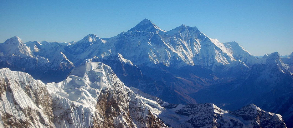
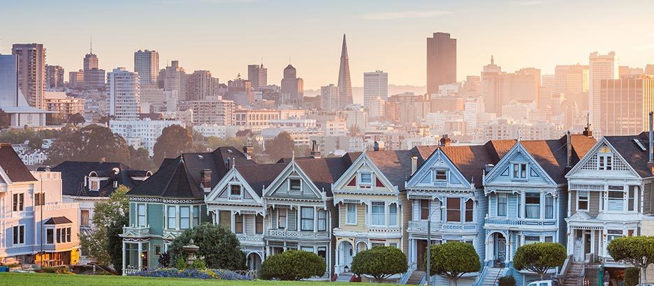
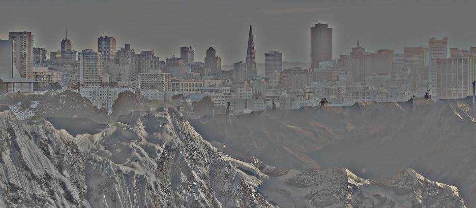
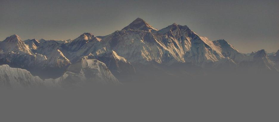
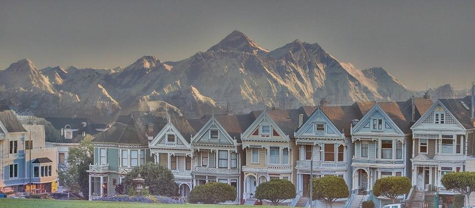
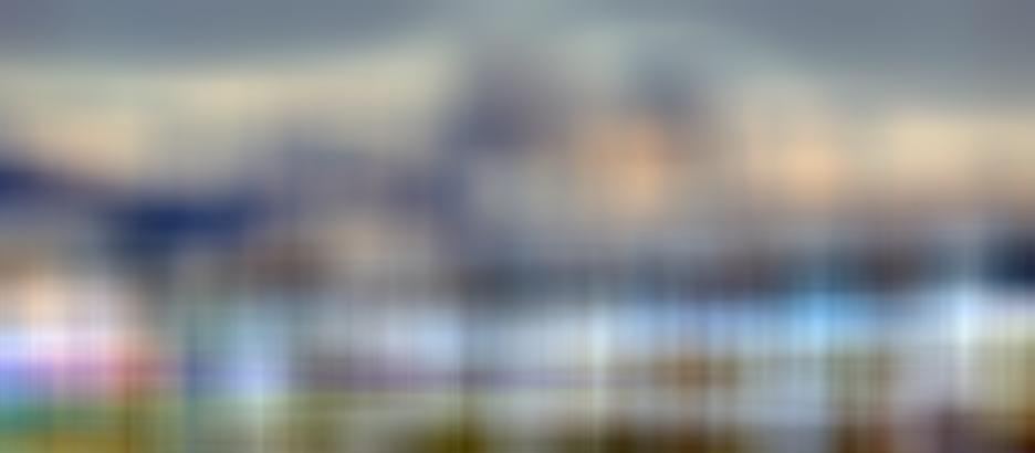
Now for my next trick, I'll put the painted ladies of San Francisco out into the Himilayas!
Oh, I entered San Francisco and the Himilayas in the wrong order, and the width of the Gaussian kernel isn't wide enough so most of the colors are missing. Here's what I meant to do!
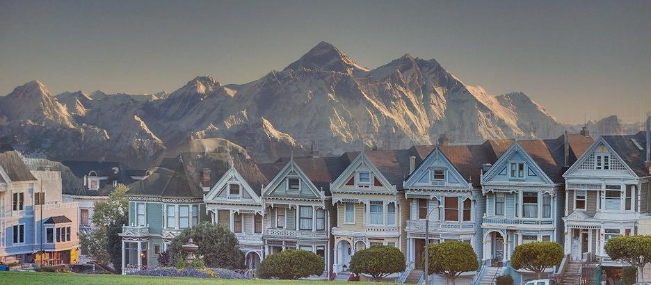
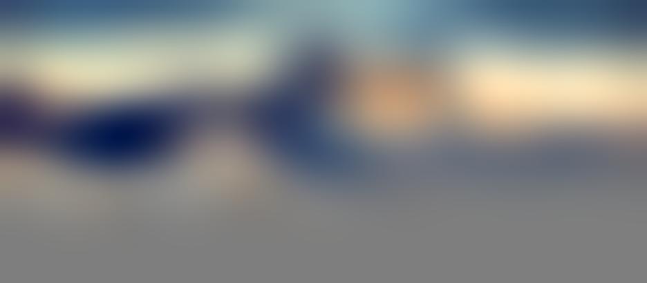
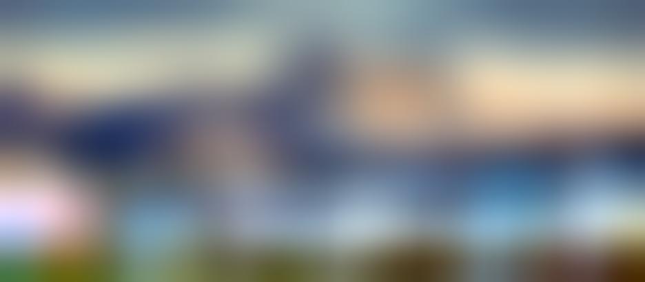
I'm pretty happy with this one, but it does start to look a little strange up close, since you can see the mountains bleed down into the roofs of the houses.
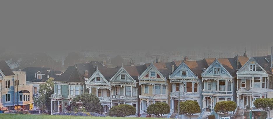
left: Himilayas; middle: Combination; right: Painted Ladies
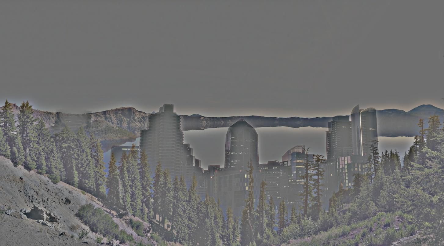
Now, I tried the same thing using a photo I took of Crater Lake and the San Diego skyline, but it didn't work so well.
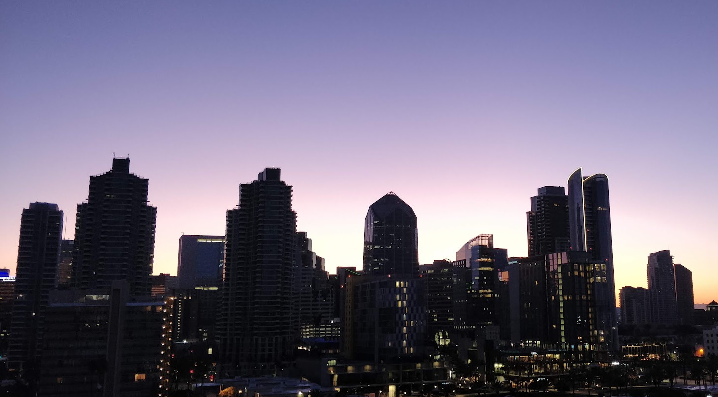
A primary reason was that the environments don't conceal each other's backgrounds well. The blurring effect isn't particularly nice to the sharp corners here, so the high contrast points like the trees, mountains, and buildings end up blending with the sky in both photos.
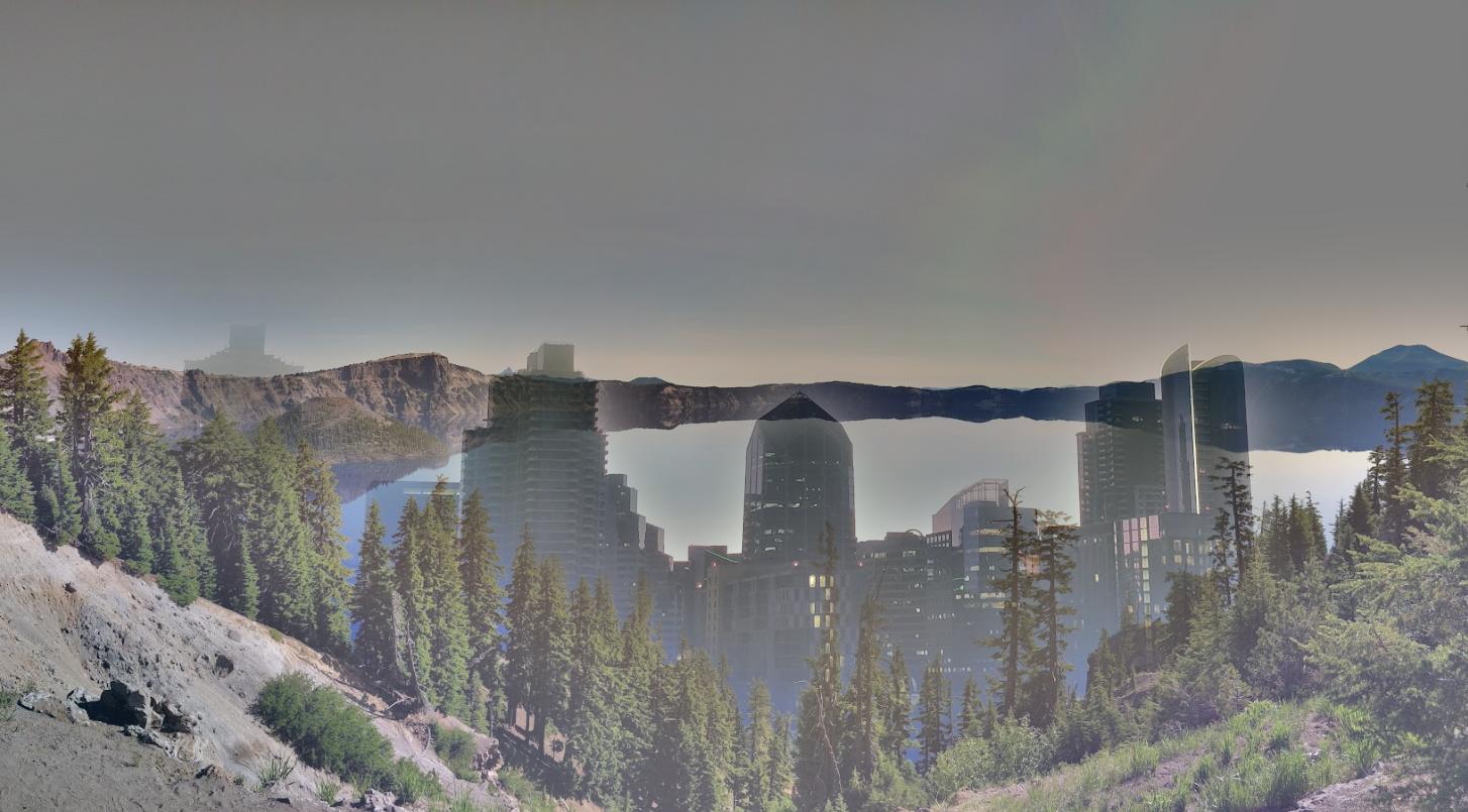
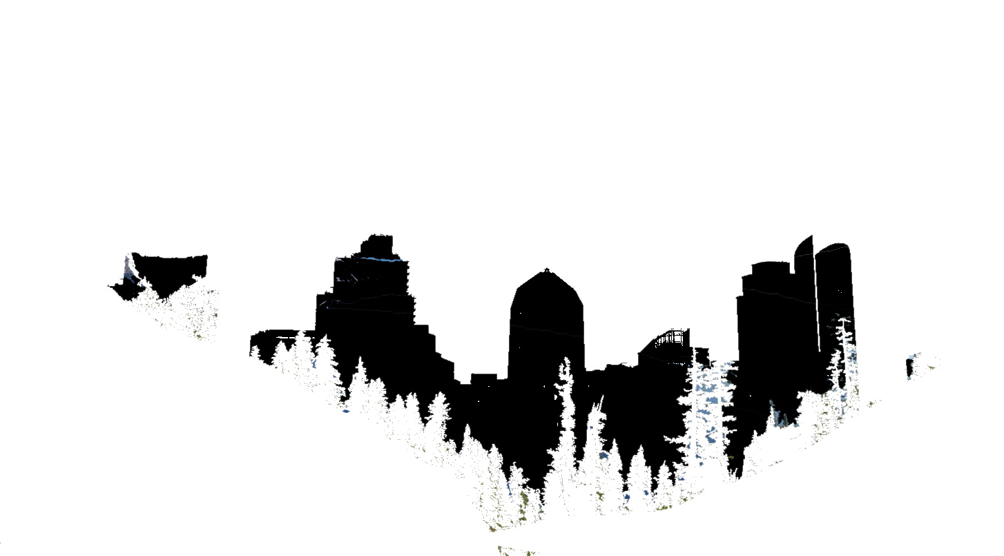
Lowering the size of the Gaussian kernel helps out with the execution of putting a skyline into nature, but removes much of the color.
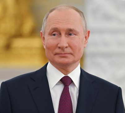
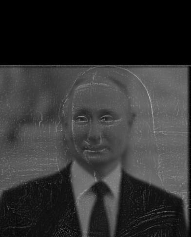
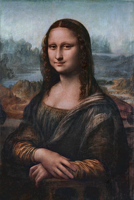
Lastly, I retried the faces experiment from earlier. Behold, the Mona Putin!
Putin's facial features really bring out a sense of three-dimensionality in this photo. It also becomes clear that the Mona Lisa - I mean Putin - is definitely looking away.
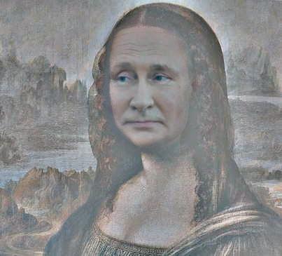
I really like how the left cheeks of Putin & Mona Lisa align. Perhaps the color of Putin's face could be adjusted a little.