
Original Image
by: Gavin Fure
Through the power of the convolution we will be exploring the frequency space of images. I've worked with audio and signal frequencies, but never thought about images this way before. It makes perfect sense! I've always wondered how these visual effects/tools were made, and now I can make them myself!
We can find the horizontal and vertical gradients of an image by convolving with the finite difference operators (Dx and Dy).
Original Image

Gradients in the x direction

Gradients in the y direction
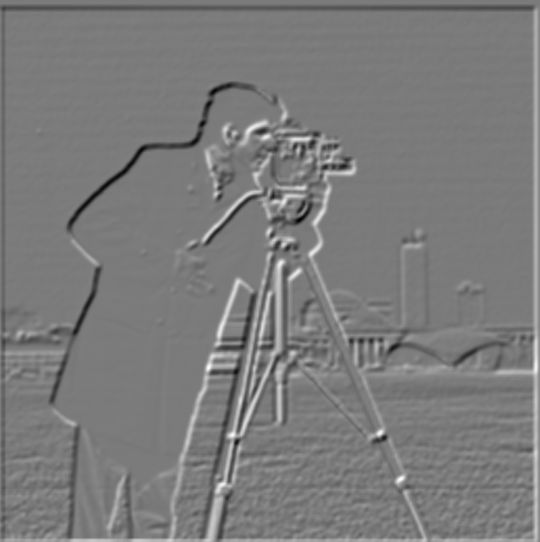
To compute the gradient magnitude (also called the edge strength), we take the square of these two gradients, add them, and then square root that result. Squaring and square rooting operations are done elementwise. Here is the output:

Gradient Magnitude
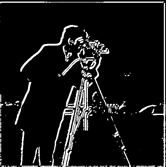
We can turn this into an edge image by denoising things a bit. We can do that using a threshold: we'll set every mostly white pixel to be totally white (with a value of 1.0) and every pixel darker than our threshold to be 0 (totally black). Here is our edge image, using a threshold of .11:

Binarized Edges [Threshold: .11]
We can use the Gaussian filter's smoothing, low-passing function to remove some addition noise and hopefully strengthen our edges a bit. Blurring even slightly can greatly improve our output. The following results were created after convolving the cameraman image with a gaussian filter with sigma=2 and kernel_size=8.

Blurred Image

(Blurred) Gradients in the x direction

(Blurred) Gradients in the y direction
(Blurred) Gradient Magnitude

(Blurred) Binarized Edges [Threshold: .11]
With this technique, I notice that we end up getting much thicker edges. The threshold is actually the same as it was before, which is a little surprising, although I think that is because 1) most edges have gotten thicker and 2) we are only using a very gentle gaussian. We aren't low-passing too hard, just getting rid of the harshest stuff. Because of this, we lose some of the thin lines of the tripod, as well as most of the structure of the background.
We can compress this operation (blur -> derivatives) into just one convolution operation by convolving the gaussian with each of our finite difference operators. We can display the gaussian and the resulting derivative of gaussian (DoG) filters.

2D Gaussian, sigma=2, kernel_size=8

DoGx

DoGy
Next, we should ensure that our results are the same as before.
Binarized DoG Edges [Threshold=.11]
(Original) Blurred Edges [Threshold=.11]

Difference between the two
There seems to be a slight empirical difference between the two results. Perceptually, they look mostly the same, but it seems that there is some sort of misalignment. This is probably due to numerical imprecision, but might also have to do with phasing issues caused by the specific settings I used with scipy's convolve2d, although changing settings doesn't seem to fix the problem. There are also some small noticeable differences, like the shape of the background and the front leg of the tripod.
To 'sharpen' an image, we want to boost the high frequencies. We can isolate the high frequency information in an image by removing all of the low frequency content. All we need is our trusty Gaussian filter: convolve an image with the gaussian, then subtract that blurred result from the original to obtain the high frequency content. Then, we can multiply the high-freq components by some scalar value alpha and add it back to the original image to boost the highs, thereby 'sharpening' the image.

Original image

High frequency content

Sharpened Image [alpha=1, sigma=3, kernel_size=9]
The difference is fairly subtle here, but definitely noticeable. To illustrate the differences, I'll crank up alpha and see how the image is affected.

Alpha = 2
Alpha = 5

Alpha = 10

Alpha = 100
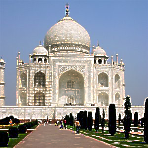
Now we're seeing those pretty little artifacts! That means we've gone too far. But, the algorithm is successful! We can improve it by compressing it into a single convolution, just like before. The resulting unsharp mask filter was used to create all of the following images. Here's the taj picture, sharpened with unsharp masking.

Unsharp Mask Taj [alpha = 2, sigma=3, kernel_size=9]
We can test our algorithm by blurring our image, then resharpening it.

Blurred [sigma=1, kernel_size=5]

Resharpened [alpha = 2.5, sigma=1, kernel_size=5]
Original image
After performing the unsharp mask operation on the blurred image, the result has much sharper edges and much more detail. This is evidence that our algorithm is working correctly. The whites are much whiter in the resharped version, and the color balance is generally a bit off, but a lot of the detail has been brought back. It's pretty impressive how even the little patterns in the main archway (on the inside of the rectangle) and at the base of the dome were preserved, as they're pretty much impossible to make out in the blurred image.
Now, let's test out our algorithm on a few more images:

Earl Sweatshirt's Some Rap Songs (Original)
from link

alpha=2.5, sigma=5/3, kernel_size=5

alpha=10

alpha=100
This picture is far too burry to be fixed with a little sharpening, haha. However, we can make it look pretty scary. The artifacts that are forming here are very box-like. This is due to our gaussian blur parameters. We can edit this to try to improve the artifacts at high values of alpha.

alpha=1.5, sigma=10, kernel_size=25

alpha=5

alpha=10
Still boxy, but in a different way. Also, since the size of our kernel has increased so much, we get much more aggressive effects even at comparatively low values of alpha. Up next, another album cover.

The Fat of the Land by The Prodigy (Original)
from link
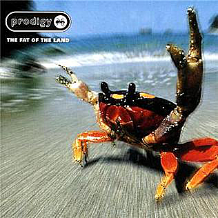
alpha=1, sigma=3, kernel_size=9
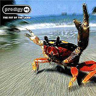
alpha=2.5

alpha=1, sigma=6, kernel_size=25

alpha=2
We can slow that crab down a little bit, but he's moving pretty fast. Some blur will always remain. Next, we'll try some of Bjork, and do our blur/resharp test again.

Bjork, Icelandic singer and international superstar
from link

alpha=.5, sigma=2, kernel_size=5

alpha=.5, sigma=6, kernel_size=25

sigma=1, kernel_size=5

alpha=2, sigma=1, kernel_size=5
In this case, even small changes in alpha can make a big difference in the outcome. Sharpening the image with even just alpha=2 already introduces some artifacts. We are able to recover a lot of high-frequency information from the blurred image, but we definitely lose a lot. The whites in her skin and the blues in the background have been blown out a little bit, and we lose importang high-frequency imformation in the wrinkes of her shirt, in details on her face, and in her hair, which remains a little blurry.
By mixing the high frequencies of one image with the low frequencies of another, we can create a hybrid image. This hybrid will look like the high frequency photo up close, but like the low frequency photo from far away. We've discussed previously how to low-pass or high-pass an image, you just need to use a gaussian filter! Here is my result on the basic test images:

Derek and Nutmeg Hybrid
I had to use fairly large kernel sizes to generate my results. For this hybrid, I used sigma=20, kernel_size=50 on Derek and sigma=50, kernel_size=80 for Nutmeg. These large kernels resulted in fairly long runtimes, but just using a larger sigma did not seem to produce the effect I was looking for.
Next, I'll show a hybrid image of my own creation. It's legendary producer Brian Eno. When he was a young rock star, he had long hair, but now he's bald, making for an interesting time-lapse effect.

Brian Eno Young/Old Hybrid

Young Brian Eno
from link

Old Brian Eno
from link
We can do frequency analysis on the components of our hybrid to see how our gaussian is actually affecting the frequency content of our image. Are we actually using good high or low pass filters?
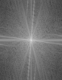
Young Brian Eno

Young Brian Eno Fourier

Young Brian Eno High Frequencies

Young Brian Eno High Frequencies Fourier
Based on these fourier analyses, it looks like our high-pass filter is working pretty well. The bright low frequency area around the center of the original image's fourier is darkened considerably in the high-passed fourier. This means that we have successfully removed a lot of low-frequency content from the image, even if there is still some left. This is evident perceptually as well in the hybrid image. Young Brian Eno essentially totally disappears from the picture after a certain distance, leaving a clear view of old eno. Interestingly, it seems that a lot of the high frequencies have been attenuated as well. The entire frequency spectrum seems a bit darker, but this effect is most prominently seen on the low frequencies. Also, there is a bright dot at the DC component, but that should be expected, right? Next, let's look at our low-pass on Bald Eno.
Bald Brian Eno
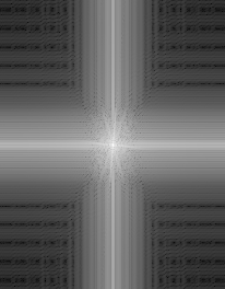
Bald Brian Eno Fourier

Bald Brian Eno Low Frequencies
Bald Brian Eno Low Frequencies Fourier
This is an interesting one. The original image's fourier has a lot of lines reflecting off of the border. I am not sure if this is the result of some sort of aliasing, or if it's because of the light source (half of Bald Eno's face is in shadow), but there is definitely a lot of high-frequency content here. In the low-passed fourier, we can see a lot of artificial geometric artifacts created in the high frequencies. This is probably due to an improperly-shaped gaussian. The gaussian I used for this (sigma=3, kernel_size=15) might be too close to a box filter, although with such a low sigma I would expect it to be closer to the impulse filter. It seems to have removed nearly all of the diagonal-directioned high frequencies and overwritten the vertical and horizontal directions with fairly thick bands. Importantly, these artifacts do not affect the lowest frequencies in the image; the center of the fourier graph is the same as it was in the original. The untouched center of the graph is a rectange, not a circle, which I found interesting as well. I'm not quite sure why that would be, but I'm pretty sure it's the same reason that caused those vertical and horizontal artifacts in the high frequencies. The highs seem a bit stronger than I would like here. This might cause a bit of a clash with Young Eno when viewed from up close. However, the cutoff frequency seemed like the best I could get perceptually, and I am choosing to trust my eyes. A bit of a high-frequency clash here isn't the worst thing because both pictures are of the same person, and also because Young Eno's long hair is an eye-grabbing high frequency component that is absent from the low-passed component. I think this hybrid is pretty good overall, although it's not perfect. Next, let's look at the frequency spectrum of the resulting hybrid to check my analyses.
Brian Eno Hybrid

Brian Eno Hybrid Fourier
I can vaguely see the cutoff frequency of the low-pass. There's a bit of a point where the low-frequencies become more dense, and it's a vertical box shape like in the low-passed fourier analysis. The vertical high-frequency component is still pretty strong here as it should be, due to Young Eno's hair consisting of mostly vertical lines. However, the horizontal component is also fairly strong, and since high-passed Young Eno didn't have much of a horizontal component, that means that this information must be coming from the low-passed Bald Eno. It's not ideal, but it's pretty slight. The geometric artifacts from the low-pass seem to be absent here (beyond the dim horizontal component). That means they were low in magnitude compared to the high-frequency component of Young Eno, which is exactly what we want.
Next, let's look at some other hybrids I made, starting with the 'failure'.
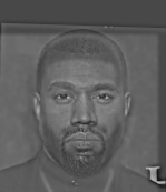
Drake/Kanye Hybrid
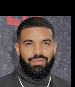
Drake (Low frequency component)
from link
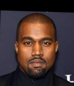
Kanye (High frequency component)
from link
Since everybody's talking about the feud between these two, I thought I'd try them out. They both have nearly the same hairstyle in this picture, so I thought it might work out. However, I did not account for the most important difference: eye location. This hybrid failed because Drake's eyes are too far apart. This causes Drake's head to appear smaller, and causes a misalignment of their other facial features. While these two artists have somewhat similar hair/head shapes in these photographs, their faces are too different for a hybrid to work properly. Also, they have very different facial hair, which further complicates things. They just do not look similar at all. This hybrid does not look like Kanye up close, and it does not look like Drake from far away, so I think I will label it a failure. It just looks weird.
Up next, we have a time-lapse of David Byrne, the lead singer of the Talking Heads.

David Byrne Time-Lapse Hybrid

Old David Byrne (High Frequency component)
from link

Young David Byrne (Low Frequency component)
from link
I think this hybrid between young and old David Byrne of the Talking Heads works pretty well. Up close, you can see the wrinkles and white hair, but far away, that completely disappears. I was very glad to find two pictures that are so well-aligned! He's making almost the same expression in both, and they're from the same angle.
I have one more hybrid, between Lil Nas X and Megan Thee Stallion.

Lil Nas Thee Stallion

Lil Nas X (High frequency component)
from link

Megan Thee Stallion (Low frequency component)
from link
This ended up being a pretty good combination. Lil Nas X's outfit has a lot of high-freqency information going on, while Megan Thee Stallion works as a good low-frequency background. Their faces and torsos line up very well, but there are some obvious issues. Firstly, Lil Nas's arm pose is pretty different from Megan's. Lil Nas is wearing a cowboy hat, and Megan has long hair. These differences give away the illusion up close (although from far away, Lil Nas disappears pretty nicely). This would likely work better on two people with similar hair shapes, like that famous hybrid of Einstein and Marilynn Monroes.
Now that we have discussed the frequncy model of images, we can use it to blend images together in a way that is very smooth. The concept behind this section is to blend lower frequency content more smoothly, while blending higher frequency content more sharply. To do this, we need to have a representation of an image at different frequency bands. We can do this via a Laplacian stack. We will repeatedly apply a low-pass filter to an image. At each application, we have two images: the original and the low-passed version. If we subtract the two, we end up with their difference: a frequency band. This approach allows us to isolate several frequency bands in an image and modify each band separately. Here are examples of a Gaussian and Laplacian stack, recreating Figure 3.42. I used a 6-layer Laplacian stack. My algorithm doubles the kernel_size of the mask's gaussian at each iteration, causing fairly long runtimes at larger depths or kernel_sizes. However, it shouldn't take more than a minute or two with the parameters I'm using. I'm sure there is a way to improve the efficiency of this algorithm, but for now it's usable.

Masked apple, layer 0 |

Masked orange, layer 0 |

Orapple, layer 0 |
|---|---|---|

Masked apple, layer 2 |

Masked orange, layer 2 |

Orapple, layer 2 |

Masked apple, layer 4 |

Masked orange, layer 4 |

Orapple, layer 4 |

Full masked apple |

Full masked orange |

Full orapple |
We can use this to blend any image we want! I tried to blend together two fish pokemon, Magikarp and Feebas, using the same vertical seam we used to make the orapple.

Magikarp from link |

Feebas from link |

Magibas (Blend) |
|---|
As you can see, the results aren't great. These two were very difficult to align, and even still I couldn't get it perfect. Magikarp is larger than Feebas, and they have different body shapes, even though they look pretty similar at first. Magikarp's whisker is only partly visible, which is an unfortunate flaw. Additionally, the blended image became darker somewhere along the way, which I don't really understand. This didn't happen to any of my other images.
Next, we will look at some irregularly-shaped masks. First, an easy shape. Googly-eyed tiger!

Googly Eyes from link |

Tiger from link |
|---|---|

Mask |

Googly-Eyed Tiger |
This uses an irregularly-shaped mask, but works best without any blending at the edges. It may not be the best candidate for this, but I think it's fun. Let's try again with real eyes.

Channing Tatum from link |
Tiger from link |
|---|---|

Mask |

Tiger with eyes |
I generated this mask using an image editing app on my phone. I mocked up this image beforehand in order to get the alignment correct. It's a little bit goofy, but I think it illustrates the principle we're going for here.
Finally, we will end with one last example. This time, we'll show the laplacian pyramid used to generate the image.

Hand |

Mouth |

Mask |
|---|---|---|

Masked hand, layer 1 |

Masked mouth, layer 1 |

Mouth Hand, layer 1 |

Masked hand, layer 3 |

Masked mouth, layer 3 |

Mouth Hand, layer 3 |

Full masked hand |

Full masked mouth |
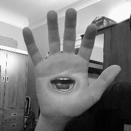
Mouth Hand |
I really liked learning about the frequency model of images! I've explored this idea with sound and music before, but not images. Sharpening is fun, and laplacian pyramids can also look pretty cool. Edge detection with only those little tiny matrices is super impressive. Thanks, and I hope you enjoyed some of my silly little pictures!
.jpg&imgrefurl=https%3A%2F%2Fpitchfork.com%2Fnews%2Flil-nas-x-reveals-tracklist-for-new-album-montero-featuring-megan-thee-stallion-elton-john-miley-cyrus-and-more%2F&tbnid=vGGWV-TyHLzTeM&vet=12ahUKEwjIt8SCsY_zAhW6BjQIHQIJBaQQMygLegUIARDCAQ..i&docid=31fZrWi4ItpNmM&w=1332&h=999&q=lil%20nas%20x&ved=2ahUKEwjIt8SCsY_zAhW6BjQIHQIJBaQQMygLegUIARDCAQ)