CS 194: Final Project
Will Panitch 3034543383
Ryan Mei 3034514471
Introduction
Good morning, and welcome to our final project for CS 194!!! Throughout this course, we've learned all about the ins and outs of imaging and computation.
It has been such an awesome semester, and we're so excited to show you what we've come up with for our final project!
Part I: The Poor Man's Augmented Reality
In which we force a camera to see things that aren't really there
The technology of Augmented Reality allows us to insert objects into images so that they appear to be in the scene, even if they aren't there in real life. That is, we can augment our images of reality with things that are not, in fact, real. This technology relies on an estimate of the properties of the camera, such as the focal length, lens distortion, and orientation relative to the objects in the scene, which are then used to project the intended points of the object into the image plane, placing them in such a way that they look as if they are natively present in the scene.
To do this in the real world is extremely complicated, and requires some method of point detection and tracking so as to calibrate the matrices for the camera. However, since this is a school project, we're allowing ourselves a little bit of cheating: We can start with labeled real-world data!

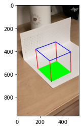
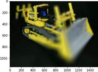
I started with a piece of " graph paper, onto which i drew dots at every fourth corner. By doing this, I ended up with a real-world object that I could use as a measuring stick for identifying my camera. Then, I creased the paper around a third of the way down and folded it 90º so that I had points that varied in the x-, y-, and z-directions. From there, all I had to do was to tell the computer the location each of those points through each frame of the video.
Now hold on just a second, you might be thinking. Labeling points in every single frame of a video?? That sounds like a lot of work!
And you're right. If we had 16 points at 25 frames per second in a 5-second video, we would be looking at 2,000 hand-labeled points. That doesn't really sound like a good time, to be completely honest. But using our knowledge from the first few projects, we can do WAY better. What if I told you that combining our tricks from projects 3 and 4 could bring that 2,000 down to just 30 or so points?
Let's start by using the ginput function that we learned about in project 3 to select our starting points in the very first frame:
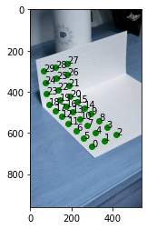
Okay, awesome. Now, to propagate those points forward, we're going to try something very hacky. Remember the harris corner detector from Project 4? Well, almost the whole paper is white, so there aren't a whole lot of interesting points except for the ones that we drew. So if we run the harris corner detector, and filter out the top 1000 points or so, it's very likely that we'll end up with corners that are located at the marked vertices. All we have to do then is find the corner in the next frame that is closest to the location of the corresponding corner in the current frame. Then, propagating forward, we end up with a pretty good tracker of the marked points through our video.
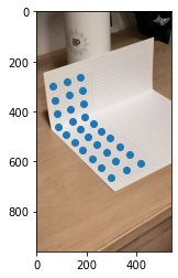
zFinally, just like in both projects 3 and 4, we set up a least squares system to solve for the camera matrix in each system. We have a pretty large number of unknowns in this system, so it's best to use as many points as we can accurately guess (all of them). Using this process, which I stole from this stack exchange answer, and using our fixed scale trick, I was able to calculate the camera matrix for each frame.
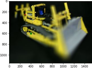
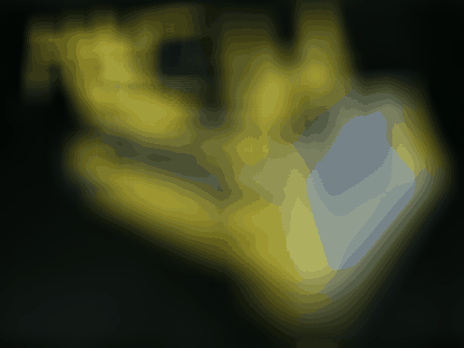
Finally, we use our camera matrix to project the points of the fake cube into the image, draw our lines, and voila! A cube where none was before!

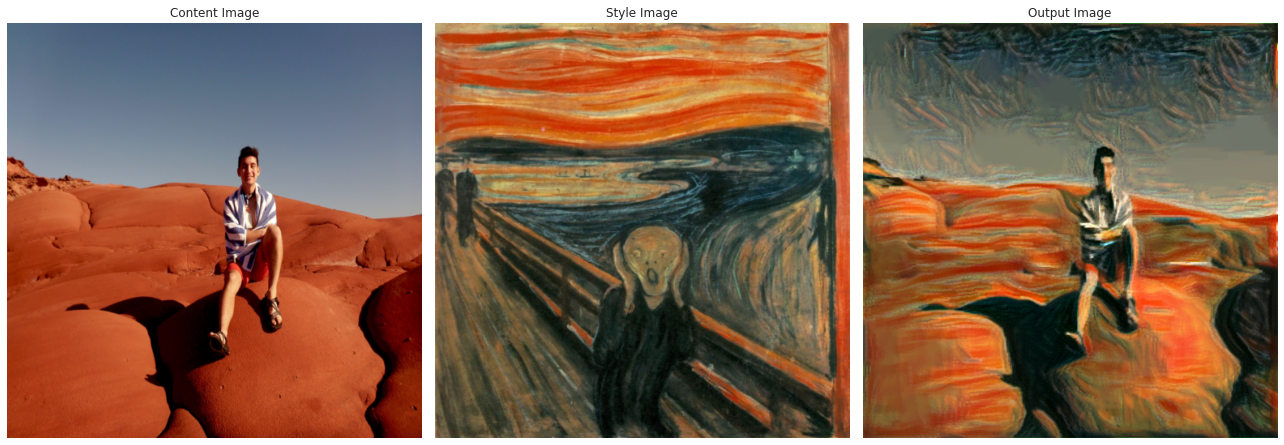
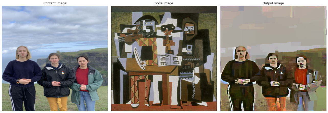
Part II: A Neural Algorithm of Artistic Style
In which we commission Van Gogh to paint some of my favorite photos.
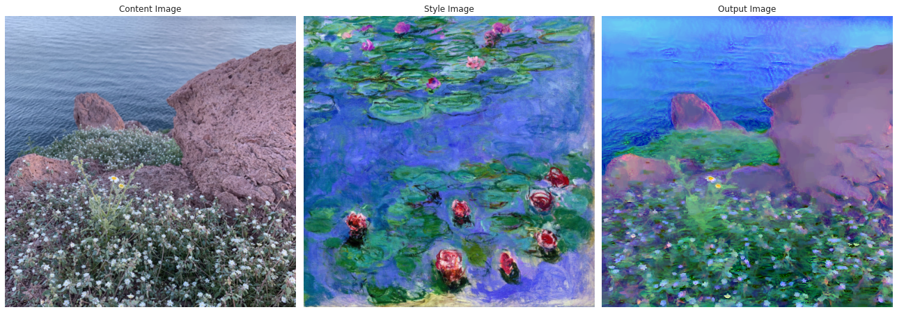
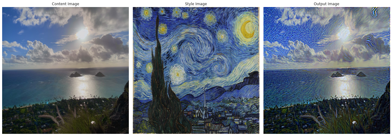
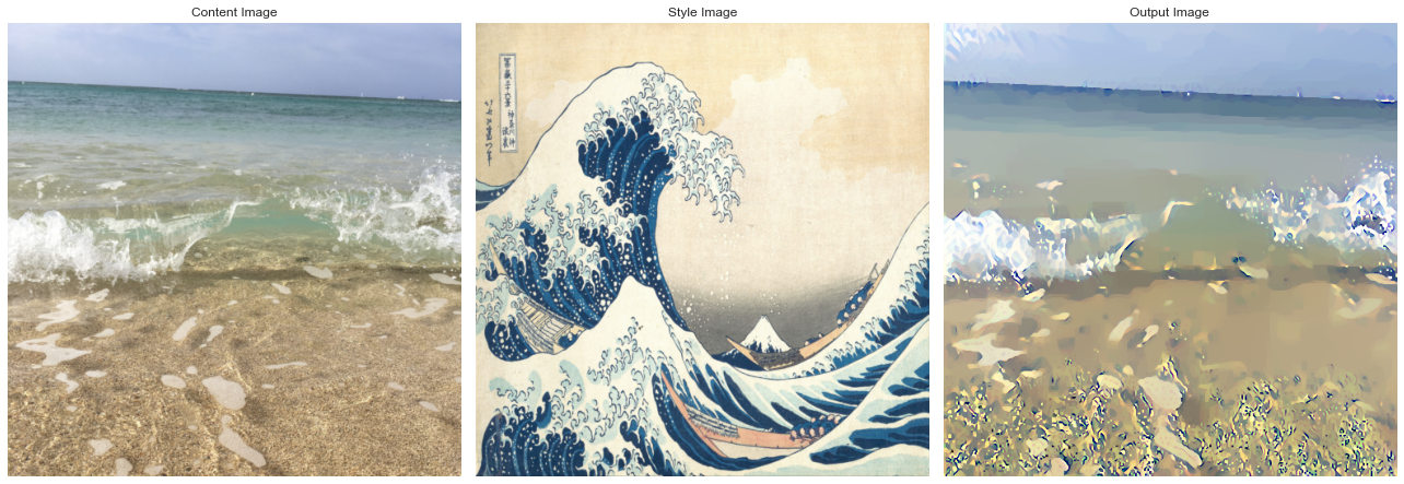
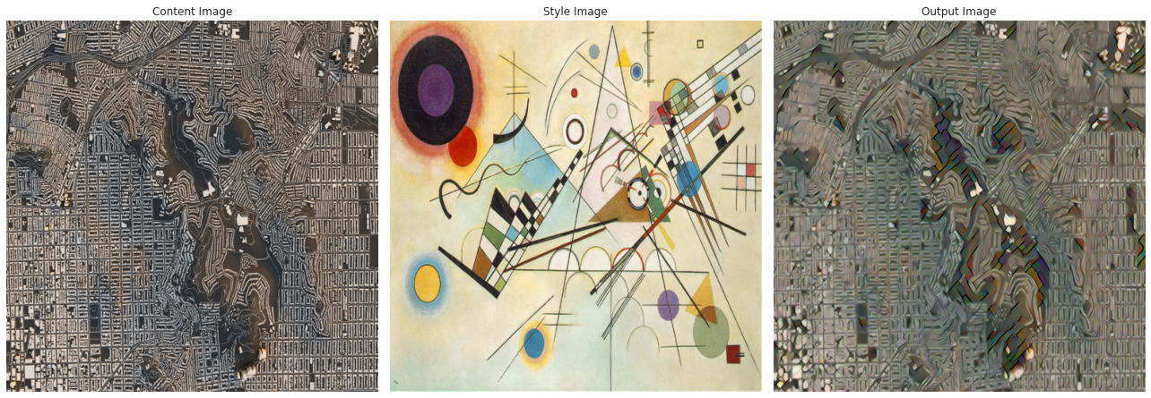
For our second project, we reimplemented and played around with the paper A Neural Algorithm of Artistic Style, which uses an intuitive but brilliant idea to create images that have content that matches one scene, but feel like another.
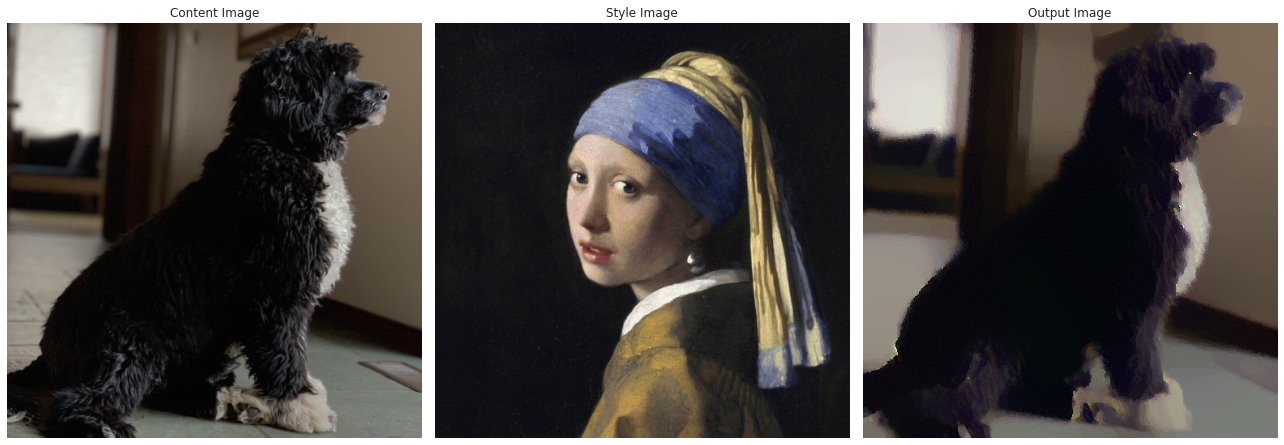
The idea behind the paper is to take a visual model that is already trained on some visual task, such as classification or detection, and use it for something it wasn't trained on. We use a pre-trained model for this because it has already learned a number of useful features for visual tasks, which means that it has ways of breaking down the raw pixel values in images into something meaningful. This makes it perfect for projects like this one, which abuse the representations that it has worked so hard to learn.
We feed in both of our images—the "content" image and the "style" image—and attempt to optimize a weighted loss that balances between the two. The first component of the loss compares the earliest activations of the neural network (that is, the raw pixel values) against those of the content image. Intuitively, minimizing this loss would cause our output image to try to match the exact pixel values displayed in the first image as closely as possible, which incentivizes the computer to recreate the objects and colors in the first image.
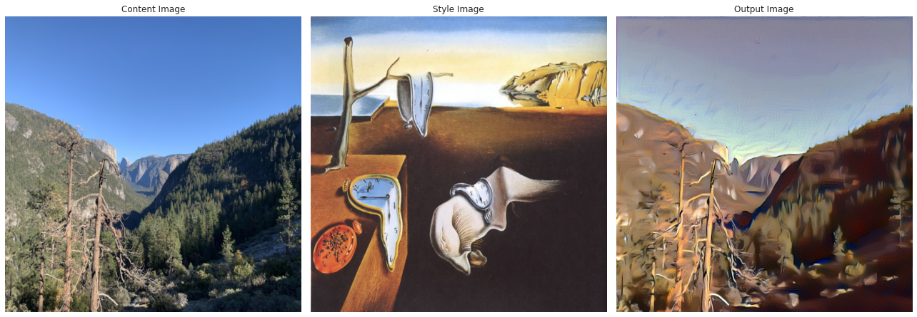
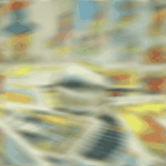
The second component of our loss is a little more nuanced. This loss is a similar difference-in-values loss, but instead of being at the beginning of the network, its comparison is between the activations in the mid-to-late layers of the network! This means that it's trying to attain similar representations between the images. These representations have gone through a little bit more processing than the earliest layers, and so represent things like textures, shapes, and blocks of color. For example, notice how the trees in the above image of Yosemite become droopy, melted, and orange when transferred towards the Dali painting!
I will now include a gallery of some of our favorite results on photos of our own!

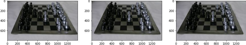
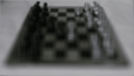
Part III: Light Field Imaging
In this project we construct light field images from a series of images captured from a 17x17 array of cameras from the Stanford Light Field Archive.
Refocusing
We can compute a refocused image using the array of images using the following procedure:
- Calculate the mean position of all the camera positions, and the shif of each image capture from the mean position
- Scale the shift vectors by a constant alpha (which determines the resulting focal plane)
- Shift each image in the array by the scaled vector, and average all the images.
By varying alpha, we can create a focus stack of our scene:
Aperture Adjustment
We can also adjust the aperture by restricting how far the images we use to compute the average are from the mean capture position. By reducing this maximum distance we reduce the aperture size.
Interactive Autofocus
We can also autofocus to a point.
We extract patches around the point at each image in the focus stack.
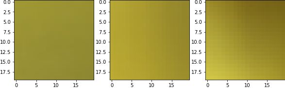
Then calculate the standard deviation of the pixel values of each patch.
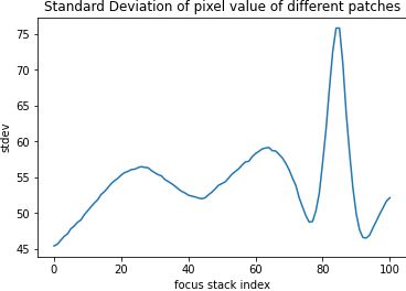
Argmax-ing we see that it peaks in image 84, which is the most in-focus image.
We can do this for another point.