Part 1: Seam Carving
We seek to implement an algorithm similar to that proposed in Seam Carving for Content-Aware Image Resizing, which uses dynamic programming to compute a vertical or horizontal "seam" (one pixel per row or column) of pixels to remove from the image with minimal impact.
We measure said impact per pixel using an energy function \(E(i, j)\). With this, we seek to remove a seam with lowest cumulative energy, which reduces to a simple dynamic programming problem with the following recurrence:
\[CE(i, j) = E(i, j) + \min \{ E(i-1, j-1), E(i-1, j), E(i-1, j+1) \}\] where \(CE(i, j)\) is the minimum cumulative energy of a seam that extends up to pixel \((i, j)\).
We then select the pixel at the bottom row with minimum cumulative energy and backtrack up by picking the pixel among the three upwards neighbors with the smallest cumulative energy. This is the seam to be removed.
To support horizontal seam removal in addition to vertical seam removal, we can simply transpose the image prior to computing cumulative energy and removing seams, then tranpose the resulting image back.
For now, we use the following energy function: \[E(i,j) = \| \nabla I \|_2, ~ \nabla I = \begin{bmatrix} \nabla I_R & \nabla I_G & \nabla I_B \end{bmatrix}^T \in \mathbb{R}^6\]
More specifically: we stack the spatial gradients of each of the image's 3 channels and then take the \(L_2\) norm. Our hypothesis is that the importance of a pixel can be approximated by the amount of local change. Smoother, consistently-colored areas will have less energy because there is less immediate local change, and therefore some of those pixels will be redundant and can be removed.
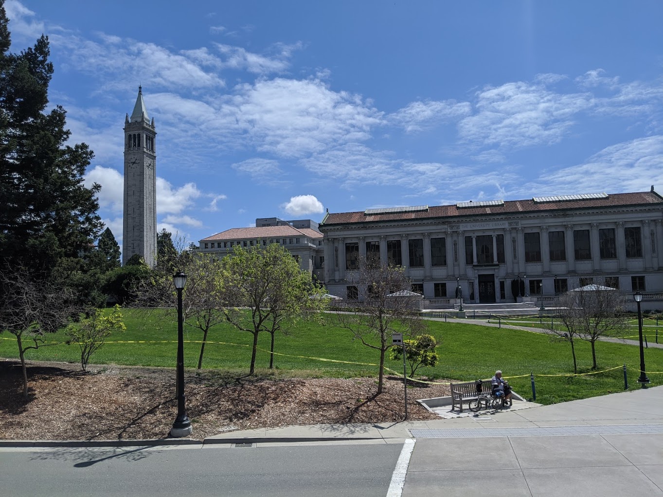
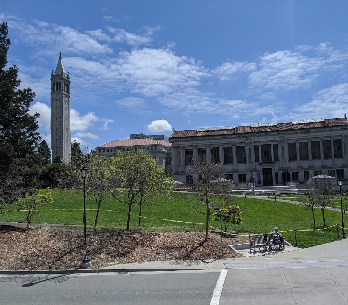
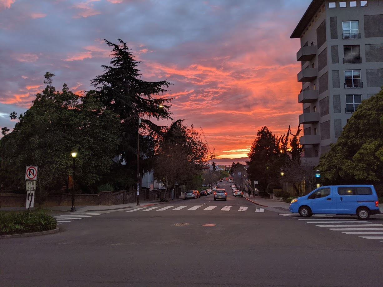
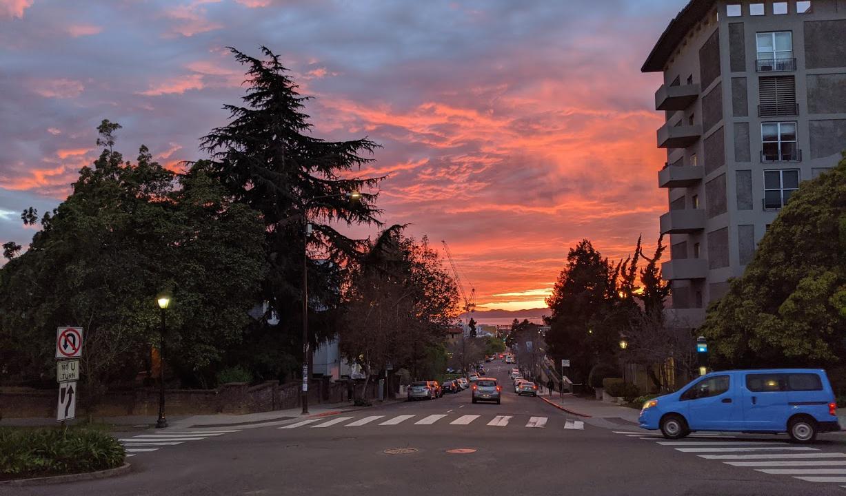
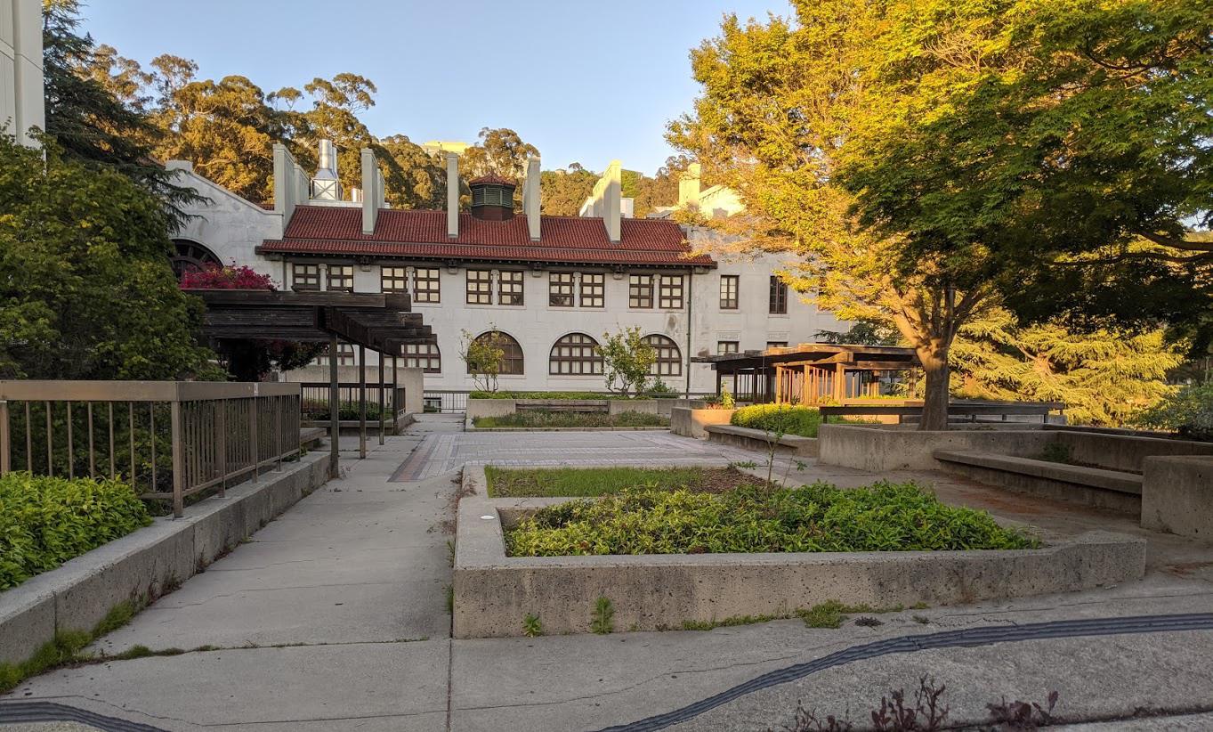
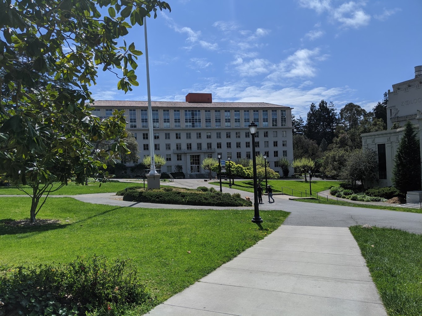
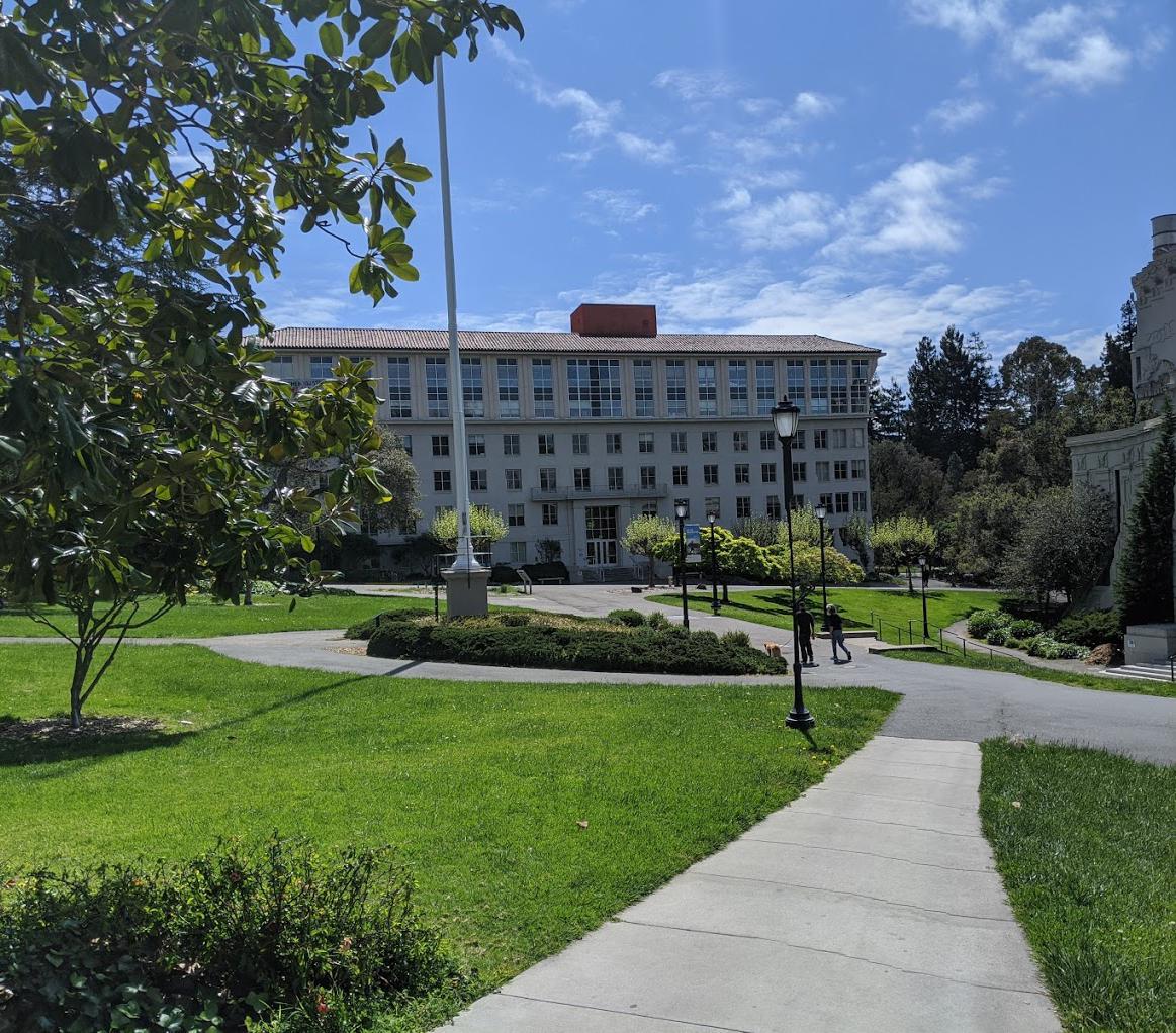
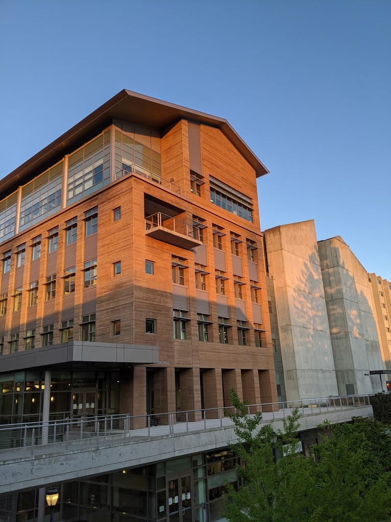
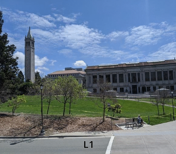
Below, we present some results of the algorithm on images from campus, as we know everyone misses campus right now. These potent pictures are accompanied by weighty words discussing specific effects of the algorithm on the image.
Results (More Successful)
| Before | After | |
|---|---|---|
 |
 |
|
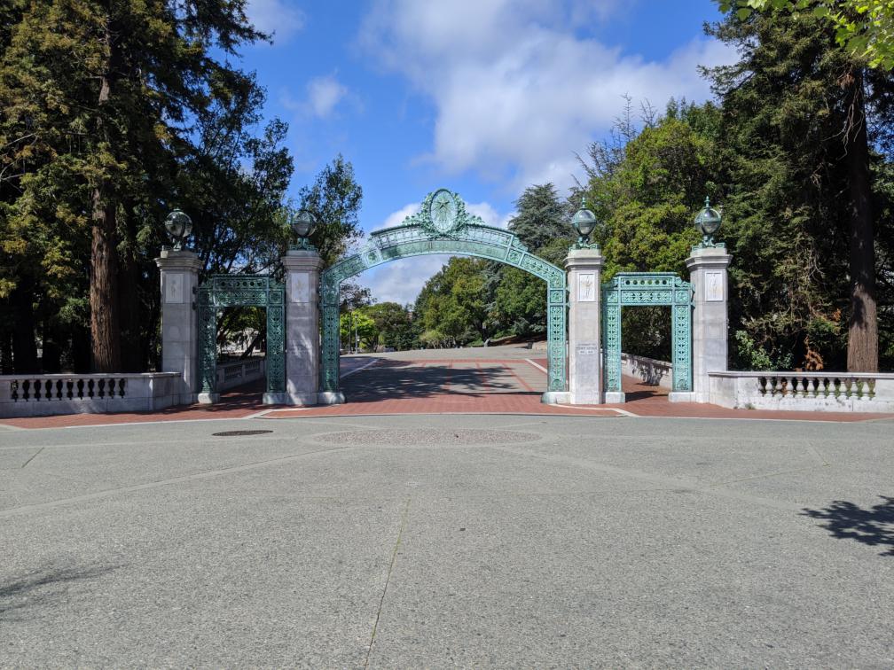
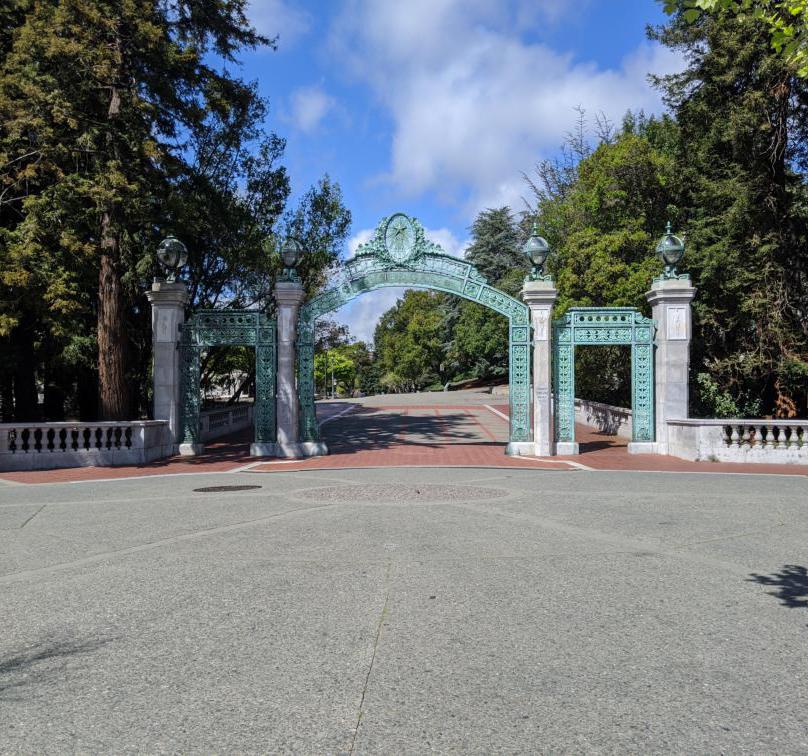
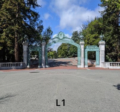
| The algorithm gives the Sather Gate pillars a squeeze, and also removes seams from the marble railings, but mostly preserves shapes, straight lines, and the overall geometry of the gate. | ||
 |
 |
|
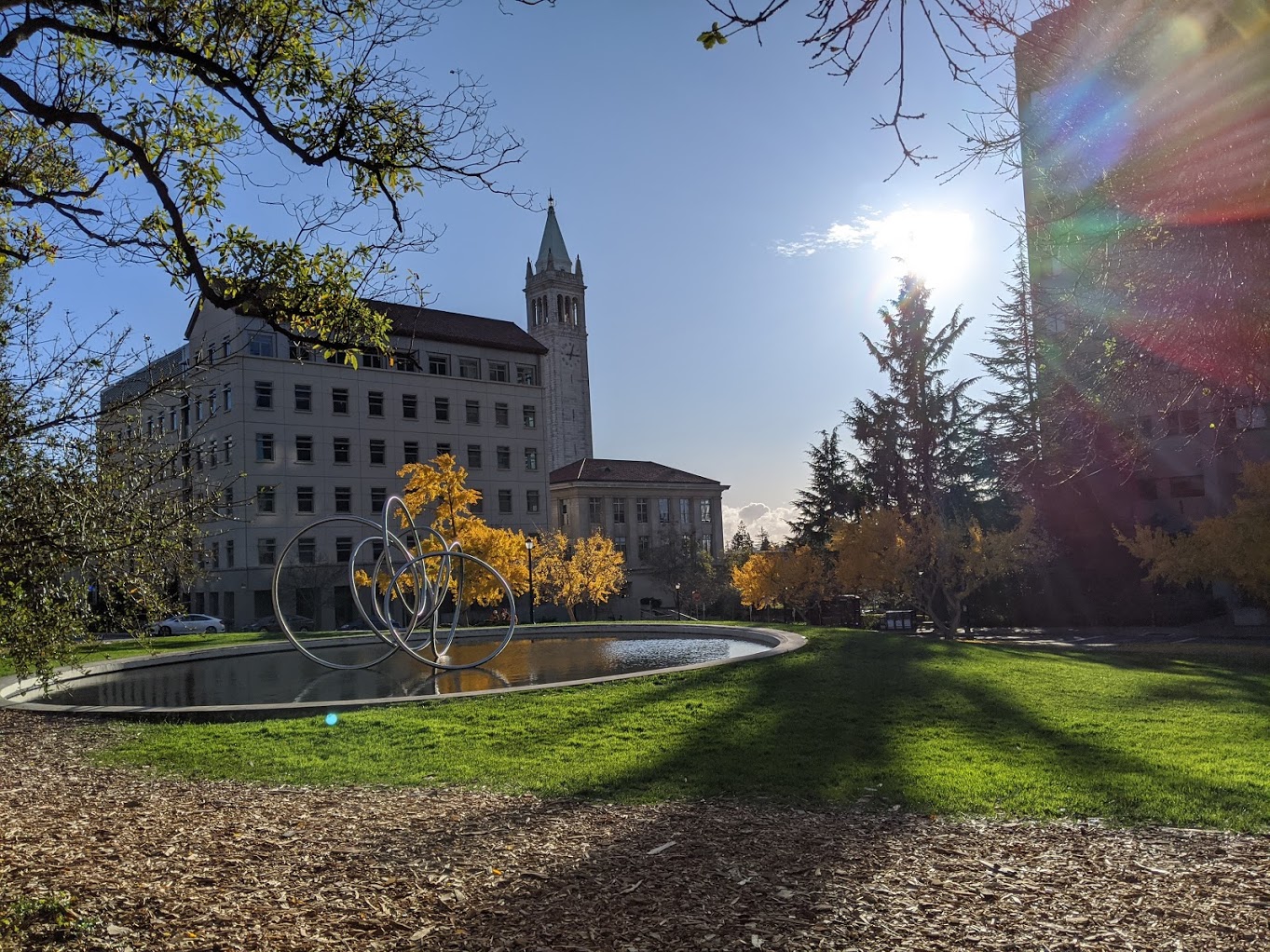
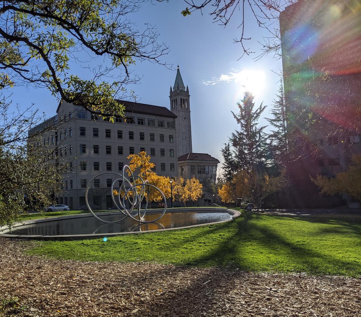
| Most buildings are left unchanged (sorry LeConte) as the algorithm targets seams with the most blue sky available. There is a small artifact in the pool border. | ||
 |
 |
|
| Most removed seams were from the left side of the image (serving more as a crop) or from shrinking the Doe pillars, but overall the building is still realistic and recognizable. | ||
 |
 |
|
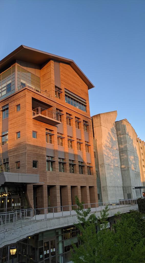
| The large regions of concrete pavement are removed, as well as the wall of Hearst Mining in between the windows. The algorithm is not as consistent here compared to Sather and Doe. | ||
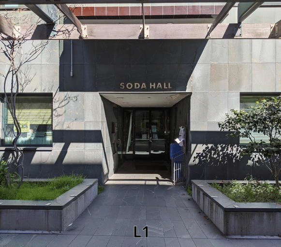
 |
 |
|
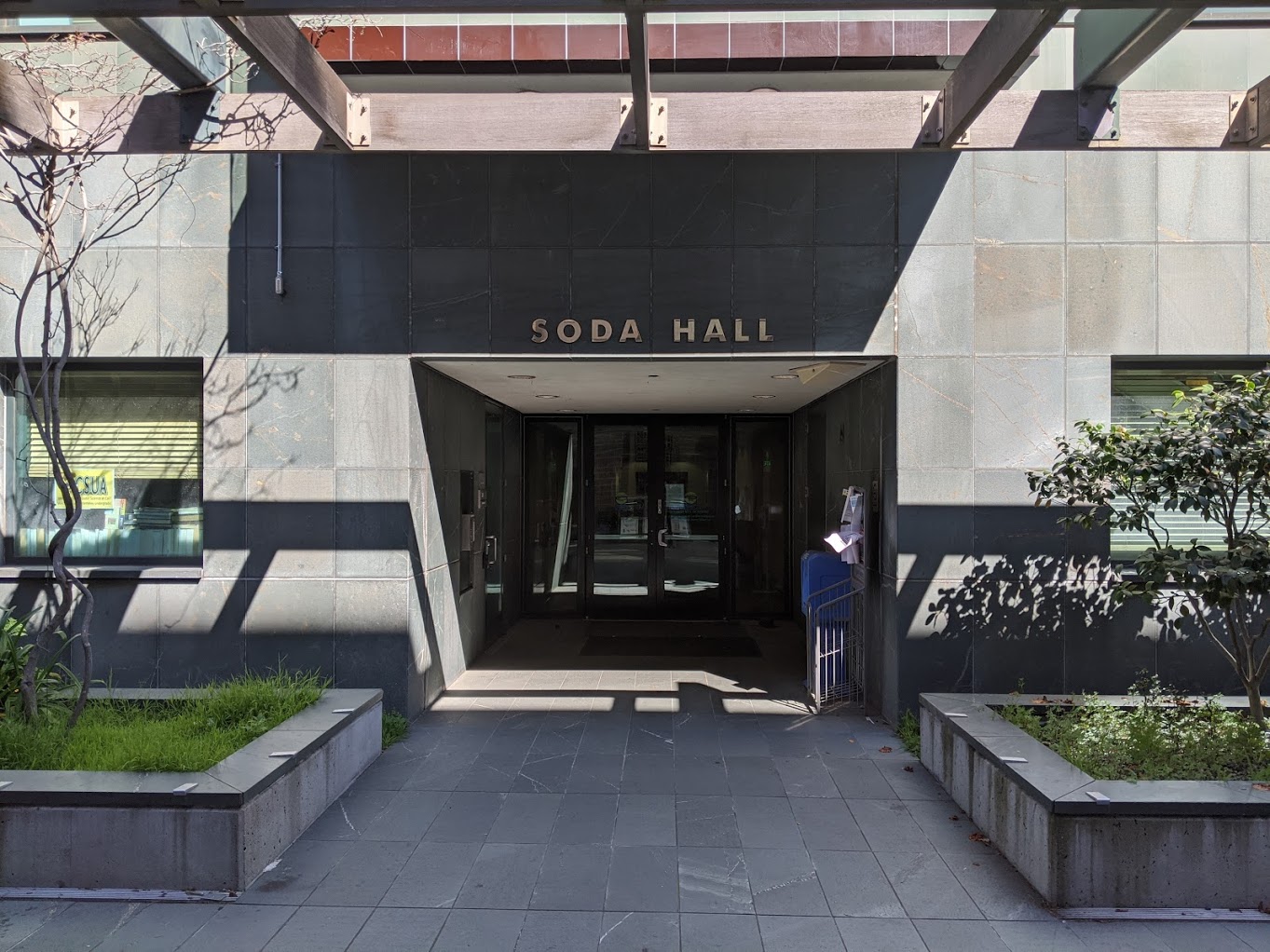
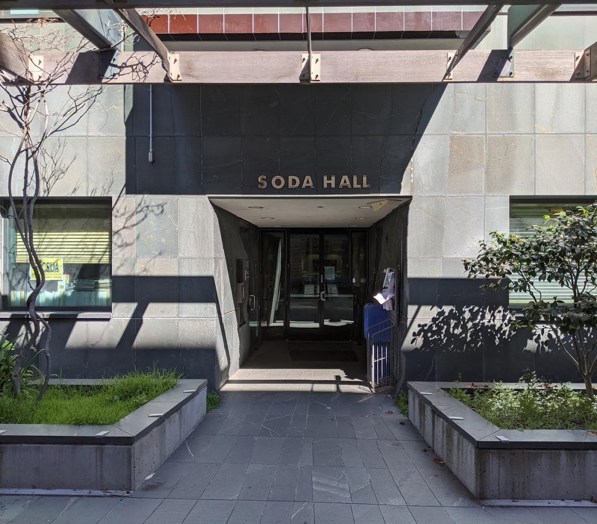
| Most seams here pass through the Soda doorway. The result is quite good but there is suspicious curvature in the shadows above and the lines between floor tiles below. | ||
 |
 |
|
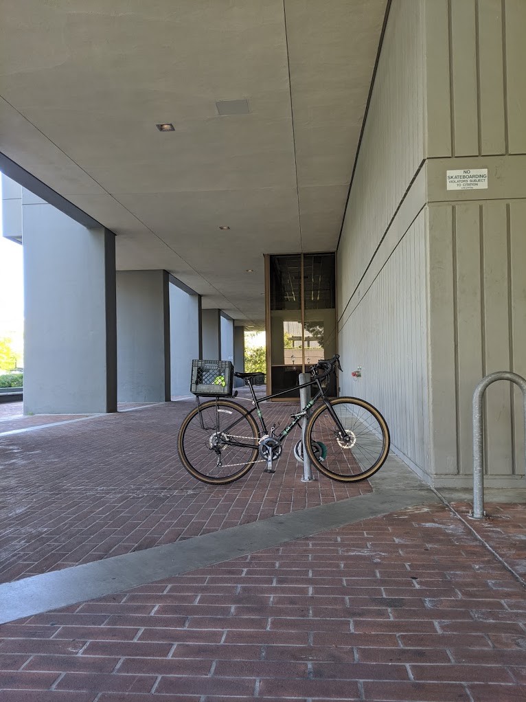
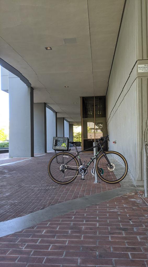
| Same as before, the algorithm curves some lines but overall the structure of the scene (the walls and pillars) are preserved well, especially if you forget the metal bar ever existed. | ||
 |
 |
|
| The algorithm removes most horizontal seams on the asphalt (again, serving as a crop) but also resizes the sky without removing the distinct geometry of the roof of the building. | ||
|
 |
|
| As with the vertical example, the removed seams go through the concrete pavement. Straight lines are mostly preserved in the farther concrete patch but are heavily distorted in the closer one. |
Results (Less Successful to Horrifically Bad)
| Before | After | |
|---|---|---|
 |
 |
|
| While still an important feature with great significance to many students, the visible part of VLSB facade has a very smooth facade, allowing for low energy seams to rip through it. | ||
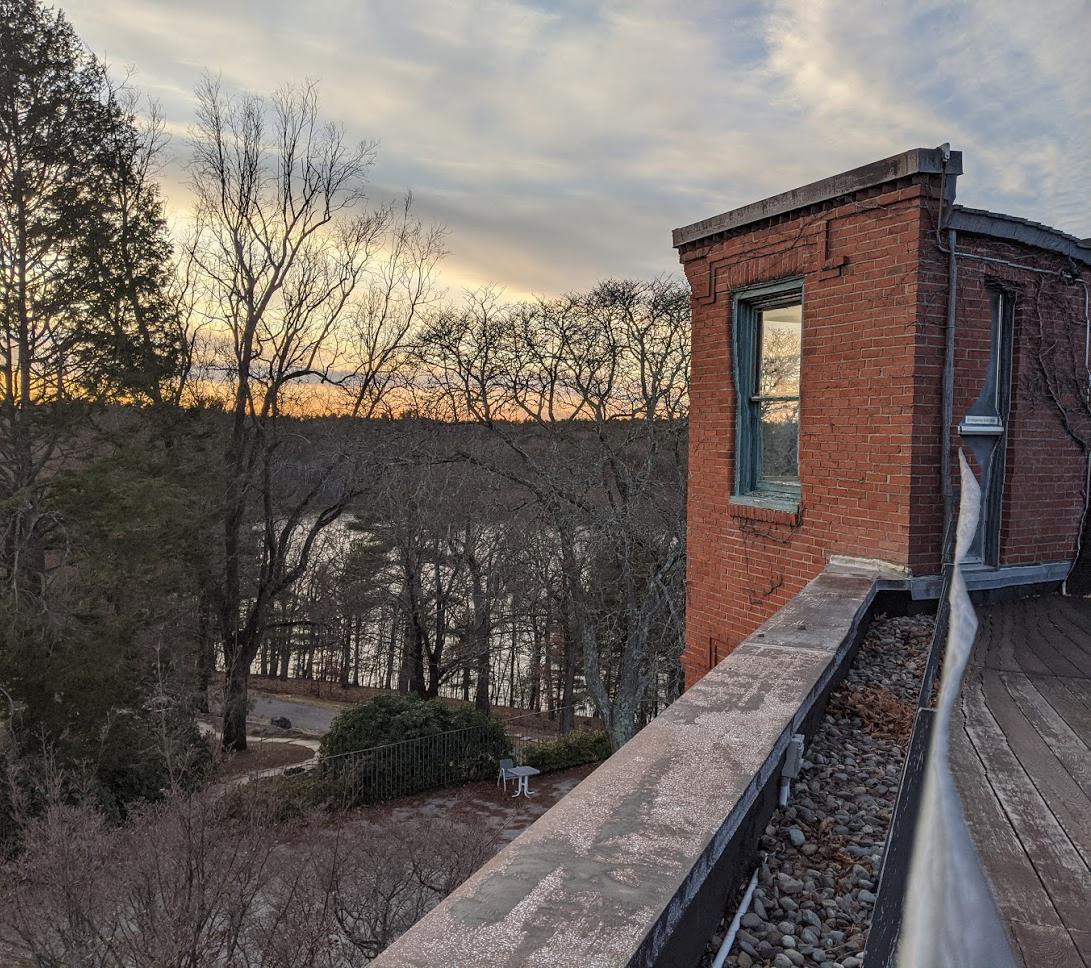
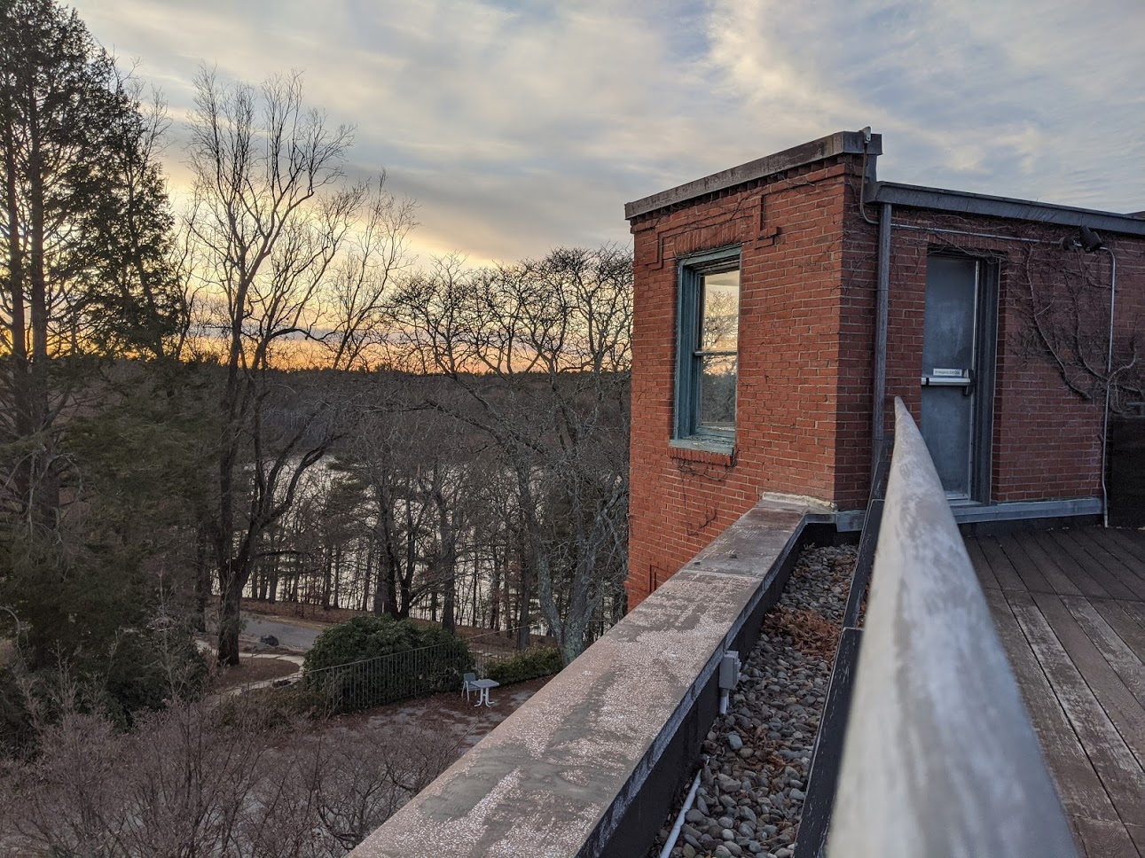 |
 |
|
| Spot the difference? This is the only picture that wasn't taken on campus! Taken from the roof of the deCordova art museum in Lincoln, MA. | Ditto for the pipe and red brick wall here, which are less noisy (though still more significant) than the forested areas to the left. | |
 |
 |
|
| The algorithm targets the consistent facades of SDH and Davis Hall but distorts the building edges with curved seams. | ||
 |
 |
|
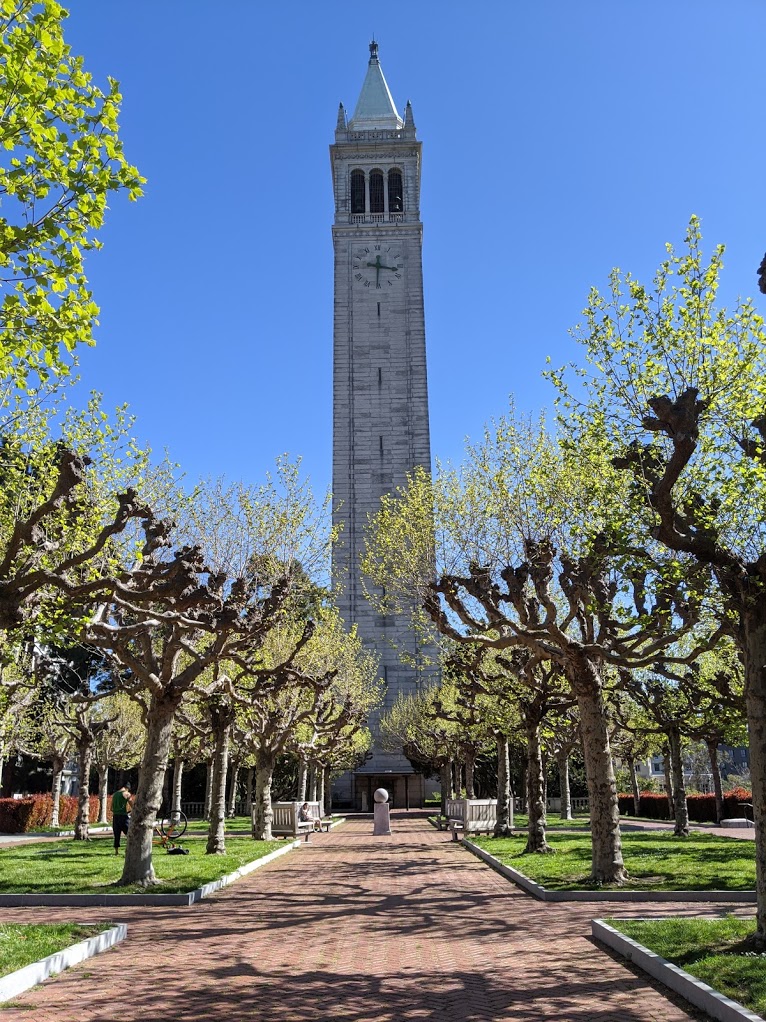
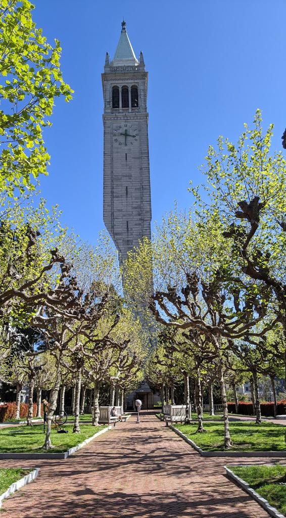
| While the algorithm correctly removes uninformative parts of the sky and walkway, the local variation from tree leaves encourages the algorithm to take a huge bite out of the Campanile. |
Bells and Whistles: \(L_2\) vs \(L_1\) Norm Energy Functions
We compare the results of the algorithm when using \(L_1\) versus \(L_2\) normed gradients as our energy functions. As these are functionally similar (both distance metrics) and are operating over elements with low dimensionality (only \(\mathbb{R}^6\)), we expect the differences to be limited in scale.
However, we know from optimization and machine learning that these norms behave very differently as objective functions. For example, using \(L_2\) (least squares ) will often produce results that are more sensitive to outliers than \(L_1\) (least absolute deviations).
To see this in practice for our application, consider our algorithm running on a single-channel image. Suppose it finds two pixels with a combined gradient of 10 but distributed differently among the two elements: \(x_1 = [5 \quad 5]^T, ~ x_2 = [10 \quad 0]^T\). Then \(\|x_1\|_1 = \|x_2\|_1 = 10\), but \(\|x_1\|_2 = \sqrt{50} \approx 7.07 \leq \|x_2\|_2 = 10\). While under the \(L_1\) energy function these two pixels would be considered equally important, under the \(L_2\) energy function the algorithm would favor \(x_1\).
This can potentially come into play in the algorithm's sensitivity to color differences between pixels. The \(L_2\) energy function would consider regions with uniformly minor deviations across all colors as lower energy than regions with sharper deviations but concentrated in a single color channel. The \(L_1\) energy function would have no such preference.
In our comparison, we note that using the \(L_1\) energy function results in more foliage being removed (Sather, Doe). This would be because leaves and vegetation are very uniform in color, especially compared to man-made surfaces that experience more variation in many color channels (for example, the splotched concrete in front of Sather Gate and the stone and tiles on Doe Library). We speculate that a similar effect is at play in Soda, where the shadow results in a dark bluish tint on the tiles in the doorway. Compare this to the sunlit tiles, where the light makes color differences (light blue, dark blue, brown) more apparent.
We propose the following heuristic:
If the surfaces you seek to remove are consistently colored or very dark, choose \(L_1\). If they are more varied (speckled with different color, very light/reflective), choose \(L_2\).
However, as we can see below, the overall difference between the two energy functions is quite minor. To study the full effects of this choice, we would want to do a deep dive into the statistics of images and pixel intensities, as well as how these minor deviations are perceived by human viewers.
| Before | After | |
|---|---|---|
|
 |
|
|
 |
|
|
 |
Conclusions
It was interesting to see how well (or poorly) this algorithm performed on a variety of scenes and it really made me think about how we choose to quantify image importance. An energy function that measures local change will be more biased towards noisy/more densely-textured images and less towards large, smooth features that could still be important, like buildings!
Part 2: Lightfield Photography
We seek to implement digital refocusing and aperture adjustment algorithms similar to those proposed in Light Field Photography with a Hand-held Plenoptic Camera, using photos available from the Stanford Light Field Archive.
The Stanford dataset includes collections of pictures taken from a 17 x 17 uniform grid of camera positions, with their grid positions and coordinates labelled.
Depth Refocusing
If we were to average all 289 images, we would see some blurring as different parts of the scene would appear in slightly different locations for different pictures. Some parts of the image would be in focus, but most would not. However, because we know the grid positions of each image, we can perform depth refocusing after the fact by applying a modified shift-and-add algorithm. The specifics are as follows:
- Compute the center coordinate \((x_c, y_c) = \sum ^n_{i=1} (x_i, y_i)\).
- For each image, compute an offset \((u_i, v_i) = (x_i, y_i) - (x_c, y_c)\).
- Pick a constant \(c\) and shift image \(i\) by \(c \times (u_i, v_i)\).
- Average the shifted images together.
We see that a smaller \(c\) corresponds to focusing on the background, while a larger \(c\) focuses on the foreground.
Here, \(c\) ranges from -0.5 to 0.5.
Here, \(c\) ranges from -0.3 to 0.3.
Aperture Adjustment
We can also adjust the aperture size after the fact. Averaging together all 289 images after shifting is equivalent to having a large aperture. However, if we take a subset of those images (in our case a square-shaped group of images around the center), we can simulate an aperture of variable size. Specifically, we modify step 4 of the shift-and-add algorithm to include the following subtasks:
- Pick a constant \(a \in [1, 8]\) which is roughly the "radius" of the aperture, or how far we wish to extend beyond the central image. For example, \(a = 1\) means picking the central image and all images within 1 of the central image.
- Average the images from grid positions (row, column) of \((8 - a, 8 - a)\) to \((8 + a, 8 + a)\) together. For \(a = 1\) that will mean grabbing 9 images in a square around the central image.
We see that a smaller \(a\) corresponds to a smaller aperture, which has less blurring outside of the focusing distance in the scene, while a larger \(a\) leads to more blurring.
Here, \(a\) ranges from 1 to 8, while the focus is fixed at \(c\) = 0.
Conclusions
It was interesting to see the effects of such minor shifts and image selections. Obviously as the aperture became smaller and the shifts became larger, artifacts from the original image became visible, but this could be remedied with a denser sampling of images (denser sample of the plenoptic function).