Seam carving is an algorithm that allows shrinking of an image along one dimension without the loss of too much information in the image. Let's try it!
The Algorithm
At a high level, seam-carving aims to find "seams" of low energy pixels in an image. A seam is a path of pixels where either a) no 2 pixels are on the same row (if it's a vertical seam) or b) no 2 pixels are on the same column (if it's a horizontal seam). Pixels also have to be adjacent to each other, leaving only 2 diagonals and the direct neighbor pixel as viable options for the next step in the seam. We then delete the seam's pixels in the image, leaving a result that is one small pixel towards the target dimension, one giant leap for pretty photos that are smaller without looking like they've been smooshed in a cartoon.
Energy of pixels was calculated using gradients in the x and y direction. I first convolved the image with either DX or DY, just like the convolutions done in project 2's edge detection. I then used the resulting array of gradients to find the energy of each pixel. A finer analysis of the algorithm will show that it requires a bit of dynamic programming. Namely, we can assume that the minimum total energy at any pixel will just be its gradient value plus the minimum of the total energies of the 3 pixels before it. Therefore, we can build up an "energy map" that is built dynamically and stores the values of the total energies at each pixel. To find the lowest energy seam, we only need to find the smallest total energy at the end of the map (the bottom or rightmost slice of the 2D array). We then repeat the process only for that specific seam, to find the pixels that belong in it. Then, we take them out. This entire process is repeated as many times as needed to achieve the target dimension.
The Images
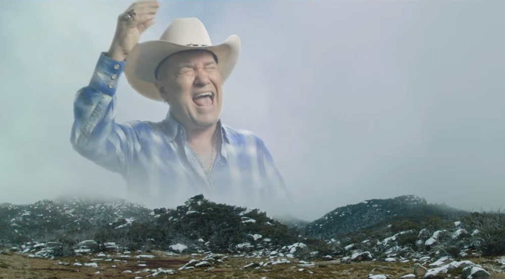
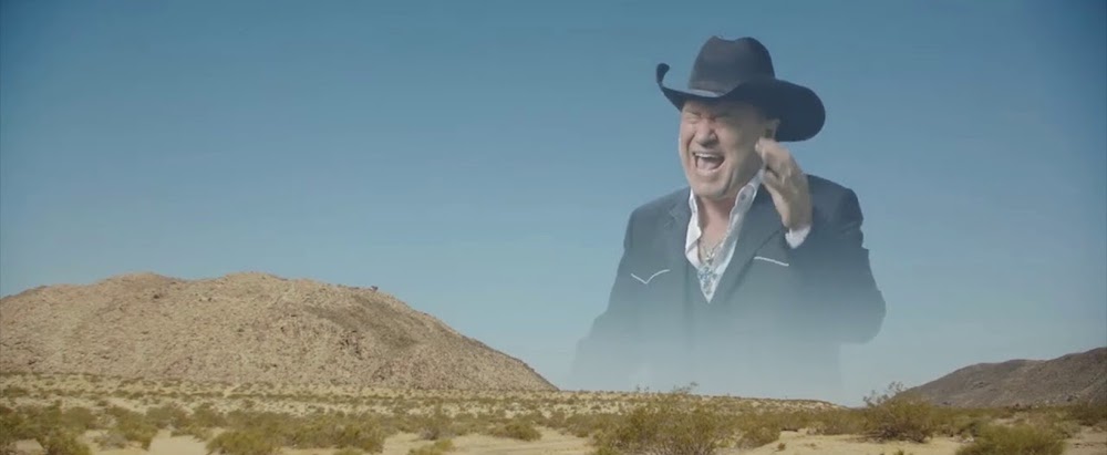
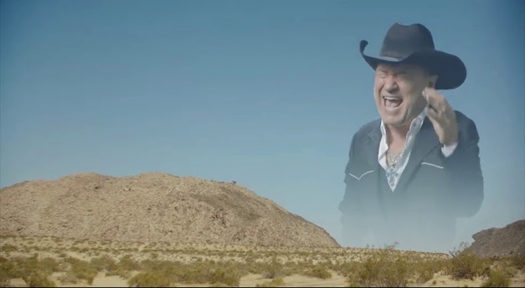
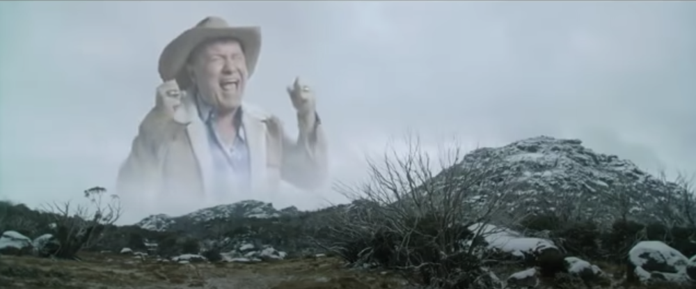
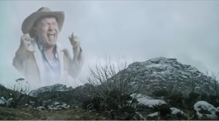
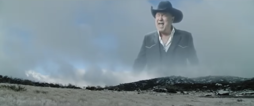
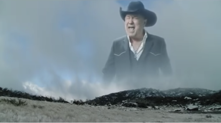
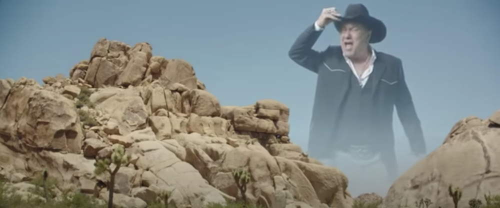
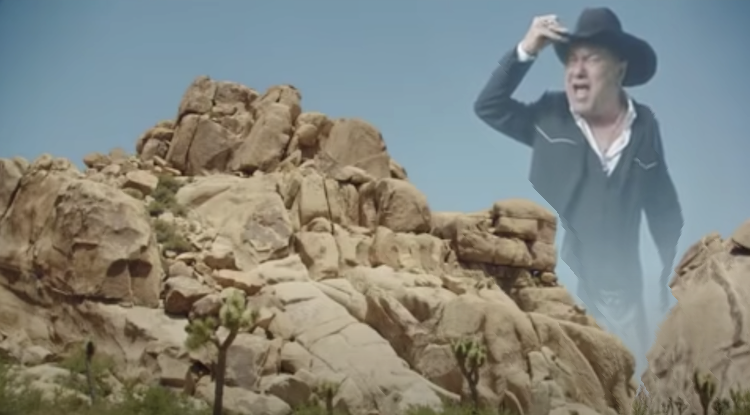
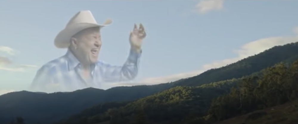
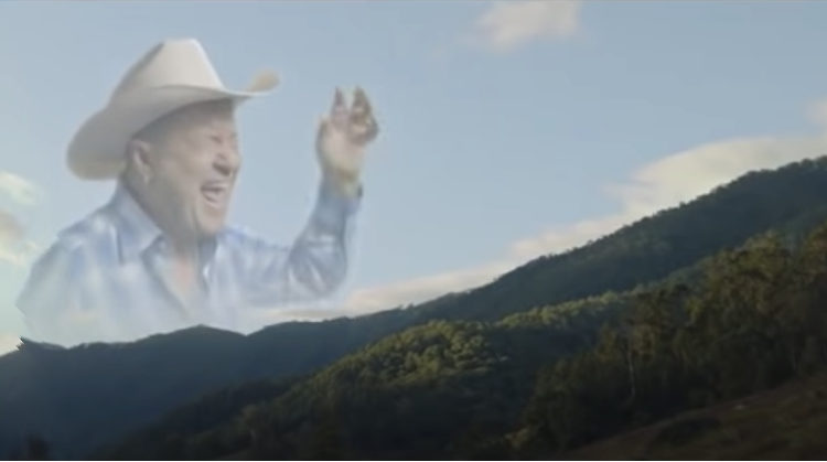
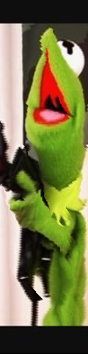
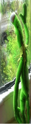
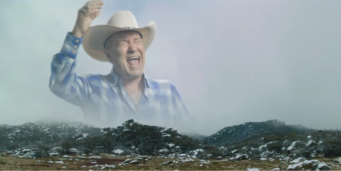
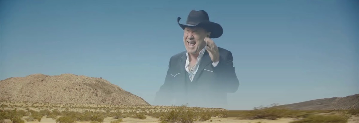
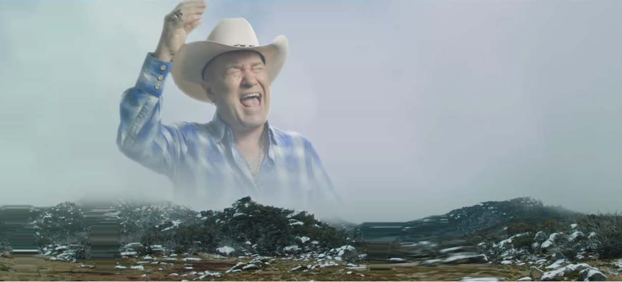
But I bore you with the words; it's carving time. Below are my results on applying seam carving to several images, in an effort to discern how well it works in horizontal carving (and how important sky cowboys really are). These images are all originally 1000 pixels wide and reduced by 250 pixels. If you would like to educate yourself on the source material, please watch this.
|

|
|
|
|
|
|
|
|
|
|
|
As can mainly be seen in examples 3 and 5, prominent features in the landscape such as rocks and trees have big gradient energy, so they cause artifacts in their surroundings (such as in the faded, weak-sauce faded cowboy spirit) if the reduction is too large. Asides from that though, these images mainly show successful applications of the algorithm applied horizontally (landscape photos prove to be good for this).
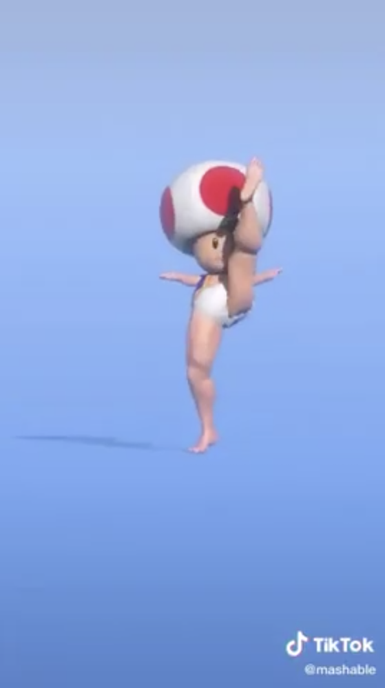
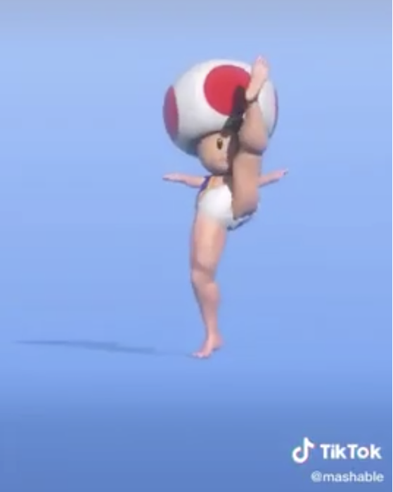
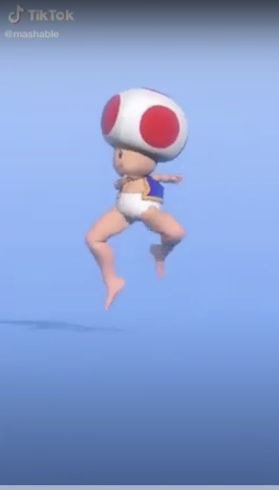
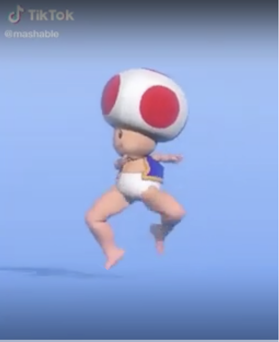
With some fernangling with the matrices, the algorithm can also be applied vertically. This helps when you really need some help paying attention to only the most important parts of, say, a Tik Tok or something. These images start at 1000 pixels and are reduced by 300 pixels in the vertical dimension.
|
|
|
|
Note how the gradient background upon which the artist dances is mostly retained, a feat unachievable by mere peasant cropping.
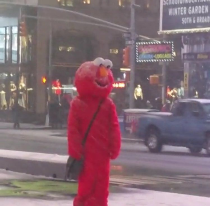
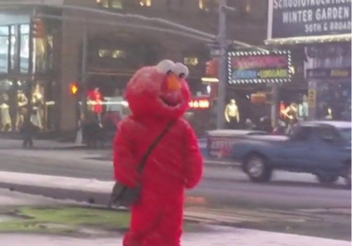
Or course, the algorithm is not perfect. Images contain a finite amount of data, and any reduction that is too extreme (reducing an image by 50% of its size or more) when there is a lot of information to retain will invariably create some artifacts of the seam carving. If gradients are roughly similar throughout the entire image, this may result in carving that looks similar to just your old regular resizing done in bad PowerPoints. Alas, some failure cases are drastic, and make me sad (700 pixels reduced by 200 vertically, in the following pictures). (These don't exhibit many artifacts, but the large amount of detail in all parts of the image cause it to undergo that compression effect, makig things noticeablly a bit squashed).

|

|
|
|
The following images look poor because of a large amount being carved out of a detailed image. We are taking out 250 pixels from a 400-pixel dimension.

|
|

|
|
Bells and Whistles: Stretching Images using Seam Insertion
Stretching an image is also possible using this seam algorithm. Instead of deleting the seam, we add a new one where the lowest energy seam is located. This allows us to sneakily add data into the picture without much being changed visually. The added seam's colors are computed as an average of its surrounding seams.
A small problem exists with the algorithm in that energy is defined as the gradient change in the perpendicular direction. When we add more seams that are an average between two, the gradient at the seam naturally becomes smaller. This naturally leads the algorithm to find its next minimum energy seam to be the same seam as the previous iteration, resulting in just a long block of added color (very uncool). To work around this, we can do several things, such as change the metric used as the energy function, or manipulate the algorithm to choose other seams. I added the index of the previously added seam to a list of indices to ignore, allowing my algorithm to choose low energy seams that weren't necessarily close to each other. This results in spread out insertions that create a better image. Below are some examples, with the altered (this time stretched) images on the right. The images are stretched by 100, 100 and 200 pixels respectfully.
|
|

|
|
|
|
|
|
|
Of course, adding generated visual data don't necessarily look good when a lot is added. Low energy seams with high-energy segments suffer from stretching artifacts if pulled too drastically. Below is an example of one of the previous images now stretched by 220 pixels.
|
I had a lot of fun in this project! It was great applying DP principles learned in 61B and 70 to something with image processsing. I found the intuition to be easy-to-understand and actually very clever.